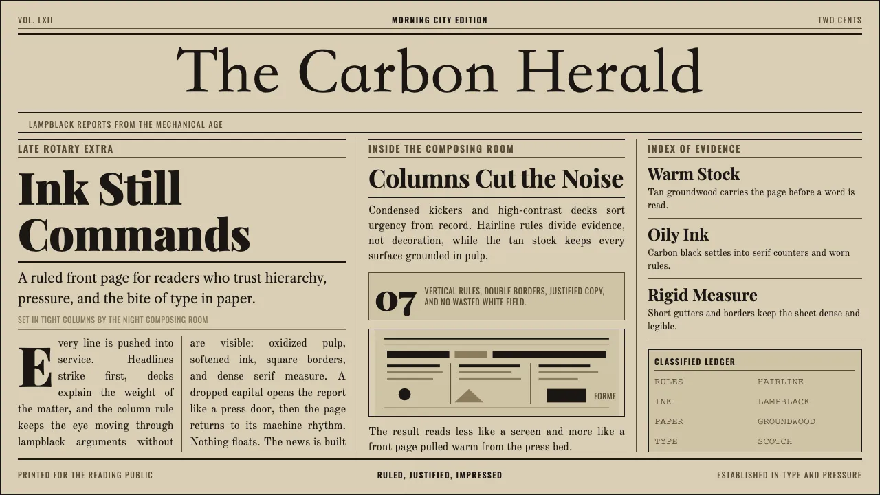
About Broadsheet Letterpress
The early-twentieth-century broadsheet was a machine for reading: oxidized groundwood pulp printed with oily lampblack ink, carved into tight columns by vertical rules and hierarchical headline decks. A wood-type or blackletter nameplate crowned the front page; Scotch and modern serifs filled the columns below.
This system rebuilds that density and authority. Warm tan paper, near-black carbon ink, hairline rules, drop initials, and condensed kickers — every surface reads as printed news, grounded in the materiality of pulp and ink rather than pixels.
- Origin
- North America
- Era
- 1900–1950 (golden age of letterpress broadsheet journalism)
- Key figures
- Ottmar Mergenthaler · Richard March Hoe · Frederic Goudy
- Movements
- Letterpress newspaper printing · Broadsheet column journalism
Broadsheet Letterpress design spec
Colors
Typography
The other 11 sections — buttons, cards, spacing, motion, techniques and more — open once you unlock. Download the DESIGN.md or send it to your AI in one click. Unlock once, yours forever.
Sign up nowStyles similar to Broadsheet Letterpress
Also inspired by print & type, with a close feel.
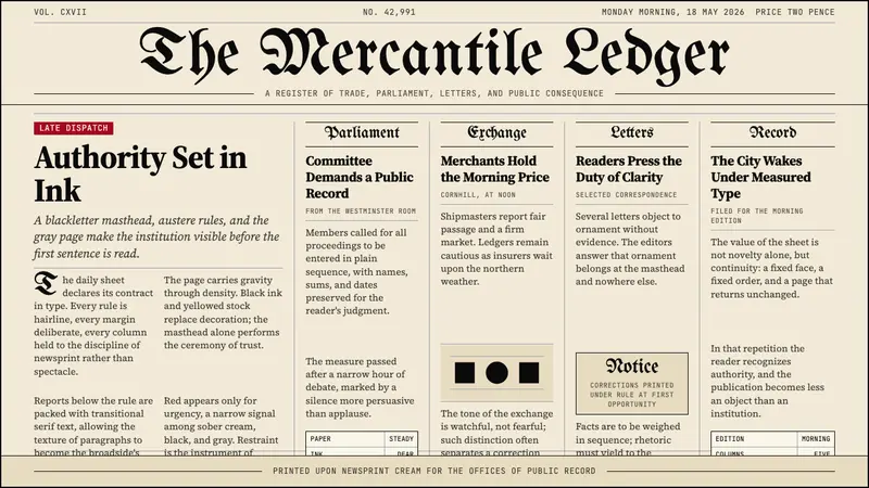 Gothic Blackletter Newspaper Masthead (1700)Authority in ink. Blackletter masthead, cream newsprint, and hairline columns.
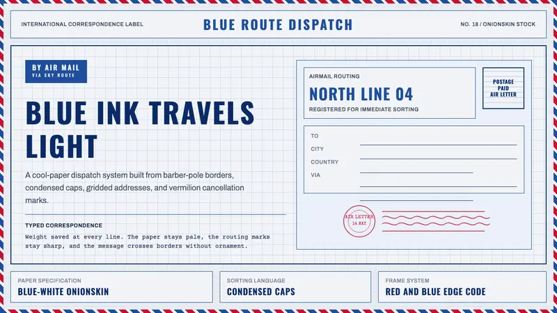 Par Avion Air MailPostal lightness made strict. Onionskin blue, Oswald caps, and red-blue edge stripes.
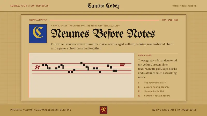 Gregorian Chant NeumesNotation becomes scripture. Rubric red staff lines and square neumes sit on tan vellum.
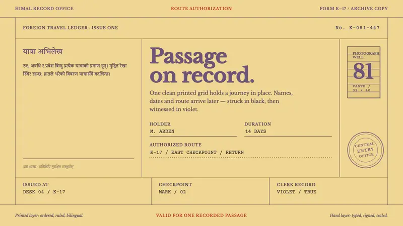 Trekking Permit 1980Order bears the journey. Violet letterpress rules hold typed records and crooked seals.