What is Syracuse Orange (College Athletics, 1870)?什么是 Syracuse Orange (College Athletics, 1870)?
One saturated cadmium orange, chosen by student vote in 1890, became the total identity of a university — no gradient, no compromise, just the color.1890年,一票定夺的镉橙色成为整所大学的完整身份——没有渐变,没有妥协,只有这一个颜色。
Syracuse Orange (College Athletics, 1870) in briefSyracuse Orange (College Athletics, 1870) 速览
Syracuse Orange is the single-hue athletic identity of Syracuse University, a private research institution founded in 1870 in upstate New York. Unlike most collegiate visual systems that rely on balanced two- or three-color palettes, Syracuse committed entirely to one dominant warm orange as its primary identifying mark. That orange — a saturated, almost aggressive cadmium tone — appears on every jersey, every stadium seat, every alumni banner, and every official communication. The color is not an accent; it is the system.锡拉丘兹大学橙色是美国大学体育品牌中最彻底的单色识别系统之一。锡拉丘兹大学是一所于1870年创立于纽约州北部的私立研究型大学,其视觉体系与大多数依赖双色或三色平衡配色的大学不同——它将一种主导暖橙完全作为核心识别标记。这种橙色——一种饱和度极高、几乎带有攻击性的镉橙色调——出现在每一件球衣、每一张体育馆座椅、每一条校友横幅和每一份官方传播物上。这种颜色不是点缀,它就是整个系统。
The visual language built around that orange is deliberately bold and economical. Deep navy blue serves as the chromatic anchor, providing the contrast and weight that allows the orange to dominate without becoming chaotic. Pure white opens up surface space for content and legibility. Condensed athletic display type — the kind of letterform that evokes jersey numerals and scoreboard signage — reinforces the competitive, arena-ready energy of the identity. Rectilinear geometry and hard-edged blocks replace any decorative curvature, channeling the no-nonsense confidence of collegiate sports branding.围绕这一橙色构建的视觉语言刻意追求大胆与经济。深海军蓝作为色彩锚点,提供对比度与重量感,使橙色得以主导整体而不失秩序。纯白色打开内容承载面,保障可读性。压缩体运动展示字体——那种唤起球衣号码与记分牌标识的字形——强化了竞技身份的力量感与赛场气质。方正的矩形几何与硬边色块取代了任何装饰性曲线,传递出大学竞技品牌特有的直接与自信。
The result is a visual system with unusually high recognition density. Because the palette is so compressed — one hero color, one anchor, one neutral — every application reads immediately as Syracuse. This monochromatic discipline is rare in American collegiate athletics, where most programs hedge across several hues, and it gives Syracuse Orange a poster-like clarity that scales from a stadium of fifty thousand down to a mobile notification badge without losing its identity.这套视觉系统具有异常高的识别密度。正因色板极度压缩——一种主色、一种锚色、一种中性色——每一次应用都能立即被识别为锡拉丘兹。这种近乎单色的纪律在美国大学体育中极为罕见,大多数院校都在多种色调之间权衡兼顾,而锡拉丘兹橙色的海报式清晰度让它从五万人的体育场缩放至移动端通知图标,都不会丧失身份。
Where does Syracuse Orange (College Athletics, 1870) come from?Syracuse Orange (College Athletics, 1870) 从何而来?
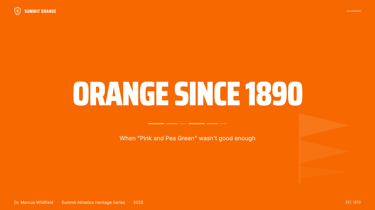
Syracuse University was chartered in 1870 by the Methodist Episcopal Church and opened its doors in 1871. Like most American universities of the period, it initially operated without a formalized athletic color. The early athletic program used what was described as 'Pink and Pea Green' — a combination that, by student accounts of the era, was both visually unremarkable and difficult to reproduce consistently on dyed fabric. The colors were tolerated rather than celebrated.锡拉丘兹大学于1870年由美以美教会特许成立,1871年正式开学。与同时期大多数美国大学一样,校方最初并没有正式确定的体育色彩。早期体育项目沿用的颜色被描述为「粉红与豌豆绿」——据当时学生的记述,这一组合既视觉平庸,又难以在染色织物上保持一致的呈现。这些颜色被勉强接受,从未真正受到喜爱。
In 1890, a student-led effort to replace the existing palette culminated in a formal vote. The students selected orange — specifically the vivid, warm-toned orange that would later be standardized against Pantone 165 — as the single color of the university. The reasoning cited in historical records emphasizes distinctiveness and visibility: orange was uncommon among the athletic programs of peer institutions in the northeast, and it read clearly at distance in outdoor venues. The decision to commit to a single hue rather than a two-tone combination was itself significant — a design choice, even if no one in 1890 would have called it that.1890年,一场由学生主导的色彩更换运动以正式投票告终。学生们选择了橙色——那种生动的暖橙色调,后来以Pantone 165作为标准色号——作为大学的唯一颜色。历史记录中提到的选择理由强调了辨识度与可见性:橙色在东北部同类院校的体育项目中极为罕见,且在室外场馆中远距离可见性极强。选择一种单一色调而非双色组合本身就意义重大——这是一个设计决策,尽管1890年的人们不会这样称呼它。
The adoption of navy blue as a secondary anchor color developed over subsequent decades as the athletic program expanded and the visual system needed a contrast partner. Navy provided depth and legibility without challenging the primacy of the orange. White entered the system as a content surface — the field on which numbers, names, and typographic information could be clearly read. By the mid-twentieth century, the three-element palette of orange, navy, and white had stabilized into the system still in use today, though the exact proportions and applications have evolved through multiple NCAA conference affiliations, including the Big East era and subsequent move to the Atlantic Coast Conference.海军蓝作为次要锚定色的引入,发生在随后数十年体育项目扩张、视觉系统需要对比伙伴的过程中。海军蓝提供了深度与可读性,同时不挑战橙色的主导地位。白色作为内容承载面进入系统——数字、姓名与排版信息得以在其上清晰呈现的底面。到二十世纪中叶,橙色、海军蓝与白色三元素色板已经稳定为沿用至今的系统,尽管具体的比例与应用方式随着多次NCAA联盟归属的变迁而演进,包括大东联盟时代及随后加入大西洋海岸联盟的转变。
The mascot history runs parallel to the color history. The university's athletic teams were long informally called 'the Orange Men' before the name was simplified to 'the Orange' in 2004 — a change that acknowledged the color itself as the identity, not a person or animal. Otto the Orange, the anthropomorphized mascot introduced in the 1980s, literalizes this: the mascot is the color made into a character. Key athletic figures who carried the identity into national prominence include basketball coach Jim Boeheim, who built one of the most decorated programs in NCAA history; football quarterback Donovan McNabb, whose tenure in the late 1990s brought widespread television visibility; and Carmelo Anthony, whose single season in 2002–2003 ended in an NCAA Championship and placed Syracuse Orange at the center of the national sports conversation.吉祥物历史与颜色历史并行发展。大学体育队长期被非正式地称为「橙人队」,直到2004年简化为「橙队」——这一改变承认了颜色本身才是身份,而非某个人或动物。1980年代引入的拟人化吉祥物奥托橙子将这一点字面化:吉祥物就是被赋予角色的颜色。将这一身份带入全国知名度的关键体育人物包括:篮球主教练吉姆·博海姆,他建立了NCAA历史上最具荣耀的项目之一;橄榄球四分卫多诺万·麦克纳布,其1990年代末的任期带来了广泛的电视曝光;以及卡梅隆·安东尼,他在2002—2003赛季的单季表现以NCAA总冠军收尾,将锡拉丘兹橙色推至全国体育话语的中心。
What defines the Syracuse Orange (College Athletics, 1870) look?Syracuse Orange (College Athletics, 1870) 的视觉特征是什么?
Dominant Cadmium Orange主导镉橙
The defining characteristic of the entire system is the commitment to one chromatic anchor. The orange in question is warm, fully saturated, and positioned toward the red end of the orange spectrum — closer to a molten amber than to a softer apricot or peach. It is not a pastel, not a muted earth tone, and not a pale accent; it is designed to dominate every surface it occupies. In any composition, the orange claims the largest visual mass and sets the emotional register: energy, competition, visibility, and institutional pride.整个视觉系统的决定性特征是对单一色彩锚点的彻底投入。这里的橙色是温暖的、充分饱和的,色调偏向橙色谱系中靠近红色的一端——更接近熔融琥珀,而非柔和的杏色或桃色。它不是粉彩,不是低饱和大地色,也不是淡雅点缀色;它被设计为主导所占据的每一个表面。在任何构图中,橙色占据最大的视觉质量,并设定情感基调:能量、竞争、可见性与机构自豪感。
Navy Blue as Structural Anchor海军蓝作为结构锚点
Deep navy blue functions as the chromatic counterweight to orange's warmth and saturation. It provides the contrast necessary for text legibility, outlines jersey stripes and logo borders, and anchors compositional edges that would otherwise dissolve into the orange field. Navy never competes with orange for dominance — it serves and frames. This relationship between a saturated warm hue and a deep cool anchor is a compositional strategy that creates maximum visual stability without introducing a third competing color.深海军蓝作为橙色的暖度与饱和度的色彩对重而存在。它提供文字可读性所需的对比,勾勒球衣条纹与标志边框,并锚定那些若无海军蓝则会消融于橙色面的构图边缘。海军蓝从不与橙色争夺主导地位——它服务于橙色并为之造框。这种饱和暖调与深冷锚色之间的关系是一种构图策略,在不引入第三种竞争色的情况下创造最大的视觉稳定性。
Condensed Athletic Typography压缩体运动字体排印
The typefaces used in Syracuse Orange contexts are characteristically condensed — tall, narrow letterforms that fit maximum information into the limited horizontal real estate of jersey backs, scoreboard panels, and stadium fascia. This condensed quality reads as energetic and purposeful rather than decorative. Headlines carry the weight of arena signage: they are large, bold, and designed to be read at speed and distance. Body text and secondary information step back cleanly, allowing the display typographic hierarchy to carry the system's athletic identity.锡拉丘兹橙色语境中使用的字体以压缩体为典型——高而窄的字形,将最大信息量压入球衣背号、记分牌面板与体育场围栏有限的横向空间中。这种压缩感令人感受到能量与目的性,而非装饰性。标题承载着体育场标识的分量:大、粗、设计为供人在运动中和远距离快速阅读。正文与次要信息干净地退后,让展示字体层级承载系统的竞技身份。
Blocky Rectilinear Geometry方正矩形几何
The compositional geometry of Syracuse Orange design is hard-edged and rectangular. Stripes are straight and of consistent width; logo lockups use rigid bounding boxes; layouts divide into clean rectangular zones rather than organic or curved regions. There is no rounding of corners, no softening of edges, no introduction of organic shapes that might suggest warmth or approachability. The geometry signals toughness, discipline, and competitive readiness — values consistent with the athletic context in which the system was developed.锡拉丘兹橙色设计的构图几何是硬边、矩形的。条纹笔直且宽度一致;标志组合使用刚性边界框;版面划分为干净的矩形区域,而非有机或曲线区域。没有圆角,没有边缘柔化,没有暗示温暖或亲近感的有机形状的引入。这种几何传递出强硬、纪律与竞争准备状态——与这套系统发展所在的竞技语境高度一致的价值观。
Jersey-Stripe Rhythm球衣条纹节奏
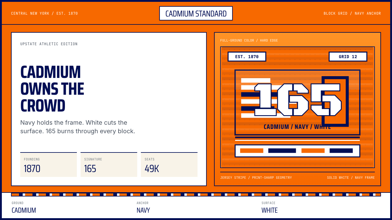
One of the most recognizable micro-patterns within the system is the horizontal stripe sequence derived from athletic jersey conventions. These stripes — typically orange bordered by narrow navy bands, or white bordered by narrow navy bands — appear not only on uniforms but migrate into graphic applications: presentation headers, web section dividers, editorial byline rules. The stripe is a modular rhythm device that carries the athletic heritage of the identity into designed contexts without requiring any literal depiction of sports equipment or imagery.这套系统中最具辨识度的微观图案之一是源自运动球衣惯例的水平条纹序列。这些条纹——通常是以窄海军蓝条边框的橙色,或以窄海军蓝条边框的白色——不仅出现在制服上,还迁移到平面应用中:演示文稿标题、网页分区线、编辑排版署名线。条纹是一种模块化节奏装置,无需任何运动器材或图像的字面描绘,就将身份的竞技传承带入设计语境。
High Contrast and Immediacy高对比度与即时感
The entire palette is calibrated for maximum optical impact at distance. Orange against white creates one of the highest-contrast warm-ground combinations available to a designer; orange against navy creates a complementary-adjacent pairing with strong chromatic tension. Neither combination is subtle, and that is entirely intentional. The system was built to be seen from the upper tiers of a stadium, read from a moving television broadcast, and recognized on a crowd of fans moving through a parking lot. Subtlety was never an objective.整套色板为在远距离产生最大视觉冲击而校准。橙色叠白色创造了设计师可用的最高对比度暖色地面组合之一;橙色叠海军蓝创造了具有强烈色彩张力的近似互补色配对。这两种组合都不是微妙的,这完全是刻意为之。这套系统是为了能从体育场上层看台被看见、从移动的电视转播中被读取、在停车场移动的球迷人群中被识别而构建的。微妙从来不是设计目标。
Monochromatic Brand Discipline单色品牌纪律
Most collegiate athletic programs spread their identity across multiple colors, creating flexibility at the cost of distinctiveness. Syracuse Orange inverts this trade-off by committing almost entirely to a single defining hue. The practical result is that any fragment of the system — a single orange stripe, an orange numeral, an orange seat in a sea of concrete — is immediately attributable. This monochromatic discipline requires accepting a narrower expressive range, but it produces a brand recognition density that is genuinely unusual in the landscape of American collegiate athletics.大多数大学体育项目将身份分散到多种颜色上,以独特性为代价换取灵活性。锡拉丘兹橙色通过几乎完全投入单一定义色调来颠覆这一取舍。实际结果是,系统的任何片段——一条橙色条纹、一个橙色号码、混凝土海洋中的一把橙色座椅——都能立即被归属。这种单色纪律要求接受更窄的表达范围,但它产生了在美国大学体育格局中真正罕见的品牌识别密度。
Who shaped Syracuse Orange (College Athletics, 1870)?谁塑造了 Syracuse Orange (College Athletics, 1870)?
An early advocate cited in Syracuse University historical records as associated with the 1890 effort to formalize the university's athletic color. The student movement he was part of replaced the informal 'Pink and Pea Green' with the single bold orange that has defined the institution ever since. His role represents the broader pattern in late-nineteenth-century American collegiate life in which student bodies — not administrations — shaped the visual identities of their institutions through advocacy and organized decision-making.锡拉丘兹大学历史档案中记载的早期倡导者,与1890年正式确立大学体育色彩的运动相关联。他所参与的学生运动将非正式的「粉红与豌豆绿」替换为此后定义这所学校的单一大胆橙色。他的角色代表了19世纪末美国大学生活中更广泛的模式:是学生群体而非行政机构,通过倡导与有组织的决策塑造了各自院校的视觉身份。
Head coach of the Syracuse University men's basketball team from 1976 to 2023, Boeheim is the figure most associated with projecting the Syracuse Orange identity into sustained national prominence. His tenure of nearly five decades produced an NCAA Championship in 2003, five Final Four appearances, and over nine hundred wins. The Syracuse orange uniform became a fixture of major college basketball broadcasts throughout his coaching career, ensuring that the color reached a national audience season after season and built an association between the orange identity and sustained competitive excellence.吉姆·博海姆自1976年至2023年担任锡拉丘兹大学男子篮球队主教练,是与将锡拉丘兹橙色身份推向持续全国知名度关联最深的人物。他近五十年的执教生涯产出了2003年NCAA总冠军、五次Final Four参赛资格以及九百余场胜利。锡拉丘兹橙色球服贯穿其执教生涯成为大学篮球重要转播的固定画面,确保这一颜色逐赛季触达全国观众,并在橙色身份与持续竞技卓越之间建立了深刻联结。
Quarterback for Syracuse University from 1995 to 1998, McNabb was a central figure in a period of heightened national attention to Syracuse football. His dual-threat play style generated extensive television coverage during the cable sports era, bringing the orange jersey into regular prime-time visibility. After his college career, his NFL success with the Philadelphia Eagles extended the cultural reach of the Syracuse Orange brand well beyond the university itself, as sports media regularly referenced his collegiate origins alongside his professional achievements.多诺万·麦克纳布于1995年至1998年担任锡拉丘兹大学四分卫,是锡拉丘兹橄榄球迎来全国高度关注时期的核心人物。他的双威胁打法在有线体育时代产生了大量电视报道,使橙色球服定期进入黄金时间视野。大学生涯结束后,他在费城老鹰队的NFL成功将锡拉丘兹橙色品牌的文化覆盖范围远远延伸到大学本身之外,因为体育媒体在报道其职业成就时始终将其大学起点一并提及。
Anthony played a single season at Syracuse in 2002–2003 before entering the NBA Draft, but that season was definitive for the program's national profile. He led Syracuse to the NCAA Championship title, providing the sports media event that placed the orange uniform at the literal center of the college basketball world. His subsequent NBA career — spanning two decades at the highest level — meant that the Syracuse orange association remained visible in professional basketball coverage for years after his college departure. Few single-season college careers have done as much to nationalize a collegiate visual identity.卡梅隆·安东尼在进入NBA选秀前于2002—2003赛季在锡拉丘兹度过了单独一个赛季,但那个赛季对项目的全国影响力具有决定性意义。他带领锡拉丘兹夺得NCAA总冠军,这一体育媒体事件将橙色球服字面意义上置于大学篮球世界的中心。他随后跨越二十年最高水平的NBA职业生涯,意味着锡拉丘兹橙色的关联在他离开大学多年后仍持续出现在职业篮球报道中。极少有单赛季的大学生涯能如此有效地将一个大学视觉身份推向全国化。
Introduced in the 1980s as Syracuse University's official mascot, Otto is an anthropomorphized orange — literally a smiling orange-colored spherical character. The choice to make the mascot the color itself, rather than an animal or historical figure, is one of the most direct expressions of how central the orange is to the institution's identity. Otto literalizes what the color system implies: the orange is not a property of the team, it is the team. The mascot's design, in its pure spherical simplicity, also echoes the bold, uncompromising visual character of the broader identity system.奥托橙子作为锡拉丘兹大学官方吉祥物于1980年代引入,是一个拟人化的橙子——字面上是一个微笑的橙色球形角色。选择以颜色本身而非动物或历史人物作为吉祥物,是对橙色对于这所学校身份的核心地位最直接的表达之一。奥托将色彩系统所暗示的内容字面化:橙色不是球队的属性,橙色就是球队。这个吉祥物的设计在其纯粹的球形简洁中,也呼应了更广泛身份系统的大胆、毫不妥协的视觉性格。
How do you use Syracuse Orange (College Athletics, 1870) today?今天怎么用 Syracuse Orange (College Athletics, 1870)?
Syracuse Orange is a high-impact, immediately recognizable style that translates well to designed contexts beyond athletics — provided the designer respects the discipline that makes it work. The system's power comes entirely from restraint: one dominant warm hue, one cool anchor, one neutral surface. Violating that economy by introducing additional colors or softening the palette's intensity immediately dissolves what makes the style distinctive. Every application decision should begin from the question: does this serve the orange, or does it compete with it?锡拉丘兹橙色是一种高冲击力、即时可识别的风格,在体育语境之外的设计场景中同样具有良好的可移植性——前提是设计师尊重使其有效运作的纪律。这套系统的力量完全来自克制:一种主导暖色、一种冷色锚点、一种中性承载面。通过引入更多颜色或柔化色板强度来打破这种经济性,会立即消解使这种风格独特的东西。每一个应用决策都应从这个问题出发:这是在服务于橙色,还是在与它竞争?
For presentation slides, the Syracuse Orange system works with particular force on cover pages and section dividers. A cover built in this style places a large field of orange — occupying the majority of the slide area — against which a white or navy logotype and title appear in condensed, heavy type. Section dividers can use the jersey-stripe motif: a bold horizontal orange band bracketed by narrow navy lines, with the section title reversed out in white. Content slides should retreat to a white or light neutral ground, using orange only for headers, key data callouts, or active-state indicators. The contrast between the high-intensity cover and the clean content slides creates a presentation rhythm that feels both energetic and professional.在演示文稿中,锡拉丘兹橙色系统在封面页和章节分隔页上发挥的力量尤为突出。以这种风格制作的封面将大面积橙色——占据幻灯片大部分区域——作为底面,白色或海军蓝的标志与标题以压缩重磅字体叠于其上。章节分隔页可以使用球衣条纹母题:一条粗水平橙色带,以窄海军蓝线条边框,章节标题以白色反白呈现。内容页应退回白色或浅中性底面,仅将橙色用于标题、关键数据标注或激活状态指示。高强度封面与干净内容页之间的对比创造出一种既充满能量又专业有序的演示节奏。
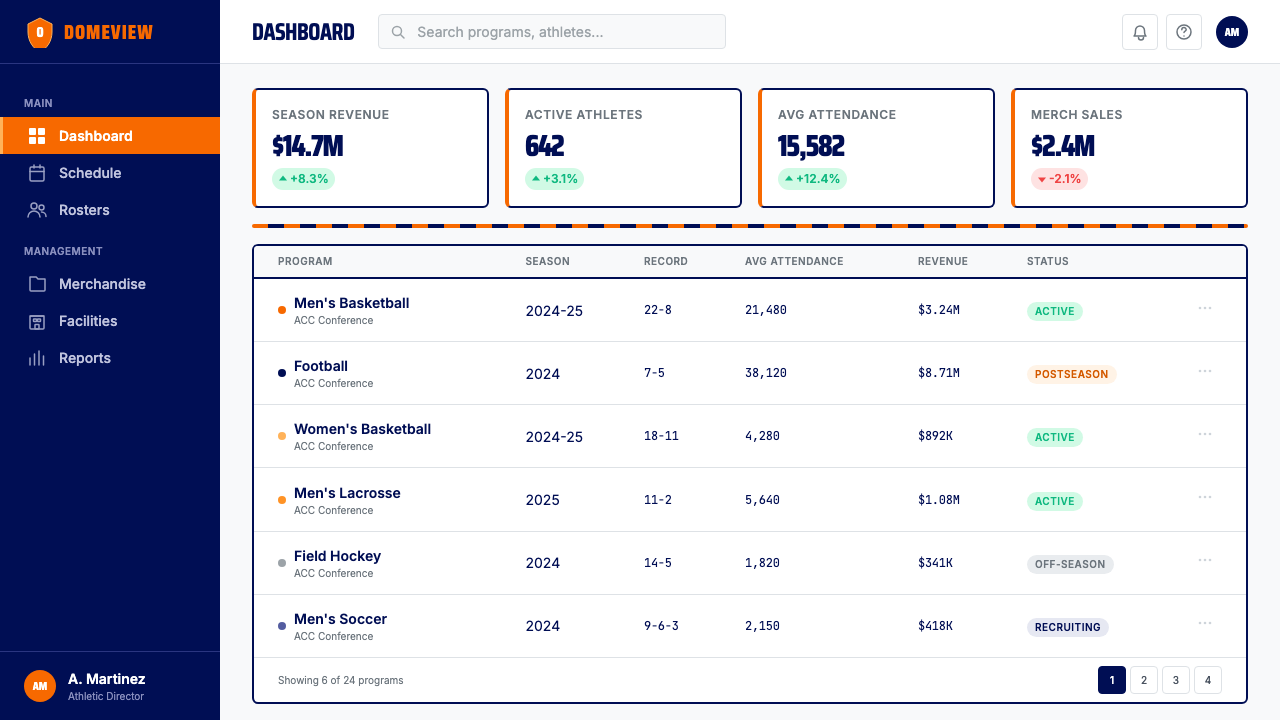
For web interfaces and dashboards, the style is well-suited to contexts where hierarchy, urgency, and scannability are primary requirements — sports scores and statistics, performance dashboards, ticketing and event platforms, any interface where the user needs to find critical information quickly. The approach: a white or very light neutral background carries all body content; orange is reserved for primary calls to action, live indicators, and top-level navigation labels; navy provides text weight for headings and structural borders. Avoid using orange as a background for large text blocks — it creates fatigue at reading lengths. Instead, use orange in short, high-contrast bursts: buttons, badges, alert banners, active tab states.对于网页界面和仪表板,这种风格非常适合层级感、紧迫感与可扫描性是首要需求的场景——体育比分与统计、绩效仪表板、票务与赛事平台,以及任何用户需要快速找到关键信息的界面。方法如下:白色或极浅的中性背景承载所有正文内容;橙色保留给主要行动号召、实时指示器和顶级导航标签;海军蓝为标题和结构边框提供文字重量感。避免将橙色用作大段文字的背景——它在阅读长度上造成视觉疲劳。转而在短促、高对比度的爆发中使用橙色:按钮、徽章、警示横幅、激活标签状态。
For editorial and marketing work, the Syracuse Orange palette supports a poster-like assertiveness that suits promotional materials, event announcements, and institutional communications. A full-bleed orange background with white condensed type is the system's most powerful single-layout move, appropriate for covers, hero sections, and billboards. Marketing page structures that alternate between an orange-dominant hero, a white content zone, and navy accent sections create visual rhythm without requiring any additional colors. The jersey-stripe motif migrates naturally into editorial dividers and section headers, providing texture and brand continuity without decorative illustration.对于编辑与营销内容,锡拉丘兹橙色色板支持一种海报式的果断感,适合促销材料、赛事公告与机构传播。全出血橙色背景配白色压缩体字体是这套系统最有力的单版面动作,适合封面、主视觉区块与广告牌。以橙色主导英雄区、白色内容区与海军蓝点缀区交替结构的营销页面,无需任何额外颜色即可创造视觉节奏。球衣条纹母题自然地迁移为编辑版面分隔线与章节标题,在无需装饰性插图的情况下提供质感与品牌连续性。
A common mistake when applying this style outside its athletic context is diluting the orange's saturation in the belief that a softer version will feel more 'professional' or 'versatile.' This is the single most damaging change one can make. A muted, washed-out orange reads as a different color entirely — it no longer carries the confident, competitive energy that defines the system. Similarly, adding a second warm accent color (gold, red, or yellow) creates chromatic confusion and undermines the monochromatic discipline that gives the style its recognition power. If the full-saturation orange feels too bold for a specific context, the correct adjustment is to reduce its surface area — use it on smaller elements — not to reduce its intensity.在将这种风格应用于体育语境之外时,最常见的错误是出于对「更专业」或「更百搭」的追求而降低橙色的饱和度。这是最具破坏性的单一改变。一种低饱和度、褪色的橙色呈现为一种完全不同的颜色——它不再承载定义这套系统的自信与竞争能量。同样,添加第二种暖色调(金色、红色或黄色)会造成色彩混乱,并破坏赋予这种风格识别力量的单色纪律。如果全饱和度橙色对某个特定场景来说过于大胆,正确的调整是减少其占用面积——将其用于更小的元素——而不是降低其强度。
Syracuse Orange (College Athletics, 1870) — FAQSyracuse Orange (College Athletics, 1870) · 常见问题
Why did Syracuse choose a single color instead of the typical two-color collegiate palette?锡拉丘兹为什么选择单一颜色,而不是典型的大学双色配色?
The 1890 student vote that established orange as the university color was primarily motivated by distinctiveness and visibility — two criteria that a single bold hue satisfies more completely than a two-color combination. Most northeastern university programs of that era used blue-and-white or crimson-and-white combinations. Orange was simply unused in the competitive landscape, and its high natural visibility in outdoor stadium conditions made it practically effective. The decision to standardize on one hue rather than two may have also reflected the production realities of 1890s textile dyeing, where consistency was easier to achieve with a single dye process. Whatever the original reasoning, the effect has been a brand recognition advantage that has compounded over more than a century.1890年确立橙色为大学颜色的学生投票,主要动机是辨识度与可见性——这两个标准被单一大胆色调比双色组合更完整地满足。那个时代大多数东北部大学项目使用蓝白或深红白组合。橙色在竞争格局中简单地尚未被使用,且其在室外体育场条件下的天然高可见性使其在实践中极为有效。选择单一色调而非双色的标准化可能也反映了1890年代纺织染色的生产现实,单一染色工艺更容易实现色彩一致性。无论最初的推理如何,其效果是一种已经在一个多世纪里持续复利增值的品牌识别优势。
How does Syracuse Orange differ from other orange-using collegiate brands like Tennessee or Clemson?锡拉丘兹橙色与田纳西或克莱姆森等同样使用橙色的大学品牌有何不同?
The key difference lies in chromatic commitment and the character of the orange itself. Tennessee uses an orange that leans toward a brighter, more yellow-inflected tone — often described as Volunteer Orange — paired with white as an essentially co-equal partner. Clemson's orange is also distinctly positioned, tending toward a warmer, slightly deeper tone, and is consistently paired with a rich purple that shares compositional weight. Syracuse Orange is positioned toward the red end of the orange spectrum, giving it a denser, more saturated quality, and it deploys navy rather than white or purple as its contrast partner. The single most meaningful difference is that Syracuse treats orange as a solo identity, not as one color in a pair — the system is built around the orange's dominance in a way that Tennessee's and Clemson's systems are not.关键差异在于色彩承诺和橙色本身的性格。田纳西使用的橙色偏向更明亮、更偏黄的色调——通常被描述为义勇兵橙——与白色搭配,两者基本上平分秋色。克莱姆森的橙色定位也截然不同,倾向于更温暖、略微更深的色调,并持续与一种分担构图重量的浓郁紫色配对。锡拉丘兹橙色定位于橙色谱系偏红的一端,赋予它更密实、更饱和的品质,且以海军蓝而非白色或紫色作为对比伙伴。最具意义的单一差异在于,锡拉丘兹将橙色视为独立身份,而非一对颜色中的一种——这套系统是围绕橙色的主导地位而构建的,田纳西和克莱姆森的系统则不然。
Can the Syracuse Orange style work in non-sports contexts like technology or financial services?锡拉丘兹橙色风格能在科技或金融服务等非体育语境中运作吗?
It can, with deliberate adaptation. The style's core properties — high contrast, strong hierarchy, immediate readability, geometric structure — are genuinely useful in any context where urgency and authority are desired values. Financial services interfaces that communicate real-time data, market alerts, or trading information can benefit from orange's attention-commanding qualities. Technology products in the competitive gaming, sports analytics, or event-ticketing categories align naturally with the palette's energy. The adaptation required is to suppress the most overt athletic signals — the jersey stripe motif, the condensed all-caps display type — and foreground the structural and typographic principles that underpin them. A dashboard that uses the orange sparingly, for critical alerts and primary actions only, with navy providing structural weight and white as the reading surface, can feel contemporary and authoritative without reading as a sports brand.可以,但需要刻意适配。这种风格的核心属性——高对比度、强层级感、即时可读性、几何结构——在任何紧迫感与权威性是期望价值的场景中都真正有用。传达实时数据、市场警报或交易信息的金融服务界面,可以受益于橙色的注意力号召品质。竞技游戏、体育数据分析或赛事票务类别的科技产品,与这一色板的能量天然契合。所需的适配是压制最明显的竞技信号——球衣条纹母题、压缩体全大写展示字体——并将支撑它们的结构性与排版原则推至前景。一个只将橙色用于关键警报与主要行动、以海军蓝提供结构重量、以白色作为阅读底面的仪表板,可以在不被读作体育品牌的情况下呈现出当代感与权威感。
Is the Syracuse Orange system appropriate for dark-mode or dark-background applications?锡拉丘兹橙色系统适合深色模式或深色背景应用吗?
The system adapts well to dark backgrounds, more readily than many athletic palettes. Orange on a very dark navy or near-black ground creates a striking and legible combination — the orange reads with even greater intensity against a dark surround than against white. The practical approach is to treat the dark ground as a replacement for white rather than as an addition to the existing palette: dark navy or near-black becomes the neutral surface, orange remains the primary accent, and white is reserved for the most critical text and interface elements. Avoid putting large blocks of orange type on pure black backgrounds, as the high chroma contrast creates optical vibration at extended reading lengths. The jersey-stripe motif works particularly well in dark contexts — an orange stripe on a dark field has an almost luminous quality that reinforces the athletic energy of the system.这套系统对深色背景的适配性良好,比许多竞技色板更容易实现。极深海军蓝或近黑底面上的橙色创造出醒目且可读的组合——橙色在深色环绕下比在白色上呈现出更强的视觉强度。实用方法是将深色底面视为白色的替代,而非现有色板的补充:深海军蓝或近黑成为中性承载面,橙色保持为主要强调色,白色保留给最关键的文字与界面元素。避免在纯黑背景上大面积使用橙色文字,因为高色度对比在延伸阅读长度时产生视觉振动。球衣条纹母题在深色语境中表现尤为出色——深色底面上的橙色条纹具有一种近乎发光的品质,强化了这套系统的竞技能量。
How much orange is too much orange in a layout?在版面中,多少橙色算是太多?
The practical threshold varies by context, but a useful working principle is that orange should occupy the largest visual mass in any given composition without occupying the majority of the total surface area. On a cover slide or hero section, orange might fill sixty to seventy percent of the space — that is the system's maximum intensity moment, appropriate for high-attention entry points. On content pages, orange should be significantly more restrained: used for headlines, key callouts, and interactive states, but not as the background of any area where sustained reading occurs. The clearest sign that a composition has too much orange is when the eye cannot find a resting point — when there is no neutral surface to recover on. Navy and white serve as visual rest areas; without adequate proportions of both, the orange becomes overwhelming rather than commanding.实际阈值因语境而异,但一个有用的工作原则是:橙色应在任何给定构图中占据最大的视觉质量,但不占据总表面积的大多数。在封面幻灯片或主视觉区块上,橙色可以填充百分之六十到七十的空间——这是系统的最大强度时刻,适合需要高度注意力的入口点。在内容页上,橙色应显著更为克制:用于标题、关键标注与交互状态,但不作为任何发生持续阅读的区域的背景。判断构图中橙色过多的最清晰信号是当视线找不到休息点的时候——当没有可供恢复的中性表面时。海军蓝与白色作为视觉休息区;若两者的比例不足,橙色就会变得压倒一切,而非统领全局。
Related design styles相关设计风格
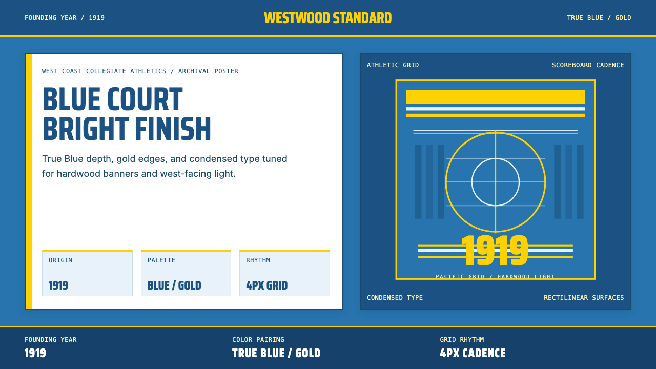 UCLA Bruin Purple & Gold (1919)Pacific authority in motion. True Blue panels, gold stripes, condensed athlet…太平洋式权威感。真蓝面、金条纹、压缩体育字。
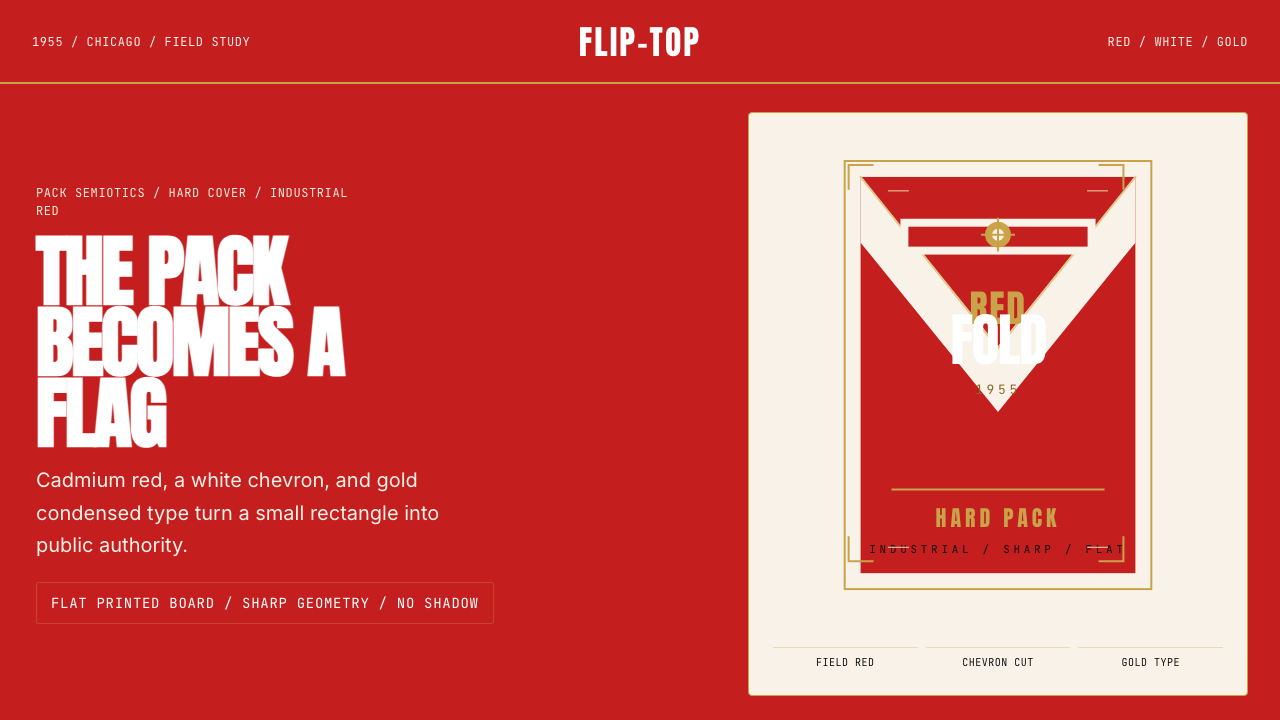 Marlboro Red Flip-Top (1955)Authority in one fold. Cadmium red, white chevron, and gold type read like a…一折成旗。镉红、白人字与金字排出强硬权威。
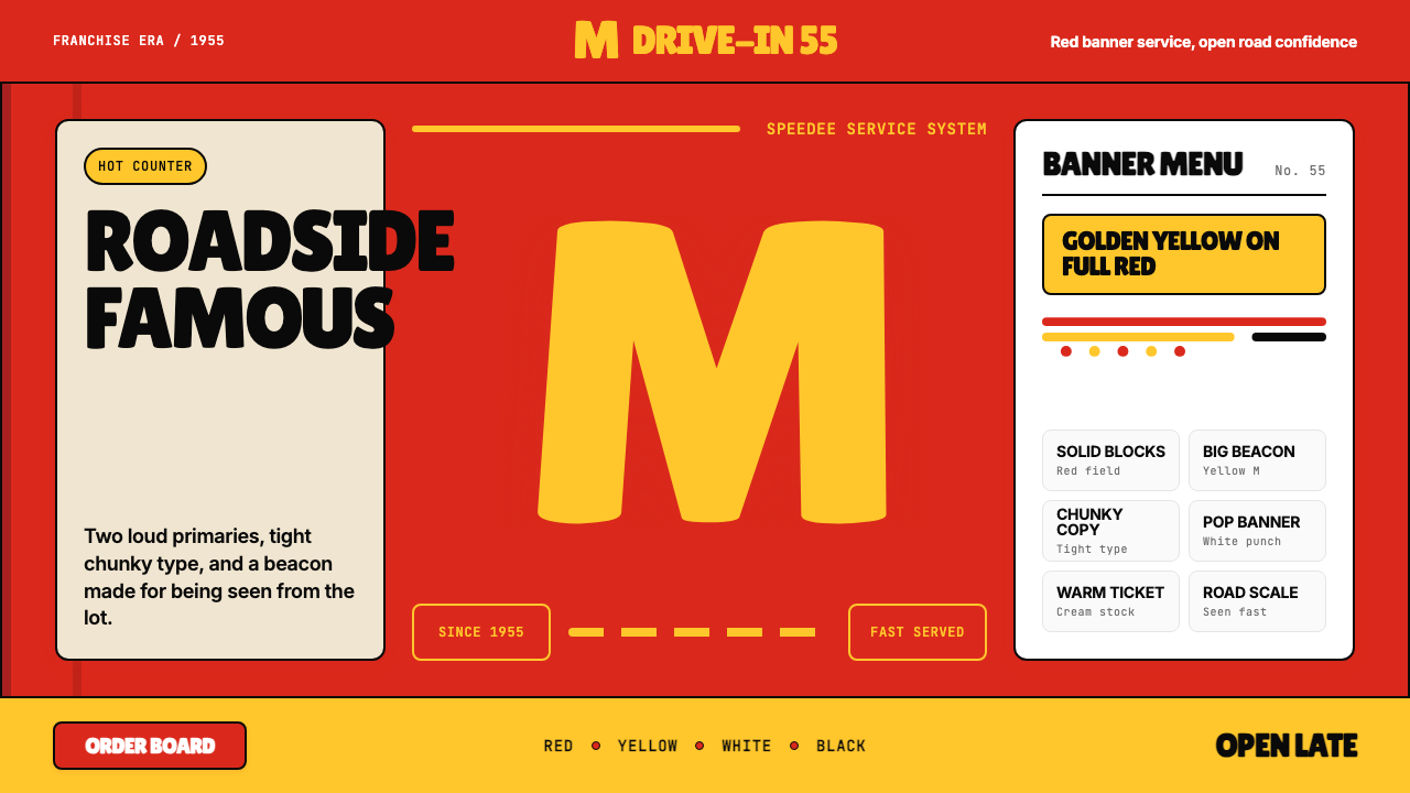 McDonald's Golden ArchesRoadside famous. Saturated red, hot yellow, and chunky type shout from 1955.路边即识别:饱和红、热黄与厚重字体喊出1955。
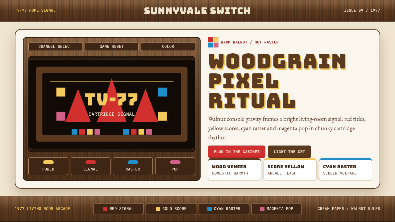 Atari 2600 (Woodgrain)Woodgrain meets raw pixels. Walnut panels frame Bungee type and CMYK raster b…木纹遇上生猛像素:胡桃木面板包裹Bungee字与CMYK色块。
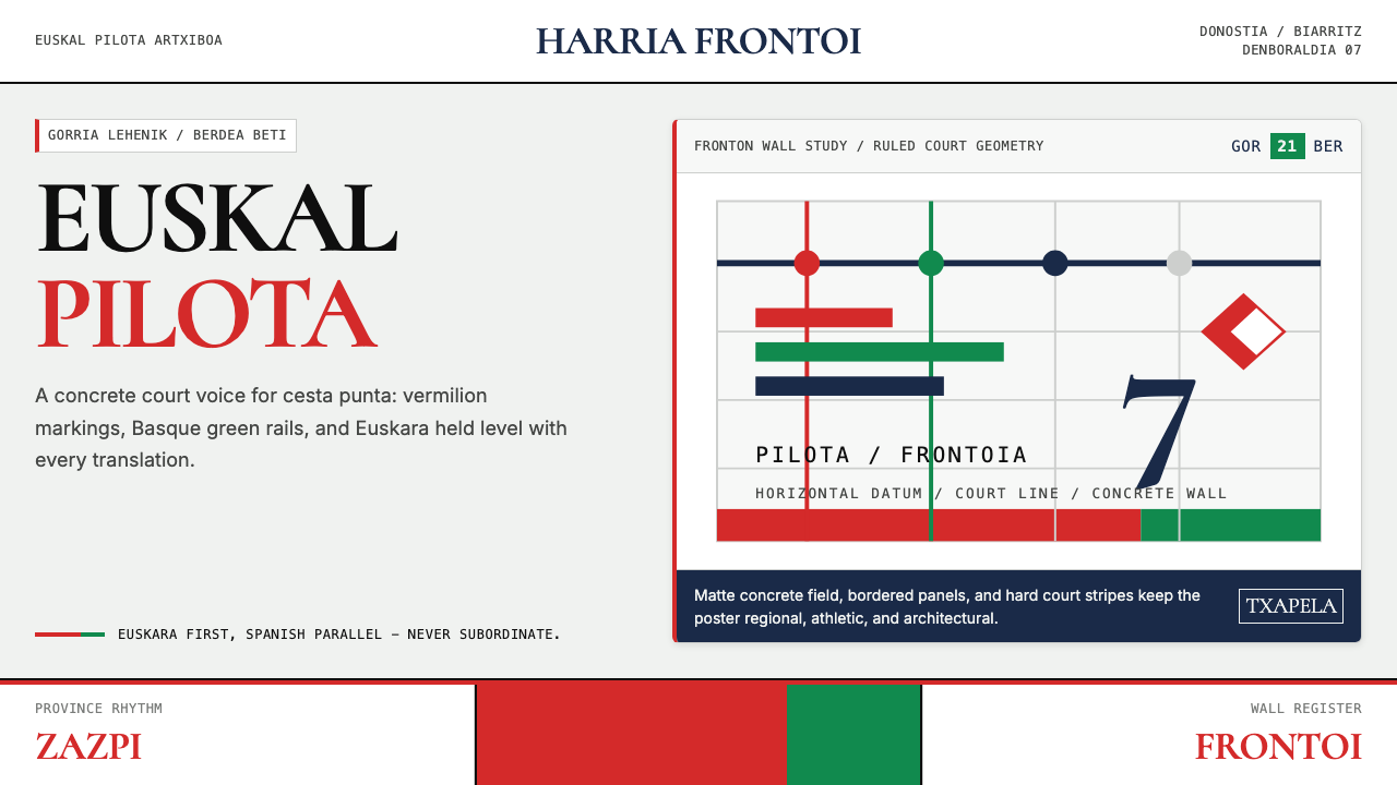 Basque Pelota Fronton Red & GreenFiercely regional. Vermilion court stripes and Basque green rule a concrete g…地域锋芒鲜明:朱红球场线与巴斯克绿统治混凝土网格。