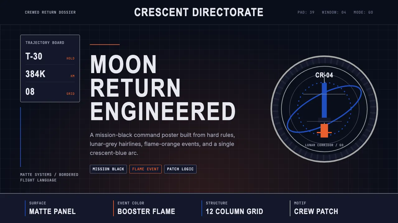
About NASA Artemis Program
NASA's Artemis program revives the agency's Apollo-era visual confidence for a new lunar decade. Deep mission black, the signature Artemis-blue crescent arc, and Saturn-V flame orange combine with engineering-grade typography to evoke Kennedy Space Center at T-minus 30 — stadium lights blazing, Orion sealed atop SLS, mission patches embroidered on flight suits.
The design language is matte, precise, and unapologetically technical. Square-edged components, rigid 8px grids, and condensed all-caps designators channel the control-room discipline of crewed spaceflight while the circular mission-patch motif anchors every composition with embroidered gravitas.
- Origin
- Washington DC, Kennedy Space Center Florida, Houston Texas
- Era
- 2017–present; visual identity crystallized 2020–2024
- Key figures
- Bill Nelson · Reid Wiseman · Christina Koch · Victor Glover
- Movements
- NASA worm logo revival · lunar return program · public-private spaceflight
NASA Artemis Program design spec
Colors
Typography
The other 11 sections — buttons, cards, spacing, motion, techniques and more — open once you unlock. Download the DESIGN.md or send it to your AI in one click. Unlock once, yours forever.
Sign up nowStyles similar to NASA Artemis Program
Also inspired by brands & products, with a close feel.
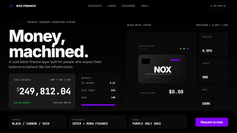 Revolut Black FinanceBanking as instrument. Pure black, hairline borders, and one electric purple signal.
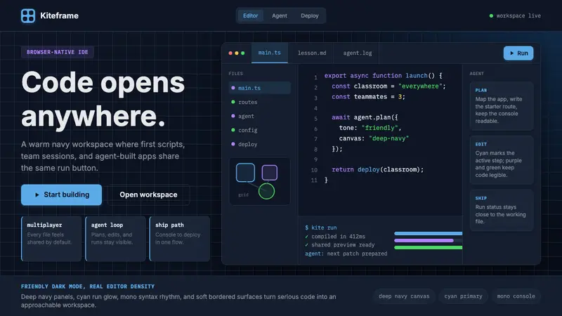 Replit Browser IDE BlueFriendly code gravity. Cyan run lights and mono panels warm the deep navy IDE grid.
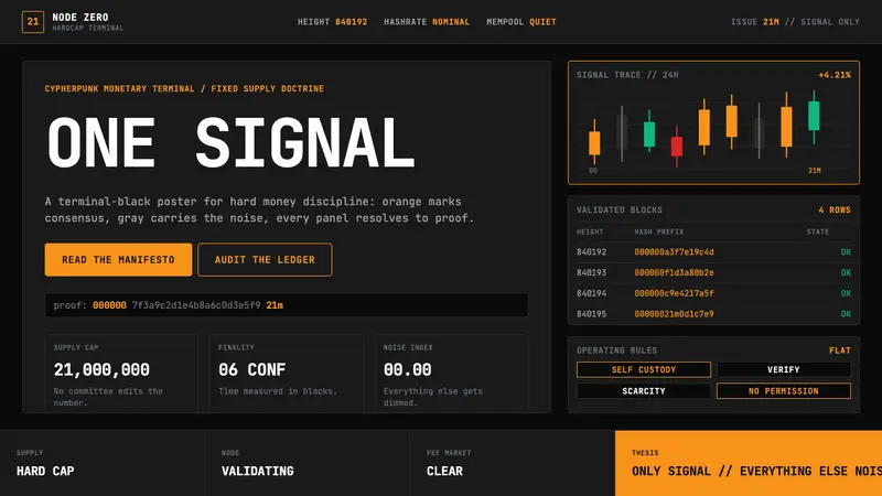 Bitcoin Maximalist OrangeOnly signal, zero spectacle. Orange mono data grids on terminal black enforce hard-money focus.
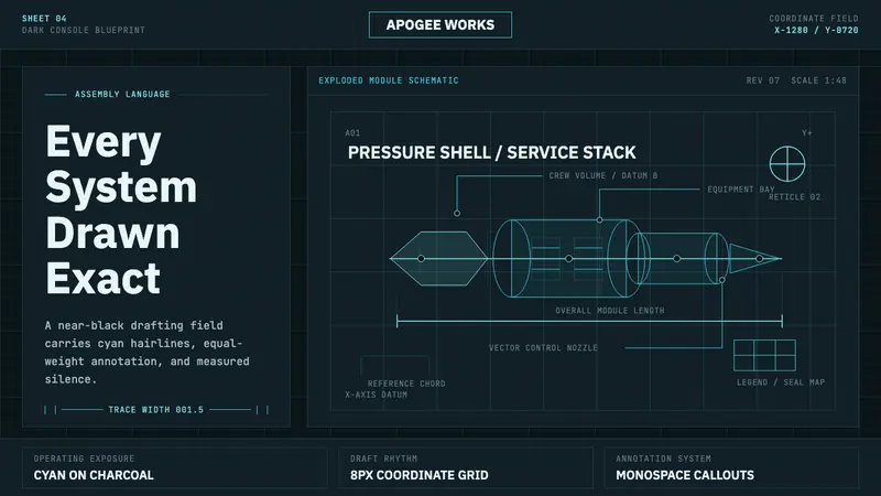 Spacecraft SchematicDrafting becomes atmosphere. Cyan hairlines and grid ticks glow on charcoal teal.