Design style guide设计风格指南
What is NZ All Blacks Rugby Haka Fern?什么是 NZ All Blacks Rugby Haka Fern?
The All Blacks' visual identity is built on a single, unyielding conviction: that black is not merely a color but a declaration of purpose — and every line, stripe, and silver fern that crosses it carries the full weight of that conviction.全黑队的视觉身份建立在一个坚定不移的信念上——黑色不只是一种颜色,而是一种使命宣言,而每一条线条、条纹与银蕨叶都承载着这份信念的全部分量。
NZ All Blacks Rugby Haka Fern in briefNZ All Blacks Rugby Haka Fern 速览
The NZ All Blacks Rugby Haka Fern design system translates the visual language of New Zealand's national rugby team into an interface aesthetic. At its core are the elements that have defined the All Blacks brand since the late nineteenth century: a deep, saturated black field, silver fern linework drawn from Māori botanical iconography, jersey-stripe grids that echo the vertical architecture of the playing kit, and typographic choices that convey solidity and controlled force.新西兰全黑队橄榄球哈卡蕨叶设计系统,将新西兰国家橄榄球队的视觉语言转化为界面美学。其核心是自十九世纪末便定义全黑队品牌的那些元素:深沉饱满的黑色底场,源自毛利植物图像学的银蕨线条,呼应球衣竖向结构的条纹栅格,以及传递稳固感与控制力的字体选择。
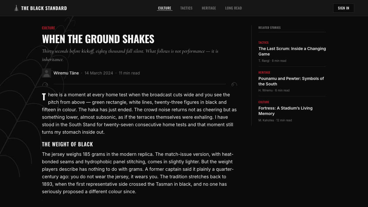
This is a dark system — decisively so. The black ground is not background; it is the dominant statement. Every other element — the silver hairlines of fern fronds, the pewter weight of display type, the occasional flash of white — is cut into or layered over that darkness. The result is an atmosphere closer to a floodlit stadium at night than to a polished corporate identity, and that atmosphere is the point.这是一套黑暗系统——毫不妥协地黑暗。黑色底面不是背景,它本身就是最主要的陈述。其他一切元素——蕨叶细丝的银灰发线、展示字体的铅锡色分量、偶尔出现的白色闪光——都是被切入或叠压在这片黑暗之上的。由此产生的氛围,更接近夜晚泛光灯下的球场,而非精致的企业形象,而这种氛围正是这套系统的核心所在。
What distinguishes this system from generic dark-mode design is its cultural specificity. The fern motif, the tā moko-inspired dividers, and the haka-derived sense of confrontational stance are not decorative choices — they are referential ones. The system asks the viewer to recognize a lineage: from the fields of Aotearoa to Eden Park to the interfaces we build today.使这套系统有别于普通深色模式设计的,是其文化特殊性。蕨叶母题、源自塔莫科的分隔线,以及哈卡战舞所赋予的对峙姿态感,不是装饰性选择,而是指涉性选择。这套系统要求观看者辨认出一条传承脉络:从奥特亚罗瓦的大地,到伊甸公园球场,再到我们今天构建的界面。
See the NZ All Blacks Rugby Haka Fern design system →查看 NZ All Blacks Rugby Haka Fern 完整设计系统 →
Where does NZ All Blacks Rugby Haka Fern come from?NZ All Blacks Rugby Haka Fern 从何而来?
The All Blacks trace their identity to 1893, when New Zealand's provincial unions first organized a national touring side. The black jersey was adopted not as a deliberate branding exercise but as a practical choice — dark fabric masked the mud and wear of hard play. Tom Ellison, one of the founding selectors and a Ngāti Mutunga man, was instrumental in establishing both the uniform and early playing standards. From the beginning, the team's identity was inseparable from its Māori membership and influence.全黑队的身份可追溯至1893年,彼时新西兰各省橄榄球联合会首次组建了全国性巡回球队。黑色球衣的采用并非刻意的品牌策划,而是出于实用考量——深色面料能遮盖激烈比赛中的泥污与磨损。汤姆·埃利森是创始选拔委员会成员之一,也是恩加蒂·穆图阿纳格(Ngāti Mutunga)族人,他在确立球衣制度与早期比赛规范方面发挥了关键作用。从一开始,这支球队的身份认同便与毛利族成员的参与和影响密不可分。
The silver fern appeared on All Blacks kits from the earliest years as a national emblem. In Māori culture, the silver fern — koru in its unfurling form — carries meanings of new life, growth, and strength. The silver underside of its fronds, visible when the leaf is caught in light, became a visual shorthand for New Zealand on the world stage. By the time the All Blacks were being broadcast to global audiences in the 1970s and 1980s, the fern on black had become one of sport's most immediately recognizable marks.银蕨叶自最早期便出现在全黑队球衣上,作为国家象征。在毛利文化中,银蕨——以其展开姿态命名的「科鲁」(koru)——承载着新生、成长与力量的含义。蕨叶背面在光线照射下可见的银白色,成为新西兰在世界舞台上的视觉简语。到1970至80年代全黑队被全球观众收看时,黑色上的蕨叶已成为体育运动中辨识度最高的标志之一。
The haka — specifically 'Ka Mate,' composed by the Ngāti Toa rangatira Te Rauparaha in the early nineteenth century, and later 'Kapa O Pango,' composed in 2005 by Derek Lardelli for the All Blacks — transformed the pre-match ritual into a global cultural moment. Buck Shelford, who captained the team in the late 1980s, is credited with restoring the full power and discipline of the haka's performance after a period of diminished practice, establishing the standard that became the brand. The haka's visual dimension — collective force expressed through synchronized stance, rhythm, and gaze — informs the design system's emphasis on confrontational directness.哈卡战舞——尤其是由恩加蒂·托阿(Ngāti Toa)酋长特·劳帕拉哈(Te Rauparaha)在十九世纪初创作的「卡·玛特」(Ka Mate),以及后来由德里克·拉德利(Derek Lardelli)于2005年专为全黑队创作的「卡帕·奥·潘戈」(Kapa O Pango)——将赛前仪式转化为全球文化时刻。巴克·谢尔福德(Buck Shelford)在1980年代末担任队长期间,于哈卡表演经历一段式微后,重新恢复了其完整的力量与纪律,确立了后来成为品牌标志的表演标准。哈卡的视觉维度——通过同步站姿、节奏与目光所表达的集体力量——为这套设计系统对抗式直接感的强调奠定了基础。
The modern brand consolidation came with the professional era and especially the Adidas partnership that began in 1999. Adidas-era kit design introduced the jersey-stripe architecture — vertical ribbed panels that create a sense of compressed energy and forward momentum — and the typographic discipline that carried the brand into digital contexts. Steve Gibbs and his collaborators in Māori visual arts informed the tā moko-inspired linework that appears in official All Blacks graphics, grounding the commercial identity in cultural authenticity. The 2011 Rugby World Cup, which New Zealand hosted and won, marked the point at which the All Blacks brand reached full global recognition — and the design language that supports it reached its current form.现代品牌的整合随着职业化时代的到来而成形,尤其是始于1999年的阿迪达斯合作关系。阿迪达斯时代的球衣设计引入了条纹结构——竖向肋纹板块创造出一种被压缩的能量感与向前的势头——以及将品牌带入数字语境的字体规范。史蒂夫·吉布斯与他在毛利视觉艺术领域的合作者,将塔莫科传统纹样的线描语言融入官方全黑队图形,以文化真实性为商业身份奠基。2011年由新西兰主办并最终捧杯的橄榄球世界杯,标志着全黑队品牌达到全球知名度的顶点——而支撑它的设计语言也在那时定型至今。
What defines the NZ All Blacks Rugby Haka Fern look?NZ All Blacks Rugby Haka Fern 的视觉特征是什么?
Color Field色彩底场
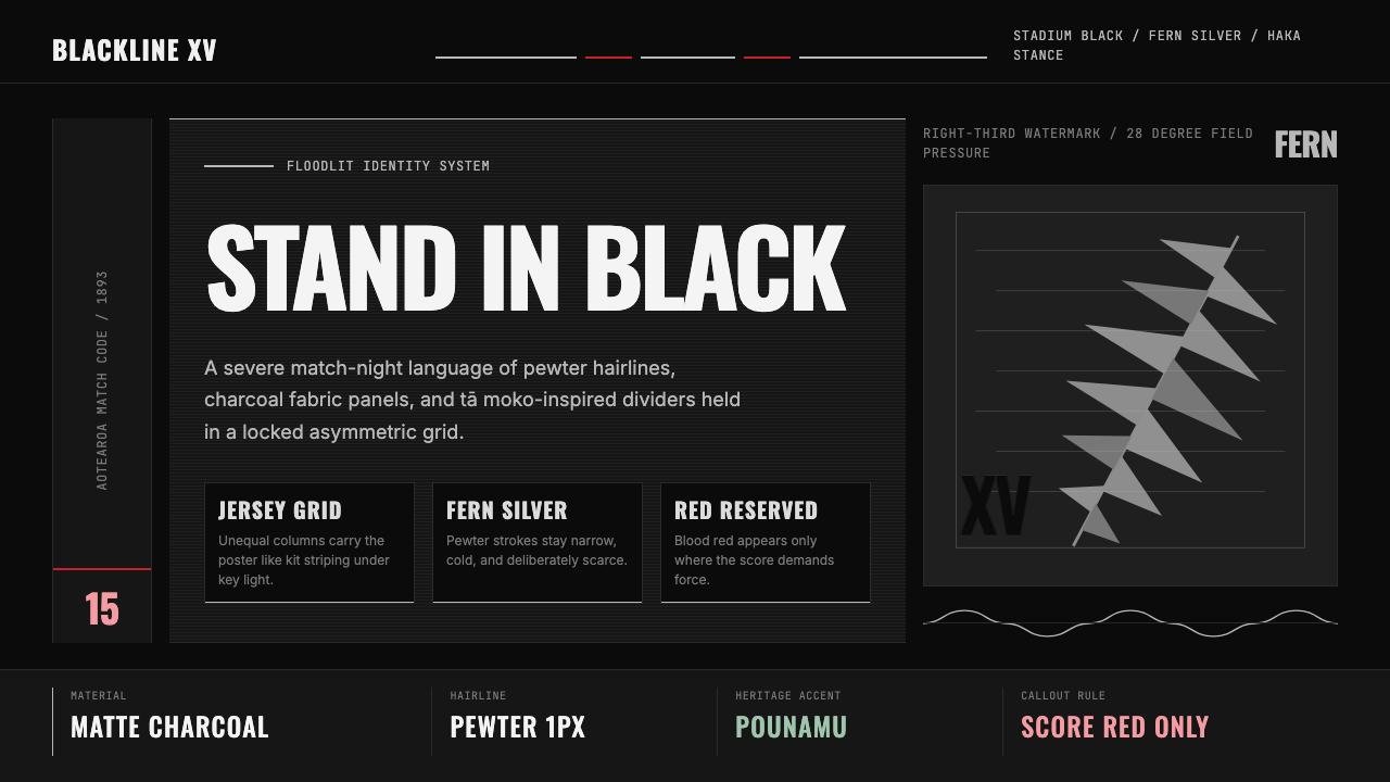
The palette is anchored by a single dominant ground: a deep, near-absolute black that functions as the primary canvas for all other elements. Against this darkness, silver and pewter tones — cool, metallic, and slightly muted — carry the role that white might play in a lighter system. A selective use of pure white appears for moments of maximum contrast, such as critical text at the highest hierarchy level. Anything that reads as warm, earthy, or bright is absent; the palette is cold and deliberate.这套色板以单一主导底面为锚点:一种深沉、接近绝对的黑色,充当所有其他元素的主要画布。在这片黑暗之上,银色与铅锡色调——冷静、金属质感、略显沉郁——承担着浅色系统中白色所扮演的角色。纯白仅在需要最高对比度的时刻出现,例如最高层级的关键文字。一切带有温暖感、土质感或明亮感的色彩均告缺席;这套色板是冷峻而经过深思熟虑的。
Fern Linework蕨叶线描
The silver fern motif appears as fine linework rather than filled silhouette — hairline strokes tracing the frond's structure give the impression of light caught on the underside of a leaf at dusk. This linework functions as both decoration and divider, appearing in headers, section breaks, and corner details. The frond curves are never mechanical; they carry the organic irregularity of botanical illustration, which prevents the system from reading as purely industrial.银蕨母题以精细线描而非填充剪影的形式呈现——描绘蕨叶结构的发丝笔触,给人一种黄昏时光线落在叶片背面的印象。这种线描同时具有装饰与分隔的功能,出现在标题、段落分隔与角落细节处。蕨叶的弧线从不机械;它们保有植物图鉴插画的有机不规则性,使这套系统不至于被读解为纯粹工业风格。
Jersey-Stripe Grid球衣条纹栅格
The layout system is derived from the vertical ribbed panels of the All Blacks playing kit. Columns are narrow and numerous, creating a compressed, high-density grid that implies forward momentum rather than open breathing room. Content is placed with deliberate asymmetry — a wide primary zone balanced against a narrow secondary zone, much as a jersey's central panel is flanked by tighter side panels. This grid makes the system feel athletic rather than editorial.版面系统源自全黑队球衣的竖向肋纹板块。列宽窄而数量多,形成一种被压缩的高密度栅格,暗示向前的势头而非开阔的呼吸空间。内容以刻意的不对称方式排布——一个宽阔的主区域与一个狭窄的副区域相平衡,恰如球衣中央主板块两侧夹着更紧密的侧板块。这种栅格使系统呈现出运动感而非编辑感。
Tā Moko Dividers塔莫科分隔线
Section dividers and structural lines reference tā moko — the traditional Māori art of tattooing, which encodes genealogy, identity, and status through interlocking curvilinear patterns. In the design system, these references appear as geometric but organically curved separators between content blocks, not as literal tattoo copies but as abstractions that carry the structural logic of interlocking line-forms. Their presence signals cultural rootedness rather than generic modernism.段落分隔线与结构线条参照了塔莫科(tā moko)——毛利族传统刺青艺术,通过相互咬合的曲线纹样编码家谱、身份与地位。在这套设计系统中,这些参照以几何化却有机弯曲的分隔符形式出现于内容块之间——不是对刺青图案的字面复制,而是承载着咬合线形结构逻辑的抽象转化。它们的存在传递文化根植性,而非泛化的现代主义。
Typographic Weight字体分量
Display type is set in broad, condensed sans-serif forms — the visual equivalent of a haka stance: planted, wide, and immovable. The weight sits at the heavy end of the spectrum, and it is used for hierarchy rather than decoration; a headline is large because it is the most important element in the hierarchy, not because large type is aesthetically pleasurable. Body text remains lean and tightly tracked, creating strong contrast between the mass of headline and the precision of detail.展示字体采用宽阔、压缩的无衬线字形——相当于哈卡战舞的站姿在视觉上的等价物:沉稳、宽展、不可撼动。字重处于极重一端,且用于传达层级而非装饰——标题字号大,是因为它是层级中最重要的元素,而非因为大字号在美学上令人愉悦。正文保持纤细紧凑的字距,与标题的分量感形成强烈对比,凸显层级之间的精准落差。
Directional Intensity方向性张力
Compositional flow in this system is unambiguously directional — elements orient toward a focal point or a direction of motion, never radiating outward from a center in the manner of symmetrical design. This reflects the haka's choreographic principle: every movement is purposeful and aimed. Diagonal accents, angled crop lines on images, and asymmetric type placement all reinforce the sense that the composition is in motion, not at rest.这套系统的构图流向具有明确的方向性——元素朝向一个焦点或运动方向取向,绝不以对称设计的方式从中心向外辐射。这呼应了哈卡的编舞原则:每一个动作都有目的、有所指向。斜线点缀、图像上的倾斜裁切线,以及非对称的文字摆放,共同强化了构图处于运动而非静止状态的感知。
Surface and Texture表面与质感
Despite the system's intensity, surface treatment is restrained. There are no gradient fills, no lens flares, no chromatic aberration effects that might read as contemporary digital decoration. Where texture appears — a subtle woven grain that references the jersey fabric, a matte quality to background surfaces — it is applied lightly and without becoming a dominant visual event. The restraint honors the jersey itself: the All Blacks kit is famously unornamented, its power derived from the absence of distraction.尽管这套系统气势强烈,表面处理却十分克制。没有渐变填充,没有镜头光晕,没有可能被读解为当代数字装饰的色差效果。偶尔出现质感之处——一种微妙的织纹颗粒呼应球衣面料,背景表面呈现哑光质地——处理轻盈,不至于成为主导性的视觉事件。这种克制向球衣本身致敬:全黑队球衣以朴素著称,其力量恰恰来自对一切干扰的排除。

See the NZ All Blacks Rugby Haka Fern design system →查看 NZ All Blacks Rugby Haka Fern 完整设计系统 →
Who shaped NZ All Blacks Rugby Haka Fern?谁塑造了 NZ All Blacks Rugby Haka Fern?
A Ngāti Mutunga man and one of the founding selectors of the All Blacks in 1893, Ellison helped establish both the black uniform and the early playing culture that would define the team's identity. His role represents the foundational presence of Māori individuals in the team's origins — a presence that has shaped the cultural dimension of the brand's visual language from the beginning.汤姆·埃利森是恩加蒂·穆图阿纳格(Ngāti Mutunga)族人,1893年全黑队的创始选拔委员会成员之一,他参与确立了黑色球衣制度与早期球队文化,为球队身份认同奠基。他的角色代表了毛利族人在球队起源中的根基性存在——这种存在从一开始便塑造了品牌视觉语言的文化维度。
As captain in the late 1980s, Shelford restored the haka 'Ka Mate' to its full intensity after a period of diminished performance, insisting on complete commitment from every player. His intervention defined the haka not as a formality but as a declaration — establishing the standard of confrontational presence that has characterized the All Blacks' pre-match ritual ever since and that informs the design system's directional intensity.巴克·谢尔福德在1980年代末担任队长期间,于哈卡「卡·玛特」(Ka Mate)表演经历一段式微后,坚持要求每位球员全力投入,将其恢复至完整的强度。他的介入将哈卡定义为宣言而非程序——确立了对峙性存在的标准,此后成为全黑队赛前仪式的特质,也是这套设计系统方向性张力的精神来源。
As All Blacks captain across much of the 2000s and 2010s, McCaw presided over the team's most commercially significant era, including the 2011 and 2015 Rugby World Cup victories. His tenure coincided with the full global expansion of the All Blacks brand and the digital codification of its visual identity. McCaw's persona — quiet authority, relentless precision — mirrors the design values the system embodies.里奇·麦考在2000至2010年代长期担任全黑队队长,主导了球队商业上最重要的时代,包括2011年与2015年橄榄球世界杯的夺冠。他的任期与全黑队品牌的全球化扩张及视觉身份的数字化定型同步发生。麦考的个人气质——沉静的权威、毫不懈怠的精准——与这套设计系统所体现的设计价值观相互映照。
A Māori visual artist whose work informed the tā moko-derived linework that appears in official All Blacks graphics. Gibbs and his predecessors in the tradition of Māori visual art gave the brand's commercial identity its cultural grounding, ensuring that the fern and moko elements in the design system are referential rather than appropriative — they carry a genealogy of meaning that extends far beyond sport.史蒂夫·吉布斯是一位毛利视觉艺术家,他的工作影响了官方全黑队图形中源自塔莫科的线描语言。吉布斯与毛利视觉艺术传承中的前辈们,为品牌的商业身份赋予了文化根基,确保设计系统中的蕨叶与莫科元素是指涉性的而非挪用性的——它们承载的意义谱系远超体育运动本身。
Lardelli composed 'Kapa O Pango' in 2005, a haka created specifically for the All Blacks that draws on the full tradition of Māori performing arts. Its composition added a second, explicitly team-specific ritual to the All Blacks' pre-match identity and deepened the cultural seriousness with which the brand engages its Māori heritage. The haka's visual choreography — collective, directed, and building in intensity — is a direct influence on the design system's compositional rhythm.德里克·拉德利于2005年创作了「卡帕·奥·潘戈」(Kapa O Pango),一首专为全黑队创作的哈卡,汲取了毛利表演艺术的完整传统。这首哈卡的诞生,为全黑队的赛前身份认同增添了第二个专属仪式,也深化了品牌与其毛利遗产之间文化联结的严肃性。哈卡的视觉编舞——集体性的、有方向的、层层递进的——是这套设计系统构图节奏的直接来源。
How do you use NZ All Blacks Rugby Haka Fern today?今天怎么用 NZ All Blacks Rugby Haka Fern?
Applying the All Blacks Haka Fern system correctly requires internalizing a single principle: the darkness is not a mood choice, it is the primary statement. Reversing the system to a light background destroys its logic. Every decision — type color, line weight, spacing between elements — should be made in reference to how it reads against deep black, not how it might adapt to a lighter context.正确应用全黑队哈卡蕨叶系统,需要内化一个核心原则:黑色不是情绪选择,它是首要陈述。将系统反转为浅色背景会摧毁其逻辑。每一个决定——文字颜色、线条粗细、元素间距——都应当参照它在深黑底面上的阅读效果来做出,而非考量它如何适应更浅的语境。
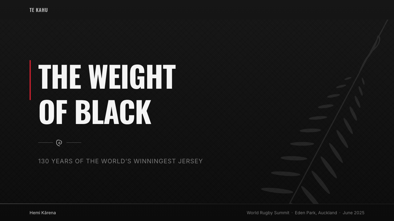
For presentation slides, this system is most powerful on full-bleed dark covers where the contrast between deep black, pewter type, and silver fern linework creates immediate visual authority. Cover slides benefit from asymmetric placement of a single large headline anchored low and left, with fern-derived linework occupying the upper right as a counterweight. Content slides should use a narrow, high-density column structure — the jersey-stripe principle — with generous vertical spacing between concept units rather than between elements within a unit. Data slides suit a diagrammatic, high-contrast treatment: figures and labels rendered in silver against black, with directional emphasis built into the chart orientation itself.在演示文稿中,这套系统在全出血深色封面上最为强大——深黑、铅锡字体与银色蕨叶线描之间的对比立刻建立起视觉权威感。封面幻灯片适合将单个大标题不对称地锚定在左下角,以蕨叶线描占据右上角作为视觉平衡。内容页应采用球衣条纹原则——窄列、高密度栅格——在概念单元之间(而非单元内部各元素之间)留出充裕的纵向间距。数据页适合示意图式的高对比度处理:在黑色底面上以银色呈现数字与标签,并在图表方向本身中嵌入方向性强调。
For web interfaces and dashboards, the system suits contexts where authority and precision are the desired values: analytics platforms, sports performance tools, financial dashboards, or any product where the user is processing information under pressure. The approach is to commit fully to the dark ground, use silver and near-white sparingly for primary interactive elements, and reserve any lighter panel only for the most critical status indicators. Navigation should be typographic and minimal — the brand is in the letterforms, not in icon arrays.对于网页界面与仪表板,这套系统适合权威感与精准度是核心价值的场景:分析平台、体育表现工具、金融仪表板,或任何用户需要在压力下处理信息的产品。操作策略是全力以赴地承诺深色底面,将银色与近白色节制地用于主要交互元素,仅将较浅的面板保留给最关键的状态指示。导航应当是字体性的、极简的——品牌存在于字形中,而非图标阵列中。
For editorial and marketing use, the system's poster-like directional force makes it ideal for high-impact promotional materials, event announcements, or brand campaigns where a sense of collective strength and cultural depth is the message. Full-width feature blocks alternating between absolute black and deep charcoal create rhythm without breaking the tonal envelope. Fern linework in headers and pull quotes signals the cultural register without requiring explanation — the motif carries its meaning to audiences who recognize it, and reads as refined detail to those who do not.对于编辑与营销用途,这套系统海报般的方向性力量使它特别适合高冲击力的推广材料、活动公告,或以集体力量感与文化深度为核心信息的品牌传播。在绝对黑与深炭灰之间交替的全宽特性区块制造节奏感,而不打破整体的色调包络。标题与引文中的蕨叶线描传递文化属性,无需额外说明——这个母题对熟悉它的受众自然承载意义,对不熟悉的受众则显现为精致的细节处理。
The most common mistake when applying this system is treating the silver and pewter tones as license for generosity — adding too many highlighted elements, softening the black with overlays, or introducing warm neutrals that break the cold precision of the palette. Authentic execution is ruthlessly spare: the black field should occupy the vast majority of any composition, and every lighter element should be earned by its functional necessity rather than placed for visual enrichment. A second common error is importing organic or rounded forms that feel warm or friendly — the system's organic elements (fern curves, moko-derived lines) are specifically cultural and structural, not warm. Adding unrelated rounded shapes or soft gradients breaks the system's logic completely.应用这套系统时最常见的错误,是将银色与铅锡色调理解为慷慨放置的许可——加入过多高亮元素、用叠加层软化黑色,或引入打破色板冷峻精准的暖色中性调。真实的执行应当毫不留情地节制:黑色底场应当占据任何构图的绝大部分,而每一个较浅的元素都应以其功能必要性来换取位置,而非为视觉丰富而放置。另一个常见错误是引入有机感或圆润形态,使整体感觉温暖或亲切——这套系统的有机元素(蕨叶弧线、源自莫科的线条)具有明确的文化属性与结构功能,并不传递温度。加入无关的圆润形状或柔和渐变,会彻底瓦解这套系统的逻辑。
See the NZ All Blacks Rugby Haka Fern design system →查看 NZ All Blacks Rugby Haka Fern 完整设计系统 →
NZ All Blacks Rugby Haka Fern — FAQNZ All Blacks Rugby Haka Fern · 常见问题
Is this system appropriate for brands with no connection to New Zealand or rugby?这套系统适合与新西兰或橄榄球毫无关联的品牌吗?
It depends on which elements you draw from and how deliberately you do so. The general dark-field, high-contrast, directionally intense aesthetic can be applied broadly — it is a legitimate design register for any brand that wants to project authority, precision, and collective strength. The specifically cultural elements — fern motifs and tā moko-derived linework — require more care. Using them without acknowledgment of their origin risks cultural superficiality; using them with explicit reference to Māori visual culture, or in contexts that have a genuine connection to Aotearoa or Pacific identity, is more defensible. Many brands use the tonal range and grid logic of this system while developing their own structural motifs instead of borrowing the fern.这取决于你借用哪些元素以及借用的方式是否经过深思。整体的深色底场、高对比度、方向性强烈的美学可以广泛应用——对于任何希望传递权威感、精准度与集体力量的品牌,这都是一种合理的设计语域。而具体的文化元素——蕨叶母题与源自塔莫科的线描——则需要更审慎的对待。未加说明地使用它们有流于文化表面化的风险;在明确指涉毛利视觉文化的语境下使用,或在与奥特亚罗瓦或太平洋身份有真实联结的场景中使用,则更具合理性。许多品牌采用这套系统的色调区间与栅格逻辑,同时发展自己的结构性母题,而非借用蕨叶图形。
How does this system differ from other dark sports-brand aesthetics?这套系统与其他深色运动品牌美学有何区别?
Most dark sports aesthetics use darkness as a backdrop for energy — bright neon accents, dynamic motion blur, explosive gradients. The All Blacks Haka Fern system inverts that logic: the darkness is not backdrop, it is foreground. The visual force comes from restraint and precision rather than spectacle. Where other dark sports designs shout, this one commands — through controlled weight, cultural reference, and the deliberate absence of visual noise. The fern and moko elements also give it a specificity that distinguishes it immediately from generic dark-premium aesthetics, which typically use no cultural motifs at all.大多数深色运动品牌美学将黑暗用作能量的背景——明亮的霓虹点缀、动感的运动模糊、爆发性的渐变。全黑队哈卡蕨叶系统颠覆了这一逻辑:黑色不是背景,而是前景。视觉力量来自克制与精准,而非视觉奇观。其他深色运动设计在呼喊,而这套系统在发号施令——通过受控的分量、文化参照,以及对视觉噪音的刻意排除。蕨叶与莫科元素也赋予它一种特殊性,使其立刻区别于通常不使用任何文化母题的泛化深色高端美学。
Can this system work for digital products outside of sports or performance contexts?这套系统能用于体育或表现类场景之外的数字产品吗?
Yes, provided the product's values align with the system's register. The system communicates authority, cultural depth, collective precision, and the absence of distraction — values that translate well to professional tools, high-stakes analytical platforms, premium content products, and any context where the user is expected to perform under pressure. It sits poorly with consumer products centered on warmth, play, or accessibility, and it is not well-suited to contexts that call for lightness or approachability. The test is not whether the category is sports-adjacent, but whether the brand genuinely wants to project the qualities the system embodies.可以,前提是产品价值观与这套系统的语域相契合。这套系统传递权威感、文化深度、集体精准性,以及对干扰的排除——这些价值观能很好地转化为专业工具、高风险分析平台、高端内容产品,以及任何期望用户在压力下表现的场景。它与以温暖感、游戏性或易接近性为核心的消费产品格格不入,也不适合需要轻盈感或亲和力的场景。检验标准不是品类是否与体育相邻,而是品牌是否真的希望传递这套系统所体现的特质。
What is the role of the haka in shaping the design system's visual logic?哈卡战舞在塑造这套设计系统视觉逻辑方面扮演了什么角色?
The haka functions as a choreographic model for compositional thinking. The haka is not decorative performance — it is structured, purposeful, directed at a specific point of confrontation, and builds in collective intensity from an established base posture. Translated into design, these qualities map onto directional composition (everything aimed rather than radiating), asymmetric but balanced placement (weight achieved through stance rather than symmetry), and typographic gravity (the heaviest elements planted low and forward). The haka also models the principle of earned intensity: the performance begins from stillness and builds — the design equivalent is compositions that have clear visual resting points before the eye reaches the focal element.哈卡作为构图思维的编舞模型发挥作用。哈卡不是装饰性表演——它是有结构的、有目的的、指向特定对峙焦点的,并从确立的基本姿态出发在集体中层层递进地积累张力。转化为设计语言,这些特质映射为:方向性构图(一切元素指向特定方向而非向外辐射),不对称但平衡的摆放(通过站姿而非对称性来实现重量感),以及字体重力(最重的元素沉落在低处与前方)。哈卡也体现了「获得性张力」的原则:表演从静止开始,逐渐积累——其设计等价物是在视线抵达焦点元素之前,构图中存在清晰的视觉静息点。
How should the fern motif be used — as a primary element or as supporting detail?蕨叶母题应当作为主要元素还是辅助细节来使用?
In most applications, the fern works best as structural detail rather than as a hero element. Used as a hero — large, centered, dominant — it becomes iconographic rather than systemic, and the composition reads as branding exercise rather than design system. As hairline linework in section dividers, corner treatments, and header details, the fern anchors the cultural register of the composition without overwhelming the content it frames. The exception is dedicated brand moments — cover slides, splash screens, printed covers — where the fern can occupy significant visual real estate precisely because the entire composition exists to establish identity rather than to communicate information.在大多数应用场景中,蕨叶作为结构性细节而非主角元素使用效果最佳。若将其用作主角——大面积、居中、主导性——它便成为图标化的,而非系统化的,构图也会被读解为品牌练习而非设计系统的展现。作为段落分隔线、角落处理与标题细节中的发线描绘,蕨叶在不压倒所框内容的前提下锚定了构图的文化属性。例外情形是专属品牌时刻——封面幻灯片、启动屏、印刷封面——在这些场合,蕨叶可以占据相当大的视觉面积,因为整个构图的存在目的正是确立身份认同,而非传递信息。
Related design styles相关设计风格
 Ukrainian Trident Blue/Yellow (2022)Defiance becomes statecraft. Wheat yellow, cornflower blue, trident mark, ste…抗争成为国家视觉:麦田黄、矢车菊蓝、三叉戟与模板网格。
 NASA Artemis ProgramCrewed return, engineered. Mission black, crescent-blue arc, flame orange, ri…载人回归的工程感:任务黑、蓝色弧线、火焰橙与刚性网格。
 Al Jazeera Arabic NewsAuthority, stripped bare. Gold seal, dense Arabic type, matte charcoal.权威感被提纯。金色印章、密集阿文、炭黑底面构成画面。
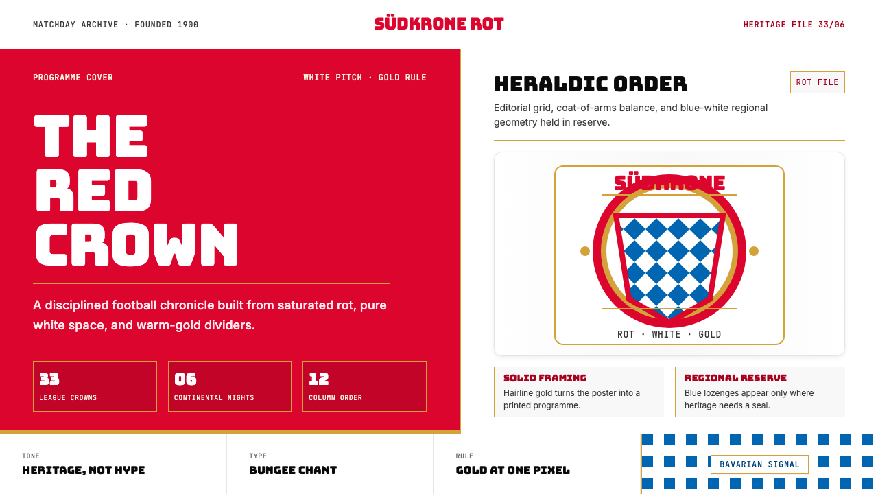 Bayern Munich (Rot)Heritage, not hype. Saturated rot fields, gold rules, and blue lozenges enfor…传统胜过喧哗:饱和红、金细线与蓝白菱格建立秩序。
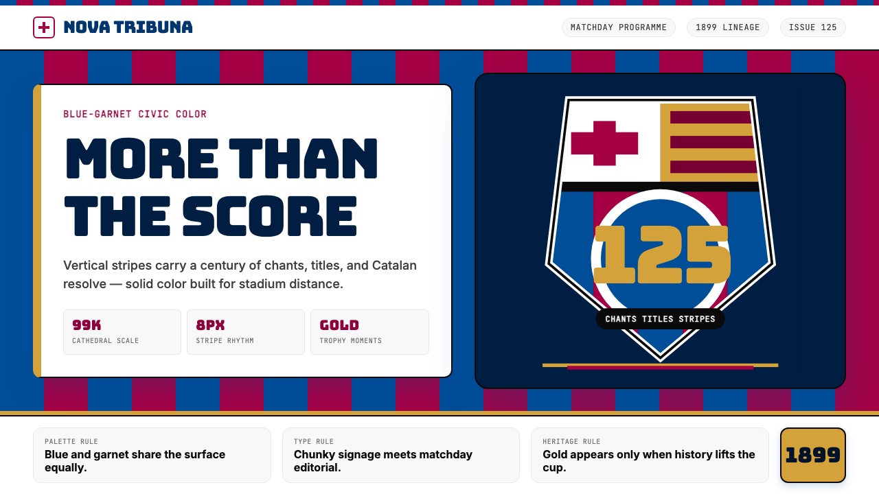 FC Barcelona (Blaugrana)Stadium heritage, not nostalgia. Blue-garnet stripes, Bungee type, gold heral…不是怀旧,是球场传承。蓝石榴红竖纹、Bungee 字体与金色纹章发声。
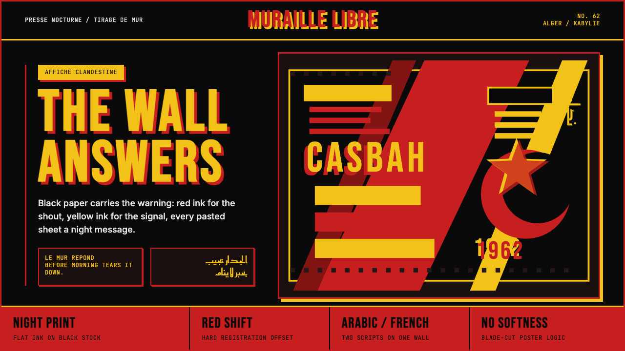 Algerian Casbah Poster (1954–1962)Every surface is a manifesto. Blood red, warning yellow, and stencil type hit…每个表面都是宣言:血红、警示黄与模板字撞上黑色新闻纸。