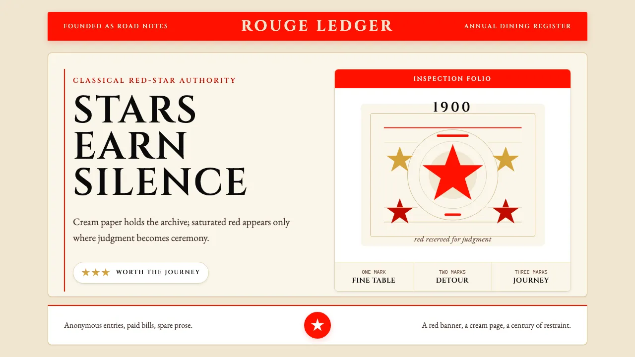
About Michelin Guide Red-Stars
Founded in 1900 by André and Édouard Michelin to encourage motorists to wear out their tires, the Michelin Guide grew into the world's most-cited fine-dining authority. Its visual identity is unmistakable: a saturated Michelin-red cover, classical French serifs set in patient generous spacing, and the rotund Bibendum mascot (drawn 1898 by Marius Rossillon) presiding over every page.
The aesthetic is restraint as ceremony. Red appears as a banner accent, not a wallpaper. Cream paper carries serif typography with the calm of a 124-year archive. One- two- and three-star marks sit beside listings the way medals sit on a uniform — earned, sparse, and never decorative.
- Origin
- Clermont-Ferrand, France → global fine-dining
- Era
- 1900 founded; Bibendum mascot 1898; current red-cover annuals 2024
- Key figures
- André Michelin · Édouard Michelin · Marius Rossillon
- Movements
- Michelin Guide fine-dining canon · French-restraint culinary criticism · 1900+ restaurant-rating canon
Michelin Guide Red-Stars design spec
Colors
Typography
The other 11 sections — buttons, cards, spacing, motion, techniques and more — open once you unlock. Download the DESIGN.md or send it to your AI in one click. Unlock once, yours forever.
Sign up nowStyles similar to Michelin Guide Red-Stars
Also inspired by brands & products, with a close feel.
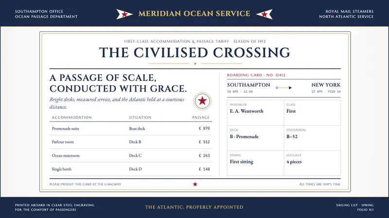 Titanic White Star Line (1912)Service made ceremonial. Navy rules, gilt capitals and a lone red star order bright ship paper.
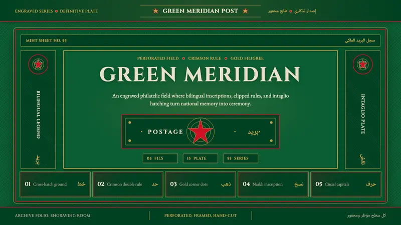 Hashemite Jordan PostageState-postal ceremony. Deep green field, crimson rules, gold filigree, bilingual stamp grid.
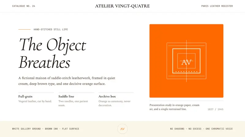 HermèsTwo centuries of restraint in orange. Brown serif on cream, gallery-quiet, near-zero ornament.
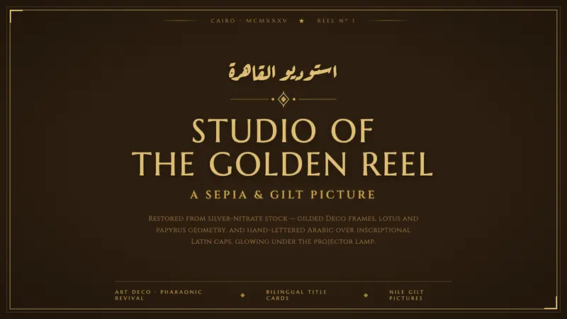 Studio Misr Cairo (1935)Egyptian cinema's golden age, gilded. Silver-nitrate brown, Deco gold frames, Arabic over Latin caps.