What is Tiffany & Co?什么是 Tiffany & Co?
Tiffany Blue is the rarest kind of brand asset — a single color so precisely associated with one company that its mere glimpse promises romance, occasion, and nearly two centuries of jeweled heritage.蒂芙尼蓝是最稀有的品牌资产——一种与一家企业精确绑定的颜色,仅凭一瞥便能唤起浪漫、珍重与近两个世纪的珠宝传承。
Tiffany & Co in briefTiffany & Co 速览
Tiffany & Co is one of the world's most recognized luxury jewelry brands, but its visual identity is defined less by logo or typography than by a single, unmistakable color. The robin's-egg blue — registered as a trademark and identified by Pantone as shade 1837, the year the company was founded — is among the most legally protected and culturally resonant colors in commercial history. It transforms any surface it touches: a box, a bag, a ribbon, a splash of digital paint. To see it is to understand the occasion immediately.蒂芙尼是世界上最受认可的奢侈珠宝品牌之一,但其视觉识别与其说由标志或字体定义,不如说由一种无可误认的颜色定义。那抹知更鸟蛋蓝——已注册为商标,潘通色卡将其标记为1837号,正是公司创立的年份——是商业史上受法律保护最严格、文化共鸣最深远的颜色之一。它改变所触及的每一个表面:一只盒子、一只手袋、一条丝带、一抹数字色彩。看见它,便立刻明白了此刻的意义。
The design language built around this color is one of studied restraint. Tiffany Blue serves as the singular chromatic anchor, paired with warm cream or ivory for editorial depth and classical serif typography for timeless formality. Decoration is present but never excessive — the system leans on the color itself to carry emotional weight rather than competing visual elements. The result is an aesthetic that communicates luxury through simplicity: confident, unhurried, and unmistakably romantic.围绕这种颜色构建的设计语言是经过深思熟虑的克制。蒂芙尼蓝作为唯一的色彩锚点,搭配温暖的奶油色或象牙色以赋予编辑页面深度,搭配古典衬线字体以传递永恒的正式感。装饰存在,但从不过度——整个系统依赖颜色本身承载情感重量,而非依靠相互竞争的视觉元素。结果是一种通过简洁传递奢华的美学:自信、从容,且毋庸置疑地浪漫。
As a design inspiration, Tiffany & Co represents the principle that true brand identity can be distilled into a single visual commitment. The palette is not broad; the forms are not bold or geometric. Instead, the system trusts a perfectly calibrated color, classical letterforms, and generous white space to do all the communicative work. It is an object lesson in how restraint, applied consistently across nearly two centuries, accumulates into something that feels inevitable.作为设计灵感,蒂芙尼代表了一个原则:真正的品牌识别可以被提炼为单一的视觉承诺。色板并不宽泛,形态并不大胆或几何化。相反,系统信任一种精确校准的颜色、古典字形与大量留白来完成所有的传达工作。这是一堂关于克制的课:持续应用近两个世纪之后,克制积累成某种不可避免的东西。
Where does Tiffany & Co come from?Tiffany & Co 从何而来?
Tiffany & Co was founded on September 18, 1837, when Charles Lewis Tiffany and John Young opened a stationery and fancy goods store at 259 Broadway in New York City. The timing placed the store squarely in the emerging culture of American aspiration — a young nation newly rich enough in some quarters to desire European-style luxury, but self-confident enough to want an American version of it. Tiffany's early years were spent selling imported European goods, building the reputation for quality and discretion that would define the brand for generations.蒂芙尼于1837年9月18日由查尔斯·路易斯·蒂芙尼与约翰·扬在纽约百老汇大街259号开设一家文具与精品店,由此诞生。这一时机使店铺恰好置身于美国渴望精英生活的新兴文化之中——一个年轻国家的部分人群已足够富裕,渴望欧洲式奢华,却又充满自信,希望拥有属于美国自己的版本。蒂芙尼早期以销售进口欧洲商品为主,逐渐建立起定义品牌数代的品质与低调声誉。
The precise origins of the robin's-egg blue shade are not entirely documented, but Tiffany Blue made its first appearance as a branded color on the cover of the Blue Book, Tiffany's annual catalog of jewelry and silverware, beginning in 1845. Charles Lewis Tiffany is said to have selected the color specifically because of its association with the robins common to American gardens and parks — birds whose eggs were a symbol of spring, renewal, and good fortune. The color appeared consistently on packaging and printed materials throughout the nineteenth century, cementing its association with the brand through sheer repetition long before formal trademark registration.那抹知更鸟蛋蓝的确切起源并未被完整记录,但蒂芙尼蓝作为品牌色彩的最早露面,可追溯至1845年《蓝皮书》(Blue Book,蒂芙尼的年度珠宝与银器目录)的封面。据说查尔斯·路易斯·蒂芙尼之所以选择这种颜色,是因为它令人联想到美国花园与公园中常见的知更鸟——这种鸟的蛋是春天、新生与好运的象征。这种颜色在整个十九世纪始终如一地出现在包装与印刷品上,在正式商标注册之前,便已通过反复呈现将自身与品牌紧密相连。
The cultural reach of Tiffany Blue expanded dramatically in the twentieth century, driven in part by the commissioning of extraordinary design talent. Elsa Peretti joined Tiffany in 1974 and created some of the brand's most iconic jewelry forms — the Bone Cuff, the Bean pendant, the Open Heart — which brought a sculptural modernism to the brand's classical heritage. Paloma Picasso, daughter of Pablo Picasso, began her collaboration with Tiffany in 1980, adding bold Mediterranean color and form to the collection. Both designers worked in dialogue with the Tiffany Blue identity without displacing it.蒂芙尼蓝的文化影响力在二十世纪随着非凡设计才华的加入而急剧扩展。埃尔莎·佩雷蒂于1974年加入蒂芙尼,创作了品牌最具标志性的珠宝造型——骨骼手环、豆形吊坠、开心项链——为品牌的古典传承注入了雕塑性的现代感。巴勃罗·毕加索之女帕洛玛·毕加索于1980年开始与蒂芙尼合作,以大胆的地中海色彩与形态丰富了系列作品。两位设计师均在蒂芙尼蓝的身份框架内工作,而未试图取代它。
The brand's cultural apotheosis came in 1961 when Audrey Hepburn, playing Holly Golightly in the film adaptation of Truman Capote's Breakfast at Tiffany's, stood before the Fifth Avenue flagship window in a black Givenchy gown, looking at jewelry she could not afford. The image — melancholy, beautiful, aspiring — compressed the entire Tiffany promise into a single frame. The brand had always sold romance as much as jewelry; the film confirmed that Tiffany Blue was the color of longing made tangible. The trademark for the color was formally registered in 1998, and in 2021 LVMH acquired Tiffany & Co for approximately sixteen billion dollars — the largest luxury goods acquisition in history at that time.品牌的文化巅峰时刻出现在1961年:奥黛丽·赫本在根据杜鲁门·卡波特小说改编的电影《蒂芙尼的早餐》中饰演霍利·戈莱特丽,身着纪梵希黑色礼服,站在第五大道旗舰店橱窗前,凝视着她买不起的珠宝。那个画面——忧郁、美丽、渴望——将整个蒂芙尼的承诺压缩进单一一帧。品牌向来销售浪漫与珠宝并重;这部电影确认了蒂芙尼蓝是可触及的渴望之色。该颜色的商标于1998年正式注册,2021年路威酩轩集团以约一百六十亿美元收购蒂芙尼——这是当时历史上规模最大的奢侈品并购交易。
What defines the Tiffany & Co look?Tiffany & Co 的视觉特征是什么?
The Anchor Color锚点色
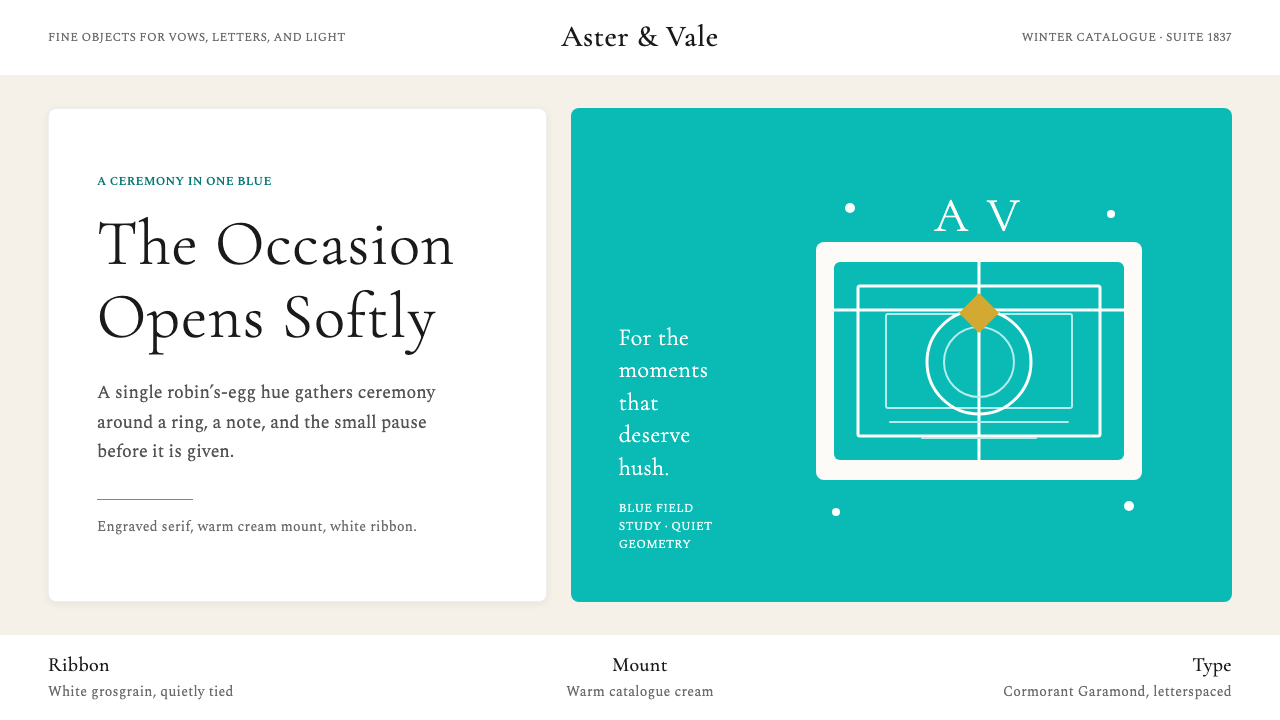
The Tiffany palette is built around a single chromatic anchor: a clear, luminous blue in the robin's-egg range — neither sky blue nor teal, but something precisely between, with a quality that reads as both fresh and precious. This color does not compete with other elements; it is the element. Supporting tones are intentionally quiet — cream, ivory, and warm white — chosen to flatter the blue rather than challenge it. When black appears, it does so as a typographic foil, never as a primary surface color.蒂芙尼的色板围绕一个单一的色彩锚点构建:一种清澈、明亮的知更鸟蛋蓝色调——既非天蓝,也非蓝绿,而是二者之间某个精确的点,兼具清新与珍贵的气质。这种颜色不与其他元素竞争;它本身就是核心元素。辅助色调刻意保持安静——奶油色、象牙色与暖白色——经过选择,是为了衬托蓝色,而非挑战它。当黑色出现时,它作为字体的衬托色,从不作为主要的表面颜色。
Classical Serif Typography古典衬线字体
The typography of the Tiffany system is rooted in classical serif letterforms — the kind historically associated with engraved stationery, formal correspondence, and the masthead traditions of established institutions. Letters have visible stroke contrast, bracketed serifs, and a vertical stress axis that conveys formality and stability without rigidity. Headlines are typically set at a restrained weight — neither the hairline of ultra-light fashion typography nor the gravitas of heavy newspaper heads — allowing the letterforms themselves to carry elegance without extra muscular effort.蒂芙尼系统的字体植根于古典衬线字形——历史上与雕版信笺、正式通信及权威机构刊头传统相关联的那种风格。字母具有可见的笔画粗细对比、括弧式衬线与垂直应力轴,传递正式感与稳定性而不失灵活。标题通常以克制的字重设置——既非超细的时尚字体,也非沉重的报纸标题字重——使字形本身承载优雅,而无需额外的力量感。
Generous White Space充裕的留白
Tiffany design consistently allocates more space than it needs to. Elements breathe. Headlines sit well away from adjacent text. Product photography floats in open fields of cream. This spatial generosity is not merely aesthetic — it is a signal of confidence and class. Brands that cannot afford to waste space crowd their layouts; brands that trust their own desirability can afford to say less. The wide margins and quiet backgrounds create a hush around each element, elevating even a small typographic detail into something worth examining.蒂芙尼的设计始终分配比所需更多的空间。元素得以呼吸。标题与相邻文字保持充分距离。产品摄影浮于开阔的奶油色底面。这种空间的慷慨并非纯粹的美学选择——它是自信与品格的信号。无力浪费空间的品牌将版面塞满;信任自身吸引力的品牌能够说得更少。宽阔的页边与安静的背景在每个元素周围营造出一种静默,使哪怕一个细微的字体细节也变得值得细察。
Restrained Ornament克制的装饰
Unlike more austere design philosophies, the Tiffany system does not prohibit decoration entirely — it curates it. A thin ruled line beneath a headline, a delicate botanical motif in a corner, a subtle embossed texture on packaging: these are the ornamental notes that distinguish Tiffany's restrained luxury from raw minimalism. The key is that each decorative element is purposefully light-handed, clearly secondary to the color and typography, and rooted in classical jewelry and engraving traditions rather than contemporary graphic trends.与更为严苛的设计哲学不同,蒂芙尼系统并非完全禁止装饰——而是对装饰进行精心甄选。标题下方一条细线、角落里一个精致的植物图案、包装上微妙的浮雕纹理:这些装饰性音符将蒂芙尼的克制奢华与纯粹极简主义区分开来。关键在于,每个装饰元素都刻意保持轻盈,明确居于颜色与字体之后,植根于古典珠宝与雕刻传统,而非当代图形潮流。
Occasion and Ceremony场合与仪式感
Tiffany design encodes the feeling of occasion into every component. The blue box is not just packaging — it is a ritual object that signals the importance of what is inside. This ceremonial quality carries through to digital and print applications: a Tiffany-styled layout suggests that the content within deserves reverence, attention, and time. Nothing is casual, nothing is hurried. Transitions, reveals, and information hierarchies are structured to feel like the unwrapping of something precious, with anticipation built into the pacing.蒂芙尼的设计将仪式感编码进每一个组件。蓝色盒子不仅仅是包装——它是一个仪式性物件,标志着其中内容的重要性。这种礼仪品质延伸至数字与印刷应用:一个蒂芙尼风格的版面暗示其中的内容值得敬重、专注与时间。没有什么是随意的,没有什么是仓促的。过渡、揭示与信息层级的构建都令人感觉像是展开某件珍贵之物的过程,节奏之中蕴含着期待。
Photography as Romance摄影即浪漫
When photography enters the Tiffany visual system, it is styled with the same restraint as every other element. Backgrounds are clean and near-neutral. Jewelry is lit to show brilliance and depth, but the overall quality of images tends toward soft, diffused warmth rather than hard studio sharpness. Lifestyle imagery — where it appears — favors intimate moments over grand gestures: two hands, a quiet table, morning light through a window. The photography reinforces the brand's core emotional proposition: that the most important moments in life deserve to be marked.当摄影进入蒂芙尼视觉系统时,它被以与所有其他元素相同的克制风格处理。背景干净、近乎中性。珠宝在打光时展示光彩与深度,但整体图像质感倾向于柔和、漫射的温暖,而非硬朗的棚拍锐度。生活方式图像——在出现时——偏爱亲密时刻而非宏大姿态:两双手、一张安静的桌子、窗外的晨光。摄影强化了品牌的核心情感主张:生命中最重要的时刻值得被铭记。
Color as Legal Territory颜色作为法律领地
Perhaps the most distinctive conceptual aspect of the Tiffany design system is that its central element — the blue — is intellectual property. Trademarked since 1998, the specific shade cannot be used by other jewelers in commercial contexts in ways that would create consumer confusion. This legal dimension has shaped how the color is deployed: with the confidence of ownership rather than the caution of imitation. The Tiffany Blue appears at full saturation, in large fields, with no apology — because it belongs to them alone.蒂芙尼设计系统最为独特的概念层面,或许在于其核心元素——蓝色——是知识产权。自1998年注册商标以来,这一特定色调不能被其他珠宝商以会引起消费者混淆的方式在商业场合使用。这一法律维度塑造了颜色的使用方式:以所有者的自信,而非模仿者的谨慎。蒂芙尼蓝以饱满的饱和度、大面积铺展,毫无歉意地呈现——因为它仅属于他们。
Who shaped Tiffany & Co?谁塑造了 Tiffany & Co?
The founder of Tiffany & Co, Charles Lewis Tiffany opened the original store in 1837 and spent his career building it into America's preeminent luxury goods house. He had an instinct for publicity that was remarkable for his era: in 1887, Tiffany purchased a portion of the French Crown Jewels when they were auctioned following the fall of the Third Republic, which earned him the title 'King of Diamonds' in the American press. It was under his leadership that the blue color became a consistent element of the brand's presentation — on catalogs, boxes, and printed materials — establishing the visual identity that would outlast him by generations.蒂芙尼的创始人查尔斯·路易斯·蒂芙尼于1837年开设原始店铺,毕生致力于将其打造为美国首屈一指的奢侈品商行。他拥有在那个时代堪称卓越的公关本能:1887年,他在法国第三共和国倒台后的拍卖中购入部分法国王室珠宝,因此获得美国媒体授予的「钻石之王」称号。正是在他的领导下,蓝色成为品牌呈现的一贯元素——出现在目录、盒子与印刷品上——建立起的视觉识别将比他本人多延续数代。
Italian-born designer Elsa Peretti joined Tiffany in 1974 and created one of the most productive and enduring partnerships in luxury design history. Her work was characterized by organic, body-conscious forms that contrasted with and complemented the brand's classical heritage: the Bone Cuff that wraps a wrist like a living thing, the Bean pendant in its smooth ovoid simplicity, the Bottle pendant that abstracts a perfume container into pure sculptural form. Peretti brought the design language of modernist sculpture into everyday wearability. She worked exclusively with Tiffany for nearly five decades until her death in 2021, and her designs remain among the brand's strongest sellers.意大利裔设计师埃尔莎·佩雷蒂于1974年加入蒂芙尼,开创了奢侈品设计史上最富成效、最为持久的合作关系之一。她的作品以有机的、贴合身体的形态为特征,与品牌的古典传承形成对照与互补:骨骼手环如同生命体般环绕手腕,豆形吊坠以光滑的卵圆形呈现纯粹的简洁,香水瓶吊坠将香水容器抽象为纯粹的雕塑形态。佩雷蒂将现代主义雕塑的设计语言带入日常可穿戴性。她几乎独家为蒂芙尼工作了近五十年,直至2021年辞世,她的设计至今仍是品牌最畅销的系列之一。
Paloma Picasso, daughter of Pablo Picasso and Françoise Gilot, began her collaboration with Tiffany in 1980 and brought an entirely different sensibility to the brand — bold, Mediterranean, vivid in color and form. Her signature designs use oversized scale, strong geometric references, and rich colored stones in ways that would seem at odds with Tiffany's classical restraint but instead expanded the brand's emotional range. The Loving Heart and Kiss collections, and her signature X collection, demonstrated that the Tiffany Blue identity was robust enough to contain multitudes — that jewelry could be exuberant within the same house that prized understatement.巴勃罗·毕加索与弗朗索瓦丝·吉洛之女帕洛玛·毕加索于1980年开始与蒂芙尼合作,为品牌带来了截然不同的感性——大胆、地中海风格、在色彩与形态上充满活力。她的标志性设计使用超大尺度、强烈的几何参照以及丰富的彩色宝石,这些在表面上似乎与蒂芙尼的古典克制格格不入,却拓展了品牌的情感范围。爱心与吻系列,以及她标志性的X系列,证明了蒂芙尼蓝的身份足够强健,足以容纳多元——珠宝可以在同一品牌旗下既狂喜又低调。
Though Audrey Hepburn had no formal design relationship with Tiffany, her portrayal of Holly Golightly in the 1961 film Breakfast at Tiffany's may have done more for the brand's cultural standing than any campaign or collection launch. The image of Hepburn in black Givenchy, pearls at her throat, coffee and pastry in hand, gazing at the Fifth Avenue window display — wistful, beautiful, aspiring — compressed the entire Tiffany emotional proposition into a single frame: that the brand's objects are worthy of longing, that they represent something precious and just out of reach. The film cemented Tiffany Blue as a color of romance in the popular imagination in a way that five decades of catalog covers had not quite accomplished.尽管奥黛丽·赫本与蒂芙尼没有正式的设计关系,她在1961年电影《蒂芙尼的早餐》中对霍利·戈莱特丽的诠释,或许比任何广告活动或系列发布更提升了品牌的文化地位。赫本身着黑色纪梵希礼服、颈间挂着珍珠项链、手持咖啡和甜点、凝视第五大道橱窗的画面——惆怅、美丽、充满渴望——将整个蒂芙尼的情感主张压缩进单一一帧:品牌的物件值得被渴望,它们代表着某种珍贵而恰好触手可及之外的东西。这部电影以五十年的目录封面未能完全做到的方式,将蒂芙尼蓝在大众想象中确立为浪漫之色。
French-born jewelry designer Jean Schlumberger joined Tiffany in 1956 and created some of the most extravagant and imaginative pieces in the brand's history — fantastical brooches and bracelets inspired by natural forms: sea creatures, flowers, birds in flight. His work brought a surrealist theatricality to Tiffany that complemented rather than displaced the brand's core elegance. Schlumberger is perhaps best known for the Bird on a Rock brooch, which has been produced in numerous variations since its introduction and which perfectly embodies the Tiffany balance of craftsmanship, fantasy, and restraint.法国出生的珠宝设计师让·施伦贝格于1956年加入蒂芙尼,创作了品牌历史上最为奢华、最富想象力的作品——由自然形态启发的奇幻胸针与手镯:海洋生物、花卉、展翅飞鸟。他的工作为蒂芙尼带来了一种超现实主义的戏剧性,与品牌的核心优雅相互补充而非取代。施伦贝格或许最为人所知的是《岩石上的鸟》胸针,自推出以来已以无数变体生产,完美体现了蒂芙尼在工艺、幻想与克制之间的平衡。
How do you use Tiffany & Co today?今天怎么用 Tiffany & Co?
The Tiffany aesthetic is one of the most potent templates available for any presentation, publication, or interface that needs to communicate luxury, romance, or considered quality. Applying it well requires understanding that the system is color-forward and typographically classical — the blue does the heavy lifting emotionally, while the typography provides credibility and structure. Before any other decision, establish the blue as the dominant chromatic presence and ensure everything else defers to it.蒂芙尼美学是任何需要传达奢华、浪漫或精心品质的演示、出版物或界面中最有力的模板之一。正确应用它需要理解:这套系统以颜色为先导,以字体为古典基础——蓝色在情感上承担主要重量,字体则提供可信度与结构。在做任何其他决定之前,先将蓝色确立为主导的色彩存在,并确保其他一切都向它让步。
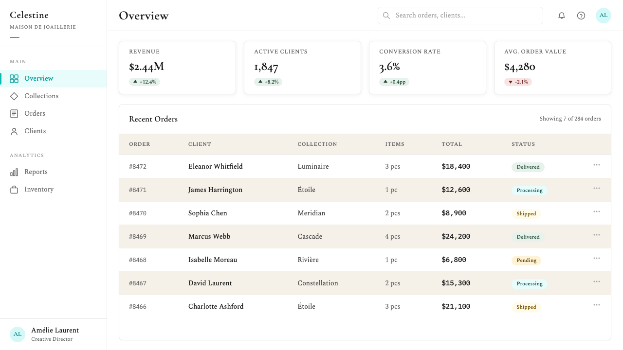
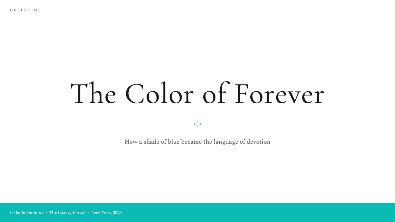
For presentation slides, the Tiffany system excels at cover pages and section dividers more than dense content pages. A cover built in this style uses the blue as a full or partial background, with a title set in elegant serif type centered or positioned in the upper third — understated, spacious, and unhurried. Section dividers work well as near-monochrome blue fields with minimal type. Content slides should shift to cream or white backgrounds with black body text, using the blue exclusively for highlighted data points, key terms, or call-out labels. Data slides in this style treat charts as refined, uncluttered objects: thin axes, sparing color — blue for primary series, cream or warm gray for secondary — and no decorative chart furniture.在演示文稿中,蒂芙尼系统在封面页与章节分隔页上的表现远优于密集内容页。这种风格的封面将蓝色作为全部或部分背景,标题以优雅的衬线字体居中或置于上三分之一处——低调、宽松、从容。章节分隔页适合作为近乎单色的蓝色底面配以极少文字。内容页应转为奶油色或白色背景配黑色正文,仅在高亮数据点、关键术语或引注标签上使用蓝色。这种风格的数据页将图表处理为精致、简洁的对象:细轴线,颜色节俭——蓝色用于主要数据系列,奶油色或暖灰色用于次要数据——不使用装饰性图表元素。
For web UI, the Tiffany aesthetic is well suited to luxury e-commerce product pages, high-end editorial sites, jewelry and beauty brand interfaces, and any context where the emotional register is romantic and aspirational. In a dashboard or pricing context, the palette works best when the blue is reserved for primary calls to action, selected states, and active indicators — not distributed across all interactive elements simultaneously. Navigation should be typographic and restrained, using the serif vocabulary with generous letter-spacing for menu items. Input fields, modals, and cards benefit from thin borders rather than filled backgrounds, maintaining the light and airy feeling that defines the system.在网页界面中,蒂芙尼美学适合奢侈品电商产品页面、高端编辑类网站、珠宝与美妆品牌界面,以及任何情感基调为浪漫和渴望性的场景。在仪表板或定价场景中,色板最有效的使用方式是将蓝色保留给主要行动号召、选中状态与活跃指示器——而非同时分布到所有交互元素上。导航应当是字体化的、克制的,以衬线字体词汇配慷慨的字间距处理菜单项。输入框、弹窗与卡片受益于细边框而非填充背景,保持定义这套系统的轻盈与通透感。
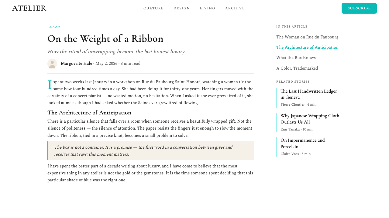
For editorial and marketing work, the Tiffany system supports layouts that feel like beautiful catalogs or magazine spreads. An editorial page in this style uses a wide outer margin for captions and pull quotes, a narrow measure for body text in a classical serif, and the Tiffany Blue reserved for section headings, initial capitals, or thin horizontal rules that mark divisions. Marketing pages work well with alternating rhythm: a blue-background hero section followed by a cream content section, followed by a white feature section. The pacing should feel generous — no section should feel crowded. Campaign imagery should always be warm-toned and intimate rather than cool or expansive.在编辑与营销内容中,蒂芙尼系统支持令人联想到精美目录或杂志版面的布局。这种风格的编辑页面为说明文字与摘引语使用宽阔的外边距,为古典衬线体正文使用窄行宽,蒂芙尼蓝保留给章节标题、首字大写或标记段落分隔的细水平线。营销页面适合交替节奏:蓝色背景的主视觉区域,继以奶油色内容区域,继以白色功能区域。节奏应当感觉慷慨——没有任何区域应感觉拥挤。活动图像应始终是暖色调的、亲密的,而非冷色调的或宏观的。
A common mistake when applying the Tiffany aesthetic is treating the blue as one color among several rather than as the organizing principle of the entire system. Designers who add competing accent colors — a gold, a deep navy, a blush pink — dilute the singular authority that makes Tiffany Blue work. The correct approach is near-monochromatic: the blue, cream, white, and black cover almost every need. A second common error is choosing sans-serif typography in the belief that it reads as modern and refined — in this system, sans-serif type typically reads as generic rather than luxurious. The classical serif is non-negotiable if the romantic, heritage dimension of the aesthetic is to be preserved.应用蒂芙尼美学时最常见的错误,是将蓝色视为若干颜色之一,而非整个系统的组织原则。加入竞争性强调色的设计师——金色、深海军蓝、粉红色——会稀释使蒂芙尼蓝得以生效的单一权威。正确的方法近乎单色:蓝色、奶油色、白色与黑色覆盖几乎所有需求。第二个常见错误是选择无衬线字体,以为这样读起来更现代且精致——在这套系统中,无衬线字体通常读起来更像通用设计而非奢华设计。若要保留美学的浪漫与传承维度,古典衬线字体是不可妥协的。
Tiffany & Co — FAQTiffany & Co · 常见问题
Can the Tiffany aesthetic work for brands outside the jewelry and luxury sector?蒂芙尼美学能否用于珠宝和奢侈品行业以外的品牌?
Yes, but with careful positioning. The aesthetic works well for any brand or product that wants to communicate considered quality, romance, and occasion — wedding and event planning services, high-end hospitality, luxury real estate, premium beauty, artisan food and drink, editorial publishing, and high-stakes financial services like private banking or wealth management all have contexts where the Tiffany visual language reads as appropriate and credible. It works less well for consumer-facing products that need to feel accessible and everyday — grocery retail, mass-market software, athletic wear — where the system's deliberate exclusivity can feel cold or alienating rather than aspirational.可以,但需要谨慎定位。这种美学适用于任何想要传达精心品质、浪漫与场合感的品牌或产品——婚礼与活动策划服务、高端酒店、豪华地产、高端美妆、工艺食品与饮品、编辑出版,以及私人银行或财富管理等高风险金融服务,都有蒂芙尼视觉语言读起来恰当且可信的场景。它在需要感觉平易近人、日常化的面向消费者产品中表现欠佳——生鲜零售、大众市场软件、运动服饰——在这些场景中,系统刻意的排他性可能令人感觉冷漠甚至排斥,而非令人向往。
Does the Tiffany style work in dark mode or on dark backgrounds?蒂芙尼风格在深色模式或深色背景上有效吗?
Not in its canonical form. The Tiffany visual system is fundamentally a light-ground aesthetic — the luminosity and freshness of the blue depends on being seen against cream, ivory, or white. On a black or very dark background, Tiffany Blue can still appear beautiful, but it reads differently: harder, cooler, more editorial fashion than romantic jewelry. If a dark variant is required, the more successful approach is to use the blue very sparingly as an accent on black — a single typographic element, a fine rule, a highlighted term — and to rely on white or cream type for all primary text. Attempting a full dark-mode version of the Tiffany palette typically loses the warmth and romance that make the system distinctive.以其经典形式而言,不适合。蒂芙尼视觉系统从根本上是一种浅色底面美学——蓝色的明亮感与清新感依赖于在奶油色、象牙色或白色衬托下被观看。在黑色或极深色背景上,蒂芙尼蓝仍然可以显得美丽,但读感不同:更硬朗、更冷峻,更像编辑时尚而非浪漫珠宝。若需要深色变体,更成功的做法是在黑色上极为节俭地将蓝色作为强调色——一个单一的字体元素、一条细线、一个高亮词——主要文字全部使用白色或奶油色。尝试完整的蒂芙尼色板深色模式版本,通常会失去使这套系统独特的温暖与浪漫。
How does Tiffany Blue relate to other famous brand colors — is it a kind of category?蒂芙尼蓝与其他著名品牌色有何关联——它是某种类别吗?
Tiffany Blue occupies a rare category: colors so precisely associated with a single brand that they function as trademarks rather than general design choices. Very few colors achieve this status — Hermès orange, Caterpillar yellow, and UPS brown are sometimes cited alongside Tiffany Blue as examples of true color ownership in commercial identity. What distinguishes genuine brand-color ownership from mere brand association is the combination of legal protection, consistent long-term application, and cultural saturation sufficient to make the average person identify the color with the brand even without seeing a logo or name. Tiffany Blue achieves all three, which is why it functions as a design system's foundation rather than just an element within one.蒂芙尼蓝占据一个稀有类别:与单一品牌精确关联到如此程度,以至于它作为商标而非普通设计选择发挥作用的颜色。极少有颜色达到这种地位——爱马仕橙、卡特彼勒黄与UPS棕有时与蒂芙尼蓝一同被引用,作为商业身份中真正颜色所有权的例证。真正的品牌颜色所有权与单纯品牌联想的区别,在于法律保护、长期一致应用,以及足以让普通人无需看到标志或名称便能将颜色与品牌相关联的文化饱和度三者的结合。蒂芙尼蓝同时实现了三者,这正是它作为设计系统基础而非其中一个元素发挥作用的原因。
What is the biggest mistake designers make when trying to evoke the Tiffany aesthetic without copying it exactly?设计师在试图唤起蒂芙尼美学而不完全复制它时,最常犯的错误是什么?
The most common mistake is substituting a different blue — a similar aqua, a comparable teal, a pale cyan — and expecting the result to carry the same emotional charge. The Tiffany effect is not merely a function of blue-green hues in general; it is the result of that specific shade accumulated through cultural repetition over nearly two centuries. Any substitute reads as generic. The second common mistake is pairing the Tiffany-adjacent blue with sans-serif typography to modernize it, which immediately destroys the system's heritage dimension. The third is adding gold as a luxury signal, which competes with the blue rather than supporting it. The honest approach when designing in this space without direct reference: choose the blue precisely, commit to classical serif type, leave enormous amounts of space, and resist any impulse to add elements the system does not need.最常见的错误是用另一种蓝色代替——一种类似的水绿色、相近的蓝绿色、淡青色——并期望结果承载同样的情感力量。蒂芙尼效果并非仅仅是蓝绿色调的功能;它是那种特定色调经过近两个世纪文化重复积累的结果。任何替代品都读起来像通用设计。第二个常见错误是将近似蒂芙尼的蓝色与无衬线字体搭配以实现现代化,这会立即破坏系统的传承维度。第三个错误是将金色作为奢华信号加入,这会与蓝色竞争而非支持它。在不直接引用的情况下在这个领域进行设计时,诚实的做法是:精确选择蓝色,承诺使用古典衬线字体,留出大量空间,并抵制任何添加系统不需要的元素的冲动。
How should data-heavy or information-dense content be handled within the Tiffany aesthetic?在蒂芙尼美学框架内,应如何处理数据密集或信息密集的内容?
Data density is the Tiffany system's greatest challenge, because the aesthetic is built around spaciousness, and dense information inherently resists space. The solution is strict hierarchy rather than compression: identify the single most important number or insight on each page and give it visual prominence — large, centered, set in the blue — while all supporting data is reduced to quiet, small serif type in near-neutral tones. Tables, if necessary, should use very fine horizontal rules between rows rather than colored alternating bands; columns should have generous padding. Charts should be stripped of all decorative elements: no backgrounds, no rounded corners, no gradient fills, no shadows. The Tiffany approach to data density is always 'show less, say more clearly' — which often means ruthlessly editing the data presented rather than redesigning how much data is shown.数据密度是蒂芙尼系统最大的挑战,因为这种美学建立在宽阔感之上,而密集信息本质上抗拒空间。解决方案是严格的层级化而非压缩:识别每页上单一最重要的数字或洞见,给予其视觉显著性——大号、居中、以蓝色呈现——而所有支撑数据则缩减为安静的、小号的近中性色调衬线字体。表格若有必要,应在行间使用极细的水平线而非彩色交替色带;列应有充裕的内边距。图表应剥除所有装饰性元素:无背景、无圆角、无渐变填充、无投影。蒂芙尼处理数据密度的方法始终是「展示更少,表达更清晰」——这通常意味着对呈现的数据进行无情删减,而非重新设计展示多少数据。
Related design styles相关设计风格
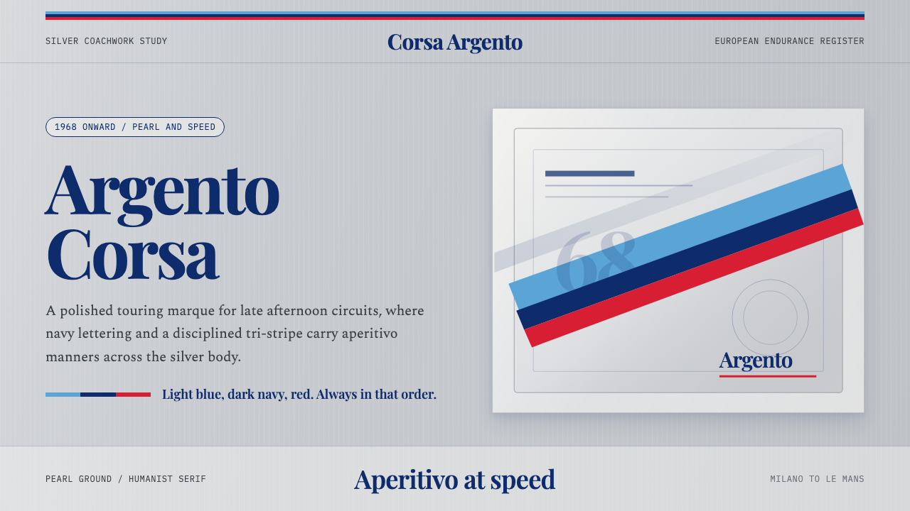 Martini Racing StripesAperitivo elegance at speed. Silver ground, Playfair serif, and a blue-navy-r…速度中的餐前酒优雅:银灰底、Playfair衬线与蓝深蓝红三色带。
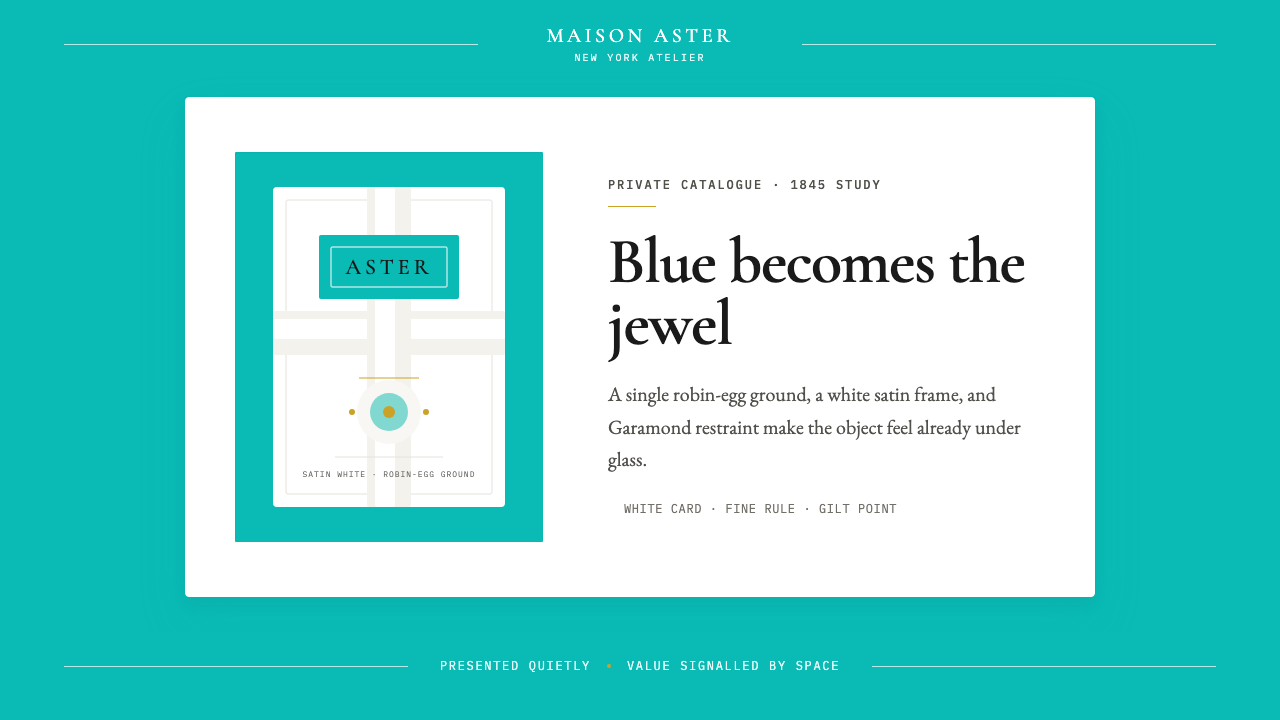 Tiffany Robin-Egg BlueBlue is the luxury signal. Robin-egg ground, white satin rules, Garamond rest…蓝色即奢华信号:知更鸟蛋蓝铺底,白缎细线与Garamond克制成章。
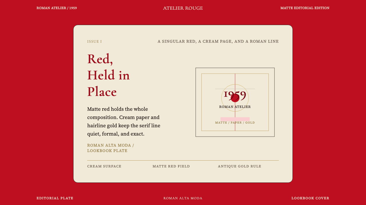 Valentino Rouge Couture (1959)Matte couture red holds the page. Cream paper and hairline gold keep it cerem…哑光高定红统领全页,奶油纸面与细金线让它更庄严。
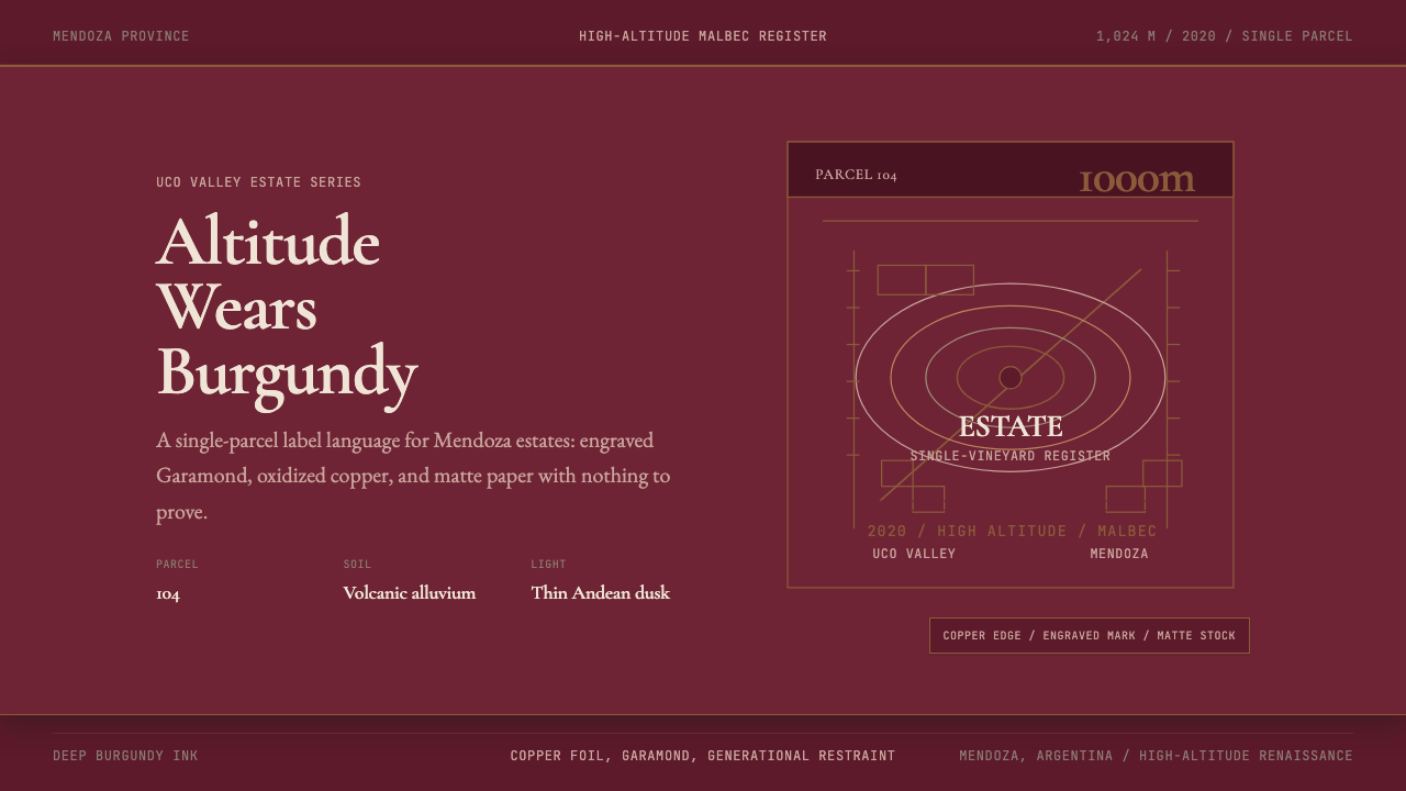 Argentine Malbec WineAltitude turned austere. Burgundy panels, engraved Garamond, oxidized copper.高海拔变得克制。酒红面板、雕刻衬线与氧化铜。
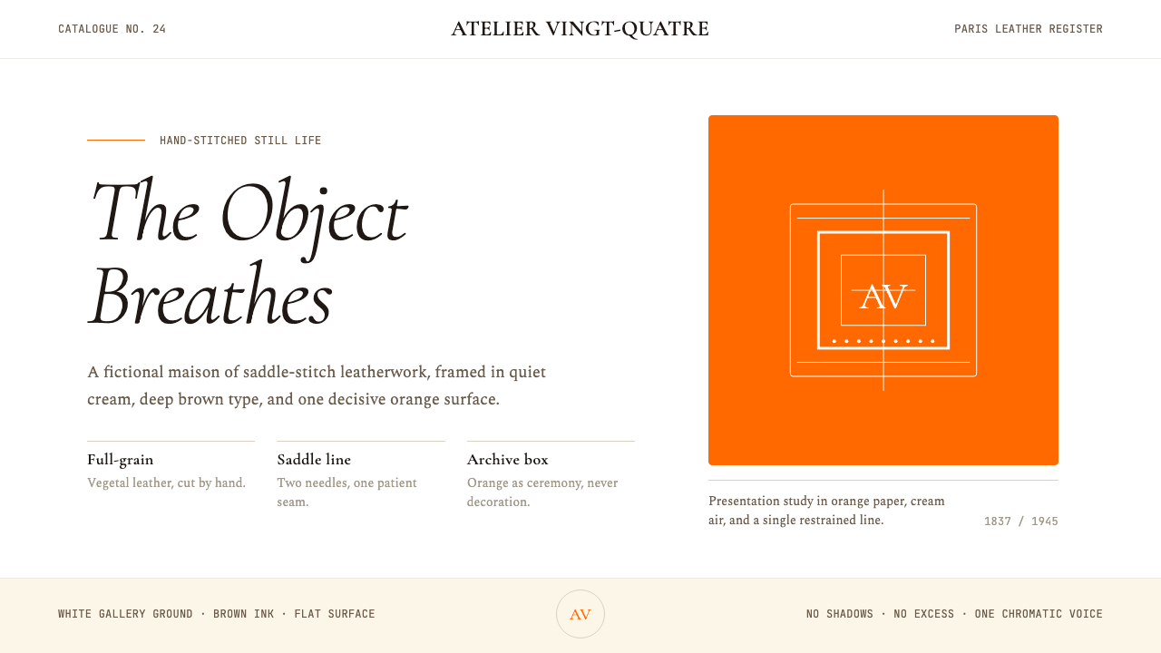 HermèsTwo centuries of restraint in orange. Brown serif on cream, gallery-quiet, ne…近两个世纪的巴黎皮革工艺:标志性的爱马仕橙、深棕衬线落于乳白纸底——产品如美术…
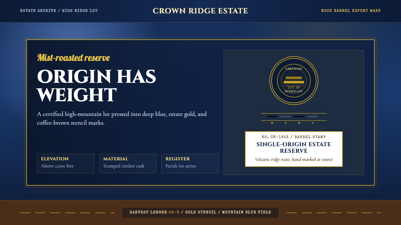 Jamaican Blue Mountain CoffeeOrigin has weight. Mountain blue, estate gold, and stencil type press like a…产地有重量。山蓝、庄园金与模板字像木桶烙印。