Design style guide设计风格指南
What is Jamaican Blue Mountain Coffee?什么是 Jamaican Blue Mountain Coffee?
Grown on volcanic ridges above the clouds and shipped in hand-stamped wooden barrels, Jamaican Blue Mountain Coffee turned the rituals of certified-origin agriculture into one of the world's most commanding visual identities.生长于云端之上的火山山脊,以手工盖章木桶出口——牙买加蓝山咖啡将原产地认证农业的仪式感,锻造成世界上最具震慑力的视觉语言之一。
Jamaican Blue Mountain Coffee in briefJamaican Blue Mountain Coffee 速览
Jamaican Blue Mountain Coffee is a design system rooted in the visual culture of one of the world's most rigorously certified agricultural brands. Its palette — anchored in the deep, mist-saturated blue of high-altitude mountain ridges, warm gold lettering, and the rich brown of roasted coffee — reads less like a branding exercise and more like a geological fact. Every color earns its place by tracing back to something real: the mountains themselves, the aged barrels, the hand-stamped lot numbers.牙买加蓝山咖啡是一套根植于全球认证最严格农产品品牌视觉文化的设计系统。它的配色——以高海拔山脊那种深沉、云雾浸透的蓝色为锚点,辅以暖金字体与浓郁的烘焙咖啡棕——读来不像一次品牌操练,更像一个地质事实。每一种颜色都有其来处:山脉本身、岁月浸染的木桶、手工盖印的批号。
The aesthetic draws on two overlapping traditions. The first is colonial estate signage — the heavy serif type, medallion seals, and engraved borders that plantation owners and export houses used to mark premium lots as far back as the eighteenth century. The second is stencil culture: the ink-pressed barrel stamps, lot codes, and origin marks that certifying authorities and cooperatives have used for generations to distinguish Blue Mountain coffee from the imitations that crowd lesser shelves. Together these traditions produce a visual language of weight, certification, and earned authority.这套美学汲取自两条交叠的传统。其一是殖民庄园招牌——厚重的衬线字体、徽章印章与雕刻边框,早在十八世纪,种植园主与出口商就用它们为顶级批次打上标记。其二是模板印刷文化:认证机构与合作社数十年来用以区分蓝山咖啡与低端仿品的油墨桶印、批次编码与原产地标记。两种传统汇聚,共同生成一套关于分量、认证与实至名归权威感的视觉语言。
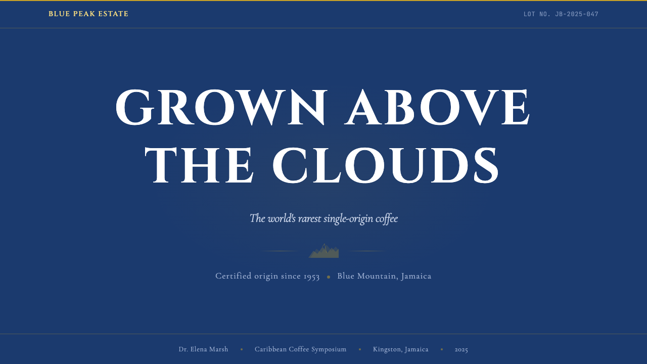
What makes this system distinctive among heritage food and beverage aesthetics is the discipline with which it uses darkness. This is a dark-background system — the deep mountain blue or near-black grounds are not accidental; they evoke the pre-dawn harvest hour, the interior of a curing warehouse, the dense canopy of Blue Mountain forest. Against that darkness, gold and cream lettering has the quality of candlelight on old paper: warm, legible, and unmistakably hand-produced.这套系统有别于其他传统食品饮料美学的,在于它对黑暗的运用之道。这是一个深色底面系统——那种深山蓝或接近黑色的底色并非偶然;它们唤起黎明前的采摘时刻、熟化仓库的幽深内部、蓝山森林浓密的林冠。在那片暗色之上,金色与奶油色文字有一种烛光落在旧纸上的质感:温暖、清晰,且无可置疑地出自人手。
See the Jamaican Blue Mountain Coffee design system →查看 Jamaican Blue Mountain Coffee 完整设计系统 →
Where does Jamaican Blue Mountain Coffee come from?Jamaican Blue Mountain Coffee 从何而来?
Coffee first arrived in Jamaica in 1728, when Sir Nicholas Lawes, then Governor of Jamaica, received plants from Martinique and established the island's first coffee cultivation in the parish of St. Andrew. The plant found ideal conditions in the Blue Mountain range east of Kingston: volcanic soil rich in minerals, consistent rainfall, cool temperatures at elevation, and the near-permanent mist that slows the cherry's maturation and concentrates its flavors. Within decades, Jamaican coffee was being exported to Britain and commanding premium prices in London counting houses.咖啡于1728年首次抵达牙买加,当时的总督尼古拉斯·劳斯爵士从马提尼克岛获得咖啡植株,在圣安德鲁教区开辟了岛上第一块咖啡种植地。蓝山山脉为这种植物提供了理想的生长条件:富含矿物质的火山土壤、充沛而规律的降雨、高海拔的凉爽气温,以及几乎常年不散的云雾——正是这云雾放慢了咖啡果的成熟速度,使其风味得以浓缩。数十年内,牙买加咖啡已出口至英国,并在伦敦的计账行中获得顶价。
The certification apparatus that defines the brand today was formally established in 1953, when the Coffee Industry Board of Jamaica was created to regulate production, set altitude requirements, and enforce the geographic boundaries of the Blue Mountain designation. Only coffee grown in the parishes of St. Andrew, St. Thomas, Portland, and St. Mary — above two thousand feet — qualifies. This precision gave the brand its most powerful visual asset: the geographic boundary itself, a line drawn on a map that separates authentic from imitation.今日定义这一品牌的认证体系,正式确立于1953年——牙买加咖啡工业委员会依法成立,负责规范产区标准、设定海拔要求,并执行蓝山原产地称谓的地理边界。只有生长于圣安德鲁、圣托马斯、波特兰与圣玛丽四个教区、海拔两千英尺以上的咖啡才有资格使用这一名称。这份精确性赋予了品牌最有力的视觉资产:地理边界本身——一条画在地图上、将真品与仿品区隔开来的线。
The barrel became the brand's most iconic physical element — and its most distinctive visual one. While most coffee regions ship in burlap sacks, Blue Mountain coffee is exported in hand-crafted wooden barrels, each stencil-stamped with the lot number, estate name, and certification marks. The barrel is simultaneously a practical container, a quality signal, and a piece of heritage theatre. Its form — the staved cylinder, the iron hoop, the flat-stamped typography — became the primary source material for the design system's typographic and structural vocabulary.木桶成为这一品牌最具标志性的实体元素,也是其最鲜明的视觉元素。大多数咖啡产区以麻袋出口,蓝山咖啡却以手工制作的木桶装运,每只木桶都用模板盖印批次编号、庄园名称与认证标记。木桶同时是实用容器、品质信号与传承剧场。它的形态——拼板圆柱、铁箍、平印字体——成为这套设计系统字体排印与结构词汇的首要素材来源。
The modern brand era, from the 1970s forward, was shaped partly by the Japanese market, which became the dominant buyer of Blue Mountain coffee and developed an intense connoisseurship around it. Japanese importers and roasters created packaging and presentation standards that reinforced the premium, almost ceremonial quality of the product. Their influence pushed the visual language toward precision: cleaner seal medallions, more controlled typography, a stricter hierarchy between the estate name, certification authority, and lot designation. The design system reflects this layered history — colonial estate culture refracted through Japanese precision.1970年代以降的现代品牌时代,部分由日本市场塑造——日本成为蓝山咖啡的主要买家,并围绕它发展出一种近乎痴迷的品鉴文化。日本进口商与烘焙商建立的包装与呈现标准,进一步强化了这款产品近乎仪式感的顶级品质。他们的影响推动了视觉语言走向精准:更简洁的徽章印章、更受控的字体排印、庄园名称与认证机构、批次标注之间更严格的层级关系。这套设计系统折射出这段叠加的历史——殖民庄园文化经日本精准性折射后的面貌。
What defines the Jamaican Blue Mountain Coffee look?Jamaican Blue Mountain Coffee 的视觉特征是什么?
Palette: Darkness as Foundation配色:以黑暗为地基
The system builds on a dark foundation — a deep, saturated mountain blue that sits between indigo and midnight, evoking the pre-dawn ridgelines and misty forest interior of the Blue Mountain range. Against this ground, warm gold and aged cream carry all the primary information: estate names, certification marks, and lot designations. Coffee-bean brown appears as a secondary mid-tone, grounding the palette in the product itself. The overall effect is rich and nocturnal — closer to a cured leather journal cover than to a contemporary brand system.系统建立在深色地基之上——一种介于靛蓝与午夜之间的深邃、饱和山蓝,唤起蓝山山脉黎明前的山脊轮廓与云雾森林的幽深内部。在这片底色上,暖金与岁月奶油色承载所有主要信息:庄园名称、认证标记与批次标注。咖啡豆棕作为中间调出现,将配色锚定于产品本身。整体效果浓郁而富有夜间气质——更接近一本熟化皮革封面的日记,而非当代品牌系统。
Typography: Barrel-Stamp Heritage字体排印:桶印传统
Type in this system carries the weight of a physical stamp. Headings and estate names use heavy, high-contrast serif letterforms — the kind that read clearly when pressed through a stencil onto wood, where fine detail is lost and only the fundamental skeleton of each letter survives. Body text and certification copy are set in compressed, tightly spaced forms that evoke the dense information blocks found on export documentation and cooperative registers. Capitals dominate; lowercase appears only for secondary or supporting text. The hierarchy is explicit and almost bureaucratic, reflecting the system's origin in regulatory documentation.这套系统中的字体承载着实体印章的重量。标题与庄园名称使用粗重、高对比度的衬线字形——那种透过模板压印在木材上时仍能清晰可读的字形,在那里细节消失,只有每个字母最根本的骨架得以留存。正文与认证文字以压缩、紧排的形式排布,唤起出口文件与合作社登记册上密集的信息区块。大写字母占主导;小写字母仅出现于次级或辅助文本。层级关系明确而近乎官僚式,反映了这套系统在法规文件中的起源。
Medallion Seals and Cartouches徽章印章与卷轴框
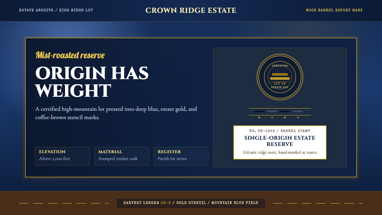
The seal medallion is the visual heart of the system. Circular or oval, it contains a compressed hierarchy: the certification authority at the outer ring, the estate or cooperative name in the middle band, and the lot designation or grade at the center. Borders are engraved-looking — fine concentric rings, dot-dash rules, or radial line patterns that evoke the intaglio printing of banknotes and official documents. Cartouche frames — the shield-and-ribbon forms borrowed from estate heraldry — contain secondary information like altitude, parish, and harvest year. Both forms communicate that this is regulated, authenticated, and traceable.徽章印章是这套系统的视觉核心。圆形或椭圆形,内含一套压缩的层级结构:认证机构占外圈,庄园或合作社名称占中间带,批次标注或等级占中心。边框看起来像雕版印刷——细密的同心环、点划线,或令人联想到钞票与官方文件凹版印刷的放射线纹。从庄园纹章借鉴而来的卷轴框架——盾牌与缎带形——容纳海拔、教区、收获年份等次级信息。两种形式都在传达同一件事:这是经过监管、认证且可追溯的。
Texture: The Feel of Certified Origin质感:原产地认证的触觉
Unlike design systems that use texture as decoration, this system uses texture as evidence. The aged paper grain, the ink-bleed at stencil edges, the slight imprecision of a hand-applied stamp — these qualities are not flaws to be smoothed away; they are proof of the human process behind certification. In digital application, these textures are rendered with restraint: a subtle noise overlay, a slightly uneven ink quality in display type, a logo treatment that looks as though it was once pressed onto wood. The goal is tactile memory — surfaces that feel as if they have passed through careful hands.不同于将质感用作装饰的设计系统,这套系统将质感用作证据。岁月纸纹、模板边缘的油墨晕染、手工盖印的轻微不精确——这些特质不是需要抹平的缺陷,而是认证背后人工过程的证明。在数字应用中,这些质感以克制方式呈现:微妙的噪点叠加、展示字体中略显不均匀的油墨质量、看起来曾被压印在木材上的标志处理。目标是触觉记忆——让界面感觉像是经过了谨慎的双手。
Hierarchy: Lot, Estate, Region层级:批次、庄园、产区
The information architecture of Blue Mountain certification maps directly onto the visual hierarchy of the design system. At the top: the regional designation (Blue Mountain, the broadest category). Below it: the estate or cooperative (the producer). Below that: the lot number and grade (the specific batch). This three-tier structure appears in every piece of work — from a barrel stamp to a web page header — and is enforced through type scale, weight, and spatial separation rather than through color differentiation. The system trusts structure over decoration to communicate importance.蓝山咖啡认证的信息架构直接映射为这套设计系统的视觉层级。最顶层:产区称谓(蓝山,最宽泛的类别)。其下:庄园或合作社(生产者)。再下:批次编号与等级(具体批次)。这种三层结构出现在每一件作品中——从桶印到网页标题——通过字号大小、字重与空间间距来强化,而非通过色彩区分。系统信任结构胜过装饰,以此传达重要性。
Restraint in Gold金色的克制
Gold is the system's most precious tone, and it is treated as such — used sparingly for what matters most. Estate names, certification seals, and primary calls to action receive gold treatment; supporting text and secondary metadata are rendered in cream or light grey. This discipline prevents the palette from tipping into excess. A surface covered uniformly in gold loses the sense of elevation that gold implies; a single gold headline on a dark ground announces itself with the quiet authority of a wax seal on a letter of introduction.金色是这套系统中最珍贵的色调,也被如此对待——只为最重要的事物惜用。庄园名称、认证印章与主要行动号召获得金色处理;辅助文字与次级元数据则以奶油色或浅灰呈现。这种自律防止了配色滑入过度。均匀覆满金色的界面失去了金色本应传达的高度感;深色底面上一行金色标题,以介绍信上封蜡印章般宁静的权威感宣告自身。
Compositional Formality构图的正式感
Layouts in this system are centered and symmetrical in a way that contemporary design rarely is. The medallion sits at the center. The estate name frames it above; the certification authority frames it below. Borders align to invisible axes. This formality is not traditionalism for its own sake — it mirrors the formal protocols of certification documents, where bilateral symmetry signals official standing and impartiality. Asymmetric layouts feel out of register with the system's authority; centering is the compositional default.这套系统中的版面是居中且对称的,这在当代设计中颇为罕见。徽章居于中央,庄园名称在上方框定,认证机构在下方框定,边框对齐于不可见的轴线。这种正式感并非为传统而传统——它映照的是认证文件的正式规程,在那里双边对称标志着官方地位与公正性。非对称版面与这套系统的权威感脱节;居中是构图的默认选择。
See the Jamaican Blue Mountain Coffee design system →查看 Jamaican Blue Mountain Coffee 完整设计系统 →
Who shaped Jamaican Blue Mountain Coffee?谁塑造了 Jamaican Blue Mountain Coffee?
As Governor of Jamaica from 1718 to 1722, Lawes introduced coffee cultivation to the island in 1728, planting seedlings received from Martinique in the parish of St. Andrew. This founding act established the geographic and agricultural conditions that would, over two centuries, develop into one of the world's most recognizable certified-origin brands. Lawes had no visual system in mind — only an agricultural experiment — but his decision to plant in the Blue Mountain foothills set in motion everything that followed.1718年至1722年间担任牙买加总督的劳斯爵士,于1728年将从马提尼克岛获得的咖啡植株种植于圣安德鲁教区,开创了岛上的咖啡种植。这一奠基之举确立了地理与农业条件,并在两个多世纪后发展为全球最知名的原产地认证品牌之一。劳斯并无任何视觉系统的设想——只是一次农业试验——但他在蓝山山麓种下植株的决定,引发了此后一切。
Established by statute in 1953, the Coffee Industry Board is the regulatory body that created the certification framework defining Blue Mountain coffee as a geographic designation. It set the altitude thresholds, the parish boundaries, the grading standards, and the inspection protocols that gave the brand its legal and visual coherence. The Board's official marks — the certification seals and stamps applied to approved barrels — are the direct ancestors of the medallion-and-seal visual language at the center of this design system.牙买加咖啡工业委员会于1953年依法成立,是创建认证框架、将蓝山咖啡界定为地理称谓的监管机构。它设定了海拔门槛、教区边界、分级标准与检验规程,赋予这一品牌法律与视觉上的一致性。委员会的官方标记——加盖于核准木桶上的认证印章与戳记——正是这套设计系统核心的徽章印章视觉语言的直接祖先。
A key figure in the twentieth-century development of the Blue Mountain coffee industry, Grant represents the generation of Jamaican agricultural leaders who transformed a colonial export commodity into a nationally controlled premium brand. His work with producer cooperatives helped establish the collective certification structures — and the shared visual marks that went with them — that allowed smallholder farmers to participate in the Blue Mountain designation alongside large private estates.格兰特是二十世纪蓝山咖啡产业发展的关键人物,代表了那一代将殖民出口商品转化为国家主导顶级品牌的牙买加农业领袖。他与生产者合作社的合作,帮助确立了集体认证结构——以及伴随这些结构而来的共享视觉标记——使小农户得以与大型私人庄园并列共享蓝山称谓。
Associated with the contemporary stewardship of Blue Mountain coffee's global brand positioning, Watson represents the modern phase of the brand's development — the period in which the visual language shifted from purely functional export documentation to deliberate premium brand communication. This transition, from stamp to system, is the design-historical moment that separates Jamaican Blue Mountain Coffee as an agricultural commodity from its existence as a global luxury designation with a coherent visual identity.与蓝山咖啡当代全球品牌定位管理相关联,沃森代表了这一品牌发展的现代阶段——视觉语言从纯功能性出口文件转向有意为之的顶级品牌传播的时期。从印章到系统的这一转变,是将牙买加蓝山咖啡作为农产品与其作为拥有连贯视觉识别的全球奢侈称谓区别开来的设计历史时刻。
How do you use Jamaican Blue Mountain Coffee today?今天怎么用 Jamaican Blue Mountain Coffee?
The Jamaican Blue Mountain Coffee design system is a heritage authority system — its strengths lie in conferring certified-origin credibility, premium positioning, and the tactile weight of physical provenance. The contexts where it performs best are those where the product genuinely has a story of quality, geographic specificity, or rigorous production — and where that story needs to be legible to a discerning audience. Applied indiscriminately, the system's formality can feel anachronistic; applied to the right subject, it is unmistakable.牙买加蓝山咖啡设计系统是一套传承权威系统——其优势在于赋予产品原产地认证的可信度、顶级定位,以及实体产地的触觉重量。它表现最佳的场景,是那些产品本身确实拥有品质故事、地理特殊性或严格生产流程——且这个故事需要向有鉴赏力的受众清晰传达的场合。若不加甄别地使用,这套系统的正式感可能流于陈旧;用于合适的对象,它则无可替代。
For presentation slides, the system works exceptionally well on covers and section dividers. A cover built on a deep mountain-blue ground, with a centered medallion seal and a gold estate-name heading, achieves an immediate premium signal. Content slides should simplify: use a cream background for dense information, reserving dark grounds for emphasis slides or summary statements. Data visualization should follow the lot-and-grade hierarchy logic — primary metrics rendered in gold, secondary metrics in cream, comparative or negative data in a muted brown or grey. Avoid overpopulating slides with the ornamental elements; one seal, one border treatment, used consistently, is more authoritative than a page dense with decorative detail.对于演示文稿,这套系统在封面与章节分隔页上表现尤为出色。以深山蓝为底、居中徽章印章搭配金色庄园名称标题的封面,能即刻传递顶级信号。内容页应当简化:密集信息使用奶油色底面,深色底面保留给强调幻灯片或总结陈述。数据可视化应遵循批次与等级的层级逻辑——主要指标以金色呈现,次级指标以奶油色呈现,对比或负面数据以静默的棕色或灰色呈现。避免在幻灯片上堆砌装饰元素;一个印章、一种边框处理方式,一致地贯穿始终,比一页密布装饰细节的幻灯片更具权威感。
For web UI, this system is best suited to landing pages, product detail pages, and checkout flows for products that can genuinely claim premium or artisan provenance. Dashboard applications are a poor fit — the system's centered formality and dark grounds slow down scannability, which dashboards require above all else. On appropriate web contexts, the system dictates: center the primary product seal, use a dark-ground hero section with gold headline, and transition to cream or near-white for text-heavy content sections. Navigation should be minimal and text-based, with no icon decoration. Interactive states can use a warm amber highlight in place of a conventional link color.对于网页界面,这套系统最适合那些能真实宣称顶级或手工产地的产品落地页、产品详情页与结账流程。仪表板应用并不适合——系统的居中正式感与深色底面会降低仪表板首要所需的可扫描性。在适合的网页语境中,系统的规则如下:居中呈现主要产品印章,使用深色底面配金色标题的英雄区,过渡到奶油色或接近白色的底面用于文字密集的内容区。导航应当简洁且以文字为主,不使用图标装饰。交互状态可用暖琥珀色高亮替代常规链接颜色。
For editorial and marketing materials, the system's poster-like quality is a strong asset. Full-bleed dark-ground spreads work well for feature stories, product launches, or brand campaigns where the objective is establishing prestige rather than driving rapid conversion. The medallion-and-cartouche vocabulary scales well to print — from a business card to a full-page advertisement — maintaining its authority at every size. In marketing copy, the visual hierarchy should reflect the certification logic: brand name largest, estate or product designation second, supporting claims at body scale.对于编辑与营销材料,这套系统海报式的品质是一大优势。全出血深色底面跨页适合特稿、产品发布或品牌战役,在那里目标是建立声望而非驱动快速转化。徽章与卷轴框架的视觉词汇在印刷中具有良好的可缩放性——从名片到整版广告——在每种尺寸上都保持权威感。在营销文案中,视觉层级应当反映认证逻辑:品牌名称最大,庄园或产品名称其次,支持性说明以正文尺寸呈现。
The most common mistake when applying this system is confusing richness with excess. The system is visually dense by design, but its density is controlled — each element has a defined role in the certification hierarchy, and adding decorative elements outside that hierarchy breaks the system's logic. A second common error is applying the dark ground universally; the dark-ground treatment is reserved for high-emphasis surfaces, while workhorse content pages need the breathing room of a cream or near-white field. Finally, this system does not translate well to contexts requiring warmth, playfulness, or accessibility in the mainstream sense — its authority register can feel exclusionary to audiences unfamiliar with the heritage it references.应用这套系统时最常见的错误,是将丰富感与过度画上等号。这套系统在视觉上本就密集,但这种密集是受控的——每个元素在认证层级中都有明确角色,在这个层级之外添加装饰性元素会破坏系统的逻辑。第二个常见错误是将深色底面无差别地全面应用;深色底面处理仅保留给高强调界面,而日常内容页面需要奶油色或接近白色底面提供的呼吸空间。最后,这套系统不适合需要温暖感、趣味性或主流意义上亲和力的语境——其权威格调对于不熟悉其所指传承的受众可能显得排他。
See the Jamaican Blue Mountain Coffee design system →查看 Jamaican Blue Mountain Coffee 完整设计系统 →
Jamaican Blue Mountain Coffee — FAQJamaican Blue Mountain Coffee · 常见问题
Is this style appropriate for brands that have no connection to Jamaica or coffee?这种风格适合与牙买加或咖啡毫无关联的品牌吗?
The system's core vocabulary — medallion seals, stencil type, dark grounds, gold accents — can be abstracted and applied to any context where certified-origin credibility and premium positioning are relevant. The heritage referencing becomes problematic only if it is literal: using Blue Mountain imagery or text to imply a geographic connection that does not exist. At the level of visual language, though, the conventions of certified-origin documentation (seal hierarchies, formal typography, restrained gold) are a legitimate design tradition with applications far beyond coffee — artisan spirits, small-batch manufacturing, luxury agricultural products, and any brand where traceable provenance is the primary value proposition.这套系统的核心词汇——徽章印章、模板字体、深色底面、金色强调——可以抽象化后应用于任何原产地认证可信度与顶级定位相关的场景。只有当传统引用变得字面化时才会出现问题:使用蓝山图像或文字来暗示一种并不存在的地理联系。但在视觉语言层面,原产地认证文件的惯例(印章层级、正式排版、克制的金色)是一种合法的设计传统,其应用远超咖啡领域——手工烈酒、小批量制造、奢侈农产品,以及任何以可追溯产地为首要价值主张的品牌。
How does this system work in a fully digital-native context, where there is no physical barrel or stamp?这套系统如何在纯数字原生语境中运作,在那里并没有实体木桶或印章?
The physical origins of the design vocabulary are a source of richness, not a limitation. In a digital context, the barrel-stamp aesthetic translates through specific typographic choices — heavier, higher-contrast serif letterforms — and through texture treatments applied with restraint. The medallion seal becomes a logo or badge component; the stencil-weight type becomes a display heading style; the dark mountain-blue ground becomes a hero or card background. What the digital application must preserve is not the physical object but the feeling it produces: weight, certification, and the sense that quality has been verified by someone who knows.这套设计词汇的实体起源是一种丰富性,而非限制。在数字语境中,桶印美学通过特定的字体选择——更粗重、更高对比度的衬线字形——以及克制运用的质感处理来转化。徽章印章成为标志或徽章组件;模板字重成为展示标题风格;深山蓝底面成为英雄区或卡片背景。数字应用必须保留的,不是实体对象,而是它所产生的感觉:重量感、认证感,以及品质经由知晓之人验证的确信感。
The system is described as dark-background. Can it work on a light background?这套系统被描述为深色底面系统。它能在浅色底面上运作吗?
Yes, but with a significant shift in register. On a light ground — cream or aged paper rather than pure white — the system becomes more legible for dense content and loses its nocturnal, pre-dawn quality. The medallion seals and stencil type hold up well on light grounds; the coffee-bean brown and a deep, unsaturated navy replace the near-black as anchoring darks. Light-ground application suits content-heavy contexts: a product specification page, an editorial layout, a certification document. The dark ground is better suited to hero sections, covers, and high-emphasis moments where the premium signal needs to arrive before a word is read.可以,但会产生明显的格调偏移。在浅色底面上——奶油色或旧纸色而非纯白——这套系统对于密集内容的可读性更好,但会失去其夜间、黎明前的气质。徽章印章与模板字体在浅色底面上依然有力;咖啡豆棕与深沉、去饱和的藏青色替代接近黑色的深色作为锚定暗色。浅色底面应用适合内容密集的场景:产品规格页、编辑版面、认证文件。深色底面更适合英雄区、封面与高强调时刻——在那里,顶级信号需要在读者读到任何文字之前便已传达。
How does the system handle color when representing data — charts, progress indicators, status tags?这套系统在呈现数据时——图表、进度指示器、状态标签——如何处理色彩?
The certification hierarchy provides the logic: gold for primary or highest-tier values, cream for standard or comparative values, and coffee-bean brown or a muted warm grey for negative or low-priority data. Status tags should avoid bright primary colors — an alert tag in saturated red or primary green reads as a system intrusion rather than as part of the design language. Instead, use a warm amber (analogous to the gold in a lower saturation) for warnings, and a desaturated teal or slate for neutral informational states. The key principle: all data colors should feel as though they belong to the same provenance vocabulary, not borrowed from a separate UI pattern library.认证层级提供了逻辑:主要或最高等级值用金色,标准或对比值用奶油色,负面或低优先级数据用咖啡豆棕或静默暖灰。状态标签应避免鲜亮的主色——饱和红色或原色绿色的警示标签读来像是系统闯入,而非设计语言的一部分。取而代之,用暖琥珀色(类似金色的低饱和版本)作为警告,去饱和的蓝绿或石板色用于中性信息状态。核心原则:所有数据颜色都应感觉像是属于同一套产地词汇,而非借自另一套界面模式库。
What is the biggest visual difference between this system and other heritage food and beverage styles?这套系统与其他传统食品饮料风格在视觉上最大的区别是什么?
Most heritage food and beverage design systems — whisky, wine, artisan cheese — default to a warm, domestic register: amber grounds, hand-lettered scripts, pastoral illustration, and a palette that evokes the hearth and the harvest table. Jamaican Blue Mountain Coffee diverges from this in its formality, its darkness, and its institutional rather than domestic reference points. The primary visual ancestors are not the farmhouse pantry or the tavern wall but the export warehouse, the customs document, and the regulatory seal. This gives the system a quality that is cool, precise, and slightly official — less about sensory pleasure and more about certified excellence.大多数传统食品饮料设计系统——威士忌、葡萄酒、手工奶酪——默认采用温暖、居家的格调:琥珀色底面、手写体、田园插图,以及唤起壁炉与丰收餐桌的配色。牙买加蓝山咖啡在正式感、黑暗感与参照系上偏离了这一路径——其参照系是机构性的而非居家性的。主要视觉祖先不是农舍储藏室或酒馆墙壁,而是出口仓库、海关文件与监管印章。这赋予了这套系统一种冷静、精准、略带官方性的气质——更少关于感官享受,更多关于被认证的卓越。
Related design styles相关设计风格
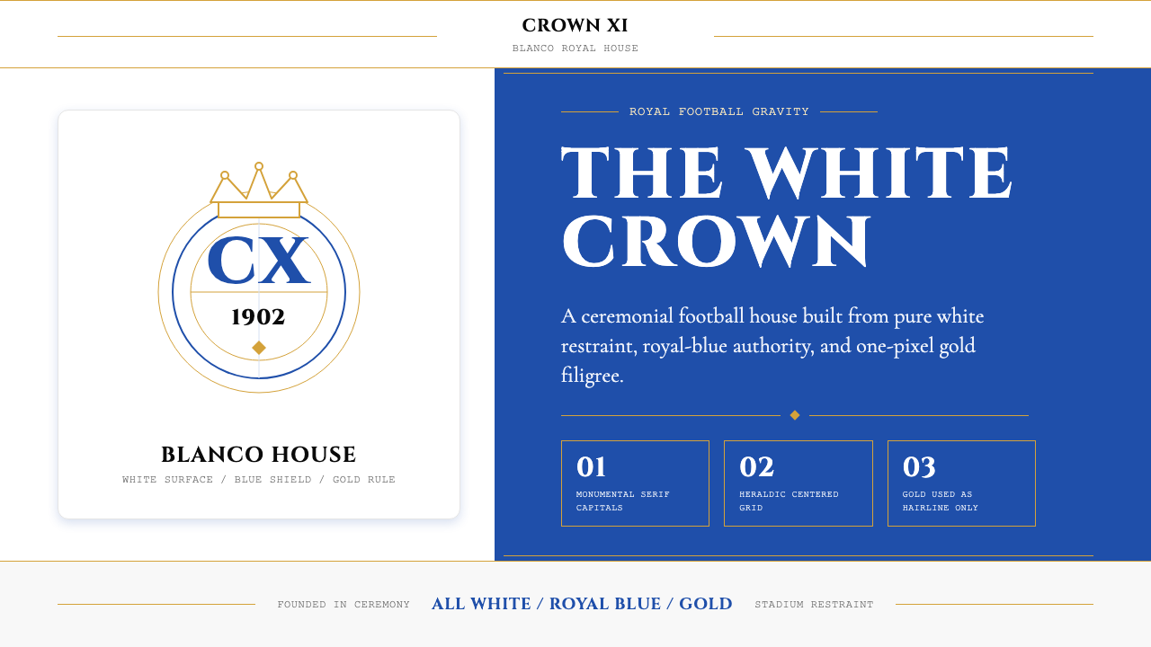 Real Madrid (Blanco)Royal restraint wins. Pure white, royal blue panels, and 1px gold filigree ca…皇家克制取胜:纯白底、皇家蓝面板与1px金线托起王冠感。
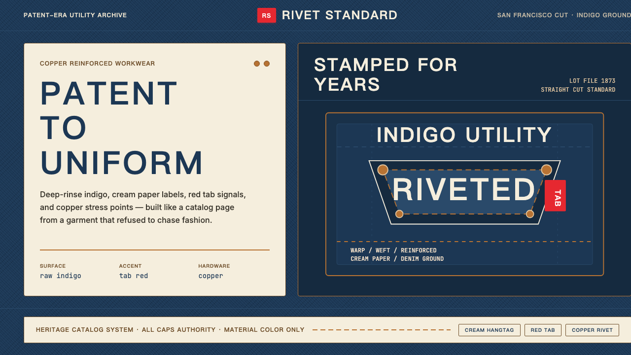 Levi's 501Utility becomes permanent. Indigo ground, cream hangtag panels, red tab and c…实用成为恒久。靛蓝底、奶油吊牌、红标与铜铆钉。
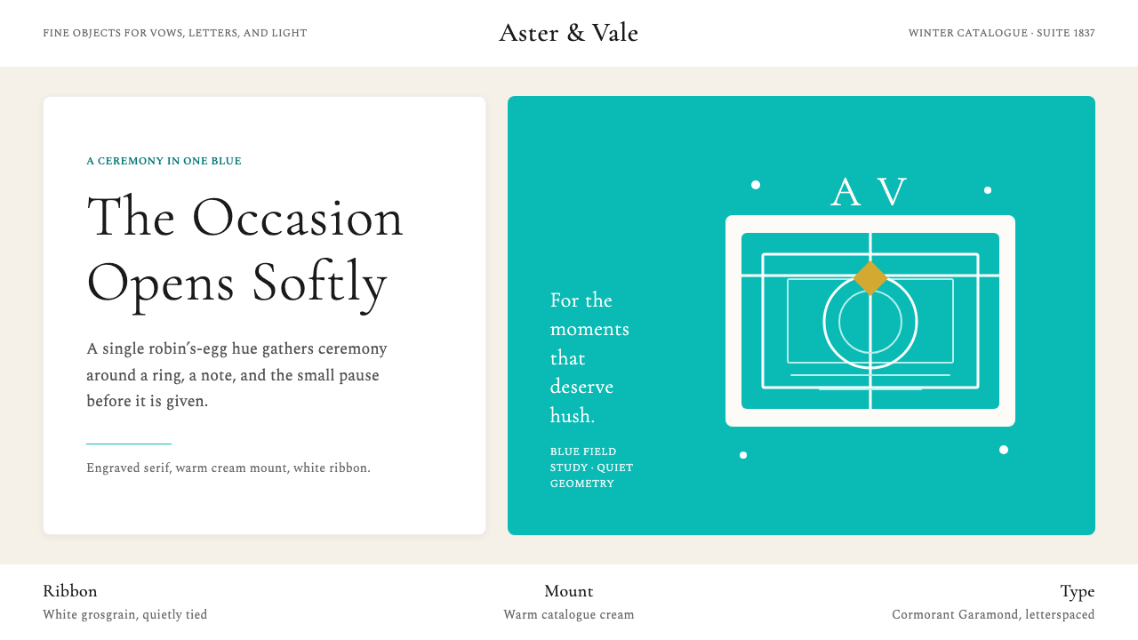 Tiffany & CoRomance in one blue. Robin's-egg panel, cream mount, airy serif restraint.一抹蓝即是浪漫:知更鸟蛋蓝面板、奶油纸底与轻盈衬线。
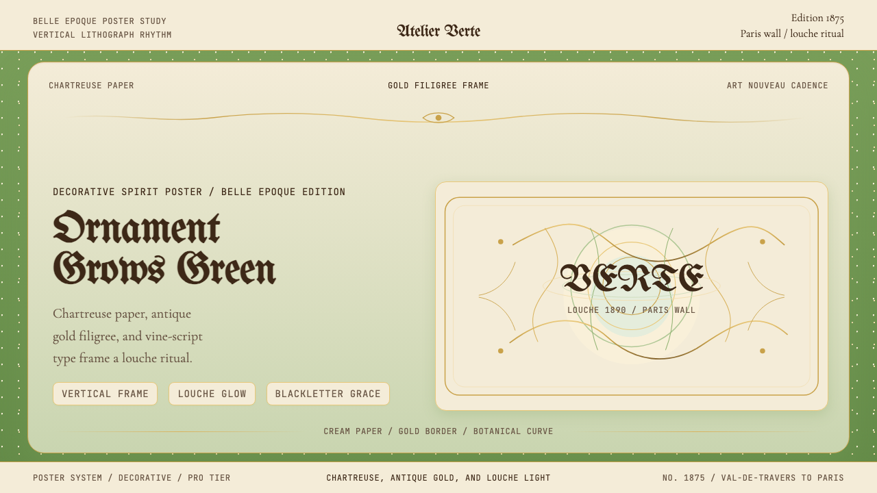 Absinthe Art Nouveau Green (1875)Ornate and verdant. Chartreuse field, gold filigree, vine-script type, and lo…华丽而青绿。黄绿色底、金丝花边与藤蔓字体托出浑浊光。
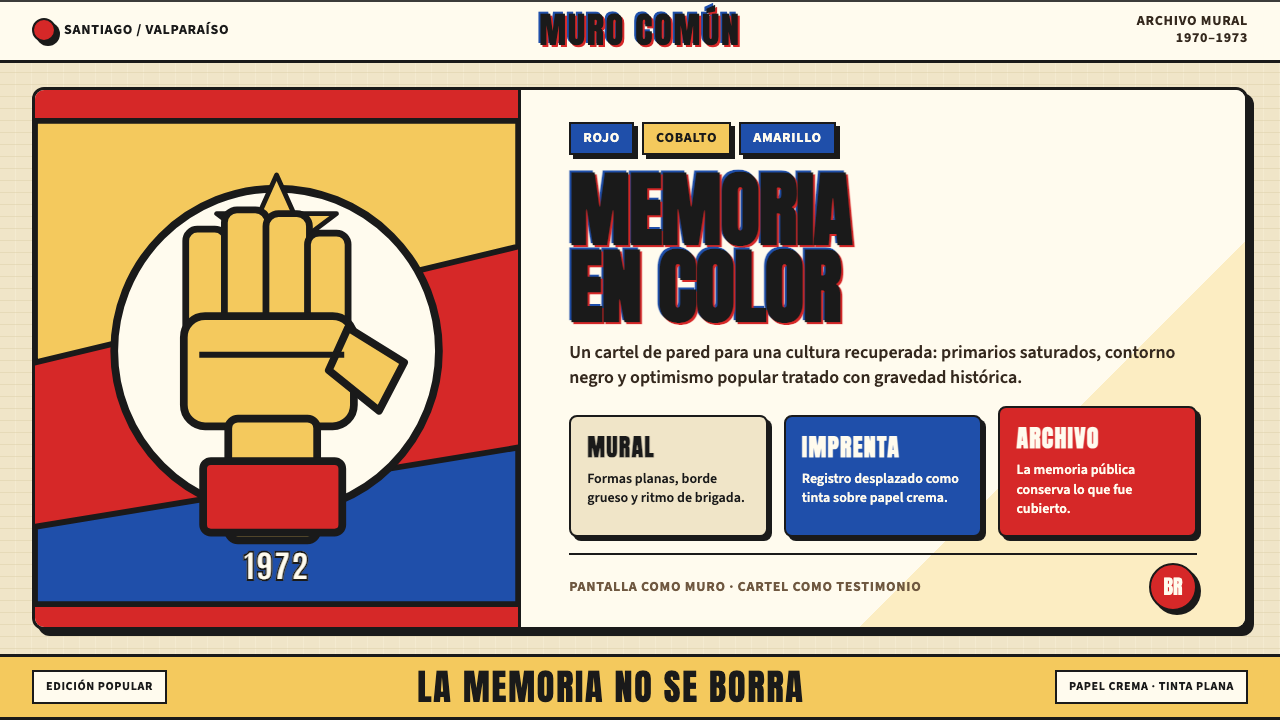 Chilean Allende-Era Propaganda (1972)Solemn revolution. Red, cobalt and yellow lock into thick black mural geometr…庄重的革命感:红、钴蓝与黄被黑色粗线锁进壁画几何。
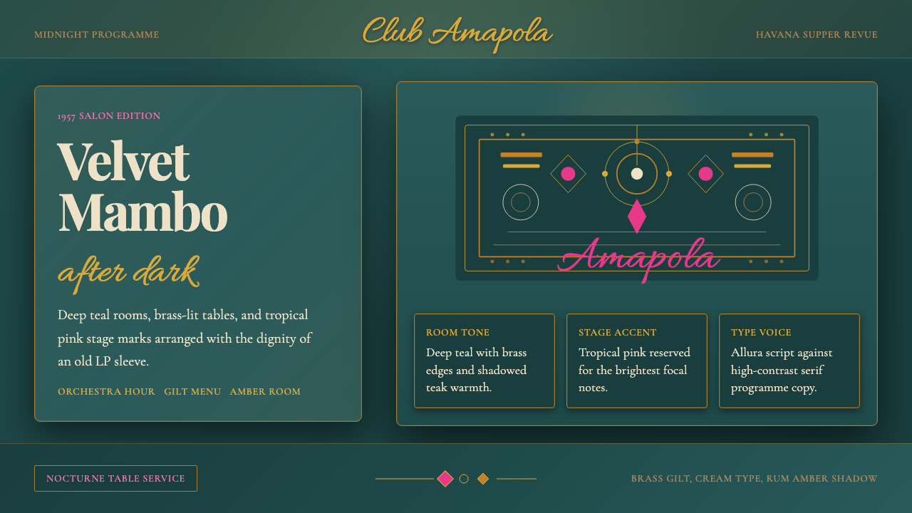 Cuban Salsa Cabaret (1950)Nightlife with dignity. Deep teal, brass gilt, and Allura script stage the ro…尊贵夜色:深青底、黄铜鎏金与Allura手写体搭台。