What is Emirates Airline (Red-Gold)?什么是 Emirates Airline (Red-Gold)?
Emirates turned a desert crossroads into a global aviation icon by committing, without compromise, to scarlet confidence and gold authority.阿联酋航空以猩红的自信与黄金的威仪,将沙漠中的中转节点锻造为全球航空的视觉标杆。
Emirates Airline (Red-Gold) in briefEmirates Airline (Red-Gold) 速览
Emirates Airline (Red-Gold) is the visual identity system of one of the world's most recognised carriers, built on two absolutes: a scarlet red applied at full saturation and a gold rendered as genuine metallic foil rather than flat pigment. Together they form a palette that signals luxury without ambiguity — not the muted earth tones of wellness brands, not the icy greys of fintech, but the unambiguous warmth of a first-class cabin at altitude.阿联酋航空(红金)是全球最具辨识度的航空公司视觉识别体系之一,建立在两个绝对值之上:以全饱和度呈现的猩红,以及渲染为真实金属箔而非平面色料的黄金。两者共同构成一套毫不含糊地传递奢华的色板——不是健康品牌的静谧大地色,不是金融科技的冰冷灰调,而是头等舱高空舱内无可置疑的暖意。
Every surface in the Emirates visual world reads as warm ivory paper stock trimmed with calligraphic gold, anchored by classical serif typography that refuses the sans-serif vernacular of the tech industry. Arabic calligraphy is not an accent or a cultural footnote — it is load-bearing, occupying equal visual weight alongside Latin letterforms and serving as the primary ornamental register of the system.阿联酋航空视觉世界的每一个表面,都呈现为以金属光泽书法线条装饰的温暖象牙纸感,并以古典衬线字体为锚——这种字体选择拒绝了科技行业的无衬线惯例。阿拉伯书法在此并非点缀或文化注脚,而是承重结构:它与拉丁字体平起平坐,构成这套视觉系统的首要装饰语汇。
The result is aviation branding that feels closer to a private banking house or a grand hotel than to a low-cost carrier. The identity signals that the passenger is not merely transported but hosted — a distinction that every visual decision, from the livery stripe to the in-flight menu card, is engineered to reinforce.最终的效果是:这是一套更接近私人银行或大酒店的航空品牌,而非廉价航空。这套识别系统传递的信息是:旅客不仅被运送,更被款待——从机尾涂装到机上菜单卡片,每一个视觉决定都在精密强化这一区别。
See the Emirates Airline (Red-Gold) design system查看 Emirates Airline (Red-Gold) 完整设计系统
Where does Emirates Airline (Red-Gold) come from?Emirates Airline (Red-Gold) 从何而来?
Emirates Airline was founded in March 1985, backed by the government of Dubai with a seed investment and two leased aircraft. The airline's creation was not born from market demand analysis but from state ambition: Sheikh Mohammed bin Rashid Al Maktoum and his advisors, including the veteran aviation executive Maurice Flanagan, conceived Emirates as an instrument of Dubai's transformation from a regional port into a global hub. The visual identity was designed from the outset to carry the weight of that aspiration — it needed to look, from day one, like a carrier that had always existed at the highest tier.阿联酋航空成立于1985年3月,由迪拜政府提供启动资金与两架租赁飞机。这家航空公司的诞生并非源自市场需求分析,而是国家雄心的产物:穆罕默德·本·拉希德·阿勒马克图姆酋长及其顾问团队——包括资深航空高管莫里斯·弗拉纳根——将阿联酋航空构想为迪拜从地区港口转型为全球枢纽的战略工具。视觉识别体系从一开始便被赋予承载这一抱负的重量——它需要从第一天起,就呈现出一家始终位居最高等级的航空公司应有的面貌。
The core palette — scarlet and gold — draws on a visual tradition deeply embedded in Gulf culture and Islamic decorative arts, where red signals vitality and authority, and gold signals divine favour and material abundance. These were not chosen for trend but for permanence: colours that carry cultural resonance across Arabic, South Asian, East Asian, and European markets simultaneously. The use of gold as metallic foil rather than flat print was a deliberate production decision, ensuring that even at small scales — a luggage tag, a boarding card — the material quality reads as physical rather than printed.核心色板——猩红与黄金——根植于海湾地区文化与伊斯兰装饰艺术的深厚传统:红色象征活力与权威,金色代表神圣恩宠与物质丰盛。这两种颜色的选择并非追随潮流,而是为了持久:它们同时在阿拉伯、南亚、东亚与欧洲市场携带文化共鸣。将黄金渲染为金属箔而非平面印刷色,是一个刻意的工艺决定——即便在小尺寸介质上——行李标签、登机牌——材料质感也能被识别为物质性的,而非印刷性的。
The calligraphic Arabic script that appears alongside the wordmark is not decorative overlay but identity-founding. Emirates operates out of a city where the script is the primary visual language of public life, and the decision to give Arabic equal billing with the Latin logotype was both culturally genuine and commercially shrewd — signalling to the Gulf's elite travellers that the airline was theirs, while to international passengers signalling cultural confidence and specificity rather than global anonymity.与标识并肩出现的阿拉伯书法并非装饰性叠加,而是身份认同的奠基之笔。阿联酋航空立足于一座以阿拉伯文为公共生活首要视觉语言的城市,赋予阿拉伯文与拉丁字母同等地位的决定,既是真诚的文化表达,也是精明的商业判断——向海湾精英旅客传递「这是你们的航空公司」,同时向国际旅客展示文化自信与特殊性,而非全球化的面目模糊。
The identity reached its most refined contemporary form through a gradual evolution across the late 1990s and 2000s, arriving at what is broadly referred to as the current identity around 2008. The visual refinements of that period — tightening the proportions of the wordmark, standardising the treatment of gold across all media, and establishing the ivory ground as mandatory rather than optional — produced a system stable enough to persist essentially unchanged through the 2010s and into the 2020s. Stability, in this context, is not stagnation: it is the mark of an identity that was correctly resolved.这套视觉识别体系经由1990年代末至2000年代的渐进演化,在约2008年前后抵达其当代最精炼的形态。那一时期的视觉提炼——收紧标识字体的比例关系、在所有媒介上统一黄金的处理方式、将象牙底色确立为必选而非可选——产生了一套足够稳定的系统,得以在整个2010年代乃至2020年代基本保持不变地延续下去。在这里,稳定并非停滞,而是一套被正确解决的视觉识别体系的标志。
What defines the Emirates Airline (Red-Gold) look?Emirates Airline (Red-Gold) 的视觉特征是什么?
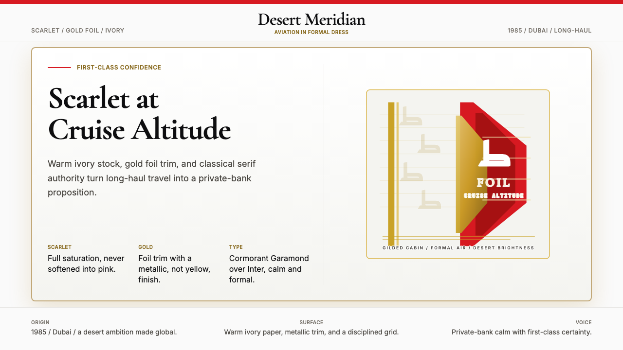
Scarlet as Foundation猩红为基
The red in the Emirates identity is not brick, not crimson, not rose — it is scarlet at absolute saturation, applied with the confidence of a material that does not negotiate. On aircraft livery it occupies the tail and engine nacelles; on printed collateral it anchors headers and borders. The colour reads as warm but not casual, bold but not aggressive. It is the visual equivalent of a formal handshake.阿联酋识别体系中的红色不是砖红、不是深红、不是玫红——它是绝对饱和度的猩红,以一种毫不妥协的材料自信被施用。在飞机涂装上,它占据尾翼与发动机舱;在印刷物料上,它锚定标题与边框。这种颜色给人的感受是温暖但不随意,大胆但不咄咄逼人——是正式握手的视觉等价物。
Gold as Material, Not Colour黄金为材质,非色彩
Gold in the Emirates system is never flat. It is always rendered as foil, metallic ink, or a carefully calibrated warm tone that implies physical reflectance. This distinction is essential: flat gold reads as decoration; foil gold reads as material. The calligraphic Arabic wordmark and the logotype flourishes are the primary carriers of this gold register, and they must be reproduced at sufficient scale and with sufficient material quality to maintain the intended effect.阿联酋体系中的黄金从不以平面色呈现。它始终被渲染为金箔、金属油墨,或一种经过精确校准的暖调——暗示物理反射感。这一区别至关重要:平面金读起来像装饰;金箔读起来像材质。阿拉伯书法字标与标识花饰是这一黄金语汇的主要载体,必须以足够的尺寸和足够的材质质量加以复现,才能维持预期的效果。
Arabic Calligraphy as Structural Ornament阿拉伯书法为结构性装饰
Unlike most international brands that treat non-Latin scripts as secondary or footnote elements, Emirates positions its Arabic calligraphy as co-equal with the Latin wordmark. The script is rendered in a classical, fluid hand — not a digitally simplified version — and its rhythmic curves provide the only organic form in an otherwise rectilinear identity system. This calligraphic register is what prevents the identity from reading as merely corporate; it locates the brand geographically and culturally.与大多数将非拉丁文字作为次要或注脚元素的国际品牌不同,阿联酋航空将其阿拉伯书法定位为与拉丁字标平起平坐的核心要素。字体以古典、流动的手写形式呈现——而非数字化简化版本——其韵律性曲线在这套以直线为主调的视觉系统中提供了唯一的有机形态。正是这一书法语汇,使这套识别体系不仅仅被解读为企业标识;它在地理与文化上为品牌定锚。
Ivory as the Ground Register象牙色为底色基调
Pure white is not the Emirates ground. The system uses a warm ivory — the tone of high-quality uncoated stock, of a card that has mass in the hand — as the default background across print collateral, menu cards, and formal communications. This ivory warmth softens the contrast between red and gold without diluting either, and it reinforces the sense of material quality: this is paper, not screen.纯白并非阿联酋的底色。这套系统使用温暖的象牙色——高品质非涂布纸的色调,握在手中有分量感的卡片颜色——作为印刷物料、餐单卡片与正式通信的默认背景。这种象牙色的温暖感在不削弱红色与金色的前提下柔化了两者之间的对比,同时强化了材质品质感:这是纸张,而非屏幕。
Classical Serif Typography古典衬线字体排印
Where text is set in Latin script, Emirates uses typefaces rooted in classical serif tradition — proportioned letterforms with bracketed serifs, optically balanced stroke contrast, and the dignified rhythm of traditional book typography. This is a deliberate refusal of the geometric sans-serif that dominates aviation and travel branding. The serif choice positions Emirates alongside private banking, fine hospitality, and luxury retail — industries where typographic tradition signals trustworthiness and permanence.在拉丁文字排版方面,阿联酋航空使用植根于古典衬线传统的字体——具有括号式衬线的匀称字形、视觉上均衡的笔画对比,以及传统书籍排印的庄重节律。这是对主导航空与旅游品牌的几何无衬线字体的刻意拒绝。衬线字体的选择将阿联酋航空与私人银行、精品酒店和奢侈品零售并列——这些行业以排印传统作为可信赖与永久性的信号。
Livery as Moving Architecture飞机涂装为移动建筑
The aircraft livery translates the brand system into architecture at the scale of a seven-storey building moving at cruise altitude. The scarlet tail, the gold calligraphic wordmark running the length of the fuselage, and the white body create a tripartite composition that reads clearly from approach distances, in photographs, and in video at any compression level. Nothing in the livery is incidental — every stripe width and every letterform position has been resolved to survive the rendering conditions of an aircraft exterior.飞机涂装将品牌系统转化为在巡航高度移动的七层楼建筑尺度的视觉构成。猩红色尾翼、沿机身延伸的金色书法字标、白色机身,共同构成三段式构图——在进近距离、照片中以及任何压缩级别的视频里都清晰可辨。涂装中没有任何偶然的设计——每一道条纹的宽度、每一个字形的位置,都经过专门解决以适应飞机外壳的渲染条件。
Restraint in the Third Dimension第三维度的克制
Despite the opulence of the palette, the Emirates identity exercises strict restraint in its spatial composition. Layouts are not busy. White and ivory fields are generous. Elements do not compete — the calligraphic wordmark owns its zone, the red field owns its zone, and body text is given space to breathe. This spatial confidence is itself a luxury signal: only brands that have resolved their hierarchy can afford to leave this much room.尽管色板极尽奢华,阿联酋航空的视觉识别在空间构成上却保持严格的克制。版面不繁复,白色与象牙色区域宽裕,各元素互不争抢——书法字标拥有自己的区域,红色色块拥有自己的区域,正文文字获得充足的呼吸空间。这种空间上的自信本身就是一种奢华信号:只有已经解决了层级问题的品牌,才能承担得起留下如此多留白的余裕。
See the Emirates Airline (Red-Gold) design system查看 Emirates Airline (Red-Gold) 完整设计系统
Who shaped Emirates Airline (Red-Gold)?谁塑造了 Emirates Airline (Red-Gold)?
As the architect of Dubai's modern transformation and the primary patron of Emirates Airline, Sheikh Mohammed shaped not only the airline's commercial strategy but the aesthetic ambition embedded in its identity. His vision of Dubai as a global hub — not merely a regional one — demanded a brand capable of standing alongside the oldest and most prestigious carriers in the world from day one. The red-and-gold identity reflects his broader philosophy: that a young institution can claim visual authority if it commits without hesitation to the highest register of its chosen tradition.作为迪拜现代转型的设计师与阿联酋航空的首要赞助人,穆罕默德酋长不仅塑造了航空公司的商业战略,也铸就了其视觉识别中蕴含的美学雄心。他将迪拜定位为全球枢纽而非区域枢纽的愿景,要求一套能够从第一天起就与世界最古老、最负盛名航空公司比肩的品牌。红金识别体系折射出他更宏观的哲学:一个年轻的机构,若能毫不犹豫地跻身其所选传统的最高语汇,便可宣称视觉上的权威。
Flanagan was the founding president of Emirates and the operational brain behind its rapid ascent. A veteran of British Caledonian and Gulf Air, he brought to Emirates the understanding that service design and brand design are inseparable — that the identity promise made by the livery and the collateral must be delivered in the cabin. Flanagan championed the decision to pursue a premium positioning from launch rather than growing into it, which is why the visual identity was resolved at the luxury register from the outset rather than evolved toward it.弗拉纳根是阿联酋航空的创始总裁,也是其快速崛起背后的运营智囊。凭借在英国喀里多尼亚航空与海湾航空的丰富经验,他深知服务设计与品牌设计不可分割——涂装与物料所承诺的身份,必须在机舱中得到兑现。正是弗拉纳根力主从创立之初便采取高端定位,而非逐步成长为高端品牌,这也是为什么这套视觉识别体系从一开始便在奢华语汇层面被解决,而非逐渐演化至此。
As the creative figure associated with key periods of the Emirates identity's development, Negus Sangaré represented the design intelligence responsible for translating the airline's aspirational brief into a resolved visual system. The challenge was substantial: producing a brand that could operate at full integrity across the extreme scale range from aircraft livery to in-flight menus, in both Arabic and Latin scripts, and across the thermal and mechanical stresses of physical aviation environments. The identity's durability across decades is evidence of the rigour applied at its founding resolution.作为与阿联酋航空视觉识别发展关键时期相关联的创意人物,内古斯·桑加雷代表了将航空公司远大愿景转化为完整视觉系统的设计智识。这项挑战相当艰巨:打造一套能够在飞机涂装到机上菜单的极端尺度跨度上保持完整一致性的品牌,同时适应阿拉伯文与拉丁文两套字体系统,以及航空物理环境的热应力与机械应力。这套识别体系历经数十年的耐久性,正是其创立之初所施加严谨度的明证。
As Emirates president through much of the airline's global expansion, Tim Clark oversaw the periods during which the visual identity was standardised and globalised — applied to a fleet that grew from dozens to nearly three hundred aircraft, across a route network spanning every continent. Clark's tenure coincided with the identity's transition from a regional airline mark to one of the most photographed liveries in the world, appearing in the background of airport photography on six continents and becoming, in effect, a global visual shorthand for premium long-haul aviation.作为阿联酋航空在大部分全球扩张期间的总裁,蒂姆·克拉克主导了视觉识别标准化与全球化的时期——将这套体系应用于从数十架扩展至近三百架飞机的机队,覆盖横跨所有大洲的航线网络。克拉克任期内,这套识别体系完成了从地区航空标志到全球被拍摄次数最多的涂装之一的转变——出现在六大洲机场摄影的背景中,并实际上成为高端远程航空的全球视觉速记。
The Emirates wordmark draws on a centuries-deep tradition of Arabic script as a fine art form. Classical Arabic calligraphy — in styles such as Naskh, Thuluth, and Diwani — was historically used to adorn mosques, royal decrees, and manuscripts of the highest cultural importance. By grounding the Emirates logotype in this tradition, the brand implicitly claims that lineage. The calligraphy is not pastiche: it is an authentic continuation of a living typographic tradition into the medium of commercial aviation, and it is the element of the identity that most clearly differentiates Emirates from every other carrier in the world.阿联酋航空的字标汲取了数百年来将阿拉伯书法视为精英艺术形式的深厚传统。古典阿拉伯书法——以纳斯赫体、苏鲁斯体、迪瓦尼体等字体风格为代表——历史上被用于装饰清真寺、王室诏书以及最高文化重要性的手稿。通过将字标植根于这一传统,品牌隐性地宣称了那一谱系。这一书法并非仿制:它是一种鲜活的排印传统在商业航空媒介中的真实延续,也是这套识别体系中最清晰地将阿联酋航空与世界上其他任何航空公司区别开来的元素。
How do you use Emirates Airline (Red-Gold) today?今天怎么用 Emirates Airline (Red-Gold)?
The Emirates Red-Gold identity is among the most demanding historical references a designer can work with, because its power depends entirely on the correct relationship between three elements — scarlet, gold, and ivory — none of which can be substituted without collapsing the system. Applying it correctly requires understanding what the palette is doing structurally: scarlet commands attention and anchors primary hierarchy, gold marks calligraphic or prestige elements, ivory provides the warm breathing ground between them. Remove any one element and the remaining two lose their meaning.阿联酋红金识别体系是设计师可以引用的最具挑战性的历史风格参考之一,因为其力量完全依赖于三个元素——猩红、黄金、象牙色——之间正确的关系,三者缺一不可,任何替换都将导致整个系统崩塌。正确应用它,需要理解这套色板在结构上做了什么:猩红统领注意力并锚定首要层级,黄金标注书法或尊贵元素,象牙色在两者之间提供温暖的呼吸底面。移除任何一个元素,其余两者都将失去意义。
For presentation slides, the Emirates identity translates to a cover and content system of considerable visual authority. A cover slide works best with a full-bleed scarlet field occupying the upper third or full background, the title set in a classical serif at generous scale in ivory or warm white, and a thin gold rule or calligraphic flourish as the sole decorative element. Content slides should be predominantly ivory-ground, with scarlet used only for section headers or call-out borders, and gold reserved for data highlights or key figures. The temptation to use both scarlet and gold on the same content slide should be resisted — their combined presence is high-voltage and will overwhelm body text at typical reading distances. Data visualisation within this system should favour warm tones for positive values and use the scarlet sparingly as an alert or emphasis register rather than as a charting primary.在演示文稿中,阿联酋识别体系可转化为一套具有相当视觉权威感的封面与内容系统。封面幻灯片最适合以占据上三分之一或全背景的猩红色块为基础,标题以古典衬线字体在宽裕的尺寸下以象牙色或暖白设置,以一条细金线或书法花饰作为唯一的装饰元素。内容页面应以象牙色底为主,猩红仅用于章节标题或标注边框,黄金则保留用于数据高亮或关键数字。应克制在同一内容页面上同时使用猩红与黄金的冲动——两者并存的视觉电压极高,在典型阅读距离上会淹没正文。数据可视化方面,这套系统应偏向以暖调表示正值,并将猩红仅作为警示或强调语汇谨慎使用,而非作为图表主色。
For web interfaces and dashboards, the Emirates palette translates best to contexts requiring perceived premium status: pricing pages for high-value services, executive dashboards, hospitality booking flows, and financial product interfaces where trust and stability are the primary emotional goals. The approach is to establish ivory or very warm off-white as the page ground, use scarlet for primary interactive elements — the call-to-action button, the active navigation state, the selected tier indicator — and deploy gold only at the smallest and highest-prestige scale: a premium badge, a selected plan border, a headline flourish. Dark mode should be approached with caution in this system; the identity is fundamentally a light-ground one, and the warm ivory-scarlet-gold relationship does not translate directly to a dark background without significant rebalancing.对于网页界面与仪表板,阿联酋色板最适合需要传递高端感知地位的场景:高价值服务的定价页面、高管仪表板、酒店预订流程,以及信任感与稳定感是首要情感目标的金融产品界面。方法是:以象牙色或极温暖的米白色作为页面底色,将猩红用于主要交互元素——行动号召按钮、激活的导航状态、选中的等级指示——并仅在最小尺寸与最高尊贵感的场合使用黄金:高级徽章、选中方案边框、标题花饰。深色模式在这套系统中应谨慎对待;这套识别体系在本质上是浅色底面的,象牙-猩红-黄金的温暖关系无法在不进行大幅重新平衡的情况下直接移植到深色背景上。
For editorial and marketing work, the Emirates style supports long-form content with strong positional authority. A feature article layout using this identity would give the opening page a full-width scarlet masthead with gold lettering, transition to ivory-ground body pages with scarlet drop capitals and gold rule section dividers, and use generous margins throughout. Marketing pages work best as a sequence of full-width panels: an ivory panel with scarlet headline and gold accent rule, followed by a scarlet panel with ivory type, followed by a near-black panel with gold type — a rhythm that uses tonal alternation to create forward momentum without relying on animation or motion effects. Print collateral — invitations, menus, loyalty programme communications — is where the identity reaches its full expression, because physical print is the only medium in which the foil gold behaves as intended.对于编辑与营销内容,阿联酋风格能够以强烈的位置权威感支撑长篇内容。运用这套识别体系的特稿文章版面,首页应设置占满宽度的猩红刊头配金色字母,过渡至正文页面时采用象牙色底、猩红首字下沉与金色线条分段,并在整体设计中保持宽裕的留白。营销页面最适合以全宽面板序列呈现:象牙色面板配猩红标题与金色强调线,紧接猩红面板配象牙色字,再接近黑色面板配金色字——这种明暗交替的节律无需依赖动效便能制造向前的阅读动势。印刷物料——邀请函、菜单、常旅客计划通信——是这套识别体系得以充分表达的场合,因为物理印刷是黄金箔感能够如实呈现的唯一媒介。
The most common mistake when working with this identity is treating the gold as a colour rather than a material. A flat golden-yellow applied at large scale reads as mustard or ochre and immediately cheapens the effect; gold in the Emirates system only functions as a metallic accent at relatively small scale and high material quality. The second common mistake is using scarlet as a background for body text — extended reading against a saturated red ground causes rapid eye fatigue and undermines the legibility the identity requires. Scarlet should be used in large fields only when text is absent or very sparse. The third mistake is replacing the classical serif with a contemporary sans-serif for reasons of modernisation — this eliminates the typographic register that distinguishes the identity from generic luxury branding and reduces it to a red-and-gold colour scheme without cultural specificity.使用这套识别体系时最常见的错误,是将黄金当作色彩而非材质对待。以大面积平面金黄色呈现时,效果接近芥末色或赭色,立刻使整体廉价化;阿联酋系统中的黄金只有在相对小的尺寸与高材质品质下作为金属感强调使用时才能发挥效用。第二个常见错误是将猩红用作正文底色——在高饱和红底上长时间阅读会导致眼睛迅速疲劳,破坏这套识别体系所需要的可读性;猩红应仅在文字缺席或极其稀少时方可用作大面积底色。第三个错误是以当代无衬线字体替换古典衬线字体——这一操作消除了将这套识别体系与通用奢华品牌区分开来的排印语汇,将其简化为一套不具文化特殊性的红金配色方案。
See the Emirates Airline (Red-Gold) design system查看 Emirates Airline (Red-Gold) 完整设计系统
Emirates Airline (Red-Gold) — FAQEmirates Airline (Red-Gold) · 常见问题
Can the Emirates palette work for brands outside aviation and travel?阿联酋色板能用于航空与旅游行业之外的品牌吗?
Yes, but the context must support the signals the palette carries. Scarlet-gold-ivory communicates luxury, cultural authority, and material substance — these are values that translate well to private banking, fine hospitality, high-end event design, premium food and beverage, and institutional communications where gravitas is required. The palette struggles in contexts that call for approachability, informality, or technical neutrality: software tools, healthcare interfaces, consumer fintech, and children's products are poor fits. The key test is whether the brand genuinely wants to make the claim that red-gold makes — that it belongs at the highest tier — because the palette will make that claim forcefully whether or not the product can support it.可以,但使用场景必须能够支撑这套色板所传递的信号。猩红-黄金-象牙色传递的是奢华感、文化权威与材质厚重——这些价值在私人银行、精品酒店、高端活动设计、顶级餐饮与需要庄重感的机构通信中能够良好迁移。这套色板在需要亲和力、非正式感或技术中立性的场景中则力不从心:软件工具、医疗界面、面向消费者的金融科技和儿童产品都不适合。关键测试是:这个品牌是否真心想做出红金色板所宣称的声明——即它属于最高等级——因为无论产品是否能够支撑这一声明,色板都会强有力地做出它。
How does this identity handle digital screen reproduction, where foil gold is impossible?这套识别体系如何处理数字屏幕复现——在那里金箔效果是不可能实现的?
This is the central technical tension of the Emirates system on screen. The solution used in Emirates digital properties is to calibrate the gold tone toward the warm, slightly orange end of the spectrum rather than the cool lemon-gold end — this produces a screen colour that reads closer to metallic gold without actually being reflective. The gold is also used more sparingly on screen than in print: as icon fills, thin borders, and single-word accent treatments rather than as large blocks. Motion design can partially compensate by animating a light-sweep effect across gold elements, simulating the way foil catches ambient light. What should never be done is substituting a flat yellow or a saturated amber — these read as completely different colours and destroy the premium register.这是阿联酋系统在屏幕上面临的核心技术张力。阿联酋数字产品中使用的解决方案,是将金色调校至光谱中偏暖、略带橙味的一端,而非偏冷的柠檬金端——这样产生的屏幕颜色在视觉上更接近金属金,尽管实际上并不具有反射性。黄金在屏幕上的使用也比在印刷中更为节制:作为图标填充、细边框与单词强调处理,而非大面积色块。动态设计可以通过为金色元素制作光扫效果的动画来部分补偿,模拟金箔捕捉环境光的方式。绝不应该做的是用平面黄色或饱和琥珀色代替——这些颜色看起来完全不同,会彻底破坏高端语汇。
Is this identity appropriate for dark-mode layouts?这套识别体系适合深色模式版面吗?
The Emirates identity is fundamentally a light-ground system, and dark mode requires significant rebalancing rather than simple inversion. On a dark background, the scarlet must be desaturated slightly to avoid overwhelming the composition; the gold tone must shift toward a brighter, more luminous value to maintain visibility; and the ivory ground disappears entirely, removing the element that softens the red-gold contrast. The result, if done carefully, can work as a premium night-mode — the aircraft livery itself is essentially a light-on-dark reading, with ivory type on a scarlet-and-dark-body aircraft. The risk is that without the ivory mediating between red and gold, the palette reads as either a sports brand or a generic luxury treatment. Dark mode works best in this system when the scarlet is removed almost entirely and only gold accents appear against a near-black ground.阿联酋识别体系从根本上是一套浅色底面的系统,深色模式需要大幅重新平衡,而非简单反转。在深色背景上,猩红必须略微降低饱和度以避免压制整体构图;金色调必须转向更明亮、更发光的值以维持可见性;而象牙色底面则完全消失,移除了柔化红金对比的那个元素。如果处理得当,结果可以作为一种高端夜间模式运作——飞机涂装本身本质上就是浅色在深色上的阅读方式,以象牙色字体呈现在猩红与深色机身的飞机上。风险在于:缺少象牙色在红金之间斡旋,色板要么被解读为运动品牌,要么被解读为泛化的奢华处理。在这套系统中,深色模式在猩红几乎完全移除、只有金色强调元素呈现于近黑底面时效果最佳。
How should the Arabic calligraphy element be handled by designers who cannot read Arabic?不懂阿拉伯语的设计师应如何处理阿拉伯书法元素?
With caution and verification. The Arabic calligraphy in the Emirates system is not a decorative flourish — it is a text element that carries specific semantic content, and misuse or distortion will be immediately apparent to a large portion of the intended audience. Designers working in this style should treat the calligraphic elements as fixed assets: use official Emirates artwork files, do not attempt to hand-trace or redraw calligraphic letterforms, do not stretch or compress the letterforms to fit a layout, and do not separate or rearrange individual letter components. If the design context requires original Arabic text rather than the Emirates wordmark, engage a native Arabic-speaking calligrapher or a type designer with verified Arabic expertise. Using a generic Arabic system font as a stand-in for calligraphic text is a category error equivalent to substituting a stock photo for a commissioned oil portrait.需谨慎处理并进行核查。阿联酋系统中的阿拉伯书法并非装饰性花饰——它是携带具体语义内容的文字元素,任何误用或变形都会被很大一部分目标受众立刻察觉。在这种风格中工作的设计师应将书法元素视为固定资产:使用官方阿联酋艺术文件,不要尝试手描或重绘书法字形,不要拉伸或压缩字形以适应版面,不要分离或重新排列单个字母组件。如果设计场景需要原创阿拉伯文而非阿联酋字标,应聘请以阿拉伯语为母语的书法家或拥有经过验证的阿拉伯文专业知识的字体设计师。以通用阿拉伯系统字体替代书法文字,是一种类别性错误,相当于以库存照片替代委托创作的油画肖像。
What distinguishes this identity from generic red-and-gold luxury branding?是什么让这套识别体系有别于泛化的红金奢华品牌?
Three things: specificity of tone, the role of the Arabic calligraphy, and the ivory mediation. Generic red-and-gold luxury branding — found across Chinese New Year campaigns, casino brands, and certain hospitality chains — typically uses a broader range of reds (from burgundy to vermilion) and treats gold as a colour rather than a material. Emirates is specific: one red, one gold register, one ground tone. The Arabic calligraphy is the second differentiator — no other global carrier brand has calligraphy as a co-equal structural element of its logotype, which means the identity is immediately and irreducibly located. Third, the ivory ground prevents the identity from reading as a festival or celebration palette: ivory is sober, ivory has mass, ivory says institution rather than occasion. These three specifics together are what prevent the Emirates look from being generically 'luxurious' and make it instead specifically powerful.有三点:色调的特殊性、阿拉伯书法的角色,以及象牙色的斡旋作用。泛化的红金奢华品牌——常见于中国新年营销活动、赌场品牌和某些酒店连锁——通常使用更宽泛的红色范围(从勃艮第红到朱砂红),并将黄金视为色彩而非材质。阿联酋是特定的:一种红、一种金色语汇、一种底色调。阿拉伯书法是第二个差异化要素——没有其他全球航空公司品牌拥有书法作为其字标的平起平坐的结构元素,这意味着这套识别体系是即刻且不可化约地被定位的。第三,象牙色底面防止了这套识别体系被解读为节日或庆典色板:象牙色是沉稳的,象牙色有分量感,象牙色传递的是机构,而非场合。这三个特殊性加在一起,正是防止阿联酋面貌变得泛化地「奢华」、使其变得特定地有力的原因。
Related design styles相关设计风格
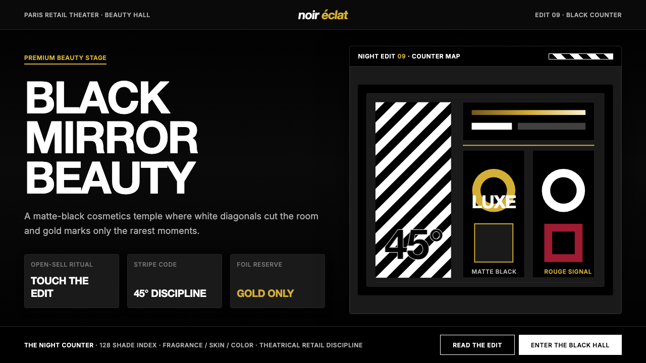 SephoraBlack is the stage. White 45° stripes and restrained gold foil make cosmetics…黑色即舞台。45°白色斜纹与克制金箔,让美妆像剧场。
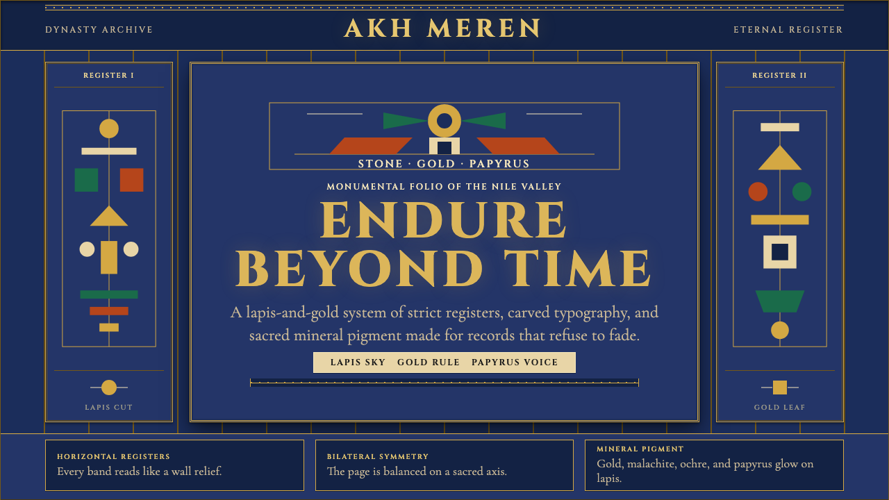 Egyptian PharaonicRegal permanence. Gold rules and Cinzel capitals carve papyrus registers into…庄严即永恒。金色分栏与Cinzel碑文字,在青金石底上刻出莎草纸秩序。
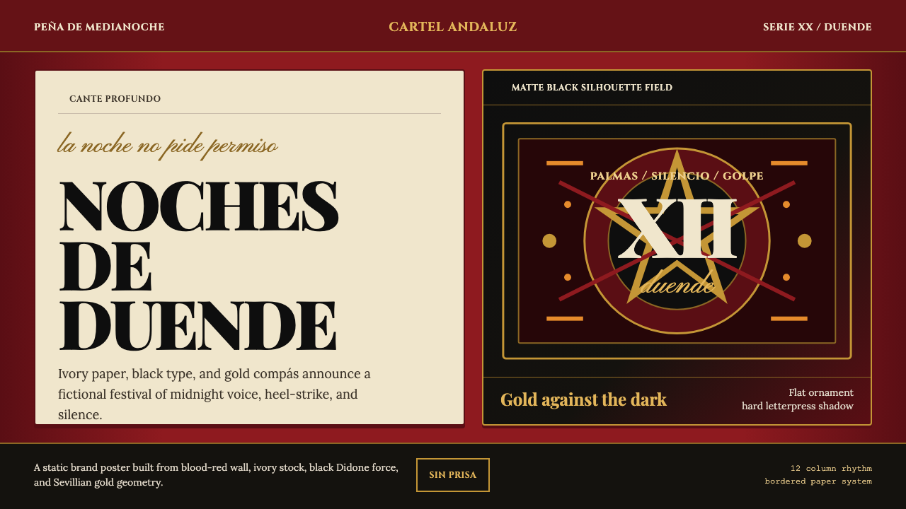 Spanish Flamenco PosterPassion printed as ritual. Blood red, ivory paper, Didone type, and flat gold…激情如仪式印成:血红墙、象牙纸、Didone字与金色节拍。
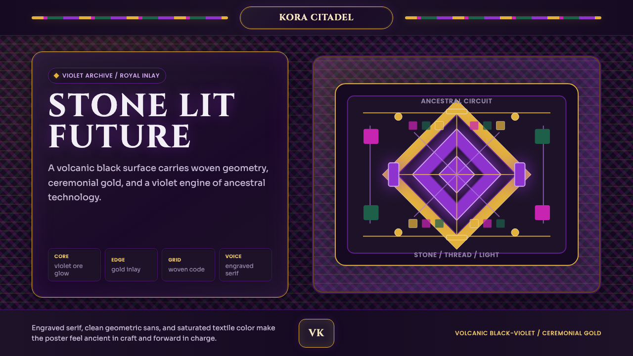 Africanfuturism VibraniumCeremony goes electric. Violet glow and gold inlay thread a volcanic textile…仪式感通电:紫光与金线织入火山黑几何网格。
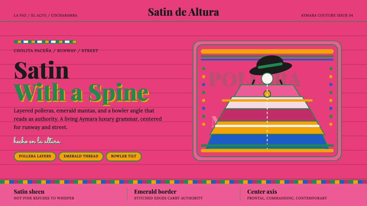 Bolivian Cholita FashionUnapologetic satin power. Hot pink fields, emerald stitches, centered pollera…拒绝低语的缎面力量。亮粉底、翡翠绣线与居中波列拉轴线。
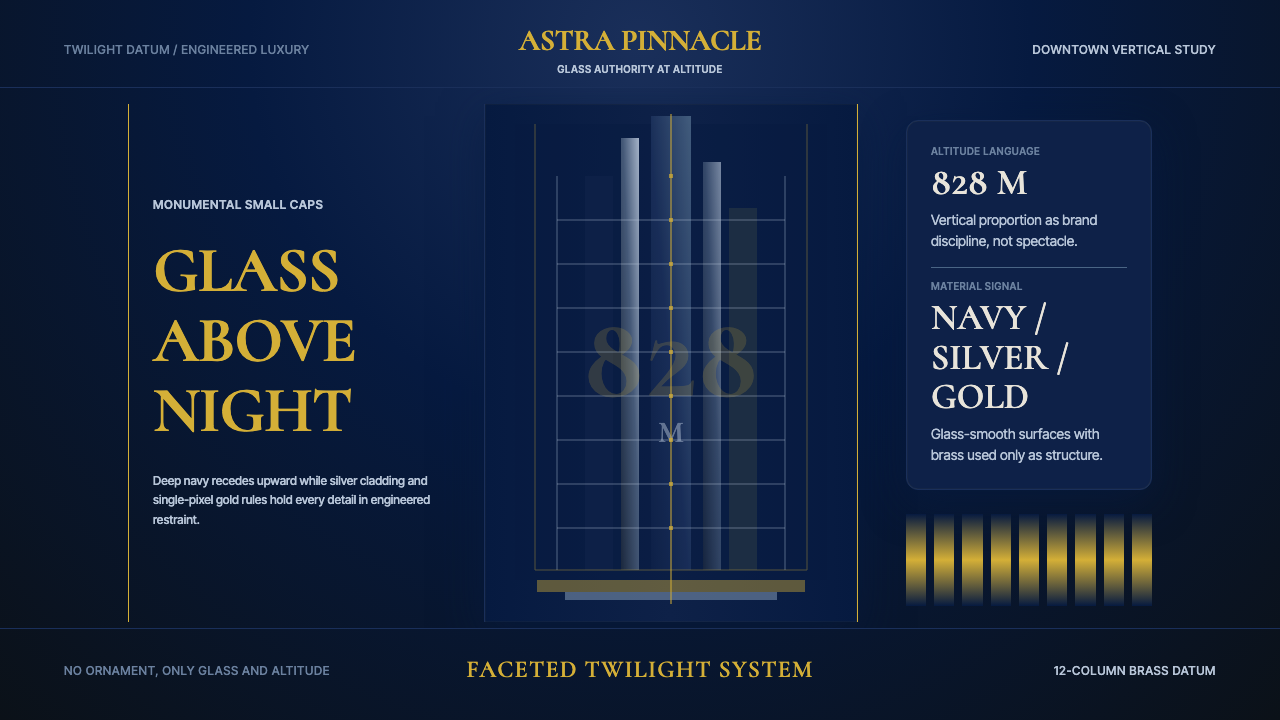 Burj Khalifa TowerAltitude becomes authority. Navy glass, silver facets, and hairline gold rule…高度即权威。夜蓝玻璃、银色切面与发丝金线向上攀升。