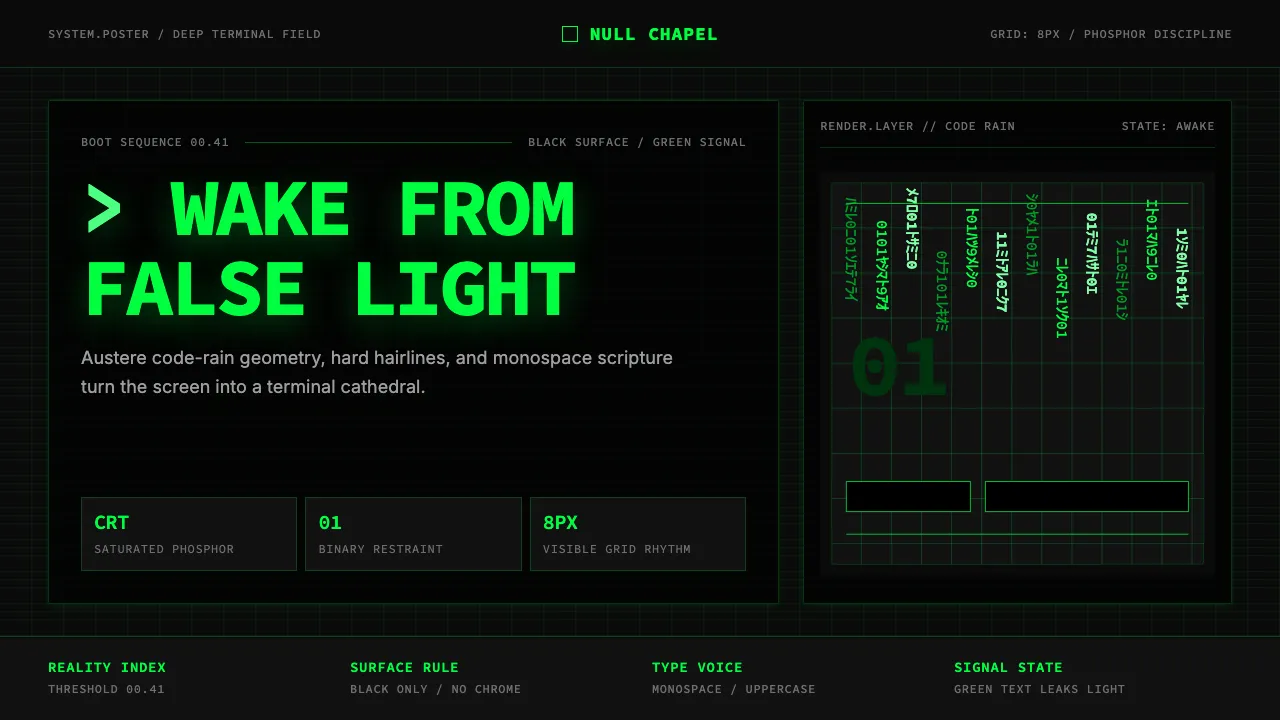
About The Matrix (Green-Code)
The Matrix (1999) crystallised cyberpunk for a mainstream audience: saturated CRT-green katakana raining down a deep-black terminal, monospace text as the very fabric of reality, and a philosophy of waking up from simulation. The look is austere, technical, and mythic — a desktop pretending to be a cathedral.
This system bottles that aesthetic for product use: two-tone Matrix-green and near-black, monospace typography as headline voice, hairline rules, zero-radius CTAs, and a phosphor glow that suggests the screen itself is leaking light. It is restrained, not decorative — every element earns its place on the grid.
- Origin
- USA — Hollywood (production), Sydney (principal photography)
- Era
- 1999 (Warner Bros. release); cultural-impact ongoing through Matrix Reloaded / Revolutions (2003) and Resurrections (2021)
- Key figures
- The Wachowskis · Bill Pope · Owen Paterson · Don Davis
- Movements
- late-1990s cyberpunk cinema · post-Ghost-in-the-Shell digital mythology · terminal aesthetic
The Matrix (Green-Code) design spec
Colors
Typography
The other 11 sections — buttons, cards, spacing, motion, techniques and more — open once you unlock. Download the DESIGN.md or send it to your AI in one click. Unlock once, yours forever.
Sign up nowStyles similar to The Matrix (Green-Code)
Also inspired by film, games & music, with a close feel.
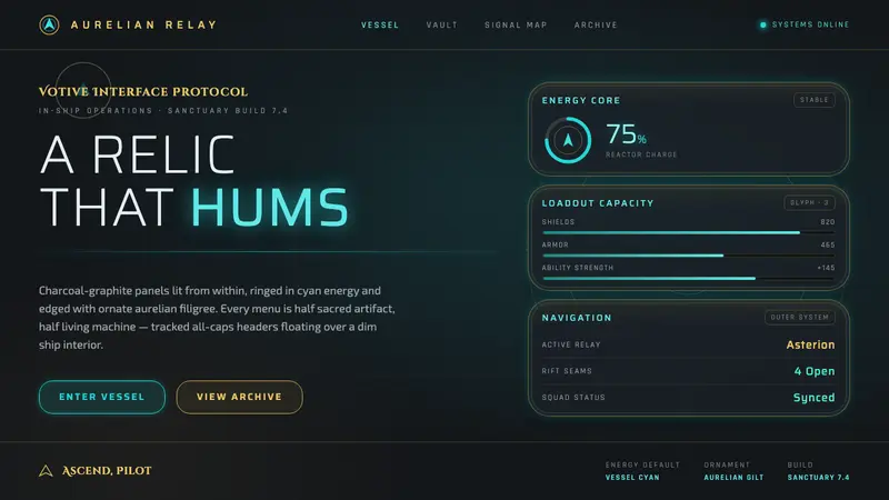 Warframe Orbiter UIHalf sacred relic, half living machine. Cyan energy rims, gold Orokin filigree on charcoal panels.
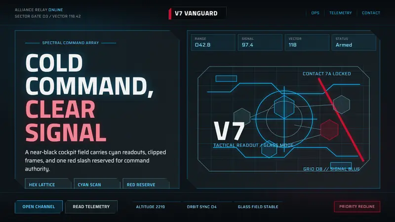 Mass Effect N7Cold military futurism. Cyan HUD grids on near-black glass, cut by one red stripe.
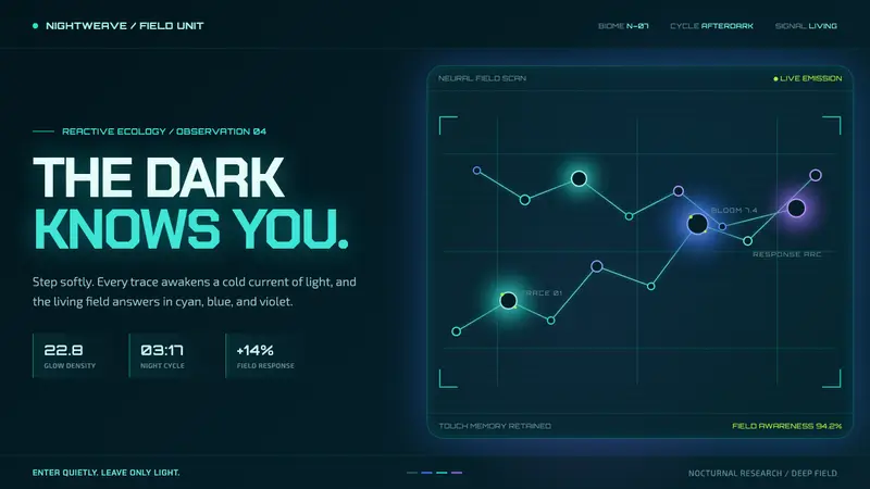 Avatar — Pandora Bioluminescence (2009)The forest knows you are there. Cyan light blooms across a deep-teal living field.
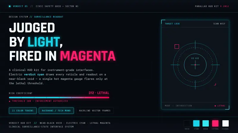 Psycho-Pass (Sibyl System)A surveillance HUD. Cyan reticles on a near-black void; magenta flares only at the kill threshold.