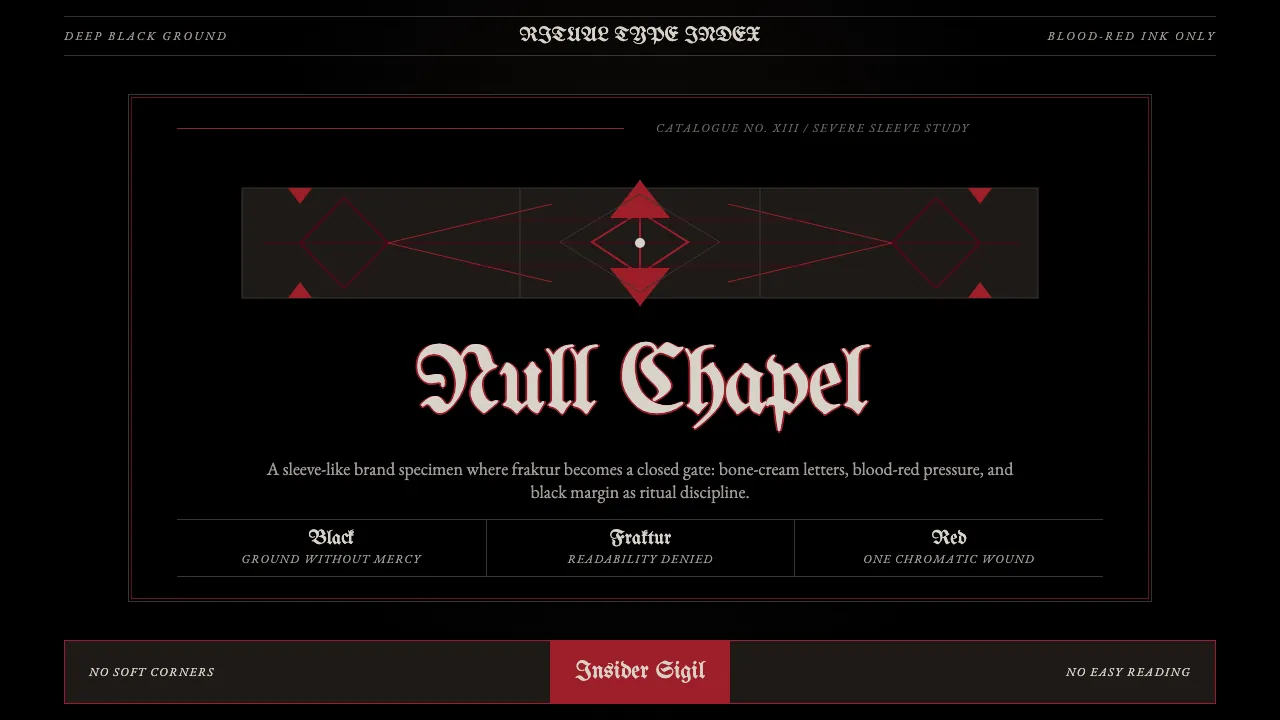
About Death Metal Blackletter
Death Metal Blackletter is the visual language of extreme-metal album covers — deep-black grounds, saturated blood-red, and tangled illegible Blackletter band-logos descended from medieval Gothic fraktur. The discipline is severe: only black, blood-red, charcoal, and a sliver of bone-cream are allowed on the page.
Born in late-1980s Florida death-metal and 1990s Norwegian black-metal, refined by logo-master Christophe Szpajdel across 10,000+ commissions, the aesthetic treats type as ritual sigil. Letters are sharpened, tangled, and pushed past readability — illegibility is the point, a barrier between insiders and the rest of the world.
- Origin
- Tampa (Florida death-metal scene) + Oslo (Norwegian black-metal scene); global underground
- Era
- Late 1980s death-metal birth; 1990s Norwegian black-metal; 2000s+ deathcore fusion; ongoing
- Key figures
- Chuck Schuldiner · Euronymous · Varg Vikernes · Christophe Szpajdel
- Movements
- Death metal · Norwegian black metal · Extreme-metal logo design
Death Metal Blackletter design spec
Colors
Typography
The other 11 sections — buttons, cards, spacing, motion, techniques and more — open once you unlock. Download the DESIGN.md or send it to your AI in one click. Unlock once, yours forever.
Sign up nowStyles similar to Death Metal Blackletter
Also inspired by pop culture, with a close feel.
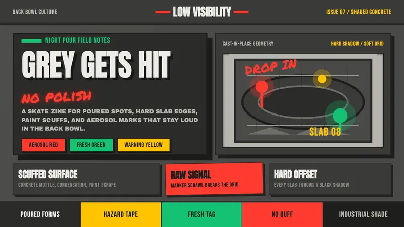 Concrete SkateparkRaw concrete detonates. Grey slab blocks carry red, green, and warning-yellow tags.
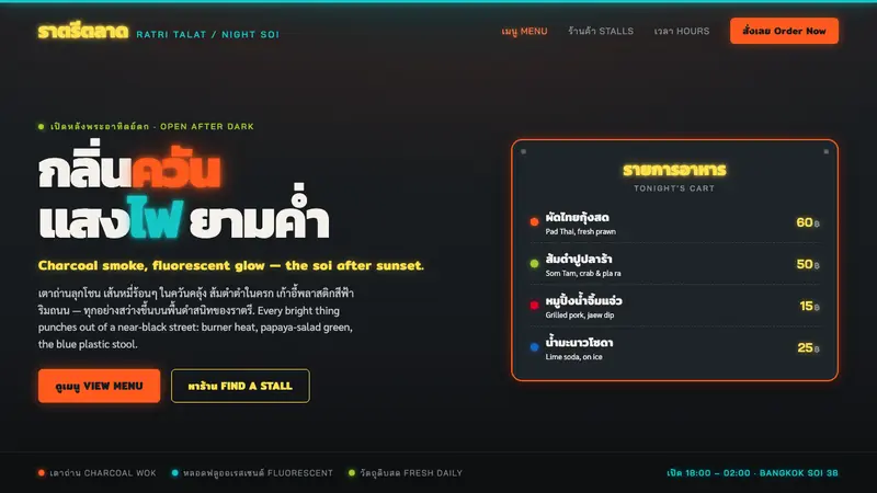 Thai Night Market Street FoodLit against the night. Chili-orange and fluorescent glow punch off a black soi, Thai script led.
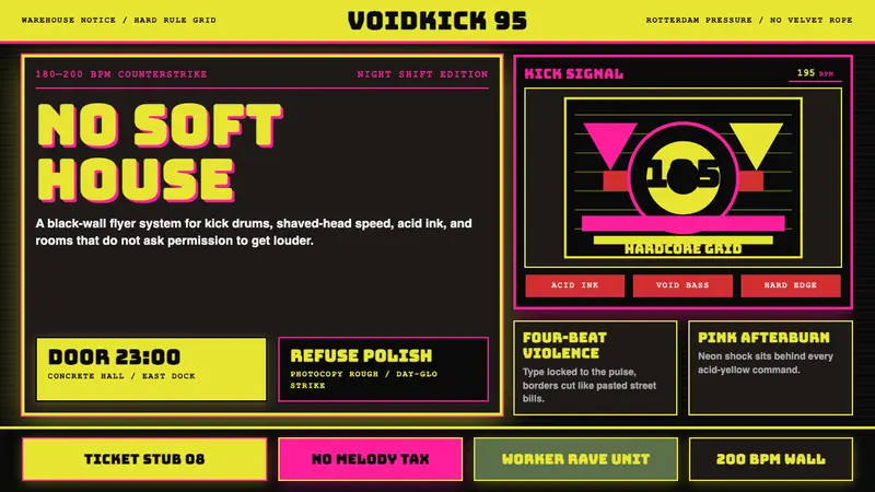 Rotterdam Gabber HardcoreHardcore refuses polish. Acid yellow, neon pink, black grid, and brutal Bungee type hit like flyers.
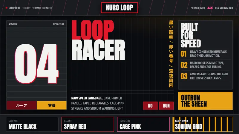 Kanjōzoku Loop RacerSpeed as contraband. Hot red numbers slice black tarmac with amber grid glare.