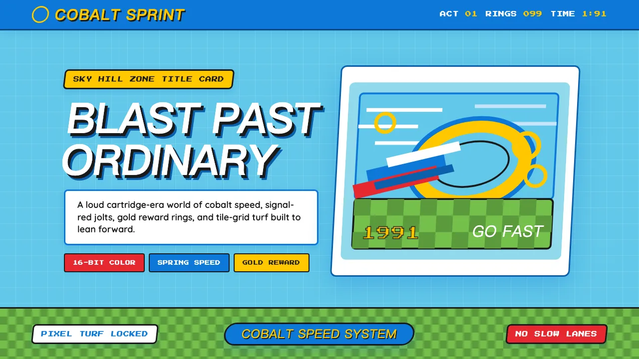
About Sonic the Hedgehog (1991)
Sonic the Hedgehog's 1991 visual identity is pure Sega Genesis attitude — Naoto Ohshima's cobalt-blue spiky mascot rendered in saturated 16-bit color against bright Green Hill Zone skies. Every element screams speed: italic-slanted wordmarks, loop-de-loop curves, and a palette of CRT-vivid blue, sneaker-red, and collectible gold.
This system captures the classic-era Sonic aesthetic before 3D redesigns diluted it — chunky pixel proportions, checkerboard ground tiles, and the brash "Genesis does what Nintendon't" confidence of early-90s Sega.
- Origin
- Tokyo, Japan / San Francisco, USA
- Era
- 1991 release; classic visual canon 1991–1998
- Key figures
- Naoto Ohshima · Yuji Naka · Hirokazu Yasuhara · Tom Kalinske
- Movements
- 16-bit console mascot wars · early-90s attitude branding · Mega Drive identity
Sonic the Hedgehog (1991) design spec
Colors
Typography
The other 11 sections — buttons, cards, spacing, motion, techniques and more — open once you unlock. Download the DESIGN.md or send it to your AI in one click. Unlock once, yours forever.
Sign up nowStyles similar to Sonic the Hedgehog (1991)
Also inspired by film, games & music, with a close feel.
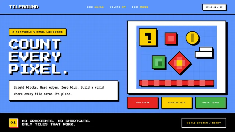 Super Mario Bros (1985)Every pixel earns its place. Sky blue, four-color tiles, and hard black outlines build the world.
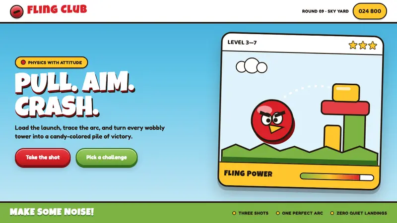 Angry Birds (2009)Adorable aggression takes flight. Candy primaries, chunky outlines, and a dotted launch arc.
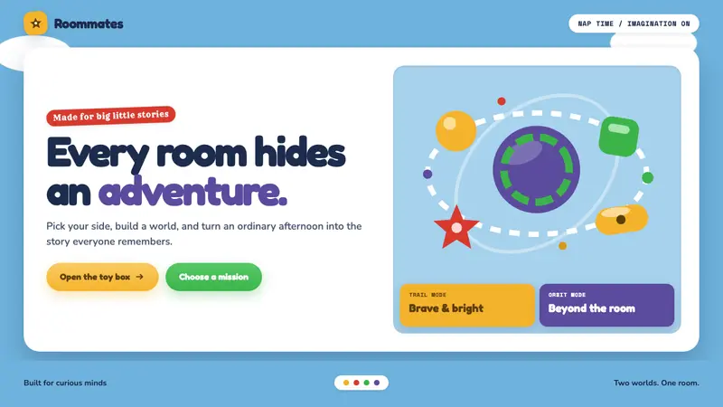 Toy Story (1995)Playtime becomes a whole world. Cloud blue, chunky type, and glossy two-tone toy forms.
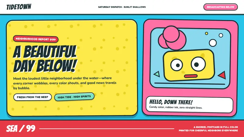 SpongeBob Bikini Bottom (1999)Undersea suburbia shouts with joy. Banana yellow and cyan bounce inside fat, wobbly ink.