What is Lichtenstein Ben-Day (1963)?
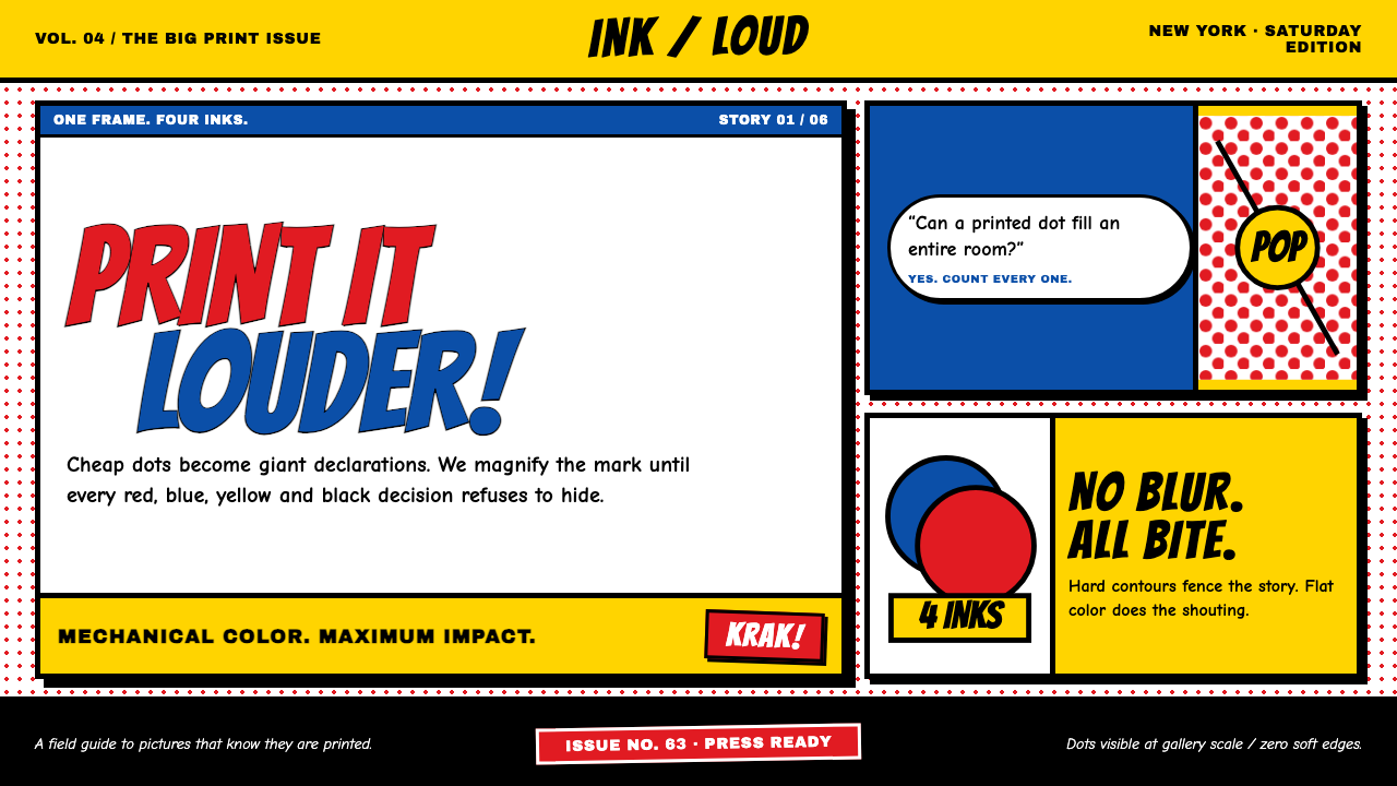
Lichtenstein Ben-Day (1963) makes cheap print heroic — primary inks, giant dots, and hard black contours shouting at wall scale.
Lichtenstein Ben-Day (1963) in brief
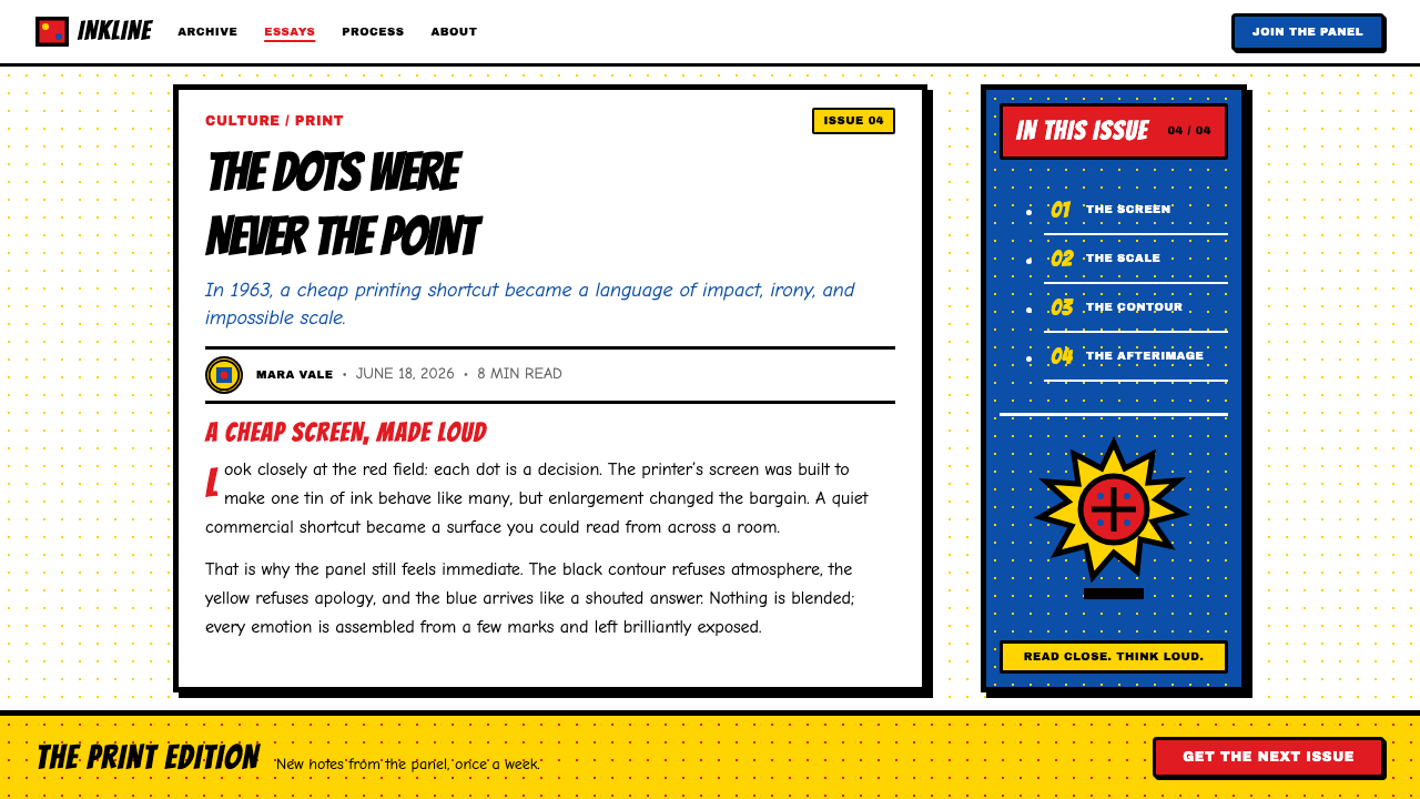
Roy Lichtenstein took the cheapest thing in print — the mechanical Ben-Day dot screen used to fake extra colors and tones in 1950s romance and war comics — and repainted it huge, deadpan, and heroic. The dots, originally a printer's shortcut for reproducing an image with only a handful of ink colors, become the entire subject: fields of perfectly regular circles blown up until each one reads as a shape in its own right rather than a printing artifact too small to notice.
Primary inks — red, yellow, and blue — march across the canvas in disciplined halftone grids alongside flat black and untouched white, and nothing else. Every shape is fenced by a thick, consistently weighted black contour, the way a printed comic panel outlines its figures so the image still reads clearly even if the color plates slip out of register. Speech balloons and jagged, exclamatory lettering crash across the frame using the same flat, printed vocabulary as everything else.
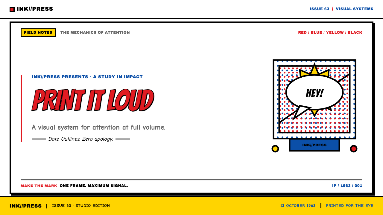
It is commercial reproduction imitated so precisely that it becomes fine art. The system reads like a single comic panel exploded to fill a wall: Ben-Day fields, hard black outlines, and a bordered balloon shouting the headline — a printed thing magnified until you can see every dot, and completely unashamed of where it came from.
Where does Lichtenstein Ben-Day (1963) come from?
Ben-Day dots are named after Benjamin Day, a nineteenth-century printer who patented the technique of using small, evenly spaced dots of a few basic ink colors to simulate additional colors, shading, and tone in mass-produced printing. For decades afterward, cheap newsprint comics and magazines relied on the process because only a handful of ink colors were economical to print at scale — overlapping dot patterns did the work that a wider ink palette would otherwise have to do.
In the early 1960s — a period running roughly from 1961 to 1968, with the signature style crystallizing in 1963 — Lichtenstein began appropriating panels from mass-produced romance and war comic books, blowing a single frame up to mural scale. Rather than mechanically printing the dots, he painted each one by hand, often with the aid of a stencil, producing a deliberate irony: an enormously painstaking, handmade simulation of the cheapest, most disposable form of mechanical reproduction.
This move sat within the broader American Pop Art movement taking shape in New York at the same time. Andy Warhol, working in parallel, was similarly elevating mass-produced commercial imagery — soup cans, celebrity photographs — to the status of fine art, and together these artists challenged assumptions about what subject matter and technique belonged on a gallery wall.
Leo Castelli, an influential New York gallerist, championed and exhibited Lichtenstein's work, alongside Warhol's, at his Manhattan gallery, helping establish Pop Art's critical and commercial legitimacy within the New York art world of the 1960s and ensuring the comic-derived style reached a serious art audience rather than remaining a novelty.
What defines the Lichtenstein Ben-Day (1963) look?
Ben-Day Dot Fields
Fields of perfectly regular, evenly spaced circular dots stand in for shading, tone, and secondary color, blown up to a scale where each dot reads as an individual shape rather than an invisible printing artifact.
Primary Ink Palette Plus White
Red, yellow, and blue carry all the color work, alongside flat black and untouched white — no secondary or tertiary hues appear anywhere. The restriction itself is the point: it mimics the limited ink set of cheap mass printing.
Hard Black Contour
Every shape is fenced by a thick, consistently weighted black outline, the way a printed comic panel outlines figures so the image still reads clearly even if color plates fall out of register.
Zero Gradient, Zero Gloss
Nothing fades, shines, or casts a soft shadow. Every transition is either a hard edge or a field of dots; the surface stays completely flat and matte throughout.
Comic Panel Composition
Speech balloons and jagged, exclamatory lettering crash across the frame using the same flat, hard-edged vocabulary as the rest of the image, treated as compositional elements rather than as a separate typographic layer.
Wall-Scale Enlargement
A single comic panel, originally meant to be read at page size, is blown up to mural scale, so that a detail invisible at its original size becomes the entire subject of the composition.
Who shaped Lichtenstein Ben-Day (1963)?
The American painter who appropriated mass-produced comic-book panels and hand-painted their Ben-Day dot screens at mural scale, crystallizing his signature style around 1963 and becoming one of the defining figures of American Pop Art.
The nineteenth-century printer who patented the dot-screen technique that bears his name, developed to simulate additional colors and tones in mass printing using only a small set of basic inks.
The influential New York gallerist who exhibited and championed Lichtenstein's work at his Manhattan gallery, helping establish Pop Art's critical and commercial legitimacy in the 1960s New York art world.
A fellow Pop Art figure working in parallel in New York, who similarly elevated mass-produced commercial imagery to fine-art status, sharing Lichtenstein's broader challenge to assumptions about worthy subject matter and technique.
How do you use Lichtenstein Ben-Day (1963) today?
This system rewards contexts that want to feel bold, confident, and unashamed of mass-market energy rather than refined or precious — entertainment, youth-oriented brands, and marketing that wants immediate, punchy visual impact all suit it well.
For presentation slides, a cover works well with a large Ben-Day dot field in a single primary color, a bold black-outlined headline treated like comic lettering, and no gradient or shadow anywhere. Content slides should keep the same primary-plus-black-and-white restriction throughout, using dot fields sparingly as an accent rather than covering every surface, so the technique still reads as a deliberate device rather than pure texture.
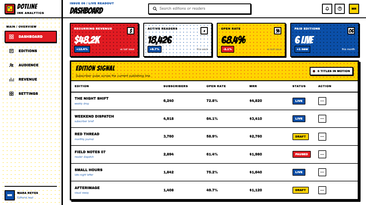
For web interfaces, hard black contours and flat primary color work well for buttons, badges, and callouts that need to grab attention immediately, while Ben-Day dot fields make an effective background texture for hero sections or empty states, kept large enough that each dot remains visible rather than blurring into a flat tint.
For editorial and marketing work, the style supports bold, declarative headlines rendered like comic-book lettering, speech-balloon-style callouts for testimonials or highlights, and full-bleed sections that commit fully to one primary color plus dots rather than blending several tones together.
A common mistake is shrinking the dots down until they read as a fine, subtle texture rather than a bold, visible pattern — the system's entire point depends on the dots being large enough to see and recognize as dots. Another is softening the black contour into a thin or inconsistent line, or adding a gradient for depth, both of which contradict the flat, mechanical-reproduction logic the style is built on.
Lichtenstein Ben-Day (1963) — FAQ
What exactly are Ben-Day dots?
Ben-Day dots are a printing technique named after Benjamin Day, using small, evenly spaced dots of a limited set of ink colors to simulate additional colors, shading, and tone in mass-produced print. Cheap comics and magazines relied on the process for decades because printing with only a handful of inks was far more economical than a full color range.
If the whole point is cheap mechanical printing, why did Lichtenstein paint the dots by hand?
That is precisely the irony the work depends on: an enormously painstaking, handmade process used to simulate the cheapest, most disposable form of mechanical reproduction. Painting each dot individually, often with a stencil, is what let him control the scale and precision needed to blow a tiny printing artifact up to mural size while keeping it perfectly regular.
How is this different from just using a generic 'comic book' style?
A generic comic-book look might use any color palette, gradients, or varied line weights borrowed loosely from comics. This system is disciplined around one specific historical printing artifact — the Ben-Day dot screen — reproduced with a strict primary-plus-black-and-white palette, a hard consistent contour, and zero gradient or gloss. The discipline of reproducing an actual mechanical process is what separates this from a loose comic-themed illustration style.
Does applying this style require literal comic-book imagery, like speech balloons?
No — the transferable core is the printing logic itself: a limited primary-ink palette, visible Ben-Day dot fields, and hard black contours with zero gradient or gloss. Speech balloons and comic lettering are one authentic application of that logic, but any layout willing to commit to the same flat, mechanical-reproduction discipline can use the system without literal comic-book content.
Related design styles
 Marlboro Red Flip-Top (1955)Authority in one fold. Cadmium red, white chevron, and gold type read like a…
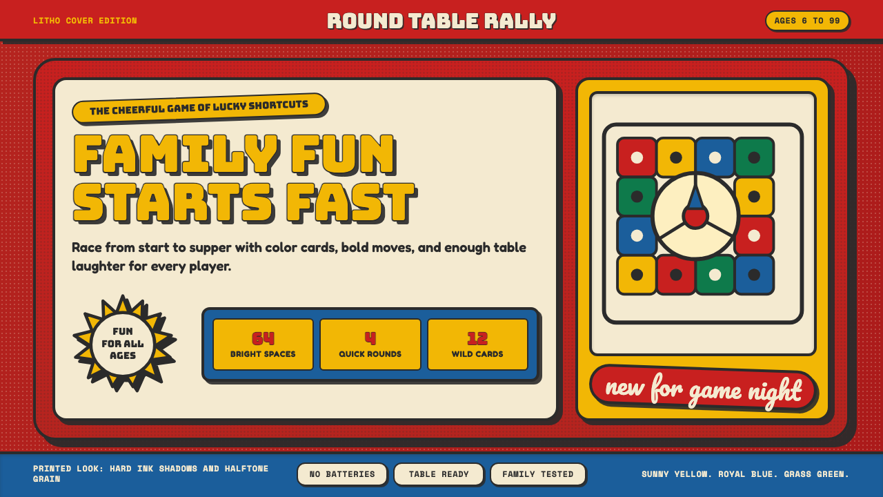 Vintage Board Game BoxShelf appeal shouts. Fire-engine red, Bungee lockups, yellow bursts, and ink…
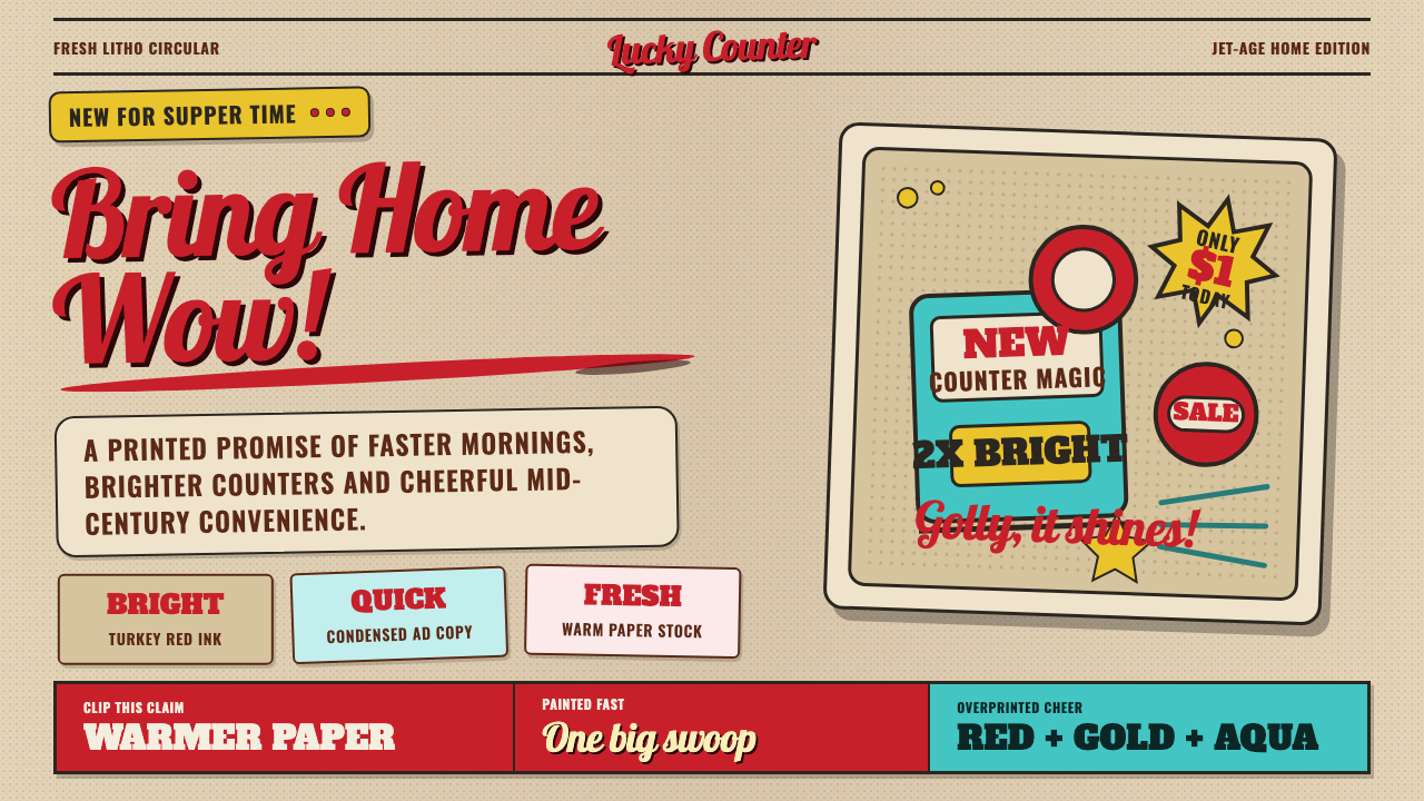 1950s Brush Script AdSells tomorrow in one swoop. Turkey red script, tan paper, starbursts, and ha…
 1970s Earth TonesWarm maximalism stays muddy. Bulbous slabs, avocado bands, and harvest-gold r…
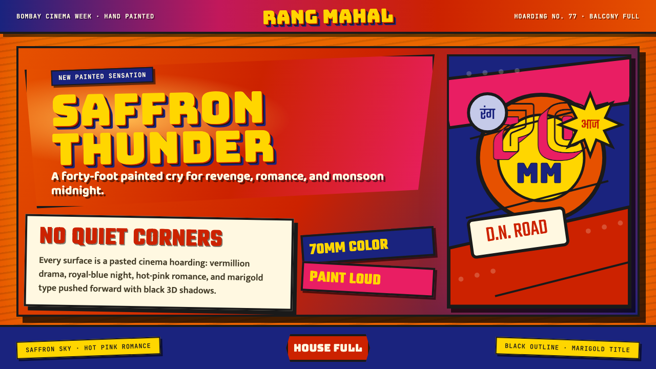 Bollywood Poster Art (1970s)Subtlety is unaffordable. Saffron fields, Bungee shadows, diagonal hoarding d…
 Dominican Merengue Perico RipiaoMaximalism keeps time. Fire-orange fields, Bebas Neue, and diagonal emerald s…