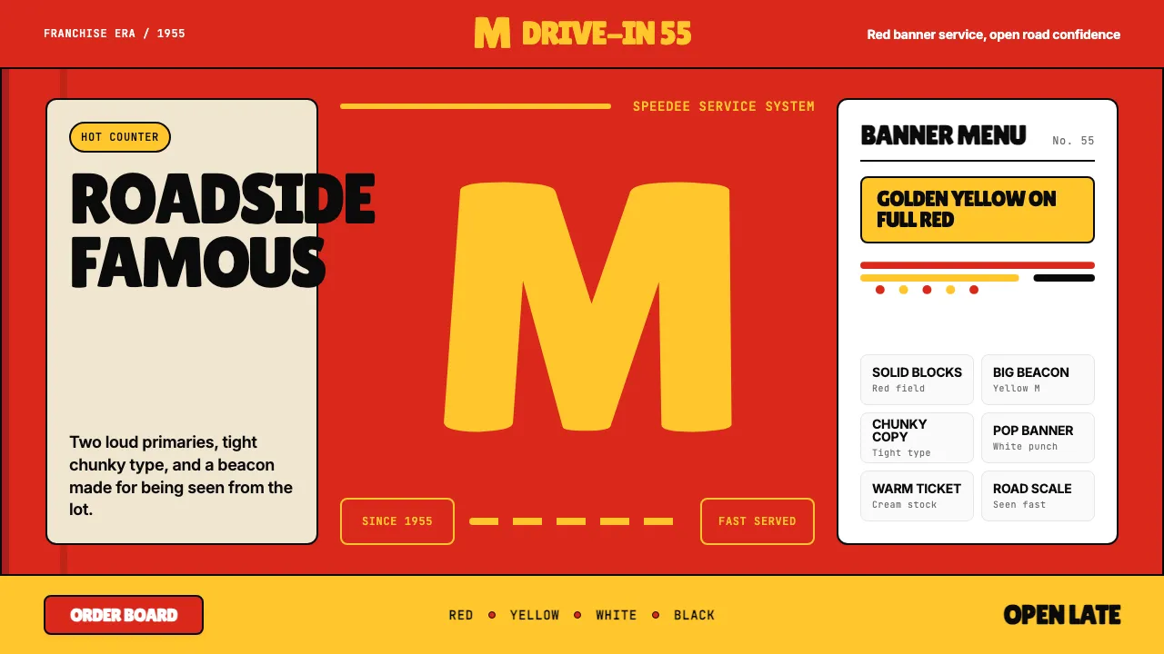
About McDonald's Golden Arches
McDonald's is the most-recognized fast-food brand on earth — built on a saturated red field, a single golden M, and a 1955 Americana franchise heritage that Ray Kroc industrialized from the McDonald brothers' burger stand.
The system speaks in two loud primaries: McDonald's-red and Golden-Arches-yellow. Type is chunky, tight, and confident. Layouts are populist and direct — banners, bold CTAs, product hero photography, and the M-logo treated as both wordmark and architectural beacon.
- Origin
- USA (Illinois → global)
- Era
- 1940 founded; 1955 Ray Kroc franchise; current visual ~2018–2024 'Speedee' system
- Key figures
- Richard McDonald · Maurice McDonald · Ray Kroc · Jim Schindler
- Movements
- 1950s American fast-food canon · Drive-through franchise design · Populist Americana branding
McDonald's Golden Arches design spec
Colors
Background
Surface
Primary
Secondary
Accent
Text
Typography
SpeedeeHeadings
InterBody
JetBrains MonoMono
Unlock for 1 credit
The other 11 sections — buttons, cards, spacing, motion, techniques and more — open once you unlock. Download the DESIGN.md or send it to your AI in one click. Unlock once, yours forever.
Sign up nowHave an account? Sign in
Styles similar to McDonald's Golden Arches
Also inspired by brands & products, with a close feel.
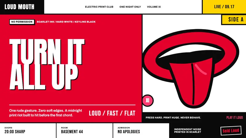 Rolling Stones Tongue (1971)Flat ink shouts loud. Scarlet curves, black keylines, and cropped poster scale refuse restraint.
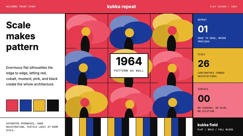 Finnish Marimekko Unikko (1964)Scale becomes pattern. Poppy red, cobalt, mustard, and Inter tile flat silhouettes.
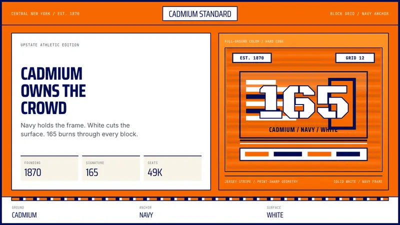 Syracuse Orange (College Athletics, 1870)One hue owns the crowd. Cadmium orange, navy frames, jersey-stripe geometry.
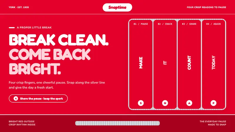 KitKat (1935)A break you can hear. Pillar-box red, plump white type, and silver grooves set the snap rhythm.