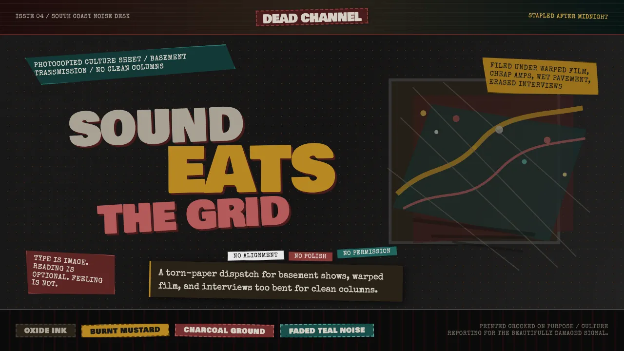
About Grunge (Carson 1993)
David Carson tore up every rule of modernist typography during his tenure as art director of Ray Gun magazine. Text bled off pages, fonts shifted mid-sentence, and legibility was sacrificed for emotional impact — most infamously when he set an entire Bryan Ferry interview in Zapf Dingbats.
This design system captures that raw, photocopied energy: muddy oxblood and burnt mustard on charcoal ground, distressed display type, deliberately broken grids, and the visual noise of ink bleed and halftone grain.
- Origin
- Southern California, United States
- Era
- 1990–1996 (Ray Gun era 1992–1995)
- Key figures
- David Carson · Neville Brody · Vaughan Oliver · Rudy VanderLans
- Movements
- Postmodern typography · Deconstruction · Grunge subculture
Grunge (Carson 1993) design spec
Colors
Background
Surface
Primary
Secondary
Accent
Text
Typography
Bowlby One SCHeadings
Special EliteBody
Cutive MonoMono
Unlock for 1 credit
The other 11 sections — buttons, cards, spacing, motion, techniques and more — open once you unlock. Download the DESIGN.md or send it to your AI in one click. Unlock once, yours forever.
Sign up nowHave an account? Sign in
Styles similar to Grunge (Carson 1993)
Also inspired by print & type, with a close feel.
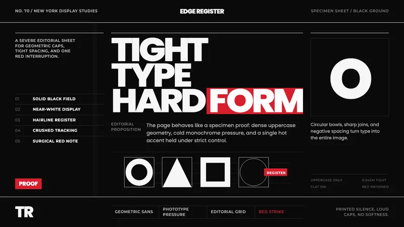 Avant Garde GothicType is the image. Tight white caps on black, ruled grids, one hot red strike.
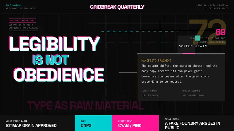 Emigre Magazine (1984–2005)Defies the tidy grid. Cyan, ochre, and hot-pink bitmap type collides on black.
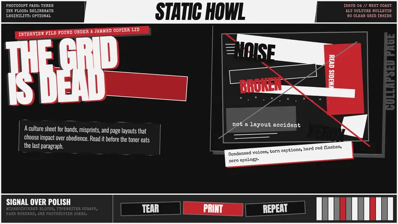 Ray Gun / David CarsonChaos becomes voice. Ink-black pages, Anton collisions, Xerox grain, and one red scar.
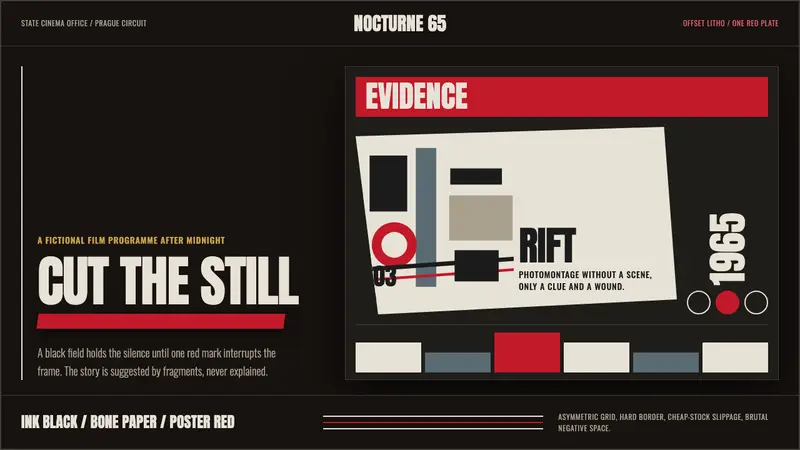 Czech New Wave PosterConcept before spectacle. Ink black, bone type and one poster-red incision fracture the grid.