About No Man's Sky
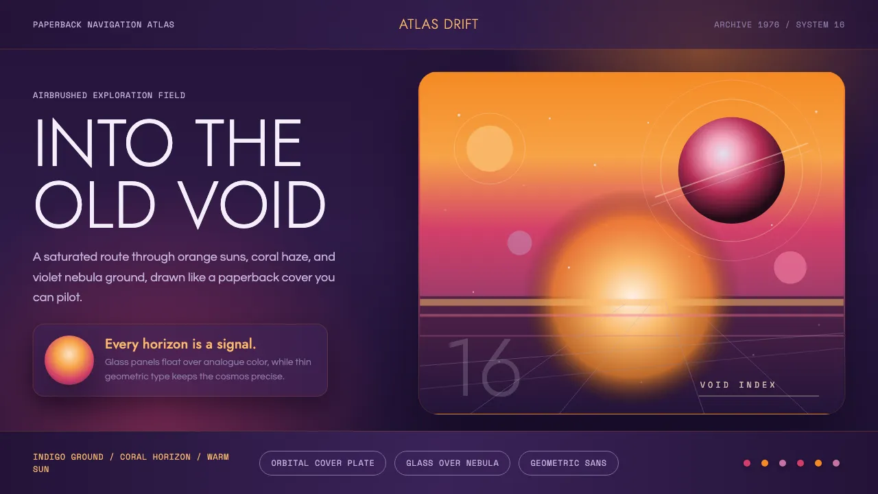
No Man's Sky was built around a single feeling: that you had stepped into an old science-fiction book cover. Director Sean Murray made it the studio's explicit north star, and art director Grant Duncan painted the universe in pulp-cover colour — a warm sun burning over an endless indigo void, skies airbrushed from orange through pink into violet.
The visual language is deliberately analogue in spirit even though it renders in real time: smooth gradient horizons, circular planet and sun motifs, and thin geometric-sans wordmarks. Nothing is flat grey. Every surface sits on rich, saturated colour, the way a 1970s Chris Foss or Peter Elson paperback never had a white margin in sight.
- Origin
- Guildford, United Kingdom
- Era
- 2010–now (released 2016); pulp referent 1970s
- Key figures
- Sean Murray · Grant Duncan · Hello Games
- Movements
- 1970s sci-fi paperback illustration · airbrushed nebula gradients · geometric-sans branding
No Man's Sky design spec
Colors
Typography
The other 11 sections — buttons, cards, spacing, motion, techniques and more — open once you unlock. Download the DESIGN.md or send it to your AI in one click. Unlock once, yours forever.
Sign up nowStyles similar to No Man's Sky
Also inspired by film, games & music, with a close feel.
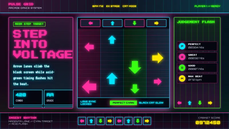 Dance Dance Revolution ArrowsPure arcade voltage. Magenta, cyan, and acid-green arrows climb a black CRT grid.
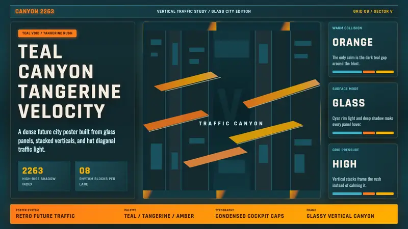 The Fifth ElementTangerine collides with teal. Vertical canyon grid, glass panels, diagonal traffic streaks.
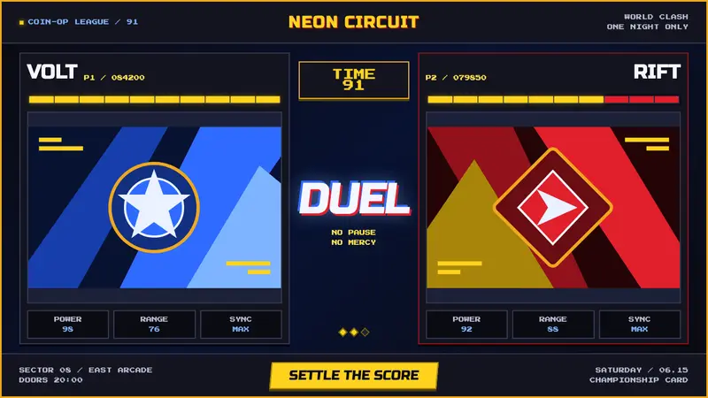 Street Fighter II (1991 Arcade)Pixel muscle hits hard. Hadouken blue, gold HUD bars, and outlined type blaze on CRT black.
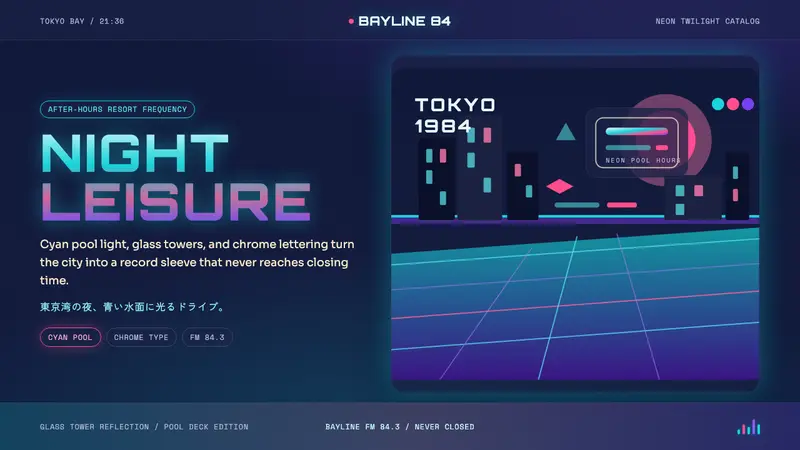 City Pop TokyoNeon leisure after dark. Cyan pool lines, chrome Orbitron, and pink-purple dusk.