What is Yukon Northern Lights?
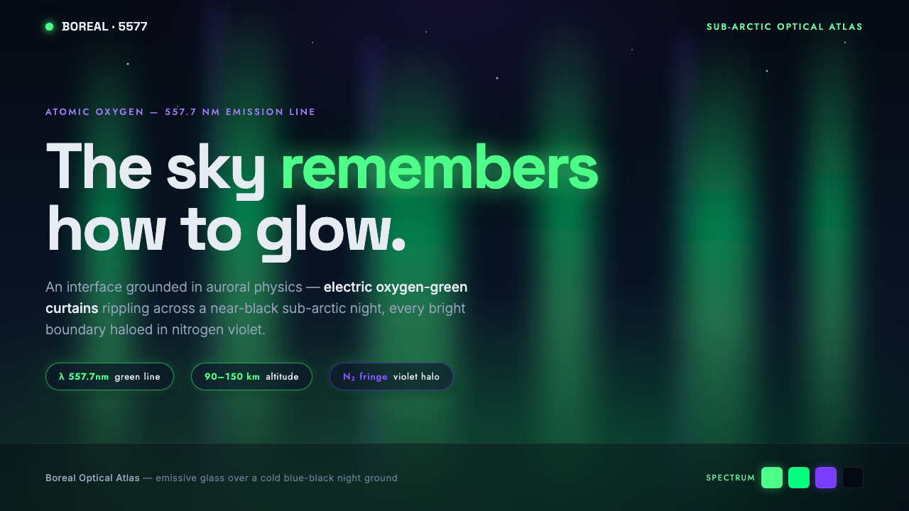
Yukon Northern Lights turns the aurora into an interface: oxygen-green light gathering, drifting, and glowing against the immense quiet of a blue-black sky.
Yukon Northern Lights in brief
Yukon Northern Lights is a dark visual system derived from the aurora borealis observed across Yukon Territory and the wider Canadian sub-arctic. Its central image is not a decorative night sky, but an atmospheric event: luminous green curtains suspended in near-black space, their bright edges carrying a restrained violet trace. The style treats interface surfaces as an expanse of cold darkness interrupted by living emission.
The defining green comes from atomic-oxygen emission, the brightest and most common auroral line. In design terms, that fact establishes a hierarchy: green is the active force, the source of attention and apparent energy. Blue-black creates depth and silence around it. Violet belongs only at the fringe, where a bright green boundary feathers into darkness. The palette is therefore directional rather than evenly distributed.
The system is cinematic without becoming illustrative. It does not require stars, mountains, landscape photography, or literal aurora drawings to feel northern. Its identity comes from contrast between a nearly lightless field and illumination that seems to originate within the page. Forms should appear to gather into soft curtains, diffuse at their borders, and leave generous darkness intact.
Where does Yukon Northern Lights come from?
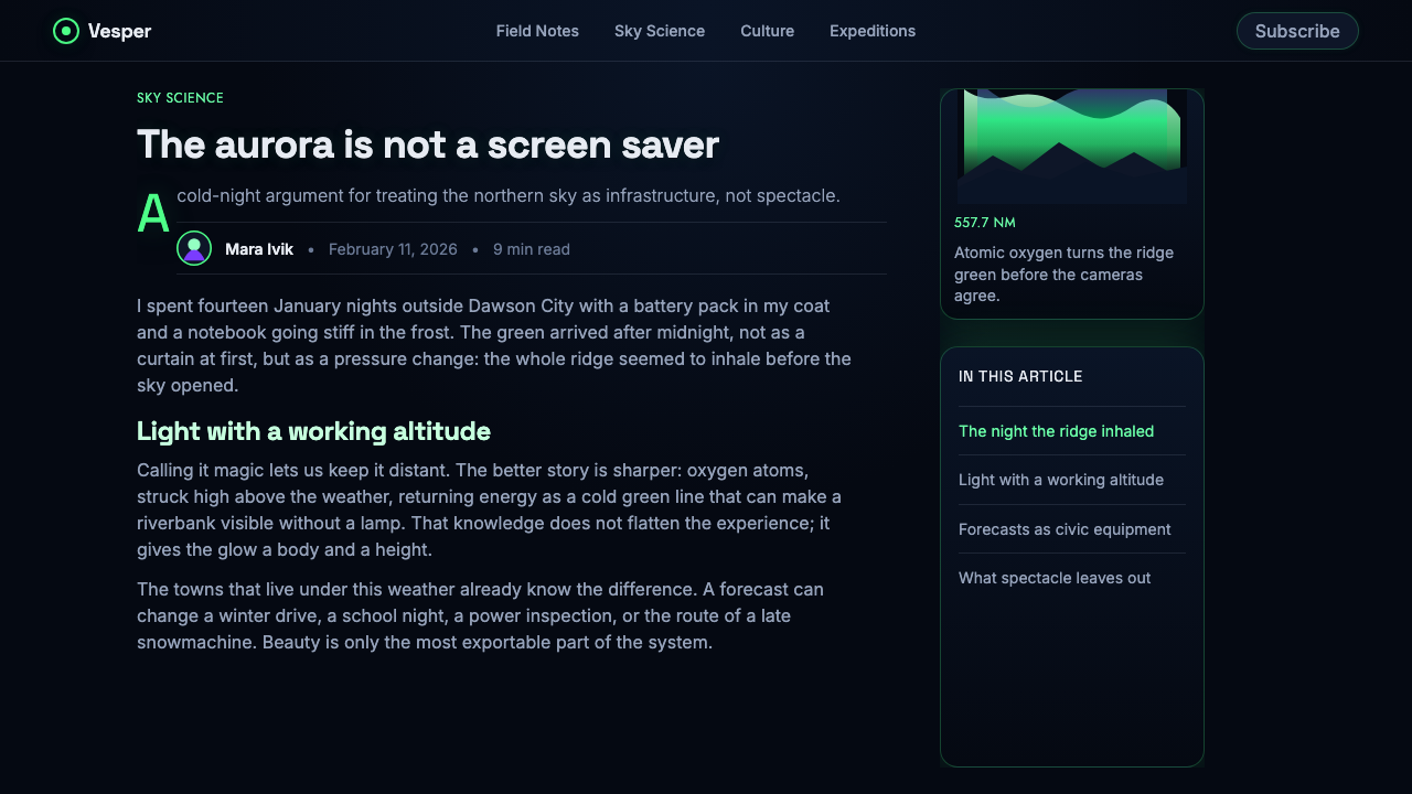
The origin of Yukon Northern Lights is older than any named design movement. Aurora borealis has been observed for millennia, including throughout the Canadian sub-arctic, where a long dark sky gives the phenomenon exceptional visual force. The system takes its authority from that natural setting: not from a decorative convention, but from the encounter between luminous atmosphere and expansive night.
Its scientific frame belongs to auroral spectroscopy and geophysical observation. The signature green is associated with atomic oxygen, while the violet edge recalls nitrogen. This distinction matters because it prevents the palette from becoming arbitrary. Green should read as the principal emission; violet should read as a boundary condition, a secondary halo created where the visible curtain loses intensity.
Anders Ångström first measured the brightest and most common auroral line. His presence in the story anchors the style in observation rather than fantasy: the glow has a physical source, and the visual language should preserve that sense of precision. The system borrows the emotional scale of a spectacle while remaining disciplined about what carries it.
Carl Størmer and Kristian Birkeland are also key figures associated with the source material’s history of auroral study. Together with Ångström, their names situate the theme within sustained attempts to observe and understand a phenomenon long seen across northern skies. For designers, that history suggests a useful posture: depict not a generic futuristic glow, but an atmosphere governed by light, distance, and restraint.
What defines the Yukon Northern Lights look?
Emissive Green
Green is the system’s visual engine. It should feel generated from within a surface rather than painted on top of it, concentrating at moments of priority and relaxing into darkness without losing its cold clarity. Its role is to establish focus, activity, and apparent energy.
Blue-Black Ground
The ground is a near-black, cold blue-black field rather than neutral black. It carries the depth of a sub-arctic night and gives every luminous element room to exist. Large uninterrupted dark areas are essential; they are atmosphere, not unused space.
Violet Fringe
Violet appears at the outer threshold of brightness, never as a competing main color. A faint violet fringe gives green curtains a spectral, atmospheric edge and makes the transition into darkness feel observed rather than decorated. Its restraint protects the hierarchy.
Curtain Form
The primary form is the auroral curtain: a vertical or diagonal field that gathers, ripples, and thins as if suspended in air. It should be soft enough to suggest atmospheric motion, yet legible enough to organize content. Broad fields are more convincing than many small decorative streaks.
Feathered Boundaries
Bright boundaries should dissolve rather than stop abruptly. The feathering is a way of showing energy dispersing through atmosphere, with the strongest green held near the inner curtain and a delicate violet trace allowed farther outward. The result should feel luminous, not blurred for its own sake.
Quiet Contrast
The style relies on contrast between radiance and stillness, not on a crowded field of effects. Dark areas, sparse type, and a limited number of luminous events make the interface feel vast. If everything glows, nothing retains the authority of an aurora.

Who shaped Yukon Northern Lights?
Ångström is identified in the source material as the first person to measure the signature auroral line associated with atomic-oxygen emission. In this design story, that measurement makes the dominant green more than an atmospheric preference: it is the visual expression of a documented physical phenomenon.
Størmer is named among the key figures connected with the theme’s auroral history. His inclusion places Yukon Northern Lights within the traditions of auroral spectroscopy and geophysical observation, keeping the system oriented toward close attention to natural light rather than generic science-fiction imagery.
Birkeland is likewise identified as a key figure in the source material. Alongside Ångström and Størmer, he represents the scientific-observation context behind a style that asks designers to make light feel situated in atmosphere, with hierarchy and physical character rather than indiscriminate visual intensity.
How do you use Yukon Northern Lights today?
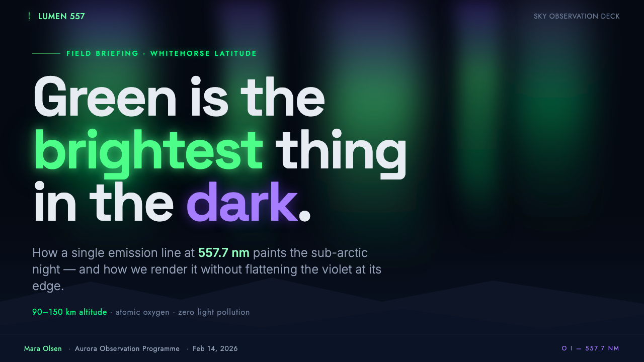
For presentation covers, use the blue-black field as a stage for one decisive auroral event. A broad green curtain can enter from an edge or gather behind a concise title, with violet reserved for its soft outer boundary. Keep supporting information quiet so the cover reads as an encounter with light, not a poster filled with effects. On content slides, preserve the same dark field but let text and structure occupy stable, calm zones beside the light.
Data slides work best when luminosity communicates emphasis rather than merely decorating charts. Treat green as the primary signal for the active series, selected finding, or dominant measure; use subdued supporting marks for context. A violet fringe can separate a highlighted region from the dark field, but should not become a second data category unless its meaning is explicit. The overall result should feel analytical and nocturnal at once.
For web interfaces, the system is particularly effective in dashboards, monitoring spaces, data-rich tools, and pricing pages that benefit from a sense of focus and depth. Use a dark, stable foundation for navigation and dense information, then reserve internal green glow for actions, status, progress, and moments requiring attention. Panels should feel contained in darkness, with luminous boundaries used sparingly to establish priority rather than to outline every component.
Editorial and marketing pages can use the system to create long-form rhythm. Alternate quiet dark reading areas with wider auroral intervals that introduce a chapter, quotation, product statement, or campaign message. Marketing should frame the green curtain as a revelation or accumulation of value, while body copy remains composed and readable in the calmer parts of the page. The violet edge can make major transitions feel atmospheric without turning them into ornamental dividers.
The common mistake is to treat Yukon Northern Lights as permission for indiscriminate neon. Saturating every label, card, and border with green destroys the phenomenon’s scale; making violet equally prominent breaks the physical hierarchy that gives the palette meaning. Avoid literal landscape clichés as well. The strongest work uses darkness as an active material, lets green lead, and permits violet only to describe where bright auroral light meets the night.
Yukon Northern Lights — FAQ
Is Yukon Northern Lights simply a neon style?
No. Neon usually distributes high-intensity color across signs, outlines, and type. Yukon Northern Lights is organized around an atmospheric hierarchy: a cold dark field, one dominant oxygen-green emission, and a restrained violet fringe. The aim is not urban brightness, but the sensation of light appearing in immense darkness.
Why must green remain dominant over violet?
The system is based on the source material’s physical distinction between the dominant atomic-oxygen green and the nitrogen-violet fringe. Green carries the central visual event. Violet describes its threshold. When violet becomes equally large or bright, the composition loses both its scientific reference and its clear hierarchy.
Can the style use photographs or illustrations?
Yes, provided they serve the atmosphere rather than replace it. Photography or illustration should preserve darkness, distance, and a clear luminous hierarchy. Literal scenic imagery is optional, not required. Abstract curtain fields and carefully controlled glow often express the system more convincingly than a direct picture of the northern sky.
Where does this style work best in a product?
It is strongest where focus, status, discovery, or a sense of depth matters: dashboards, monitoring tools, analytical surfaces, feature announcements, and high-attention pricing or campaign moments. It is less suitable when every interface element must compete equally for notice, because the style depends on preserving quiet darkness around its rare luminous events.
Related design styles
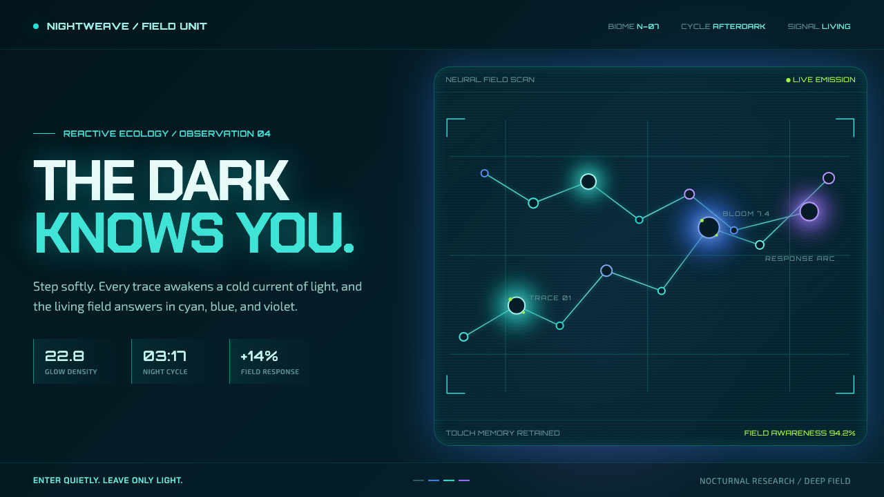 Avatar — Pandora Bioluminescence (2009)The forest knows you are there. Cyan light blooms across a deep-teal living f…
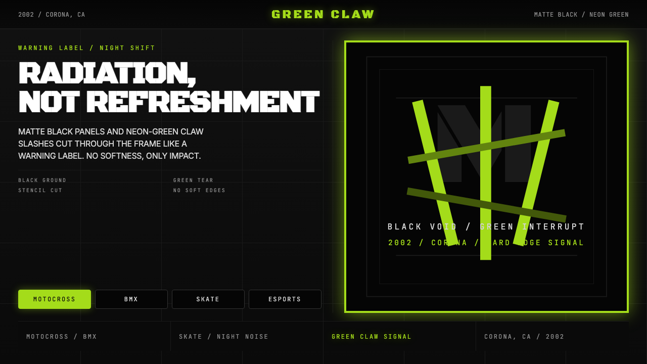 Monster Energy Claw (2002)Aggression, not refreshment. Matte black and neon-green claw slashes cut the…
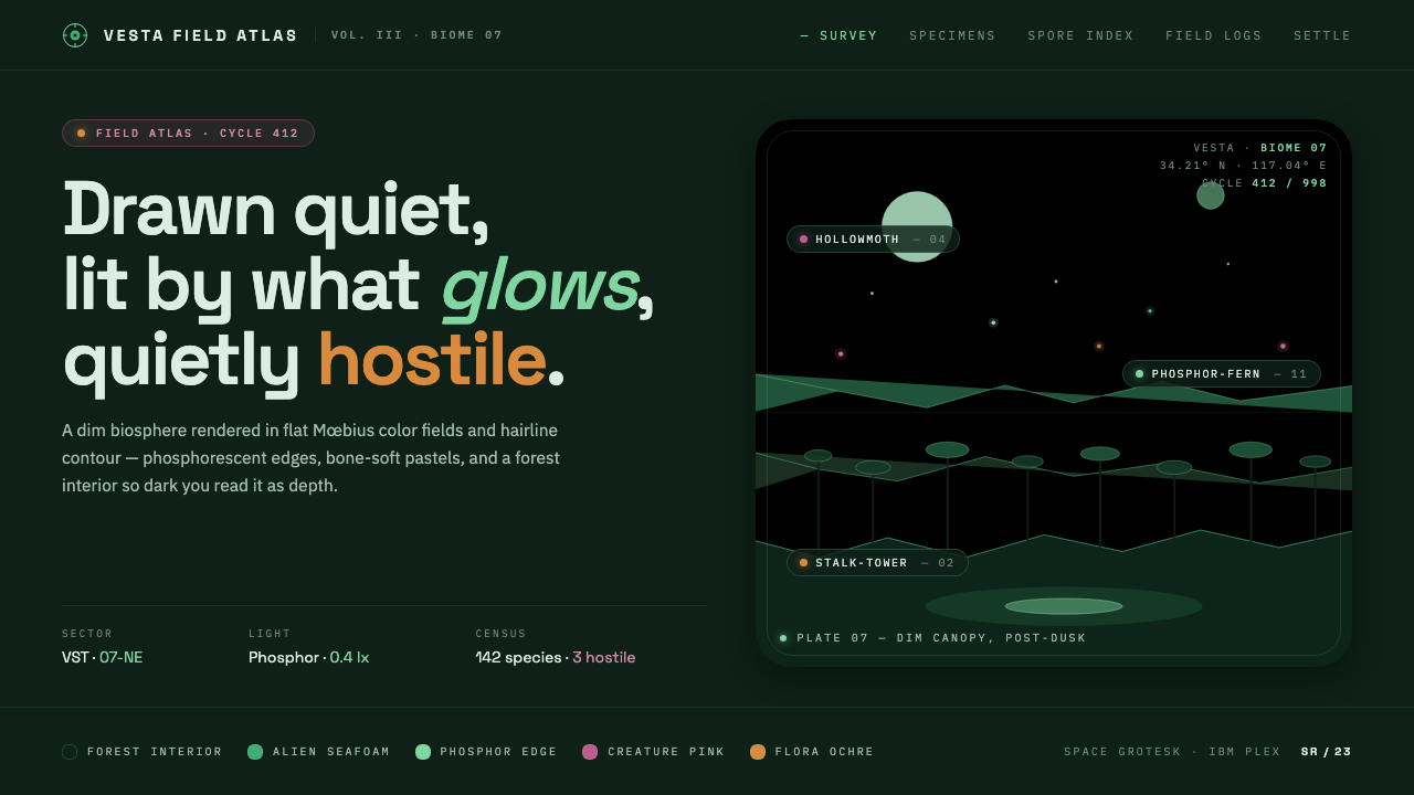 Scavengers ReignDrawn quiet, lit by what glows. Flat Mœbius color planes, hairline contours,…
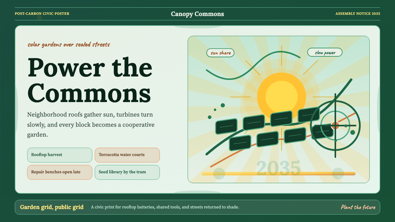 Solarpunk Utopia Poster (2014)Optimism has infrastructure. Emerald ground, saffron sunburst, humanist serif…
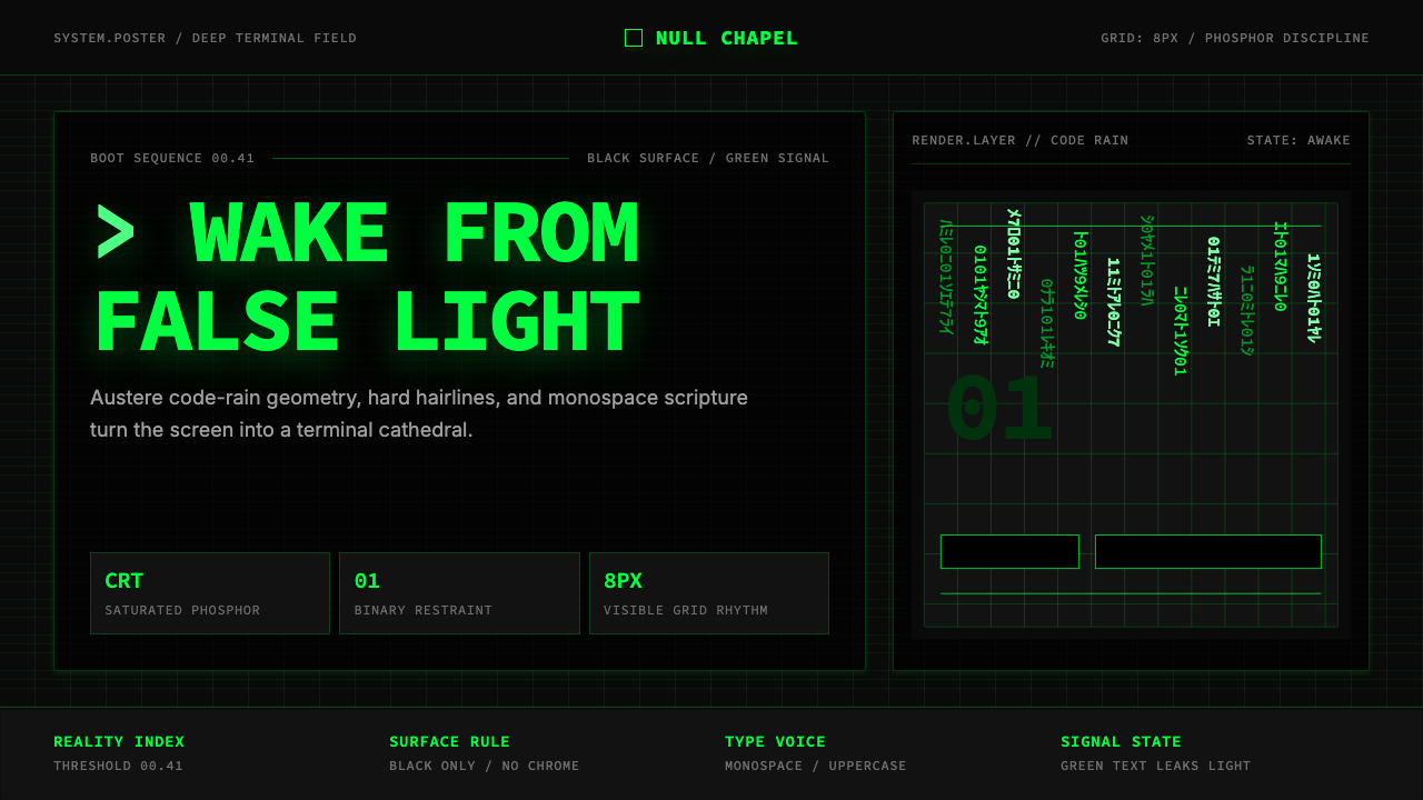 The Matrix (Green-Code)Terminal myth, disciplined. CRT green code rain, black grid, monospace script…
 AfrofuturismAncient future, fully luminous. Gold kente grids cut through cosmic purple an…