What is Scavengers Reign?
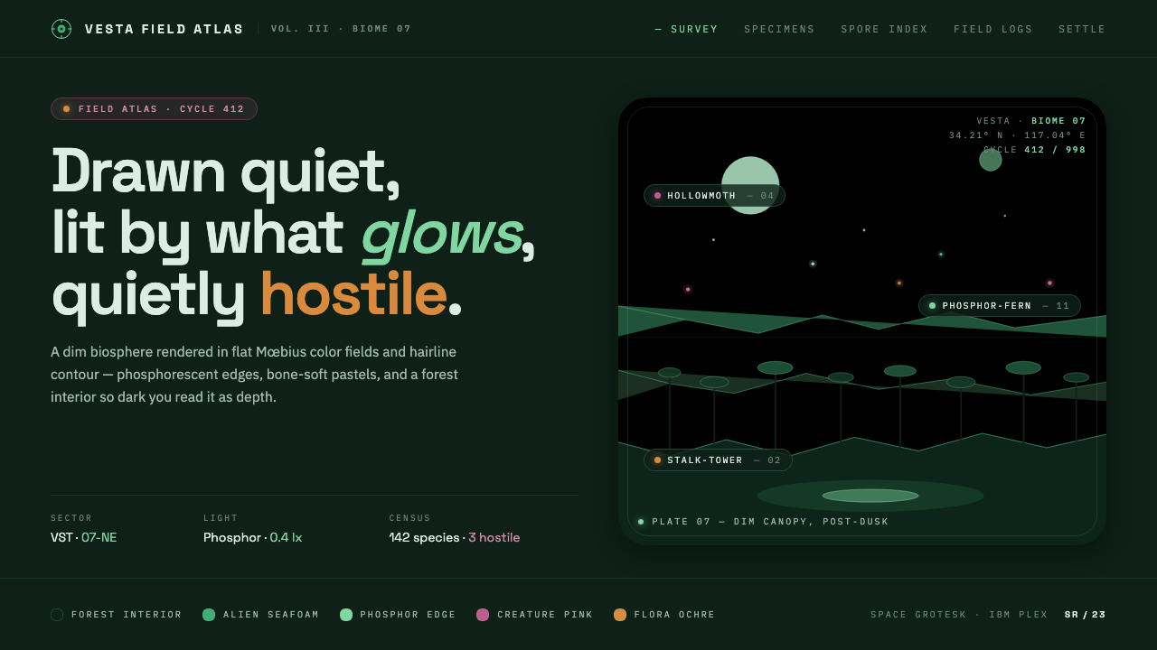
Scavengers Reign draws the eye into a dim alien ecology where flat color, fragile linework, and bioluminescent accents make beauty feel quietly dangerous.
Scavengers Reign in brief
Scavengers Reign is a visual language built around planet Vesta, an alien biosphere rendered as a dense, dim forest interior. Its atmosphere is not simply dark; it is seafoam-dark, humid in feeling, and filled with forms that seem to continue beyond the edge of the frame. The style combines Mœbius-like flat color fields with thin organic contours, creating images that feel drawn rather than rendered and natural rather than polished.
The central tension is between calm surfaces and hidden hostility. Large areas of quiet color give the eye somewhere to rest, while unfamiliar flora, creature silhouettes, and delicate biological structures introduce unease. Nothing needs to shout. A small luminous mark can imply life, threat, direction, or elapsed time because the surrounding field remains restrained.
Translated into interface, the system uses a dark forest-like ground, broad flat planes, hairline organic linework, and soft pastel accents for creatures and plants. These accents are not decorative confetti. They carry emotional and temporal information, allowing a page to brighten, dim, or shift mood without abandoning its underlying stillness.
Where does Scavengers Reign come from?
Scavengers Reign belongs to the visual world of a 2023 animated series produced in North America and presented through Max and Adult Swim. Its setting is the fictional planet Vesta, but its design language treats that planet less like a backdrop than like a living system. Forest, creature, atmosphere, and illumination are bound together, so the environment itself becomes the source of both beauty and threat.
The style draws from a visual lineage associated with Mœbius in the 1970s and 1980s and with Hayao Miyazaki’s Nausicaä in 1984. From Mœbius comes the confidence of flat color planes, expressive contours, and worlds that feel expansive without relying on heavy rendering. From Nausicaä comes an eerie botanical sensibility: nature is magnificent, interconnected, and capable of overwhelming human intention.
Those references are not reproduced as period pastiche. Scavengers Reign combines them with retro-science-fiction animation and organic surrealism, producing a mood that is quieter and more biologically strange than a conventional adventure setting. The result is neither bright futurism nor grim industrial dystopia. It is an ecology of subdued colors, unfamiliar growth, and illumination that appears to come from life itself.
The source material identifies Joseph Bennett, Charles Huettner, Mœbius, and Hayao Miyazaki as key figures in the reference field. Their presence describes a bridge between the contemporary series and its visual ancestry: North American animation, French bande dessinée, retro-sci-fi imagery, and surreal organic form. The design system preserves that bridge by treating every interface element as part of an environment rather than as an isolated component.
What defines the Scavengers Reign look?
Seafoam Darkness
The ground is deeply dark but not neutral black. A seafoam-green cast gives the interface the feeling of an enclosed forest, underwater cavern, or humid alien interior. This darkness should feel atmospheric rather than empty, allowing pale forms and luminous marks to emerge from within it.
Flat Color Planes
Color appears in broad, decisive fields rather than modeled surfaces. Planes may overlap, interrupt one another, or create the sense of a creature or plant through silhouette alone. Avoid visual treatment that makes every form look polished, metallic, or volumetrically simulated.
Organic Hairline
Contours are delicate, irregular, and alive with small changes in direction. Lines should describe tendrils, membranes, veins, roots, and unfamiliar anatomy without becoming decorative filigree. Their fragility matters: a fine contour against a dark field can make an interface element feel observed rather than manufactured.
Bioluminescent Accents
Light is scarce and therefore meaningful. Soft pastel creature and flora accents should appear as pockets of living color, not as a universal highlight treatment. Their presence can suggest attention, transition, emotion, or discovery while the surrounding darkness remains intact.
Quiet Hostility
The composition should remain calm even when it is unsettling. Threat comes from proximity, ambiguity, and unfamiliar relationships between forms rather than from aggressive alerts or theatrical effects. Spacious pauses and restrained movement create the feeling that the environment is watching back.
Ecological Hierarchy
Hierarchy should feel discovered rather than announced. Strong contrast belongs to the most important information, while secondary material recedes into the forest-like field. Grouping, contour, and luminous color can reveal relationships without relying on heavy panels, badges, or ornamental chrome.
Who shaped Scavengers Reign?
Joseph Bennett is identified in the source material as a key figure connected with Scavengers Reign. In this design system, his name anchors the contemporary side of the reference field: the alien ecology, quiet menace, and animation language are treated as a living present rather than only as historical quotation.
Charles Huettner is also named as a key figure in the Scavengers Reign reference set. His inclusion keeps the system tied to the series itself, where flat planes, delicate contours, and strange biological forms work together as a coherent atmosphere.
Mœbius represents the visual lineage of French bande dessinée and the flat, emotionally charged color plane. His influence is most useful here as a discipline of omission: let a contour and a field of color suggest a world without explaining every surface.
Hayao Miyazaki is named through the connection to Nausicaä, whose botanical and quietly perilous sensibility forms part of the system’s lineage. The useful lesson is that nature can be beautiful, immense, and threatening at the same time, without turning the composition into spectacle.
How do you use Scavengers Reign today?
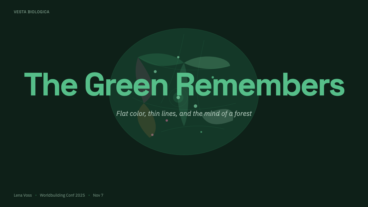
For presentation slides, use the cover as an opening into the habitat: a deep seafoam field, a broad flat creature or flora silhouette, and a restrained title that feels discovered inside the image. Content slides should preserve generous quiet areas and let linework, color planes, and small luminous markers establish structure. Data slides can treat charts as ecological diagrams, using pastel accents to show change or emotional weight while keeping the overall field subdued.
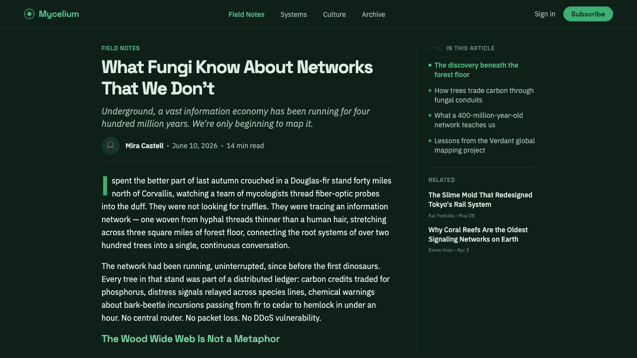
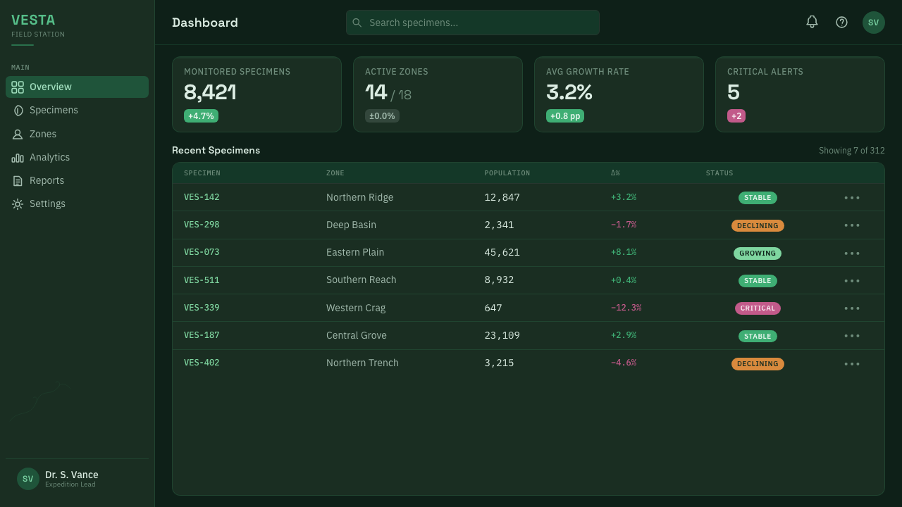
For web interfaces, the style suits dashboards, monitoring tools, and pricing pages that need atmosphere without sacrificing legibility. Keep the main information embedded in a dark, stable ground; use flat panels or outlined regions rather than glossy cards; and reserve luminous accents for active states, important changes, or meaningful thresholds. Pricing tiers can feel like habitats with distinct organisms and color cues, provided the distinctions remain calm and readable.
For editorial and marketing work, the system supports long-form storytelling about technology, nature, exploration, science fiction, and unfamiliar worlds. A page can alternate between dense dark fields and broad pale color planes, with organic contours acting as section markers or marginal notes. Marketing imagery should suggest an ecosystem rather than present a catalogue of features: a small glowing detail, an interrupted silhouette, or a strange botanical form can carry more identity than a crowded arrangement of claims.
The common mistake is treating the style as a generic dark interface with neon decoration. Excessive glow, constant contrast, glossy gradients, aggressive animation, and too many accent colors destroy the quiet hostility that gives the system its character. Another mistake is making every line equally delicate or every panel equally dim. The design needs variation: some forms should recede, some should emerge, and light should feel earned by context.
Scavengers Reign — FAQ
Is Scavengers Reign simply a dark mode?
No. Dark mode is primarily a contrast choice, while Scavengers Reign is an environmental language. Its darkness has a seafoam cast, its surfaces are organized as flat color planes, and its linework suggests organic structures. Bioluminescent accents are selective and meaningful. If the interface could be recolored into an ordinary black-and-neon theme without losing anything, the system has not been applied deeply enough.
How much glow should the interface use?
Use glow sparingly enough that it remains perceptually rare. Light should mark an event, a living presence, a transition, or a meaningful focus rather than decorate every interactive element. The surrounding dark field is part of the effect. When everything glows, nothing feels alive; when most of the field stays quiet, a small pastel accent can carry unusual force.
Can this style support data-heavy dashboards?
Yes, if atmosphere does not replace hierarchy. Use the dark ground to reduce visual noise, flat planes to group related information, and luminous accents to identify the most consequential changes. Charts should remain diagrammatic and legible, with linework used to clarify relationships rather than imitate biological texture everywhere. The strange atmosphere should frame the data, not obscure it.
Is the style identical to Mœbius or Nausicaä?
No. They are visual lineages, not interchangeable labels. Mœbius contributes the language of flat planes and expressive contours, while Nausicaä contributes a botanical, eerie, and quietly perilous relationship with nature. Scavengers Reign combines those references with North American animation, retro-sci-fi animation, and organic surrealism. The result should feel related without becoming imitation.
Where does this style work best?
It works best where discovery, ecology, atmosphere, or quiet tension are useful values: exploration tools, science-fiction interfaces, environmental dashboards, cultural storytelling, and editorial worlds that need a memorable sense of place. It is less suitable when the product depends on bright cheerfulness, rapid spectacle, or dense decorative richness. The key question is whether the product benefits from feeling like a living environment rather than a neutral utility.
Related design styles
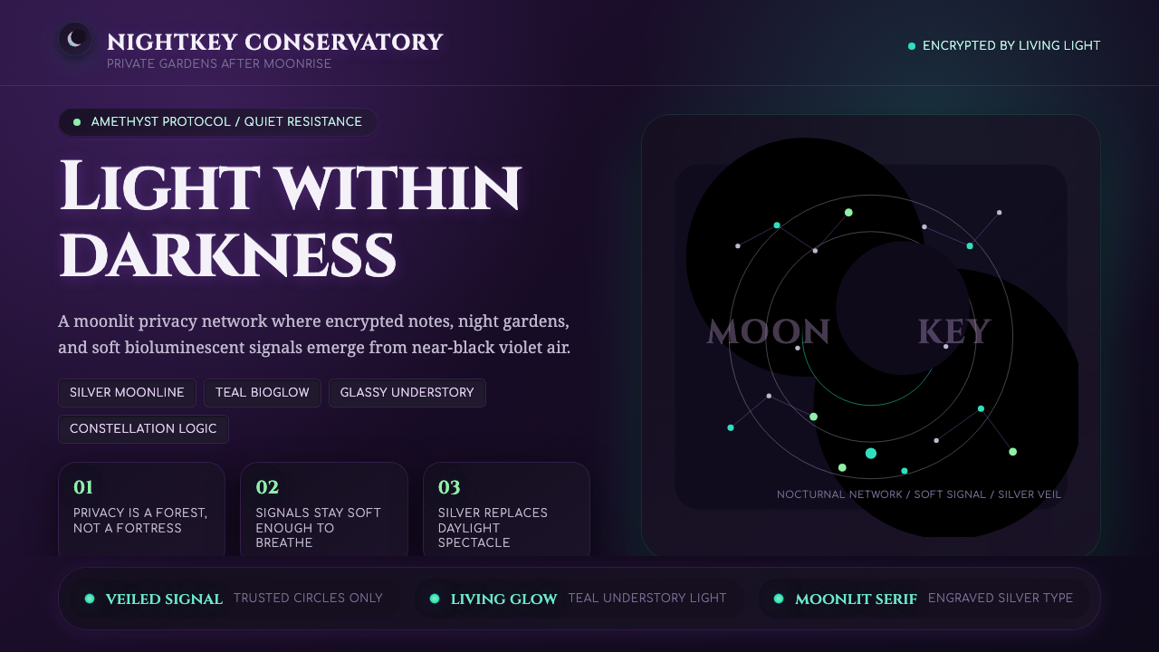 LunarpunkLight hides in darkness. Amethyst night, silver serif, and teal bioglow surfa…
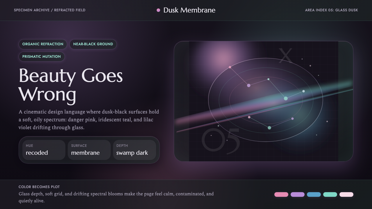 Annihilation (The Shimmer)Beautifully wrong. Dusk black carries pink, teal, and lilac refraction throug…
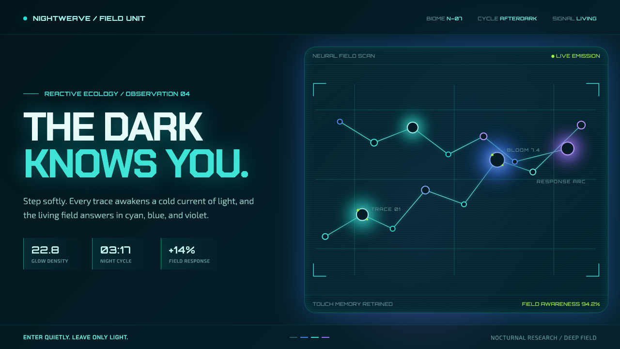 Avatar — Pandora Bioluminescence (2009)The forest knows you are there. Cyan light blooms across a deep-teal living f…
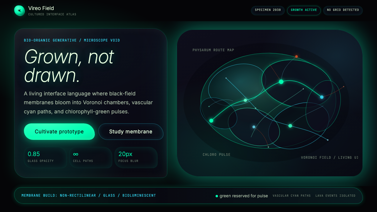 Bio-Organic GenerativeInterfaces feel cultured. Void black, Voronoi membranes, and neon chlorophyll…
 Bioluminescent ShoreDarkness becomes alive. Cyan wave-lines and specks ignite over an ink-blue se…
 Biopunk GrownLife replaces industry. Algae green glows on chamber dark with serif voice an…