What is Snowpiercer (2013)?
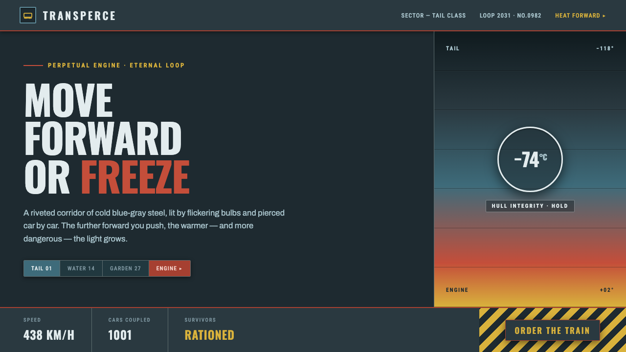
Snowpiercer turns survival into a moving color hierarchy: frostbitten steel-gray at the rear, warning red and amber at the front, and condensed signage pushing everyone forward.
Snowpiercer (2013) in brief
Snowpiercer is Bong Joon-ho’s 2013 thriller set aboard a perpetually circling train carrying humanity’s last survivors through a frozen Earth. Its visual world begins in the tail section: grimy, frostbitten blue-gray steel, flickering bulbs, dust, and pressure. Moving car by car toward the front, the palette becomes increasingly gaudy and saturated before arriving at the sterile engine. This design system translates that journey into a dark industrial language.
The central idea is a cold-to-warm class gradient. Steel-gray establishes the harsh shared condition, while red and amber appear as controlled signals of authority, danger, movement, or access. The colors are not a cheerful palette applied over a dark interface. They are breaches in the gloom, reserved for moments that must command attention. Every accent should feel as though it has pierced a sealed metal environment.
The style is therefore less about futuristic decoration than enforced progression. Surfaces feel riveted, enclosed, and functional; typography resembles condensed transit-warning signage; composition advances through compartments, thresholds, and directional cues. The result should suggest a machine that cannot stop, carrying unequal lives through an inhospitable world.
Where does Snowpiercer (2013) come from?
The source places Snowpiercer in a frozen near future, with the story set in 2031. The film itself was released in 2013 and belongs to contemporary dystopian science fiction, but its visual force comes from material immediacy rather than abstract futurism. The train is understood through steel, frost, grime, bulbs, and enclosed passage. Its world feels built, occupied, and under constant strain.
The production spans South Korea and the Czech Republic, with filming at Barrandov Studios. That context matters because the design language depends on the collision between controlled construction and lived deterioration. The environment is not merely a background for action. Its changing surfaces and colors communicate where a person stands within the train’s social and physical order.
Bong Joon-ho provides the film’s central directorial vision, while Hong Kyung-pyo’s cinematography shapes the movement from the grim blue-gray tail through increasingly saturated cars toward the sterile engine. The source identifies contemporary dystopian science fiction, class-allegory cinema, and industrial-realist set design as the key movements surrounding the work. Together, these references explain why the visual system feels political without relying on slogans.
The design extraction should preserve that progression instead of copying isolated props. Begin with the tail section’s cold steel and intermittent light. Introduce front-car red and amber only as the journey advances or as hierarchy becomes explicit. Keep the industrial shell dark and restrained, so that every warmer interruption carries narrative weight. The style succeeds when color, material, and direction all describe the same unequal machine.
What defines the Snowpiercer (2013) look?
Steel-Gray Ground
The dominant field is cold blue-gray steel, darkened by grime and frost rather than softened into a neutral gray. It should feel enclosed and weathered, with enough tonal variation to suggest panels, seams, and riveted construction. The ground carries most of the visual weight so that warmer accents remain scarce and consequential.
Condensed Signage
Typography takes its cue from condensed Oswald signage and transit warnings. Narrow, assertive letterforms create the feeling of limited wall space and continuous movement. Headings should behave like operational labels or carriage instructions, while supporting text remains disciplined and legible. Type is directional infrastructure, not a decorative voice.
Riveted Industrial Surface
Material cues come from dark steel, rivets, frost, and accumulated grime. Texture should support the sense of structure and occupation rather than become ornamental noise. Panels, borders, and hard divisions can imply a compartmental machine, but the surface must remain readable. The environment feels used because its construction is visible.
Intermittent Illumination
Light is suggested through flickering bulbs and uneven pools of visibility rather than a uniformly bright environment. A dark field should contain moments of exposure and disappearance, creating pressure around important information. Illumination is part of the atmosphere’s instability: it reveals the machine briefly, then lets the surrounding steel close in again.
Cold-to-Warm Progression
The system organizes hierarchy as a journey from cold tail-section blue-gray through gaudy saturated color toward the sterile engine. This is not a decorative spectrum. It is a narrative gradient that can structure sections, stages, or levels of access. The closer an element moves toward front-car color, the more deliberate its position and meaning should become.
Piercing Accents
Front-car red and amber are reserved strictly for accents that must interrupt the gloom. They can identify warnings, decisive actions, thresholds, or moments of exceptional status. They should not flood the interface or replace the steel-gray ground. Their power comes from scarcity: a single warm signal should feel like an event inside a cold machine.
Who shaped Snowpiercer (2013)?
Bong Joon-ho is the filmmaker named at the center of Snowpiercer’s visual and narrative world. His contribution to this design reference is the conversion of a perpetually moving train into a social diagram: enclosed compartments, unequal positions, and a journey whose changing atmosphere carries meaning. The system draws from that structural pressure rather than treating the film as a surface mood.
Hong Kyung-pyo’s cinematography establishes the film’s decisive color and light movement. The tail section is rendered as grimy, frostbitten blue-gray steel under flickering bulbs, while the train advances toward saturated color and then sterile whiteness. For designers, this makes lighting and palette inseparable: atmosphere is not added afterward but built through the controlled passage from cold to warm.
Ondřej Nekvasil is identified in the source as one of Snowpiercer’s key figures, alongside Bong Joon-ho and Hong Kyung-pyo. His inclusion points to the importance of production construction in this reference: the industrial language depends on believable enclosure, steel, frost, grime, and compartmental progression. The design system should therefore feel built and inhabited, never like an abstract science-fiction skin.
How do you use Snowpiercer (2013) today?
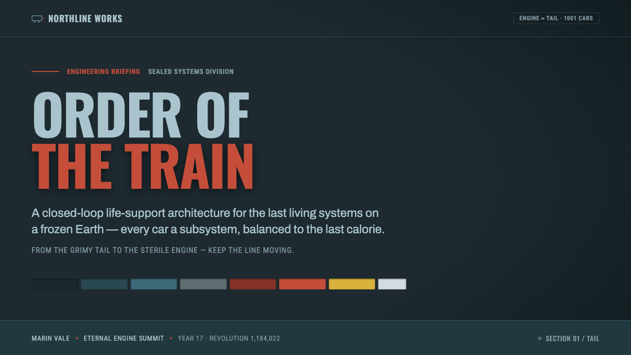
For presentation slides, treat the deck as a train moving through compartments. The cover can establish the cold steel-gray field with one front-car red or amber signal cutting across it. Content slides should use restrained signage-like headings, hard divisions, and clear directional sequencing. Data slides can express progression through changes in temperature and saturation: the most neutral information stays within the steel ground, while decisive findings or threshold states receive the scarce warm accents. The composition should feel operational, enclosed, and forward-moving.
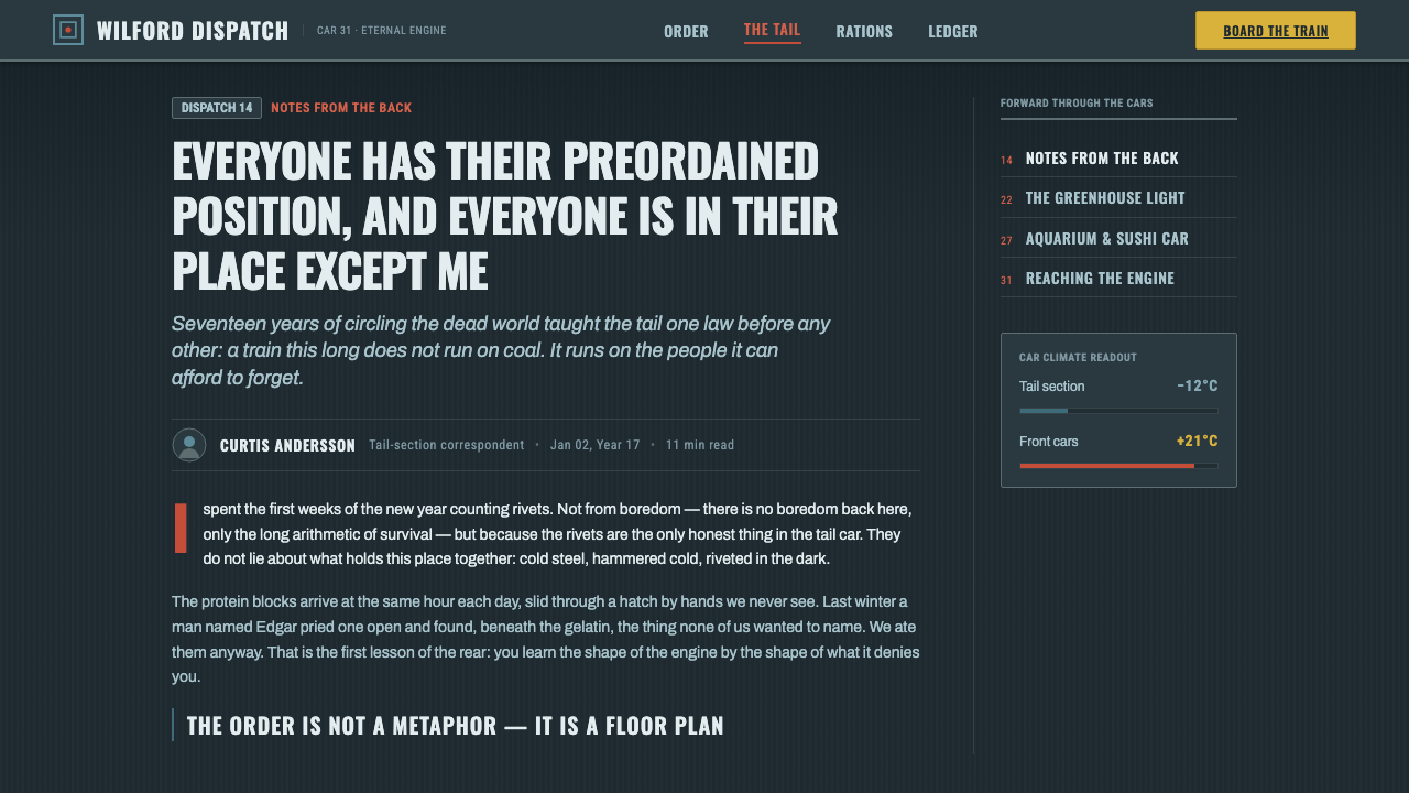
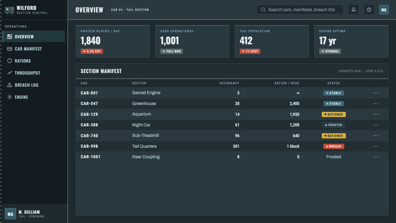
For web dashboards and pricing pages, the system works best when the dark steel ground carries the interface and warm colors mark consequential states. Red can identify danger, blockage, or urgent interruption; amber can indicate movement, pending transition, or a tier closer to the front of the train. Cards should feel like connected compartments rather than floating decorative tiles. Labels need the authority of condensed transit signage, and every accent should have a clear reason to exist.
For editorial and marketing work, build a controlled journey through the page. Opening sections can remain cold, dense, and blue-gray, while later sections introduce stronger red or amber as the argument reaches a decision, reveal, or call to action. Use riveted panels, narrow measures, and hard compositional breaks to suggest industrial construction. Marketing language benefits from the style’s severity when the product needs to communicate urgency, endurance, hierarchy, or movement through constraint.
The common mistake is to turn Snowpiercer into generic dark science fiction by covering every surface with saturated color, glowing effects, or decorative machinery. That destroys the class gradient. The base must remain cold, steel-gray, and materially restrained; red and amber must stay rare enough to pierce it. Another failure is using condensed signage type everywhere without establishing hierarchy. The typography should support the train’s operational logic, not become an imitation prop.
Snowpiercer (2013) — FAQ
Is this simply a dark science-fiction style?
No. Darkness is only the ground condition. The defining structure is the movement from cold blue-gray steel in the tail section toward saturated color and sterile whiteness at the front. It is also an industrial-realist language of enclosed compartments, visible construction, flickering light, and controlled warning accents. Removing the social gradient leaves a generic dark interface; preserving it produces the Snowpiercer reference.
How should red and amber be used?
Use them as scarce signals, not as equal members of the base palette. Red can pierce the field when danger, interruption, or decisive authority must be recognized. Amber can suggest movement, transition, or a position closer to the front. Their meaning depends on contrast with the cold steel ground. If they appear everywhere, they stop representing access and urgency and become ordinary decoration.
Can the system work on a light background?
It can be adapted, but a light treatment should not erase the system’s pressure. The source language is fundamentally dark, steel-gray, and enclosed, with warmth arriving as an interruption. A lighter variation should preserve strong material contrast, condensed signage, and the cold-to-warm hierarchy. If the result becomes open, airy, and evenly cheerful, it has moved away from the reference even if red and amber remain.
How can a layout communicate the train’s forward movement?
Organize information as a sequence of compartments, thresholds, and escalating states. Let headings, dividers, and content blocks create a clear directional reading path. Reserve stronger color for later stages or moments of consequence, so the viewer experiences progression rather than a static collage. The movement should come from hierarchy and ordering; arrows, motion lines, and literal train imagery are optional and should never carry the entire idea.
Related design styles
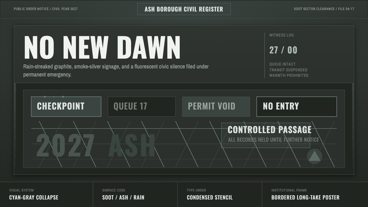 Children of MenHope drains out. Soot-green fields, smoke-silver type, and checkpoint rules h…
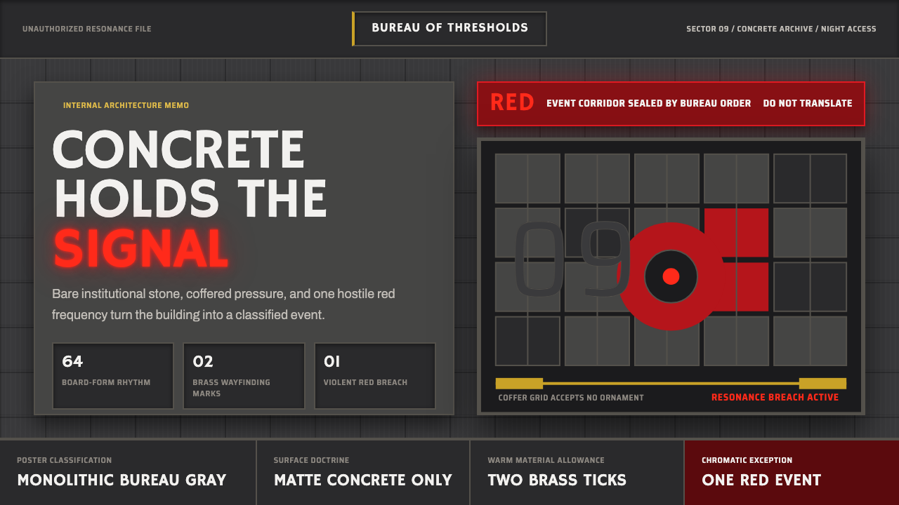 Control — Oldest HouseConcrete becomes menace. Brutalist gray grids are cut by one violent red sign…
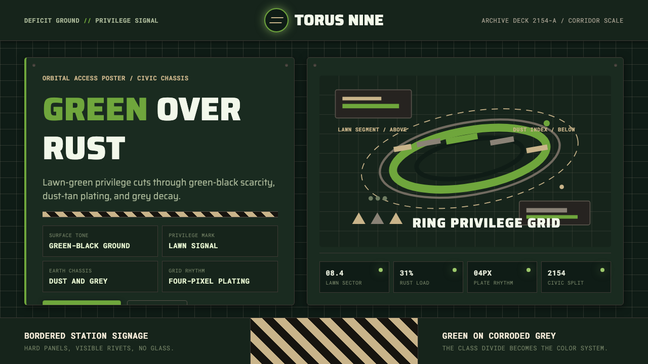 Elysium OrbitalClass divide made visible. Lawn green cuts through green-black plating and du…
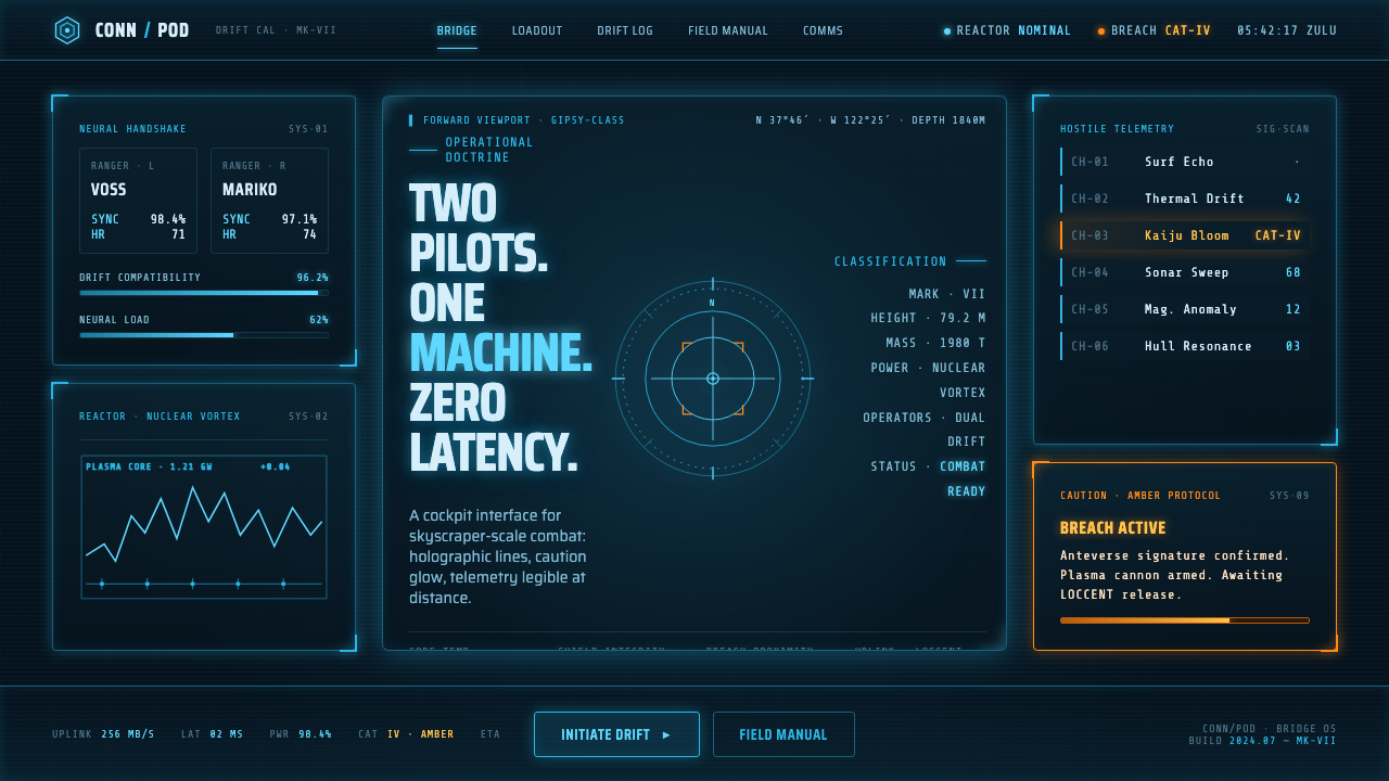 Pacific Rim Jaeger HUDTwo pilots, one machine. Faded Corsair-cyan holograms on near-black steel, am…
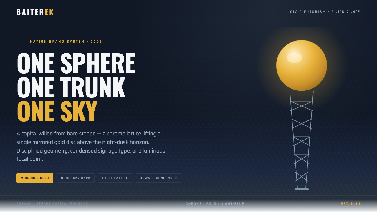 Astana Baiterek TowerCivic optimism in chrome and gold. A mirrored sphere crowns a white lattice t…
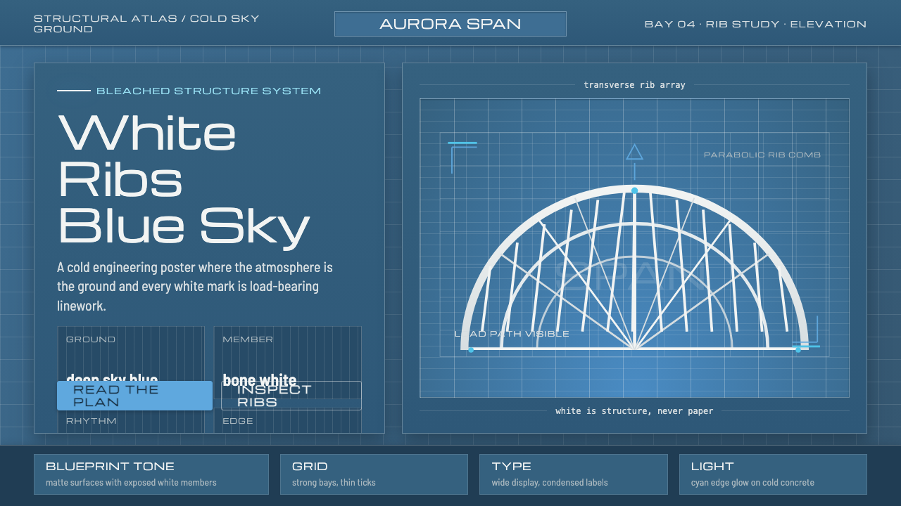 Calatrava White RibsArchitecture becomes blueprint. Bone-white ribs cut through deep Valencian sk…