What is Children of Men?
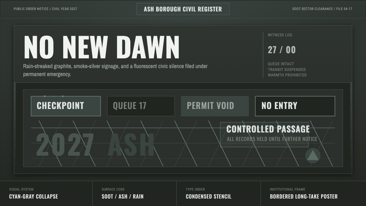
Children of Men turns cinematic despair into a design system — desaturated soot and smoke tones, condensed institutional type, and the cold visual grammar of checkpoints and collapse.
Children of Men in brief
Children of Men Design System is drawn from Alfonso Cuarón's 2006 film of the same name, a near-future dystopia in which the youngest person on Earth has just died and civilization is quietly unraveling under the weight of that loss. Rather than borrowing science-fiction's usual chrome-and-neon vocabulary, the film — and this system with it — imagines collapse as something drab, bureaucratic, and grimy: a world of checkpoints, refugee cages, and crumbling infrastructure rendered in the flat gray light of an overcast London.
The signature is a desaturated cyan-gray-green key: dark soot-green grounds standing in for ash and industrial decay, smoke-silver as the dominant neutral for type and structure, and a documentary-style visual grain that refuses the clean, color-graded polish typical of speculative fiction. Nothing glows. Nothing is saturated. The palette behaves like weathered concrete and old newsprint rather than a screen.
Structurally, the system leans on condensed industrial grotesque type — the kind found on transit signage, military stencils, and emergency notices — because in the film's world, most visible text belongs to institutions: government warnings, refugee processing signage, checkpoint instructions. This gives the system a cold, official register even before any specific message is applied, and it borrows the iconography of institutional control (cages, barriers, stenciled numbers) as a structural, not decorative, layer.
Where does Children of Men come from?
Children of Men was directed by Alfonso Cuarón and released in 2006, adapted loosely from P. D. James's 1992 novel The Children of Men, though the film substantially reworks the novel's premise and setting. It is set in Britain in 2027, imagining a world in which no child has been born anywhere on Earth for eighteen years — a global infertility crisis that has left humanity facing slow, certain extinction — and follows a disillusioned bureaucrat, played by Clive Owen, drawn into protecting the one pregnant woman left alive.
The film's visual identity owes as much to its cinematographer, Emmanuel Lubezki, as to Cuarón's direction. Lubezki shot the film in a relentlessly desaturated, gray-blue-green key and pioneered long, unbroken handheld takes — several sequences run for multiple uninterrupted minutes through chaotic, violent action — that were technically groundbreaking at the time and required custom rigs to achieve. This long-take, vérité approach was chosen specifically to deny the audience the comfort of conventional edited coverage, keeping the camera embedded in the chaos rather than cutting away from it.
Rather than building a science-fiction future full of new technology, the production design deliberately extrapolated a near-future Britain from existing infrastructure allowed to decay: familiar London streets, buses, and public spaces rendered filthy, overcrowded, and militarized, with refugee processing cages and propaganda signage layered onto recognizable contemporary settings. This choice — using a barely-altered present rather than an invented future — is central to why the film's visual language reads as grounded and bureaucratic rather than fantastical, and it is the specific quality this design system is built to preserve.
The film's tone sits within a broader lineage of bleak, documentary-influenced social-realist cinema and dystopian storytelling concerned less with spectacle than with the texture of institutional collapse — how a society keeps functioning administratively even as it loses its reason to exist. Critically, Children of Men was recognized for its technical achievement (particularly its cinematography and long-take sequences) and has grown in reputation since release as a defining visual reference for grounded, non-glossy dystopian design.
What defines the Children of Men look?
Color
The palette is built on desaturation as a governing principle rather than a specific hue selection: dark soot-green as the dominant ground, smoke-silver as the working neutral for type and structural elements, with color drained close to grayscale throughout. Where any color survives, it reads as sickly and institutional — the pale green of fluorescent-lit interiors, the grimy tint of rain-streaked concrete — rather than vivid or expressive.
Typography
Type leans condensed and grotesque — the narrow, no-nonsense letterforms associated with transit signage, government stencils, and emergency notices — because in this world, most visible printed language belongs to authority rather than to individuals. This gives headline and label treatments an inherently cold, official voice, distinct from the warmer or more expressive display type common in other narrative design systems.
Texture and Grain
A documentary-style visual grain runs through the system, rejecting the smooth, color-graded polish typical of both glossy sci-fi and clean corporate design. Surfaces should feel handled, weathered, and slightly degraded — rain-streaked, soot-stained, worn at the edges — rather than crisp and freshly rendered. This grain is what keeps the aesthetic feeling like reportage rather than illustration.
Institutional Iconography
Visual motifs draw from the cold apparatus of state control: cage-like enclosures, barrier lines, stenciled identification numbers, warning signage. These elements function structurally — as framing devices, dividers, and label systems — rather than as illustrative decoration, echoing how such iconography operates in the film's world as functional bureaucratic tooling rather than symbolism.
Light
Lighting throughout reads as flat, overcast, and slightly sickly — the diffuse gray daylight of a permanently cloudy sky, or the harsh, unflattering cast of institutional fluorescent tubes. There is no warm golden hour, no dramatic directional spotlighting; light in this system is ambient, unglamorous, and indifferent, the way weather is indifferent to the people caught in it.
Composition
Composition favors long, continuous, embedded framing over cut-together, curated arrangements — a visual logic borrowed from the film's signature long takes, which keep the viewer inside a single unfolding moment rather than assembling meaning through editing. Applied to static design, this translates into layouts that feel like a single sustained scene rather than a collage of separate decorative elements.
Mood
The governing emotional register is exhausted dread rather than active horror — the specific texture of hope draining slowly out of a system that keeps functioning administratively long after it has lost any reason to. This is a mood of bureaucratic collapse rather than dramatic catastrophe, and it should read as weary and grim rather than loud or aggressive.

Who shaped Children of Men?
Cuarón directed and co-wrote Children of Men, shaping its core visual strategy of extrapolating dystopia from a barely-altered present rather than an invented future. His insistence on long, unbroken takes through complex, dangerous-feeling scenes is central to the film's sense of embedded, documentary immediacy, and this design system's emphasis on continuous, non-collaged composition traces directly back to that directorial choice.
As cinematographer, Lubezki devised the film's desaturated gray-blue-green key and executed its technically pioneering long takes, several running for multiple uninterrupted minutes through chaotic action sequences using custom camera rigs. His color and lighting choices are the direct visual source for this system's palette and its rejection of glossy, color-graded polish in favor of a documentary look.
Owen played Theo Faron, the disillusioned central character whose journey through the film's checkpoints, refugee camps, and crumbling institutions gives the audience its primary embedded viewpoint on the world's decay — the human-scale vantage point that keeps the film's bleak production design grounded in lived experience rather than abstract spectacle.
James wrote the 1992 novel The Children of Men, which supplied the premise of global infertility and societal collapse that the film adapts and substantially reworks. While the film departs significantly from the novel in plot and tone, the foundational idea — a world quietly ending through the simple absence of new children — originates with James's book.
The film sits within a broader tradition of documentary-influenced social realist cinema that favors handheld immediacy, muted color, and grounded, unglamorous settings over stylized spectacle. This movement's visual vocabulary — rather than any single named studio or workshop — is what this design system draws on for its texture, grain, and refusal of polish.
How do you use Children of Men today?
Children of Men Design System is a mood-forward, narrative style best suited to work that wants to signal seriousness, institutional weight, or dystopian urgency — journalism about crisis and displacement, documentary and film-adjacent branding, speculative fiction and worldbuilding projects, and any content that benefits from a grim, grounded register rather than an optimistic or playful one.
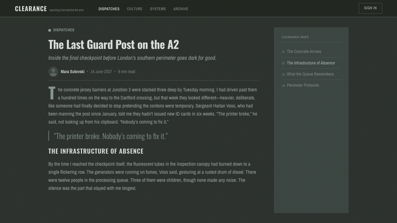
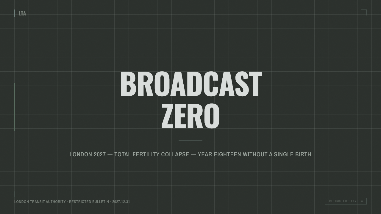
For presentation slides, the style is effective for cover pages and stark section dividers: a full-bleed dark soot-green or smoke-silver field with visible grain, condensed institutional type for the title, and minimal ornamentation communicates gravity immediately. Content slides should keep composition sparse and text left-aligned in the condensed grotesque, echoing signage rather than conventional slide design; avoid decorative charts or playful iconography, since anything that reads as polished or cheerful will clash badly with the palette's deliberate grimness. Data slides work best rendered starkly — plain bars or numerals in smoke-silver against the dark ground, styled like an official report rather than a marketing dashboard.
For web interfaces, this system is a strong fit for crisis-reporting platforms, documentary or investigative-journalism sites, and speculative-fiction or alternate-history projects, where the cold, institutional register reinforces the subject matter. It is a poor fit for consumer dashboards, e-commerce, or anything that needs to feel inviting, fast, or optimistic — the desaturated grimness actively works against conversion-oriented or cheerful product experiences, so it should be reserved for contexts where that seriousness is the point rather than a side effect.
For editorial and marketing work, the style is well suited to long-form journalism, documentary trailers and landing pages, and any campaign built around social commentary or near-future speculation. Pull-quotes and section breaks benefit from the condensed institutional type treatment and stenciled-number motifs used sparingly as structural markers, echoing checkpoint signage without becoming literal illustration of it.
A common mistake is treating this as generic 'gritty' or 'grungy' styling — adding random scratches, heavy vignettes, or aggressive contrast without the specific desaturated cyan-gray-green discipline that defines the source material. The style's power comes from restraint and flatness, not maximalist distress texture; overdoing the grain or pushing contrast too hard tips it into generic horror-movie styling rather than the quiet, bureaucratic dread the source material actually conveys.
Children of Men — FAQ
Does this style require literal science-fiction subject matter to work?
No. The film's central visual move was extrapolating dystopia from a barely-altered present rather than inventing new technology, which is exactly why this system works well for real-world serious subject matter — crisis journalism, documentary work, social commentary — and not only for speculative fiction. The style communicates institutional gravity and quiet collapse; it does not require spaceships or futuristic props to read correctly.
Why does the style avoid bright accent colors even for calls to action?
Because a bright, saturated accent color would directly contradict the desaturation that is the palette's defining logic — it would read as a design system borrowing the film's grimness as a surface trend rather than actually understanding it. If a call to action is needed, it should still sit within the muted, institutional register — perhaps a slightly warmer or higher-contrast neutral — rather than introducing conventional bright UI color.
How does this differ from a generic post-apocalyptic or 'war-torn' aesthetic?
Generic post-apocalyptic styling tends toward maximalist destruction — rubble, fire, dramatic ruin. This system is specifically about bureaucratic and infrastructural decay: a society that still processes paperwork, still posts official signage, still runs buses, even as it quietly loses its future. The restraint is the point — decay here is administrative and slow rather than explosive, which is what separates it from war-movie or wasteland visual tropes.
Can this style be applied without feeling too dark or off-putting for a commercial brand?
For most consumer-facing commercial contexts, this style is a poor fit by design — it is intentionally cold and unglamorous, not a flexible neutral theme. It works best confined to specific storytelling moments (a documentary trailer, a crisis-awareness campaign, a speculative-fiction project) rather than applied as a brand's everyday visual identity. Using it broadly for routine commercial UI will likely read as needlessly bleak rather than intentional.
Where does the checkpoint and cage iconography come from, and is it meant to be taken literally?
It comes directly from the film's production design, which depicted refugee processing and state control through literal cages, barriers, and stenciled signage set against recognizable London locations. In design application, these motifs should generally function structurally — as framing lines, dividers, or label systems — rather than being reproduced as literal illustrations of cages or checkpoints, which would tip the style toward heavy-handed literalism rather than atmospheric suggestion.
Related design styles
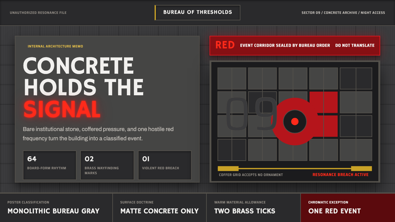 Control — Oldest HouseConcrete becomes menace. Brutalist gray grids are cut by one violent red sign…
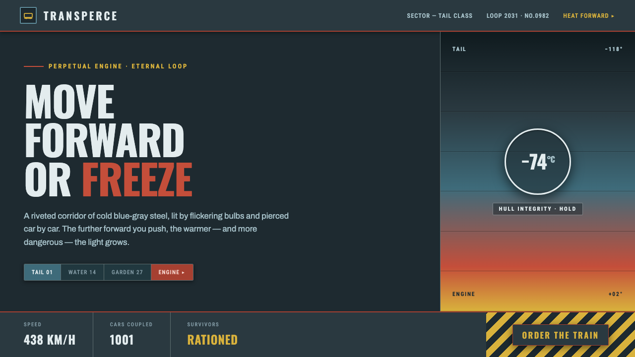 SnowpiercerMove forward or freeze. Cold blue-gray steel pierced by front-car red, conden…
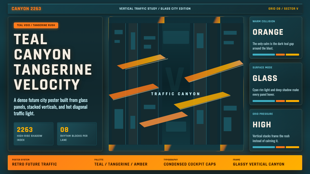 The Fifth ElementTangerine collides with teal. Vertical canyon grid, glass panels, diagonal tr…
 Daft Punk Discovery (Gold-Helmet)Warm sci-fi disco. Gold serif caps orbit a magenta void with chrome-disc geom…
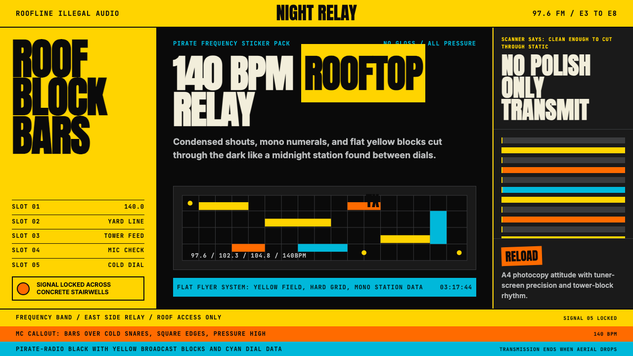 Grime London Pirate Radio (2003)Pirate signal, flat and urgent. Yellow blocks, mono FM numerals, hard flyer g…
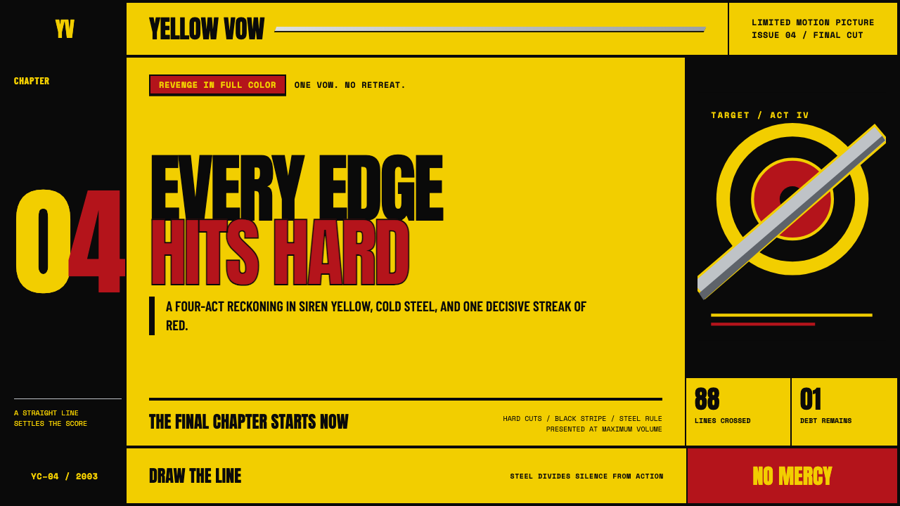 Kill Bill (2003)Revenge lands at full volume. Chrome yellow, slab type, and steel rules cut t…