What is BIG Bjarke Ingels?
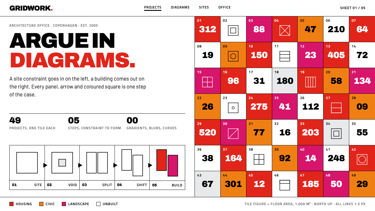
BIG's style is architecture argued on white paper: a uniform black line, flat red-orange-magenta tiles packed edge to edge, and comic-panel strips in which every arrow advances the argument.
BIG Bjarke Ingels in brief
BIG Bjarke Ingels is a graphic style drawn from the public face of the Copenhagen-founded architecture practice BIG, established in 2005. Its starting point is a white sheet. On that sheet sit black axonometric line drawings, all in one uniform line weight, and a periodic-table-like grid of square project pictograms in red, orange and magenta, packed edge to edge. A finished building, a sketch model and a construction site each receive a tile of the same size, so the grid treats every stage of a project as an equal.
The style keeps that sheet intact. The ground is pure white, line and type are pure black, and colour appears only as flat fill, with no gradients, no lighting and no shadows. Headings and annotations share a single squarish sans-serif, so the words read as part of the drawing rather than as captions underneath it. Layouts run in equal-width panels, in the manner of a comic.
Underneath the look is a rule about purpose: every arrow, panel and transformation strip must carry a step of the argument. A diagram is not decoration; it is the sentence. That makes the style unusually good at explanation, at showing how something changes from A to B or why a form follows a constraint, and unusually unforgiving of ornament, because anything that does not advance the reasoning has no place on the sheet.

Where does BIG Bjarke Ingels come from?
BIG was founded in Copenhagen in 2005, and the background material lists Bjarke Ingels, Julien De Smedt, Sheela Maini Søgaard and Kai-Uwe Bergmann as key figures. The practice also operates studios in New York, London and Barcelona. The graphic language recorded here is that of its original pictogram website, which was retired in 2023 when the practice relaunched under the name BIG LEAP. This style therefore preserves a specific, now historical look and not the practice's current site.
A pivotal moment for the look came with Yes is More, dated 2009 to 2010. The source material describes it as a roughly four-hundred-page black-and-white architectural comic, and the rules of this style trace back to it: equal-size panels advancing step by step, drawing and word treated as a single medium, and a refusal to dress the page in colour that does not mean something. The book turned a portfolio into a narrated sequence, and the website's tile grid applied the same idea to a whole body of work.
Three currents are named in the background notes. Pragmatic utopianism and hedonistic sustainability are the outlook: the belief that ambitious, even playful buildings can also be practical and environmentally responsible, without asking people to give up pleasure. Diagram-as-argument architecture is the method, in which a diagram is not a summary produced after the design but the means by which the design is justified. The architectural comic is the format that carries both, borrowing the rhythm of panels to show a project evolving from problem to proposal.
The tile grid is the most distinctive image to come out of these ideas. Like a periodic table, it implies that projects belong to a family with shared properties; like falling blocks in a puzzle game, it implies a playful, modular way of building. Red, orange and magenta give the grid a warm, high-energy field against the white page, while the black line keeps the architecture itself unmistakably serious. Together they express a combination of tones, playful in presentation and rigorous in reasoning.
What defines the BIG Bjarke Ingels look?
The White Sheet
The ground is pure white paper with no tint, texture or border. It is the drawing board of the system: all information is placed on it rather than inside containers. White also lets the flat colour tiles carry maximum chroma, because there is no competing background hue.
Uniform Black Line
Drawings and type share one pure black and, for linework, one uniform line weight. A building outline, a dimension arrow and a letter stroke all belong to the same graphic family. Uniform weight removes the emphasis hierarchy that thick and thin lines usually create, so emphasis has to come from arrangement and from what is drawn.
Axonometric Drawing
Buildings are drawn axonometrically, as three-dimensional forms seen from an angle without perspective convergence, so parallel edges stay parallel. This preserves true proportions and makes the drawing explanatory rather than atmospheric: you can read how a roof turns into a slope or how a volume is cut, as in a technical illustration, but with a cartoonist's clarity.
Flat Pictogram Tiles
Red, orange and magenta squares tile the project grid with no gaps. They are flat fills, with no gradient, no gloss and no outline, so each tile is a pure colour field carrying a pictogram. Equal tile size equalises everything: a built landmark, a sketch model and a muddy construction site get the same visual weight, which expresses an attitude to process as well as to results.
One Squarish Sans
Headings and annotation use a single squarish sans-serif. Its blocky proportions echo the square tiles and the orthogonal geometry of the drawings, so the type looks drafted rather than typeset. Using one family for both display and label text folds words into the drawing, in the way annotations belong to a technical sheet.
Comic Panels and Transformation Strips
Pages are divided into equal-width panels that advance like a comic strip. A transformation strip shows a form changing over several steps, a block, then a cut, then a slope. The reader's eye moves in a controlled order, and each panel earns its place by adding information to the one before.
No Lighting at All
There are no gradients, no light sources, no cast shadows and no soft effects. Depth comes from the geometry of the drawing, not from simulated light. The refusal keeps every element in the same flat register as the paper and makes the sheet feel like a diagram that could be printed in any medium.

Who shaped BIG Bjarke Ingels?
Bjarke Ingels is the first of four key figures named in the background material, and the style carries his name alongside the practice's. The movements listed for the style, pragmatic utopianism, hedonistic sustainability, diagram-as-argument architecture and the architectural comic, together describe the public method associated with the practice. The material does not detail individual roles, so the name is best read as the face of that method.
Julien De Smedt is named second among the key figures tied to the practice's 2005 beginning in Copenhagen. Having more than one name attached to the origin is a reminder that the graphic language belongs to a studio culture. The shared squarish sans, the common line weight and the uniform tiles are the sort of rules a team can hold in common and apply across many projects.
Sheela Maini Søgaard is the third name in the list. Her presence, with the others, ties the style to a named group rather than to an anonymous template. The practice's studios in New York, London and Barcelona mean a drawing system like this has to be portable: a uniform line and flat colour travel across offices and media far more easily than a hand-crafted look.
Kai-Uwe Bergmann completes the group of four. Read together, the four names set the style's limits in time as well as place: the founding in Copenhagen in 2005, the comic book of 2009 to 2010, and the retirement of the original pictogram site in 2023. The look is best understood as a defined chapter of the practice's public life, with a beginning and an end.
How do you use BIG Bjarke Ingels today?
Use the BIG style when an idea needs to be explained rather than merely shown: a process, a transformation, a before-and-after, a rationale. It turns reasoning into layout, so it fits any subject where 'because' matters.
For slides, a cover is a white sheet with a single black line drawing and one tile, or a short run of tiles, in red, orange or magenta. Content slides should be built from equal-width panels, three or four across, reading left to right as steps, each carrying one drawing and one annotation line. For data, replace conventional charts with diagrammatic marks: bars drawn as flat coloured tiles, flows drawn as arrows. A project overview slide can be a pictogram grid in which each square stands for one item.
For web interfaces, the style suits portfolio sites, project indexes, documentation and onboarding flows. A project index becomes a tile grid of flat colour squares, with no hover decoration beyond a change in line or fill. Dashboards should be white sheets with black line charts and flat colour tiles for status. Pricing pages can lay plans out as comic panels, with differences marked by arrows and annotations. Navigation is type only, in the squarish sans, with no icons beyond pictograms.
In editorial and marketing work, tell the story as a sequence: problem, constraint, move, result. A case study built as a transformation strip is easier to follow than prose, and a poster built as one large diagram with labelled arrows holds its own without photography. Photography, if used, should be treated as another tile in the grid, not as a hero image that overrides the page.
The most frequent mistake is to adopt the tiles while forgetting the argument. A pretty grid of coloured squares with no steps, no arrows and no sequence is a pattern, not a BIG-style sheet. Others include adding shadows or gradients to the tiles, varying line weights for drama, mixing in a second typeface, or colouring the page ground. The sheet stays white, the colour stays flat and the line stays one weight.

BIG Bjarke Ingels — FAQ
What is an axonometric drawing, and why does it matter here?
An axonometric drawing shows a three-dimensional form from an angle without perspective convergence, so parallel edges stay parallel and proportions stay true. BIG's public drawings use it in a uniform black line, which makes buildings legible as diagrams: you can see how volumes stack, cut and slope. In the style it signals explanation rather than atmosphere.
Why does the project grid resemble a periodic table?
Both are grids of equal squares that invite comparison across a family of members. The source material compares the tiles to the periodic table and to falling blocks in a puzzle game. The first suggests a systematic catalogue of projects, the second a playful, modular way of building. In the grid a completed building, a sketch model and a construction site get the same tile size, so none outranks the others.
Is this the current BIG website look?
No. The source material notes that the original pictogram site was retired in 2023 with the BIG LEAP relaunch. This style records that earlier look: white sheet, black line, flat tiles. It is worth using as a graphic language in its own right, but it should not be mistaken for the practice's current web presence.
Can I use colours beyond red, orange and magenta?
The tile family is intentionally warm and narrow, and its power comes from the contrast between those three flat colours and the pure black line on white. Adding more hues weakens the periodic-table effect. If you need extra distinctions, vary the pictogram, the position in the grid or the annotation before introducing a new colour.
How does the style treat photography?
Photography enters as another tile or panel rather than as a full-bleed hero. The source material says built work, sketch models and construction-site pictures are given equal weight on the grid, so a site photograph is as valid an image as a finished building. Keep photographs inside the panel structure and leave the page ground white.
Related design styles
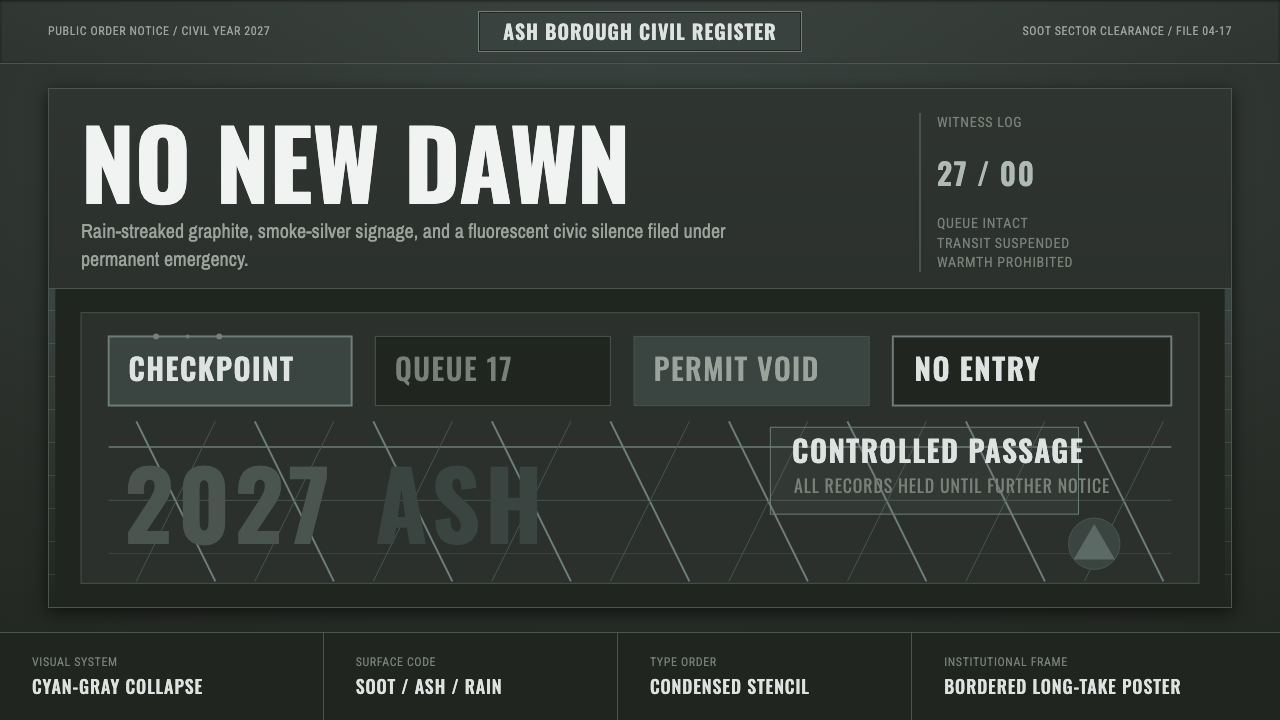 Children of MenHope drains out. Soot-green fields, smoke-silver type, and checkpoint rules h…
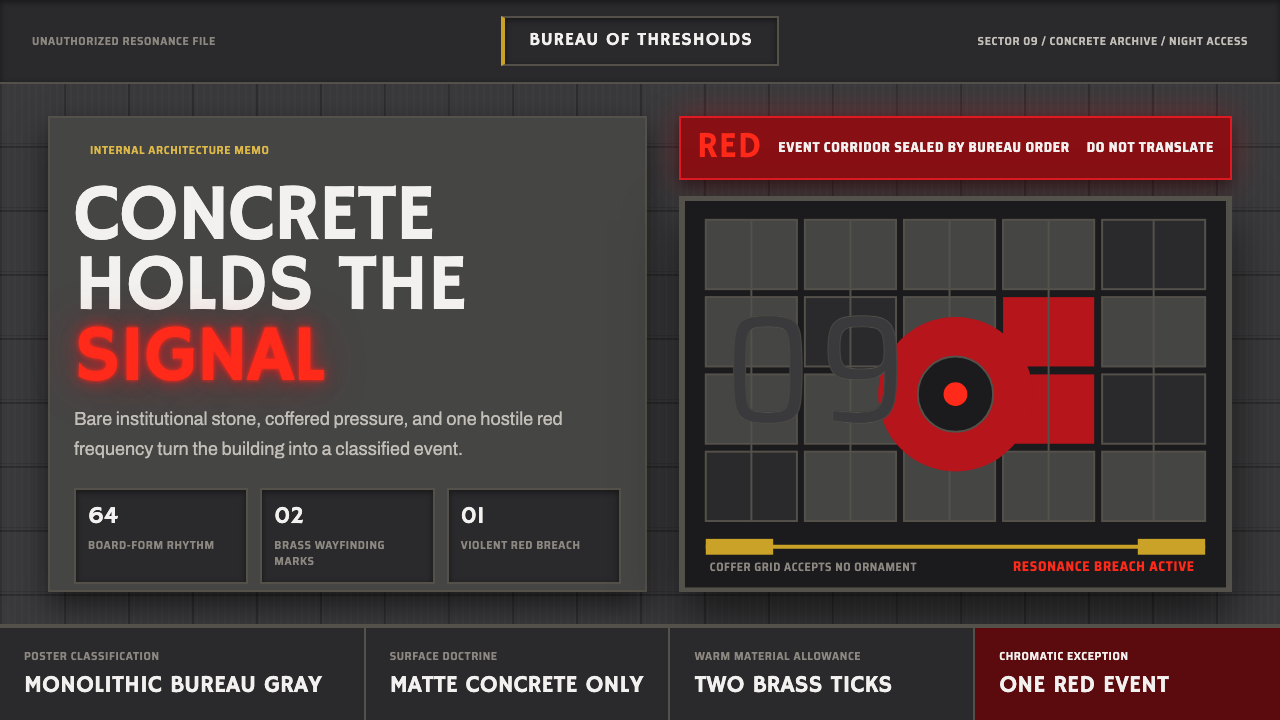 Control — Oldest HouseConcrete becomes menace. Brutalist gray grids are cut by one violent red sign…
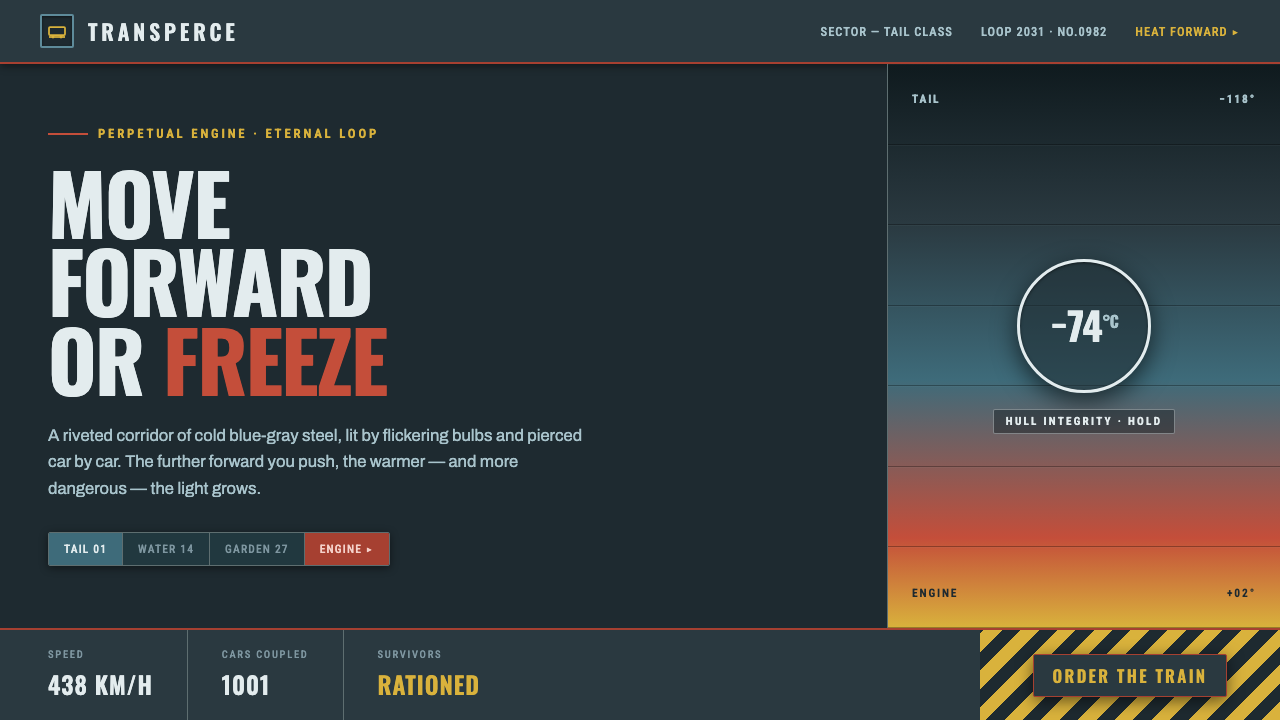 SnowpiercerMove forward or freeze. Cold blue-gray steel pierced by front-car red, conden…
 Airport Wayfinding GeometricLegibility becomes command. Signal yellow, black sans, and green route bands…
 Algae Bioreactor FacadeThe wall is alive and working. Chartreuse-to-olive panels make every process…
 Calatrava White RibsArchitecture becomes blueprint. Bone-white ribs cut through deep Valencian sk…