What is The Fifth Element?
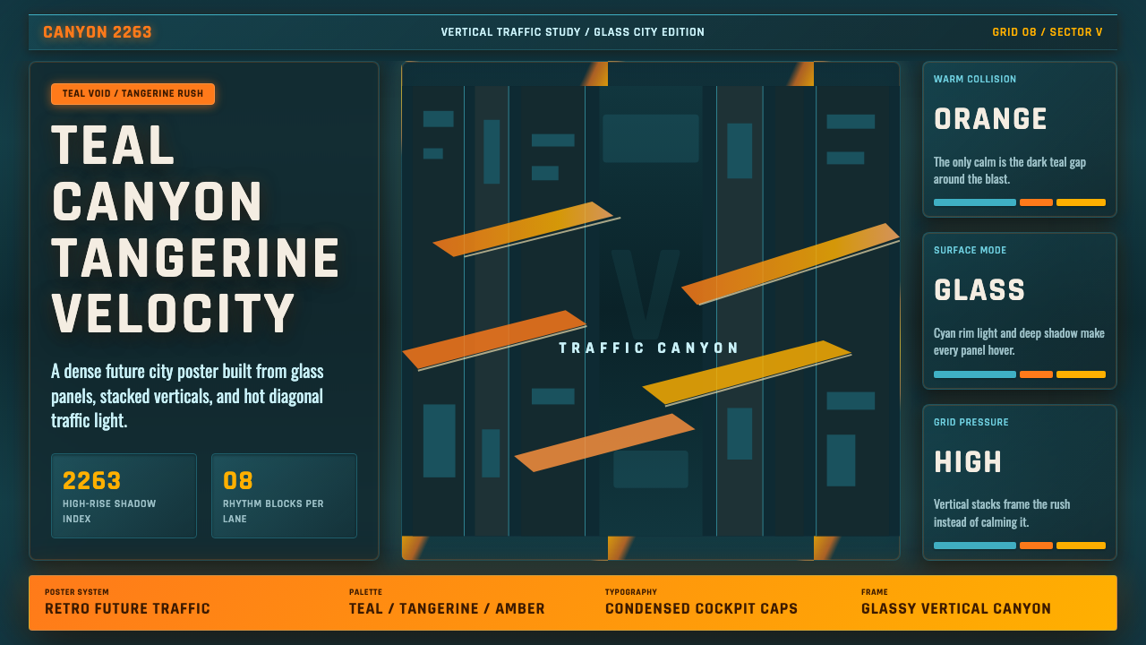
The Fifth Element turns the future into a vertical collision — tangerine speed cutting through teal shadow, glassy interfaces glowing inside an impossibly crowded city canyon.
The Fifth Element in brief
The Fifth Element is a dark retro-futurist style derived from Luc Besson's 1997 vision of New York in 2263, with concept design associated with comic artist Jean “Moebius” Giraud and costumes by Jean Paul Gaultier. Its defining environment is not an open skyline but a vertical traffic canyon: immense buildings frame a deep teal-blue void while warm-colored flying vehicles cross the gap as compact flashes of speed.
The visual system is organized around collision. Tangerine and electric orange strike against cool teal darkness; rigid vertical structures meet diagonal traffic streaks; translucent panels float over dense architectural layers. Warm color behaves like an event rather than a background. It identifies motion, urgency, and human activity inside a city otherwise dominated by shadow, glass, and monumental depth.
Unlike cleaner visions of technological modernity, this world is maximal and visibly accumulated. Information, architecture, transport, fashion, and light occupy the frame simultaneously. Its future feels retro-chic because advanced systems are presented through the graphic instincts of 1990s French science fiction: theatrical contrast, comic-book spatial drama, and a willingness to let elegance coexist with visual noise.
Where does The Fifth Element come from?
The style begins with a double time frame: The Fifth Element was made in 1997 but imagines New York in 2263. That distance allowed the production to invent an advanced metropolis while preserving the visual attitudes of its own decade. The result is neither a neutral forecast nor a purely nostalgic revival. It is 1990s retro-futurism projecting itself forward, carrying contemporary ideas about glamour, density, speed, and spectacle into an exaggerated urban future.
Its regional and artistic context is Western European, specifically a French production shaped by the tradition of French science-fiction bande dessinée. That tradition supports the film's preference for audacious silhouettes, deep illustrated spaces, crowded machinery, and environments that can be read almost like enormous comic panels. Jean “Moebius” Giraud and Jean-Claude Mézières connect the project to that visual culture, while Luc Besson supplies the cinematic vision that turns drawn futurism into movement, light, and inhabited scale.
The vertical traffic canyon is the central organizing invention. Instead of arranging the city along a conventional ground plane, the image extends above and below the viewer. Buildings become canyon walls, shadow becomes measurable depth, and traffic travels laterally or diagonally through the void. This inversion changes the emotional meaning of the metropolis: height is ordinary, open space is dangerous, and a small vehicle can communicate the scale of an entire architectural field.
Jean Paul Gaultier's costume contribution extends the same principle of collision from the city to the body. Fashion belongs to the future without dissolving into anonymous technical uniforms; it remains conspicuous, styled, and performative. Architecture, transportation, and clothing therefore share a common attitude: advanced life is layered rather than purified. The future has not eliminated personality or excess. It has compressed them into a louder, faster, more theatrical environment.
What defines the The Fifth Element look?
Color Collision
The palette is built around a warm-cool confrontation. Tangerine, electric orange, and occasional yellow-silver vehicle accents flare against teal-blue shadow. The dark field should remain dominant so that warm color feels scarce, mobile, and consequential. Orange is most convincing when attached to traffic, warnings, active controls, or decisive information rather than spread evenly as decoration.
Vertical Canyon
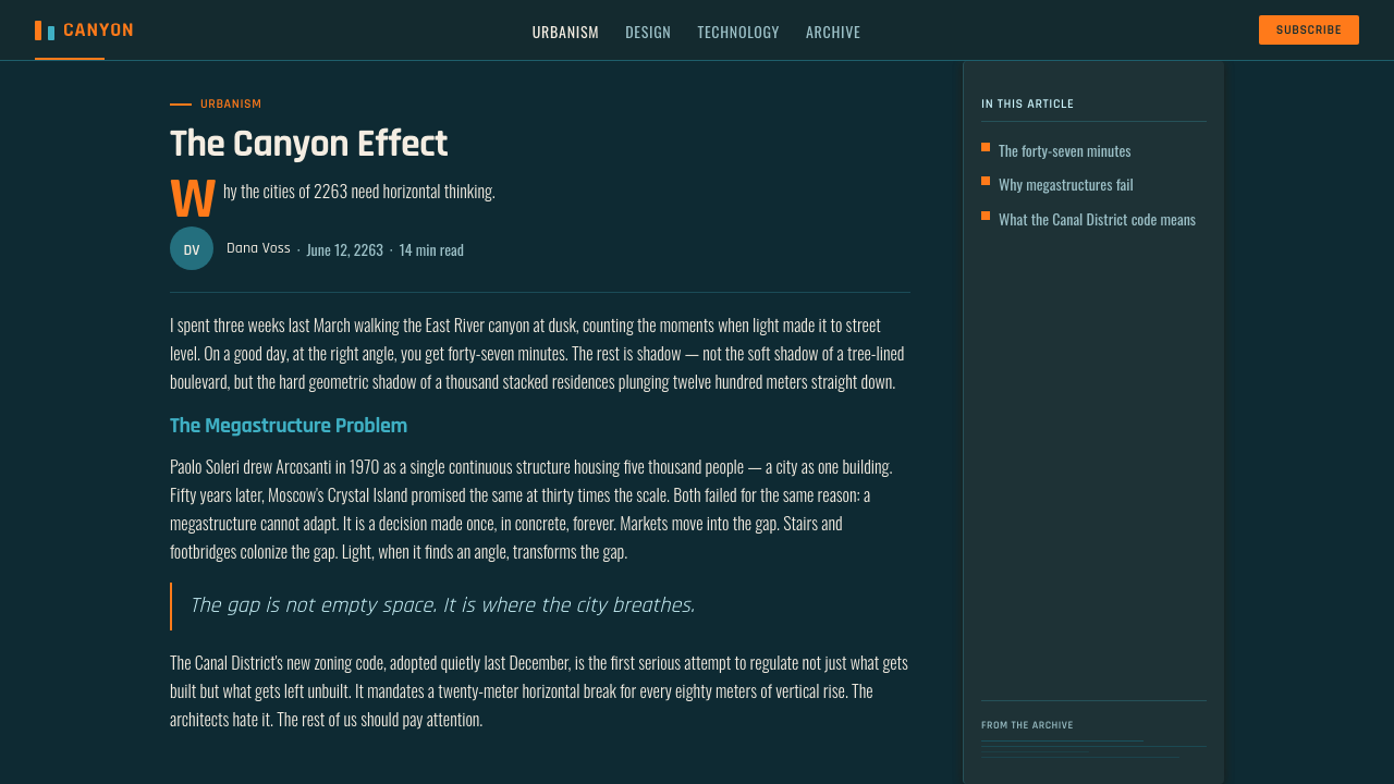
Strong vertical divisions define the spatial grammar. Tall columns, narrow gaps, stacked modules, and cropped structures imply architecture continuing beyond the frame. Horizontal organization still exists, but it behaves like bridges, traffic lanes, or suspended platforms crossing a much larger vertical system. The viewer should sense depth beneath the interface, not merely content arranged down a page.
Glass Panels
Interface surfaces appear translucent, edge-lit, and layered over darkness. Their purpose is not to create serene minimalism but to suggest information suspended inside a populated technological environment. Borders, luminous edges, and partial overlaps help separate layers while allowing the city-like field behind them to remain visible. Opaque blocks are reserved for information that must interrupt the visual traffic.
Diagonal Velocity
Diagonal streaks cut across the vertical grid like flying vehicles crossing between towers. They introduce urgency without requiring every object to appear tilted or unstable. A few concentrated trajectories are stronger than a field of random slashes: each should suggest an origin, a destination, and passage through depth. Motion is read as traffic with direction, not abstract visual excitement.
Maximal Layering
The style accepts density but requires depth hierarchy. Foreground controls, middle-distance panels, structural lines, distant architecture, and moving lights should remain distinguishable even when they overlap. Repetition creates metropolitan scale; contrast determines what can be acted upon. Successful compositions feel crowded with systems, not crowded with unrelated decoration.
Retro-Chic Futurism
Technology is theatrical rather than invisible. Glowing frames, conspicuous vehicles, dramatic color blocking, and fashion-conscious silhouettes give the future a designed personality. The look should not be polished into generic science fiction. Its charm depends on preserving the tension between advanced infrastructure and the bold visual taste of a 1997 production imagining a distant century.
Who shaped The Fifth Element?
Besson directed the 1997 vision of New York in 2263 and provides the work's unifying cinematic premise. Under that vision, the city is understood through movement and scale rather than static architectural display: vehicles cross immense gaps, light reveals depth, and human activity persists inside monumental infrastructure. His role anchors the style as a complete inhabited world rather than a collection of futuristic motifs.
Giraud, identified in the source material as the comic legend behind the design concept, links the film to French science-fiction bande dessinée. That connection is visible in the illustrated clarity of the city canyon, the audacity of its scale, and the coexistence of fine detail with immediately readable silhouettes. His presence helps explain why the future feels drawn, composed, and graphically intentional even when densely layered.
Mézières appears among the project's key figures and reinforces its relationship to French science-fiction comics. Within the style's history, that association matters because the city is conceived as a narrative environment: transportation, architecture, and technological clutter imply routines and stories rather than functioning as empty spectacle. The resulting visual language feels culturally rooted in bande dessinée instead of resembling placeless corporate futurism.
Gaultier designed the costumes, giving the inhabitants of 2263 a visual force equal to their surroundings. The clothing preserves glamour, eccentricity, and bodily presence inside a technologically saturated city. This contribution is essential to the style's retro-chic character: futurism is expressed not only through machines and interfaces but through conspicuous personal presentation, proving that advanced urban life can remain theatrical and fashion-conscious.
How do you use The Fifth Element today?
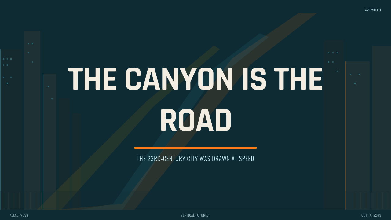
For presentation covers, begin with the canyon rather than a conventional centered title. Tall dark structures can frame a narrow field of teal depth, while a compact tangerine form or diagonal streak establishes movement. Place the title as if it were signage attached to the architecture or a luminous panel suspended between towers. The composition should feel like an entry into the city, with the warm accent leading the eye toward the subject.
Content slides need stricter control. Use vertical bands to establish reading zones, then float translucent panels at different apparent depths. Headings can behave like illuminated wayfinding while body text remains calm and highly legible. On data slides, bars, timelines, and routes can become traffic systems: cool structures hold the information, warm marks identify change or priority, and a limited number of diagonals connect related events without turning the chart into scenery.
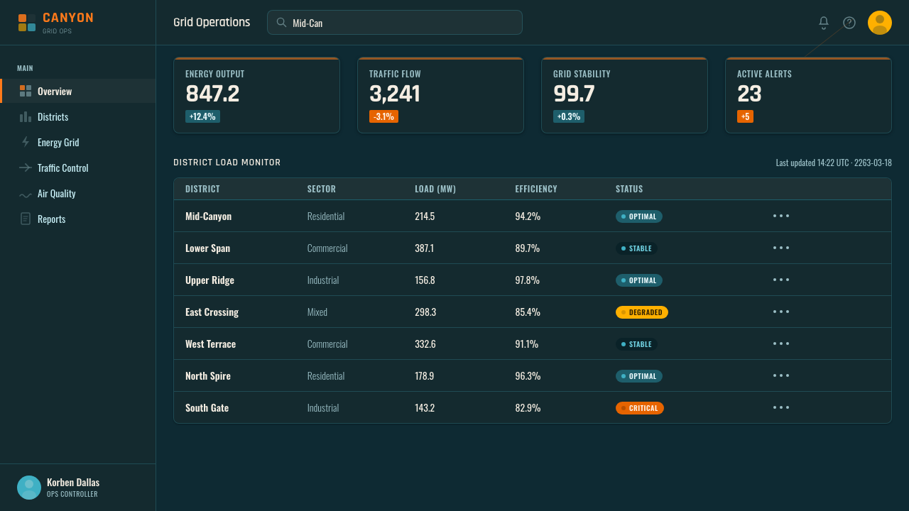
For web dashboards and pricing interfaces, treat navigation as stable architecture and live information as traffic. A dark teal field supports stacked glass-like modules, persistent vertical rails, and bright status accents. Pricing tiers can appear as adjacent towers rather than isolated cards, with the recommended option marked by a concentrated warm glow or a forward-moving streak. Density is appropriate, but primary actions must remain more prominent than atmospheric detail.
Editorial and marketing layouts benefit from the style's cinematic scale. Long-form pages can alternate deep vertical image fields with narrow explanatory panels, allowing pull quotations or campaign statements to cross the grid like suspended signs. Product launches can use vehicle-like streaks to carry attention from proposition to proof and then to action. The visual story should progress through layers of the city rather than repeating the same glass panel in every section.
The common mistake is confusing maximalism with unrestricted noise. Filling every gap with glowing lines, translucent boxes, orange accents, and arbitrary diagonals destroys the canyon effect because nothing remains distant and nothing appears to move. Preserve large regions of cool shadow, assign every warm element a functional role, and keep the strongest motion on a small number of trajectories. The style succeeds when density has traffic rules.
The Fifth Element — FAQ
Is The Fifth Element style simply cyberpunk?
It shares cyberpunk's dense city, darkness, illuminated technology, and overwhelming infrastructure, but the source material defines it more specifically through French science-fiction bande dessinée and 1990s retro-futurism. Its tangerine-teal collision, theatrical fashion, and comic-like vertical space create a more flamboyant and consciously stylish mood than a generic dark technological dystopia. Calling it cyberpunk alone removes much of its regional and visual specificity.
Why is the vertical traffic canyon so important?
It condenses the entire world into one spatial idea. The canyon communicates architectural scale, urban density, technological transport, darkness, danger, and speed at the same time. It also provides a reusable compositional system: vertical structures establish depth, small vehicles supply scale, and diagonal routes generate movement. Without that spatial logic, orange and teal alone become a superficial color scheme rather than The Fifth Element.
Can the style work in a light interface?
A light adaptation is possible, but it weakens the defining relationship between luminous traffic and shadowed depth. To retain the identity, a light interface still needs substantial cool structural fields, vertical framing, layered translucent surfaces, and warm accents used as moving or active signals. If the background becomes uniformly bright and the glass loses contrast, the result will read as general retro-futurism rather than this specific cinematic system.
How should typography behave in this style?
The source material does not prescribe a particular typeface, so typography should support the established spatial language rather than imitate an invented film prop. Clear, assertive lettering can function as signage on architectural planes, while compact supporting text belongs inside glass panels. Hierarchy should come from placement, contrast, scale, and illumination. Excessively decorative lettering competes with the already dense environment and makes navigation harder.
What distinguishes a convincing homage from a superficial imitation?
A superficial imitation combines a dark background, orange accents, and translucent cards. A convincing homage reconstructs the deeper system: monumental vertical depth, traffic moving across that depth, warm color assigned to active events, layered information with readable hierarchy, and a retro-chic tension between advanced technology and conspicuous style. The key test is spatial. If the composition feels like an inhabited city canyon before any decorative effects are added, the underlying logic is working.
Related design styles
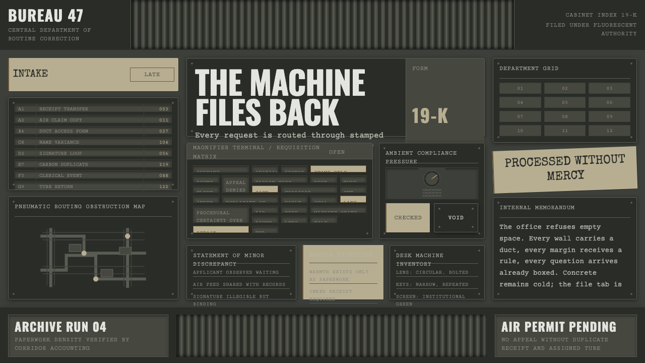 Brazil (1985)Bureaucracy turns hostile. Gray-green grids, duct bands, and manila stamps cr…
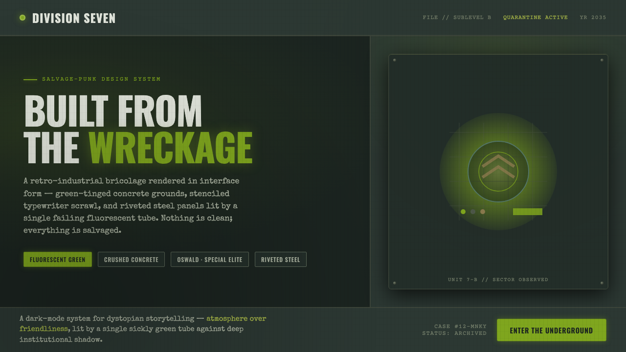 12 MonkeysBuilt from the wreckage. Sickly fluorescent green on crushed-black concrete,…
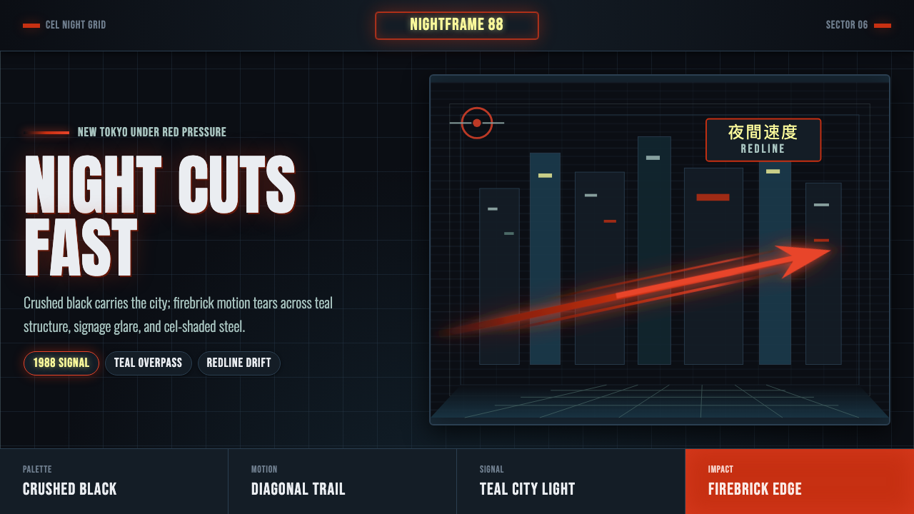 Akira Neo-TokyoNight moves fast. Firebrick trails cut crushed black, teal grids, and condens…
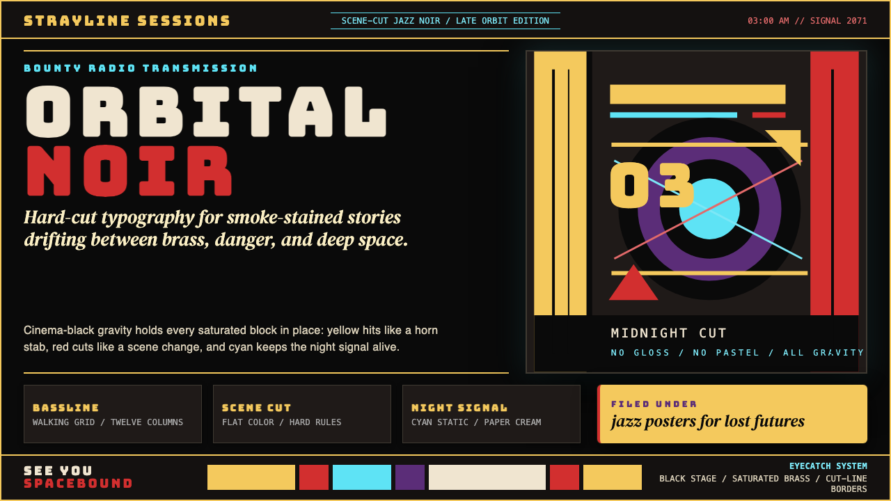 Cowboy Bebop Jazz-NoirCool at 3 AM. Bungee type, jazz yellow, red cuts, and cyan rules hit deep bla…
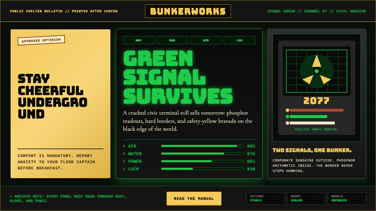 Fallout Vault-Tec Pip-BoyIrradiated optimism. Vault yellow and CRT green lock into a bordered bunker g…
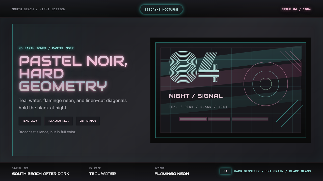 Miami Vice Pastel Teal (1984)Pastel noir, not nostalgia. Teal glow and flamingo pink slice black with geom…