What is 12 Monkeys?
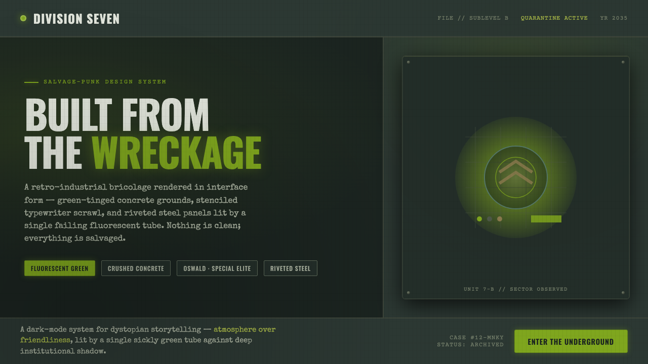
12 Monkeys turns a plague future into a damaged operating environment: fluorescent illness, crushed-black infrastructure, and information that looks recovered rather than designed.
12 Monkeys in brief
12 Monkeys is the visual world associated with Terry Gilliam’s 1995 plague-future film: an underground environment of jury-rigged pipework, plexiglass interrogation spheres, salvage junk, and oppressive darkness. Its future is neither sleek nor technologically triumphant. It feels assembled after the fact, with institutions surviving through repairs, scavenged components, and systems whose original purpose has been obscured by damage.
The style is defined by diseased fluorescent illumination against green-tinged concrete and blackened industrial surfaces. Muted yellow-green, institutional teal, grey-green steel, and sodium-vapor gold appear as contaminated pools of visibility rather than decorative color. Deep shadow is not empty background; it is the pressure surrounding every usable surface, making lit areas feel temporary, exposed, and slightly unsafe.
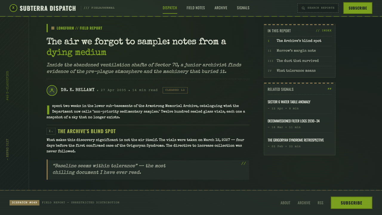
As an interface language, 12 Monkeys translates retro-industrial bricolage into worn panels, riveted boundaries, stencil-like typewriter marks, and light that decays into grime at the edges. It should feel improvised but not chaotic. Every scratch, seam, and stained margin implies a system kept alive by repeated intervention. Nothing is polished into neutrality; every element carries the residue of use.
Where does 12 Monkeys come from?
The style originates in 12 Monkeys, Terry Gilliam’s 1995 film, framed as a post-plague future in 2035. That framing matters because it establishes a world already shaped by catastrophe. The visual question is not how an ideal future would look, but how people would inhabit the remains of systems after disease, confinement, and institutional breakdown have reordered daily life.
Its regional production context is North America, with Philadelphia and Baltimore identified as shooting locations. Rather than presenting a distant, frictionless future, the film’s atmosphere remains physically tied to urban industrial material: concrete, steel, pipework, enclosed rooms, transparent barriers, and accumulated salvage. Familiar infrastructure becomes estranged when it is crowded, dimmed, and treated as something to be kept functioning under pressure.
The source places the work within 1990s dystopian science fiction, but its visual identity is especially shaped by Gilliam’s retro-industrial bricolage. Bricolage is the central operational idea: existing matter is recombined into a provisional whole. The result is not a clean industrial system with decorative distress added afterward. It is a world in which repair, reuse, and awkward assembly are the visual logic from the beginning.
Salvage-punk production design gives that logic its tactile character. Plexiglass, pipes, junk, panels, grime, and harsh fluorescent tubes coexist without being resolved into a unified finish. The style’s force comes from this contradiction: it is highly constructed, yet it makes construction itself feel desperate. A successful adaptation preserves that tension between institutional machinery and improvised survival.
What defines the 12 Monkeys look?
Contaminated Light
Fluorescent green is the style’s primary emotional instrument. It should read as harsh, clinical, and physically unhealthy, casting narrow zones of visibility through a larger field of darkness. Light is never ambient comfort; it is evidence of surveillance, interrogation, machinery, or emergency power.
Crushed-Black Ground
The background feels like black concrete, soot-darkened steel, or a room whose boundaries disappear beyond available light. It has weight and material presence, not the emptiness of a neutral dark interface. Shadow should compress the composition and make every illuminated object feel retrieved from a hostile space.
Salvaged Surfaces
Panels look reused, patched, riveted, stained, and imperfectly aligned. Texture is not a decorative overlay; it implies age, institutional neglect, and repeated repair. Edges may appear chipped or grimy, but the wear must support the sense that the system has a history of handling and survival.
Typewriter Evidence
Typography should resemble worn typewriter output, stenciled labeling, or bureaucratic graffiti. It belongs to files, warnings, case material, and improvised operational notes rather than polished branding. Unevenness and abrasion can be useful, but legibility remains essential: the type must feel recovered without becoming unreadable.
Institutional Teal and Steel
Teal and grey-green steel provide the system’s institutional temperature. They make the fluorescent green feel more toxic and help distinguish structural surfaces from active signals. Sodium-vapor gold can appear as exhausted warmth, but it should never turn the scene hospitable; it is a residue of failing infrastructure.
Improvised Containment
Plexiglass spheres, pipework, seams, and enclosed compartments create a language of containment. Layouts should feel partitioned by barriers, inspection windows, and technical boundaries. This is not open-plan futurism; it is a world where access is controlled, spaces are monitored, and every enclosure suggests both protection and confinement.
Who shaped 12 Monkeys?
Gilliam is identified as the filmmaker behind 12 Monkeys, and the source explicitly links the style to Gilliam retro-industrial bricolage. His importance here is the refusal of a seamless future: the image system is built from mismatched industrial matter, recovered junk, and oppressive environments that remain visibly assembled.
Roger Pratt is named among the work’s key figures. Within this style study, that attribution anchors the importance of photographic atmosphere: desaturated cyan-steel, bilious yellow-green, deep shadow, and fluorescent illumination operate together as a visual condition rather than as isolated color choices.
Jeffrey Beecroft is also named as a key figure. The style’s production-design vocabulary is inseparable from the source’s salvage-punk materials: jury-rigged pipes, plexiglass interrogation spheres, panel seams, junk, and surfaces whose roughness makes the future feel physically inhabited.
How do you use 12 Monkeys today?
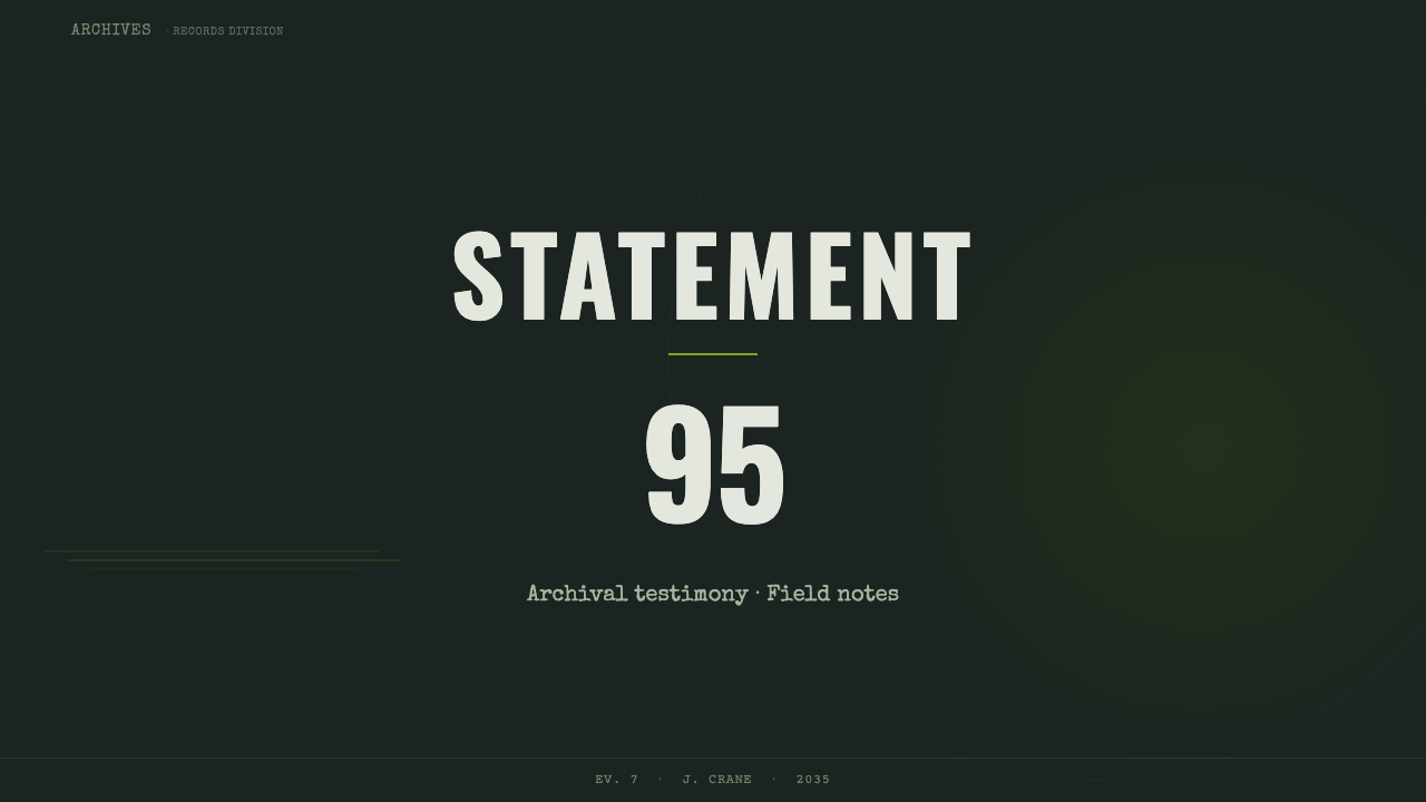
For presentation covers, use the style as an atmosphere of evidence and containment. Let a dark, green-tinged structural field carry a damaged panel, a fluorescent spill, or a transparent barrier motif, then place the title as if it were an operational label. Avoid making the cover merely neon. Its authority comes from darkness, material weight, and the sense that the title has been found inside a restricted facility.
Content slides should work like recovered case material. Use clear typewriter-like hierarchy, worn dividers, restrained annotation, and panel boundaries that separate evidence from commentary. Dense information is appropriate when it appears organized by institutional constraints rather than decorative cards. For data slides, charts should resemble monitored readings or archived diagnostics: muted structural tones carry the baseline, while fluorescent green is reserved for anomalous signals, critical changes, or the information that demands attention.
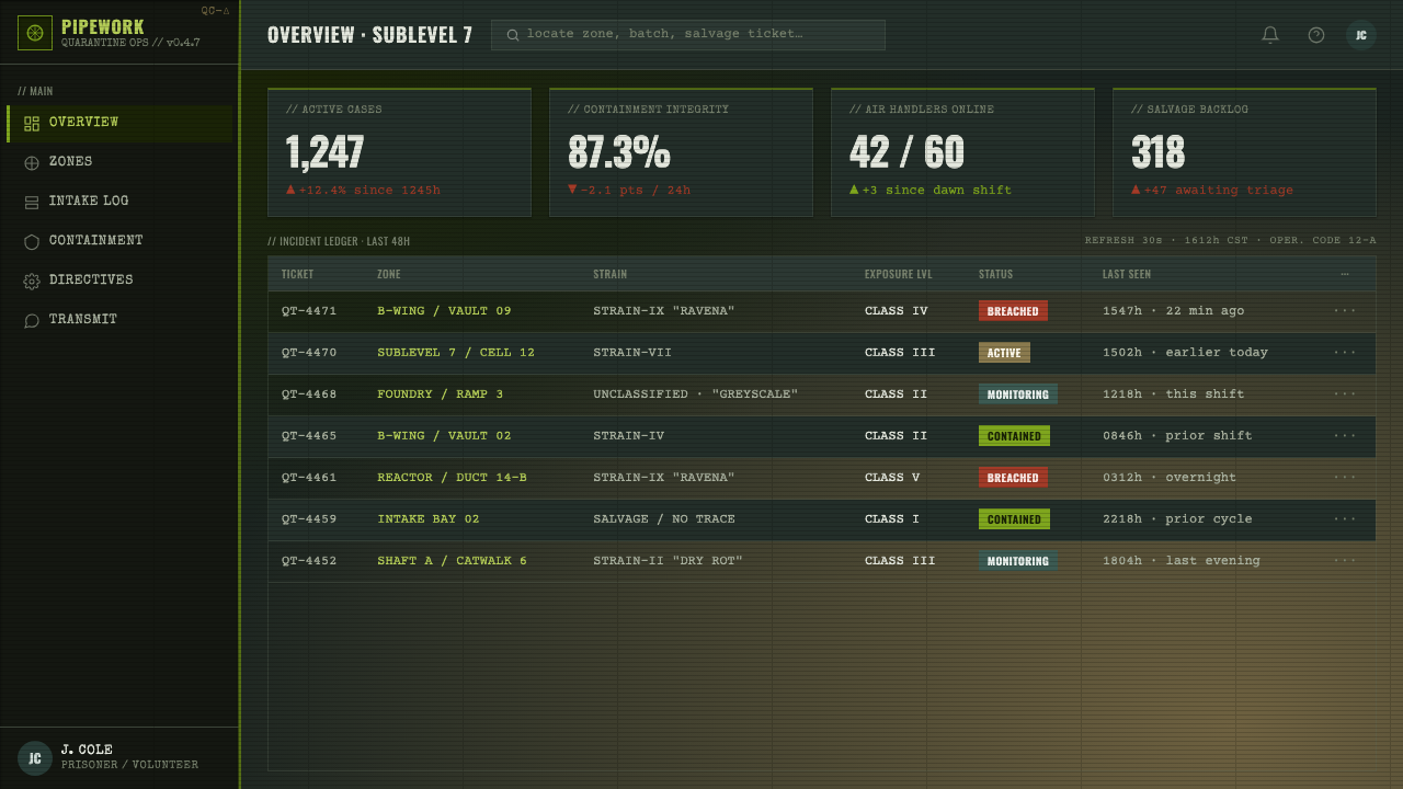
On the web, 12 Monkeys suits dashboards, monitoring tools, research interfaces, security-oriented products, and pricing pages that benefit from a severe operational tone. A dashboard can frame modules as salvaged equipment bays, with teal-steel structure and green alerts emerging from deep shadow. A pricing page should preserve legibility and trust: make tiers read as access levels or provisions, not as a theatrical disaster set.
For editorial and marketing work, the style is most effective when the subject already contains tension, systems failure, investigation, public health anxiety, industrial culture, or speculative technology. Use fluorescent illumination to direct attention through a field of grime, and use worn type to make pull quotes, metadata, and labels feel archival. Marketing should retain a disciplined information hierarchy; excessive noise turns the visual language into costume.
The common mistake is treating 12 Monkeys as a generic black-and-neon cyberpunk look. That loses its specific character. The style depends on desaturation, sickly rather than celebratory green, physical wear, institutional confinement, and visibly improvised construction. If every surface glows cleanly, every line is perfect, or every component looks premium, the result becomes futuristic nightlife instead of plague-era salvage.
12 Monkeys — FAQ
Is 12 Monkeys simply a cyberpunk style?
No. It overlaps with dystopian science fiction, darkness, industrial technology, and artificial light, but its defining logic is salvage rather than sleek augmentation. Cyberpunk often treats technology as dense, stylish, and commercially seductive. 12 Monkeys treats it as damaged infrastructure under institutional pressure. Its green light is sickly, its materials are worn, and its future looks repaired rather than upgraded.
Can the fluorescent green be used everywhere?
It should not be. The green works because it interrupts a larger system of black, concrete, steel, teal, and dirty gold. When it is everywhere, it becomes decorative and loses its alarming function. Use it as a contaminated source of attention: an alert, a tube light, a critical reading, an active boundary, or a trace of unstable energy.
How distressed should the interface feel?
Enough to suggest use, repair, and material history, but never enough to compromise comprehension. Distress belongs at seams, margins, panel surfaces, and secondary labels. Primary content, navigation, and essential controls must remain decisively readable. The goal is not simulated damage for its own sake; it is a credible feeling that the interface has survived real conditions.
Does this style work for consumer-facing marketing?
It can, provided the product benefits from severity, investigation, survival, or industrial credibility. It is strong for campaigns with a speculative, investigative, or high-stakes subject. It is less suitable when the product needs effortless warmth, luxury polish, or playful reassurance. The style asks audiences to enter a compromised system, which is a powerful invitation only when that tension serves the message.
What keeps a 12 Monkeys adaptation from becoming theatrical?
Keep the improvisation functional. Pipes, panels, stains, typography, transparent barriers, and fluorescent signals should each imply a role in communication, containment, or maintenance. Limit decorative clutter and preserve a clear hierarchy. The source world is strange, but its strangeness comes from believable systems pushed into decay, not from random visual eccentricity.
Related design styles
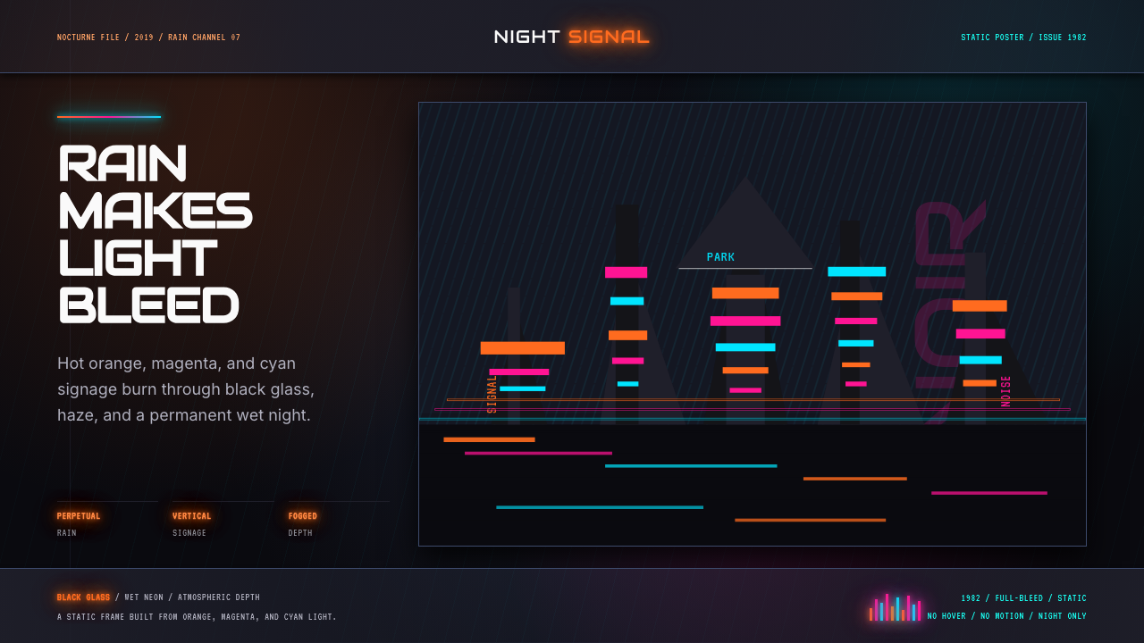 Blade Runner 1982 Neon NoirRain-soaked noir. Orange, magenta, and cyan neon cut black glass.
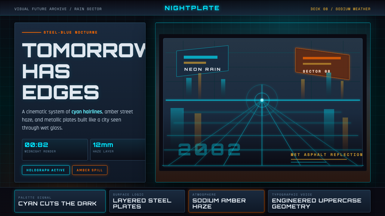 Retro-Futurism (Syd Mead)Tomorrow looks dangerous. Steel-blue night, neon cyan edges, and amber rain r…
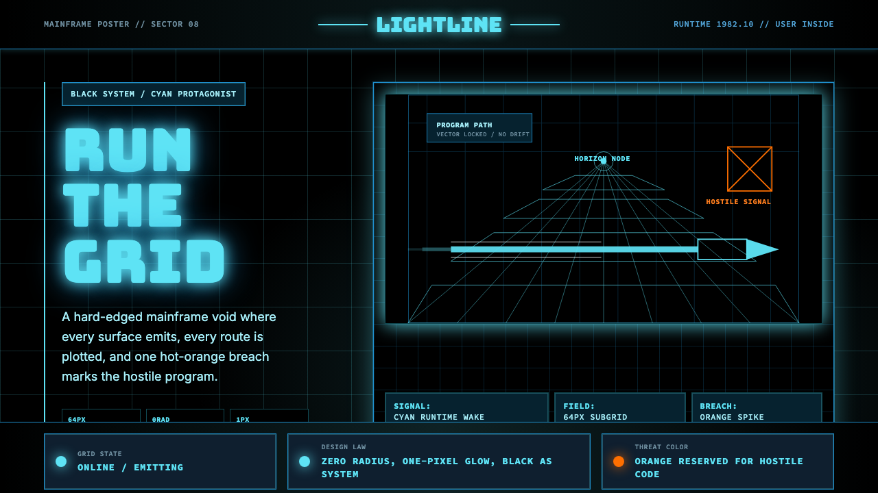 Tron Grid (1982)Cyber-precision in black. Neon cyan grids, Bungee type, and one orange breach…
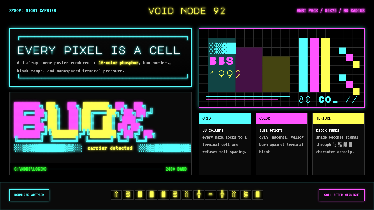 ASCII Art BBS (1992)Terminal art hits hard. Cyan-magenta-yellow glow, box borders, block ramps.
 Brazil (1985)Bureaucracy turns hostile. Gray-green grids, duct bands, and manila stamps cr…
 The Fifth ElementTangerine collides with teal. Vertical canyon grid, glass panels, diagonal tr…