What is Brazil (1985)?
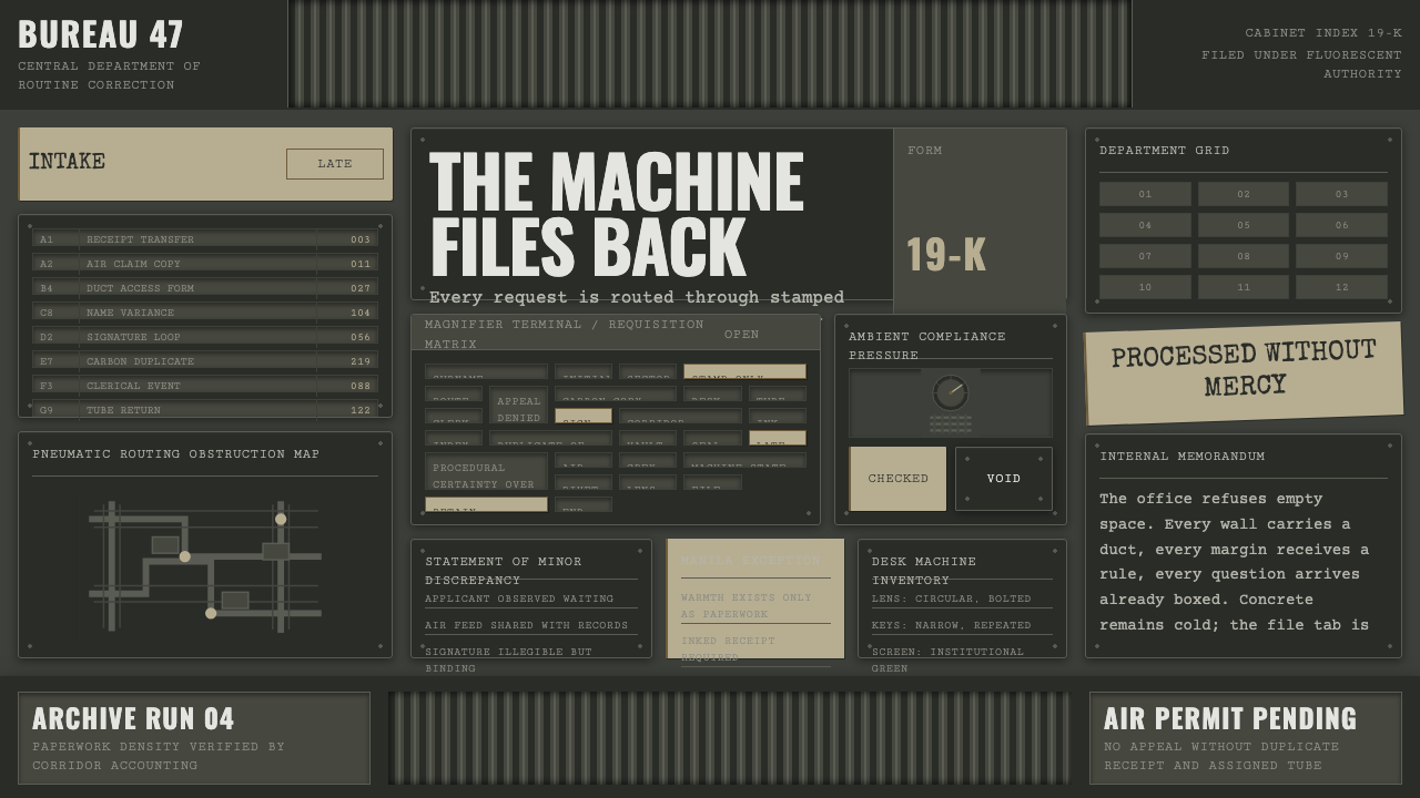
Brazil imagines bureaucracy as a design language — a drab gray-green machine-state where warmth survives only in yellowing paper, and every surface looks like it has been issued in triplicate.
Brazil (1985) in brief
This design system is drawn from Terry Gilliam's 1985 film Brazil, a dystopian satire that renders an all-powerful Ministry of Information not as sleek totalitarian menace but as drab, exhausting bureaucratic tedium. The visual world is dominated by gray-green surfaces, corrugated ductwork running along walls and ceilings like exposed circulatory systems, and the cold, even glare of fluorescent lighting — a palette built to feel institutional and airless rather than sinister in any glamorous sense.
The film imagines its future through a 1940s lens: typewriters wear bolted-on magnifying lenses in place of screens, messages travel through pneumatic tubes, and paperwork multiplies in stamped, carbon-copied triplicate. It is retro-futurism turned claustrophobic — technology that looks handmade and overbuilt rather than sleek, crammed into spaces never designed to hold it.
This system distills that mood into an interface language: sooty concrete and grimy painted metal for structure, a dense clutter of stamped forms and manila folders standing in for information architecture, and warmth rationed out only through aged paper tones — never through the air, the walls, or the light itself, which stay a cold, drained gray-green throughout.
Nothing in the language is meant to be admired. Where a conventional luxury or futuristic style asks the eye to linger on a polished surface, this one insists that every surface is simply doing its job, badly, and has been doing it for a very long time. That deliberate lack of glamour is the point: the design communicates a state so consumed by its own procedure that it never had time or budget left over for anything resembling beauty.
Where does Brazil (1985) come from?
Brazil was directed by Terry Gilliam, the American-born, British-based filmmaker best known as the animator and occasional live-action performer for Monty Python, and released in 1985 as one of his first major solo directorial statements. The film sits in the tradition of dystopian satire running from Orwell's Nineteen Eighty-Four through Fritz Lang's Metropolis, but distinguishes itself by choosing absurdist bureaucratic tedium over sleek totalitarian spectacle as its central horror.
The film is set, in its own famous opening title, 'somewhere in the 20th century' — a deliberately unmoored, anachronistic timeframe that lets its production design borrow visual cues from the 1930s and 1940s (art deco silhouettes, chunky mechanical typewriters, industrial ductwork) and warp them through a satirical, dystopian lens rather than pinning the story to any real decade. That anachronism is central to the design system's identity: it reads as old and new, functional and absurd, at the same time.
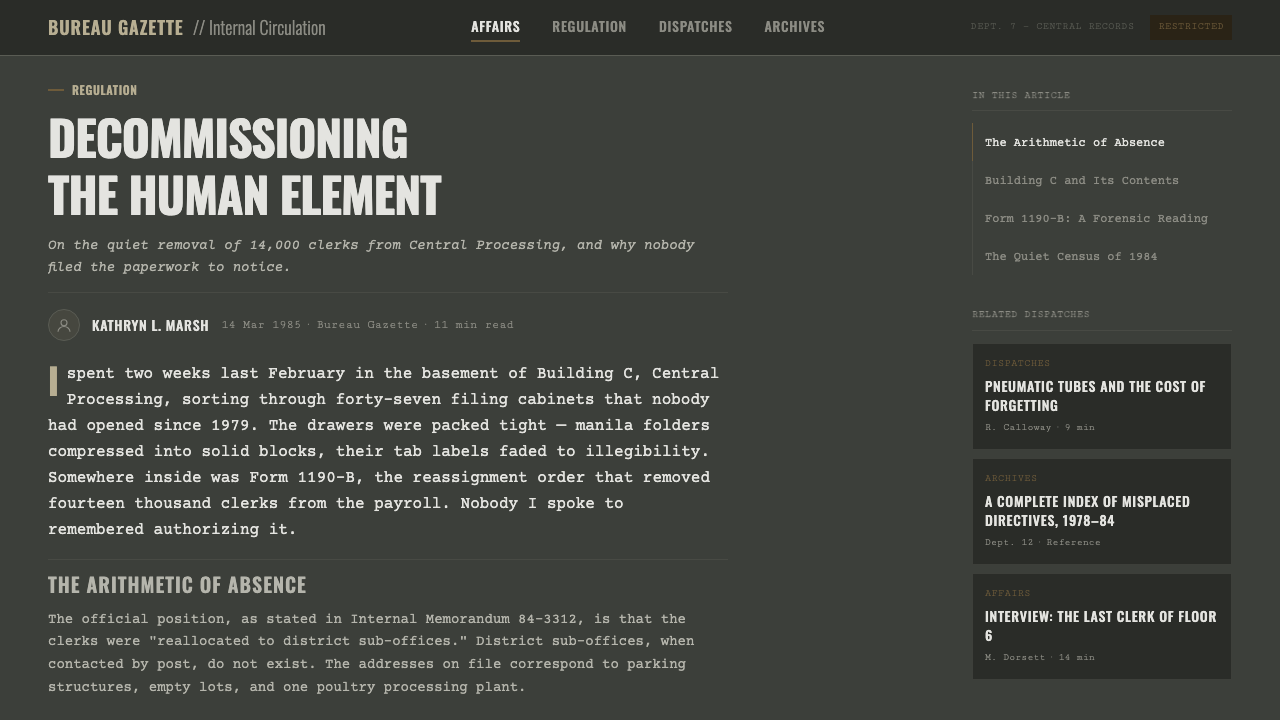
Brazil was a British production made largely at Pinewood Studios in England, with production design credited to Norman Garwood, whose sets translated Gilliam's vision of a state literally clogged by its own infrastructure — ducts threading through offices, forms stacked past the point of function — into physically built, load-bearing spaces rather than matte-painted backdrops. The physicality of that design, built rather than illustrated, is a large part of why the aesthetic reads as oppressively real rather than cartoonish.
The film's reputation has grown considerably since its contested 1985 release — Universal Pictures initially resisted Gilliam's cut and the film became known for the dispute over its ending — and it is now regarded as one of the defining works of dystopian satire, cited alongside Metropolis and Nineteen Eighty-Four as visual shorthand for bureaucracy rendered as oppressive architecture.
Part of what has kept the film's visual language alive for design purposes is how legible its central metaphor remains outside the plot itself: ductwork standing in for infrastructure nobody chose to hide well, forms standing in for a process that exists mainly to perpetuate itself, and fluorescent light standing in for an institution with nothing to illuminate but its own paperwork. Even stripped of story, the imagery still reads instantly as 'bureaucracy' to anyone who encounters it.
What defines the Brazil (1985) look?
Institutional Palette
The base palette stays within a narrow, drained range of gray and gray-green — the color of unpainted concrete, old metal, and fluorescent-lit air. Warmth is not banned outright but rationed: it appears only in the yellowed tone of aged paper and manila stock, never spreading into the walls, the light, or the structure itself.
Grimy Machinery
Surfaces read as worn and functional rather than pristine — painted metal shows wear at the edges, concrete carries a sooty film, and every material looks like it has been in continuous, unglamorous service for decades. Nothing looks new; nothing looks designed to be looked at.
Bureaucratic Density
Composition favors crowded, functional clutter over open negative space — stamped forms, filed documents, and duct runs crowd into every available surface, mimicking a system so overbuilt with process that no space is left empty. This density is deliberate disorder, not decorative richness.
Duct and Pipe Motif
Corrugated ductwork and exposed pipework function as a recurring structural motif, threading across surfaces the way circuitry might in a more conventional dystopian style — except rendered as clumsy, oversized, and visibly retrofitted rather than sleek and integrated.
Cold Fluorescent Flatness
Light is even, cold, and shadowless in the way overhead fluorescent tubes render a room — no warm pooling, no dramatic falloff, just a flat institutional glare that drains color rather than sculpting it. Where shadow does appear, it is hard-edged and mechanical, cast by ductwork or furniture rather than atmosphere.
Stamped Officialdom
Information is presented with the visual weight of official paperwork — stamps, seals, carbon-copy repetition, and forms that feel filled out rather than composed. This gives the system a distinctive information texture: dense, procedural, and faintly absurd in its excess of formality.
Who shaped Brazil (1985)?
Gilliam directed and co-wrote Brazil, shaping its vision of dystopia as absurdist bureaucratic tedium rather than sleek totalitarian spectacle. His famous dispute with Universal Pictures over the film's ending — he took out a full-page trade advertisement demanding its release — became part of the film's legend and underscored how deliberately uncompromising its dark satirical tone was meant to be.
Garwood served as production designer, translating Gilliam's imagined bureaucratic machine-state into physically built sets — ductwork, offices, and machinery constructed as real, load-bearing environments rather than painted backdrops. That physical solidity is a major reason the film's world feels oppressively tangible rather than merely illustrated.
Brazil was made as a British production largely on soundstages at Pinewood Studios, one of the historic centers of British filmmaking. Working within a studio system rather than on location allowed the design team to physically construct the ductwork-choked office spaces that give the film's world its claustrophobic, load-bearing density.
Brazil belongs to a design lineage that imagines the future through the technology and forms of an earlier decade, then curdles that nostalgia into satire. Rather than showing a future built from clean, advanced materials, it shows one built from overbuilt, jury-rigged 1940s-style machinery — a choice that makes its bureaucracy feel handmade, tired, and inescapably human rather than abstractly futuristic.
How do you use Brazil (1985) today?
Brazil's design language communicates institutional absurdity and oppressive process, which makes it powerful for narratives about bureaucracy, red tape, satire, or dystopian tone — and a poor fit anywhere a product needs to feel warm, fast, or effortless. Its central discipline is restraint of warmth: the palette must stay institutional gray-green almost everywhere, with warm paper tones reserved for the rare accent, not spread throughout.
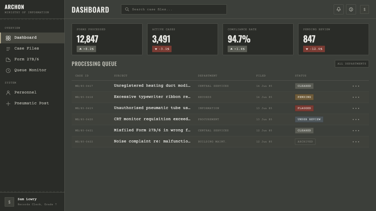
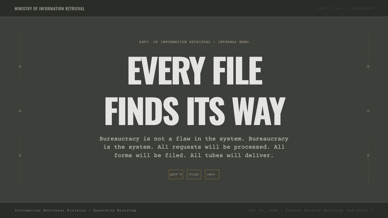
On presentation slides, the style is strong for satirical or cautionary content — a cover slide built from a single duct-and-stamp motif on a gray-green field sets tone immediately. Content slides work best treated like case files: dense grids of stamped or bordered blocks standing in for information hierarchy, rather than open, airy layouts. Data slides benefit from being framed as evidence in a file — bordered, stamped-looking containers around each chart rather than a clean, modern chart treatment.
For web interfaces, the aesthetic suits products that want to satirize or comment on bureaucracy, complexity, or institutional friction — internal tools poking fun at their own red tape, or dashboards for products whose brand voice is deliberately deadpan and process-heavy. It is a poor match for consumer-facing dashboards or pricing pages that need to feel inviting; the cold, cluttered mood actively works against ease and trust in most commercial contexts.
In editorial and marketing work, the style is most at home illustrating essays or campaigns about bureaucracy, dystopia, institutional satire, or retro-futurism itself — a duct-and-stamp visual motif signals those themes immediately to a reader. It should not be reached for as a generic 'moody dark' aesthetic; its specific reference point is comic, oppressive officialdom, and using it without that satirical intent tends to read as merely gloomy rather than pointed.
A common mistake is treating this as a generic industrial or cyberpunk dark theme and adding neon accents or sleek chrome surfaces to modernize it. That misreads the source entirely — Brazil's world is deliberately unglamorous, clunky, and overbuilt rather than sleek, and its horror comes precisely from looking dowdy and mundane rather than futuristic. Polishing away the grime and clutter removes the satire along with it.
A second, subtler mistake is over-explaining the joke — stacking so much visible irony or exaggerated bureaucratic imagery into a layout that it stops reading as a coherent design and starts reading as a costume. The strongest applications treat the aesthetic with a straight face: dense, gray-green, and procedural, trusting the material itself to carry the satire rather than announcing it.
Brazil (1985) — FAQ
How is this different from a general 'cyberpunk' or 'industrial' dark theme?
Cyberpunk aesthetics typically pair darkness with sleek surfaces and glowing neon accents to suggest advanced, if dystopian, technology. Brazil's design language does the opposite: its technology looks handmade, overbuilt, and retrofitted rather than sleek, and its warmth comes from aged paper rather than neon glow. Where cyberpunk signals a slick dangerous future, this style signals an exhausting, paper-choked present dressed up as bureaucracy — the horror is tedium, not danger.
Is this the same as steampunk?
They share a fondness for visible, overbuilt machinery, but the reference points differ. Steampunk generally imagines an alternate Victorian-era technology built around brass, gears, and steam power, often with an adventurous or romantic tone. Brazil's world is set in an unmoored '20th century' rather than the Victorian era, is built from mid-century office and industrial materials — ductwork, typewriters, filing systems — rather than brass and steam, and its tone is satirical and oppressive rather than adventurous.
Can this style work for a consumer-facing product, or is it only suited to satire?
It can work outside pure satire, but only where the brand voice is deliberately deadpan, self-aware, or process-critical — a productivity tool that jokes about its own red tape, for instance. For most consumer products that need to feel warm, fast, or trustworthy, the style's cold institutional mood and deliberate clutter work directly against the goal, and a different, more inviting design language will serve the product better.
Why does warmth only appear in the paper tones and nowhere else?
That rationing is the mechanism that makes the style read as bureaucratic rather than simply drab. If warmth were spread throughout — into the walls, the lighting, the metal — the design would lose the sense of an institution that manufactures nothing comforting except the paper trail it forces people to live inside. Confining warmth to aged manila and filing tones keeps the contrast pointed and intentional: the only comfort in this world is buried in its own paperwork.
Related design styles
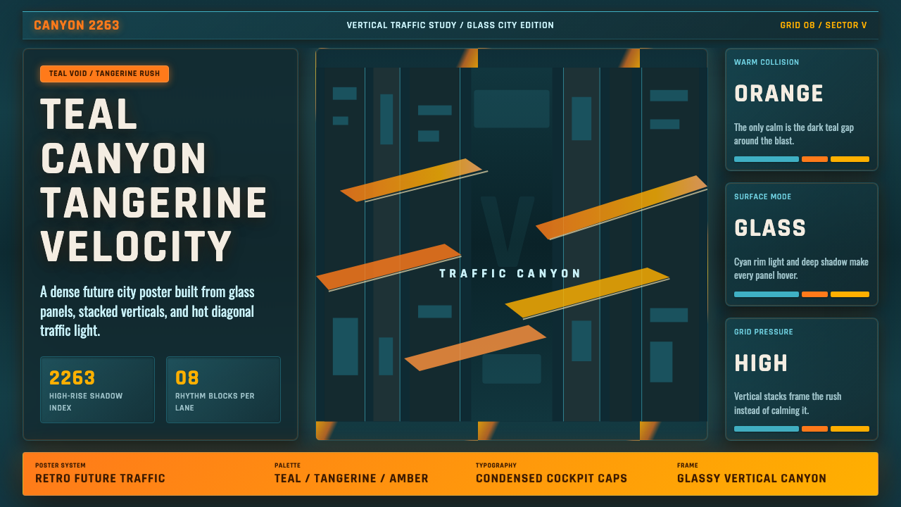 The Fifth ElementTangerine collides with teal. Vertical canyon grid, glass panels, diagonal tr…
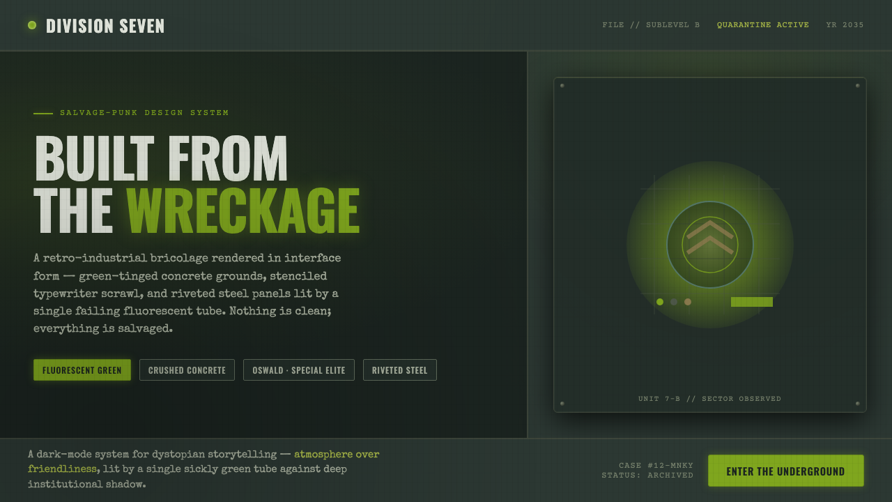 12 MonkeysBuilt from the wreckage. Sickly fluorescent green on crushed-black concrete,…
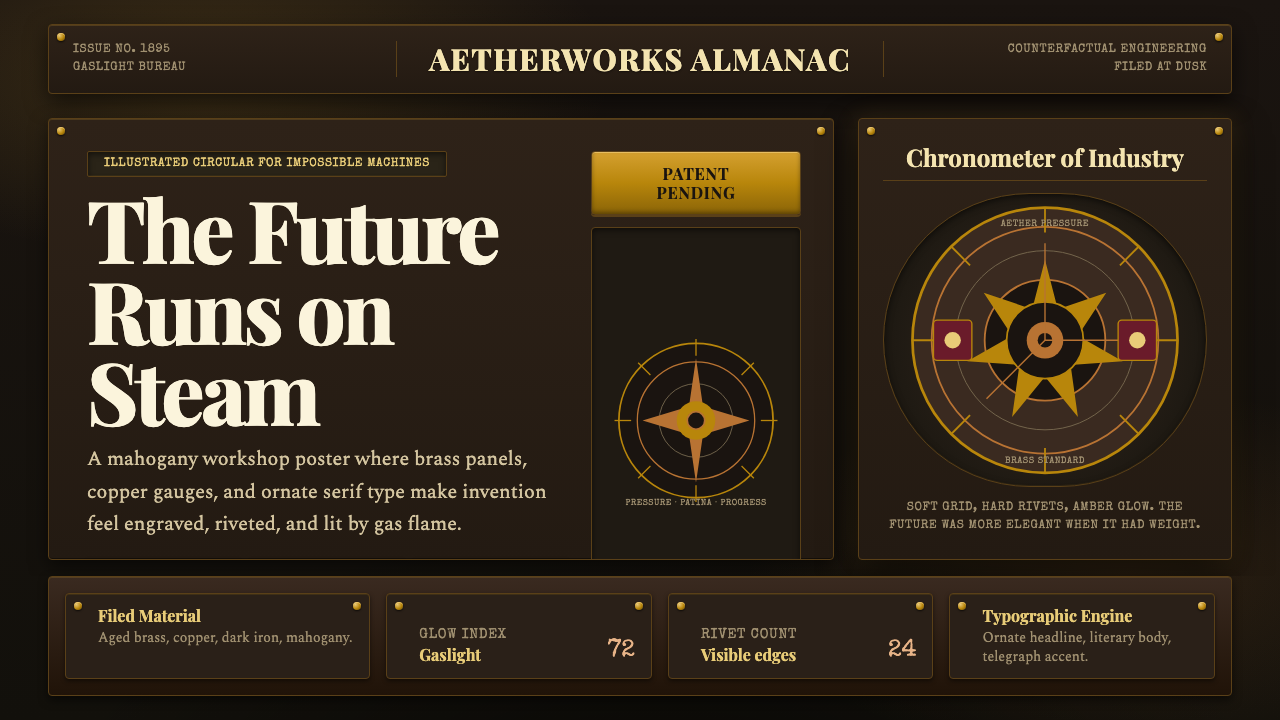 Steampunk VictorianVictorian machinery glows. Aged brass, copper panels, and Playfair type hum u…
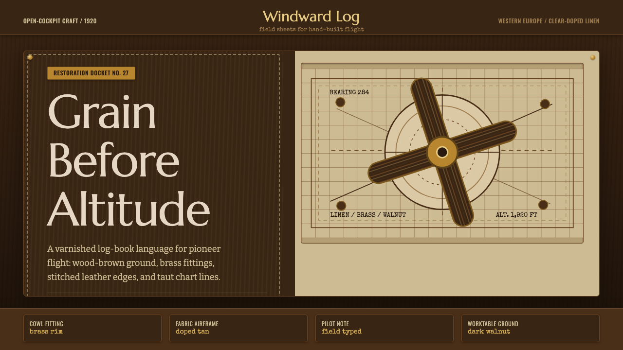 Biplane AviationPioneer flight feels hand-built. Dark walnut, brass, stitched edges, and char…
 Aeronautical ChartReads like cockpit data. Magenta-blue airspace rings cut through dense dark-c…
 Akira Neo-TokyoNight moves fast. Firebrick trails cut crushed black, teal grids, and condens…