What is Steampunk Victorian?什么是 Steampunk Victorian?
Steampunk Victorian imagines the Industrial Revolution never ended — only grew more beautiful, wrapping brass gears, copper pipes, and gaslight amber in the ornate silhouette of the Victorian age.蒸汽朋克维多利亚风格想象工业革命从未停止——只是变得更加美丽,将黄铜齿轮、紫铜管道与煤气灯的琥珀色光,包裹进维多利亚时代的繁复轮廓之中。
Steampunk Victorian in briefSteampunk Victorian 速览
Steampunk Victorian is a retrofuturist design aesthetic rooted in the visual culture of the British Victorian era (1837–1901) and filtered through the speculative fiction of Jules Verne and H.G. Wells. Its core proposition is an alternate history in which steam power, mechanical engineering, and ornamental craft evolved together into something richer than either industrialism or decorative revivalism alone could produce. The result is a visual language of warm metals — aged brass, copper, dark iron — layered against deep mahogany grounds and lit by the amber warmth of gas flame.蒸汽朋克维多利亚风格是一种复古未来主义设计美学,根植于英国维多利亚时代(1837—1901年)的视觉文化,并经由儒勒·凡尔纳与赫伯特·乔治·威尔斯的推想小说加以过滤。其核心命题是一段替代历史:在这段历史中,蒸汽动力、机械工程与装饰工艺共同演化,结出了比单纯的工业主义或装饰复兴主义都更为丰盛的果实。由此诞生的视觉语言以温暖的金属为主调——铜锈黄铜、紫铜、暗铁——叠压在深色红木底面上,由煤气灯的琥珀暖光点亮。
The style fuses two impulses that the actual Victorian age held in tension: a love of mechanical precision and a passion for surface ornament. Rivets and gears appear alongside flourishes and filigree. Clockwork mechanisms are rendered with the same care as carved wooden moldings. Typography in this aesthetic leans toward elaborate serif letterforms — the kind of ornate display faces that graced Victorian handbills, penny dreadfuls, and exposition catalogues — while the overall mood oscillates between the workshop and the drawing room, the engine house and the gentleman's club.这种风格融合了真实维多利亚时代内在的两种张力:对机械精密的迷恋与对表面装饰的热情。铆钉与齿轮和花饰与丝状装饰并肩出现;钟表机构与雕刻木线脚以同等的匠心呈现。这一美学中的字体排印倾向于繁复的衬线字形——那种曾装点维多利亚传单、廉价惊悚小说与博览会目录的华丽展示字体——而整体气氛在工作坊与会客厅、锅炉房与绅士俱乐部之间摆荡。
What distinguishes authentic Steampunk Victorian from mere Victorian pastiche is the insistence on mechanical depth. Every surface implies construction: panels are riveted, not merely painted; pipes connect and exhaust; gauges register pressure. The aesthetic does not simply decorate — it engineers, and the engineering is always visible. Darkness and warmth coexist: deep shadow plays against glowing amber highlights, and every composition suggests a world lit by fire and conducted through copper.将真正的蒸汽朋克维多利亚风格与单纯的维多利亚仿古区分开来的,是对机械深度的坚持。每一个表面都暗示着建造的逻辑:面板是铆接的而非单纯上漆的,管道彼此连接并排出气体,压力表记录着数值。这种美学不只是在装饰——它在工程,而这工程始终是可见的。黑暗与温暖共存:深邃的阴影与发光的琥珀高光相互映衬,每一幅构图都暗示着一个由火点燃、由铜传导的世界。
See the Steampunk Victorian design system查看 Steampunk Victorian 完整设计系统
Where does Steampunk Victorian come from?Steampunk Victorian 从何而来?
The Victorian era that Steampunk aestheticizes was itself a period of profound visual contradiction. Britain's Industrial Revolution, in full force from roughly 1760 onward, produced iron bridges, steam locomotives, and mass-manufactured goods. Yet the Victorian middle and upper classes responded to industrialization not by embracing its stark machine aesthetic but by doubling down on ornament: Gothic Revival architecture, elaborate cast-iron grilles, William Morris wallpapers, Arts and Crafts workshops. The real Victorian age was already a collision between the factory and the parlor, and Steampunk took that collision as its founding premise.蒸汽朋克所美学化的维多利亚时代本身就是一个充满视觉矛盾的时期。英国工业革命自约1760年起进入全盛,造就了铁桥、蒸汽机车与大批量制造的商品。然而维多利亚时代的中上阶层对工业化的回应,并非接纳其冷峻的机械美学,而是更加执著于装饰:哥特复兴建筑、繁复的铸铁格栅、威廉·莫里斯的壁纸、工艺美术运动的工坊。真实的维多利亚时代本就是工厂与客厅之间的碰撞,而蒸汽朋克把这一碰撞作为自己的奠基前提。
The literary roots run directly through Jules Verne's 'Extraordinary Voyages' series — particularly 'Twenty Thousand Leagues Under the Sea' (1870) and 'The Mysterious Island' (1874) — and H.G. Wells's scientific romances, including 'The Time Machine' (1895) and 'The War of the Worlds' (1898). Both authors depicted technologies beyond their era's capability but rendered them with the tactile, mechanical specificity of contemporary engineering. Verne's Nautilus submarine is described with the loving detail of a Victorian ship-builder's manual; Wells's time machine is assembled from nickel, ivory, crystal, and brass in a laboratory that smells of machine oil. These texts established the template: fantastical function wrapped in period-authentic material.文学根源直接贯穿儒勒·凡尔纳的「非凡旅行」系列——尤其是《海底两万里》(1870年)与《神秘岛》(1874年)——以及赫伯特·乔治·威尔斯的科学浪漫小说,包括《时间机器》(1895年)与《星际战争》(1898年)。两位作者描绘的技术都超越了其所在时代的能力,却以当代工程学那种触感十足、机械感十足的精确性加以呈现。凡尔纳笔下的鹦鹉螺号潜艇以维多利亚时代造船手册的细致描述呈现;威尔斯的时间机器在一间散发机油香气的实验室里,以镍、象牙、水晶与黄铜组装而成。这些文本确立了模板:以同时代真实材料包裹的奇异功能。
The term 'steampunk' was coined in 1987 by science fiction author K.W. Jeter in a letter to Locus Magazine, as a playful contrast to the then-fashionable 'cyberpunk.' Jeter, along with Tim Powers and James Blaylock, had been writing Victorian-set fantastical fiction; 'steampunk' named what they were doing retrospectively. The visual aesthetic crystallized through the 1990s and early 2000s, gathering momentum from role-playing games, film (notably Terry Gilliam's 'Brazil' in 1985, and the 'Wild Wild West' adaptation in 1999), and eventually the maker and cosplay communities of the mid-2000s, where handcrafted goggles, modified clockwork jewelry, and leather-strapped gadgetry became a recognizable subcultural uniform.「蒸汽朋克」一词由科幻作家K·W·杰特于1987年在致《焦点》杂志的一封信中创造,作为当时流行的「赛博朋克」的戏谑对应。杰特与蒂姆·鲍尔斯、詹姆斯·布莱洛克当时都在创作以维多利亚时代为背景的幻想小说;「蒸汽朋克」是对他们所做之事的事后命名。这一视觉美学在1990年代至2000年代初逐渐结晶,从角色扮演游戏、电影(尤其是特里·吉列姆1985年的《巴西》与1999年的《狂野西部》),以及2000年代中期的创客与角色扮演社群中汲取动能——手工制作的护目镜、改造的钟表珠宝与皮革绑带装置,成为可识别的亚文化制服。
The fully formed Steampunk Victorian aesthetic as a self-conscious design movement emerged around 2006–2010, coinciding with the explosion of craft-sharing platforms and maker culture. William Gibson and Bruce Sterling's 1990 novel 'The Difference Engine' — which imagined a Victorian Britain powered by Charles Babbage's hypothetical analytical engine — provided a canonical text for the look's intellectual ambitions. By the 2010s, the aesthetic had spread far beyond literary subculture into fashion, interior design, event production, game UI design, and digital illustration, solidifying its vocabulary of riveted brass panels, exposed gear trains, pressure gauges, and gaslight-warm color throughout.作为自觉设计运动的成熟蒸汽朋克维多利亚美学,约于2006—2010年间随着工艺分享平台与创客文化的爆发而浮现。威廉·吉布森与布鲁斯·斯特林1990年的小说《差分机》——想象了一个由查尔斯·巴贝奇假想分析引擎驱动的维多利亚英国——为这一外观的智识抱负提供了经典文本。到2010年代,这一美学已从文学亚文化扩展至时尚、室内设计、活动制作、游戏界面设计与数字插画,将其铆接黄铜面板、裸露齿轮传动装置、压力表与煤气灯暖色的视觉词汇凝固成型。
What defines the Steampunk Victorian look?Steampunk Victorian 的视觉特征是什么?
Color色彩
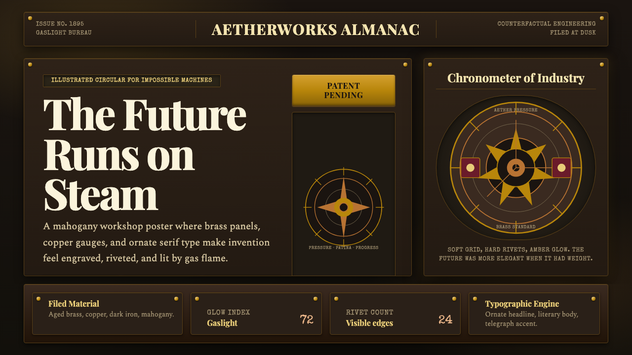
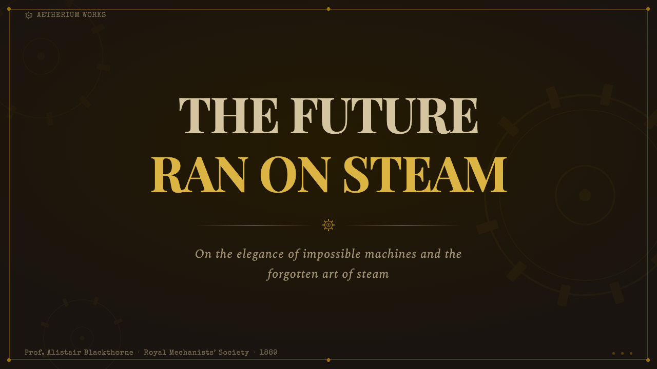
The palette is built on warm metals and organic darks. Aged brass — a tarnished, slightly greenish gold — is the signature hue, appearing on mechanical elements, borders, and typographic ornaments. Copper provides a ruddier complement. Dark iron and charcoal form the shadowed grounds. Mahogany and deep walnut browns anchor the wooden surfaces. The only consistent light source is amber — the yellow-orange warmth of gaslight and open flame — which means highlights glow rather than illuminate evenly. Cool tones appear only as deep teal or bottle green in glass and indicator elements, never dominating. The overall impression is of a world perpetually seen by candlelight.色板建立在温暖金属色与有机暗色之上。铜锈黄铜——一种带有轻微绿意的暗金色——是标志性色相,出现在机械零件、边框与字体装饰上。紫铜提供了更红润的补色。暗铁与炭灰构成阴影底面。红木与深胡桃褐色锚定木质表面。唯一一致的光源是琥珀色——煤气灯与明火的黄橙暖光——这意味着高光是在发光而非均匀照亮。冷色调仅以深青色或瓶绿色出现于玻璃与指示元素中,从不占主导。整体印象是一个永远在烛光下被观看的世界。
Typography字体排印
Display typography is emphatically serif, drawing on the ornate Victorian tradition of fat-face and slab-serif letterforms that dominated nineteenth-century printing and advertising. Headlines carry weight and presence, often featuring elaborate swash alternates, ink-trap details, or decorative terminals. Body text favors high-contrast classical serifs — the kind associated with quality Victorian periodicals and scientific journals — which lend authority and legibility. A third voice, the typewriter face, appears as a mechanical accent: monospaced, slightly imperfect, suggesting telegrams, ledger entries, or instruments printing data. Letterspacing is generous in display use; ornamental rules, borders, and flourishes frame and anchor the typographic hierarchy.展示性字体排印以浓重的衬线为特征,汲取十九世纪印刷与广告中占主导的肥面体与板衬线维多利亚装饰传统。标题字具有重量感与存在感,常带有精心设计的花饰替代字形、墨水陷阱细节或装饰性末端。正文倾向于高对比度的古典衬线——那种与优质维多利亚期刊和科学杂志相关的字体——赋予权威感与可读性。第三个声部是打字机字体,作为机械强调:等宽、略带不完美,暗示着电报、账本条目或仪器打印出的数据。展示用法中字间距宽松;装饰性横线、边框与花饰框架并锚定字体层级。
Texture and Material质感与材质
Texture is essential, not optional. Every surface in a Steampunk Victorian composition implies a material: hammered or engraved metal, worn leather, polished wood grain, glass with slight distortion, paper that has been handled and aged. The patina of use — tarnish on brass, scratches on copper, foxing on paper — is not a flaw but a virtue. Digital applications of the style achieve this through layered overlays suggesting oxidation, subtle noise suggesting grain, and vignettes suggesting light fall-off at the edges of a gas lamp's reach. The contrast between highly machined precision (the gear teeth are exact) and organic wear (the casing is dented) defines the aesthetic's characteristic visual complexity.质感是必要的,而非可选的。蒸汽朋克维多利亚构图中的每一个表面都暗示着一种材质:锤击或雕刻的金属、磨损的皮革、抛光的木纹、带有轻微变形的玻璃、被翻阅与陈化的纸张。使用的包浆——黄铜上的铜锈、紫铜上的划痕、纸张上的黄斑——不是瑕疵,而是美德。这种风格的数字应用通过暗示氧化的层叠叠加、暗示纹理的细腻噪点、以及暗示煤气灯边缘光线衰减的暗角来实现这一效果。高度机械精密性(齿轮齿形分毫不差)与有机磨损(外壳凹陷变形)之间的对比,定义了这一美学标志性的视觉复杂度。
Mechanical Ornament机械装饰
Gears, cogs, springs, pipes, pressure gauges, rivets, and valves are the primary decorative vocabulary — but they function as ornament by being visible rather than hidden. In real Victorian machinery, working parts were often concealed behind polished casings; Steampunk Victorian does the opposite, celebrating the mechanism itself as the surface. Clock faces, compass roses, and technical-diagram linework appear as decorative motifs. This mechanical ornament is never purely abstracted — it retains its implied function, even when used decoratively. A gear in the corner of a layout implies something is being driven by it; a pressure gauge implies a system under tension.齿轮、轮齿、弹簧、管道、压力表、铆钉与阀门是主要的装饰词汇——但它们通过可见而非隐藏来发挥装饰功能。在真实的维多利亚机械中,工作部件常被藏在抛光外壳后面;蒸汽朋克维多利亚风格则反其道而行,将机构本身作为表面加以颂扬。钟面、罗盘玫瑰图与技术示意图线条作为装饰母题出现。这种机械装饰从不纯粹抽象——即使用于装饰目的,它依然保留着隐含的功能。版面角落的齿轮暗示某件东西被它驱动;压力表暗示一个处于张力之下的系统。
Depth and Layering深度与层叠
Where Bauhaus is flat and Minimalism recedes, Steampunk Victorian insists on depth. Compositions layer foreground mechanisms over middle-ground paneling over background shadow, creating an impression of inhabitable space rather than a designed surface. Light falls directionally — from a source at upper left or from a lantern positioned within the frame — and produces hard cast shadows with soft penumbra edges consistent with warm artificial light. Vignetting, common in Victorian photography and lantern-slide projection, reinforces the sense that the viewer is peering through an aperture into a richly detailed world.包豪斯是平面的,极简主义是退隐的,而蒸汽朋克维多利亚坚持深度。构图将前景机械叠压在中景板材上,再叠压在背景阴影上,创造出可供栖居的空间感而非设计表面感。光线有方向地落下——来自左上方的光源,或来自画面内部摆放的提灯——产生硬边投影,带有与温暖人工光一致的柔和半影边缘。晕影效果在维多利亚摄影与幻灯片投影中十分常见,它强化了观者正在通过一个孔径窥视丰富细节世界的感知。
Darkness as Ground以暗为底
Steampunk Victorian is almost always a dark-mode aesthetic. The dominant ground is dark — deep brown, near-black charcoal, or dark iron — against which warm metal highlights and amber light become intensely vivid. This darkness is not the cool, high-contrast darkness of noir or goth but the warm, close darkness of a fire-lit interior. It creates intimacy and suggests that the scene exists in a private, enclosed space: a workshop, a library, a captain's cabin. Lighter variants of the style exist but always risk losing this sense of depth and enclosed warmth that defines the aesthetic's emotional register.蒸汽朋克维多利亚几乎始终是一种暗色模式美学。主导底面是深色的——深棕、近黑的炭色或暗铁色——温暖的金属高光与琥珀色光在其衬托下变得异常鲜活。这种黑暗不是黑色电影或哥特风格那种冷峻的高对比度黑暗,而是火光内部那种温暖、贴近的黑暗。它创造出亲密感,暗示场景存在于一个私密、封闭的空间:工作坊、书房、船长舱室。这种风格确实存在较浅的变体,但它们始终面临失去这种深度感与封闭温暖感的风险——而这正是这一美学情感基调的定义要素。
Structured Ornament有结构的装饰
Unlike the free-flowing organic ornament of Art Nouveau or the horror vacui of some Victorian surface decoration, Steampunk Victorian ornament is structured and mechanical. Borders are built from repeating geometric segments — keystone shapes, bolt-head motifs, sprocket-tooth patterns — rather than floral arabesques. Decorative fills are derived from technical diagrams, hatching, and engineering cross-sections. Even the filigree, where it appears, has the regular, constructed quality of a gear tooth rather than the irregular, growing quality of a vine. Ornament obeys the engineering logic of the composition: it fills a panel, reinforces a frame, or marks a functional boundary.与新艺术运动自由流动的有机装饰或某些维多利亚表面装饰的充盈恐惧症不同,蒸汽朋克维多利亚的装饰是有结构的、机械性的。边框由重复的几何片段构成——拱心石形状、螺栓头母题、链轮齿形图案——而非花卉阿拉伯纹样。装饰填充来自技术示意图、剖线与工程剖面图。即便是出现的丝状装饰,也具有齿轮齿那种规律的、构造性的品质,而非藤蔓那种不规律的、生长性的品质。装饰服从构图的工程逻辑:填充一块面板,强化一个框架,或标记一条功能性边界。

See the Steampunk Victorian design system查看 Steampunk Victorian 完整设计系统
Who shaped Steampunk Victorian?谁塑造了 Steampunk Victorian?
Verne's 'Extraordinary Voyages' series, published between 1863 and 1905, established the template for technologically detailed retrofuturism. His machines — the Nautilus submarine, the Albatross airship, the cannon-launched moon capsule — were not described abstractly but with the material specificity of a Victorian engineer: brass fittings, mahogany paneling, thick glass portholes, precise instrumentation. This tactile, material richness became the primary literary source for the Steampunk visual vocabulary, and Verne's affection for the intersection of luxury and mechanism remains the aesthetic's emotional core.凡尔纳于1863至1905年间出版的「非凡旅行」系列,为充满技术细节的复古未来主义确立了模板。他的机器——鹦鹉螺号潜艇、信天翁号飞艇、炮弹发射的月球舱——不是抽象描述的,而是以维多利亚时代工程师的材质精确性呈现:黄铜配件、红木镶板、厚重玻璃舷窗、精密仪器。这种触感十足的材质丰富性成为蒸汽朋克视觉词汇的首要文学来源,而凡尔纳对奢华与机械交汇处的热爱,至今仍是这一美学的情感核心。
Wells brought to the proto-steampunk literary tradition a darker, more anxious quality. Where Verne celebrated the machine, Wells interrogated it. His time machine is assembled with almost obsessive material specificity — quartz rods, nickel bars, ivory plates — yet it transports its rider into futures of entropy and extinction. Wells's visual sensibility — the melancholy of a brilliant device in a decaying world — contributed the aesthetic's undertow of decay and ruin, the sense that all the beautiful machinery exists within a system that is winding down. This tension between celebration and elegy is what separates Steampunk Victorian from mere mechanical nostalgia.威尔斯为原型蒸汽朋克文学传统带来了更黑暗、更充满焦虑的品质。凡尔纳颂扬机器,威尔斯则审问它。他的时间机器以近乎强迫症般的材质精确性组装——石英棒、镍条、象牙板——却将骑手运送进熵增与灭绝的未来。威尔斯的视觉感受力——一件精美装置在衰朽世界中的忧郁——为这一美学贡献了衰败与废墟的暗流,即所有美丽机械都存在于一个正在卷紧弹簧、走向终结的系统之内的感知。这种颂歌与挽歌之间的张力,将蒸汽朋克维多利亚风格与单纯的机械怀旧区分开来。
Jeter coined the term 'steampunk' in a 1987 letter to Locus Magazine and wrote the novels 'Morlock Night' (1979) and 'Infernal Devices' (1987) that helped define the genre. His work engaged seriously with the moral and class dimensions of Victorian society — the exploitation beneath the ornament, the empire that funded the engineering — giving the aesthetic a critical edge that distinguishes serious Steampunk Victorian from superficial gear-and-goggle decoration. Jeter's framing remains important to designers who want the style to carry intellectual weight rather than functioning as mere cosplay.杰特于1987年在致《焦点》杂志的信中创造了「蒸汽朋克」一词,并创作了《莫洛克之夜》(1979年)与《地狱装置》(1987年)等帮助定义这一流派的小说。他的作品认真涉及维多利亚社会的道德与阶级维度——装饰之下的剥削,资助工程的帝国——赋予这一美学一种批判性锋芒,将严肃的蒸汽朋克维多利亚风格与流于表面的齿轮护目镜装饰区分开来。对于那些希望这种风格承载智识重量而非仅仅充当角色扮演的设计师而言,杰特的框架至今仍然重要。
Gibson, already the father of cyberpunk, co-wrote 'The Difference Engine' (1990) with Bruce Sterling, imagining a Victorian Britain transformed by Charles Babbage's analytical engine — a computer built from brass and ivory rods, powered by steam, staffed by human punch-card operators called 'clackers.' The novel elevated Steampunk from a visual subculture to a serious counterfactual literary form, establishing the idea that Victorian aesthetic richness and computational-era complexity could coexist. Gibson's participation also linked steampunk to the broader science fiction tradition and gave it intellectual credibility beyond craft and cosplay communities.身为赛博朋克之父的吉布森与布鲁斯·斯特林合著了《差分机》(1990年),想象了一个被查尔斯·巴贝奇的分析引擎所改变的维多利亚英国——一台由黄铜与象牙棒构成、以蒸汽驱动、由被称为「叩击者」的人力穿孔卡操作员操控的计算机。这部小说将蒸汽朋克从视觉亚文化提升为严肃的反事实文学形式,确立了维多利亚美学丰富性与计算时代复杂性可以共存的理念。吉布森的参与也将蒸汽朋克与更广泛的科幻文学传统相连,赋予其超越工艺与角色扮演社群的智识公信力。
Though not a designer, Babbage — the nineteenth-century mathematician who designed but never completed the Difference Engine and Analytical Engine — is the movement's patron saint of unrealized potential. His machines, had they been built at full scale, would have been extraordinary objects: thousands of precision-machined brass columns, wheels, and rods in an arrangement of almost architectural grandeur. The Science Museum in London eventually built a working Difference Engine No. 2 in 1991, and photographs of it — gleaming brass rack and pinion, in a case of mahogany and glass — read as the ur-image of Steampunk Victorian design.巴贝奇虽非设计师,但这位设计却未能完成差分机与分析机的十九世纪数学家,是这一运动未实现潜力的守护圣人。他的机器若按完整规模建造,将是非凡的物件:数千个精密加工的黄铜柱、轮盘与杆件,以近乎建筑宏伟的方式排列。伦敦科学博物馆最终于1991年建造了一台可运转的差分机二号,其照片——在红木与玻璃柜中闪亮的黄铜齿条与小齿轮——被视为蒸汽朋克维多利亚设计的原型图像。
How do you use Steampunk Victorian today?今天怎么用 Steampunk Victorian?
Steampunk Victorian is among the more demanding historical styles to apply well in contemporary design work, because its power comes from layered texture, controlled darkness, and the suggestion of mechanical depth — qualities that flatten badly when reduced to a color palette or a few gear icons. Applying it correctly requires committing to the full atmospheric logic: warm dark grounds, amber accent lighting, textured metal surfaces, and structured ornament that implies construction rather than mere decoration.蒸汽朋克维多利亚是当代设计实践中较难应用得当的历史风格之一,因为它的力量来自层叠的质感、受控的黑暗与机械深度的暗示——这些品质在被简化为色板或几个齿轮图标时会严重失真。正确应用它,需要完全投入其大气逻辑:温暖的深色底面、琥珀色强调光、有质感的金属表面,以及暗示建造而非单纯装饰的结构性装饰。
For presentation slides, Steampunk Victorian works best on atmospheric cover slides and section dividers rather than content-dense body slides. A cover built in this style uses a deep, near-black ground with a central mechanical illustration or emblem — a compass rose, a gear assembly, a pressure gauge — rendered in warm brass tones, with the title set in a heavy ornate serif and a subtitle set in a lighter but still high-contrast serif below. Section dividers can use full-width panel treatments with riveted border details. Content slides should be restrained by comparison: a dark but not fully opaque background, a clear typographic hierarchy in high-contrast serif and a monospaced accent for data labels, and minimal decorative intrusion to preserve readability. Data visualizations become instruments: bar charts rendered as pressure gauges, progress indicators as gear-advance meters, numerical readouts styled as telegraphic ledger entries.对于演示文稿,蒸汽朋克维多利亚在氛围性封面与章节分隔页上的效果,优于内容密集的正文页。这种风格下的封面使用深邃、近黑的底面,中央放置一个机械插图或徽章——罗盘玫瑰图、齿轮组件、压力表——以温暖的黄铜色调呈现,标题以粗重的华丽衬线字体排印,副标题以较轻但仍高对比度的衬线字体置于其下。章节分隔页可以使用带有铆接边框细节的全宽面板处理。相比之下,正文内容页应当克制:深色但非完全不透明的背景,高对比度衬线与等宽强调字体定义清晰的字体层级,最小化装饰干预以保持可读性。数据可视化变成仪器:以压力表形式呈现的柱状图,以齿轮进度表形式呈现的进度指示器,以电报账本样式排印的数字读出。
For web interfaces, the style suits applications where atmosphere and specialness are more important than neutral utility — boutique e-commerce, game dashboards, portfolio sites, event registration pages, and niche community platforms. The approach is to define a warm dark background, establish a brass or copper accent color for interactive elements and calls to action, and use an ornate serif for display headings with a high-legibility serif for body text. Navigation can be treated as a brass-bordered instrument panel. Cards and modules should use subtle texture overlays suggesting worn leather or aged metal rather than flat or soft-shadow treatments. Pricing pages work with a tier-differentiation logic: standard tiers in muted iron gray, premium tiers in glowing amber-brass, with the structural contrast between dark restraint and warm highlight doing the persuasive work that flat-design color blocks would handle elsewhere.对于网页界面,这种风格适合氛围感与特殊感比中性实用性更重要的应用——精品电商、游戏仪表板、作品集网站、活动报名页面,以及小众社群平台。方法是:定义温暖的深色背景,为交互元素与行动号召建立黄铜或紫铜强调色,展示标题使用华丽衬线,正文使用高可读性衬线。导航可以被处理为一个黄铜边框的仪表盘面板。卡片与模块应使用暗示磨损皮革或老化金属的细腻质感叠加,而非平面或软阴影处理。定价页面适合等级区分逻辑:标准等级以哑光铁灰色呈现,高级等级以发光琥珀黄铜色呈现,深色克制与暖色高光之间的结构性对比,完成平面设计色块在其他地方所承担的说服工作。
For editorial and marketing work, Steampunk Victorian excels at covers, posters, feature headers, and event collateral where impact and memorability matter more than sustained readability. A poster in this style uses the full warm-dark palette, a focal mechanical illustration, and typographic hierarchy in contrasting display and body serifs, framed with structured border ornament. Editorial feature layouts can open with a wide, atmospherically dark header image — a mechanical illustration, a period-authentic photograph of actual Victorian machinery, or a hybrid — followed by body text set in a legible high-contrast serif on a lighter (but not pure white) ground that echoes the overall warmth. Marketing one-pagers and landing pages work well with the aesthetic when the product itself has connotations of craft, precision, heritage, or depth of engineering — watchmaking, leather goods, specialty coffee equipment, audiophile hardware, historical games.对于编辑与营销内容,蒸汽朋克维多利亚在封面、海报、专题标题与活动周边上表现出色——在这些场合,冲击力与记忆点比持续可读性更重要。这种风格下的海报使用完整的温暖深色色板、一个焦点机械插图,以及在对比性展示与正文衬线中形成层级的字体排印,以结构性边框装饰加以框定。编辑专题版面可以以宽幅、氛围黑暗的标题图像开场——机械插图、真实维多利亚机械的时代摄影,或两者的混合——随后正文以可读的高对比度衬线排印在较浅(但非纯白)的底面上,呼应整体温暖感。当产品本身具有工艺、精密、传承或工程深度的含义时——制表业、皮革制品、精品咖啡设备、发烧友音频硬件、历史题材游戏——营销单页与落地页与这一美学配合良好。
The most common mistake when applying Steampunk Victorian is the gear-and-goggles reduction: assuming that scattering gear icons over a neutral background and setting text in an ornate font constitutes the style. It does not. The style's power is atmospheric, not iconographic — it requires the dark ground, the warm ambient light, the layered texture, and the sense of constructed depth. A second common error is letting the darkness become unreadable: the style must balance deep shadows with sufficient amber or brass highlights to maintain visual hierarchy and legibility. The third pitfall is anachronism in the wrong direction — using obviously digital interface conventions (flat toggle switches, sans-serif microcopy, iOS-style icons) inside an otherwise period-authentic frame, which collapses the aesthetic's internal logic.应用蒸汽朋克维多利亚时最常见的错误,是「齿轮与护目镜」式的简化:以为在中性背景上散布齿轮图标并用华丽字体排印文字,就构成了这种风格。事实并非如此。这种风格的力量是大气性的而非图像性的——它需要深色底面、温暖的环境光、层叠的质感,以及建造深度的感知。第二个常见错误是让黑暗变得无法阅读:这种风格必须在深邃阴影与充分的琥珀色或黄铜高光之间取得平衡,以维持视觉层级与可读性。第三个陷阱是错误方向上的时代错位——在一个在其他方面符合时代真实感的框架内使用明显的数字界面惯例(平面拨动开关、无衬线微文字、iOS风格图标),这会瓦解这一美学的内在逻辑。
See the Steampunk Victorian design system查看 Steampunk Victorian 完整设计系统
Steampunk Victorian — FAQSteampunk Victorian · 常见问题
How is Steampunk Victorian different from general Victorian or Art Nouveau?蒸汽朋克维多利亚与一般维多利亚风格或新艺术运动有何不同?
Victorian design encompasses a wide range of revival and applied styles — Gothic Revival, Rococo Revival, Arts and Crafts, japonisme — not all of which are dark, metallic, or mechanically focused. Art Nouveau (emerging in the 1890s) specifically reacted against Victorian historicism with a flowing, organic, plant-derived ornament in lighter, more pastel palettes. Steampunk Victorian is specifically the branch of Victorian aesthetic that foregrounds mechanical engineering, metalwork, and the industrial sublime — not the parlor, the china cabinet, or the flower garden, but the workshop, the engine room, and the inventor's laboratory. It is also necessarily a self-conscious anachronism: a contemporary design choice that adopts Victorian codes, rather than a design made in that period.维多利亚设计涵盖广泛的复兴与应用风格——哥特复兴、洛可可复兴、工艺美术运动、日本主义——并非全部都是黑暗、金属质感或以机械为重点的。新艺术运动(兴起于1890年代)专门以流动的、有机的、植物衍生的装饰来反对维多利亚历史主义,采用更轻盈、更接近粉彩的色板。蒸汽朋克维多利亚专门是维多利亚美学中将机械工程、金属工艺与工业崇高感置于前台的分支——不是客厅、瓷器柜或花园,而是工作坊、发动机房与发明家的实验室。它也必然是一种自觉的时代错位:一种采纳维多利亚符码的当代设计选择,而非一件制作于那个时代的设计作品。
Can this style work in light mode, or is it always dark?这种风格能在浅色模式下使用吗,还是说它必须是深色的?
The style is most powerful in dark mode, where warm metal highlights gain maximum luminosity against deep grounds. Light-mode variants exist — think of aged parchment or ivory grounds with deep sepia and dark iron typography — and these can work well for editorial or print contexts where the aesthetic needs to coexist with extensive body text. However, the pale variant sacrifices the style's most distinctive quality: the sense of gaslit warmth, the impression of peering into a fire-lit interior. A parchment-and-sepia version tends to read as 'vintage' or 'antique' rather than specifically Steampunk Victorian, because it loses the metallic highlights and the dramatic chiaroscuro that make the full dark version so recognizable.这种风格在深色模式下最为强大,温暖的金属高光在深邃底面上获得最大的发光度。浅色变体确实存在——想象一下以老化羊皮纸或象牙色为底面,配以深褐与暗铁排版——在美学需要与大量正文文字共存的编辑或印刷场景中,这些变体可以很好地运作。然而,浅色变体牺牲了这种风格最独特的品质:煤气灯暖光的感觉,窥视火光照耀的内部空间的印象。羊皮纸加深褐色的版本往往被解读为「复古」或「古董」,而非特定的蒸汽朋克维多利亚风格,因为它失去了金属高光与戏剧性明暗对比——而正是这两者使完整的深色版本如此易于辨认。
Does Steampunk Victorian work for data-heavy or analytical products?蒸汽朋克维多利亚风格适用于数据密集型或分析性产品吗?
Counterintuitively, yes — with care. The Victorian era produced some of the finest data visualization in history, including Florence Nightingale's polar area diagrams and Charles Minard's Napoleon campaign map. The style's instrument-panel logic (gauges, dials, ledger readouts) maps naturally onto dashboard interfaces. The key is treating data elements as instruments rather than as abstract charts: a thermometer-style progress bar, a gear-advance loading indicator, a ledger-column numerical readout. The risk is that the heavy ornamental framework competes visually with the data itself. The discipline is to make the data the mechanism — the thing the instruments are measuring — and to keep ornamental framing subordinate to informational clarity.反直觉地,可以——但需要谨慎。维多利亚时代产生了历史上一些最精良的数据可视化作品,包括弗洛伦斯·南丁格尔的极坐标面积图与查尔斯·米纳德的拿破仑战役地图。这种风格的仪表板逻辑(压力表、表盘、账本读出)自然地映射到仪表板界面上。关键在于将数据元素视为仪器而非抽象图表:温度计样式的进度条、齿轮进度加载指示器、账本列数字读出。风险在于繁重的装饰框架与数据本身产生视觉竞争。自律在于使数据成为机制——仪器正在测量的事物——并让装饰框架服从于信息清晰度。
What product categories and brand personalities fit this style?哪些产品类别和品牌个性适合这种风格?
Steampunk Victorian aligns with brands whose core identity involves precision craft, historical depth, or the celebration of mechanism and engineering. Strong fits include: luxury watchmaking and horology, specialty spirits and aged whisky, leather goods and bespoke accessories, historical board games and tabletop RPGs, audiophile hardware, artisan coffee equipment, heritage cycling and automotive brands, and fiction-based entertainment with period settings. It struggles for brands that need to signal accessibility, modernity, clinical precision, or emotional warmth — healthcare applications, mainstream consumer tech, children's products, wellness and mindfulness platforms, and any brand whose identity depends on lightness, speed, or ease. The style's inherent darkness and complexity communicate that the product rewards attention and patience; this is a virtue in some markets and a barrier in others.蒸汽朋克维多利亚与核心身份涉及精密工艺、历史深度或对机构与工程之颂扬的品牌相契合。高度匹配的类别包括:奢侈制表与钟表学、特色烈酒与陈年威士忌、皮革制品与定制配件、历史桌游与桌面角色扮演游戏、发烧友音频硬件、手工咖啡设备、传承自行车与汽车品牌,以及以历史为背景的虚构娱乐作品。它在需要传递亲切感、现代感、临床精确度或情感温暖感的品牌中表现欠佳——医疗应用、主流消费电子、儿童产品、健康与正念平台,以及任何品牌身份依赖轻盈、速度或便捷感的场景。这种风格内在的黑暗感与复杂性传递出「这个产品值得用心投入与耐心等待」的信号;这在某些市场是美德,在另一些市场则是障碍。
How do you apply this style without it looking like Halloween or cosplay decoration?如何应用这种风格而不让它看起来像万圣节或角色扮演装饰?
The distinction between serious Steampunk Victorian design and cosplay decoration lies in restraint and systemic consistency. Cosplay decoration uses gears, top hats, and goggles as isolated symbols pasted onto a generic background. Serious design application builds an atmospheric system: every design decision — color, typography, texture, light direction, ornamental grammar — contributes to the same coherent world. Restraint in iconographic elements is critical: the fewer gear icons used as decoration, the more powerful the aesthetic reads. What carries the style is not the iconography but the palette, the texture, the lighting logic, and the typographic voice. Applied with rigor, the result reads as authoritative and atmospheric; applied carelessly, it reads as costume. The test is whether removing the obvious period symbols (gears, goggles) would still leave a coherent, recognizable visual world — if yes, the application is working.严肃的蒸汽朋克维多利亚设计与角色扮演装饰之间的区别,在于克制与系统一致性。角色扮演装饰将齿轮、礼帽与护目镜作为孤立的符号粘贴在通用背景上。严肃的设计应用构建一个大气系统:每一个设计决定——色彩、字体、质感、光线方向、装饰语法——都为同一个连贯世界作出贡献。对图像元素的克制至关重要:作为装饰使用的齿轮图标越少,美学感读起来越强大。承载这种风格的不是图像学,而是色板、质感、光照逻辑与字体声音。严格应用,结果读起来既权威又有大气感;粗心应用,读起来就像服装。检验方法是:移除明显的时代符号(齿轮、护目镜)之后,是否仍然留下一个连贯的、可识别的视觉世界——如果是,则应用是成功的。
Related design styles相关设计风格
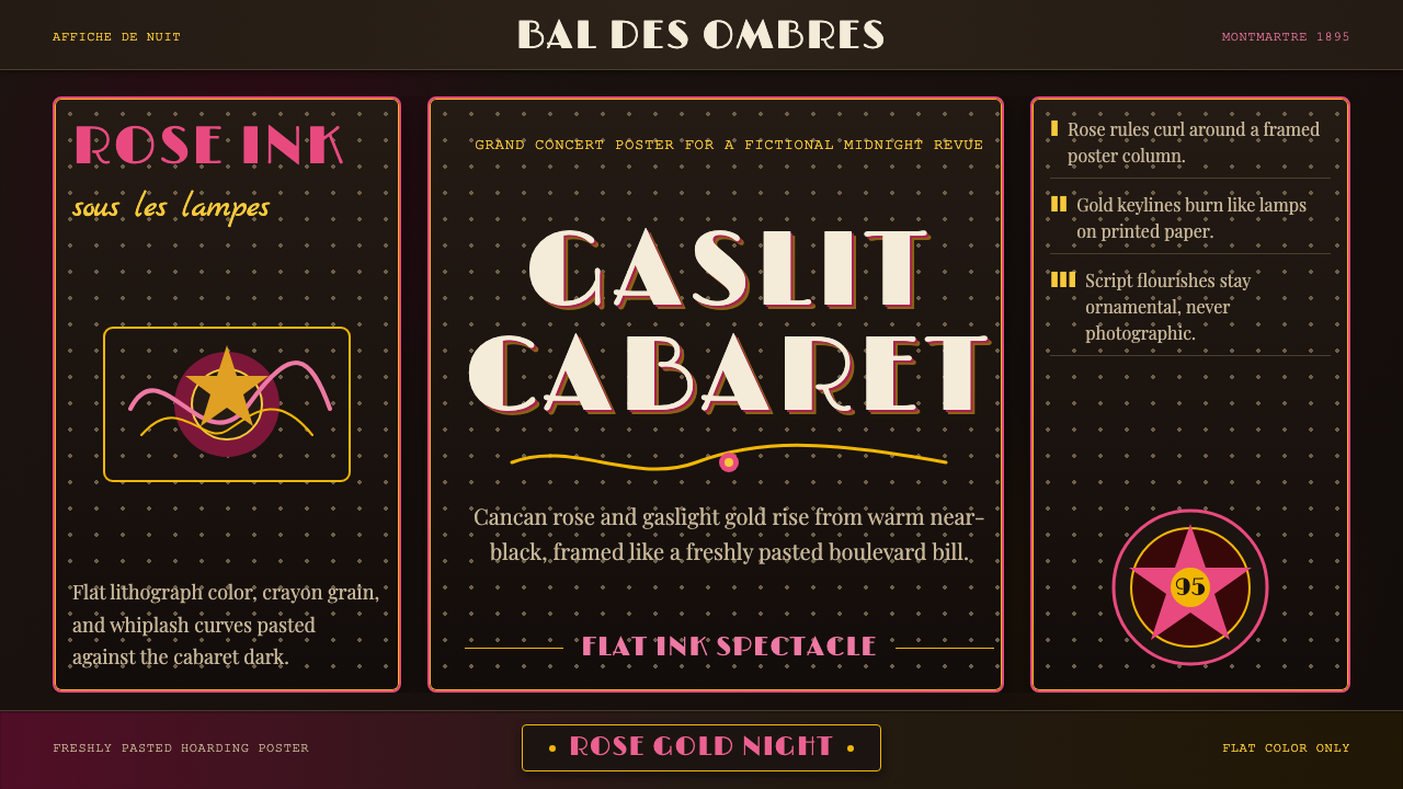 Belle Époque ParisCabaret night glows. Rose ink and gaslight gold curl across warm near-black p…歌舞厅之夜发光:玫红与煤气灯金在暖近黑海报框中卷曲。
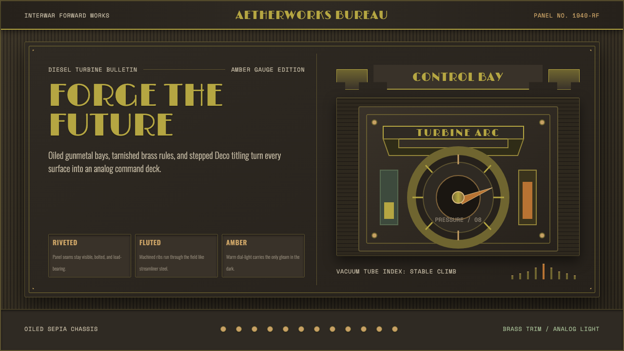 Dieselpunk RetrofutureMachine age, dark and bolted. Gunmetal grid, brass rivets, amber gauge geomet…黑暗铆接的机械时代:枪铁网格、黄铜铆钉与琥珀仪表几何。
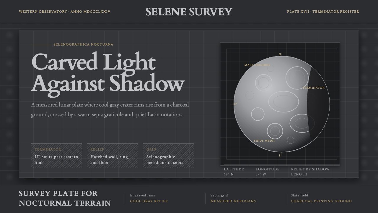 Lunar SelenographyMoonlight becomes measurement. Slate ground, sepia grid, and hatched gray cra…月光成为测量:石板灰底、赭石经纬网、排线灰环形山。
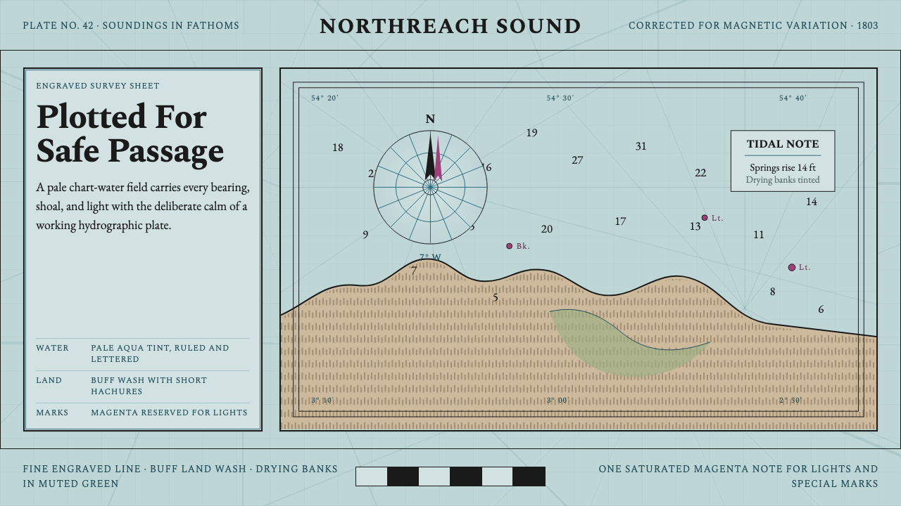 Admiralty Sea ChartSurvey authority, engraved. Aqua chart water, black soundings, buff land, one…测量权威感。淡水绿图水、黑色水深、浅赭陆地与一抹品红。
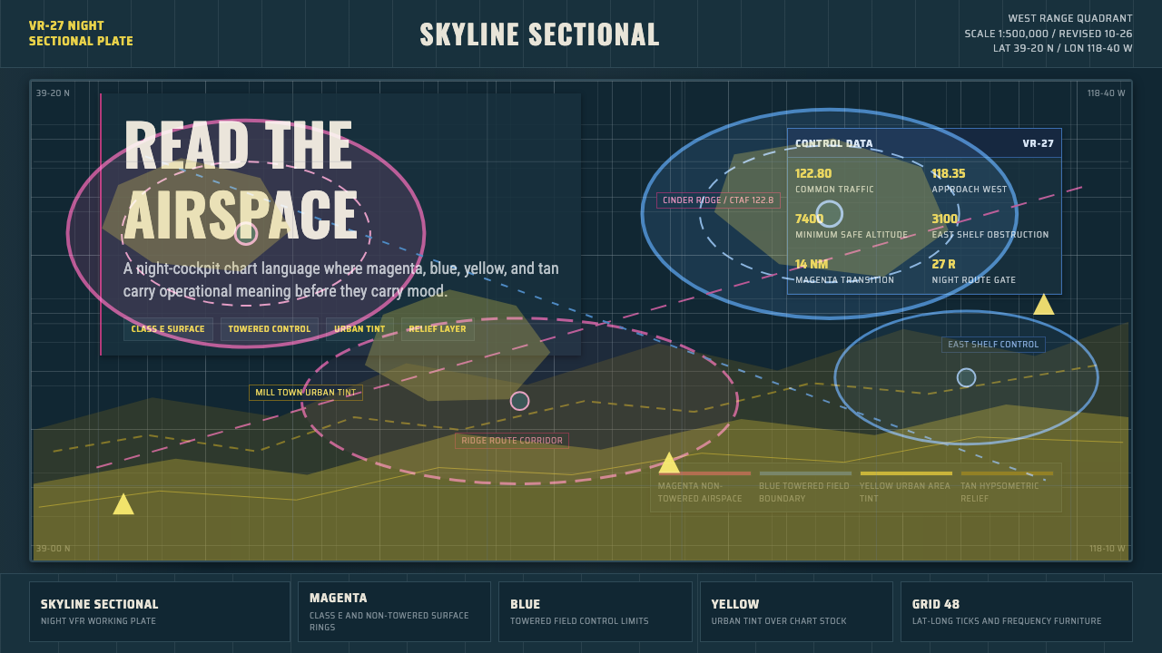 Aeronautical ChartReads like cockpit data. Magenta-blue airspace rings cut through dense dark-c…像座舱数据般可读:品红与蓝色空域环切入深色密集网格。
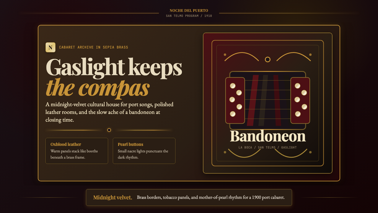 Argentine Bandoneón 1900 (Tango)Gaslit tango luxury. Midnight velvet, brass fileteado, and pearl-button geome…煤气灯下的探戈奢华:午夜绒底、黄铜卷草与珍珠琴键。