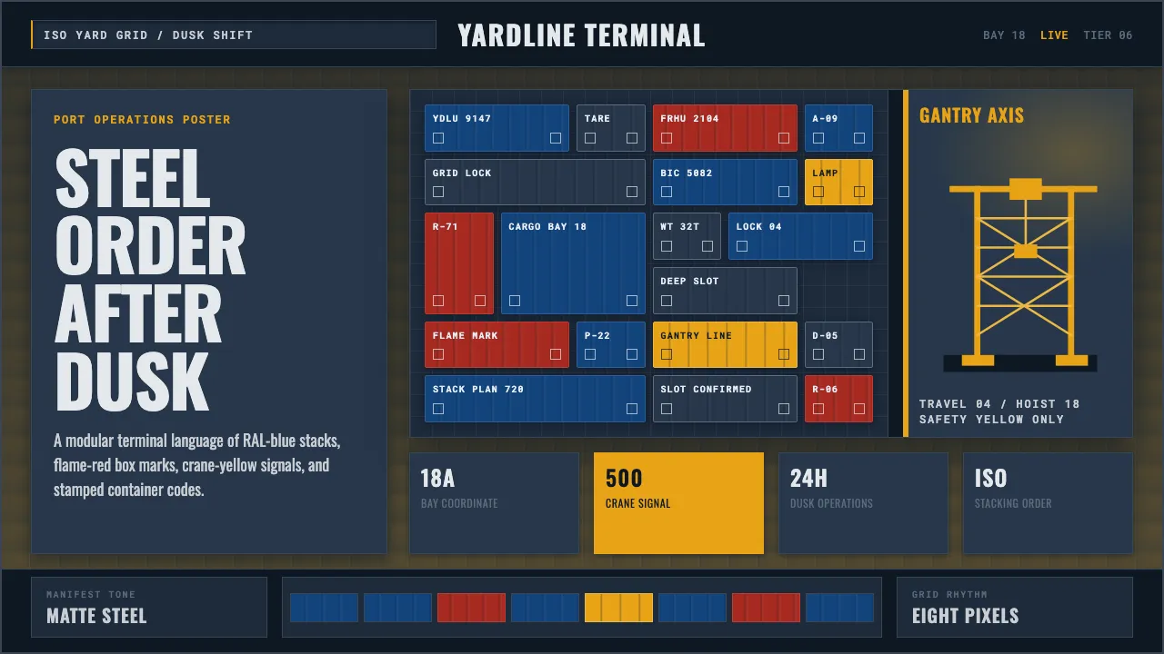
About Container Port
Container Port distills the visual language of the modern mega-terminal at dusk: stacked steel ISO boxes in RAL gentian blue and flame red, ship-to-shore gantry cranes glowing safety yellow, all under a twilight slate sky lit by sodium dock lamps. It is the aesthetic of global logistics — stenciled alphanumeric codes, modular stacking grids, corrugated steel, and the heavy geometric order of a port that never sleeps.
This design system translates that industrialism into interface form — slate-blue dusk grounds, RAL primary blocks, condensed stencil-grotesque type, and monospace container codes that read like BIC identifiers stamped on a forty-foot box.
- Origin
- East Asia (Shanghai, Shenzhen, Busan container terminals)
- Era
- 2010–now (contemporary mega-port era; ZPMC automated terminals ~2017–2024)
- Key figures
- Maersk · ZPMC (Shanghai Zhenhua Heavy Industries) · Malcom McLean · ISO TC104
- Movements
- ISO container standardization · Contemporary industrial / logistics design · Modular grid systems
Container Port design spec
Colors
Typography
The other 11 sections — buttons, cards, spacing, motion, techniques and more — open once you unlock. Download the DESIGN.md or send it to your AI in one click. Unlock once, yours forever.
Sign up nowStyles similar to Container Port
Also inspired by architecture & places, with a close feel.
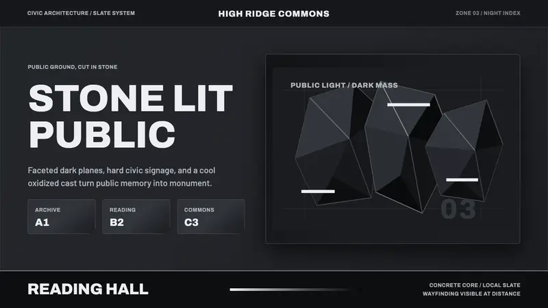 Medellín Library ParkCivic gravity in slate. Near-black planes, cool grey hairlines, and bold wayfinding.
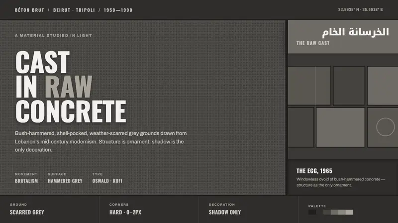 Beirut Brutalist GrayStructure is the only ornament. Scarred bush-hammered grey, monumental Oswald caps, bilingual Kufi.
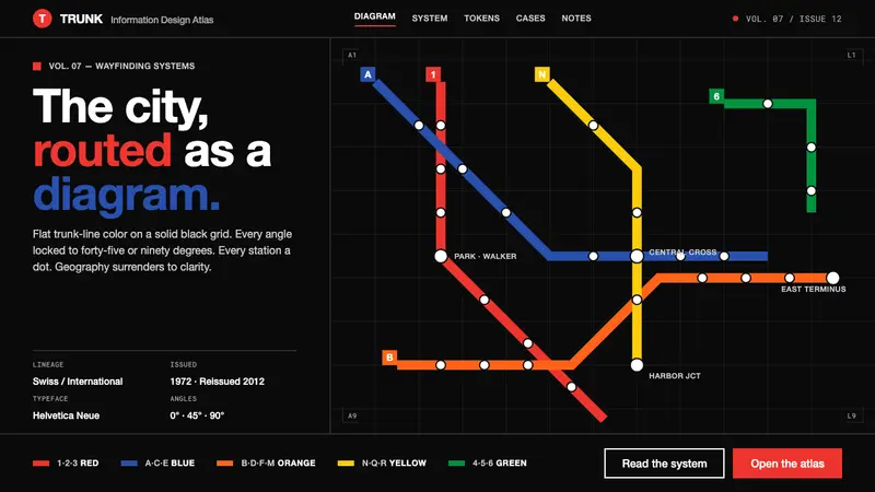 NYC Subway Vignelli (1972)The city as a circuit diagram. Flat trunk-line color on black, angles locked to 45° and 90°.
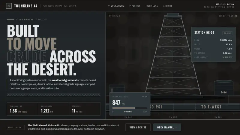 Gulf Oil Derrick IndustrialEngineered, not decorative. Soot-darkened gunmetal, derrick lattice, condensed Oswald stencils.