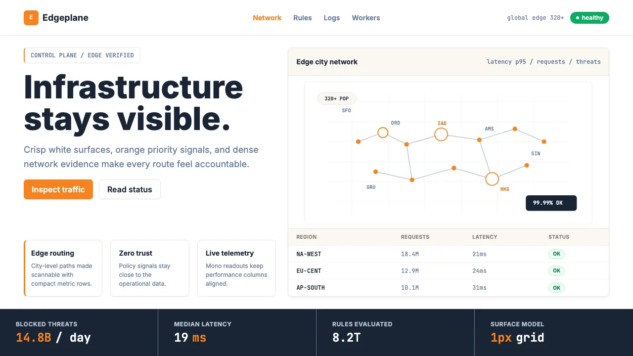
About Cloudflare Orange Edge
Cloudflare's visual identity is the orange logo that became an entire design system. Built on clean white surfaces, the trademark Cloudflare orange #F6821F anchors every primary action, while ink-navy text and hairline borders keep the dense data dashboards legible. The aesthetic is infrastructure made visible — world maps dotted with edge POPs, status pill badges, and data-grid tables that feel operational, not decorative.
The system pairs Inter's neutral precision with JetBrains Mono for metric readouts and code blocks. Shadows are near-invisible; borders are hairline. Every element serves the dashboard — crisp, dense, and unapologetically functional. Cloudflare proves that boring infrastructure can look sharp when you commit to one color and execute it with conviction.
- Origin
- San Francisco / Austin, global edge network (320+ cities)
- Era
- 2009 founded; current visual language ~2020–2025
- Key figures
- Matthew Prince · Michelle Zatlyn · John Graham-Cumming · Lee Holloway
- Movements
- Edge Computing / CDN Industry · Post-AWS Regional Cloud · Zero-Trust Networking
Cloudflare Orange Edge design spec
Colors
Typography
The other 11 sections — buttons, cards, spacing, motion, techniques and more — open once you unlock. Download the DESIGN.md or send it to your AI in one click. Unlock once, yours forever.
Sign up nowStyles similar to Cloudflare Orange Edge
Also inspired by brands & products, with a close feel.
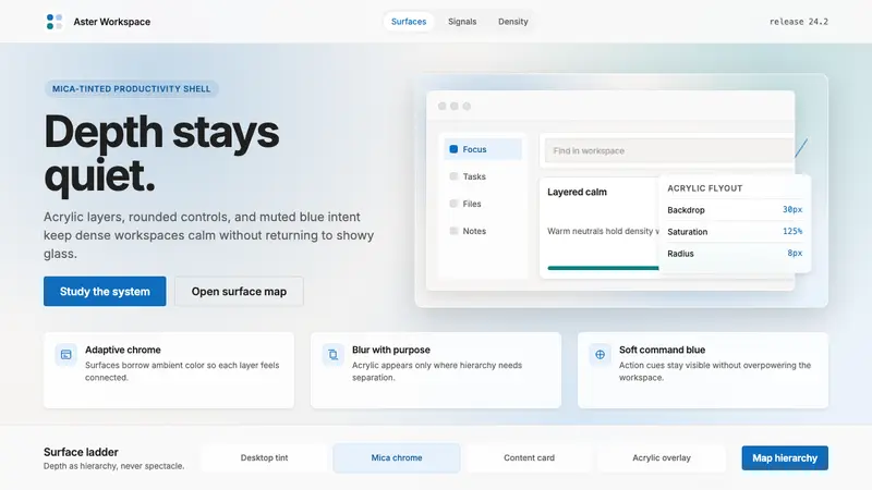 Microsoft Fluent 2Disciplined translucency. Warm Mica neutrals, acrylic blur, and muted blue create calm depth.
 MongoDB Leaf GreenDisciplined green, open warmth. Forest leaf forms and Spring accents breathe in white space.
 Dark Mode UICalm night interfaces. Charcoal layers rise by overlay lightness, not shadow.
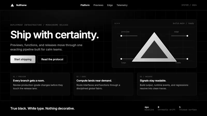 Vercel 2024Developer luxury by subtraction. Pure black, white Inter, rigid grid, triangular release mark.