What is Amazon Web Services (AWS)?什么是 Amazon Web Services (AWS)?
AWS turned enterprise cloud infrastructure into a visual language — dark navy, saturated orange, and relentless grid discipline that says 'serious engineering' before a single word is read.AWS 将企业级云基础设施转化为一套视觉语言——深蓝底色、饱和橙色与严苛的网格纪律,让人还没读到一个字,就已感受到「严肃工程」的气场。
Amazon Web Services (AWS) in briefAmazon Web Services (AWS) 速览
Amazon Web Services is the visual design system of the world's dominant infrastructure cloud — a platform launched in 2006 that now runs roughly thirty percent of the global web. Its aesthetic is not accidental decoration but a deliberate corporate signal: this is enterprise infrastructure, not a consumer app. The palette pairs a highly saturated warm orange brand accent against a deep, near-black navy console background, organized through a dense but legible grid of service-tile icons, white card surfaces, and high-contrast typographic labels. Nothing in the system tries to look friendly in the manner of consumer software; everything is calibrated to read as technically authoritative and professionally reliable.亚马逊云服务(AWS)是全球主导性基础设施云的视觉设计系统——这一平台于2006年推出,如今承载着全球约三成的网络流量。它的美学绝非偶然的装饰,而是刻意为之的企业信号:这是企业级基础设施,不是消费级应用。色彩体系将高饱和度的暖橙品牌色与近乎黑色的深海军蓝控制台背景配对,通过密集却清晰的服务图标网格、白色卡片面板和高对比度排版标签组织呈现。系统中没有任何元素试图模仿消费级软件的亲和感,一切都被校准为在技术上令人信服、在专业层面值得依赖。
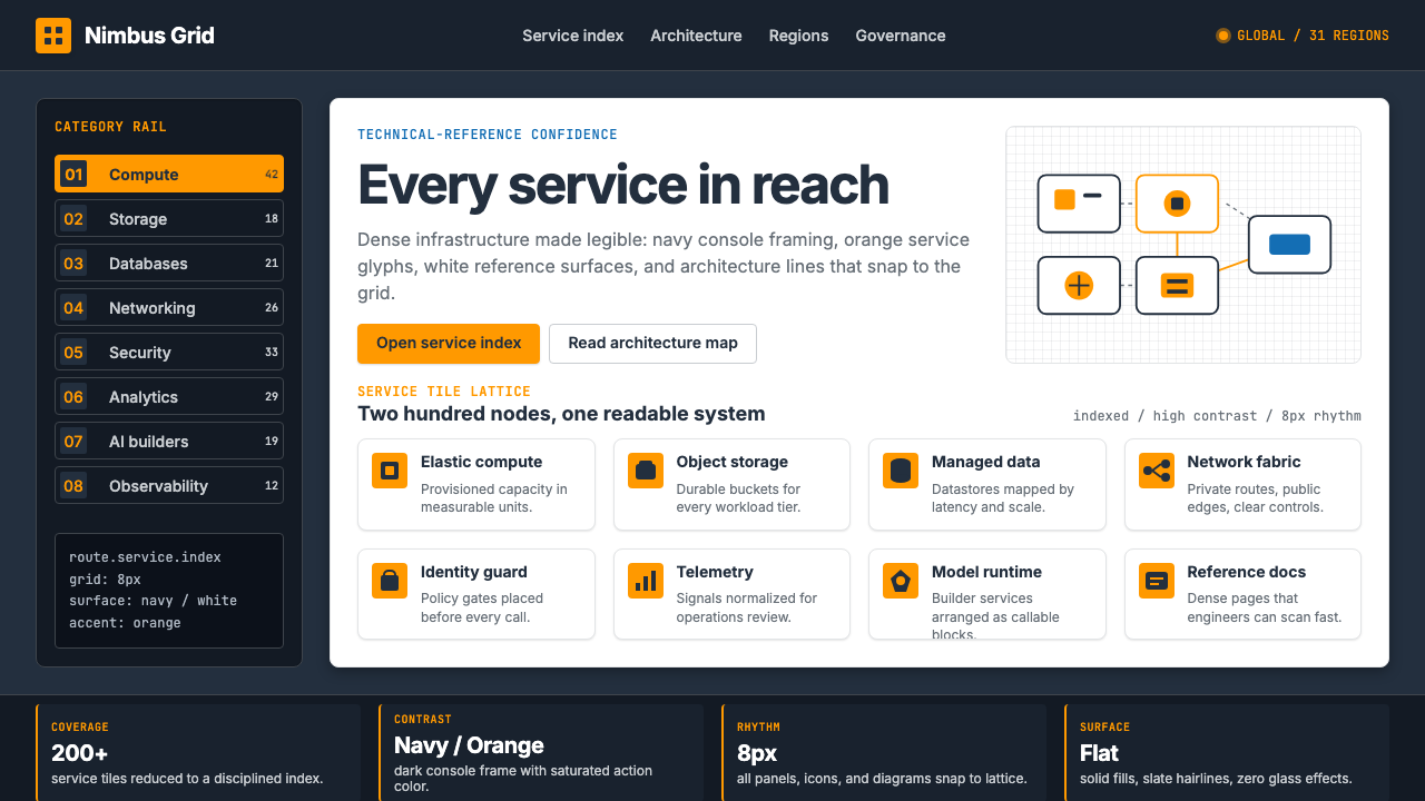
The core tension in the AWS visual language is between density and legibility. The platform hosts over two hundred distinct services — compute, storage, databases, machine learning, networking, security, and dozens more — and each must be discoverable, identifiable, and distinguishable at a glance. The solution is systematic: a consistent orange-on-dark icon grid where each tile carries a service-category color treatment derived from the brand's orange anchor, organizing a complex catalog into a coherent navigational surface. The result feels less like software design and more like a technical reference document brought to life.AWS视觉语言的核心张力在于密度与可读性之间的平衡。这一平台承载两百余项独立服务——计算、存储、数据库、机器学习、网络、安全等——每一项都必须能够被一眼发现、辨认和区分。解决方案是系统性的:一套连贯的橙色底深色图标网格,每个方块以源自品牌橙主色的服务类别色彩处理,将复杂的服务目录组织成连贯的导航界面。结果呈现出的质感与其说是软件设计,不如说是被赋予了生命的技术参考手册。
What distinguishes AWS's aesthetic from other enterprise platforms is its unapologetic commitment to chiaroscuro — the dramatic contrast between the deep navy console shell and the bright, warm service icons and orange call-to-action elements. This is not a muted, low-contrast enterprise grey that tries to disappear; it is a high-contrast, bold-color system that asserts presence. The design language says that the platform itself is confident, expansive, and too large to be shy.将AWS美学与其他企业平台区别开来的,是其对明暗对照毫不妥协的坚守——深海军蓝控制台外壳与明亮温暖的服务图标、橙色行动召唤元素之间的戏剧性对比。这不是试图隐身于背景中的低对比度企业灰;这是一套以高对比度、强色彩主张存在感的系统。这套设计语言宣告:这一平台自信、广博,大到不需要羞涩。
See the Amazon Web Services (AWS) design system查看 Amazon Web Services (AWS) 完整设计系统
Where does Amazon Web Services (AWS) come from?Amazon Web Services (AWS) 从何而来?
Amazon Web Services was born not from a design vision but from an infrastructure problem. In the early 2000s, Amazon's engineering teams found themselves repeatedly building the same internal tools — storage layers, compute allocation systems, database primitives — for different projects. Andy Jassy, who had been working closely with Amazon's CEO Jeff Bezos, recognized that these internal services could be offered externally as a pay-per-use utility platform. In 2006, Amazon launched Simple Storage Service (S3) and Elastic Compute Cloud (EC2), the two foundational primitives that defined what cloud computing would become. The visual design of that early console was utilitarian to the point of severity — it was developer tooling, and it looked exactly like developer tooling.亚马逊云服务的诞生源于一个基础设施问题,而非一个设计愿景。2000年代初,亚马逊的工程团队发现自己在为不同项目反复搭建相同的内部工具——存储层、计算分配系统、数据库基础组件。曾与CEO杰夫·贝索斯紧密合作的安迪·贾西意识到,这些内部服务可以按需收费的形式向外部开放。2006年,亚马逊推出了简单存储服务(S3)与弹性计算云(EC2),这两项基础组件定义了云计算的未来形态。那个早期控制台的视觉设计,实用主义到近乎严苛——那是开发者工具,也确实看起来像开发者工具。
The platform's brand identity evolved alongside its commercial ambitions. For its first decade, AWS's visual language was largely inherited from Amazon's e-commerce aesthetic: functional, data-dense, and not particularly distinctive. The 2017 brand refresh marked a turning point. AWS established its own visual system, architecturally distinct from the consumer-facing Amazon brand, built around what would become its signature combination: the deep navy console environment, the saturated orange service icon accent, and the Amazon Ember typeface — a custom sans-serif commissioned from the type foundry Dalton Maag in 2014 and first deployed across Amazon's family of products. Ember gave the platform typographic coherence across an enormous range of surface areas, from tiny console labels to full-page marketing spreads.平台的品牌视觉随着商业野心的扩张而演变。在最初十年里,AWS的视觉语言大量沿袭亚马逊电商美学:功能性强、数据密集,没有特别突出的个性。2017年的品牌焕新标志了一个转折点。AWS建立了自己独立于面向消费者的亚马逊品牌的视觉系统,围绕其标志性组合构建:深海军蓝控制台环境、饱和橙色服务图标强调色,以及Amazon Ember字体——这款定制无衬线字体于2014年委托字体工作室Dalton Maag设计,随后部署于亚马逊旗下产品系列的各个界面。Ember为这一平台在从微小控制台标签到整页营销物料的广泛范围内提供了排版上的一致性。
Werner Vogels, Amazon's Chief Technology Officer since 2005, became the intellectual and public face of the platform's engineering culture — his blog, 'All Things Distributed,' and his conference appearances at re:Invent established the vocabulary through which AWS communicated its identity to developers. This was a brand built through engineering credibility, not lifestyle aspiration. The architecture diagrams that appeared in AWS documentation and conference talks — dense boxes-and-arrows technical schematics using the service icon set — became one of the most recognizable forms of technical communication in the industry. These diagrams are as much a part of the AWS visual identity as the console itself.维尔纳·沃格尔斯自2005年起担任亚马逊首席技术官,成为平台工程文化的精神与公众面孔——他的博客「一切皆分布式」(All Things Distributed)以及他在re:Invent大会上的演讲,建立了AWS与开发者社区沟通身份认同的话语体系。这是一个靠工程信誉构建的品牌,而非靠生活方式憧憬。出现在AWS文档和会议演讲中的架构图——使用服务图标集绘制的密集方框与箭头技术示意图——已成为行业内最具辨识度的技术沟通形式之一。这些架构图与控制台本身一样,是AWS视觉身份的核心组成部分。
Adam Selipsky succeeded Jassy as AWS CEO in 2021, inheriting a platform that had grown to roughly ninety billion dollars in annual revenue by 2023. By this point, the AWS visual system had become a reference standard in enterprise cloud design — its icon grid, service-category color conventions, and dark-console-on-white-content layout logic had been widely imitated by competitors including Microsoft Azure and Google Cloud, both of which adopted elements of the dark-navigation, service-tile pattern that AWS had pioneered. The irony is that a platform whose early console was purely utilitarian had, through scale and consistency, produced one of the most studied and copied visual systems in enterprise software.2021年,亚当·塞利普斯基接替贾西出任AWS首席执行官,接手的平台到2023年年收入已达约九百亿美元。此时,AWS视觉系统已成为企业云设计的参照标准——它的图标网格、服务类别配色惯例、深色导航配白色内容的版面逻辑,已被微软Azure和谷歌云等竞争对手广泛借鉴,两者均采用了AWS率先开创的深色导航、服务方块图案的部分元素。讽刺之处在于:一个早期控制台纯属实用主义的平台,凭借规模与一致性,催生了企业软件领域研究与仿效最多的视觉系统之一。
What defines the Amazon Web Services (AWS) look?Amazon Web Services (AWS) 的视觉特征是什么?
Orange-on-Navy Contrast橙蓝对比
The defining visual move is the pairing of a saturated warm orange against a deep, near-black navy background. This is not a neutral enterprise palette — it is a deliberately high-contrast, assertive combination that places the brand accent at maximum visibility against the darkest possible ground. The orange reads as warm, energetic, and action-oriented against the cold depth of the navy, creating a visual hierarchy that instantly separates navigation from content, action from information.定义性的视觉动作是将饱和暖橙色与近乎黑色的深海军蓝背景配对。这不是中性的企业色板——而是一种刻意追求高对比度的强势组合,将品牌强调色置于能见度最高的位置,衬托在最深的底色上。橙色在冷峻深邃的蓝色映衬下呈现出温暖、充满活力、指向行动的感受,制造出能够立即区分导航与内容、行动与信息的视觉层级。
Service-Tile Icon Grid服务方块图标网格
AWS organizes over two hundred services into a coherent catalog through a systematic icon grid — each service rendered as a square tile carrying a simplified, flat pictogram against a colored background. The tile backgrounds use a set of category-derived hues that descend from the orange anchor: warm tones for compute and storage, cooler tones for networking and security. The grid itself is the taxonomy made visible: a spatial catalog where proximity implies category and color implies domain.AWS通过系统性的图标网格将两百余项服务组织成连贯的目录——每项服务呈现为一个方形图块,彩色背景上承载着简洁的扁平图形符号。图块背景使用一套源自橙色主色的类别衍生色调:计算与存储用暖色调,网络与安全用冷色调。网格本身就是被视觉化的分类体系:一张空间目录,相邻意味着同类,颜色意味着领域归属。
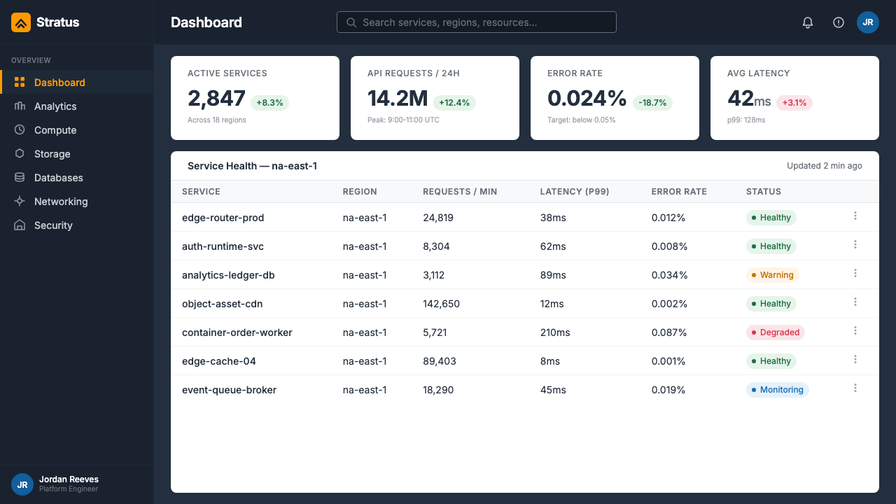
Dark Console, Light Content深色控制台,浅色内容
The AWS console employs a deliberate split-surface logic: the navigation shell — header bar, service navigation, sidebar — is rendered in deep navy, while the primary content area sits on a clean white or near-white ground. This contrast is functional as much as aesthetic: the dark shell frames and recedes, making the white content area feel like the working surface, the place where actual engineering happens. The transition from navigation to content is a shift from orientation to operation.AWS控制台采用刻意的分割表面逻辑:导航外壳——顶部栏、服务导航、侧边栏——呈现为深海军蓝,而主内容区域则坐落于干净的白色或接近白色的底面上。这种对比的功能性与美学性同样强烈:深色外壳框定并退让,使白色内容区域感觉像真正的工作面——实际工程发生的地方。从导航到内容的过渡,是从定向到操作的转变。
Architecture Diagram as Identity架构图作为身份标识
Few enterprise platforms have made a visual artifact as central to their identity as AWS has with its architecture diagrams. These are dense, technical schematics built from the service icon set — boxes, arrows, VPC boundaries, availability zone brackets — that appear in documentation, conference talks, and customer case studies. The diagrams have a distinct visual grammar: flat-color service icons arranged in spatial clusters, connected by directional arrows, enclosed in dashed-line region boundaries. Learning to read and draw these diagrams is itself a professional credential in the cloud industry.很少有企业平台像AWS那样,将某一视觉制品放置在品牌身份的如此核心位置。架构图是由服务图标集搭建的密集技术示意图——方框、箭头、VPC边界、可用区括号——出现在文档、会议演讲和客户案例研究中。这些图表拥有独特的视觉语法:扁平色服务图标按空间簇排列,以方向箭头相连,用虚线区域边界框定。在云计算行业,能够读懂和绘制这些图表本身就是一种专业资质。
Flat, Geometric Iconography扁平几何图标体系
AWS service icons follow a strict flat-color, geometric reduction principle. Each icon reduces its subject — a compute instance, a database, a content delivery network — to its most recognizable geometric silhouette, rendered without gradients, shadows, or dimensional effects. The pictogram reads at small sizes because it carries only the essential geometric gesture. This is not decorative illustration; it is wayfinding at the scale of a service catalog.AWS服务图标遵循严格的扁平色、几何简化原则。每个图标将其主题——计算实例、数据库、内容分发网络——简化为最具辨识度的几何轮廓,不使用渐变、阴影或立体效果。图形符号在小尺寸下依然清晰,因为它只携带最核心的几何姿态。这不是装饰性插图,而是服务目录尺度上的路径指引。
Typographic Hierarchy Without Decoration无装饰的排版层级
The AWS visual system achieves typographic hierarchy through scale, weight, and color contrast alone — no decorative borders, no ornamental dividers, no background tints applied purely for visual texture. Service names, category labels, pricing tiers, and status indicators are distinguished by their position in a size and weight scale, with the orange accent reserved for interactive elements and primary calls to action. The discipline is functional: in a dense service catalog, typographic clarity is survival.AWS视觉系统仅通过尺度、字重和色彩对比来实现排版层级——没有装饰性边框,没有花饰分隔线,没有纯为视觉质感而添加的背景色块。服务名称、类别标签、定价层级和状态指示器通过在尺寸与字重量表中的位置相互区分,橙色强调色保留给交互元素和主要行动号召。这种自律是功能性的:在密集的服务目录中,排版清晰度关乎生死。
Engineering Culture Aesthetic工程文化美学
The overall visual register of AWS is what might be called engineering confidence — the aesthetic of a technical manual produced by people who know the subject matter thoroughly and trust their audience to meet them at that level. There is no visual softening for onboarding, no playful illustration to ease complexity, no lifestyle imagery suggesting aspiration. The design assumes competence. This is simultaneously AWS's greatest strength with its core professional audience and its most significant limitation when reaching new or non-technical users.AWS整体的视觉语域可以称之为工程师式的自信——这是由深刻了解主题的人为同等水平受众制作的技术手册的美学。没有为入门用户软化的视觉处理,没有用于缓解复杂性的趣味插图,没有暗示某种生活方式憧憬的图像。这套设计预设受众的专业能力。这既是AWS对其核心专业受众的最大优势,也是在接触新用户或非技术用户时最显著的局限所在。
See the Amazon Web Services (AWS) design system查看 Amazon Web Services (AWS) 完整设计系统
Who shaped Amazon Web Services (AWS)?谁塑造了 Amazon Web Services (AWS)?
Jassy served as the founding CEO of AWS from its inception through 2021, when he succeeded Jeff Bezos as CEO of Amazon itself. His strategic vision of cloud computing as a utility service — pay only for what you use, scale infinitely on demand — defined not just AWS's business model but the entire enterprise cloud industry. Under his leadership, AWS grew from an internal infrastructure experiment to a platform generating tens of billions in annual revenue, and the visual design system that emerged during his tenure reflects his engineering-first, customer-second cultural stance: function over form, capability over aesthetics.贾西自AWS成立之初担任创始首席执行官,直至2021年接替杰夫·贝索斯出任亚马逊整体CEO。他对云计算作为公用服务的战略愿景——按需付费、无限弹性扩展——不仅定义了AWS的商业模式,更定义了整个企业云行业。在他的领导下,AWS从内部基础设施实验成长为年收入数百亿美元的平台。他任期内形成的视觉设计系统折射出他的工程师优先文化立场:功能优于形式,能力优于美学。
As Amazon's Chief Technology Officer since 2005, Vogels became the engineering intellectual face of AWS — its most prolific public communicator and the architect of its technical credibility. His annual keynotes at re:Invent, AWS's flagship conference, are elaborate technical demonstrations in which new services are introduced through live architecture diagrams and code demonstrations. His long-running blog, 'All Things Distributed,' established a writing style for cloud technical communication that combines engineering rigor with strategic vision. Vogels made the architecture diagram a primary vehicle of AWS identity.沃格尔斯自2005年起担任亚马逊首席技术官,成为AWS的工程智识面孔——其最多产的公众传播者,也是平台技术公信力的建构者。他在AWS旗舰大会re:Invent的年度主题演讲是精心设计的技术展示,新服务通过实时架构图和代码演示引入。他长期坚持的博客「一切皆分布式」确立了云计算技术传播的写作风格,将工程严谨性与战略视野融为一体。沃格尔斯使架构图成为AWS身份认同的核心载体。
Selipsky served as AWS CEO from 2021 onward, inheriting a platform whose visual identity was already a global reference standard. His tenure coincided with the platform's expansion into machine learning services, generative AI tooling, and deeper industry-specific clouds — categories that required the visual system to extend into new domains while maintaining the legibility and authority that the orange-on-navy language had established. His re:Invent keynotes introduced a more polished presentation layer to AWS's public communications, while preserving the engineering-first visual register of the console itself.塞利普斯基自2021年起担任AWS首席执行官,接手的平台视觉身份已是全球参照标准。他的任期恰逢平台向机器学习服务、生成式AI工具和更深度行业专属云的扩张——这些新领域要求视觉系统延伸至新版图,同时保持橙蓝语言所建立的可读性与权威感。他的re:Invent主题演讲为AWS的公众传播引入了更为精致的呈现层次,同时保留了控制台本身工程师优先的视觉语域。
The London-based type foundry Dalton Maag was commissioned by Amazon in 2014 to design Amazon Ember, the custom typeface that serves as the typographic backbone of the entire AWS visual system. Ember is a humanist sans-serif with a large x-height and open apertures, designed to remain legible at the small sizes demanded by dense console interfaces and to scale gracefully to large headline sizes in marketing contexts. By commissioning a custom typeface rather than licensing an existing one, Amazon gave AWS a typographic signature that no other enterprise platform shared — a subtle but powerful signal of the platform's scale and investment in its own identity.这家总部位于伦敦的字体工作室于2014年受亚马逊委托,设计了Amazon Ember——这款定制字体是整个AWS视觉系统的排版骨架。Ember是一款具有大字高和开放字腔的人文主义无衬线字体,设计上兼顾在密集控制台界面小尺寸下的清晰可读性,以及在营销场景大标题尺寸下的优雅伸展性。通过委托定制字体而非授权现有字体,亚马逊赋予了AWS一个独一无二的排版签名——这是一个微妙却有力的信号,彰显了平台的规模与对自身身份建设的投入。
AWS's annual re:Invent conference, held in Las Vegas since 2012, is not a figure in the biographical sense but a designed artifact that has shaped AWS's public visual identity as much as the console itself. The conference produces tens of thousands of architecture diagrams, technical session slides, and product announcement graphics each year — all subject to the AWS visual system's rules. The characteristic re:Invent aesthetic — orange on dark, dense technical diagrams, service icon grids, white-on-dark slide templates — has become a recognized genre of enterprise technical communication, distinguishable at a glance from any other cloud platform's conference materials.AWS自2012年起每年在拉斯维加斯举办的re:Invent大会,在传记意义上并非一个人物,却是一件被设计出来的制品——其对AWS公众视觉身份的塑造力与控制台本身不相上下。大会每年产生数以万计的架构图、技术演讲幻灯片和产品发布视觉物料——全部遵循AWS视觉系统的规则。具有辨识度的re:Invent美学——深色底橙色、密集技术示意图、服务图标网格、深底白字幻灯片模板——已成为企业技术传播中公认的视觉类型,一眼便能与任何其他云平台的大会物料相区分。
How do you use Amazon Web Services (AWS) today?今天怎么用 Amazon Web Services (AWS)?
The AWS visual language is most legible when applied to contexts that share its underlying values: technical authority, categorical density, and the need to orient expert users within a complex system. Applying it correctly requires understanding that the style's power comes from its systematic restraint — the orange is powerful because it is reserved, the dark navy reads as stable because the content surfaces are kept consistently light.AWS视觉语言在与其底层价值观相符的场景中最为清晰:技术权威、类别密度,以及引导专业用户在复杂系统中定向的需求。正确应用它需要理解:这种风格的力量来自系统性的克制——橙色之所以有力,是因为它被保留;深蓝之所以显得稳定,是因为内容面始终保持一贯的浅色。
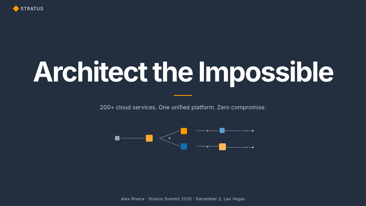
For presentation slides, the AWS aesthetic works best when applied with the same discipline it brings to the console. A cover slide benefits from the dark-navy-field approach: the service icon grid or a single large service icon in orange anchors the visual field, while the title and subtitle sit in high-contrast white type. Content slides should commit to the dark-shell, light-content split — a dark header band with orange accent carries the section title, while the body area operates on a clean white ground with the systematic typographic hierarchy that AWS console labels demonstrate. Architecture diagram slides are where the style truly excels: dense technical schematics using the AWS icon set, arranged in the boxes-and-arrows grammar that engineering audiences recognize instantly. Avoid importing lifestyle photography or illustrative imagery — it conflicts with the visual register.对于演示文稿,AWS美学在以同等纪律应用时效果最佳。封面幻灯片适合深海军蓝底色方案:服务图标网格或单个大号橙色服务图标锚定视觉场,标题与副标题以高对比度白色字体呈现。内容幻灯片应坚持深色外壳、浅色内容的分割——带橙色强调的深色页眉带承载章节标题,正文区域在干净白底上运行,采用AWS控制台标签所示范的系统性排版层级。架构图幻灯片是这种风格真正大放异彩之处:使用AWS图标集绘制的密集技术示意图,以工程师受众一眼即识的方框与箭头语法排列。避免引入生活方式摄影或插画图像——它们与视觉语域相冲突。
For web dashboards and cloud service UI, the AWS visual pattern is a natural reference. Apply a dark top navigation bar as the primary orientation surface, reserving the orange accent strictly for active states, primary action buttons, and alert indicators. The main content area should be white or very lightly tinted, organized in a card grid that mirrors the service-tile logic. Use flat, outlined iconography rather than illustrated icons, and keep the icon color palette limited to functional category signals rather than decorative variety. Pricing pages work particularly well in this style: the tier-differentiation grid, with its horizontal comparison structure and orange highlight for the recommended tier, directly mirrors AWS's own pricing page conventions.对于网页仪表板和云服务界面,AWS视觉模式是自然的参照。以深色顶部导航栏作为主要定向界面,将橙色强调严格保留给活跃状态、主要操作按钮和警示指示符。主内容区域应为白色或极浅色调,以镜像服务方块逻辑的卡片网格组织。使用扁平线框图标而非插画风格图标,将图标色彩限制在功能性类别信号,而非装饰性多样化。定价页面在这种风格下表现尤为出色:层级比较网格,水平对比结构,加上推荐层级的橙色高亮——这直接镜像了AWS自身定价页面的惯例。
For editorial and marketing content — blog posts, technical white papers, case studies — the AWS visual language supports a clear hierarchy through its typographic discipline. Use a single sans-serif typeface at multiple weights rather than mixing families. Deploy the orange sparingly as a link color, pull-quote accent, or section marker. Technical diagrams should follow the boxes-and-arrows convention even when simplified, giving the reader a visual grammar consistent with what they encounter in AWS documentation. Marketing pages for infrastructure or developer tools are particularly well-served by the style's poster-like directness: alternating dark-navy feature blocks and white content sections, with orange used only for the primary call-to-action element per section.对于编辑与营销内容——博客文章、技术白皮书、案例研究——AWS视觉语言通过排版自律支持清晰的层级。使用单一无衬线字体的多个字重,而非混用字体家族。将橙色节制地用作链接色、引用段落强调或章节标记。技术示意图即便经过简化,也应遵循方框与箭头惯例,为读者提供与AWS文档一致的视觉语法。基础设施或开发者工具的营销页面尤其适合这种风格的海报式直接感:深海军蓝特性区块与白色内容区块交替呈现,橙色仅用于每个区块的主要行动号召元素。
A common mistake when applying the AWS visual language is treating the orange as a general-purpose accent to be distributed liberally across every interactive element, illustration, and decorative touch. In the AWS system, the orange is powerful precisely because it is rare — it marks the action, the selection, the critical status. Diluting it across the entire composition dissolves the visual hierarchy the system depends on. Equally damaging is softening the dark navy to a medium grey in the mistaken belief that it will feel more approachable; the dramatic contrast between the near-black navigation shell and the white content area is what gives the system its authority. Choosing a medium tone for both surfaces produces the worst of both worlds: neither bold nor clean.应用AWS视觉语言时最常见的错误,是将橙色视为可以自由分布在每个交互元素、插图和装饰细节上的通用强调色。在AWS系统中,橙色之所以有力,恰恰在于它的稀缺——它标记行动、选中状态、关键状态。将其稀释至整个构图,会瓦解系统所依赖的视觉层级。同样具有破坏性的是:出于让界面更易亲近的错误判断,将深海军蓝软化为中性灰——近黑色导航外壳与白色内容区域之间的戏剧性对比,正是赋予系统权威感的来源。为两个面选择中间色调,会产生两头不占的最差结果:既不大胆,也不清爽。
See the Amazon Web Services (AWS) design system查看 Amazon Web Services (AWS) 完整设计系统
Amazon Web Services (AWS) — FAQAmazon Web Services (AWS) · 常见问题
Is the AWS visual style appropriate for non-cloud products?AWS视觉风格适用于非云计算产品吗?
It can be, but only when the product shares the underlying values the style communicates: technical authority, categorical depth, and the assumption of expert users. The style works well for developer tools, data dashboards, infrastructure monitoring products, security platforms, and any interface where the user is a professional who values orientation over aesthetics. It struggles in consumer contexts, emotional service design, or products targeting non-technical audiences — the visual language's severity reads as cold or intimidating to users who are not already predisposed to trust it on professional grounds.在某些条件下可以,但仅限于产品与这种风格传达的底层价值观一致时:技术权威性、类别纵深,以及对专业用户的预设。这种风格适合开发者工具、数据仪表板、基础设施监控产品、安全平台,以及任何面向重视定向胜过美学的专业用户的界面。它在消费级场景、情感型服务设计或面向非技术受众的产品中则力不从心——对于并非已在专业层面信任它的用户而言,这套视觉语言的严肃性会被解读为冷漠或令人生畏。
How does AWS's visual approach differ from other major cloud platforms?AWS的视觉方案与其他主要云平台有何不同?
AWS's visual language is the oldest and has defined the category default. Microsoft Azure and Google Cloud both arrived later and drew from AWS's conventions — the dark navigation shell, the service icon grid, the flat-color iconography — while diverging in palette and personality. Azure leans toward a cooler, more corporate blue-and-grey palette with Microsoft's Fluent Design language softening the edges. Google Cloud applies Material Design conventions, introducing more color variety, rounded geometry, and a lighter overall surface treatment. AWS alone maintains the dramatic high-contrast orange-on-near-black combination and the uncompromising density that comes from two decades of accumulated service catalog. The AWS aesthetic is the most severe and the most recognizable.AWS的视觉语言是最早确立的,并定义了这一类别的默认标准。微软Azure和谷歌云均是后来者,从AWS的惯例中汲取——深色导航外壳、服务图标网格、扁平色图标体系——同时在色板和个性上有所偏离。Azure倾向于更冷峻、更具企业感的蓝灰色板,辅以微软Fluent设计语言柔化边缘。谷歌云运用Material Design规范,引入更多色彩变化、圆角几何和更轻盈的整体界面处理。唯有AWS保持着戏剧性的高对比度橙配近黑色组合,以及源自二十年服务目录积累的不妥协密度。AWS美学是最严肃的,也是最具辨识度的。
Can the AWS style work in a light-mode or all-white layout?AWS风格能用于浅色模式或全白版面吗?
Yes — the AWS console itself uses white as the primary content surface, with the dark navy confined to navigation elements. A light-mode interpretation of the AWS style is therefore entirely authentic: white content cards, clean sans-serif typographic hierarchy, flat orange for active states and calls to action, and flat icon treatments in the service icon grammar. The critical requirement is that the orange retain its character as a rare, functional accent rather than a pervasive decorative color. The dark shell is not mandatory; what is mandatory is the restraint, the systematic hierarchy, and the orange's reserved status.可以——AWS控制台本身将白色作为主要内容界面,深海军蓝仅限于导航元素。因此,AWS风格的浅色模式诠释是完全符合原意的:白色内容卡片、干净的无衬线排版层级、扁平橙色用于活跃状态和行动号召,以及服务图标语法下的扁平图标处理。关键要求是橙色保持其作为稀少功能性强调色的特性,而非无处不在的装饰色。深色外壳并非强制要求;强制要求的是克制、系统性层级,以及橙色的保留地位。
What is the right way to use the AWS icon style without the full icon library?在没有完整图标库的情况下,如何正确应用AWS的图标风格?
The principles behind the AWS icon style can be applied independently of the specific icon library. The core rules are: reduce the subject to its most recognizable geometric silhouette; render it in a single flat color against a contrasting tile background; keep the tile square; assign background colors by category rather than by individual preference. The result should read as a wayfinding system, not an illustration. If custom icons must be created from scratch, designing them through geometric reduction — starting with the simplest possible shape that still communicates the subject — produces results consistent with the AWS visual grammar.AWS图标风格背后的原则可以在不依赖特定图标库的情况下独立应用。核心规则是:将主题简化为最具辨识度的几何轮廓;以单一扁平色呈现在对比鲜明的方块背景上;保持方块为正方形;按类别而非个人偏好分配背景颜色。结果应呈现为路径指引系统,而非插图。若必须从头创建自定义图标,通过几何简化进行设计——从能够传达主题的最简形状出发——将产生与AWS视觉语法一致的结果。
Does the AWS aesthetic age well, or does it feel like a specific moment in enterprise software history?AWS美学经得起时间考验吗?还是它更像企业软件历史上特定时刻的产物?
The AWS aesthetic is simultaneously historically situated and remarkably durable. It is situated because the dark-console, service-grid pattern it pioneered has now been so widely adopted that it no longer reads as distinctive within the cloud category — it has become the category default. It is durable because its underlying principles — high contrast, systematic hierarchy, flat color, functional iconography — are structural rather than stylistic, and structural principles age more slowly than surface trends. The orange-on-navy combination will eventually feel dated in the same way that all specific color pairings eventually do, but the organizational logic of the AWS visual system — grid, icon, category, contrast — is likely to remain legible and influential long after its specific palette has been superseded.AWS美学既具有历史定位性,又拥有相当的持久力。说它有历史定位性,是因为它所开创的深色控制台、服务网格模式如今已被广泛采纳,在云计算类别内不再具有独特性——它已成为类别默认。说它有持久力,是因为其底层原则——高对比度、系统性层级、扁平色、功能性图标——是结构性的而非风格性的,而结构性原则的老化速度远慢于表层趋势。橙配深蓝的组合终将像所有特定色彩搭配那样显得过时,但AWS视觉系统的组织逻辑——网格、图标、类别、对比——很可能在其特定色板被取代之后很久,仍保持清晰可读和影响力。
Related design styles相关设计风格
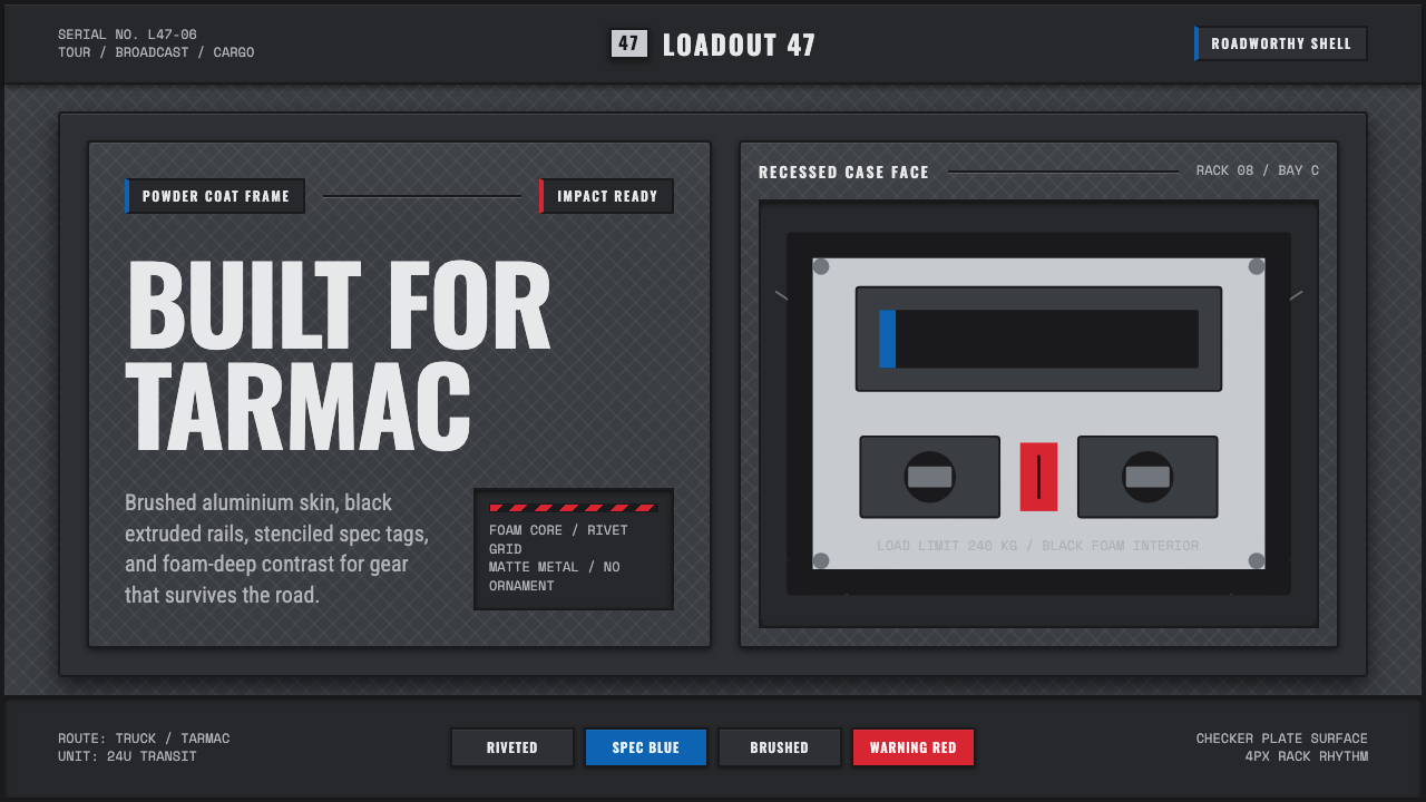 Aluminium Flight CaseRoadproof and exact. Diamond-plate gray, stencil type, black frames, blue-red…坚硬精确:菱形铝纹、模版字、黑框与蓝红规格标签。
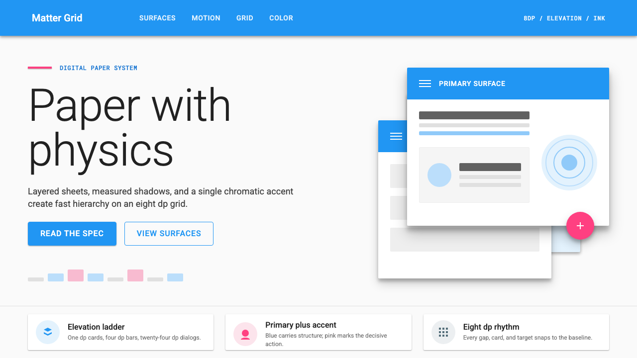 Material Design 1.0Depth made flat usable. Blue app bars, pink FABs, 8dp grids, and crisp paper…让扁平拥有深度:蓝色应用栏、粉色FAB、8dp网格与纸张投影。
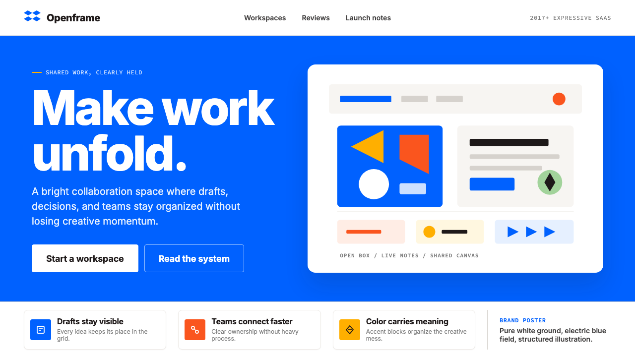 Dropbox ModernFriendly SaaS gets loud. Electric blue and Sharp Sans drive a structured geom…友好 SaaS 变响亮:电蓝与 Sharp Sans 推动几何网格。
 Adobe Creative CloudUnified, not uniform. Red anchor, white space, and saturated app tiles organi…统一而不单一:红色锚点、留白与高饱和应用方块组织整套工具。
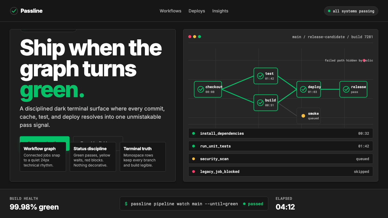 CircleCI Pipeline-GreenConfidence goes green. Emerald status lines cut through terminal-black pipeli…信心变绿。翠绿状态线切过终端黑流水线网格。
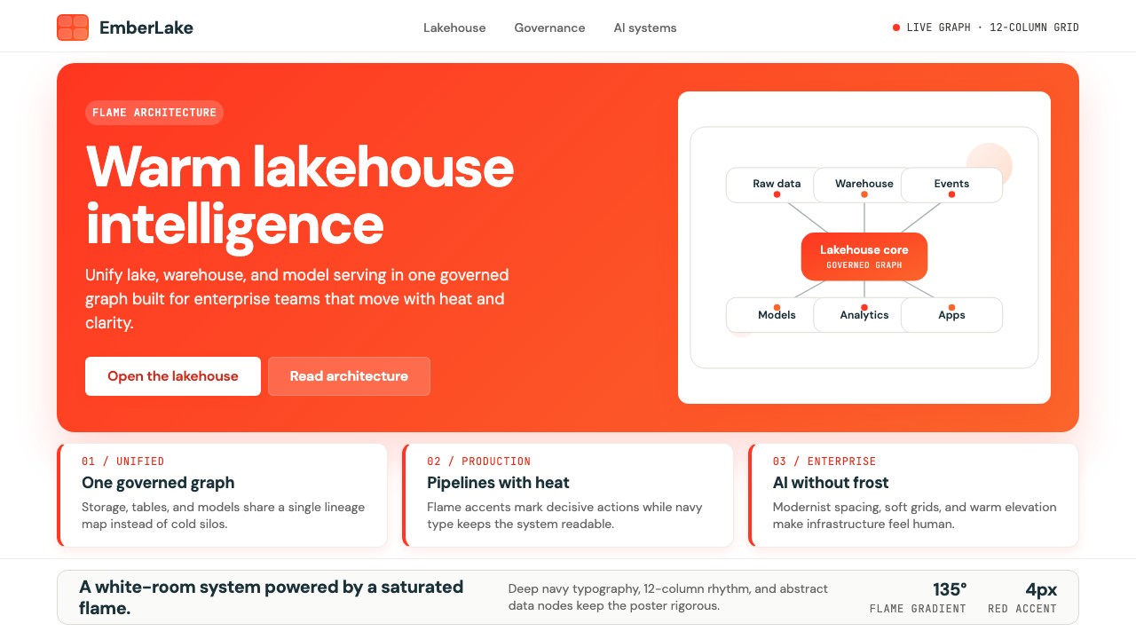 Databricks LakehouseWarm enterprise confidence. Flame red-orange gradients meet DM Sans and clean…温暖的企业信心:红橙火焰渐变配 DM Sans 与洁净数据图。