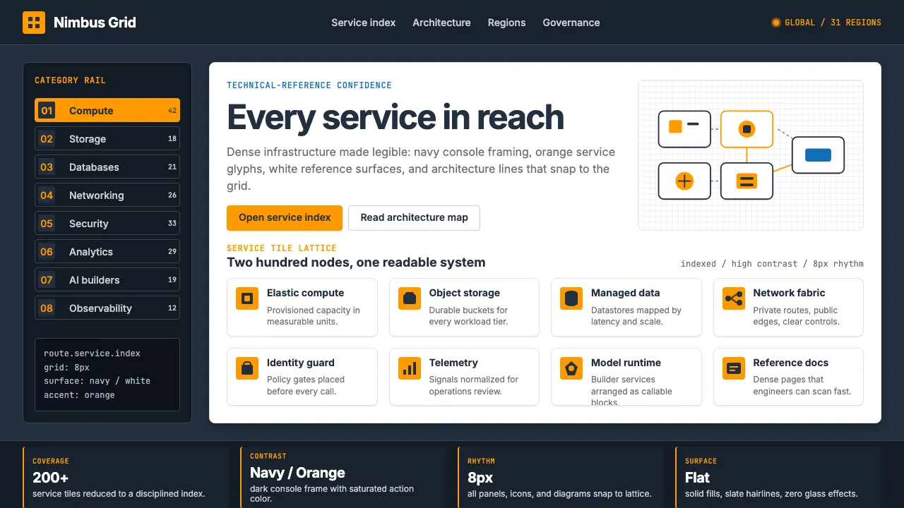
About Amazon Web Services (AWS)
Amazon Web Services is the original infrastructure-cloud — launched 2006, now powering roughly thirty percent of the web. Its visual identity is intentionally enterprise-not-consumer: a saturated AWS-orange (#FF9900) brand-accent set against AWS-navy (#232F3E) console-dark, organized through Amazon Ember sans-serif and a service-tile-grid of around two hundred services.
The aesthetic feels like the AWS Console itself — dark-navy navigation, orange service-tile-icons, white text, dense architecture-diagrams, generous category-sidebars. It is the design language of technical-reference confidence: clean flat-color, high-contrast chiaroscuro, sharp icon grids, and absolutely no skeuomorphism.
- Origin
- USA — Seattle (Amazon HQ) + global cloud hub-distribution
- Era
- Launched 2006 (S3 + EC2); current brand 2017 refresh; Amazon Ember typeface 2014; ~$90B revenue (2023)
- Key figures
- Andy Jassy · Werner Vogels · Adam Selipsky · Dalton Maag
- Movements
- enterprise-cloud-computing · IaaS-platform-design · technical-reference-UX
Amazon Web Services (AWS) design spec
Colors
Typography
The other 11 sections — buttons, cards, spacing, motion, techniques and more — open once you unlock. Download the DESIGN.md or send it to your AI in one click. Unlock once, yours forever.
Sign up nowStyles similar to Amazon Web Services (AWS)
Also inspired by brands & products, with a close feel.
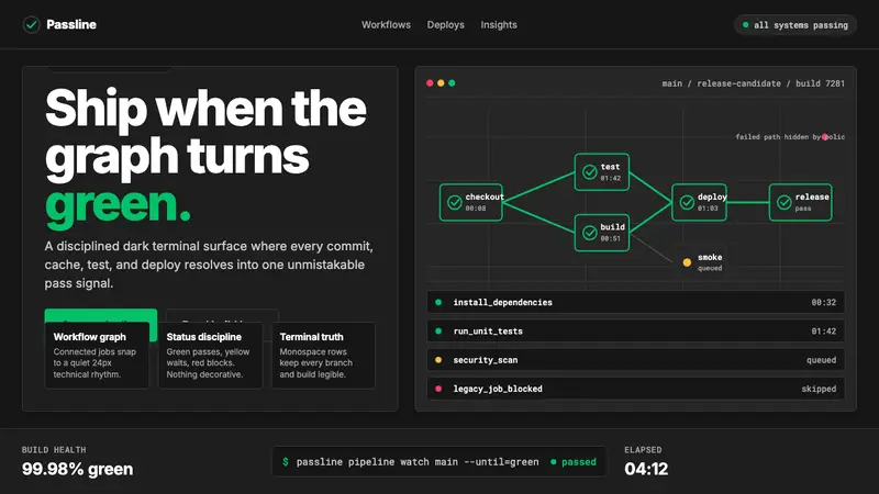 CircleCI Pipeline-GreenConfidence goes green. Emerald status lines cut through terminal-black pipeline grids.
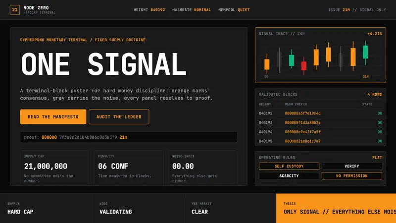 Bitcoin Maximalist OrangeOnly signal, zero spectacle. Orange mono data grids on terminal black enforce hard-money focus.
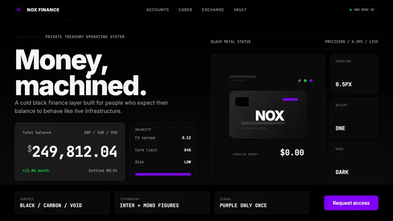 Revolut Black FinanceBanking as instrument. Pure black, hairline borders, and one electric purple signal.
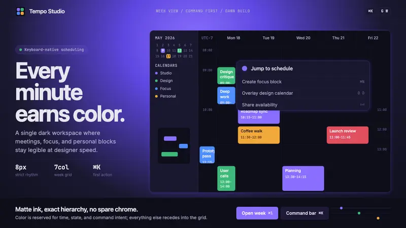 Cron CalendarDesigner-tech restraint. Purple wash, ink grid, mono shortcuts, surgical event colors.