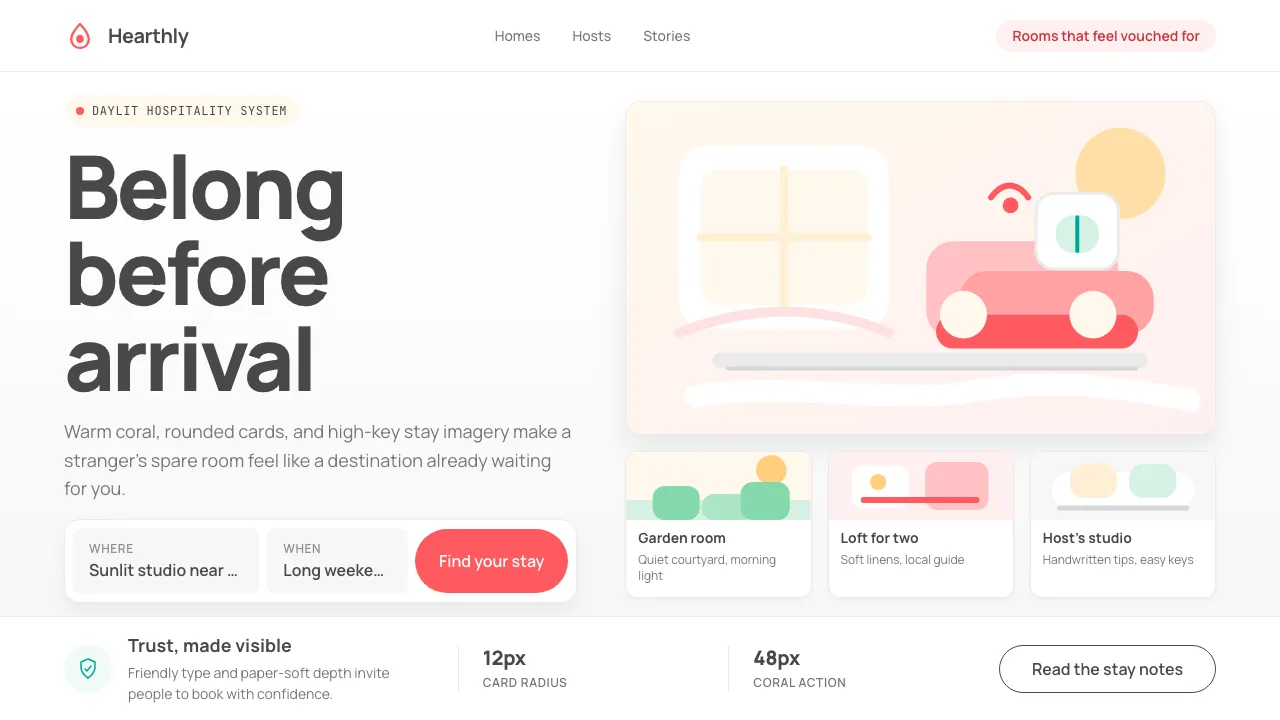
About Airbnb 2014
Airbnb's 2014 rebrand replaced a forgettable wordmark with the Bélo — a symbol meant to convey belonging — and wrapped the entire product in warm coral, generous whitespace, and the friendly curves of Cereal. The result was a visual language so distinctive it became shorthand for "trust between strangers online," inspiring an entire generation of marketplace and lifestyle SaaS brands.
At its core, the Airbnb aesthetic is daylit hospitality: large hero photography, soft rounded cards, and a signature coral-red that feels energetic without being aggressive. Every design decision — from pill-shaped buttons to generous line-heights — serves one goal: make a stranger's spare room feel like a destination.
- Origin
- San Francisco, California; brand work by DesignStudio London
- Era
- 2014 brand refresh (Bélo logo); signature visual language 2014–2018
- Key figures
- Brian Chesky · Joe Gebbia · Ben Wright · Karri Saarinen
- Movements
- sharing-economy design · humanist digital branding · photo-led web design
Airbnb 2014 design spec
Colors
Typography
The other 11 sections — buttons, cards, spacing, motion, techniques and more — open once you unlock. Download the DESIGN.md or send it to your AI in one click. Unlock once, yours forever.
Sign up nowStyles similar to Airbnb 2014
Also inspired by brands & products, with a close feel.
 Cohere Coral-AIEnterprise AI feels humane. Coral panels, sky-blue chips, and organic curves soften the grid.
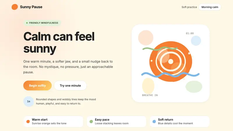 HeadspaceOptimism makes calm approachable. Sunrise orange and wobbly rounded forms breathe on cream.
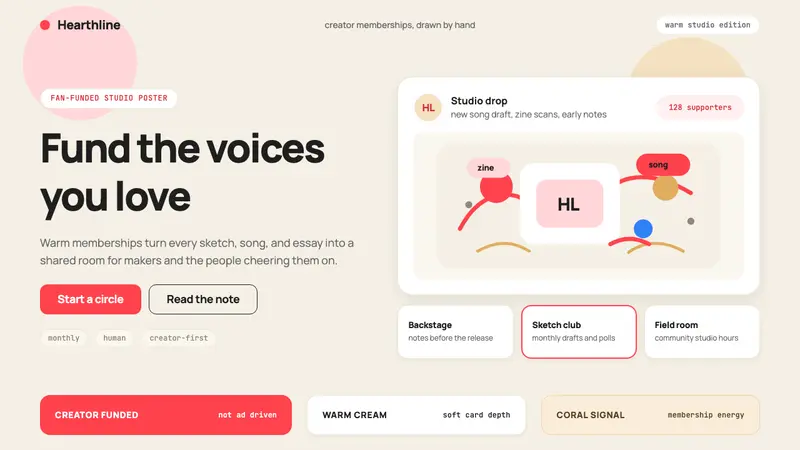 Patreon 2017Creator funding feels human. Coral CTAs on warm cream, rounded cards, hand-drawn accents.
 Xiaohongshu (RedNote) 2024Warm notes feel trusted. Cream-pink masonry cards glow with signature red accents.