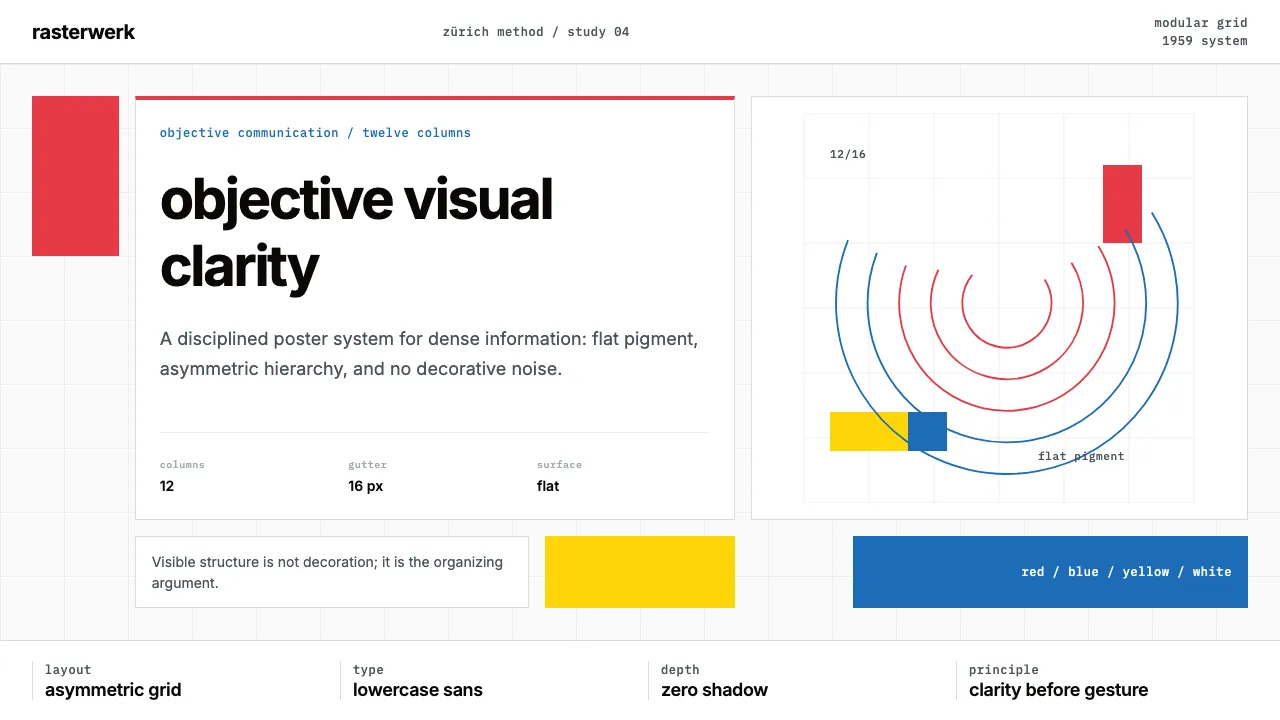
About Müller-Brockmann Swiss
Josef Müller-Brockmann's work is the canonical statement of Swiss International Style: Helvetica on rigorous modular grids, asymmetric compositions, and saturated primary-color accents on white. His Tonhalle Zürich concert posters (1950–72) and *Grid Systems in Graphic Design* (1981) became the textbook for objective visual communication.
This system translates his doctrine into digital tokens — the 12-column grid as foundational substrate, Inter as the Helvetica substitute, flat saturated red and blue accent blocks, and the absolute rejection of decorative ornament or depth illusion.
- Origin
- Zürich, Switzerland
- Era
- 1950–1972 peak poster work; foundational books 1971–1981
- Key figures
- Josef Müller-Brockmann · Armin Hofmann · Emil Ruder · Karl Gerstner
- Movements
- Swiss International Style · Basel and Zürich typographic schools · Neue Grafik
Müller-Brockmann Swiss design spec
Colors
Typography
The other 11 sections — buttons, cards, spacing, motion, techniques and more — open once you unlock. Download the DESIGN.md or send it to your AI in one click. Unlock once, yours forever.
Sign up nowStyles similar to Müller-Brockmann Swiss
Also inspired by art & artists, with a close feel.
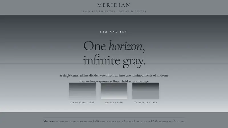 Sugimoto SeascapesTime, held still. A centered hairline horizon splits luminous neutral gray into sea and sky.
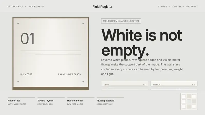 Robert Ryman White PaintingWhite becomes material. Cool grey wall, raw edges and metal fasteners expose each layer.
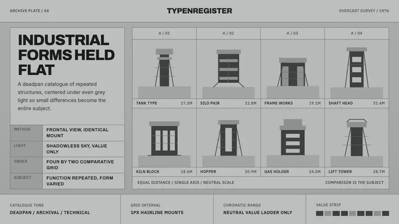 Bechers Industrial TypologyDeadpan order. Mid-grey ground, Archivo labels, and strict hairline grids reveal variation.
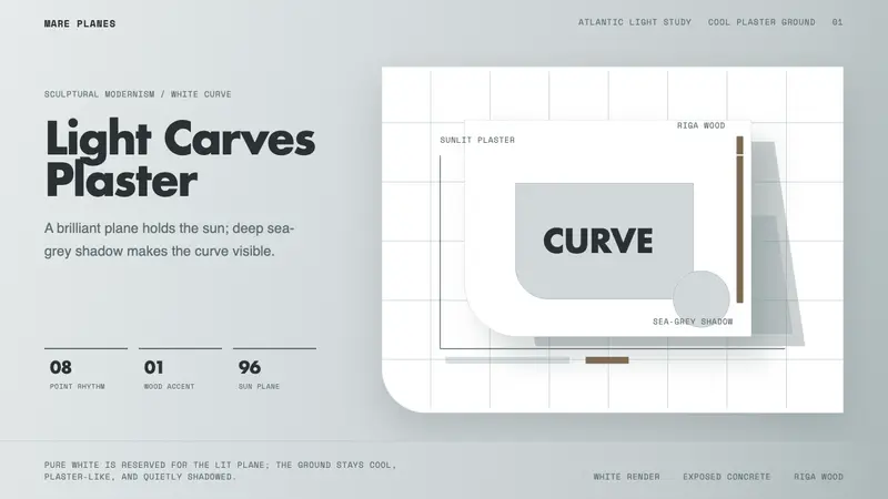 Alvaro Siza WhiteLight makes the form. White planes on cool plaster throw sea-grey shadow and one wood note.