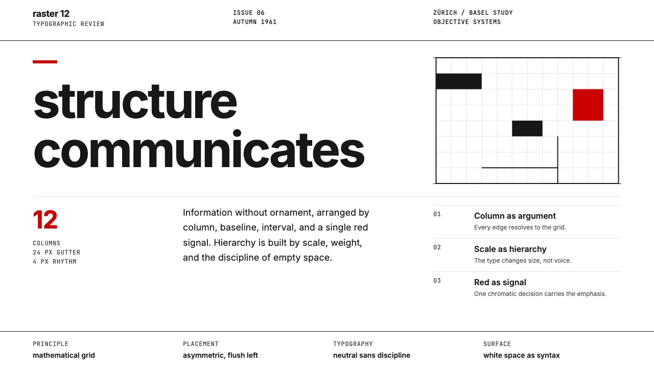
About Swiss International Style
The Swiss International Typographic Style emerged from Zürich and Basel in the 1950s as a radical commitment to objectivity: information should communicate through structure, not decoration. Mathematical grids, sans-serif type, asymmetric composition, and disciplined use of white space became the vocabulary of an entire generation of corporate and editorial design.
Its influence is inescapable — from Lufthansa's identity to the New York subway signage — and its core principles (hierarchy through scale and weight, not ornament) remain the bedrock of modern UI and editorial design sixty years later.
- Origin
- Zürich and Basel, Switzerland
- Era
- 1950s–1970s (peaked 1955–1965); visual principles still foundational today
- Key figures
- Josef Müller-Brockmann · Armin Hofmann · Max Bill · Emil Ruder · Adrian Frutiger
- Movements
- Modernism · New Typography · Constructivism
Swiss International Style design spec
Colors
Typography
The other 11 sections — buttons, cards, spacing, motion, techniques and more — open once you unlock. Download the DESIGN.md or send it to your AI in one click. Unlock once, yours forever.
Sign up nowStyles similar to Swiss International Style
Also inspired by design movements, with a close feel.
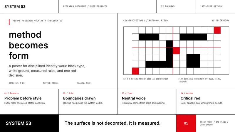 Ulm School (HfG Ulm)Clarity becomes discipline. Black-white grid, Inter grotesk, and one surgical red mark.
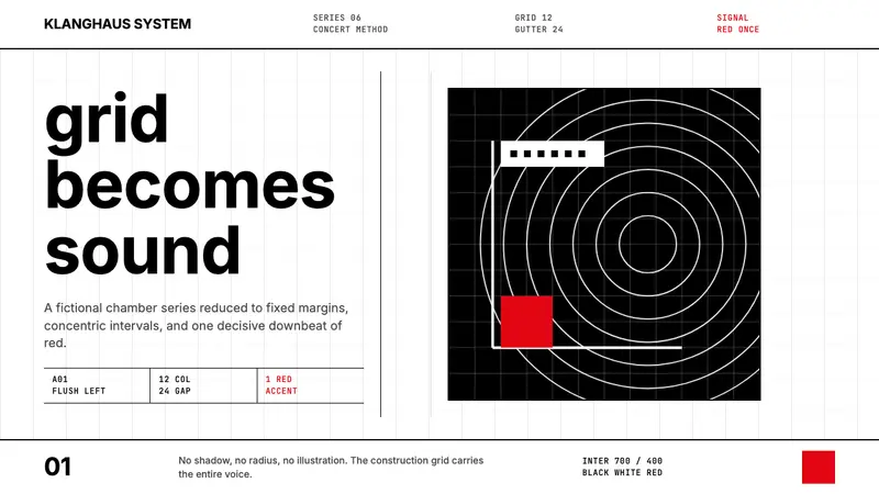 Müller-Brockmann GridOrder becomes force. Black-white 12-column grid, Inter type, one red downbeat.
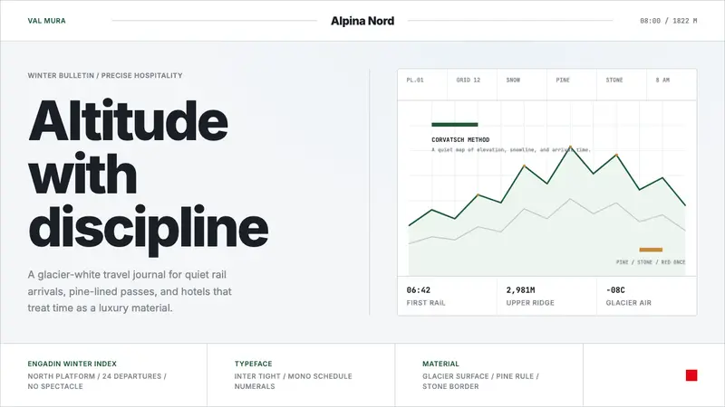 Swiss Alps GraubündenAlpine precision, restrained. Glacier white, pine rules, and tight Inter grid the silence.
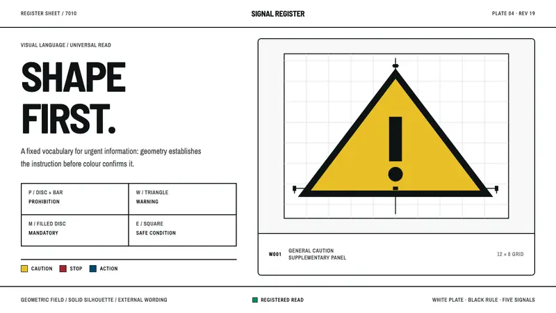 ISO Safety SymbolsShape speaks before colour. Black-on-signal geometry sits on a rigorously ruled white register.