What is Mono-ha (Lee Ufan, 1968)?
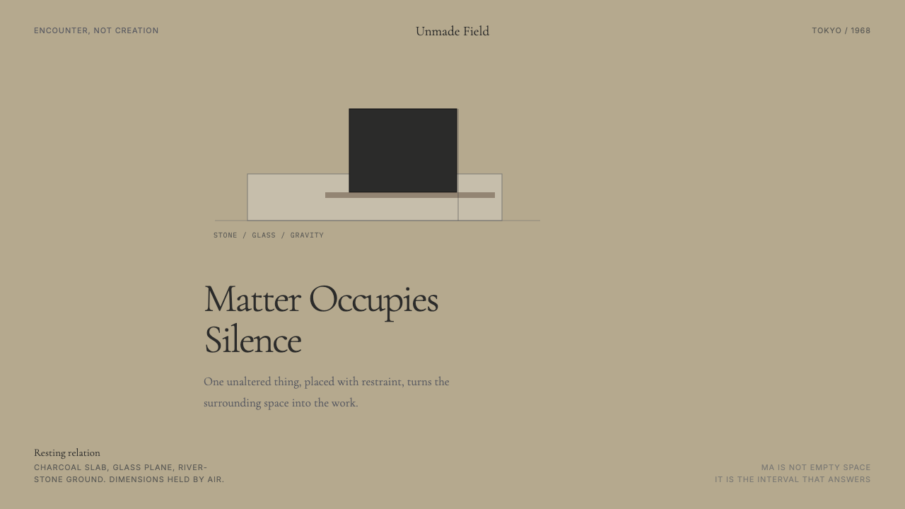
Mono-ha asks what happens when you stop making and start listening — placing a stone on glass, leaning timber against a wall, and calling the encounter between matter and space the work itself.
Mono-ha (Lee Ufan, 1968) in brief
Mono-ha, literally translated as the 'School of Things,' was a Japanese avant-garde movement that emerged in the late 1960s around a radical proposition: that art need not fabricate anything. Rather than shaping materials into new forms, Mono-ha artists placed unaltered things — river stones, steel plates, timber beams, cotton, wire, glass — into deliberate relationships with the space around them and with each other. The result was sculpture that refused to be sculpture in any conventional sense.
The movement was inseparable from the philosophical influence of Lee Ufan, a Korean-born artist and philosopher based in Japan, whose writings theorized what Mono-ha practice was already doing. Lee argued that the Western tradition of art-making imposed the self upon the world — the artist's will reshaping matter according to an idea. Mono-ha proposed the opposite: a withdrawal of the self so that matter could reveal its own nature, its resistance, its weight, its silence. The encounter between thing and world was the subject; the artist was its facilitator, not its author.
As a design language, Mono-ha translates this philosophy into visual practice. Surfaces carry the color and texture of natural materials — concrete, earth, unprocessed stone, undyed linen. Composition is sparse to the point of ceremony: a single element placed in a field of emptiness, with the surrounding void treated as active rather than absent. The Japanese concept of ma — the charged interval between things, neither empty nor full — governs how space is used. Nothing is crowded. Nothing competes.
Where does Mono-ha (Lee Ufan, 1968) come from?
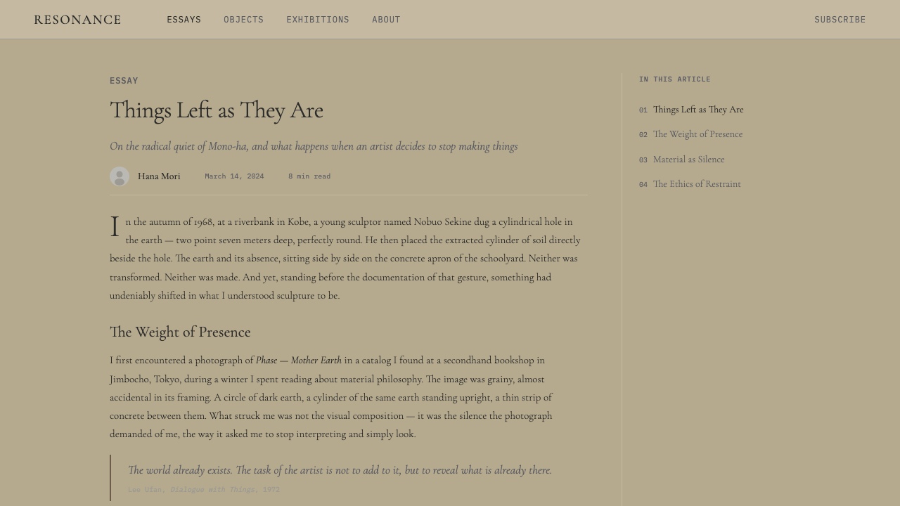
The founding moment of Mono-ha is generally located in October 1968, when sculptor Nobuo Sekine created Phase — Mother Earth at the open-air Suma Rikyu Park exhibition in Kobe. Sekine excavated a cylindrical hole in the earth and placed the displaced soil as an identical cylinder beside it — two volumes, one void and one solid, in perfect formal correspondence. The work did not represent anything; it simply made visible the relationship between matter removed and space created. Lee Ufan, who encountered the work and recognized in it something he had been theorizing, became Sekine's close collaborator, and the Mono-ha constellation began to coalesce around this encounter.
Mono-ha grew from the specific context of late 1960s Japan, a country undergoing rapid and disorienting modernization. The postwar economic miracle was remaking daily life, and the art world's dominant movements — the preceding Gutai group, with its emphasis on performance and process; the concurrent Conceptual art and Land art movements in Europe and America — all pointed away from the traditional art object. Mono-ha shared a historical moment with Arte Povera in Italy, which also rejected the fabricated art object in favor of humble, unprocessed materials. Yet Mono-ha was philosophically distinct: where Arte Povera retained a political charge, Mono-ha was grounded in phenomenology and Eastern philosophical traditions of receptivity and non-action.
Lee Ufan's philosophical framework drew on the work of Japanese philosopher Nishida Kitaro and the phenomenological tradition of Heidegger, whose concept of 'letting be' — allowing things to reveal themselves on their own terms — resonated deeply with Mono-ha practice. Lee's 1969 essay 'In Search of Encounter' became the movement's key theoretical text, arguing that true creative work begins not with making but with meeting: the artist positions themselves to encounter the world rather than to impose a vision upon it. This philosophical seriousness distinguished Mono-ha from movements that shared its material vocabulary but not its conceptual depth.
The movement's active period ran roughly from 1968 to the mid-1970s, centered on a community of artists working around Tama Art University in Tokyo. Key figures included Lee Ufan, Sekine, Susumu Koshimizu, and Kishio Suga, each of whom developed distinct approaches within the shared philosophical framework. Mono-ha never produced a manifesto or institutional structure; it coalesced around shared sensibility rather than declared program. By the late 1970s the tight cluster had dispersed, though Lee Ufan continued developing his practice — and the theoretical legacy of Mono-ha has since been extensively reconsidered, with major retrospectives at the Guggenheim and elsewhere establishing it as one of the defining art movements of the postwar period.
What defines the Mono-ha (Lee Ufan, 1968) look?
Unaltered Material
The central discipline of Mono-ha is restraint from transformation. Stones, glass plates, iron sheets, and timber appear in compositions exactly as they were found or manufactured — not shaped, not painted, not finished. This is not laziness but philosophy: altering the material would impose the artist's will upon it, obscuring the thing's own character. In design terms, surfaces carry the actual color and texture of their material rather than simulated or idealized versions of it. Concrete reads as concrete; linen reads as linen.
Ma — The Active Void
In Mono-ha aesthetics, empty space is never background. Ma — the Japanese concept of interval or pause — holds the same visual weight as any placed object. A composition might consist of a single element surrounded by an expanse of negative space so generous that the eye must rest in it, treating the emptiness as a presence. Margins are not inefficiencies but structural decisions. The void around a thing is part of what the thing is.
Earth Palette
Color in the Mono-ha system is drawn from the natural world's most neutral register: the gray of weathered concrete, the warm brown of bare earth, the cool off-white of uncoated glass, the near-black of charcoal or iron. These are not colors chosen for beauty but colors inherited from the materials themselves. Saturation is low; the palette reads as tonally unified rather than chromatically varied. A single warmer or cooler note — perhaps rust from oxidized steel — functions as the system's only inflection point.
Compositional Singularity
Where most design systems build complexity through accumulation — more elements, more hierarchy, more visual incident — Mono-ha moves in the opposite direction. The canonical composition contains one thing, or one relationship between two things, and nothing else. When multiple elements appear, they are given individual space so that each can be encountered separately before the eye synthesizes them into a whole. Density is not the goal; encounter is.
Contemplative Typography
Text in Mono-ha-derived design is set slowly. Type is typically drawn from an old-style or classical serif tradition — letterspaced and unhurried, with generous line height that allows each line to breathe before the next arrives. Weight is restrained; headlines do not shout but announce. The type does not dominate the composition; it occupies its corner of the field as one placed object among others, no more and no less important than the silence beside it.
Weight and Resistance
Mono-ha work communicates a sense of physical weight even in two dimensions. This is achieved through compositional gravity — heavy-toned elements are anchored low in the field, lighter tones rise toward the top — and through the visual density of textured surfaces against open space. The aesthetic resists the frictionless sleekness of contemporary digital design; it wants you to feel the mass of the thing you are looking at.
Interval and Pause
Rhythm in Mono-ha design is not the regular pulse of a grid but the irregular breathing of a composed moment. Sections are separated not by decorative dividers but by extended blank intervals. The reader is not hurried from one unit to the next; they are invited to pause, to let one thing register before moving on to another. This is a deliberately slow aesthetic — one that asks for a different kind of attention than most contemporary design solicits.
Who shaped Mono-ha (Lee Ufan, 1968)?
Born in Korea in 1936 and based in Japan from 1956, Lee Ufan is both the primary theorist and the most internationally recognized practitioner of Mono-ha. His early essays, particularly 'In Search of Encounter' (1969) and 'About Composition' (1971), articulated the philosophical framework — drawn from phenomenology and non-Western thought — that gave Mono-ha its intellectual coherence. As a painter, he developed the 'From Point' and 'From Line' series, in which a single brushstroke of mineral pigment is applied repeatedly across a canvas, each mark slightly different from the last, registering the encounter between hand, tool, pigment, and surface. Major retrospectives at the Guggenheim Bilbao and New York have established his position as one of the defining artists of the late twentieth century.
Sekine's Phase — Mother Earth (1968) is the event from which Mono-ha is conventionally dated. His practice centered on phenomenological encounters between natural materials and industrial processes: earth and concrete, mass and void, compression and release. His subsequent Phase works continued exploring the tension between material transformation and material identity — how far can matter be displaced, rearranged, or pressurized before it ceases to be itself? Sekine's work provides the clearest bridge between Western Land Art and the specific philosophical character of Mono-ha.
Suga's contribution to Mono-ha was a sustained investigation of what he called 'peripheral conditions' — the ways in which context, boundary, and situation determine what a thing is. His installations often used multiples of simple industrial materials (rods, planks, stones) arranged to make visible the logic of their own positioning: why this angle, why this distance, why this relationship to the wall or floor. Where Lee Ufan was philosophical and Sekine phenomenological, Suga was almost systemic — approaching material placement as a kind of spatial argumentation.
Koshimizu brought a particular attention to the relationship between material skin and structural interior. His works often placed sheets of stone, wood, or iron so that their surfaces — veined, grained, oxidized — became the primary subject of encounter. He was less interested in the placement of objects in space than in the encounter between the viewer's gaze and the face of the material itself. This focus on surface as phenomenological event — not ornament, not representation, but raw presence — connects his practice to Mono-ha's broader investigation of what things are before they become objects.
How do you use Mono-ha (Lee Ufan, 1968) today?
Mono-ha is one of the most demanding historical styles to apply in contemporary design work, because its power depends not on its visual vocabulary alone but on the discipline with which that vocabulary is deployed. A layout that borrows stone textures and generous whitespace but fills the remaining space with competing elements has missed the point entirely. The style requires genuine compositional restraint — fewer elements than feel comfortable, more space than feels efficient.
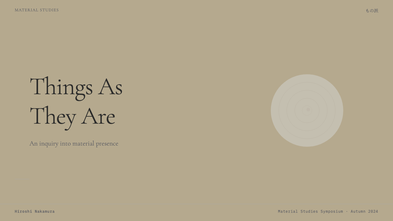
For presentation slides, Mono-ha offers an approach that distinguishes itself from both corporate polish and minimalist cliché. A cover slide benefits from a single strong visual — a textured photographic element cropped to occupy one region of the frame — with the title set in a classical serif at a restrained size, surrounded by field that is allowed to remain genuinely empty. Content slides should use a single organizing axis: either a left-anchored text block with a wide right margin held for a single image or data visualization, or a full-spread photograph treated as ground with type overlaid in a clear, unhurried weight. Data slides work particularly well when charts are simplified to their structural minimum — two or three tonal values, no decorative fill patterns, axes labeled plainly.
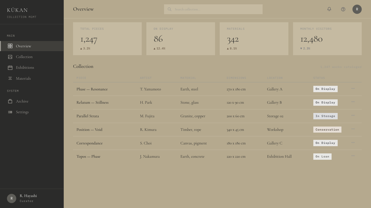
For web interfaces, Mono-ha translates best to contexts that can justify slowness: editorial sites, portfolio pages, luxury or cultural institution websites, and landing pages for products that communicate through depth rather than urgency. The approach prioritizes vertical rhythm and horizontal breathing room. Navigation should be typographic and understated. Cards, if present, should avoid boxed borders entirely — the edge of the card is defined by surrounding space, not a drawn line. Interactive states are indicated through tonal shifts rather than color saturation.
For editorial and marketing contexts, the style excels in situations where the product itself has weight — books, materials, objects, spaces, services with genuine depth of craft. A Mono-ha-derived campaign might pair a single large-format photograph of an object with a brief, unhurried descriptive text. Marketing pages can use extended single-column sections where one image and one passage of text occupy each vertical band. The pacing is editorial rather than promotional: the assumption is that the reader will stay, not that they must be grabbed.
The most common mistake when applying Mono-ha is treating it as merely a neutral or minimal style and filling it with standard contemporary design conventions — flat icon sets, gradient-free color blocks, rounded cards. The result looks emptied but not intentional. Authentic Mono-ha application requires taking the void seriously: the space must feel chosen, not default. A second common error is combining the stone-and-earth palette with type that reads as digital and frictionless — the typographic register should feel as considered and unhurried as the spatial arrangement.
Mono-ha (Lee Ufan, 1968) — FAQ
Is Mono-ha the same as Japanese minimalism or wabi-sabi?
Mono-ha is related to both but distinct from each. Japanese minimalism, as it appears in contemporary design and architecture, often pursues a refined, purified aesthetic — simplicity as elegance. Wabi-sabi values impermanence, incompleteness, and the beauty of natural aging. Mono-ha is more philosophically radical than either: it is not about elegance or beauty but about the encounter with material reality on its own terms. A Mono-ha work is not beautiful in the conventional sense; it is present. The distinction matters in practice: Mono-ha design is not refined or polished, and its emptiness is not serene — it is charged.
Can Mono-ha work in a dark or high-contrast color scheme?
Mono-ha's canonical palette is light-ground — the bleached concrete, bare earth, and uncoated glass of the natural world's neutral register. A dark inversion is possible but requires care. The risk with a dark-ground Mono-ha interpretation is that the textural surfaces that carry so much of the system's meaning become difficult to read at low luminosity, and the weight-and-void dynamic can collapse into simple dark emptiness. If working dark, the palette is best anchored in deep charcoal or iron-black rather than pure black, with textural surfaces allowed to emerge slightly from the ground. The key discipline is the same: one element, one relationship, and space treated as active.
What is the role of photography in Mono-ha-derived design?
Photography in Mono-ha design functions as a direct record of material encounter — not as illustration or atmosphere-setting but as evidence of a specific thing in a specific place. The appropriate photographic register is close, unhurried, and materially attentive: the grain of a stone surface, the edge where glass meets concrete, the way light falls on an undressed surface without dramatic staging. Macro or near-macro photography of textures and junctions works well. Wide-angle lifestyle imagery or any photography that tells a human story rather than recording material presence is incompatible with the system's values.
How does Mono-ha handle hierarchy when there is genuinely complex content to communicate?
Mono-ha's compositional singularity is a discipline, not an absolute constraint — complex content can be organized within the system, but it requires restructuring how hierarchy is established. Rather than using visual complexity to signal importance (bold colors, multiple type sizes, decorative separators), Mono-ha-derived hierarchy works through pacing and position. Important content occupies more space and more silence around it. Secondary content appears later in the vertical sequence, smaller and with less surrounding margin. The reader moves through the composition the way a viewer moves through an installation — encountering each element in turn, with the sequence itself doing organizational work. Dense content should be broken into distinct encounters rather than stacked into a single view.
Is Mono-ha appropriate for commercial or product-driven design, or is it too conceptually demanding for most users?
Mono-ha is well-suited to commercial contexts where the product communicates through restraint and material seriousness: galleries, cultural institutions, high-end furniture and materials brands, architecture and interiors practices, publishing, and any creative service that positions craft and attention as its core value proposition. It struggles in contexts that require rapid information scanning, high conversion optimization, or emotional warmth. The system's pacing is contemplative; users who are not already inclined to slow down may experience it as withholding rather than considered. The practical test is whether the product's own values align with what the style communicates — presence, weight, restraint, the beauty of what is not there.
Related design styles
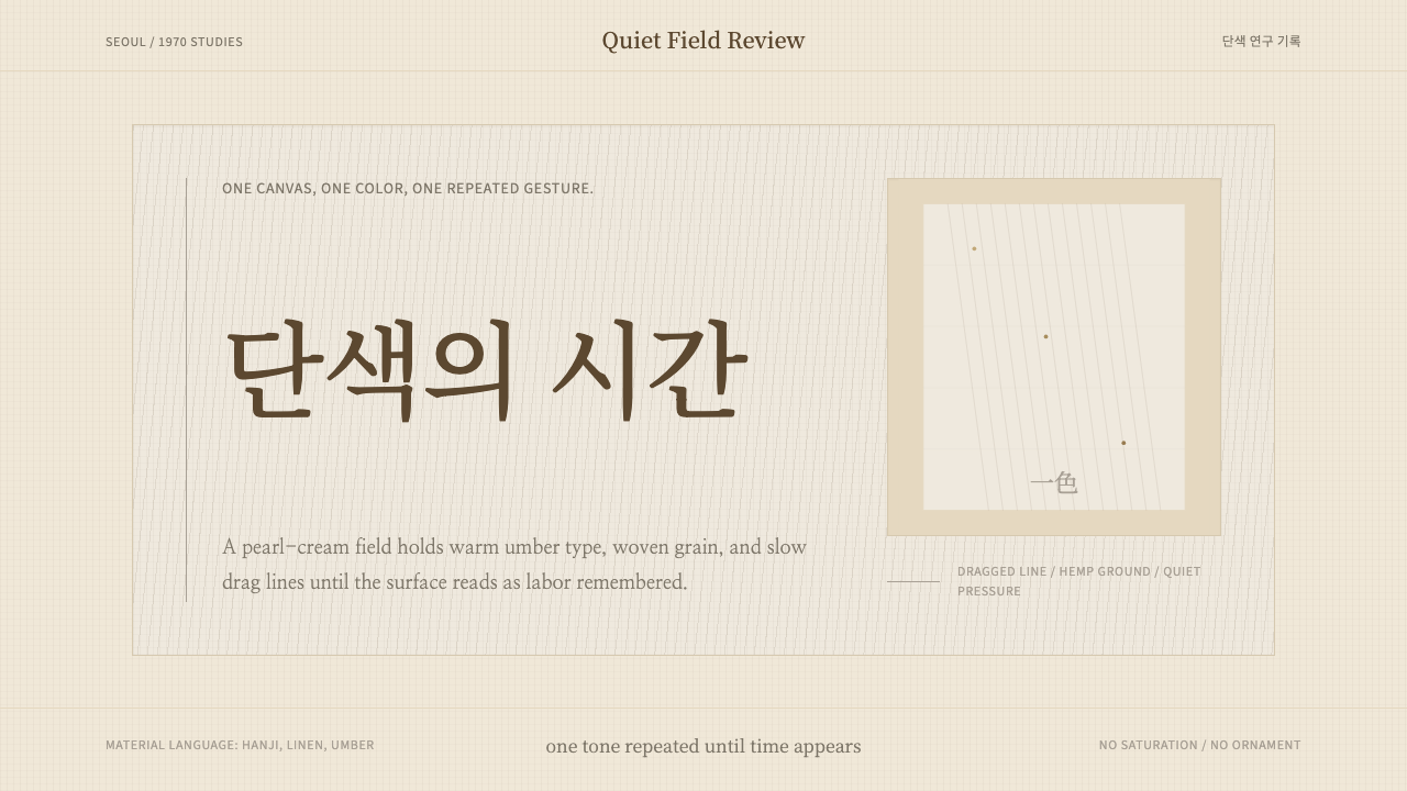 Korean Dansaekhwa MonochromeLabor becomes stillness. Umber serif type and drag lines on pearl cream.
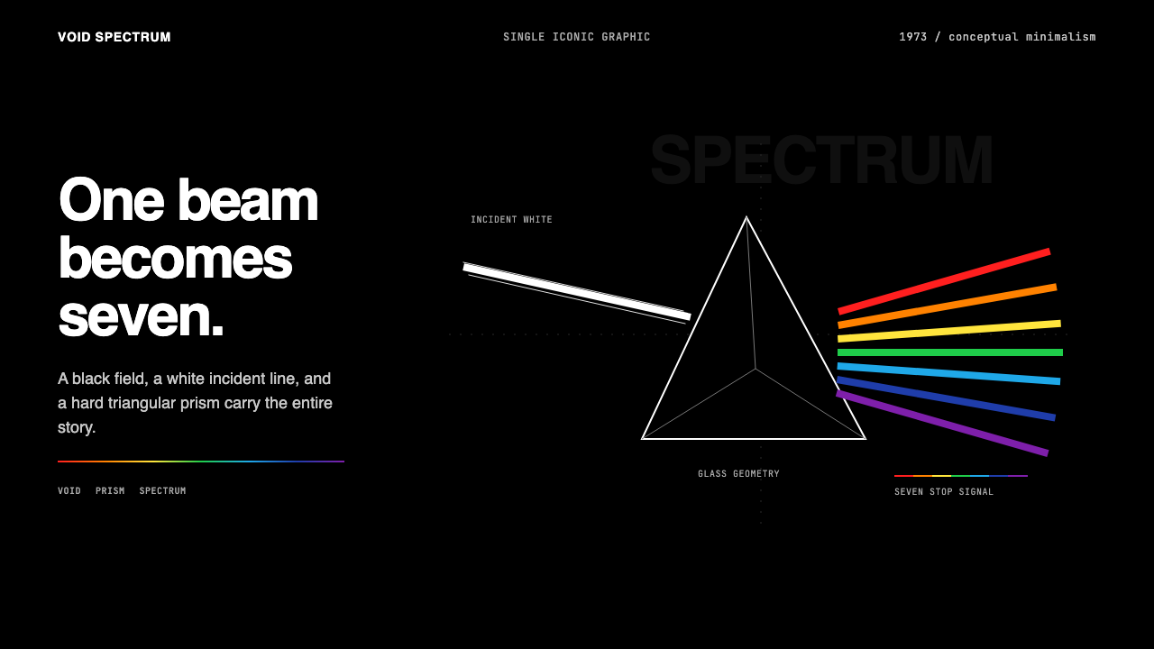 Pink Floyd — Dark Side of the MoonOne image does everything. Black void, white beam, hard prism, seven exact co…
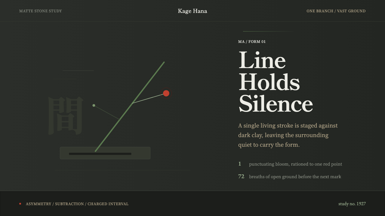 Ikebana SōgetsuQuiet becomes form. Dark stone, Mincho type, one green line and a single red…
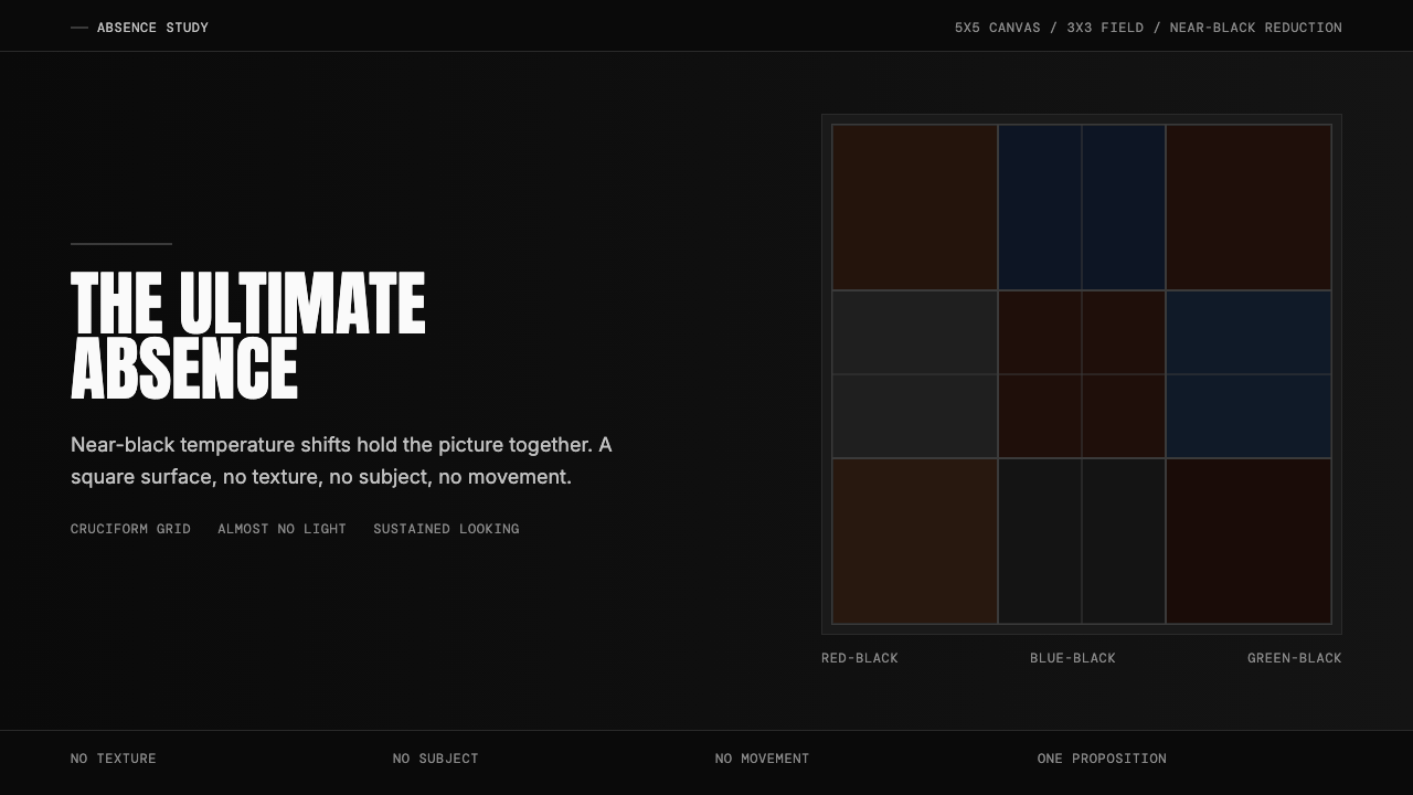 Ad Reinhardt Black Painting (1953)Austere absence. Near-black grid shifts reveal structure on sustained looking.
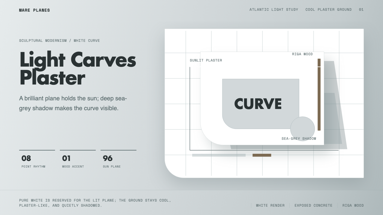 Alvaro Siza WhiteLight makes the form. White planes on cool plaster throw sea-grey shadow and…
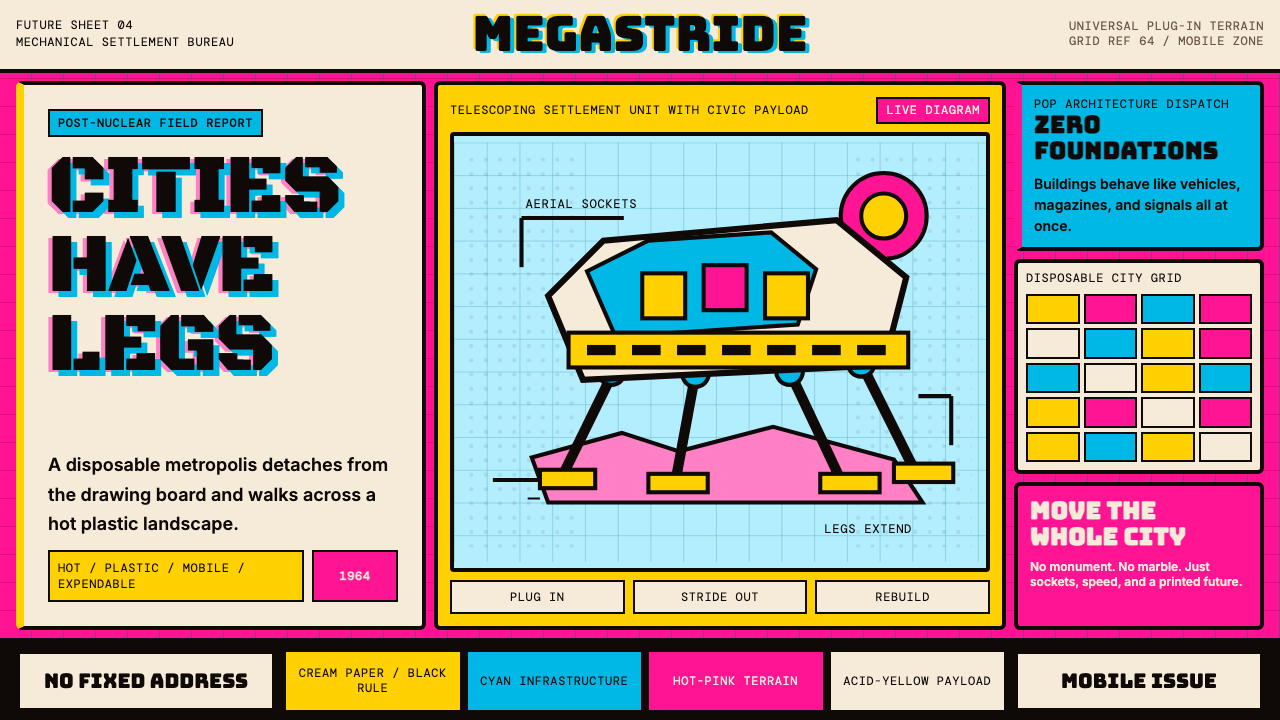 Archigram Walking City (1964)Cities refuse foundations. Hot pink, cyan, and acid yellow lock a bordered co…