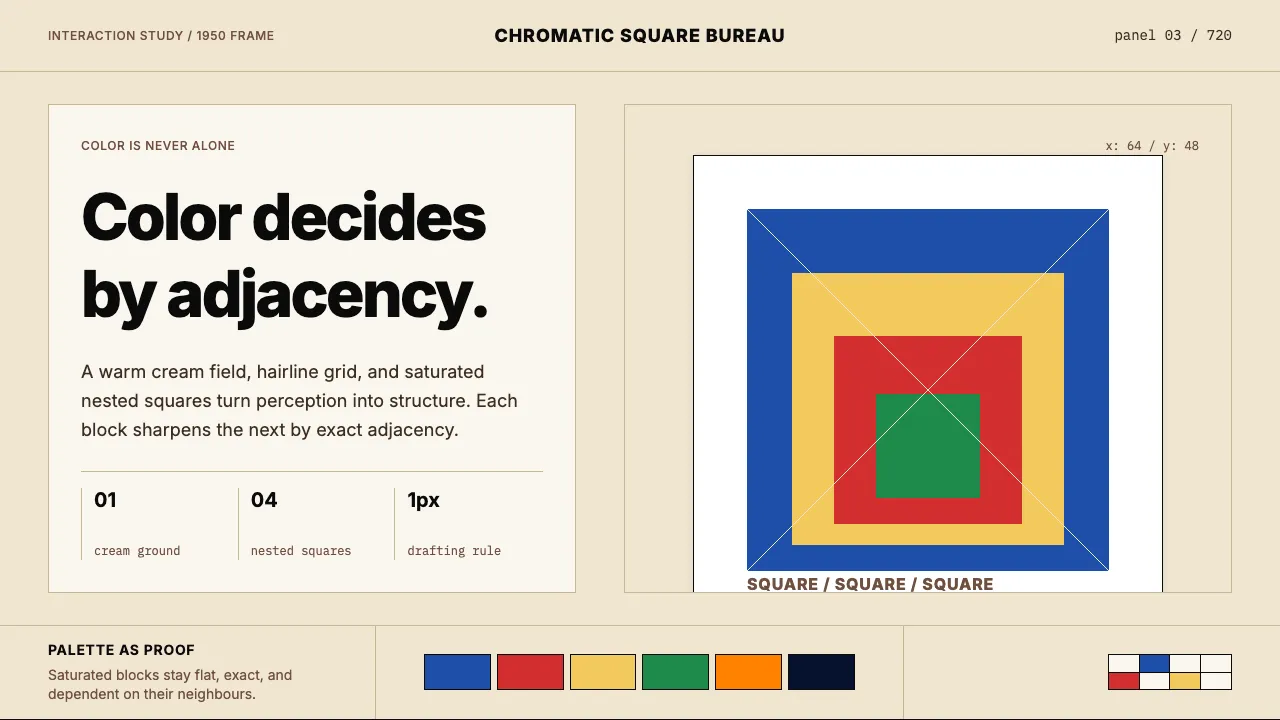
About Josef Albers — Homage to the Square
Josef Albers spent 26 years painting nested squares to prove that color is not a fixed property but a perceptual event. The Homage to the Square series — over 1000 panels in concentric saturated bands on warm cream gesso — became the canonical study of how adjacent hues alter each other.
Translated into interface, the system reads as Bauhaus-modernist discipline: warm cream page, hairline rules, zero radii, sans-serif typography spaced with German precision, and a small set of fully saturated chromatic blocks used as both structure and accent. Every color earns its place by interacting with its neighbour.
Learn more about the Josef Albers — Homage to the Square style
- Origin
- USA — Black Mountain College, North Carolina + Yale University
- Era
- 1950–1976 (Homage to the Square series, 1000+ paintings); Interaction of Color, 1963
- Key figures
- Josef Albers · Anni Albers
- Movements
- Bauhaus · Black Mountain College · Mid-century modernism · Color-field minimalism
Josef Albers — Homage to the Square design spec
Colors
Typography
The other 11 sections — buttons, cards, spacing, motion, techniques and more — open once you unlock. Download the DESIGN.md or send it to your AI in one click. Unlock once, yours forever.
Sign up nowStyles similar to Josef Albers — Homage to the Square
Also inspired by art & artists, with a close feel.
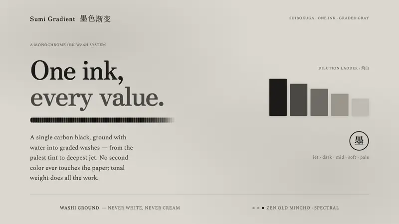 Sumi Grayscale GradientOne ink, every value. A single carbon black diluted into graded grays, marked by a dry-brush stroke.
 Korean Dansaekhwa MonochromeLabor becomes stillness. Umber serif type and drag lines on pearl cream.
 Plum Blossom Ink (宋)Silence carries the ink. Tea-tan ground, reserved blossoms, and one diagonal branch.
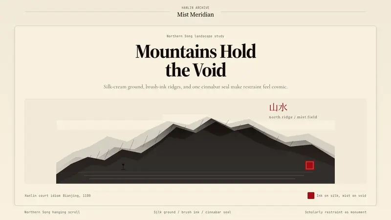 Song Landscape Painting (1100)Monumental calm. Silk-cream ground, ink ridges, and a cinnabar seal.