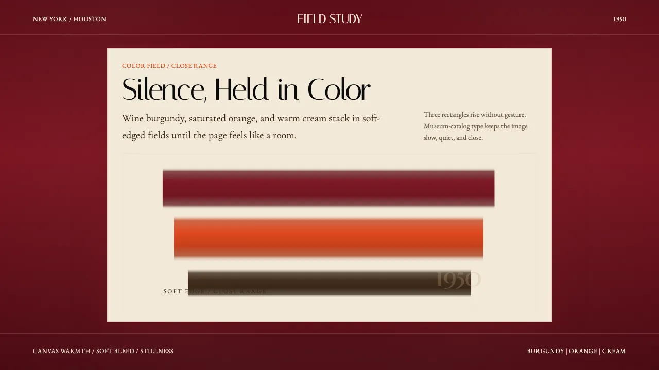
About Mark Rothko Color Field (1950)
Mark Rothko's color-field canvases reduce painting to its most elemental act: two or three soft-edged rectangles of saturated pigment stacked vertically, filling the viewer's entire visual field from close range. This system translates that monumental silence into interface — wine burgundy, saturated orange, and warm cream become page-flooding grounds, while classical serif typography echoes the museum-catalog tradition that has always framed Rothko's work.
Every surface carries canvas warmth. Edges bleed rather than cut. The palette is rigorously mineral-pigment: no electric hues, no decorative accents. The result is contemplative, immersive, and unapologetically slow.
- Origin
- New York City, Houston
- Era
- 1949–1970 classic color-field period; Rothko Chapel inaugurated 1971
- Key figures
- Mark Rothko · Clement Greenberg · Dominique de Menil · Barnett Newman
- Movements
- Abstract Expressionism · Color-Field Painting · New York School
Mark Rothko Color Field (1950) design spec
Colors
Typography
The other 11 sections — buttons, cards, spacing, motion, techniques and more — open once you unlock. Download the DESIGN.md or send it to your AI in one click. Unlock once, yours forever.
Sign up nowStyles similar to Mark Rothko Color Field (1950)
Also inspired by art & artists, with a close feel.
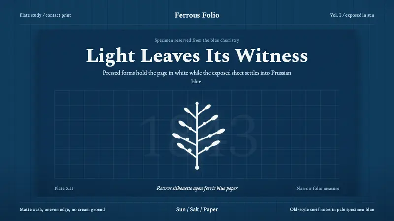 Anna Atkins CyanotypeScience turns spectral. Prussian blue ground, white reserves, Victorian serif margins.
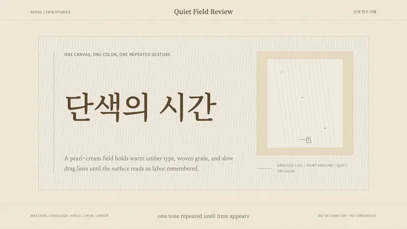 Korean Dansaekhwa MonochromeLabor becomes stillness. Umber serif type and drag lines on pearl cream.
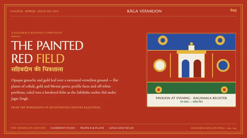 Mewar Rajput MiniatureThe ground is the painting. Vermilion fields, cobalt, gold-leaf rules, profile faces in a folio.
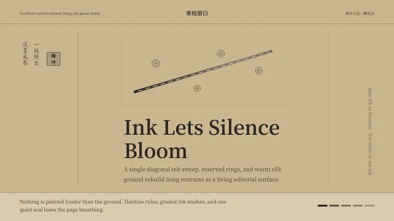 Plum Blossom Ink (宋)Silence carries the ink. Tea-tan ground, reserved blossoms, and one diagonal branch.