What is Soviet Ruble?
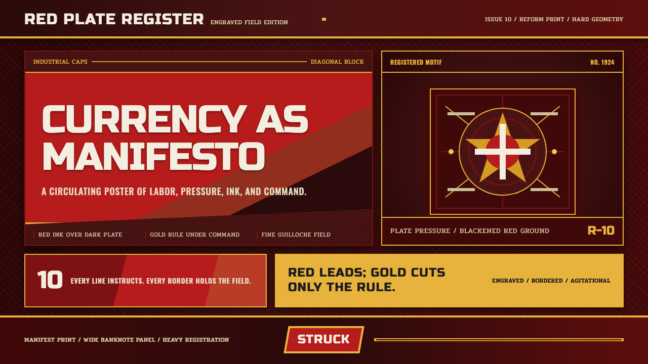
The Soviet Ruble style treats a banknote as a manifesto — engraved red ink, constructivist blocking, and industrial capitals built to agitate rather than to decorate.
Soviet Ruble in brief
Soviet Ruble is a design system drawn from the chervonets, the currency engraved by the state printing house Goznak in the 1920s during the birth of the Soviet Union. Unlike most historical currency design, which aims for quiet trustworthiness, the chervonets was an overtly ideological object — dense with worker-and-peasant imagery, wheat sheaves, and the hammer-and-sickle emblem, printed in a distinctive engraved red that made the bills instantly recognizable as products of the new revolutionary state.
The visual language fuses two things that do not usually appear together: the disciplined, mechanical precision of intaglio engraving — the same technique used for centuries on trustworthy Western currencies and legal documents — and the aggressive graphic vocabulary of Constructivism, the avant-garde art movement that treated bold diagonal composition and industrial materials as inherently revolutionary. The result is a system that looks simultaneously official and militant.
Rendered as a design system, this reads as a dark, engraved-red ground carrying heavy industrial capital letterforms, diagonal agitprop blocking that drives text and image at an angle rather than a static grid, fine-line guilloche patterns — the intricate engraved lines historically used on currency to resist forgery — and a disciplined three-color logic of red, black, and gold. Nothing about it is genteel or softened; every element is built to instruct and to agitate, in the way a piece of state currency doubles as a piece of propaganda.

Where does Soviet Ruble come from?
The chervonets was introduced during the 1922–1924 Soviet monetary reform, a currency stabilization effort undertaken as the young Soviet state emerged from the chaos of the Russian Civil War and the catastrophic hyperinflation that followed the revolution. The old ruble had become nearly worthless; the chervonets, partly backed by gold, was designed to restore confidence in Soviet money both domestically and, to a degree, internationally. This meant the currency had to accomplish two things simultaneously — project the disciplined trustworthiness expected of any national currency, and unmistakably announce that it belonged to a revolutionary socialist state rather than the fallen Tsarist regime it replaced.
The engraving itself was produced by Goznak, the Soviet state printing house responsible for currency, stamps, and official documents — an institution with roots in Imperial Russian printing that was repurposed under new state authority. Goznak's engravers were master craftsmen trained in the exacting discipline of intaglio printing, in which an image is cut into a metal plate and the resulting fine, raised lines carry the ink. This technique, chosen for its resistance to forgery, imposed its own visual discipline: precise linework, fine crosshatching, and the guilloche patterns that had long been standard security features on currency worldwide.
Onto this technically conservative printing method, Soviet designers grafted the graphic program of Constructivism, the avant-garde movement that emerged in Russia in the years immediately following the 1917 revolution. Constructivist artists rejected the idea of art as decoration or personal expression, insisting instead that visual design should serve a direct social and political function — communicating instructions, building solidarity, advancing the revolution. Their signature devices — diagonal composition, bold sans-serif capitals, and stark red-and-black contrast borrowed from agitprop poster design — were originally developed for posters and print media aimed at a largely illiterate population that needed to absorb political messages at a glance.
The fusion of these two traditions on currency was historically unusual: most nations kept their currency design conservative and their propaganda posters radical, treating money as a symbol of continuity rather than upheaval. The Soviet Union, uniquely, wanted its money to look revolutionary too — every banknote a small, pocket-sized reminder that the state issuing it had broken permanently with the past.
What defines the Soviet Ruble look?
Color
A disciplined three-tone system of engraved red, black, and gold governs the entire palette. Red is the dominant ground, evoking both revolutionary symbolism and the actual color of intaglio-printed currency ink; black carries type and structural linework; gold appears sparingly, reserved for emblematic or hierarchically important elements rather than general decoration.
Typography
Heavy industrial capital letterforms dominate, set with the mechanical uniformity of a printing press rather than the fluid variation of hand lettering. Text is overwhelmingly set in capitals — a choice that reads as declarative and instructional rather than conversational, echoing the way state proclamations and currency denominations are traditionally rendered.
Diagonal Agitprop Blocking
Text and image blocks are arranged along hard diagonal axes rather than a static horizontal grid, a device borrowed directly from Constructivist poster design intended to convey urgency and forward momentum. This diagonal energy is one of the clearest markers separating this system from conventional, static currency or document design.
Guilloche Fine-Line Work
Intricate, densely repeating fine-line patterns — historically a security feature resistant to forgery — appear as border treatments and background texture. These patterns should feel mechanically precise and endlessly repeating, in contrast to the bolder, hand-drawn quality of the agitprop imagery they frame.
Worker-and-Peasant Imagery
Figurative motifs — laborers, farmers, wheat sheaves, industrial machinery — appear rendered in a bold, engraved, slightly idealized manner rather than photographic realism. These figures are types representing the socialist ideal of labor rather than portraits of specific individuals, consistent with the broader propaganda tradition this system belongs to.
Emblematic Marks
The hammer-and-sickle and similar state emblems function as focal anchor points within a composition, typically rendered in gold or held as the single most refined, carefully engraved element against the surrounding bold typography and blocking. Their placement should feel earned and central, not scattered as generic decoration.
Engraved Surface Quality
All linework should read as if cut into a metal plate rather than drawn freehand or rendered with soft digital gradients — crisp, slightly raised-looking, and mechanically consistent in weight. This engraved quality is what separates the style from a generic red-and-gold propaganda look; it ties the system specifically to the discipline of currency and document engraving.

Who shaped Soviet Ruble?
The anonymous master craftsmen employed by Goznak, the Soviet state printing house, who executed the actual intaglio engraving of the chervonets and subsequent Soviet currency. Trained in a technical discipline with roots in Imperial Russian and broader European currency printing, they applied their precision craft to distinctly revolutionary iconography.
The broader movement of Russian avant-garde artists and designers active in the years following 1917, who developed the diagonal composition, bold typography, and stark red-black contrast that Soviet currency design borrowed. Figures associated with this movement rejected art as private expression in favor of design as direct social and political tool.
How do you use Soviet Ruble today?
Soviet Ruble is a maximalist, ideologically-charged style, and applying it well means treating every element as if it must justify itself through instruction or agitation, never through pure decoration. The system rewards discipline in its restricted color logic and precise linework even as its compositional energy stays aggressive and diagonal.
For presentation slides, a cover page benefits from the engraved-red ground with a single gold emblematic mark held at a diagonal angle, paired with heavy capital-letter title text. Content slides should use the guilloche fine-line pattern sparingly as a border or background texture rather than filling the whole page, keeping body text set in a cleaner, still-capitalized but less dense typeface for legibility. Data visualizations suit this system unusually well — bar charts and infographics rendered with hard red-black-gold contrast and diagonal labels evoke the agitprop poster tradition directly.
For web interfaces, the style suits brands built around bold, declarative confidence — financial products playing with historical or ironic framing, gaming and entertainment properties, or cultural and archival projects about Soviet or Cold War history. Dashboards should use the color discipline (red, black, gold only) rigorously rather than introducing additional hues, and interactive elements can borrow the diagonal blocking for section dividers or call-to-action banners.
For editorial and marketing work, the style suits long-form history and political-design features. Pull quotes benefit from being set in heavy capitals against the engraved-red ground, and section breaks can use the guilloche pattern as a recurring divider motif. Photography or illustration should favor the bold, idealized figurative style of the era over photographic realism.
A common mistake is treating this style as simply "red and gold with Cyrillic-adjacent lettering," which flattens it into generic Soviet kitsch. The specific combination of engraved precision (guilloche linework, crisp intaglio-style edges) with Constructivist diagonal energy is what makes the system cohere — dropping either half collapses it into either a bland vintage-currency look or a generic red propaganda poster.

Soviet Ruble — FAQ
What is a chervonets, and how does it differ from the ruble?
The chervonets was a Soviet currency unit introduced in the 1922–1924 monetary reform, partly backed by gold, designed to stabilize the economy after the old ruble had been devastated by hyperinflation following the revolution and civil war. It circulated alongside a reformed ruble for a period before the two systems were eventually unified. In design terms, chervonets notes are the specific historical artifacts this style draws its engraving and iconography from.
Why does the style use engraving-style linework instead of flat illustration?
Intaglio engraving was the standard technique for currency and official documents worldwide because the fine, precise lines it produces are extremely difficult to forge. Soviet currency inherited this technical discipline directly, and the resulting visual quality — crisp, mechanically consistent linework — became inseparable from the aesthetic. Flattening it into simple illustration would remove the specific historical association with currency and official state documents.
Is this style purely nostalgic, or does it still carry ideological weight?
Applied to contemporary design, the style is generally used for its visual and historical interest rather than as genuine political advocacy — much as Art Deco or Bauhaus are applied today without reviving their original social movements. That said, the imagery originates from real state propaganda, and thoughtful application should treat it as a historical design reference rather than stripping away all awareness of what the original imagery was built to communicate.
How strict does the red-black-gold color rule need to be?
Strict adherence is what keeps the system readable as this specific style rather than generic vintage propaganda design. Red should dominate as the ground, black should carry structural type and linework, and gold should be reserved for a small number of emblematic or hierarchically important elements. Introducing additional hues, or letting gold spread too broadly, dilutes the disciplined contrast the style depends on.
Related design styles
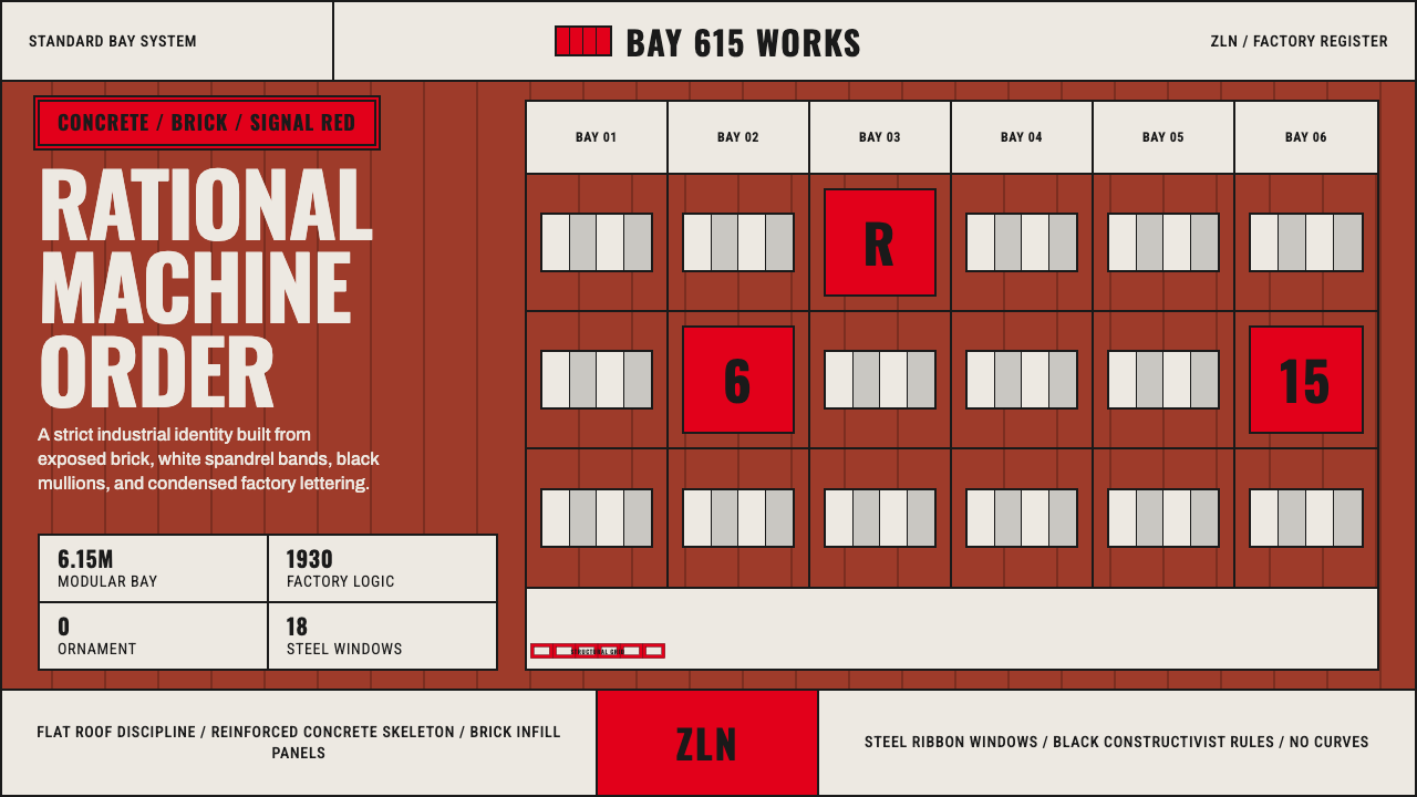 Baťa Zlín Functionalist BrandMachine-age precision. Brick red, concrete bands, and Oswald type lock into a…
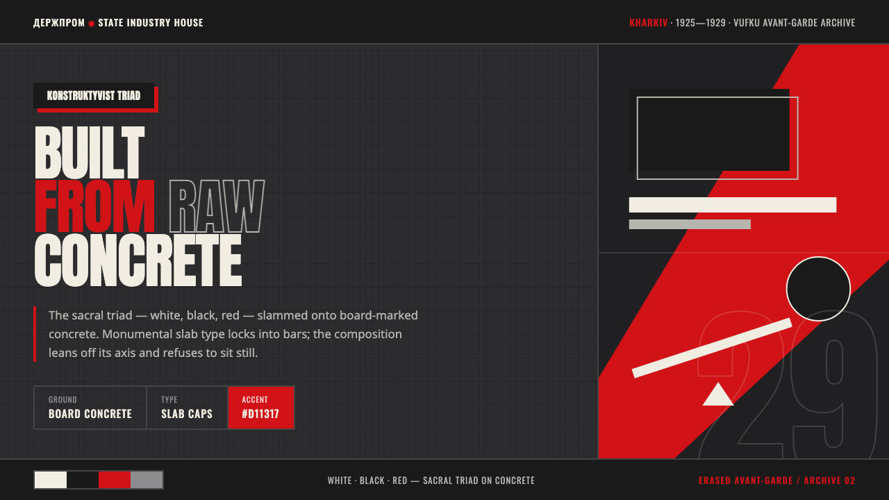 Kharkiv Constructivism (Derzhprom)Monumental, made structural. White-black-red triad on raw concrete, slab caps…
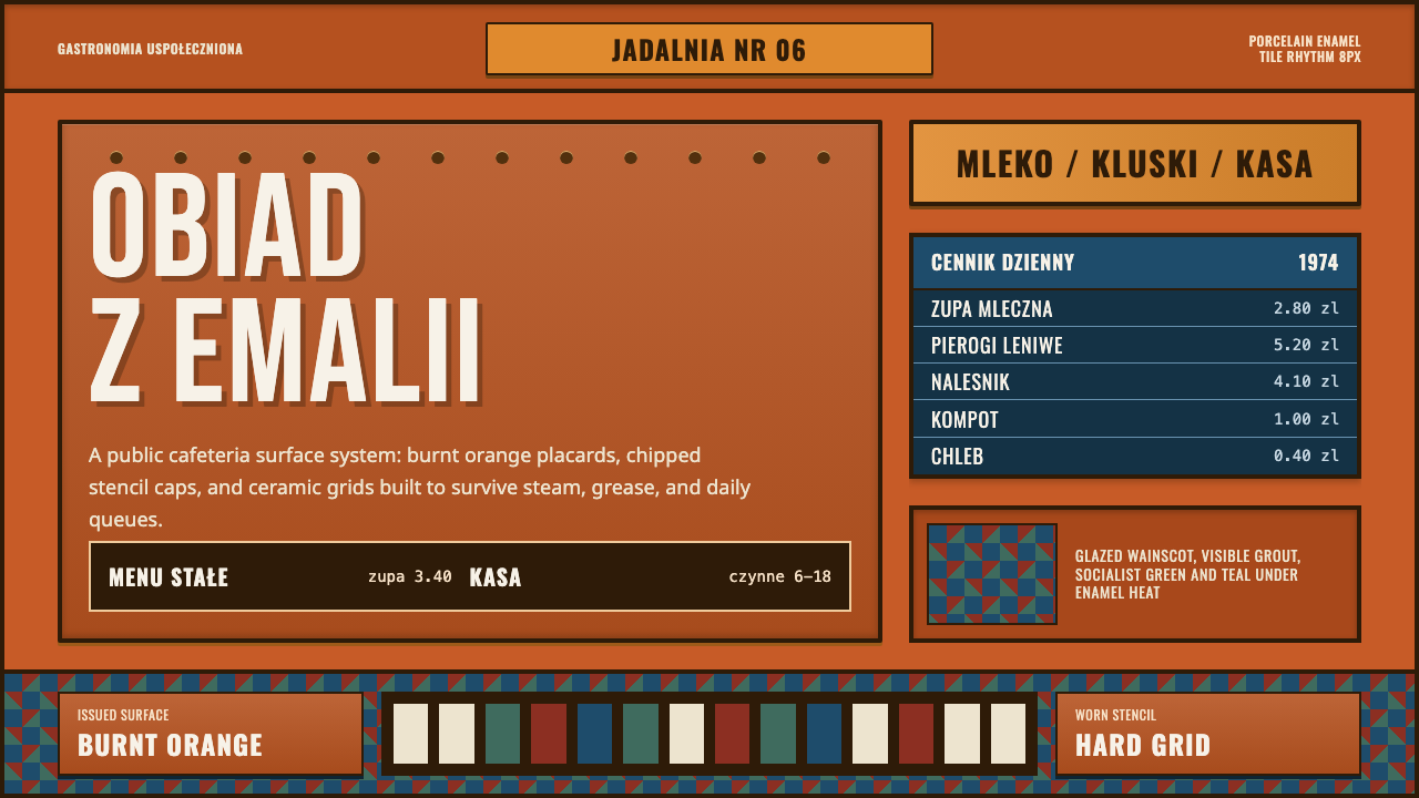 Polish Milk Bar (PRL)State-issued warmth. Burnt orange enamel, stencil caps, and hard tile grids.
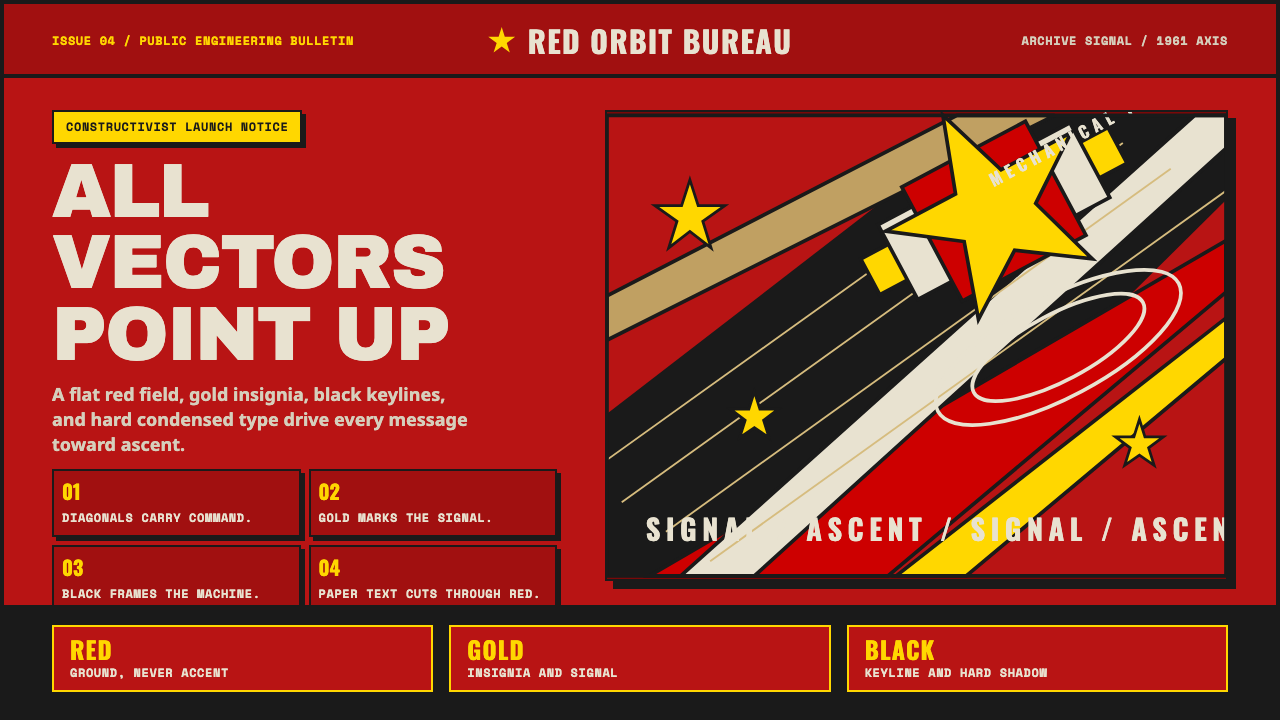 Soviet Space ProgramHeroic by construction. Red fields, gold stars, black keylines, and diagonal…
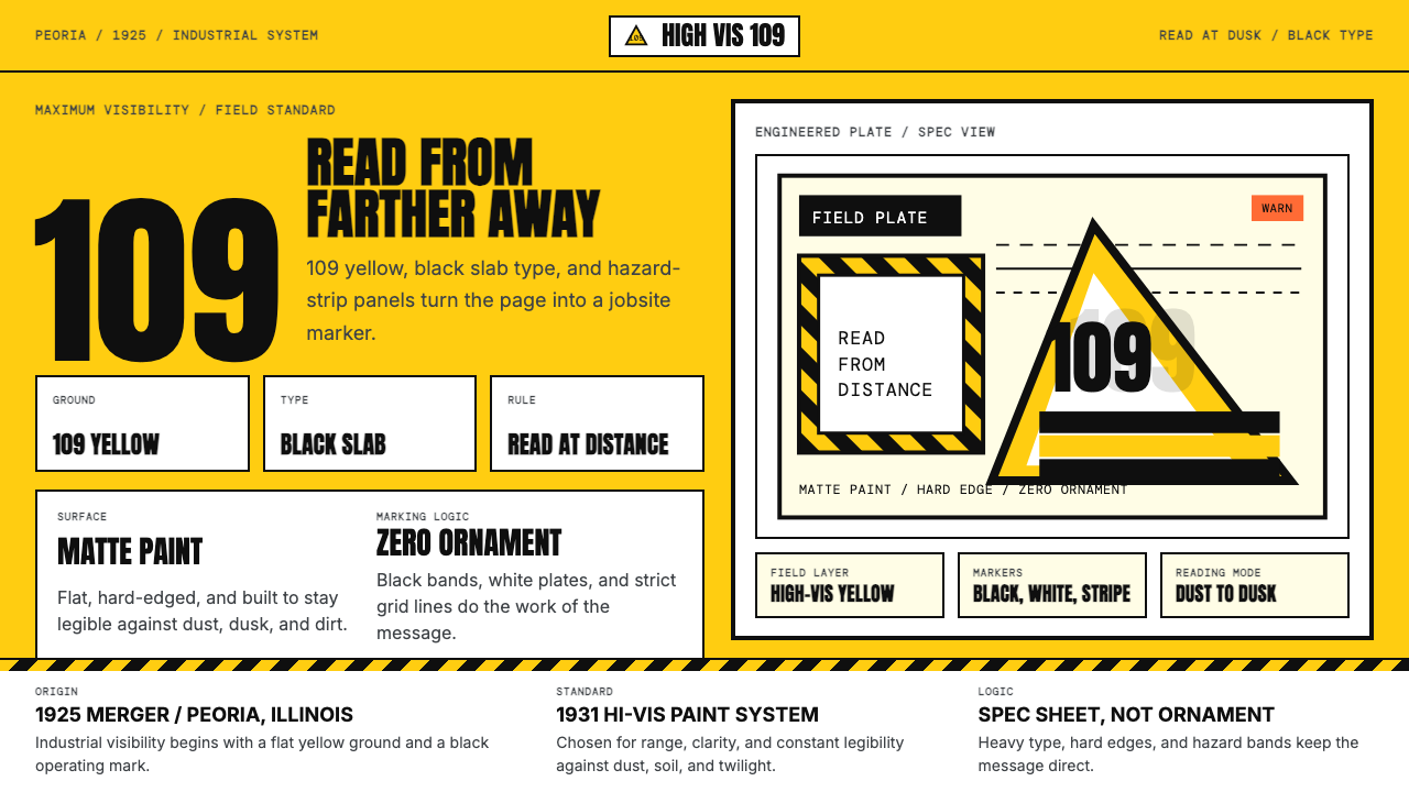 Caterpillar Construction Yellow (1925)Maximum visibility, zero softness. 109 yellow ground and black slab type.
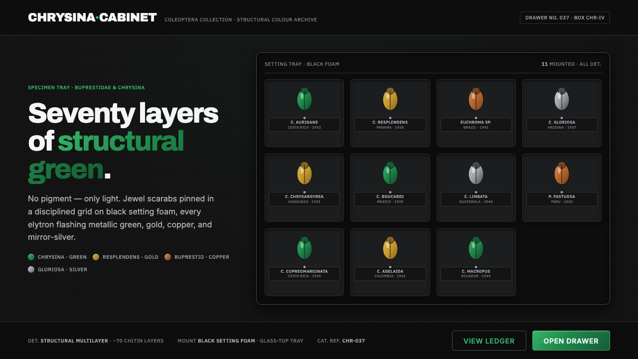 Iridescent Scarab DrawerOrder makes the shimmer read. Jewel scarabs pinned in a grid on black foam, m…