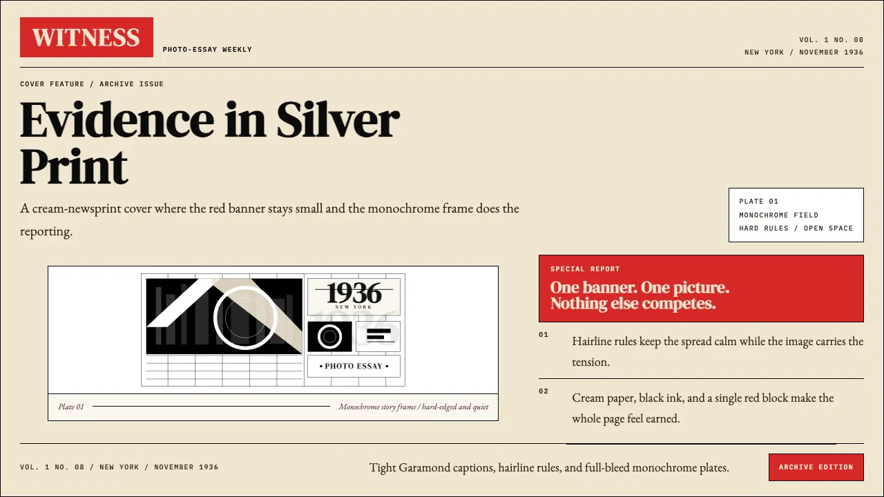
About LIFE Magazine (Red-Banner)
LIFE is the saturated-red wordmark stamped across the top of a cream newsprint page, anchoring dramatic black-and-white photography that taught a century how to read pictures as a story. Founded in 1936 by Henry Luce, it weaponized the photo-essay into the dominant American magazine form.
The aesthetic is restraint plus a single emergency-red banner: heavy Bodoni-derived serif wordmark, generous letter-spaced caps, hairline rules, full-bleed monochrome photographs, and captions set tight in Garamond. Nothing else is allowed to compete with the picture.
- Origin
- New York City, USA
- Era
- 1936 founded (Time Inc.); weekly 1936–1972; monthly 1978–2000; LIFE.com ongoing
- Key figures
- Henry Luce · Margaret Bourke-White · Alfred Eisenstaedt · W. Eugene Smith
- Movements
- 20c American photojournalism · photo-essay magazine genre · editorial modernism
LIFE Magazine (Red-Banner) design spec
Colors
Typography
The other 11 sections — buttons, cards, spacing, motion, techniques and more — open once you unlock. Download the DESIGN.md or send it to your AI in one click. Unlock once, yours forever.
Sign up nowStyles similar to LIFE Magazine (Red-Banner)
Also inspired by brands & products, with a close feel.
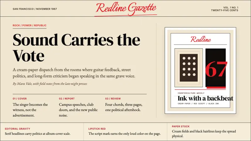 Rolling Stone MagazineCounterculture gets editorial weight. Cream paper, lipstick red script, serif headlines.
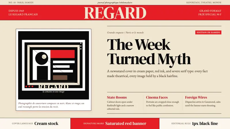 Paris MatchThe cover shouts in one red slab. Cream paper, serif headlines, and black rules stage drama.
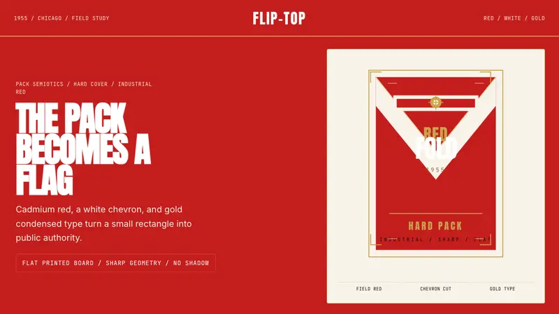 Marlboro Red Flip-Top (1955)Authority in one fold. Cadmium red, white chevron, and gold type read like a flag.
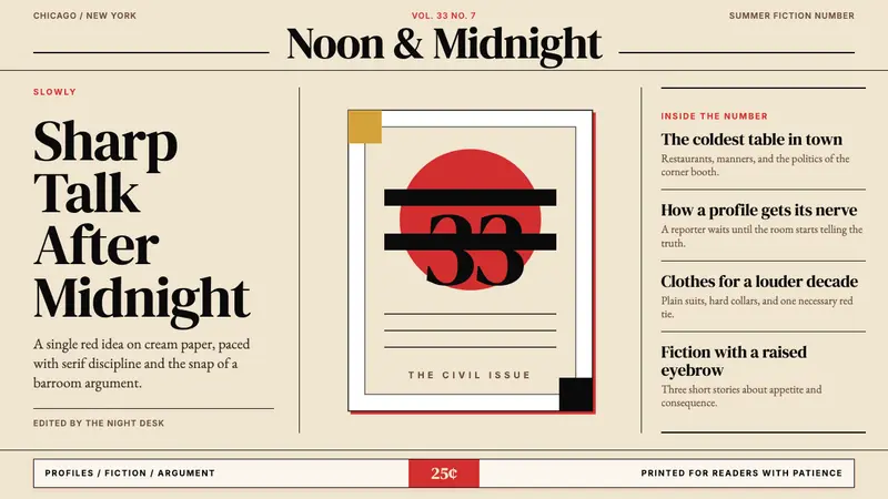 Esquire MagazineConceptual punch on paper. Cream stock, black hairlines, and one saturated red idea.