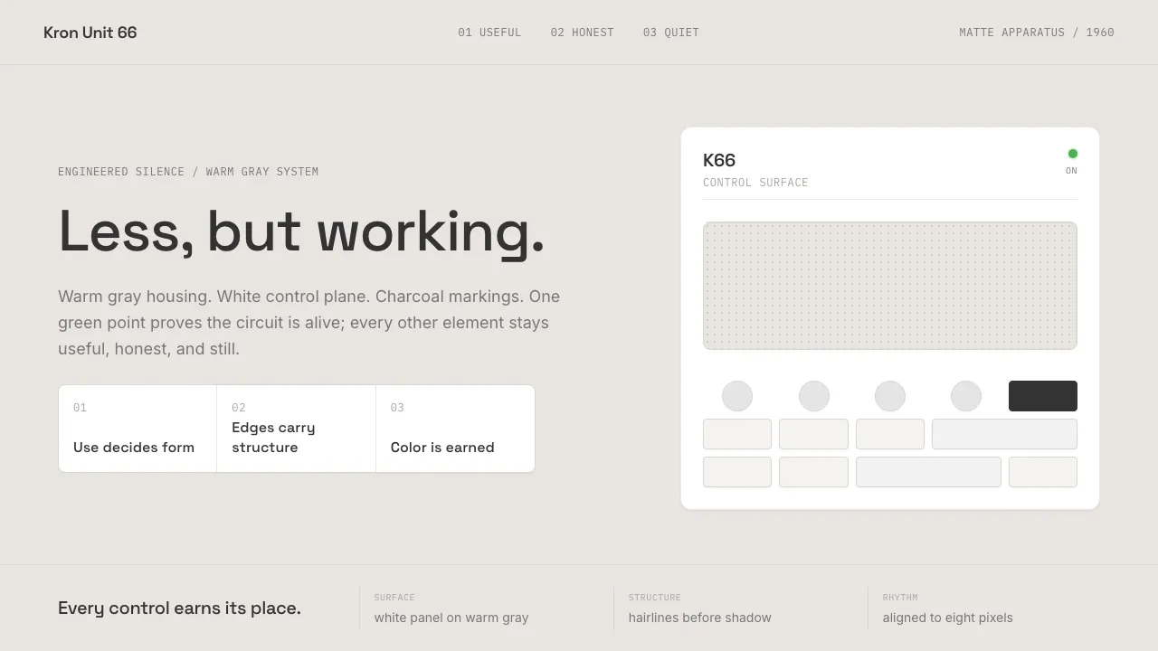
About Dieter Rams / Braun
Dieter Rams' Braun is "less but better" made physical — the white-and-gray functionalism that defined consumer electronics from the 1956 SK4 record player to the 1987 ET66 calculator, and quietly shaped Apple, MUJI and countless descendants. Every control has a reason; every surface is matte; every color is earned.
The aesthetic is warm gray, pure white, charcoal text, and one precise green dot — the ON indicator, the single moment that color is permitted. Typography is invisible by design. Geometry is rectangles and circles, aligned to a grid. The brand's voice is simply: I do not need to shout. I work.
- Origin
- Kronberg im Taunus, Germany
- Era
- 1955–1995 (Rams at Braun); 10 Principles codified ~1970s; influence peaks again 2000s via Jony Ive/Apple
- Key figures
- Dieter Rams · Hans Gugelot · Dietrich Lubs · Fritz Eichler
- Movements
- German functionalism · Ulm School of Design · Good Design
Dieter Rams / Braun design spec
Colors
Typography
The other 11 sections — buttons, cards, spacing, motion, techniques and more — open once you unlock. Download the DESIGN.md or send it to your AI in one click. Unlock once, yours forever.
Sign up nowStyles similar to Dieter Rams / Braun
Also inspired by brands & products, with a close feel.
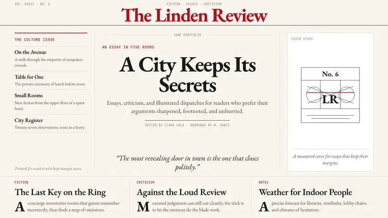 The New Yorker ClassicQuiet authority. Cream paper, EB Garamond columns, ink cartoons, and one red rule.
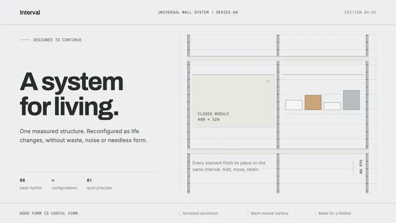 Vitsœ 606 ShelvingQuiet form, built to endure. Brushed silver rails impose rhythm on cool plaster and open space.
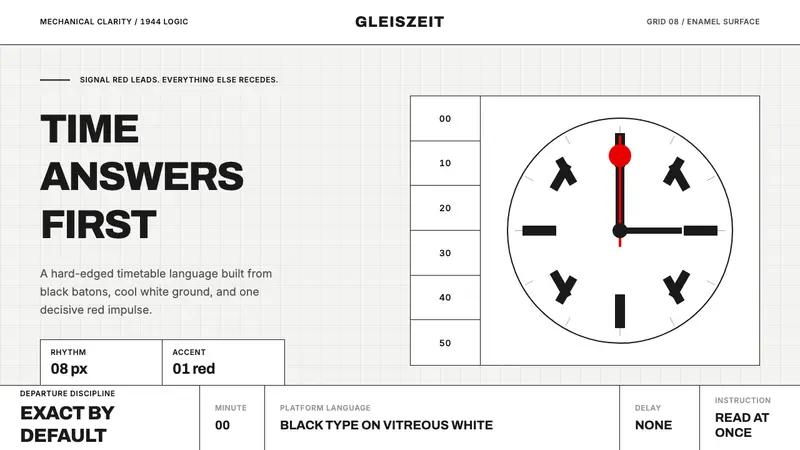 Swiss Railway ClockPrecision refuses decoration. Black batons and one red hand cut through enamel white.
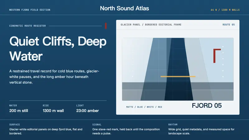 Norwegian Fjord TourismMonumental, not loud. Fjord blue, glacier-white panels, and one stave-red accent.