What is Ulaanbaatar Panel Housing?
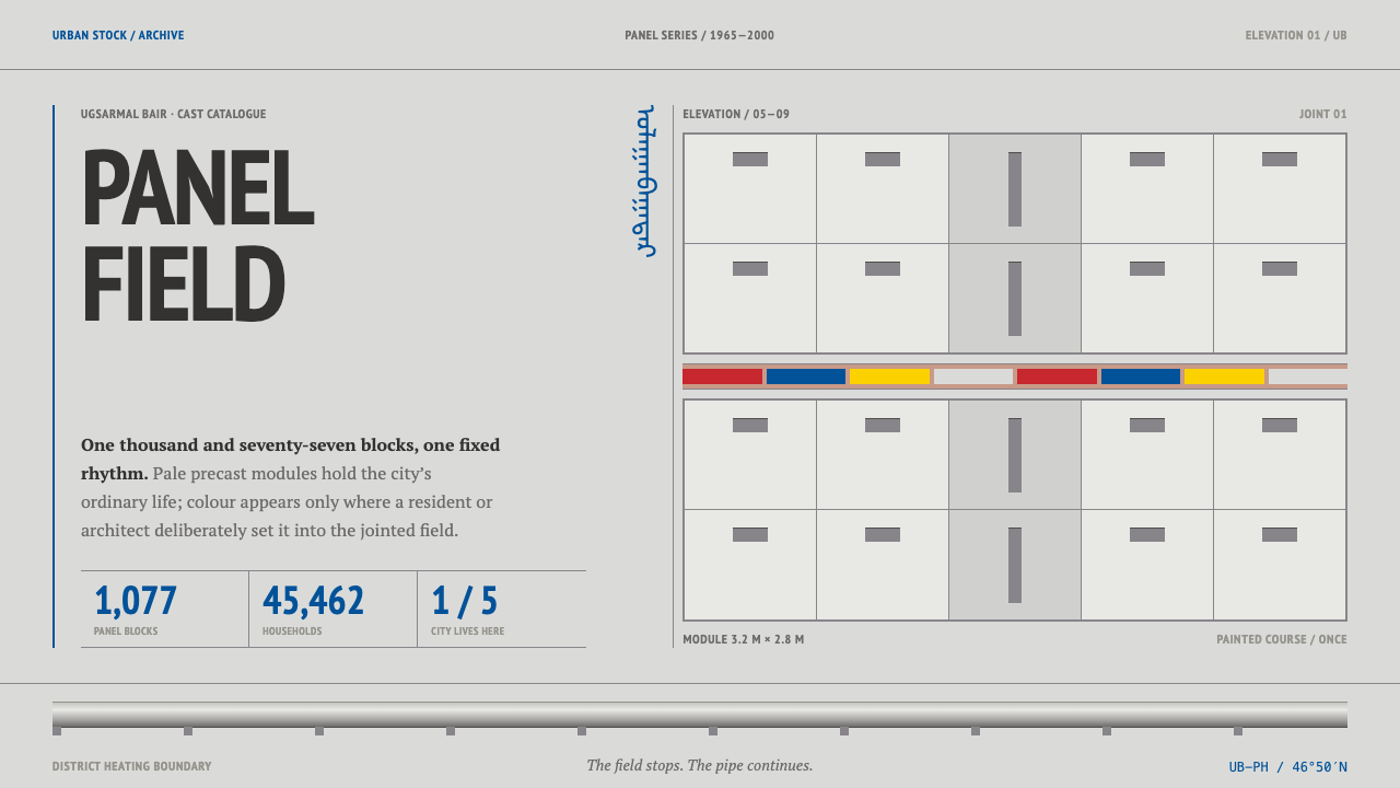
Ulaanbaatar Panel Housing is the look of grey precast concrete, open joints and a single narrow band of Mongolian colour: order first, ornament only where someone chose to put it.
Ulaanbaatar Panel Housing in brief
Ulaanbaatar Panel Housing is a design style drawn from ugsarmal bair, the precast concrete apartment blocks that Mongolia's capital built between 1965 and 2000. Its visual language is a neutral grey field, one repeated module, joints between panels left visibly open, and a very small amount of colour placed in a single deliberate line. It is the aesthetic of a catalogue: every element belongs to a standard set, and variation is the exception rather than the habit.
The scale of the original gives the style its weight. The city built 1,077 of these blocks, 780 of nine storeys, 263 of five and 34 of twelve, and by 2014 they housed about 45,462 households, roughly a fifth of Ulaanbaatar's population. A style built from that many identical rectangles is not really about any single building. It is about the rhythm of the repeat and what survives inside it, which is why the design treats sameness as its material instead of a flaw to be hidden.
Look closely and the Mongolian contribution turns out to be small and exact. In a few districts an architect set a narrow horizontal band of painted ornament into one course of an otherwise plain facade, in red, blue and yellow drawn from the national colours. The style keeps that ratio: broad calm for the field, a thin line for the ornament, nothing in between. Lettering follows the city's own signage, a narrow sans-serif set for Mongolian Cyrillic, in the same economical spirit as the panels.
Where does Ulaanbaatar Panel Housing come from?
The blocks belong to a system, and the system was Soviet. The first movement recorded behind this style is Soviet-assisted industrialised panel housing, a method in which wall, floor and stair elements are cast in a factory from a catalogue of standard types and then assembled on site. Between 1965 and 2000 Ulaanbaatar used that method to build its apartment districts, and the largest concentrations stand in Bayanzürkh, Songinokhairkhan and Nalaikh. What the method produces is a repeatable face: the same panel, the same opening, the same joint, again and again.
The stock is not uniform in height, and the proportions are telling. Nine-storey blocks dominate with 780 buildings, the five-storey type follows with 263, and the twelve-storey tower is the rarity at 34. Windows sit on a fixed rhythm along shared horizontal lines, and the module never bends to suit a site. Because roughly 45,462 households lived in these buildings by 2014, the panel block is not a marginal type in Ulaanbaatar. It is the ordinary face of a large part of the city, and its identity is civic and shared rather than authored.
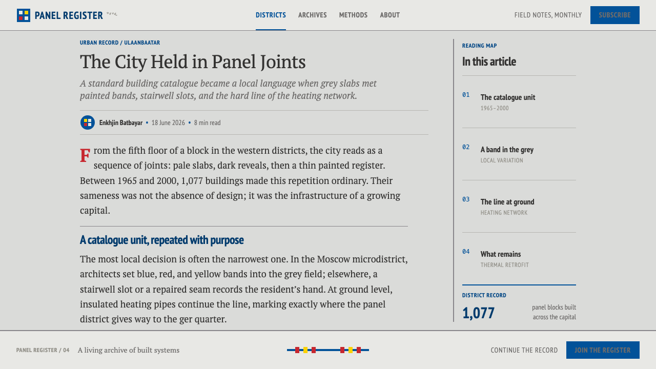
The Mongolian layer is thin by design. In the western micro-districts and in the one known as Moscow, an architect set a painted decorative band horizontally into one course of the standard panels, using red, blue and yellow taken from the national colours. The record does not preserve a name for whoever made these bands, and the anonymity suits them: a local decision folded into a standard that was never meant to be local. The band is one line wide, and the wall around it stays plain.
Two further layers complete the picture. The first is the insulated heating pipe that runs along the ground, a line the city itself draws: the panel district ends at the pipe, and on the other side begins the ger district, the area of traditional round felt dwellings. The second is the thermal retrofit programme applied to the panel stock in more recent decades, which is why the current visual reference spans the 2010s and 2020s rather than only the original construction years. Mongolian Cyrillic signage, in use since 1941, supplies the lettering throughout.
What defines the Ulaanbaatar Panel Housing look?
Concrete Grey Field
The ground is a neutral, slightly cool concrete grey that covers nearly the whole surface. It is deliberately unremarkable: no tint is added to make it friendlier, and weathering is accepted rather than polished away. Surfaces are matte, and the field behaves like a wall rather than a canvas, which keeps attention on structure and on the single place where colour is allowed.
Repeated Module
One panel module repeats without variation, and openings are cut on a fixed rhythm along shared horizontal lines. Translated into layout, this means equal intervals, identical card sizes and rows that align from top to bottom. Interest comes from consistency rather than alternation; a design in this style should look as if it could be extended sideways or upward by simply adding another identical unit.
Visible Joints
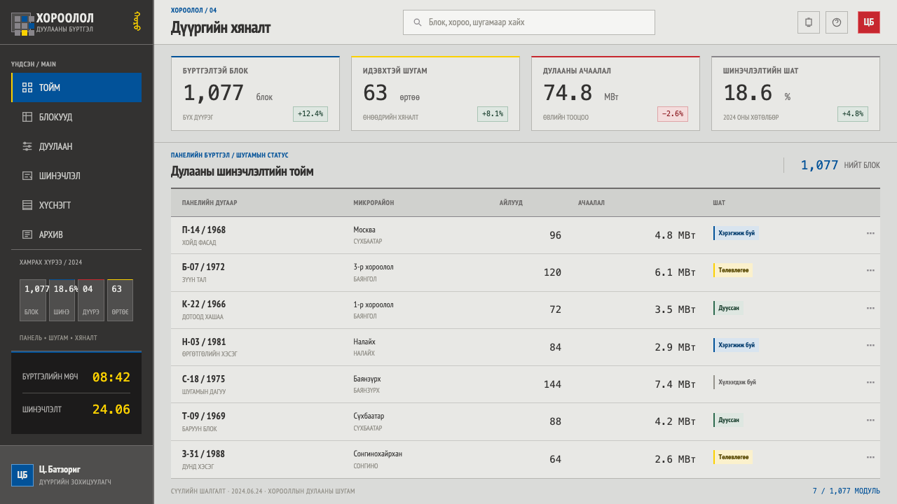
The seams between panels are never plastered over. They stay legible as thin dividing lines that show a wall is made of parts. In an interface this means shown rules, visible gaps between components and table borders that admit the grid underneath. Hiding the structure behind soft shadows or rounded blending would contradict the logic of the material.
The Painted Band
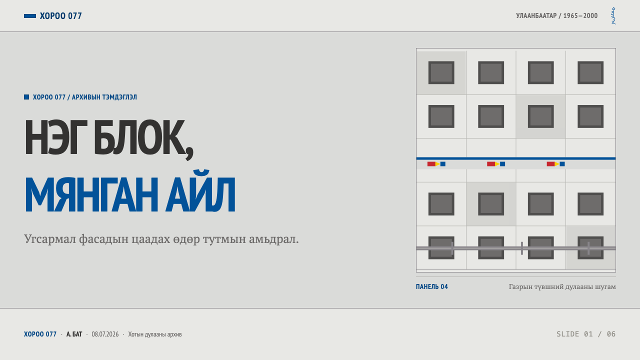
The ornament is one narrow horizontal band, set into a single course of the facade and running its full width, painted in flat red, blue and yellow shapes. It appears once. Colour here is rationed like a signal: a second band, or colour spread across the field, breaks the ratio that makes the first one meaningful.
Narrow Sans-Serif Lettering
Type is a narrow, plain sans-serif that works in the Cyrillic alphabet as well as the Latin one, echoing the lettering on building numbers and shopfront signs. Narrowness lets long Mongolian words fit into tall, tight columns, and it gives text the same upright, economical posture as the facade. Weight differences are modest; hierarchy comes from size and position.
Material Honesty, No Softness
Concrete does not glow, blur or float. The style rejects gradients, glassy highlights and diffuse shadows, and shows depth only through recessed joints and the plain difference between a field and its band. Edges are cast, so they are hard; surfaces are matte, so they are flat.
The Dividing Line
The heating pipe running along the ground is the style's boundary marker: a single continuous line that separates one kind of settlement from another. Used in layout, it becomes a long unbroken rule or a plain edge between zones, a reminder that this style marks transitions with one clear gesture, not with ornament.
Who shaped Ulaanbaatar Panel Housing?
The households who lived in the blocks are the style's real authors. About 45,462 households lived in these buildings by 2014, roughly a fifth of the city, and the visual identity of the panel district is the sum of their shared, ordinary surroundings rather than the signature of any one designer. Designing in this style means respecting that collective scale: the result should feel like part of a city, not a showpiece.
Whoever first set a coloured band into a standard panel course in the western micro-districts and the one known as Moscow made the single decision that turns generic Soviet housing into something recognisably Mongolian. Their names are not preserved in the record, which fits the work: the gesture is small, repeatable and collective. A designer borrowing it should keep the ratio, one thin line of colour against a wide calm field.
The system behind the blocks was Soviet technical practice: factory-cast panels, standard types and rapid assembly. It supplies the grid, the module and the rhythm of openings. Nobody inside the programme was designing a style, yet its rules are what give the style its internal discipline. Treat that logic as a constraint to honour rather than a limitation to fight.
In recent decades the panel stock has been retrofitted for thermal performance, with extra insulation and new surface finishes. This is why the style's present-day look belongs to the 2010s and 2020s as much as to the original decades. The retrofit is not a corruption of the original design but the latest layer in it: later cladding and colour sit on top of the same repeating module.
How do you use Ulaanbaatar Panel Housing today?
Ulaanbaatar Panel Housing is best used where the message is order, repetition and quiet public purpose: infrastructure, housing, planning, civic data and any product whose strength is that it behaves the same way every time. It is a light style on a grey field, and it rewards restraint more than invention.
On slides, a cover works like a wall: a wide grey field, a narrow bold title set low and to the left, and one thin band of red, blue and yellow running across a single line. Content slides are modules in a grid, with equal boxes, visible dividing rules and no decorative icons. Data slides suit tables and plain bar charts in a family of greys, with the three colours held back for one highlighted figure.
For web interfaces, the style fits admin consoles, dashboards, listings and pricing pages. Cards share one size and align on a strict grid; borders stay visible between cells; navigation is plain text in a narrow sans-serif. Reserve the three colours for a single header stripe, a progress bar or a status band, and let everything else remain concrete grey.
In editorial and report work, such as urban studies, annual reports and architecture essays, set long text in narrow columns, mark sections with plain rules that echo panel joints, and let a single painted-band motif sit once at the head of a document. Photographs of apartment blocks need no filter; their repetition already carries the idea.
The most common mistake is to spend the colour. Flooding backgrounds with red, blue and yellow, or repeating the band on every section, erases the proportion that gives it meaning. Close behind come rounded corners, glass effects and drop shadows, which belong to a different material. If the layout starts to feel decorated, remove things until the grey wall carries the page again.
Ulaanbaatar Panel Housing — FAQ
What does ugsarmal bair mean?
Ugsarmal bair is the Mongolian name for precast, factory-assembled apartment blocks. In this style it refers to the housing type Ulaanbaatar built between 1965 and 2000, and to the aesthetic that type carries: a grey concrete field, a repeated module, open panel joints and one narrow band of colour.
Is this a Soviet style or a Mongolian one?
Both, in layers. The system, the module and the panels come from Soviet-assisted industrialised housing, and they supply the discipline. The Mongolian part is small and deliberate: a painted band in colours drawn from the national palette, plus Mongolian Cyrillic signage. A grey wall alone is generic panel housing; the single band is what makes it Ulaanbaatar.
How is it different from Brutalism?
Brutalism treats concrete as sculptural mass and values expressive, individual buildings. Panel housing values the opposite: standardisation, repetition and the absence of individual gesture, with concrete as one catalogue item among many. Choose Brutalism for heavy, dramatic volumes and this style for quiet, repeatable order.
How much colour should I use?
As little as possible. Red, blue and yellow belong to one narrow band, and everything else stays neutral grey. A simple test applies: if you remove the band the page should still stand, and when it is in place it should read as the single conscious colour decision on the page.
Can this style work in dark mode?
The reference is a light grey wall, but a dark version works if it stays faithful to the material. Deepen the field to a darker concrete grey, keep the open joints and the narrow lettering, and let the three-colour band remain the only colour. The risk is a glowing interface, and concrete is matte, so a dark version should be matte too.
Related design styles
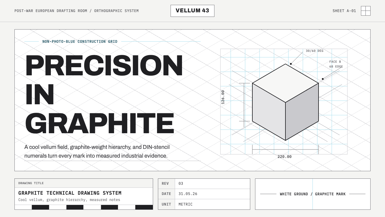 Graphite Technical DrawingDrafting-room precision. Non-photo-blue grid and graphite DIN lettering do th…
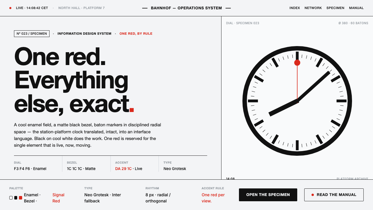 Hilfiker Railway ClockEverything exact, one thing live. Black hands on cool enamel white — one red…
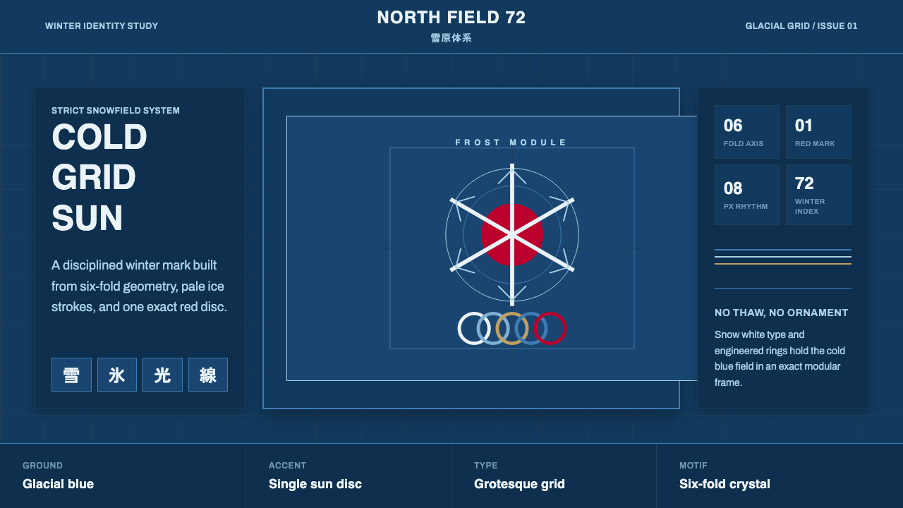 Sapporo Winter 1972Icy order, exact and calm. Glacial blue grid, snow-white type, one red sun di…
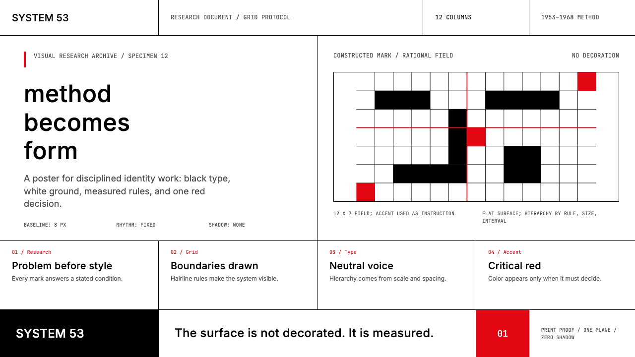 Ulm School (HfG Ulm)Clarity becomes discipline. Black-white grid, Inter grotesk, and one surgical…
 Vitsœ 606 ShelvingQuiet form, built to endure. Brushed silver rails impose rhythm on cool plast…
 Doctor's Clinical Lab CoatSterile by design. Cool clinical white, teal signals, and seam-line grids enf…