What is Hong Kong MTR?
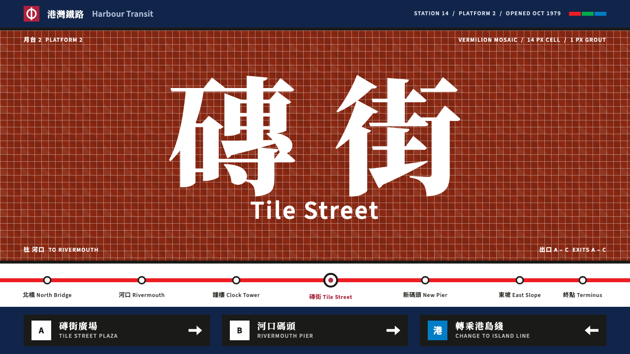
Hong Kong's MTR gave every station its own colour of glazed tile, so a rider who could not read the name could still tell where they were, and a whole city learned to navigate by the colour of a wall.
Hong Kong MTR in brief
The Hong Kong MTR style is the visual identity of the Mass Transit Railway as its first stations opened between 1979 and 1985. It is a late-modernist transit design built on colour-coded stations, black enamel sign panels with white lettering, a white route-map ground and bilingual Chinese and English wayfinding. It is one of the clearest examples of a public system that let colour, not text alone, carry identity.
Its central idea is that every station has a colour. Walls were clad in glazed mosaic tile of a single hue, so the vermilion of one station was visibly different from the blue of another. The colour was both a memory aid and a way of coping with a city where many riders read different languages and scripts, or no script at all, and where crowds and speed left little time to read a sign.
On a screen, Curio's version keeps that logic. A white map ground holds the page, a strong MTR red marks the brand and active states, a deep navy handles navigation and footers, and large fields of line colour behave like the coloured walls of a platform. Chinese sits above English in every label, set in a Song-style serif over a plain sans, and sign panels are black with white type and a single arrow pointing the way.

Where does Hong Kong MTR come from?
The Mass Transit Railway Corporation, usually shortened to MTRC, was founded in 1975, and the first section of the railway opened in October 1979. The Island line followed in 1985. The source material places the style in Hong Kong, from Kowloon across the harbour to Hong Kong Island, and treats the decade between 1975 and 1985 as its formative period. In that decade the city was growing fast, and a high-capacity underground railway was a statement of ambition as well as a piece of infrastructure.
The figure most closely associated with the identity is Roland Paoletti, the system's chief architect. Under his direction, each station was given its own colour of mosaic tile. The Chinese-language source gives examples: Mong Kok in vermilion, Yau Ma Tei in a grey-and-white speckle, Admiralty in blue, Central in a deep red. The source also credits the design and signage teams of the MTRC as a collective, and that is worth remembering, because a transit identity is never the work of one person; it is the combined output of architects, graphic designers, engineers and sign-makers.
The result sits within several design traditions. It is late-modernist, with clean geometry and a strong belief in the clarity of systems. It is bilingual wayfinding, designed for a city where Chinese and English share public space and the order of the two languages is itself a visual decision. And it is colour-coded station identity, an approach used by transit networks elsewhere but pursued here with unusual commitment, down to the tile on the walls.
Later generations of MTR graphics, with their line maps and coloured routes, built on this foundation, and the vermilion-and-white look has become shorthand for the city's public life. For designers today, the interest lies in its discipline. Each colour has a job, each sign has one message and one arrow, and each label has the same hierarchy of Chinese above English. Curio's system takes that discipline and applies it to pages, dashboards and wayfinding-style layouts.
What defines the Hong Kong MTR look?
Colour as wayfinding
Each station and each line has a colour, and that colour does the identifying. Large fields of line colour behave like the coloured walls of a platform: they tell you where you are before you read anything. On the page, a red line, a green line and a blue line each hold a section of content, and the colour stays consistent from navigation to chart to label.
Vermilion brand red
A bold MTR red marks the logo, the active state and the thing the user should do next. It is used sparingly and always with intent, never as a general decoration. Against a clean white ground, the red gives the system its confident, public-service feel.
Black enamel sign panels
Signs are rectangular panels with a black ground and white lettering, with a single arrow pointing to one end. They are high contrast, easy to read at a glance and very consistent. In interface terms, they become banners, section headers and callouts: a solid dark block, a short white label and one directional cue.
White map ground
The ground is a clean white borrowed from the route map. It makes the colours of lines and signs stand out and keeps the layout calm even when many colours are present. A navy is used for navigation and the footer, anchoring the page the way a map's frame anchors the diagram.
Chinese over English
Every label stacks the two languages in the same order, with Chinese above and English below. The Chinese is set in a Song-style serif with strong horizontal strokes, the English in a clean sans-serif. The consistency matters more than the particular type choice: a rider learns the pattern once and reads every sign the same way.
Tile-like grids and fine joints
The mosaic tile is echoed in tidy modular grids with thin, regular gaps. Cards and tables line up like tile courses, and thin joints between them keep the colour fields crisp rather than blending. The effect is orderly, quietly industrial and very legible.

Who shaped Hong Kong MTR?
Paoletti was the chief architect of the Mass Transit Railway and is the person most associated with its station design. Under his direction, each station was assigned a distinct glazed mosaic tile colour, turning the walls themselves into a wayfinding tool and giving the system its most recognisable early identity.
The design and signage teams of the MTRC are credited collectively in the source material. Their work covers the signs, route maps, lettering and layout rules that made the system legible. Their contribution is a reminder that a transit identity is built by a group, and that its consistency is the product of many small decisions repeated reliably.
How do you use Hong Kong MTR today?
Slides: Use the white ground as the default and treat each section of the deck as a line with its own colour. A cover slide can be a black enamel panel with the title in white and a small red mark. Content slides keep a coloured band at the top, a clear heading and one idea. Data slides benefit most: assign each series a line colour, use thin tile-like gridlines and label bilingual items with the primary language above the secondary one.
Web and UI: This is an excellent system for navigation-heavy sites, travel and city guides, dashboards with several categories and any product that has to help people find their way. Use colour for category, red for the active state or primary action, and navy for the frame. Build tabs and breadcrumbs like route strips, and keep sign-style banners for important notices. Forms and settings pages stay calm on the white ground.
Editorial and marketing: Maps, timelines, event schedules, wayfinding guides, wall posters and signage are the natural uses. A poster can set a single big colour field, one black panel with the key message and a line of bilingual text below. For a brochure, use a section colour for each chapter so readers feel where they are in the book. Multilingual publications gain a lot from the stacked-language rule.
A common mistake is to assign colours decoratively. If a colour appears in a section, it should continue to mean that section everywhere else. Another is to use many reds or to let the brand red spread over every button; the red works only when it is rare. A third is to break the language order, putting English above Chinese on one page and below on another, which undermines the consistency that made the original signs so quick to read.
Finally, remember that the original is a physical system. Tile, enamel and steel give it depth and resilience that a screen cannot copy, so on a page lean into the clarity, the grid and the colour logic rather than trying to imitate the material.

Hong Kong MTR — FAQ
What is the Hong Kong MTR design style?
It is the colour-coded, bilingual wayfinding identity of the Mass Transit Railway as its first stations opened between 1979 and 1985. Each station had its own colour of glazed mosaic tile, signs were black enamel with white lettering, and labels stacked Chinese above English. Curio's version adds a white map ground, a vermilion brand red, navy for navigation and large line-colour fields.
Who designed the station tile colours?
The chief architect of the system, Roland Paoletti, is the figure most associated with assigning each station its own tile colour. The source material also credits the design and signage teams of the Mass Transit Railway Corporation collectively, since a transit identity is the result of many people's work.
Why does every station have a different colour?
Colour makes it possible to identify a station at a glance, even for riders who cannot read the name or who read a different script. It also helps in crowded, fast-moving settings where there is no time to read. The colour works as both a memory aid and a navigation cue.
Is this style only suitable for transport projects?
No. Any project that needs clear categories, strong navigation or bilingual content can use it, including city guides, dashboards, schedules, directories and educational material. It is less suited to atmospheric storytelling, luxury branding or anything that relies on soft, decorative visuals.
How do I use the Chinese-over-English rule well?
Pick one order and apply it everywhere. Set the Chinese in a Song-style serif and the English in a plain sans-serif, keep their relative sizes consistent and give both lines the same alignment. The value of the pattern comes from repetition, so any exception weakens it.
Related design styles
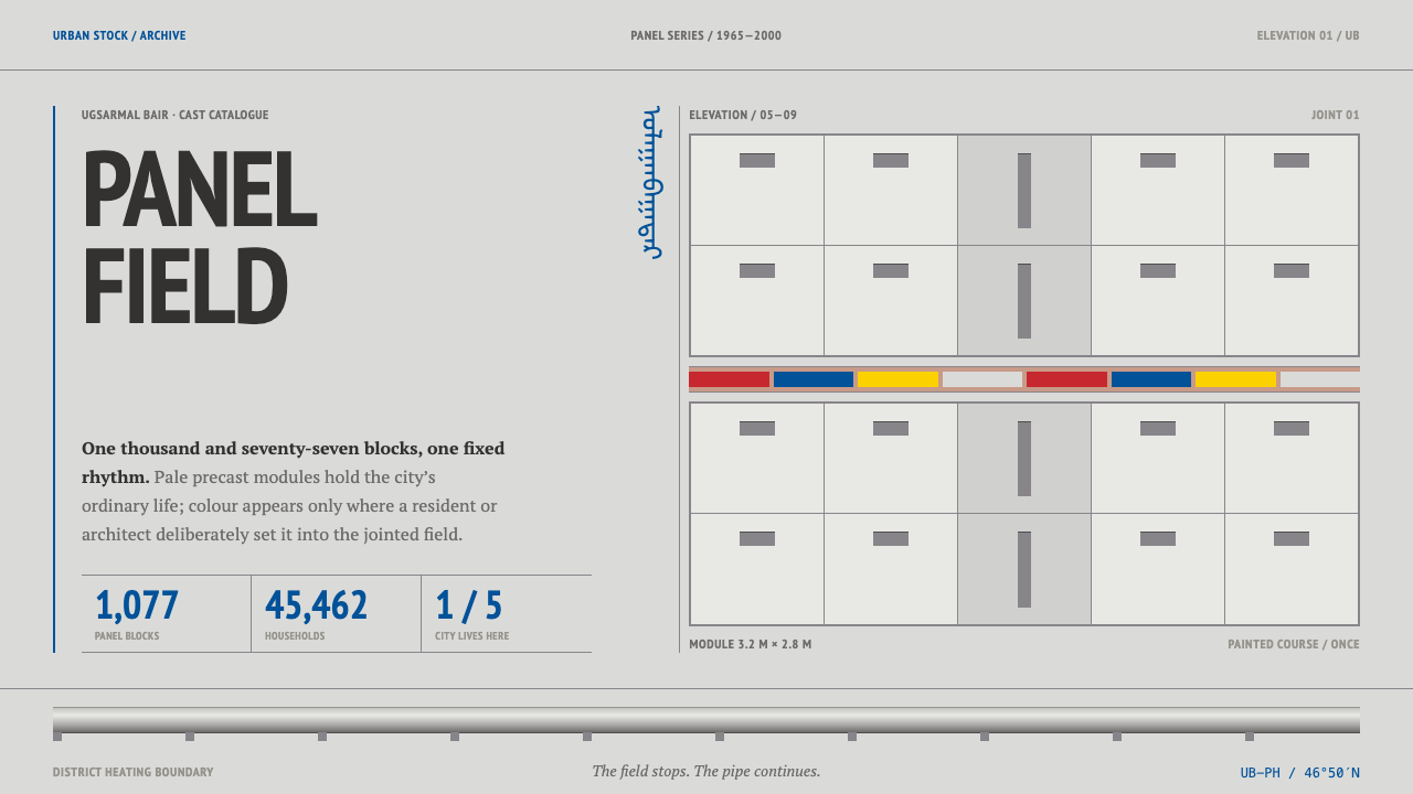 Ulaanbaatar Panel HousingConcrete refuses spectacle. PT Sans Narrow, visible seams, and one red-blue-y…
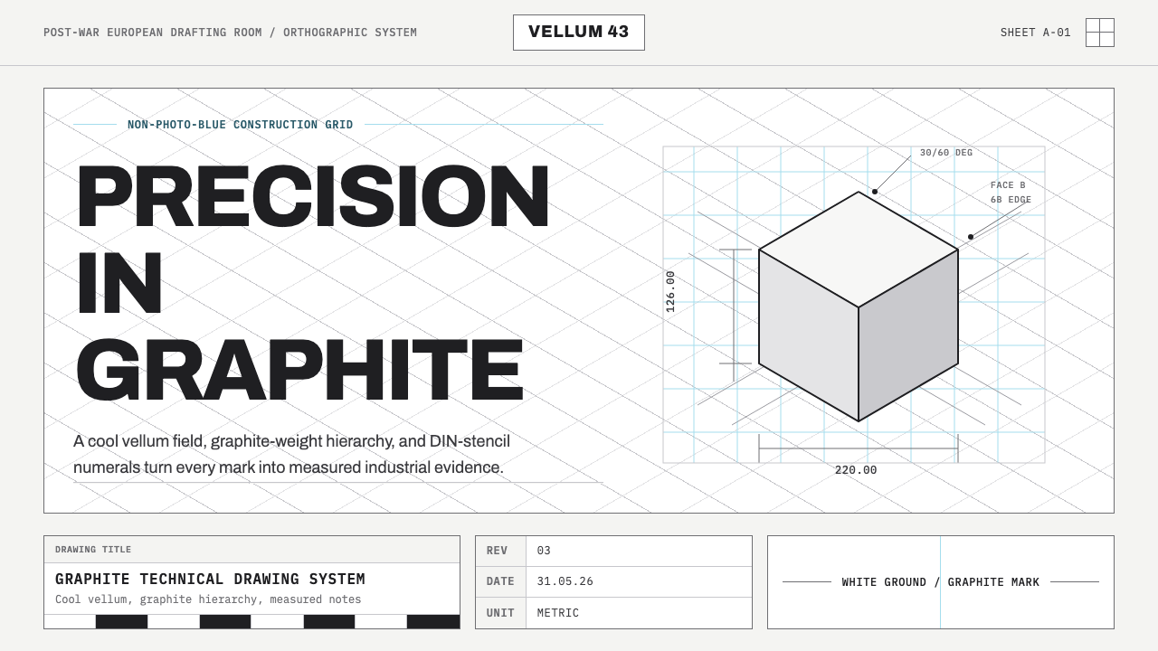 Graphite Technical DrawingDrafting-room precision. Non-photo-blue grid and graphite DIN lettering do th…
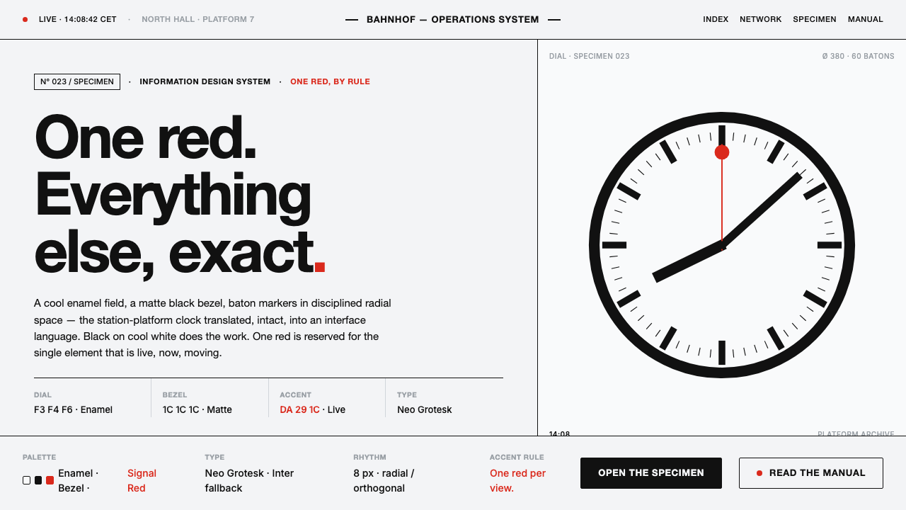 Hilfiker Railway ClockEverything exact, one thing live. Black hands on cool enamel white — one red…
 Sapporo Winter 1972Icy order, exact and calm. Glacial blue grid, snow-white type, one red sun di…
 Ulm School (HfG Ulm)Clarity becomes discipline. Black-white grid, Inter grotesk, and one surgical…
 Vitsœ 606 ShelvingQuiet form, built to endure. Brushed silver rails impose rhythm on cool plast…