About Hong Kong MTR
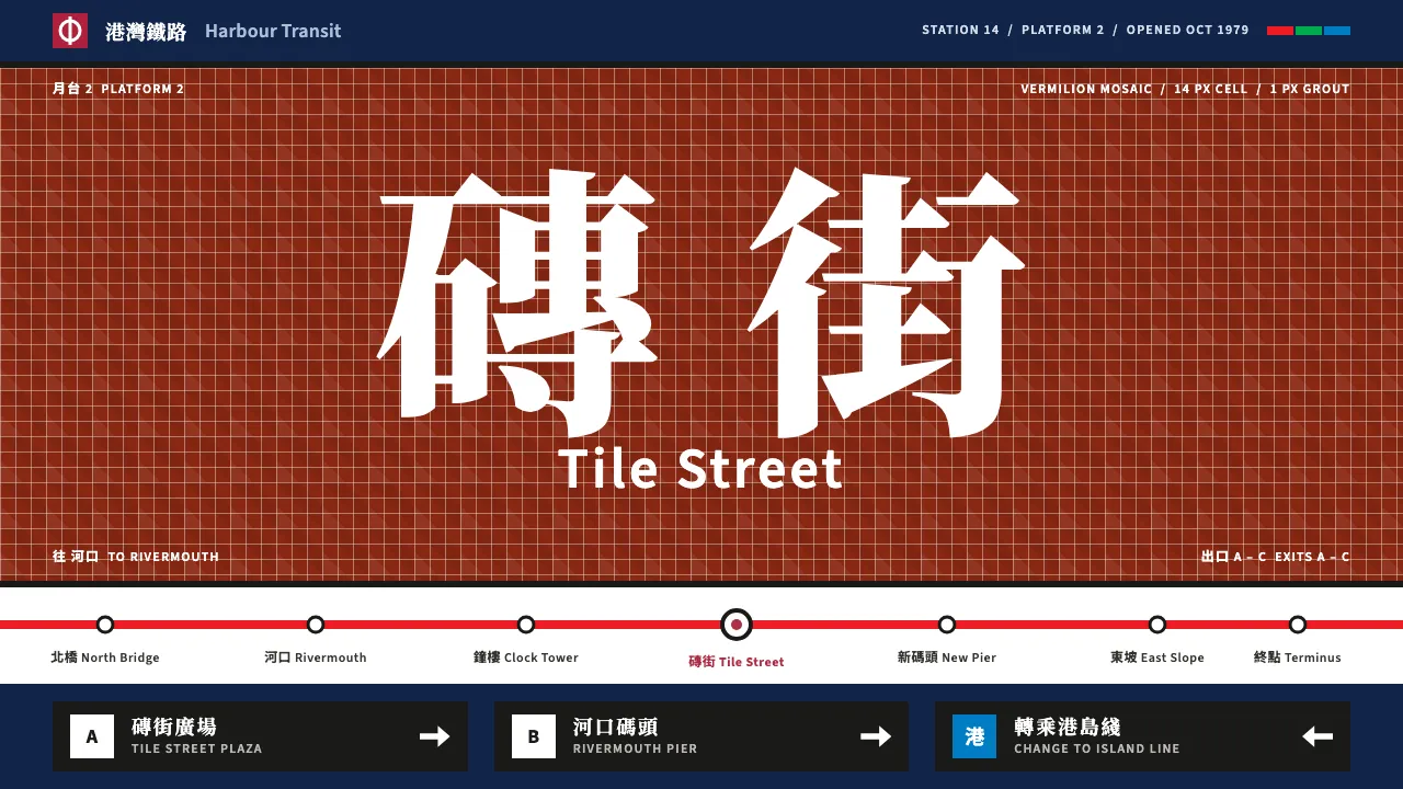
A design system drawn from the stations of Hong Kong's Mass Transit Railway as they opened between 1979 and 1985. Each station had its own colour of glazed mosaic tile, so a rider who couldn't read the name could still tell Mong Kok's vermilion from Admiralty's blue.
The system keeps that logic: a white map ground, MTR red for the mark and active states, navy for navigation, line colours for large fields, and black enamel sign panels with white type. Chinese sits above English, set in a Song-style serif over a plain sans.
- Origin
- Hong Kong, from Kowloon to Hong Kong Island
- Era
- 1975–1985 (MTRC founded 1975, first section opened October 1979, Island line 1985)
- Key figures
- Roland Paoletti · Mass Transit Railway Corporation design and signage teams
- Movements
- Late-modernist transit design · Bilingual wayfinding · Colour-coded station identity
Hong Kong MTR design spec
Colors
Typography
The other 11 sections — buttons, cards, spacing, motion, techniques and more — open once you unlock. Download the DESIGN.md or send it to your AI in one click. Unlock once, yours forever.
Sign up nowStyles similar to Hong Kong MTR
Also inspired by architecture & places, with a close feel.
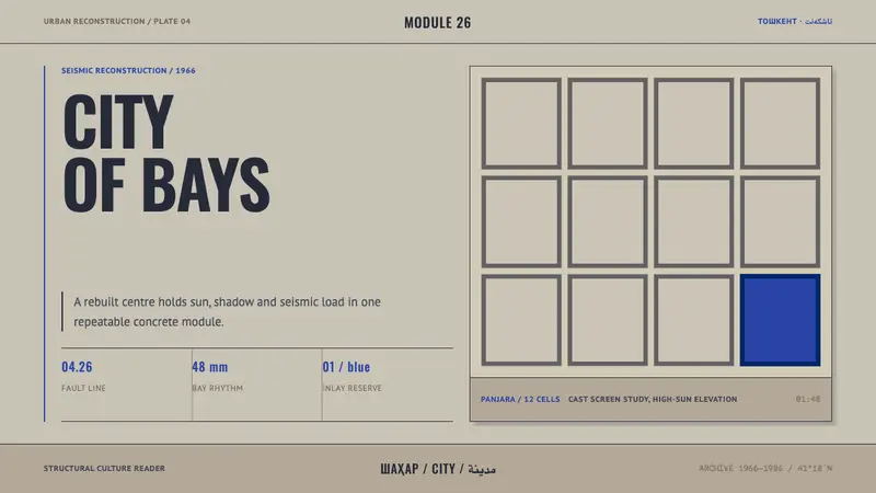 Tashkent Seismic ModernismStructure keeps its cool. Sun-bleached concrete grids hold one reserve of Timurid blue.
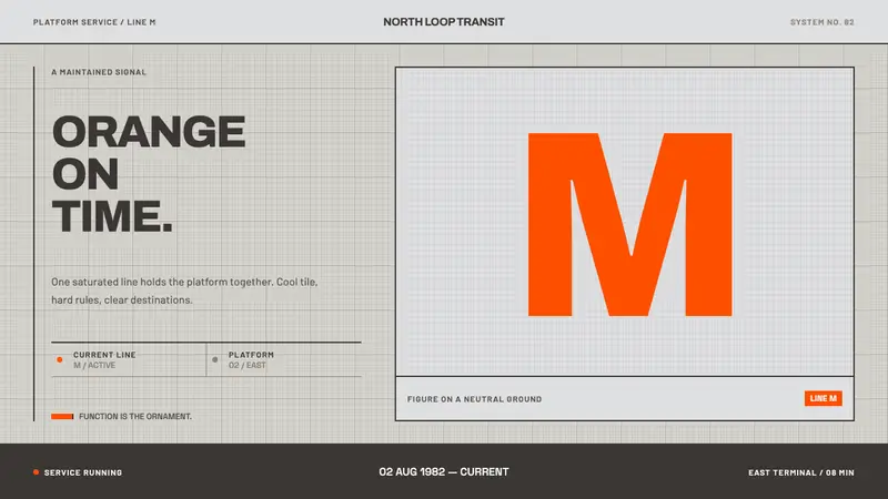 Helsinki Metro OrangeOne orange does the work. Archivo signage cuts across an 8px concrete tile grid.
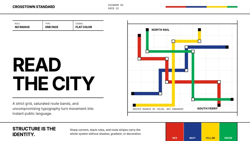 Massimo Vignelli NYCClarity becomes infrastructure. Black rules and route stripes lock the white grid.
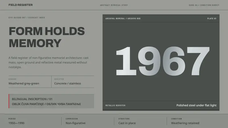 Yugoslav SpomenikMonumentality without figures. Concrete grey-green meets stainless geometry at a hard horizon.