What is Planispheric Astrolabe?
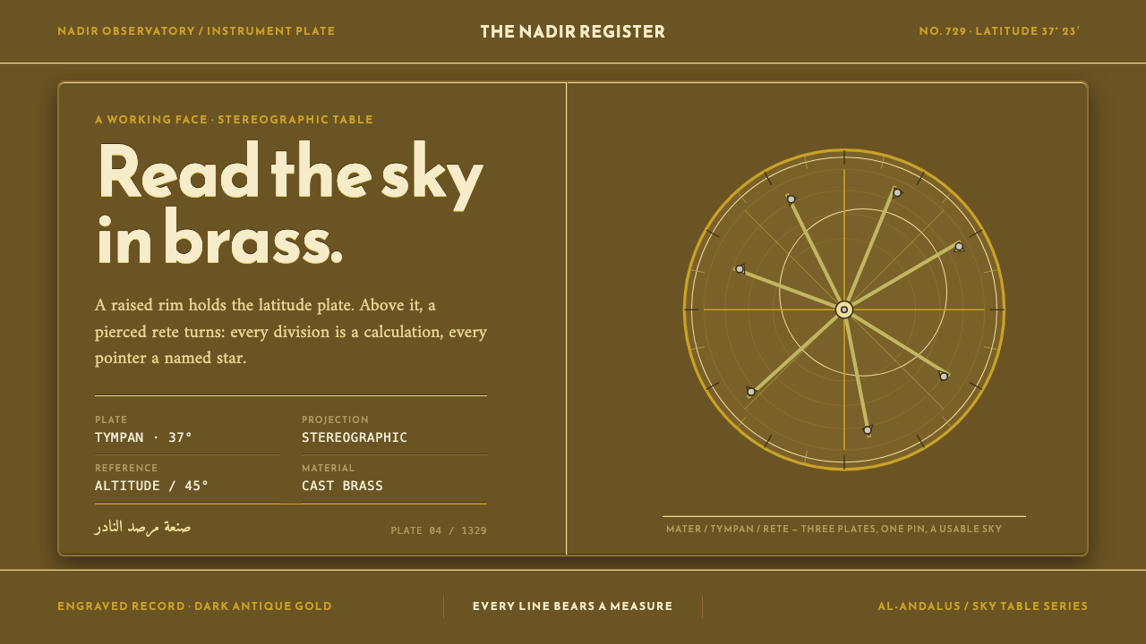
The astrolabe was a computer made of brass — a dark, layered disc whose every line, ring and pointer did a piece of astronomical work, leaving a visual language with no decoration to remove.
Planispheric Astrolabe in brief
The planispheric astrolabe is a medieval analogue computer for the sky: a cast and engraved brass disc that flattens the dome of the heavens into a projection a person can hold. The name states the principle — planispheric means the celestial sphere has been laid out on a plane — and the design follows from that purpose. Brass was chosen not for show but because wood warps, and an instrument whose scales must keep their geometry for generations cannot afford to move.
The anatomy is layered. A raised-rim body, the mater, holds a stack of tympans — thin plates, each engraved for one latitude where the instrument is to be used. Above them sits the rete, a pierced openwork plate whose filed star-pointers and off-center ecliptic ring turn freely over the engraved plate beneath. Turning the rete is how the user turns the sky: the stars and the sun's path slide across the fixed lines of the horizon and the altitude circles, and time, position and angle can be read where the lines cross. The back of the instrument carries a shadow square, a calendar and trigonometric scales for measuring and calculating.
As a visual system, the astrolabe is dark, concentric and exacting. The surviving instruments have settled into a deep antique-gold patina, bright only where the pointers and cut scales have caught light and been handled. Star names are cut in Kufic script beneath the pointers. Everything on the face is a working scale: layers are real layers, circles are real concentric circles, and no line is there to fill a gap. That discipline — a dark ground, fine metallic detail, nothing ornamental — is what a design system built on the astrolabe inherits.
Where does Planispheric Astrolabe come from?
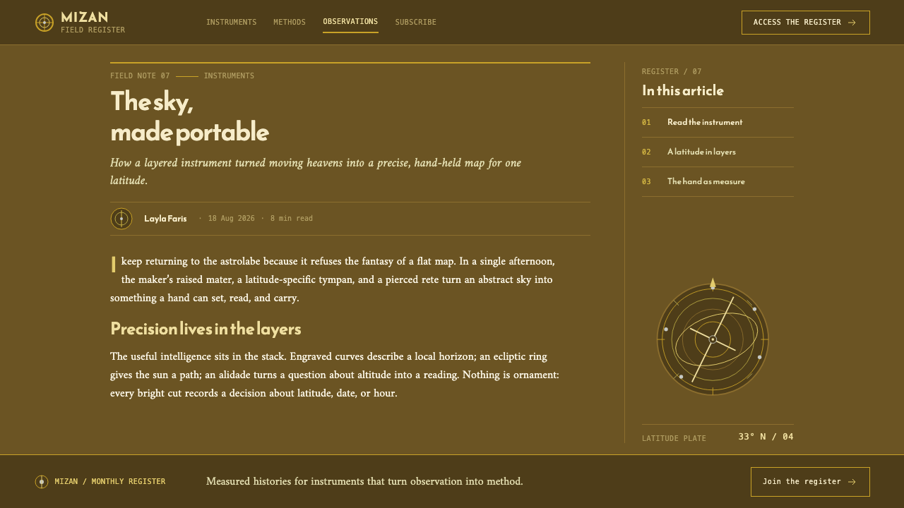
The astrolabe this style draws on belongs to the Islamic world's mathematical astronomy of the twelfth to fourteenth centuries. The source record dates a Maghribi astrolabe to about 1145–1155 and an instrument tied to Ahmad ibn Ali al-Sharfi to AH 729, which corresponds to AD 1329. The two sit nearly two centuries apart, and the continuity between them is what interests designers: a layout fixed enough that makers could work to the same plan across generations while still giving each instrument its own hand.
The geometry behind the instrument is stereographic projection, the method that carries circles on a sphere onto circles on a plane. The rotating rete traces the apparent motion of the stars; the tympans below it draw the local horizon, the circles of equal altitude and the lines that divide the sky for one particular latitude. That is why a serious astrolabe came with several tympans: each was a different place on Earth. The off-center ecliptic ring on the rete is no flourish — the sun's yearly path is tilted against the celestial equator, and on the projection that tilt appears as a circle whose center is displaced.
The tradition of making them was regional and highly skilled. The record places it across the Islamic world, from the Maghreb to al-Andalus, with one locale named as Alcalá, near Seville. Andalusi and Maghribi workshops cast the discs, engraved the scales, filed the star-pointers by hand and cut the Arabic star names, and they did so within a wider culture of mathematical astronomy that treated observation, calculation and instrument-making as parts of one craft. The astrolabe was at once a teaching tool, a reference table and a personal instrument.
What carries over into design is an attitude toward ornament. In an astrolabe, beauty is a by-product of precision: fine scribed circles, filed pointers, the quiet rhythm of engraved letters. Decorated instruments exist, but the visual language this system draws on is the working face — a surface where every line is doing arithmetic. That is the rule the style takes for itself: if a mark cannot be read as a scale, a label or a pointer, it does not belong.
What defines the Planispheric Astrolabe look?
Dark Brass Ground
The ground is a dark antique gold — the patina of old brass rather than the shine of new. Brightness is rationed to the places where metal has actually caught the light: the tips of the pointers, the cut edges of the scales. Contrast is therefore built from small, sharp highlights on a deep field, not from large pale areas, and the page keeps the hush of an object kept in a case.
Concentric Scales
Circles share a center. Rings for hours, degrees and months nest inside one another like the scales on a real plate, and the spacing between them is regular enough that the eye reads the structure before it reads any label. A concentric ring in this system is never a decorative frame; it is a scale that could in principle be read.
True Layering
Layers are real layers. The mater holds the tympan, the tympan sits beneath the rete, and the rete is pierced so that the plate underneath shows through its openings. In an interface that means panels which genuinely overlay one another, with the lower layer visible through gaps, rather than flat cards faking depth with soft shadows.
Silver Star Studs
Small silver points mark the stars on the dark plate, echoing the filed pointers of the rete — the rete described in the source record carries twenty-nine of them. They are the main accent: tiny, cool-toned and sparse, they give the face a night-sky quality without a single illustrated star. Silver is the only cool color on a warm ground, so it reads instantly as 'something to find'.
Kufic Labels
Star names, and the signs of the zodiac, run in Kufic script beneath the pointers. Kufic is an angular, geometric style of Arabic lettering that suits being cut into metal, and its squared forms sit naturally against ruled scales. Labels are small, even and engraved-looking, set where the line they name begins, and they are always there to identify something rather than to ornament.
The Reverse Face
The back of the astrolabe is a second page with its own logic: a shadow square for reading heights from shadows, a calendar relating the date to the sun's place in the year, and trigonometric scales. It reminds a designer that a system can have a front that shows state and a back that does the arithmetic. In an interface, this is the case for putting the working tools — conversions, scales, references — one deliberate step behind the primary view.
Nothing Ornamental
The rule that governs the rest. Every line on the face is a working scale; none exists to fill space. There is no filigree, no floral border, no gradient sheen laid on to make the metal look rich. The richness comes from density and accuracy — the viewer senses that every mark could be checked — and that sense of reliability is the real luxury of the style.
Who shaped Planispheric Astrolabe?
Al-Sharfi's name is attached to the astrolabe dated AH 729 (AD 1329) in the source record. It is the later of the two anchor instruments, and it shows how long the essential layout — mater, tympans, rete, engraved back — remained a working standard. For designers, he stands for the maker's side of the tradition: a person who put his name to an object whose beauty was the by-product of every scale being correct.
The earlier anchor instrument in the record, dated to about 1145–1155, comes from the western Islamic tradition of instrument-making. Its role in the style is to supply the oldest form of the pattern: a dark metal face, concentric engraving and openwork star-pointers already fully formed. It shows that nothing in the later design language was a late addition; the discipline was there from the start.
Stereographic projection is the mathematical method that makes the instrument possible, carrying circles of the sky onto circles on a flat plate. It is not a person, but it behaves like the style's silent author: it is the reason the rings are concentric, the ecliptic is off-center and the stars can be moved against the lines of the horizon. Designers who understand it use circles as arguments, not as shapes.
The workshops of al-Andalus and the Maghreb were the collective author of this look. Casting brass, engraving scales, filing pointers and cutting Kufic names were separate skills that had to agree to the last line. The result is a style defined by cooperation between layers — a pierced plate over an engraved plate over a cast body — and by lettering that serves the scale it labels.
How do you use Planispheric Astrolabe today?
The astrolabe style suits products and presentations in which precision is the selling point and the audience is willing to look closely: scientific and technical software, tools for time, place and navigation, craft and heritage brands, museums, and explanatory writing about mathematics or the history of science. It is a dark style with a lot of fine detail, so it rewards screens and print runs where that detail can be seen, and it asks that every mark earn its place.
On a cover slide, let one large set of concentric rings sit off-center on the dark field, with the title set small, even and well spaced beside it. Content slides can stack their material in real layers: a main panel with a thinner panel visibly beneath it, divided by a fine ring or rule rather than a box. Data slides are the style's natural home for radial and circular forms — polar charts, clock-like diagrams, calendars of the year — with the highlight color reserved for the one series or pointer that matters and silver points for individual marks.
On the web, think of dashboards that are really about position and time: scheduling tools, orbit or tide calculators, observability views arranged around a dial, maps that care about latitude. Navigation can be a thin ring or a row of small labels, content can sit in overlapping panels, and secondary tools — conversions, settings, references — can live on a 'reverse' view, one deliberate step behind the front. A pricing page can offer plans as stacked plates, each engraved for a different situation, with one highlighted by a silver mark rather than a banner.
In editorial and marketing work, the style gives a long article about instruments, astronomy or craft a serious, museum-like voice. Use generous margins, small engraved-looking captions, and thin rules instead of tinted boxes. For makers of precision goods — instruments, watches, navigation or scientific products — the astrolabe's message is credible without a single claim: the surface itself implies that every mark is functional. Photography works best as close detail of real metal, lit sparingly.
The most common mistake is to read the style as 'gold on black luxury' and cover it in gradient sheen, glow, filigree and a faux-brass texture. The source of this look is a working instrument; ornament that does no work contradicts it. A related mistake is using a pseudo-Arabic display font to give a surface an 'oriental' flavor — if Kufic lettering is used, it should name something real, in the right place, set small and legibly. Finally, do not make the highlights large: the dark ground is the point, and silver or bright brass used as a fill destroys the quiet that makes the details visible.
Planispheric Astrolabe — FAQ
Why is the astrolabe made of brass?
Because wood warps. An instrument whose scales have to line up to the last engraved mark cannot be made of a material that moves with humidity and age, so makers cast it in brass. The material was a functional choice rather than a decorative one, and the dark antique-gold of the surviving instruments is the patina of centuries, not an applied finish. That is why the style treats its metallic look as something earned by wear — bright only where light and hands have touched it.
What are the mater, tympan and rete?
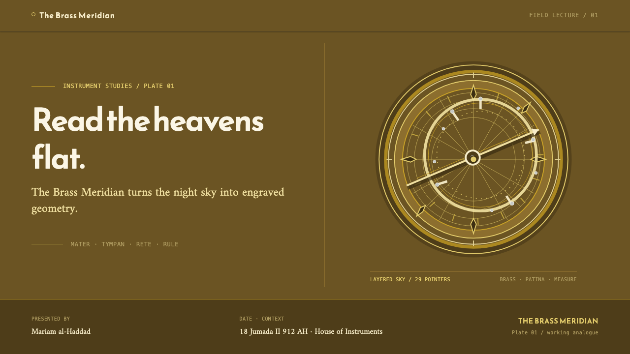
The mater is the raised-rim body that holds everything. A tympan is a thin plate engraved for one latitude, and the mater carries a stack of them, so the instrument can be used in several places. The rete is the pierced upper plate with the star-pointers and the off-center ecliptic ring; it turns above the tympan to reproduce the motion of the sky. In design terms they are three layers: a container, a fixed reference plate, and a moving overlay.
Is this just a luxury gold-and-black theme?
No, and the difference matters. A luxury theme uses gold as a signal of price: large, shiny, applied everywhere. The astrolabe uses brass as a working material and keeps its brightness to the few places where light would really fall. The dark ground, the silver star points and the fine concentric scales make a quiet, technical surface. If a design reads as expensive before it reads as precise, it has drifted away from the astrolabe.
Does the style require Kufic lettering?
Kufic names beneath the pointers are part of the instrument's character, and using them where they identify something real gives the style its authenticity. But they are not a requirement for every project. A design can follow the astrolabe's logic — small, even, engraved-looking labels placed exactly where the line they name begins — in any script. What it should not do is use Kufic-style letterforms as a decorative flavor with no meaning attached.
How do I keep a dark, detailed style readable on screens?
Keep body text and primary labels at generous size and high contrast against the dark ground, and use the finest rules only for structure, never for essential information. Limit bright elements to a few at a time so they read as pointers rather than noise. Make sure fine concentric lines survive small screens by simplifying them, not by thickening them; a few rings that read clearly are better than many that blur together.
Related design styles
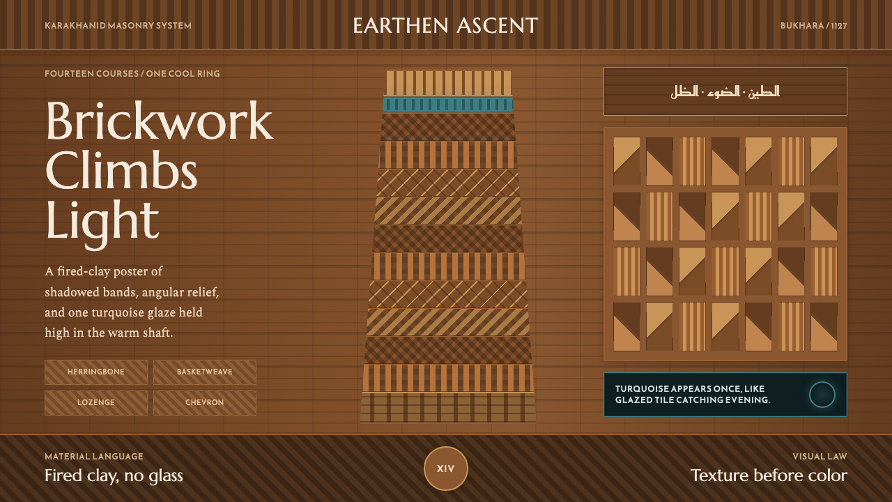 Bukhara Kalon Minaret BrickworkMonumental warmth. Ochre brick bands climb toward one turquoise ring.
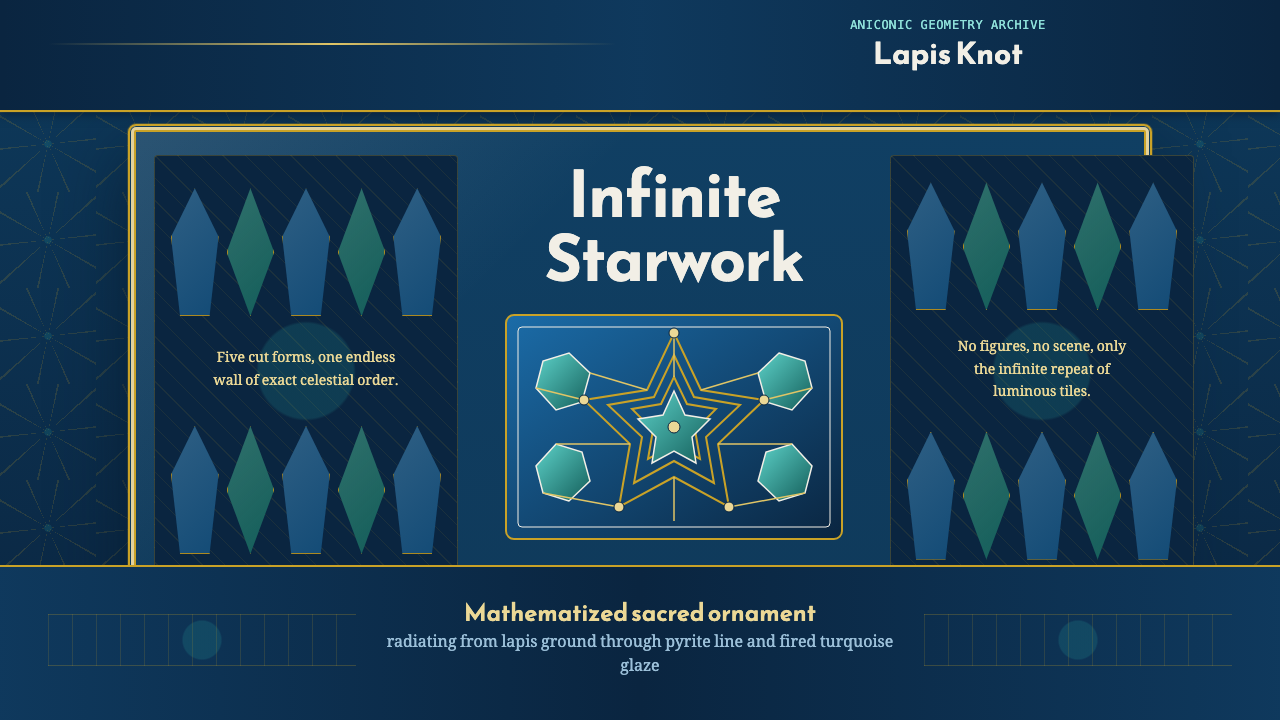 Islamic Girih TilesSacred geometry glows. Cobalt tile, turquoise stars, and gold strapwork repea…
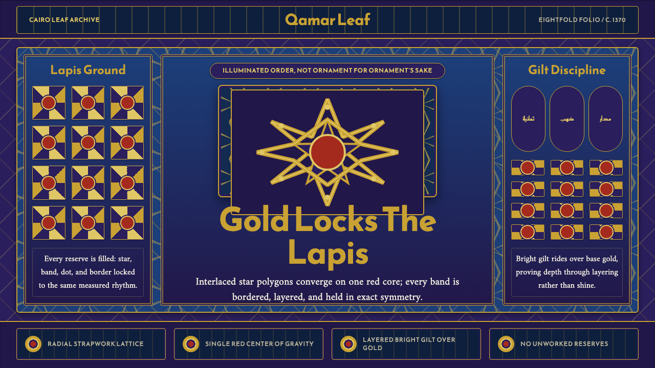 Mamluk Quran IlluminationGilded density rules. Lapis ground, eightfold gold strapwork, and one red cor…
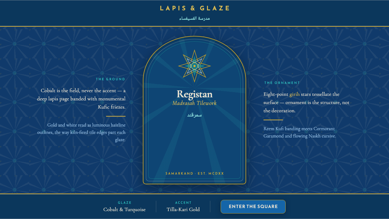 Registan Madrasah TileworkCobalt is the ground, not the accent. Gold girih stars tessellate deep lapis…
 Diatom ArrangementDark-field order. Cyan and mint rosettes glow inside Victorian hairline rings.
 Sacred Geometry Platonic SolidsGeometry feels ritual. Cream paper, indigo wireframes, gold rules stage the f…