What is Registan Madrasah Tilework?
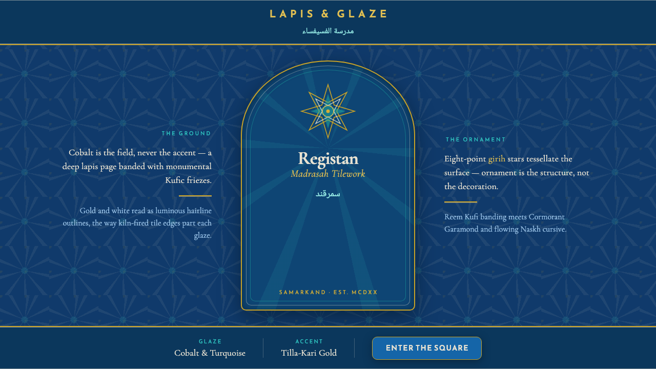
Registan Madrasah Tilework turns ornament into atmosphere: cobalt becomes an immersive field, while turquoise stars, gold filaments, and calligraphic bands make every surface feel devotional and alive.
Registan Madrasah Tilework in brief
Registan Madrasah Tilework draws from the tiled surfaces of Samarkand’s Registan ensemble: the madrasahs of Ulugh Beg, Sher-Dor, and Tilla-Kari. Its visual identity begins with saturated cobalt and deep lapis grounds, then builds outward through turquoise majolica, white-and-gold stars, curling tendrils, and monumental bands of Arabic calligraphy. The result is not a sparse decorative language. It is an all-over system in which color, geometry, script, and architectural scale reinforce one another.
The central organizing device is girih ornament: interlocking geometric stars and angular linework that create continuity across a surface without reading as a repeated wallpaper pattern. A star may act as a focal point, but it also belongs to a larger field of crossings, edges, and neighboring forms. This gives the style its distinctive tension between rigor and abundance. The geometry is controlled, yet the overall impression is expansive, celestial, and almost infinite.
In digital form, the system translates the material richness of majolica tile into a dark, luminous interface language. Deep blue establishes the page as a ground rather than an empty canvas. Turquoise tessellation creates rhythm and direction; gold and white clarify hierarchy, edges, and moments of emphasis. Angular Kufi-inspired banding can provide architectural weight, while flowing Naskh-inspired text and a Latin serif introduce a more literary, human cadence. The style is most convincing when these elements feel woven together, not placed as isolated exotic accents.
Where does Registan Madrasah Tilework come from?
The source of this style is the Registan ensemble in Samarkand, Uzbekistan, a Central Asian architectural complex associated with the Timurid period. Its principal span is identified as 1417–1660, and the Ulugh Beg madrasah dates from 1417–1420. Within that setting, tilework is not a secondary finish applied after architecture is complete. It is a primary visual skin: cobalt, turquoise, white, and gold organize facades into fields of belief, learning, ceremony, and civic presence.
The ensemble is defined here through its three madrasahs: Ulugh Beg, Sher-Dor, and Tilla-Kari. Their shared tiled character makes the group legible as a unified visual world even as individual surfaces vary in motif, calligraphy, and density. A deep lapis ground allows brighter colors to appear luminous rather than merely loud. Turquoise stars punctuate that darkness, while white-and-gold ornament catches the eye as a line of illumination. The surfaces are structured to be read both from afar, as monumental composition, and nearby, as intricate workmanship.
Its ornamental grammar belongs to Islamic majolica and tile-mosaic practice, joined to girih geometric ornament. Girih does not depend on pictorial representation to create richness. Instead, stars, polygons, angled paths, and tendril-like passages establish visual continuity. The system can expand across a wall or band around an architectural surface while maintaining a sense of internal law. This is why the style has such strong digital potential: its complexity is not arbitrary detail, but a disciplined relationship among repeated forms.
Ulugh Beg and Yalangtush Bakhodur are the key figures named in the source material. Their presence anchors the style in a specific Timurid and Samarkand context rather than treating it as a generic category of blue-and-gold ornament. For contemporary designers, that context matters. The visual language carries the gravity of a particular architectural ensemble, and its strongest adaptations preserve that gravity through scale, continuity, and respect for script-like and geometric structure.
What defines the Registan Madrasah Tilework look?
Cobalt as Ground
Cobalt and lapis-like blue should occupy the role usually given to empty background. It is not a small accent used to enliven an otherwise neutral composition; it is the environment in which all other elements appear. Against this darkness, turquoise feels electric, white becomes crisp, and gold reads as illumination. The page should feel sheathed rather than merely colored.
Girih Continuity
Girih stars and angular interlocks form a connected field rather than a collection of decorative badges. Lines should appear capable of continuing beyond the visible frame, and neighboring motifs should feel structurally related. The desired effect is measured density: enough repetition to suggest an endless system, enough variation in scale or cropping to prevent the surface from becoming static.
Turquoise Illumination
Turquoise is the vivid counterforce to the lapis field. It works best in stars, tessellated fragments, borders, or selected navigational moments where a change of state must be unmistakable. It should not be spread uniformly across the composition. Its power comes from appearing as a cool, brilliant emergence from the deeper blue.
Gold and White Filigree
Gold and white act as fine-grained clarifiers. They outline stars, sharpen tendrils, frame meaningful labels, and bring a luminous finish to important boundaries. Their use should be precise rather than lavish. When every line is bright, the hierarchy collapses; when brightness is reserved for articulate crossings and ceremonial moments, the pattern acquires depth and dignity.
Calligraphic Bands
Monumental Kufic and Thuluth calligraphy are part of the architectural language named by the source material. In a digital adaptation, angular Kufi-like forms can function as structural bands, dividers, or display motifs, while cursive Naskh-like movement can soften long reading passages or secondary labels. Script should retain the authority of a band around a facade, not become a casual ornamental flourish.
Devotional Density
This style is intentionally dense, but density is not clutter. Ornament, typography, and geometry should share an ordered field with clear dominant zones and quieter margins. A large unbroken lapis area can be as important as an intricate star panel. The contrast between stillness and elaboration allows the composition to feel contemplative instead of merely busy.
Who shaped Registan Madrasah Tilework?
Ulugh Beg is named as a key figure in the source material and gives his name to one of the Registan ensemble’s madrasahs. The Ulugh Beg madrasah, dated 1417–1420, provides the earliest specific architectural anchor supplied for this style. In a design narrative, that association connects the tilework to scholarship, architectural scale, and the Timurid setting of Samarkand.
Yalangtush Bakhodur is the other key figure identified in the source material. His inclusion is a reminder that Registan tilework belongs to a historical ensemble and a continuing architectural tradition, not to an anonymous visual archive. Contemporary uses should therefore treat its motifs as parts of a coherent system with place, patronage, and cultural weight.
The Registan ensemble itself is the decisive figure of the style. The madrasahs of Ulugh Beg, Sher-Dor, and Tilla-Kari establish the visual vocabulary together: cobalt and turquoise majolica, star-and-tendril girih, deep lapis grounds, and monumental calligraphic banding. Any digital interpretation is strongest when it preserves this ensemble logic rather than extracting a single tile as a standalone motif.
How do you use Registan Madrasah Tilework today?
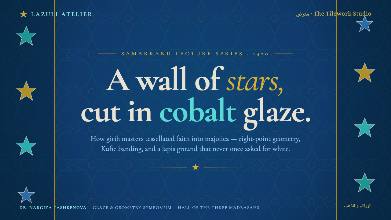
For presentation covers, use the lapis field as an enveloping stage. Let a cropped girih star or a calligraphic band establish the composition, then place the title with ample breathing room so it reads as an inscription rather than a label. Content slides should become calmer architectural panels: use restrained borders, a consistent reading axis, and small turquoise or gold signals to separate ideas. Do not cover every slide in full tessellation; the alternation between dense ornamental moments and quiet blue surfaces is essential.
Data slides benefit when charts are treated as parts of the same geometric language. A radial or segmented graphic can echo a star without pretending to be historic ornament, while lines and annotations can borrow the precision of tile boundaries. Keep comparisons legible against the dark ground and reserve luminous accents for the data series that need priority. The aim is ceremonial clarity, not a decorative chart frame.
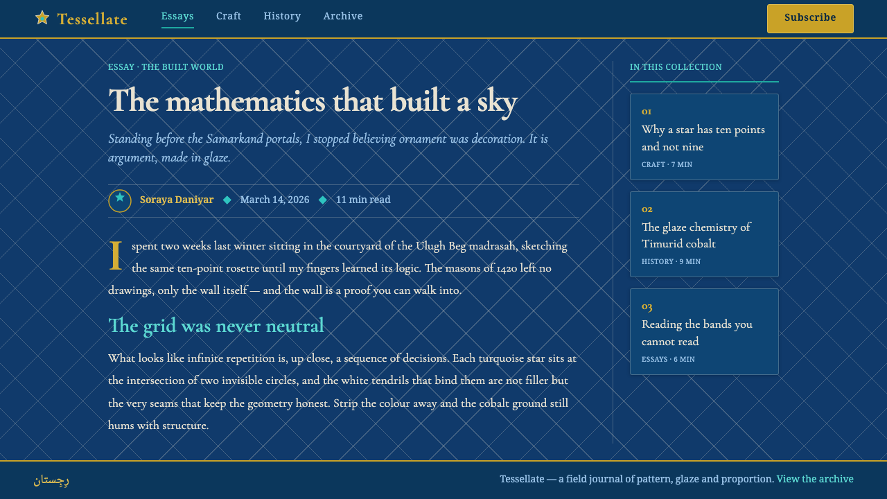
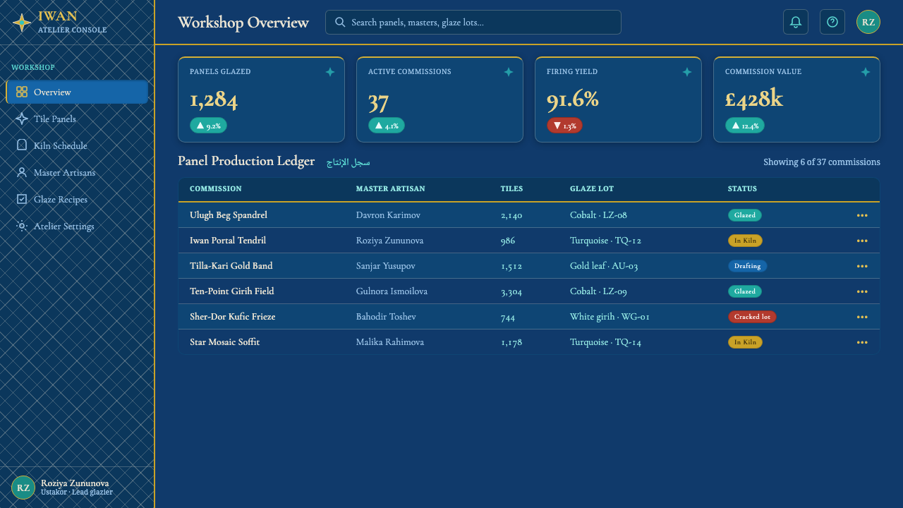
For web interfaces, this style suits cultural platforms, archives, educational products, premium dashboards, and pricing pages that need gravity as well as visual distinction. Use the dark lapis ground to establish atmosphere, then organize information in panels whose edges feel like architectural inlay. Navigation can use a strong typographic spine and occasional angular markers; states, alerts, and selected plans can receive turquoise, white, or gold emphasis. Dense pattern belongs at entrances, headers, feature moments, and empty-state illustrations, not behind every operational control.
For editorial and marketing work, the style is especially effective when a long page moves between immersive visual sections and readable prose. Open with cobalt, stars, and an oversized inscription-like title; then allow article text to sit in calmer zones with ornamental bands marking transitions. Campaign pages can frame products, exhibitions, destinations, or research with a sense of craft and cultural seriousness. The strongest imagery is often abstract and material: tile surfaces, stars, linework, calligraphic rhythm, and deep fields of color.
The common mistake is to treat the style as a generic dark luxury theme by scattering gold lines over blue surfaces. That loses the logic of the source. Gold must clarify, turquoise must animate, and girih must connect. Another mistake is using ornate pattern beneath dense body text, where it competes with reading. Preserve a hierarchy between field, structure, script, and ornament; the style becomes convincing through disciplined relationships, not through maximum decoration.
Registan Madrasah Tilework — FAQ
Is this style simply a blue-and-gold luxury look?
No. Blue and gold are visible entry points, but the style depends on a deeper system: lapis-like blue as ground, turquoise as a luminous counterpoint, girih as a continuous geometry, and calligraphic banding as architectural structure. If gold is applied without those relationships, the result may feel expensive but will not resemble Registan tilework in its spatial or devotional character.
How much pattern should a digital layout use?
Use enough pattern to establish a field and a recognizable rhythm, but not so much that every reading surface vibrates. The historical reference is dense, yet it also relies on large deep grounds, framed bands, and distinct zones of attention. In an interface, reserve the most intricate tessellation for moments of arrival, transition, celebration, or low-information space. Functional reading areas need quieter structure.
Can Latin typography coexist with Kufi and Naskh-inspired forms?
Yes, provided each voice has a clear role. Use angular Kufi-inspired forms for architectural display moments, bands, and compact labels; use flowing Naskh-inspired movement where a softer literary rhythm is useful; and let a Latin serif carry extended English or multilingual reading. The goal is not to imitate scripts indiscriminately, but to create a hierarchy in which angular structure and cursive flow support the same page.
Where does Registan Madrasah Tilework work best?
It is strongest where cultural depth, ceremony, scholarship, or atmosphere are meaningful product values: museum and archive experiences, educational publishing, heritage storytelling, event identities, research platforms, and premium editorial campaigns. It is less suitable for highly utilitarian flows that require visual neutrality, rapid scanning, or a deliberately casual tone. Its density and gravity should be chosen as a message, not added as surface decoration.
Related design styles
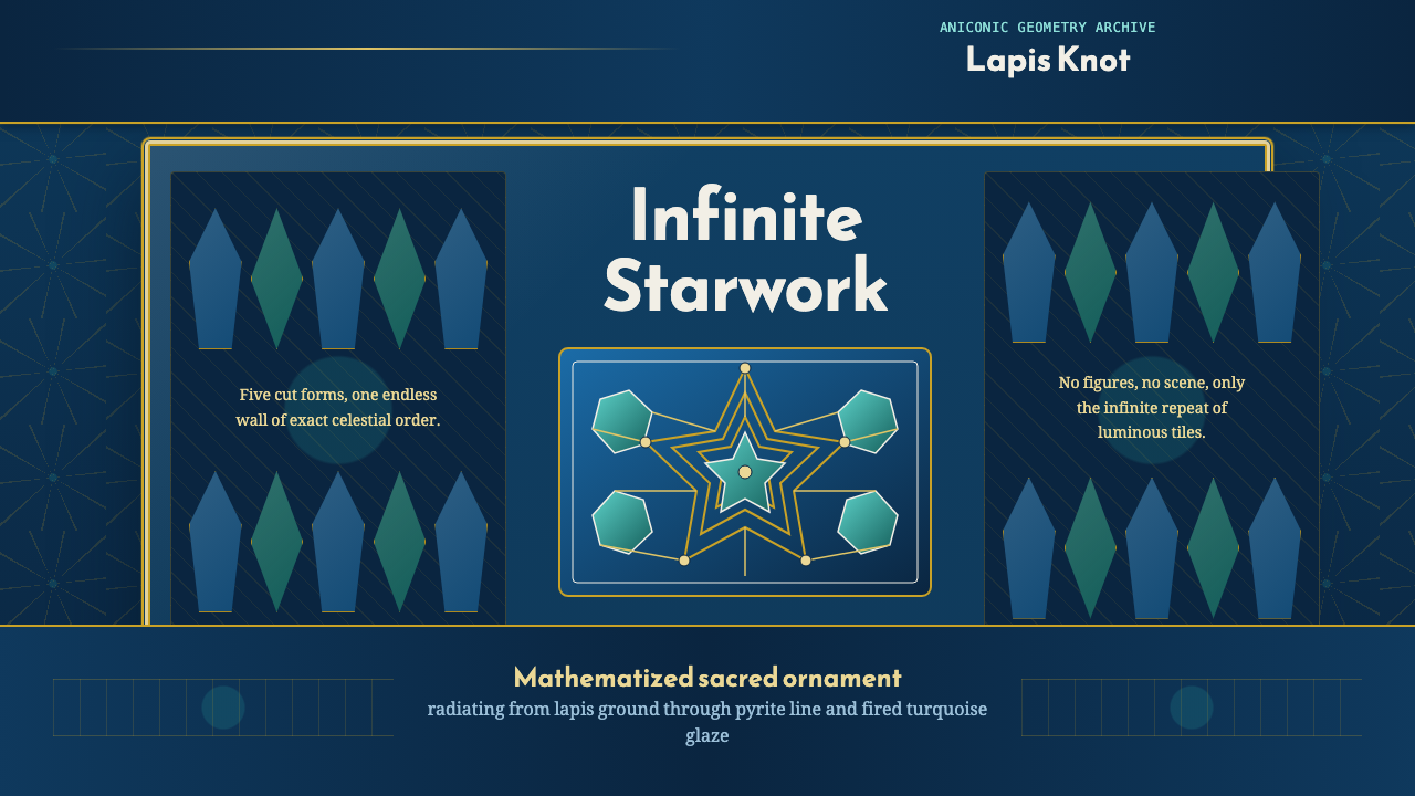 Islamic Girih TilesSacred geometry glows. Cobalt tile, turquoise stars, and gold strapwork repea…
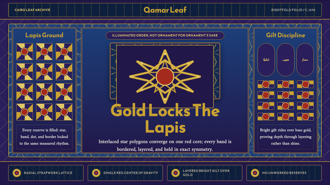 Mamluk Quran IlluminationGilded density rules. Lapis ground, eightfold gold strapwork, and one red cor…
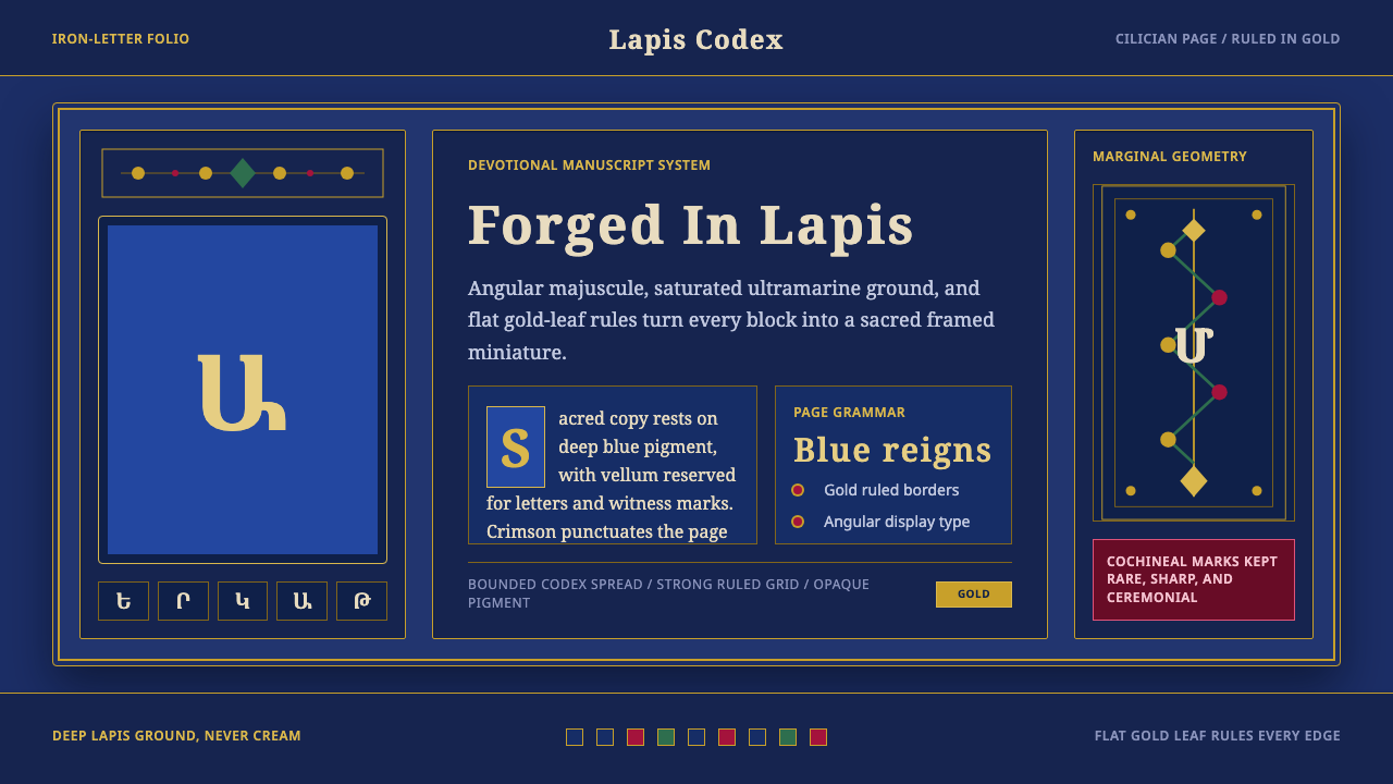 Armenian ErkatʿagirDevotional lapis reigns. Gold rules and angular serif glyphs frame a sacred g…
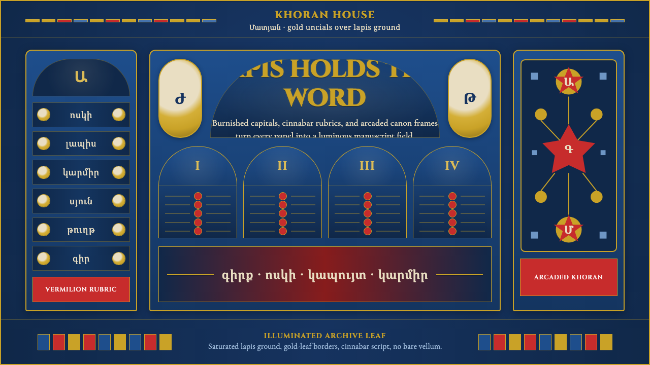 Armenian Manuscript FolkloreJewel-dense devotion. Lapis ground, gold uncials, and vermilion arcades fill…
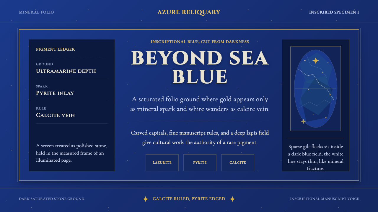 Badakhshan Lapis LazuliStone as manuscript. Ultramarine field, pyrite flecks, calcite veins, carved…
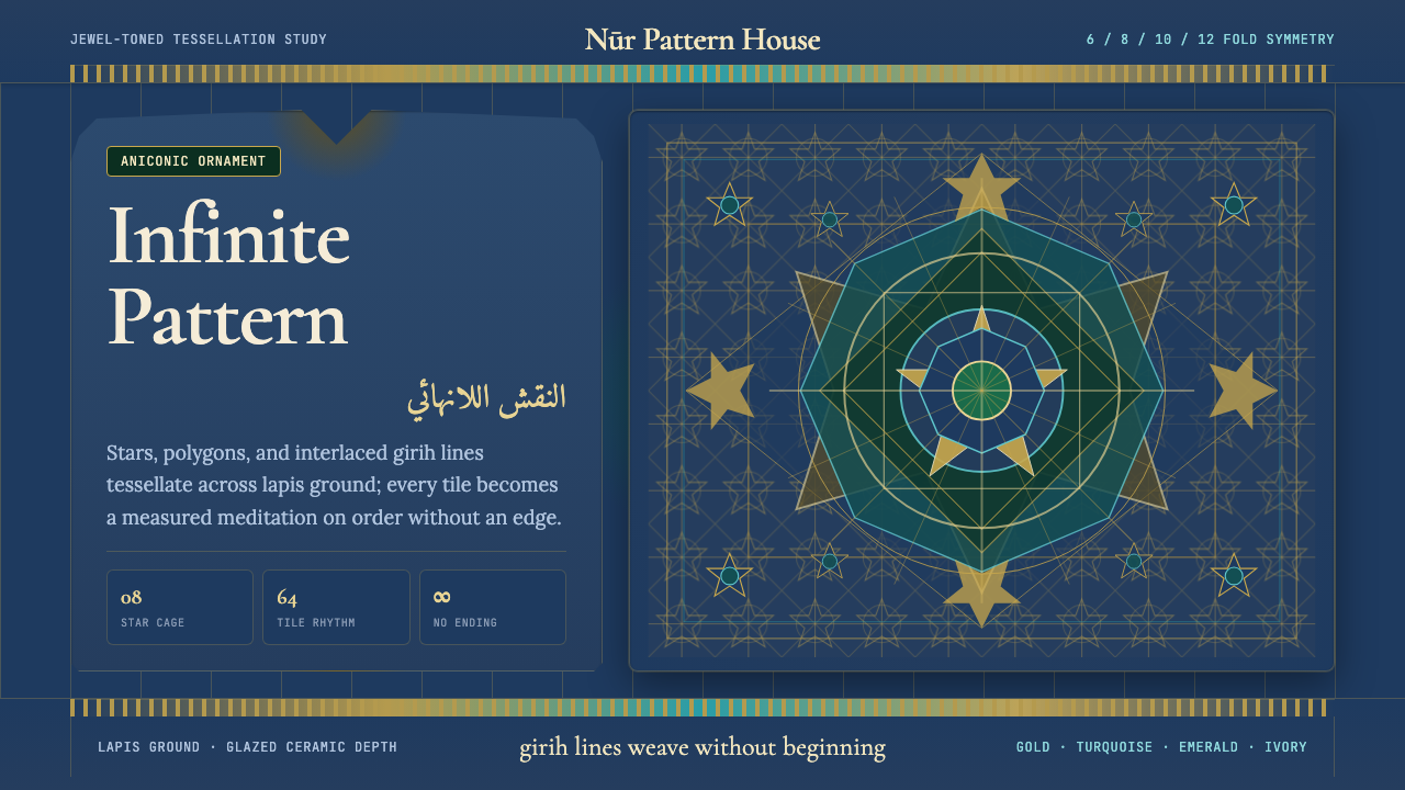 Islamic Geometric ArtInfinite order, fully tiled. Lapis ground with gold girih lines and turquoise…