What is Mamluk Quran Illumination?
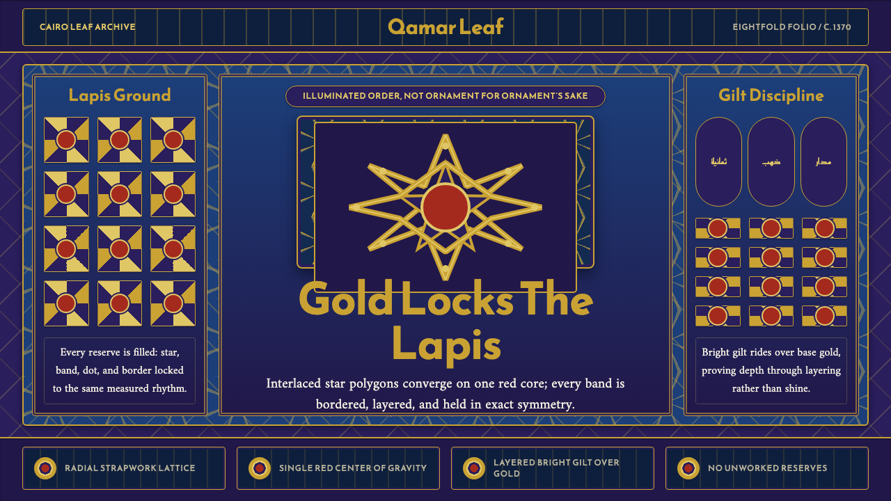
Mamluk Quran illumination turns the page into a jewel-like carpet: lapis ground, disciplined strapwork, layered gold, and a single red center holding every line in orbit.
Mamluk Quran Illumination in brief
Mamluk Quran illumination is a manuscript language of geometric density associated here with a Cairo frontispiece from around 1370, the kind of page commissioned by amirs such as Arghun Shah. It is not an ornamental border placed around content. The page itself becomes a total field: eight-pointed stars and interlaced hexagons form a radial strapwork lattice, while every reserve between the bands is filled with gilded split-palmette scrollwork.
Its visual system is governed by three commitments. Lapis blue establishes the ground, gold performs the drawing, and one red central medallion fixes the page’s center of gravity. Geometry is exact and symmetrical, with no loose improvisation. Density is a sign of completion: open areas are not restful pauses but spaces that still require infill.
The sense of luxury comes from accumulation rather than gloss. A darker base gold supports brighter gilt above it, allowing the surface to read as layered, worked, and precious. In an interface, this logic produces a dark, concentrated environment where hierarchy comes from nested geometry, contrast between gold layers, and the controlled return of red rather than from spacious minimalism.

Where does Mamluk Quran Illumination come from?
The reference point is a Mamluk Quran frontispiece from Cairo around 1370, situated within the Mamluk Sultanate during the Bahri–Burji transition. The regional setting is Cairo, with Syrian ateliers also part of the material context. That combination matters to the style’s character: it is courtly, manuscript-based, and deliberately constructed rather than casually ornamental.
The page belongs to a culture of commissioned refinement. Amirs such as Arghun Shah could sponsor manuscripts whose visual authority was expressed through labor, precision, and costly surface treatment. The frontispiece therefore reads as a statement of order and patronage at once. Its grandeur is not produced by scattered decoration but by the complete coordination of ground, lattice, infill, and central emblem.
Its geometric structure is built from eight-pointed stars and interlaced hexagons locked into radial strapwork. The bands establish the architecture of the page, while gilded split-palmette scrollwork occupies the reserves between them. The relationship is essential: geometry supplies the governing framework, and vegetal infill prevents any reserve from becoming visually inert.
The resulting page is best understood as a carpet page of pure discipline. It does not seek an airy field, informal asymmetry, or naturalistic depth. Every element participates in a symmetrical convergence toward the red center, while the layered treatment of gold gives the surface its richness. The contemporary interface system inherits this method of organization rather than merely copying its colors.
What defines the Mamluk Quran Illumination look?
Lapis Ground
The ground is deep lapis blue, a dark field that makes every line feel deliberate and every gilt passage feel illuminated from within. It is not empty background; it is the continuous material under the whole system. Gold, red, and secondary dark tones gain authority because the blue holds them in one concentrated atmosphere.
Radial Geometry
Eight-pointed stars and interlaced hexagons create a radial structure that locks rather than drifts. The geometry should feel engineered, with every junction answering another junction across the page. Repetition is not monotony here; it is evidence that the system has been carried through without slack.
Gold Strapwork
Gold serves as the drawing instrument. Strapwork defines the principal paths, divides the reserves, and makes the page legible as an interlocked construction. Its brightness must remain controlled: the lines are precious because they organize the field, not because they behave like decorative glitter.
Infilled Reserves
The spaces between bands are filled with gilded split-palmette scrollwork. This turns density into a structural principle. Reserves are not allowed to read as accidental gaps; they are active compartments whose vegetal movement enriches the hard geometry without weakening its discipline.
Layered Gilt
Luxury is expressed through two registers of gold: a quieter base gold and a brighter gilt laid over it. The distinction should be felt as depth and craft rather than as a metallic special effect. Variation within the gold family creates hierarchy while keeping the palette tightly controlled.
Red Core
A single red central medallion marks the center of gravity. Red is not distributed as a general accent across the page; its scarcity gives it authority. Used at the point where the geometry converges, it acts as a visual seal, preventing the dense lattice from becoming directionless.
Symmetrical Completion
The composition depends on exact symmetry and a sense that the surface has been completed from edge to center. Loose spacing, casual offsets, and unfilled zones contradict the system. Even when adapted for modern interfaces, the design should feel closed, balanced, and fully resolved.

Who shaped Mamluk Quran Illumination?
Arghun Shah represents the kind of Mamluk amir who could commission a Quran frontispiece of this character. His significance within the system is patronal rather than pictorial: the page’s density, precision, and layered gilt belong to a culture in which manuscript refinement could carry authority and prestige.
The Mamluk court illuminators are the makers implied by this visual language. Their work is legible through coordination: geometric strapwork, vegetal infill, controlled color, and layered gold must operate as one continuous surface. The result is less a collection of motifs than a disciplined field in which every part reinforces the others.
The Cairo manuscript ateliers provide the principal production setting for the reference style, with Syrian ateliers included in its regional context. Their importance lies in the relationship between place and method: the page is courtly, densely worked, and materially focused, yet its logic is portable because the geometry and layering are clearly organized.
How do you use Mamluk Quran Illumination today?
For presentation slides, use the lapis ground as the visual field and let the cover establish one commanding central composition: a red medallion or red focal block surrounded by disciplined gold geometry. Content slides should feel like successive compartments in a carpet page, with gold lines organizing text and diagrams rather than serving as decoration. Data slides can translate charts into radial or interlocking structures, but the red accent should remain concentrated at the key conclusion or selected value.
For web interfaces, the system suits dashboards, pricing pages, and other products that need a strong sense of authority and hierarchy. Use lapis as the environmental ground, gold for navigation, borders, and structural divisions, and red for the decisive action, selected tier, or central status. Cards should feel nested rather than floating in empty space. Dense composition is appropriate, but hierarchy must still be clear through gold layering, restrained contrast, and consistent geometry.
For editorial work, treat the page as a complete field instead of placing ornament around a conventional article. A title can occupy a central medallion-like zone, while sections sit inside framed reserves connected by gold strapwork. Pull quotes, metadata, and illustrations should participate in the lattice. Marketing pages can use the style’s courtly intensity for launches, cultural products, luxury services, or products that want to communicate craft and deliberate order.
A common mistake is to copy the palette while abandoning the system. A dark blue background with scattered gold lines and several red accents may look luxurious, but it is not this language if the geometry is loose, the reserves are empty, or the center has no clear gravity. Another mistake is to simulate luxury with excessive shine. The stronger approach is controlled layering: quieter gold beneath brighter gilt, one red core, and enough structural repetition for the page to feel fully resolved.

Mamluk Quran Illumination — FAQ
Is this simply a generic Islamic geometric style?
No. Geometry is essential, but the specific character comes from the combination of Mamluk Quran illumination, lapis ground, radial strapwork, gilded split-palmette infill, layered gold, and one red central medallion. Removing the density, the central convergence, or the distinction between base gold and bright gilt would produce a different system.
Can the style work without a dark lapis ground?
The lapis ground is one of its defining conditions, so replacing it changes the atmosphere immediately. A lighter adaptation is possible, but it should preserve the deeper logic: gold must remain the drawing layer, the geometry must stay exact and symmetrical, and red must remain scarce enough to hold the center. Without those relationships, the result becomes a different decorative language.
How should gold be used without making the interface look glossy?
Use gold as structure, not as surface effect. Let a quieter base gold establish the main lattice, then reserve brighter gilt for selected edges, crossings, or important details. The contrast between layers should suggest craft and depth rather than simulated shine. Gold is strongest when it makes the page more organized.
Can the composition be made asymmetrical for a modern interface?
It can be adapted, but asymmetry should not be introduced casually. The reference system depends on exact symmetry, radial convergence, and a completed surface. If a modern layout requires asymmetry, preserve a clear center of gravity and use repeated geometry to keep the page feeling locked together. Casual offsets would weaken the defining discipline.
Does this style suit every kind of product?
No. It is strongest where craft, authority, ritual, rarity, or deliberate order are useful values: dashboards, pricing systems, cultural products, luxury services, and editorial experiences. Its density can become oppressive when a product needs casual openness or effortless lightness. The key question is whether the product can support a visual world in which completion is expressed through structure rather than spare space.
Related design styles
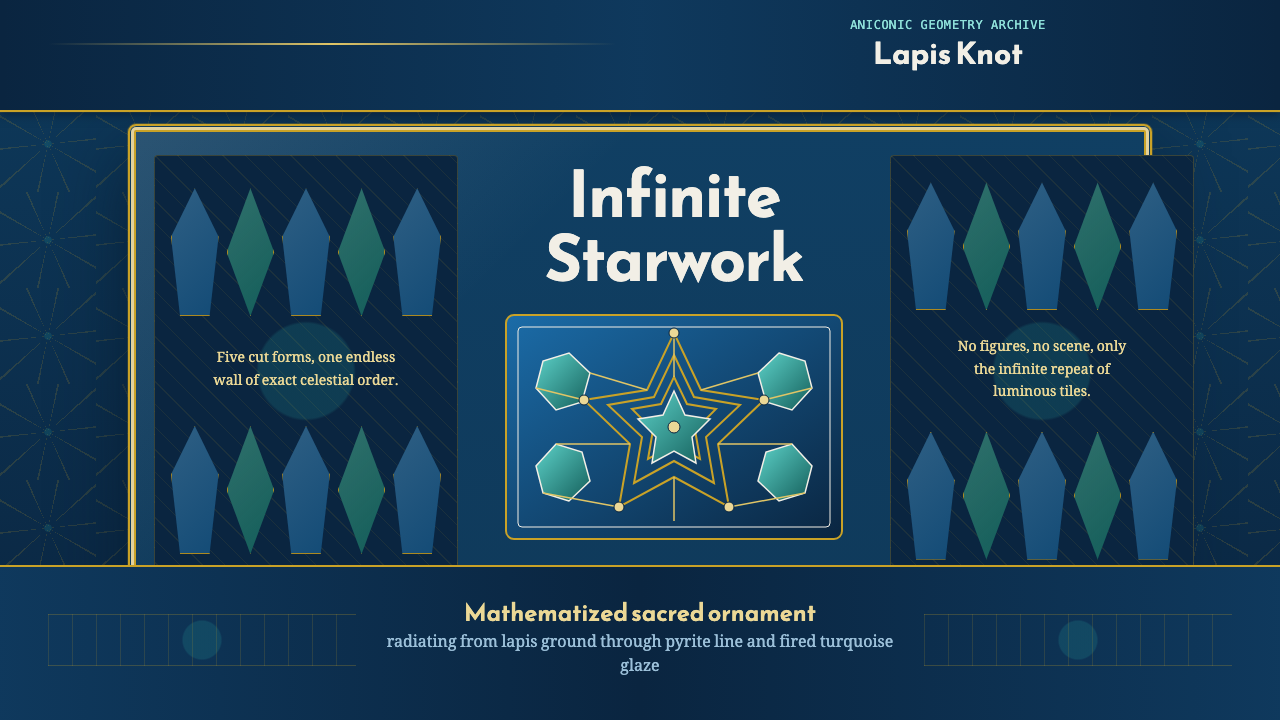 Islamic Girih TilesSacred geometry glows. Cobalt tile, turquoise stars, and gold strapwork repea…
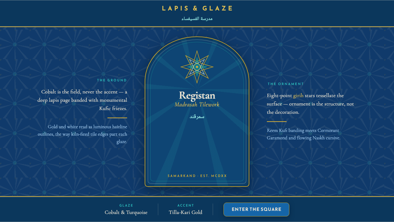 Registan Madrasah TileworkCobalt is the ground, not the accent. Gold girih stars tessellate deep lapis…
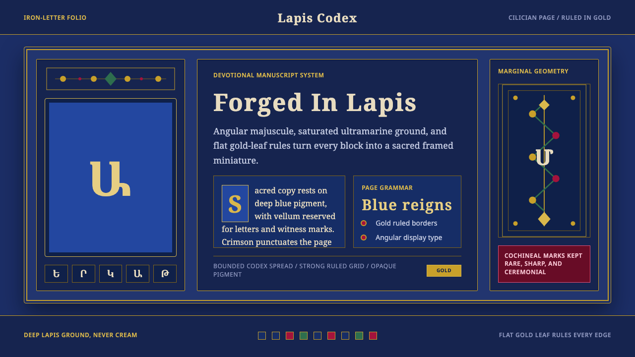 Armenian ErkatʿagirDevotional lapis reigns. Gold rules and angular serif glyphs frame a sacred g…
 Armenian Manuscript FolkloreJewel-dense devotion. Lapis ground, gold uncials, and vermilion arcades fill…
 Badakhshan Lapis LazuliStone as manuscript. Ultramarine field, pyrite flecks, calcite veins, carved…
 Herat Friday Mosque TileHistory is built to be repaired. Cobalt fields lock turquoise stars into tile…