What is Bukhara Kalon Minaret Brickwork?
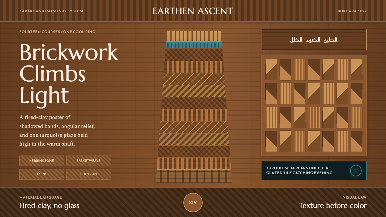
The Kalon Minaret of Bukhara turns plain fired brick into fourteen bands of shadow and pattern, climbing toward a single ring of turquoise glaze.
Bukhara Kalon Minaret Brickwork in brief
The Kalon Minaret is a tapering brick tower in Bukhara, in present-day Uzbekistan, whose shaft is built entirely from fired clay brick arranged into fourteen distinct ornamental bands stacked one above another. Herringbone, basketweave, lozenge, and chevron patterns each occupy their own horizontal register, so that from a distance the tower reads less like a single continuous surface and more like a stack of woven textile bands turned to stone. At sunset, the low, raking light catches the relief of each pattern and the whole shaft glows a deep, warm gold.
This design system distills that structure into an interface language built almost entirely from texture and shadow rather than color. The dominant palette is dark and earthen — warm brick tones deep enough to feel like dusk on fired clay — organized into stacked horizontal bands the way the minaret's masonry courses are organized. Relief is everything here: pattern is felt through light and shadow raking across a surface, not painted onto it.
Against that overwhelmingly warm, textural ground, a single cool accent appears: a ring of turquoise glazed tile, historically used sparingly on Central Asian brick towers to mark a specific register on an otherwise unglazed shaft. In this theme, that ring functions the way a single spot color functions in a otherwise monochrome system — rare, deliberate, and disproportionately powerful because everything around it withholds color entirely.
Where does Bukhara Kalon Minaret Brickwork come from?
The minaret was raised in 1127, commissioned by the Karakhanid ruler Arslan Khan, and belongs to the broader tradition of Karakhanid brick architecture that flourished across Central Asia in this period. The Karakhanids, a Turkic dynasty that controlled Transoxiana in the eleventh and twelfth centuries, sponsored major building programs in cities along the trade routes of the region, and Bukhara — one of the great cities of that network — received some of the era's most ambitious monumental architecture as a result.
What distinguishes the Kalon Minaret within that tradition is its commitment to ornamental masonry banding: rather than treating brick purely as a structural material to be finished with applied decoration, the builders used the brick itself, laid in different bond patterns, as the entire decorative program. Fourteen bands running around the tower's circumference each employ a different arrangement — herringbone courses, basketweave units, lozenge and chevron formations — so that ornament and structure are, in this building, the same act. This approach represents one of the most developed expressions of a broader early Central Asian tradition of patterned brickwork, in which craftsmen achieved visual richness through geometry and light rather than through paint, stucco, or applied tile.
Glazed tilework appears on the tower only sparingly, in keeping with the early Central Asian glazed-tile tradition of this period, which had not yet developed into the fuller, more saturated tile programs seen on later regional monuments. A band of turquoise glaze near the top of the shaft stands out precisely because it is exceptional against so much unglazed brick — an early, restrained use of color against a material and technique otherwise defined by texture and relief rather than pigment.
As a pre-modern monument — predating 1900 by many centuries — the minaret has survived as one of the most complete records of this brick-banding tradition, and its combination of structural height, patterned masonry, and singular color accent has made it a reference point for understanding how Central Asian builders of this era achieved visual complexity from a single, humble material: fired clay brick, laid with enough variation to read, at a distance, as pattern rather than wall.
What defines the Bukhara Kalon Minaret Brickwork look?
Warm Brick Ground
The dominant surface is a deep, warm, earthen tone evoking fired clay brick at dusk — never bright terracotta, always closer to a dark, glowing ochre. Almost everything in the system sits within this warm register, which functions as the neutral base the way white or grey functions in most other systems.
Stacked Horizontal Bands
Composition is organized into distinct horizontal registers stacked one above another, echoing the minaret's fourteen courses of differing brick pattern. Rather than one continuous surface, the layout reads as a sequence of bands, each with its own internal rhythm, inviting a vertical, climbing sense of progression from one section to the next.
Raking-Light Relief
Pattern is conveyed through the illusion of low, angled light catching a textured surface — shadow and highlight doing the work that color would do in a flatter system. Surfaces feel carved or laid rather than printed, with texture reading as physically present rather than applied as a flat overlay.
Geometric Weave Patterns
Herringbone, basketweave, lozenge, and chevron arrangements — all patterns achievable through the angle and offset of identical repeated units rather than through drawn ornament — provide the visual vocabulary. Each pattern is built from a single repeated module, never from freehand decorative line work.
Single Turquoise Ring
One band of cool turquoise glaze breaks the otherwise entirely warm, unglazed palette — the system's sole departure from earth tones. Its placement is exceptional rather than routine, appearing once, at a specific register, rather than repeated throughout the composition.
Tapering Verticality
The overall form narrows gradually from base to top, giving compositions built on this theme a sense of upward, tapering momentum rather than a static rectangular block. Elements can be scaled or narrowed subtly as they ascend a layout to echo this structural taper.
Monumental Scale
Despite being built from a single humble material, the tower reads as monumental through sheer height and repetition rather than through applied grandeur. This theme favors large, confident scale for hero elements over small, densely detailed ornament — bigness achieved through repetition of a simple unit, not through elaboration.
Who shaped Bukhara Kalon Minaret Brickwork?
Arslan Khan, the Karakhanid ruler who commissioned the minaret in 1127, sponsored one of the most ambitious brick monuments of his dynasty's building program, cementing Bukhara's status within the network of major Central Asian cities along the era's trade routes.
As the broader architectural tradition the minaret belongs to, Karakhanid brick architecture flourished across Transoxiana in the eleventh and twelfth centuries, producing major monumental buildings that relied on fired brick as both structural material and primary decorative medium.
This technique and tradition — organizing decorative brick patterns into distinct horizontal bands rather than a single continuous surface treatment — is the specific craft practice that produced the minaret's fourteen registers of herringbone, basketweave, lozenge, and chevron pattern.
This early tradition of glazed tile, used sparingly and precisely rather than across an entire surface, accounts for the minaret's single turquoise band — a restrained precursor to the more elaborate, fully saturated tile programs that later Central Asian monuments would develop.
How do you use Bukhara Kalon Minaret Brickwork today?
For presentation slides, this theme works well where a deck wants to feel monumental and grounded rather than light and airy. A cover slide can use the deep warm-brick ground with a single title band picked out in the turquoise accent, treated the way the minaret's one glazed ring stands out against unglazed brick — used once, at one register, not repeated. Content slides can borrow the banding principle directly: instead of one undifferentiated body of text, organize content into stacked horizontal sections, each with a subtly different texture or shade of the warm ground, giving the slide the same climbing, registered structure as the tower itself. Data slides suit raking-light relief particularly well — bars or columns rendered with a soft directional shadow read as carved rather than flat, reinforcing the material, physical quality the whole system depends on.
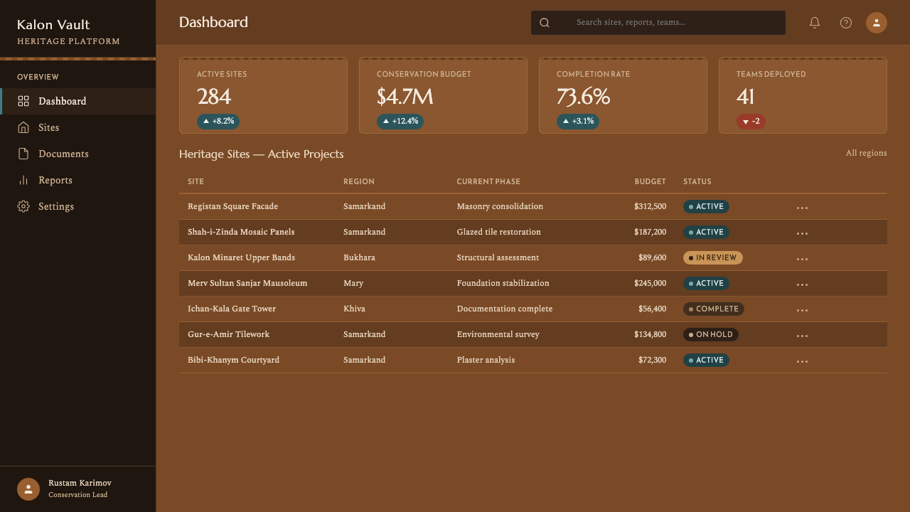
In web interfaces, the theme is well suited to dashboards, editorial platforms, and any product wanting to feel substantial, historic, or crafted rather than light and startup-bright. A dashboard can use the warm brick ground as its dominant surface, organize panels into horizontal bands rather than a uniform grid of identical cards, and reserve the turquoise accent exclusively for a single primary state — an active filter, a key metric, a primary action — echoing the minaret's singular color moment. Pricing pages benefit from the same restraint used elsewhere in this theme: differentiate a recommended tier through scale, position, or the turquoise accent rather than through added color across the whole page.
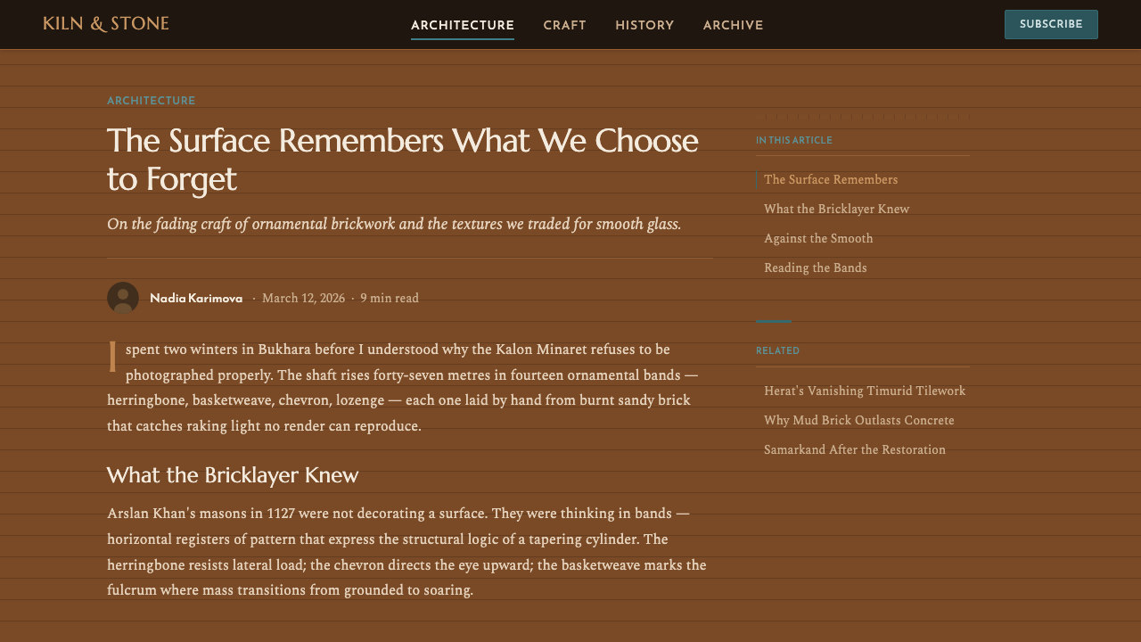
For editorial and marketing layouts, the stacked-band structure translates naturally into long-form article design: alternating section backgrounds in slightly different shades of the warm ground can mark chapter breaks the way the minaret's bands mark different patterns, while a single turquoise rule or pull-quote treatment can function as the one moment of accent color in an otherwise entirely warm-toned piece. Marketing pages suited to this theme tend to be for heritage brands, craft goods, architecture and travel content, or any product wanting gravity and permanence rather than lightness.
The theme also lends itself well to loading states, empty states, and textural background treatments generally, since raking-light relief and geometric weave patterns can function as subtle, non-representational background texture without competing with foreground content — much as the minaret's masonry patterns are legible from a distance without demanding close reading.
A common mistake is treating the turquoise accent as a general secondary color to be used freely for links, icons, and buttons throughout an interface. In the source structure, that color appears exactly once, at one register, against an overwhelming field of warm, uncolored brick — its power depends entirely on that scarcity. A second mistake is flattening the bands into a single uniform texture applied everywhere; the theme's structural logic depends on distinct registers with their own internal pattern, not one repeating texture stretched across the whole composition.
Bukhara Kalon Minaret Brickwork — FAQ
Does this theme require literal brick or masonry imagery to work?
No. The theme abstracts a structural logic — a warm textural ground, stacked horizontal bands, raking-light relief, and a single cool accent — rather than a literal brick photograph or texture map. It can be applied through color, layout banding, and subtle shadow treatment alone, without any depiction of actual masonry, much as the palette and structure can be felt without a photo of the minaret itself.
How many horizontal bands should a layout based on this theme use?
There is no fixed count to match — the minaret's fourteen bands are a structural inspiration, not a rule to replicate exactly. What matters is that a layout reads as organized into distinct registers rather than one undifferentiated field, whether that means three sections on a landing page or a dozen rows in a dashboard. The principle is stacking with variation, not a specific number.
Can the turquoise accent be used more than once in a single layout?
It can appear more than once across a large product — for instance, once per major dashboard screen — but within any single composition it should stay rare, ideally appearing at just one register or moment. Repeating it densely within one view collapses the contrast that gives it meaning, turning a deliberate accent into an ordinary secondary color.
Is this theme too dark or heavy for consumer-facing, playful products?
It generally is. The system's monumental scale, warm-dark ground, and restrained single accent are built for gravity, permanence, and craft — qualities that suit heritage brands, cultural and architectural content, and serious editorial or dashboard products, but that can feel unnecessarily heavy for lighthearted consumer apps built around speed, novelty, or casual daily use.
What role does shadow play in this theme compared to a flat, modern design system?
Shadow here is not a decorative effect layered on top of flat color — it is the primary means by which pattern and texture are conveyed at all, standing in for the color and gradient work that flatter systems would use instead. A raking, directional shadow across a textured surface is doing the job that a printed pattern or applied color might do elsewhere, which is why this theme reads as carved and physical rather than illustrated or flat.
Related design styles
 Algerian M'zab TileworkTurquoise burns in earth. Kufi type and zellige grids lock cyan into ochre gr…
 Turkmen Bukhara RugHeraldic and earthbound. Madder red, ivory hairlines, and octagonal güls lock…
 Azerbaijani Quba CarpetRed is the field. Indigo botehs and ivory latch-hooks orbit a stepped medalli…
 Bhutanese Yathra Wool WeaveHighland wool made digital. Brown-maroon bands carry cyan diamonds and spare…
 Islamic Girih TilesSacred geometry glows. Cobalt tile, turquoise stars, and gold strapwork repea…
 Mamluk Quran IlluminationGilded density rules. Lapis ground, eightfold gold strapwork, and one red cor…