What is Mandaean Ginza Rba?
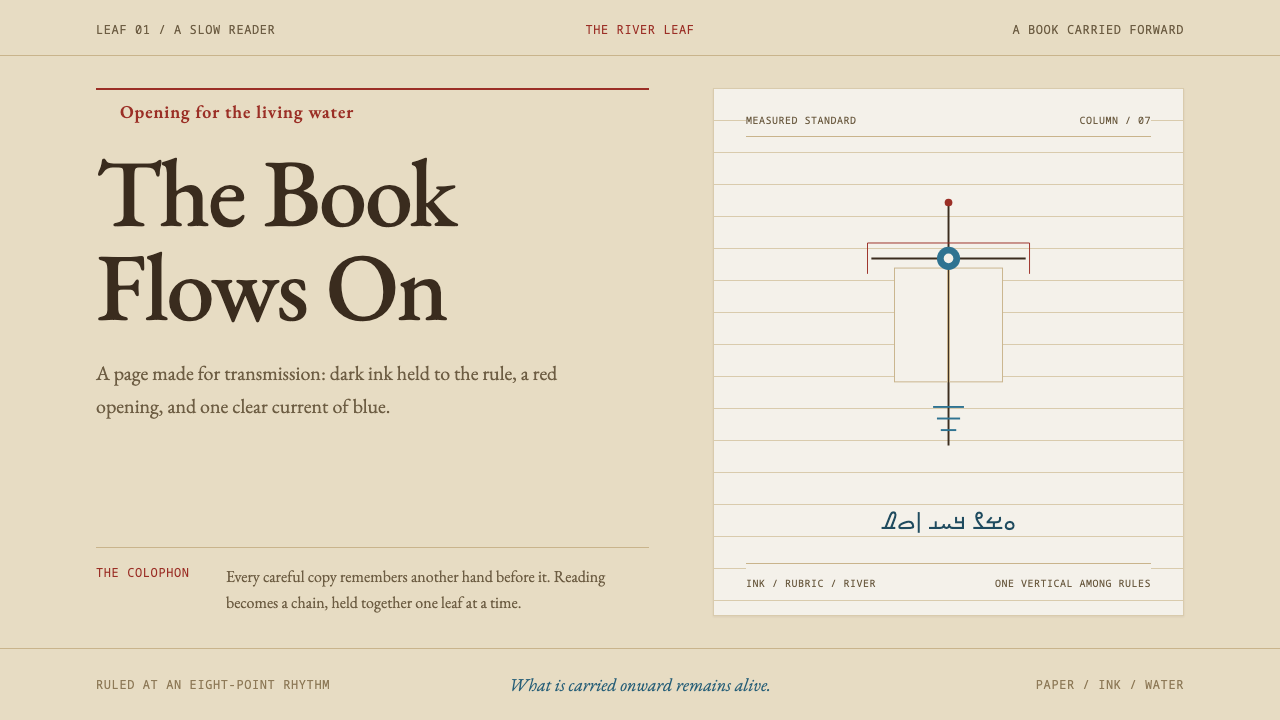
A buff leaf of hand-copied rag paper, ruled columns, red rubrication and a single vertical standard hung with white silk: the Ginza Rba as a page that holds a lineage.
Mandaean Ginza Rba in brief
Mandaean Ginza Rba is a design language drawn from a single manuscript tradition: the hand-copied great book of the Mandaeans, the Ginza Rba. Its unit is not the screen or the poster but the page, a buff leaf of rag paper carrying brown-black ink in ruled columns, with red rubrication opening each section and Mandaic running right to left in its own rounded alphabet.
The material choices are ritual ones. Scribes copy onto rag paper, never parchment, because they avoid animal-derived materials for ritual purity. The page is therefore made from cloth and plant fibre and written in ink, and the visual language inherits that sobriety. It is made to be written and read, and the style adds nothing that the scribe's own toolkit of paper, ruling, ink and red does not already supply.
As a design system it comes down to a handful of moves: a buff paper ground; a single justified column on visible ruling; sections marked by colour rather than by a jump in size; and one vertical accent, the drabsha, the cross-armed standard hung with white silk. Blue enters as the yardna, the flowing water of baptism. The result is quiet, readable and strongly rhythmic, a style in which a long text feels like one continuous act rather than a stack of components.
Where does Mandaean Ginza Rba come from?
The Ginza Rba is the great book of the Mandaeans, whose homeland in the source is southern Iraq and Khuzestan in Iran, a country of marshes and rivers. The name is usually rendered as the Great Treasure. The source dates the manuscripts it draws on to before 1900, and what it takes from them is not a decorative repertoire but a way of making a page: how the ink is laid, how the lines are ruled, where the red comes in, and how a copy ends.
Two manuscripts anchor the style. Codex Marshall 691 was copied in 1529 at Huwayza. Huntington MS 6, held in the Bodleian Library in Oxford, was copied in 1615 at Basra by the scribe Adam Paraš son of Zihrun. It runs to more than five hundred leaves and carries its history openly, water stains and insect damage included. The brown-black ink falls neatly on the ruled lines, and every new section opens in red. Nothing about the page is hidden or tidied away.
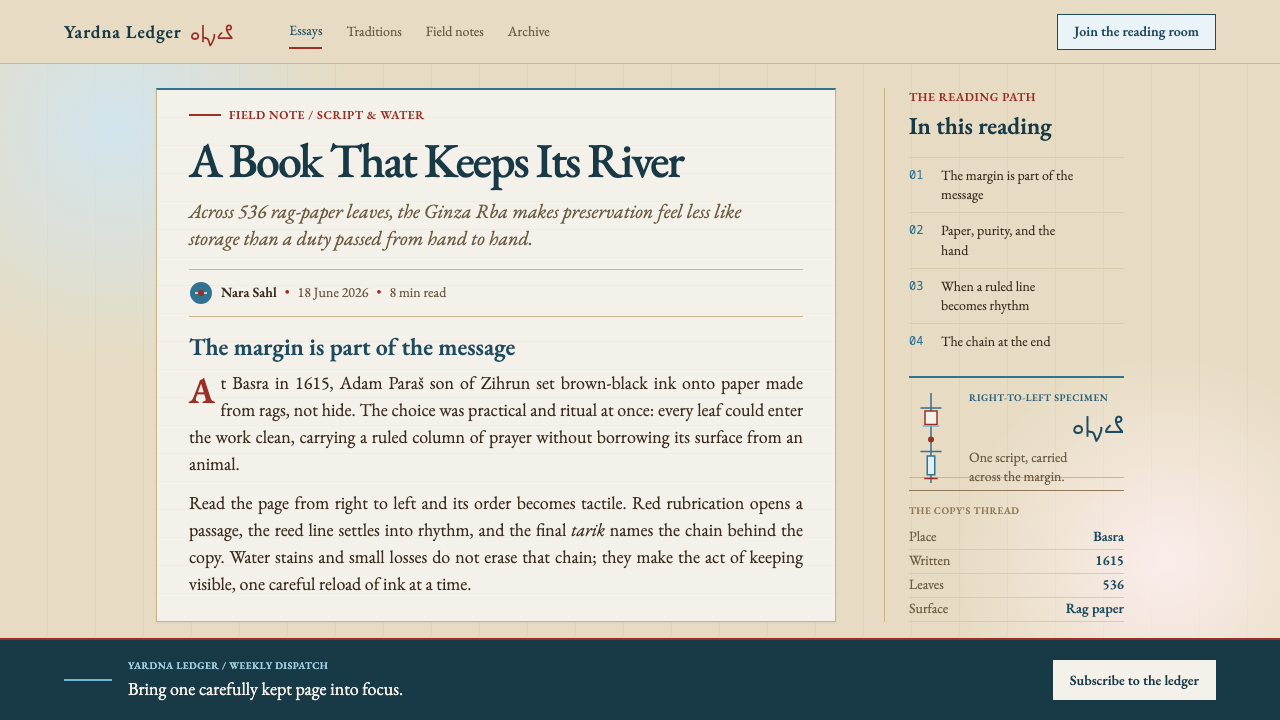
Every Mandaean manuscript closes with a tarik, a colophon of lineage in which one name follows another and ties this copy back to copies made hundreds of years before. The tarik shows what a manuscript is for: not only to preserve a text but to continue a chain of copying. A design that takes the page as its unit inherits that idea. Each page belongs to a series, and each series carries a signature at the end that connects the present copyist to those before.
Two images from the living ritual world around the book supply the rest of the vocabulary. The yardna, the flowing water of baptism, gives the style its blue. The drabsha, a cross-armed standard hung with white silk, gives it the one vertical accent. Both come from the ritual rather than from the book's decoration, which is why they feel integral: page and ritual draw on the same small vocabulary of water, cloth, ink and red. The source places the tradition among marshes and rivers, where water is a landscape as well as a rite.
What defines the Mandaean Ginza Rba look?
Buff Paper
The ground is buff, a warm, slightly dull cream like handmade rag paper: never bright white, never parchment-yellow. The paper is the page, not a texture laid over a screen. It should feel flat and matte, with perhaps a faint unevenness in tone, and no vignette, curling or fake torn edge. Everything else sits on it as ink would, and the restraint lets the ink and the red carry the contrast.
Ink and Rubrication
Text is brown-black ink, a warm dark that is softer than pure black. Red opens each section, the old scribal practice of rubrication. The key design rule follows: sections are marked by colour, not by a jump in size. Headings stay close to body size and announce themselves by their red opening rather than by scale. A single document therefore keeps an even, calm texture while still being easy to navigate.
Column and Ruling
The layout is a single justified column set on visible ruling. The lines are not a hidden grid but part of the picture: faint, regular, there to show where the writing sits. Text hangs on those lines the way a scribe's pen follows them. A long text is read down one column at a steady pace, with margins that stay quiet. There are no sidebars competing with the measure.
Rounded Script
Mandaic runs right to left in its own rounded alphabet, and the style is built around that rounded, continuous quality. For Latin or other scripts the rule is to keep an even, flowing rhythm and calm, open letterforms. Do not simulate Mandaic with decorative fonts or fake glyphs. The script belongs to a living community, and the style borrows its calm rhythm, not its letters. Where right-to-left content is real, layouts should support it properly.
The Drabsha
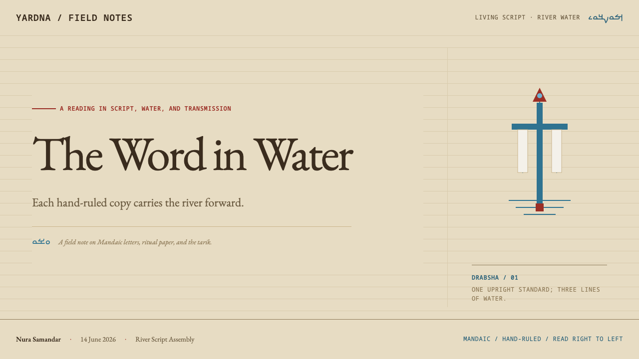
The drabsha, a cross-armed standard hung with white silk, supplies the one vertical accent in an otherwise horizontal system. In design terms it is a single upright element, a slim vertical rule or marker, used once on a page or screen, with white as its only decoration. Because the rest of the page lies in lines of text, one vertical is enough to give the whole composition an axis. Repeating it would turn a signature into a pattern.
Yardna Blue
Blue belongs to the yardna, the flowing water of baptism. It is used as flow, not as fill: a thin line, a link, a progress or movement cue, never a large panel of colour. Blue and red do different jobs. Red marks structure and beginnings; blue marks movement and connection. Keeping them from competing is what lets the buff page stay calm.
Lineage Colophon
Every copy ends in a tarik, a chain of names. The style turns that into a quiet principle of closure: documents and sections should end deliberately, with a line that connects the reader back to what came before, such as a source, an author chain or a revision history. A page that simply stops feels unfinished; a page that ends in a lineage feels held.
Who shaped Mandaean Ginza Rba?
The scribe who copied Huntington MS 6 at Basra in 1615, a manuscript of more than five hundred leaves now in the Bodleian Library. He is the one named person in the source's set of key figures, and his hand is the model for the style: even, unhurried, and faithful to ruling. His manuscript keeps its water stains and insect damage, a reminder that this is a style of use, not of display.
A Ginza Rba manuscript copied in 1615 at Basra and now held in the Bodleian Library in Oxford. It is the most fully described source object: brown-black ink in tidy ruled columns, red openings for each section, damage left visible, and a closing tarik that links it to earlier copies. When the style asks how a page should look and behave, this manuscript is the answer in physical form.
A second Ginza Rba manuscript, copied in 1529 at Huwayza. Together with Huntington MS 6 it gives the style its evidence base: two copies made nearly a century apart, in different places, yet sharing the same page logic. Its presence shows that the style rests on a continuing practice rather than on one exceptional object.
The unnamed copyists whose names appear one after another in a manuscript's closing colophon. They are not individuals the source names, but they are the figure the style honours most: the lineage as a series of hands. For designers, they stand for the idea that careful repetition, copy after copy, is a form of authorship and that a document is strongest when it admits the chain it belongs to.
How do you use Mandaean Ginza Rba today?
As a slide cover, treat the slide as a leaf. Set a buff ground, place a short title in calm, rounded type at the head of a single ruled column, open it with a red mark, and set the drabsha as one slim vertical element at the edge. Add nothing else. A cover that looks like the first page of a hand-copied book, with one red opening, is more memorable than one that fills the frame.
Content slides work best as one column of text on faint ruling, with each section opened in red rather than made bigger. For data, use ruled tables where the rows themselves are the visual: thin rules, brown-black figures, one red opening per group. Keep charts few and simple, drawn in ink tones, and use blue for the flowing element such as a trend line. Close the deck with a short line of sources, in the manner of a colophon.
In web interfaces the style suits long-form reading products: documentation, reading apps, translation and annotation tools, archives, and knowledge bases. Give the page a single justified column with visible ruling, mark section headings in red and keep their size close to the body text. Use the vertical accent for the active navigation item, once, and blue for links and flow. Tables on pricing and settings pages should be ruled rather than boxed, so the page stays one continuous leaf.
Editorial work is the natural home of this style. Essays, translations, annual reports, scholarly editions and long interviews all benefit from a calm column, red openings and a colophon-like ending that credits sources and previous versions. For marketing pages, keep the paper ground and let the headline be an ordinary line of text with a red beginning. Photographs, if used at all, should be modest and documentary, set flush with the column like a plate in a book.
The most common mistake is to treat a living religious tradition as wallpaper. That means filling the page with a pseudo-Mandaic font, scattering symbols as decoration, or adding parchment textures, burnt edges and sepia filters. Parchment is precisely the material the scribes avoid, so a parchment look contradicts the system. The second mistake is breaking the colour logic by making headings huge and keeping red for decoration; red marks beginnings, and size should not do its work.
Mandaean Ginza Rba — FAQ
Why rag paper and not parchment, and does it matter for design?
The scribes avoid animal-derived materials for ritual purity, so they copy onto rag paper. For design it matters in two ways. First, the ground should be a matte, flat buff with the quiet tone of handmade paper, not a glossy or burnt parchment effect. Second, it explains the style's sobriety: the page is made of cloth and plant fibre and written with ink, and nothing in the visual language reaches for ornament beyond what that process supplies.
What does colour mark in this style?
Colour marks structure and function. Red opens each section, as in the rubrication of the source manuscripts. Blue belongs to the yardna, the flowing water, and is used for links and movement. Brown-black carries the text, and white appears only in the single standard, the drabsha. Sections are distinguished by colour rather than by changes in size, which keeps the page even in texture.
Can I use the Mandaic script in my design?
Only if the content is genuinely Mandaic, and then with proper font and direction support. Using the script, or imitations of it, as decoration for unrelated content is the quickest way to cheapen the style. The better approach is to borrow its qualities: a rounded, continuous rhythm, even spacing and calm letterforms in whatever script your content actually uses.
What is the drabsha, and do I need to draw it?
The drabsha is a cross-armed standard hung with white silk, the source's single vertical accent. You do not need a literal illustration. In practice it can be a slim vertical element, used once on a page or screen, with white as its only decoration, such as a thin marker beside an active section. The point is to give a horizontal, text-led page one clear axis.
Does the style suit dashboards and product interfaces?
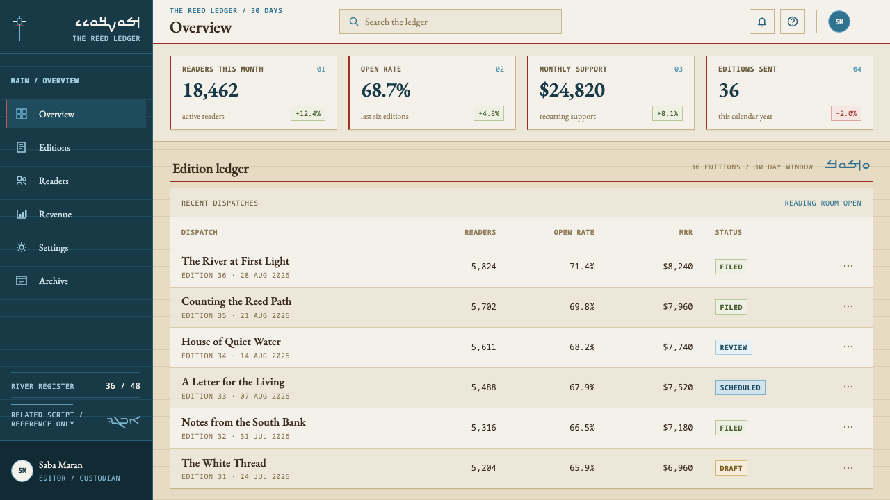
It suits reading-led and record-led interfaces better than dense, control-heavy dashboards. Documentation, archives, annotation tools, report viewers and settings pages with ruled tables work well. A dashboard full of widgets, alerts and dense colour coding fights its single-column, one-red logic. If you must use it there, keep one main column of content and let secondary information follow in ruled lists.
Related design styles
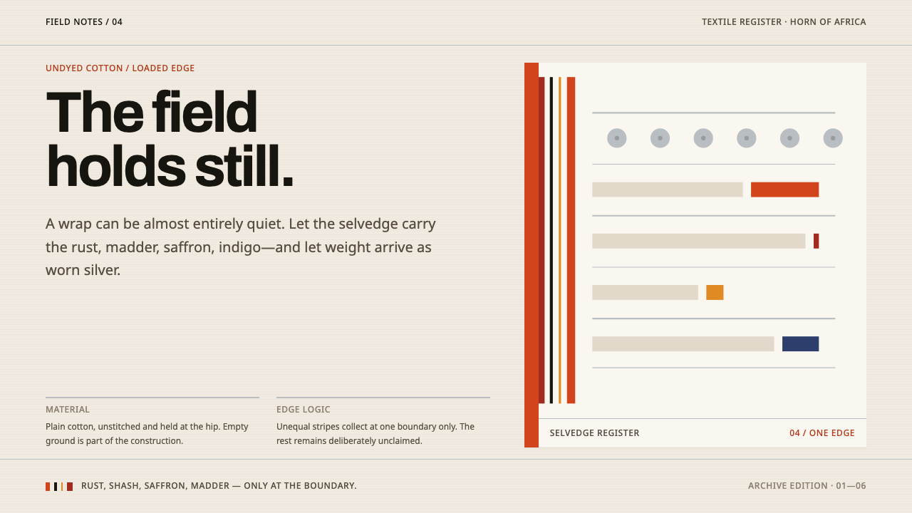 Afar Nomad TextileWeight lives at the edge. Rust and madder selvedges cut across a quiet cotton…
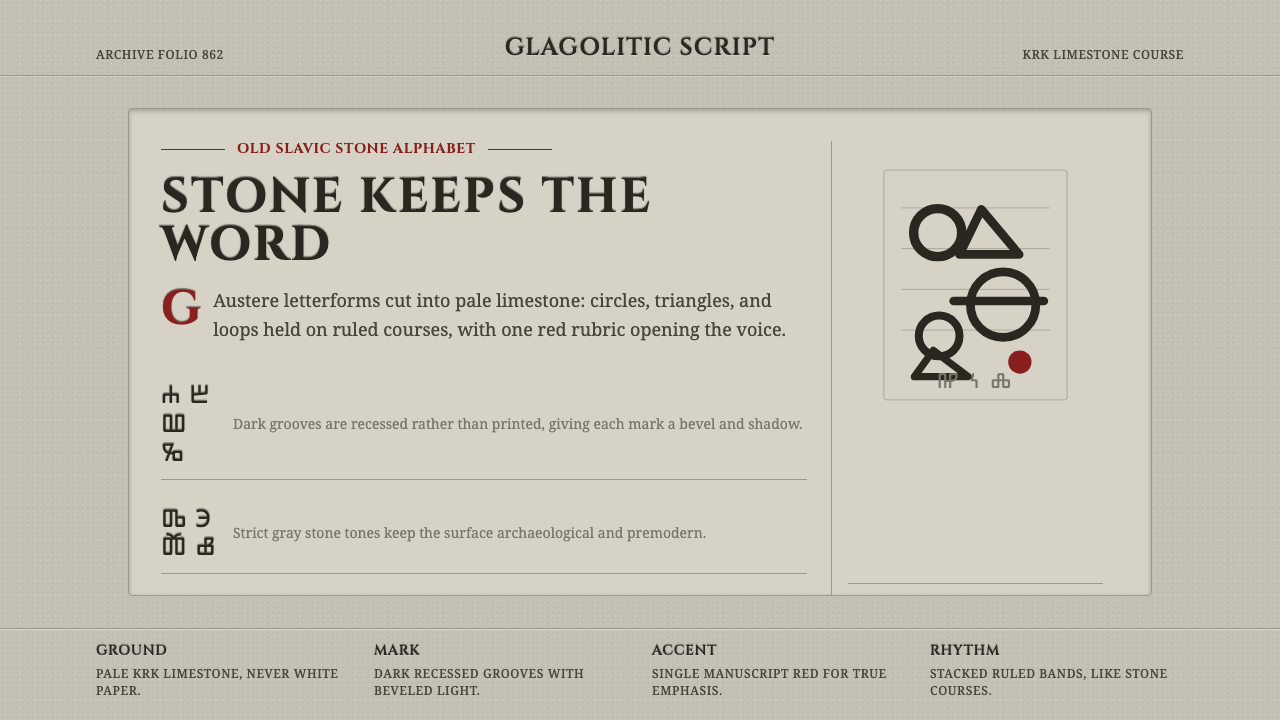 Glagolitic ScriptCarved faith in limestone. Cinzel capitals and red rubrics sit in shadowed gr…
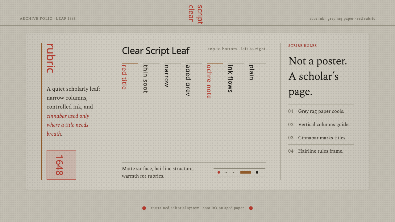 Kalmyk Todo Bichig Clear ScriptRestraint becomes script. Soot columns on grey rag paper, touched by cinnabar…
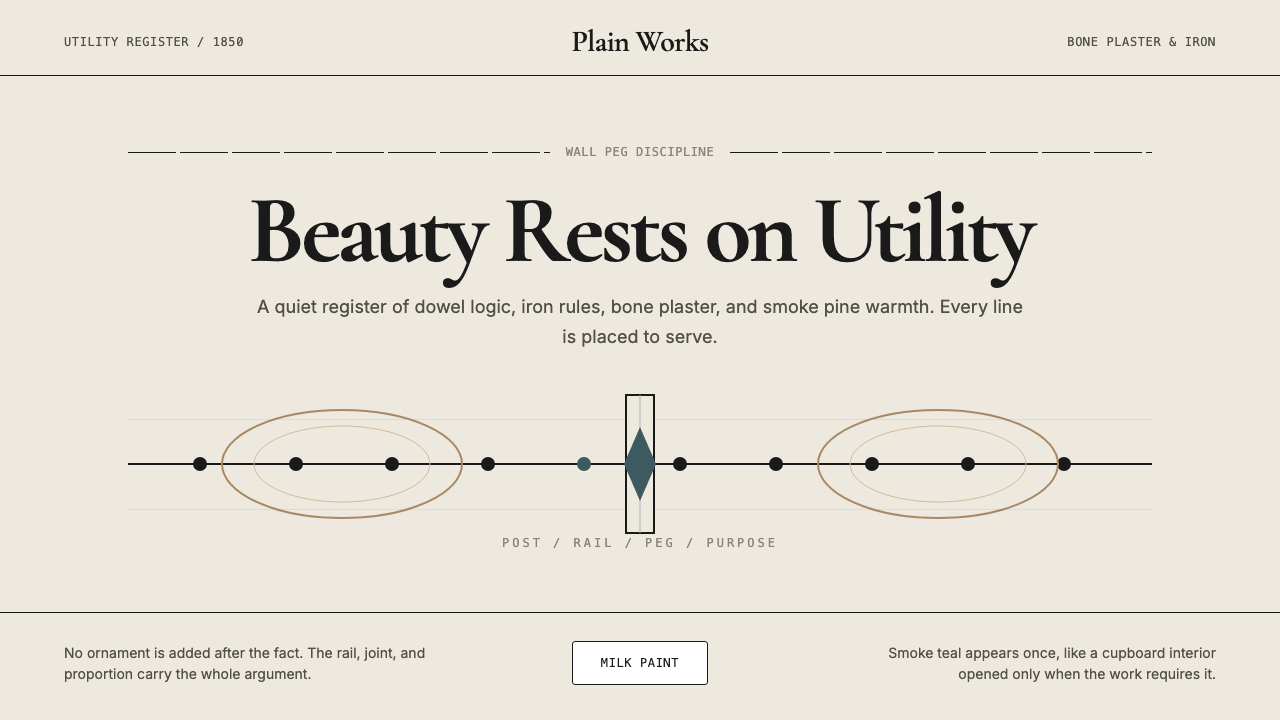 Shaker Furniture 1850Utility becomes beauty. Bone plaster, iron black, smoke pine, and one smoke-t…
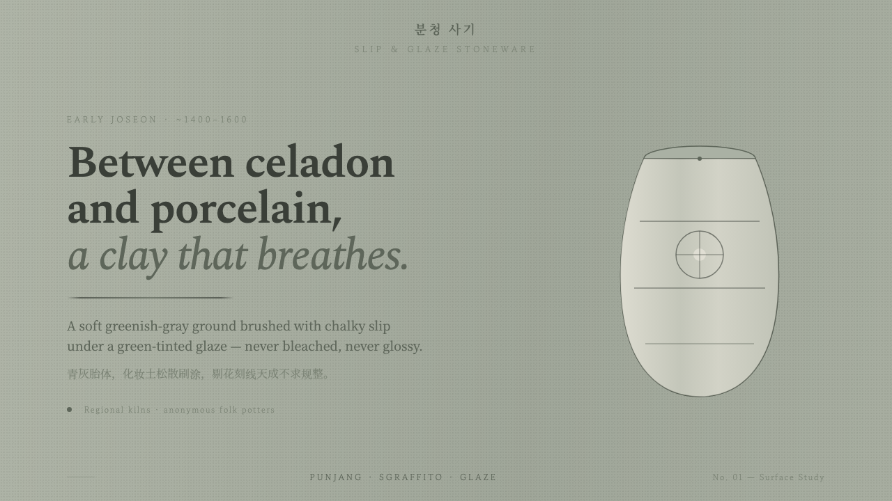 Buncheong Gray Slip WareBetween celadon and porcelain. Greenish-gray clay, chalky slip brushwork, dar…
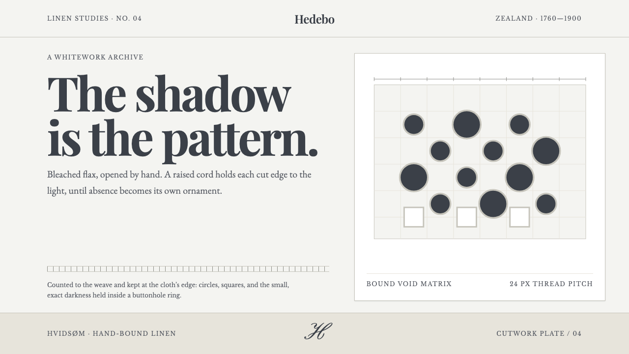 Danish Hedebo CutworkOrnament is cut, not applied. Bleached linen and bound shadow turn voids into…