What is Kindle?
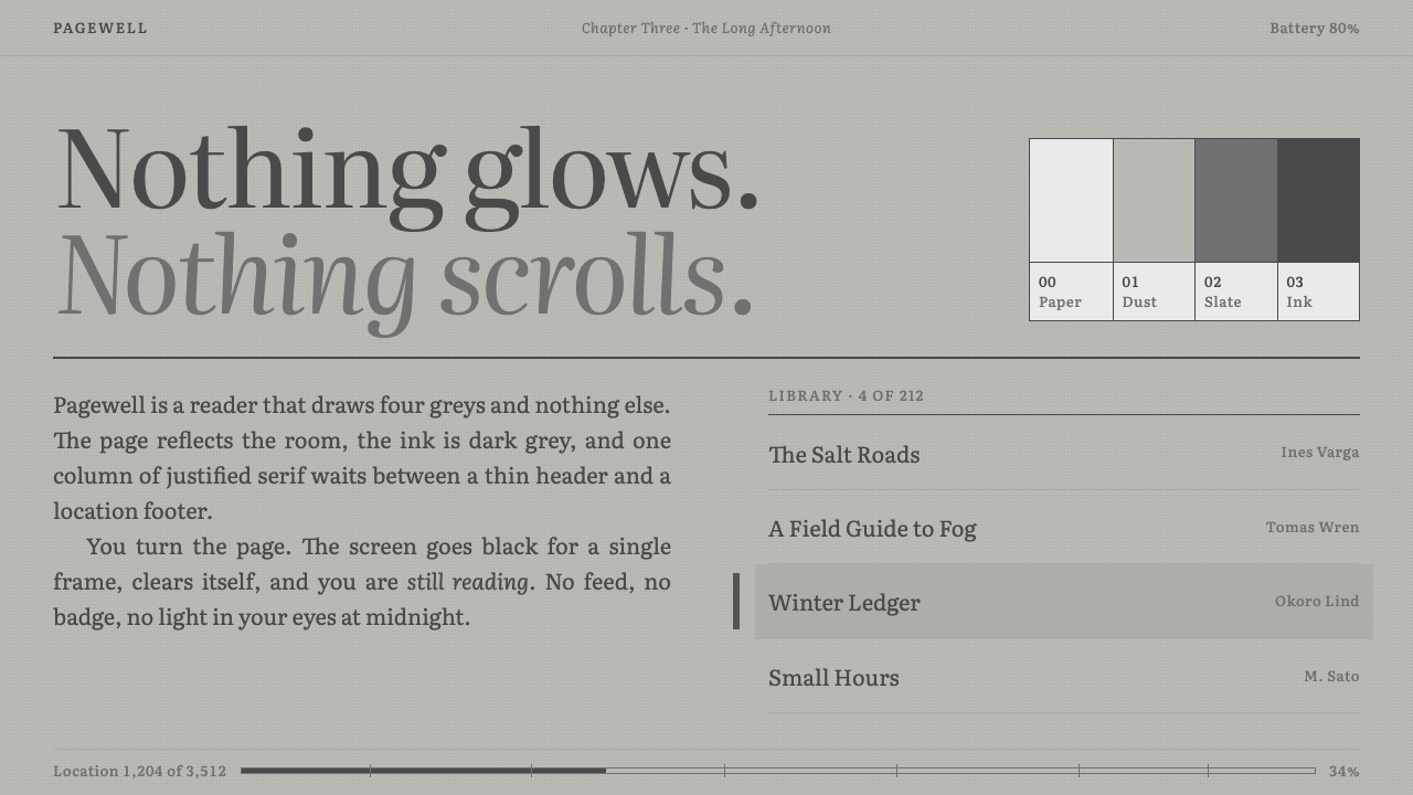
The Kindle look is the design of a screen that refuses to glow: green-grey paper, grey ink, one justified column and a black flash for every page turn.
Kindle in brief
The Kindle style is the visual language of dedicated e-reader screens, modeled on the first Kindle that shipped in November 2007 with an E Ink Vizplex panel. Its defining traits are a matte grey ground with a faint green cast, text in a dark grey rather than true black, a narrow tonal range of only a few grey levels, and a total absence of glow, shadow or transparency. It is a style defined by what it declines to do.
Layout follows the logic of a printed page. One column of justified serif text sits between a thin running header carrying the book title and a footer showing a location number and a progress bar with chapter ticks. Lists have square corners, a selected item is marked by a bar in the margin, and the only animation worth the name is the black flash that clears the screen when the page turns.
The result is quiet in a very particular way. It is not minimalism for its own sake, and it is not decorative retro. It is the design of a device built to disappear while a person reads for hours, and it teaches a lesson that applies far beyond e-readers: an interface can earn trust by being calm, predictable and slightly dull.

Where does Kindle come from?
The first Kindle was introduced by Amazon in November 2007. Its screen used an electrophoretic technology, a class of e-paper displays in which tiny charged particles are moved to form text, and it needed power only to change the page, not to hold it. The panel was a six-inch E Ink Vizplex, which drew just four levels of grey. The paper was a matte grey with a green tinge, and the ink was a dark grey. Those physical limits, not aesthetic preference, produced the original look.
Jeff Bezos, listed among the key figures, drove the idea of a book-reading device that would make buying and reading a book as effortless as possible, and Gregg Zehr led the hardware work in the Amazon lab that built it. Their brief was to make a device that vanished into the act of reading. This is the root of the 'calm technology' attitude associated with the style: a tool that asks for no attention, never notifies, never glows and never scrolls.
The reception shaped the style as well. Writer Nicholson Baker, also named among the key figures, wrote a famous essay that complained the screen looked grey, a little green and sickly. That criticism is useful because it describes exactly what the design is: unflattering, honest and deliberately unlike a bright tablet. The grey-green paper became part of the memory of the product, and later versions refined contrast without abandoning the principle that the page should look like paper, not a lamp.
Typography developed over the product's life. By 2015 the Paperwhite 3 introduced Bookerly, a serif designed for the device by the type foundry Dalton Maag, and in 2016 the Oasis brought Amazon Ember, a sans-serif, also by Dalton Maag. Together they show a hierarchy that persists in the style: a generous serif for reading, a clean sans for interface chrome. The lineage also includes the broader field of digital long-form reading, in which designers learned that comfort over hours matters more than novelty over seconds.
What defines the Kindle look?
Color
The ground is a matte, slightly green-tinted grey, like paper left in dim light. Text is a dark grey, never pure black, and the whole interface uses only a few tonal steps. There are no brand hues and no accent colors; emphasis comes from darkness and weight. A fully black state exists only for the brief flash between pages. The palette is deliberately modest, so that nothing competes with the words.
Type
Reading text is a serif with generous spacing and even color, set justified in one column. The serif is chosen for sustained reading, with clear shapes that survive a low-resolution grey screen. Interface labels use a quieter sans-serif. Sizes change in few, clear steps, and the reader controls them. Headings are modest, relying on weight and spacing rather than scale.
Shape
Corners are square. Lists are flat rows separated by hairlines, buttons are plain rectangles and a selected item is marked by a bar in the margin. There are no shadows, no translucency, no rounded cards and no layered depth. Every shape is what it is, and a flat plane suits a screen that cannot render soft gradients anyway.
Composition
The page is a single column with wide margins, a thin running header with the book title above and a footer below. The footer carries a location number and a progress bar with ticks marking chapters. Content never scrolls; it is paginated, so the reader always sees a complete page. Everything outside the text is peripheral and quiet.
Motion
The only motion is the page-turn flash, in which the screen clears to black and redraws. There are no fades, slides, springs or parallax. This is not a lack of polish; it is the honest behavior of the display technology, and it makes the interface feel dependable, because every change is a full, clean replacement.
Tone
The tone is calm, patient and unsentimental. It is closer to a library than to a shop, and it favors endurance over delight. The interface does not celebrate, nag or recommend while you read. It makes room, which is exactly why it feels trustworthy over a long session.

Who shaped Kindle?
Bezos led Amazon when the first Kindle was introduced in November 2007, and championed the idea of a dedicated reading device that would make a book available in seconds. His influence on the style is indirect but real: a device built around one job and one customer outcome tends to look single-minded, and the Kindle's refusal to be a general-purpose screen is reflected in its spare interface.
Zehr is associated with the hardware effort at the Amazon lab behind the Kindle. His engineering work made it possible to ship a reading device around the constraints of electronic paper, and those constraints, few grey levels and slow refresh, are the origin of the style's flatness and its page-turn flash.
Dalton Maag is the type foundry behind Bookerly, the serif introduced with the Paperwhite 3, and Amazon Ember, the sans-serif that arrived with the Oasis. Their work set the typographic pairing of the later Kindle: a comfortable reading serif and a restrained interface sans. Any design that borrows the style should honor that pairing.
Baker is the writer whose essay criticized the first Kindle's screen as grey, greenish and unwell. His critique is part of the story of the style, because it names what the design is by contrast with a bright screen, and because the same restraint that he found drab later became what many readers loved.
How do you use Kindle today?
In presentations, the Kindle style suits reading-oriented decks: reports, essays, research summaries, book talks and any material meant to be read rather than watched. Use the grey ground, dark grey text and a serif body for content slides, and keep one column of text per slide. A cover can be as simple as a title, an author line and a thin running header. Because there is no glow, avoid dramatic imagery and let words carry the page.
For data slides, work in tonal steps instead of hues. Charts can be built from a few shades of grey with direct labels and hairline rules, and a progress bar with chapter ticks is a lovely device for showing where a presentation or a process stands. Tables should be flat rows with thin dividers and square corners. If something must be highlighted, use weight or a margin bar, not color.
In web interfaces, the style fits readers, long-form article platforms, documentation, note-taking tools, library catalogs and any product built around sustained attention. A reading view should be one justified or well-set column with wide margins, a thin header with the title and a footer showing position and progress. Pagination can replace infinite scrolling. Settings should be simple and give readers control over text size and spacing.
In editorial and marketing work, it is a natural fit for essays, newsletters, ebooks, literary brands and calm, trustworthy product pages. A single column with generous margins and a restrained serif tells readers that the content deserves time. It also works as a deliberate counterpoint to the bright, animated look of most digital products.
The common mistake is to take the grey and the serif but add the things the device refused. Drop shadows, rounded cards, color accents, parallax and smooth transitions all break the contract of the style. Another error is to set long text in a wide, ragged block, which loses the page-like discipline. A third is to treat the green-grey tint as a mere filter and forget that low contrast must stay comfortable; dark grey text must still be clearly readable. Keep it calm, but never faint.

Kindle — FAQ
What is the Kindle design style?
It is the visual language of e-ink reading devices, modeled on the first Kindle of 2007. A matte green-tinted grey ground, dark grey serif text in one justified column, a thin running header, a location footer with a chapter-tick progress bar, square corners and no glow, shadow or transparency define it. The only motion is the black flash of a page turn.
Why is the paper grey-green instead of white?
Because the original Vizplex e-paper panel was physically that color, a matte grey with a faint green cast, and could only draw four grey levels. The look began as a hardware limit. It stayed as a style because it reads as paper rather than as a lamp, and because it is gentle on the eyes during long sessions.
Which fonts belong to the style?
A comfortable reading serif is central. The later Kindles used Bookerly, a serif by Dalton Maag introduced with the Paperwhite 3 in 2015, and Amazon Ember, a sans-serif by the same foundry, introduced with the Oasis in 2016. The Literata serif is also a fitting choice. Use a serif for body text and a restrained sans for interface labels.
Can I use it for something other than reading apps?
Yes. Any product that wants a calm, text-first, trustworthy feel can borrow it: documentation, journaling, research tools, newsletters and report decks. It is less suitable for products whose appeal rests on color, motion or playfulness. When in doubt, ask whether the user will spend a long time reading; if so, the style fits.
How do I show emphasis without color?
Use weight, spacing and position. A selected item can be marked by a bar in the margin, a heading by a heavier weight, and an important note by a ruled box with a thin line. Darkness is the only accent available, so use it sparingly. This restriction is what keeps the interface calm.
Related design styles
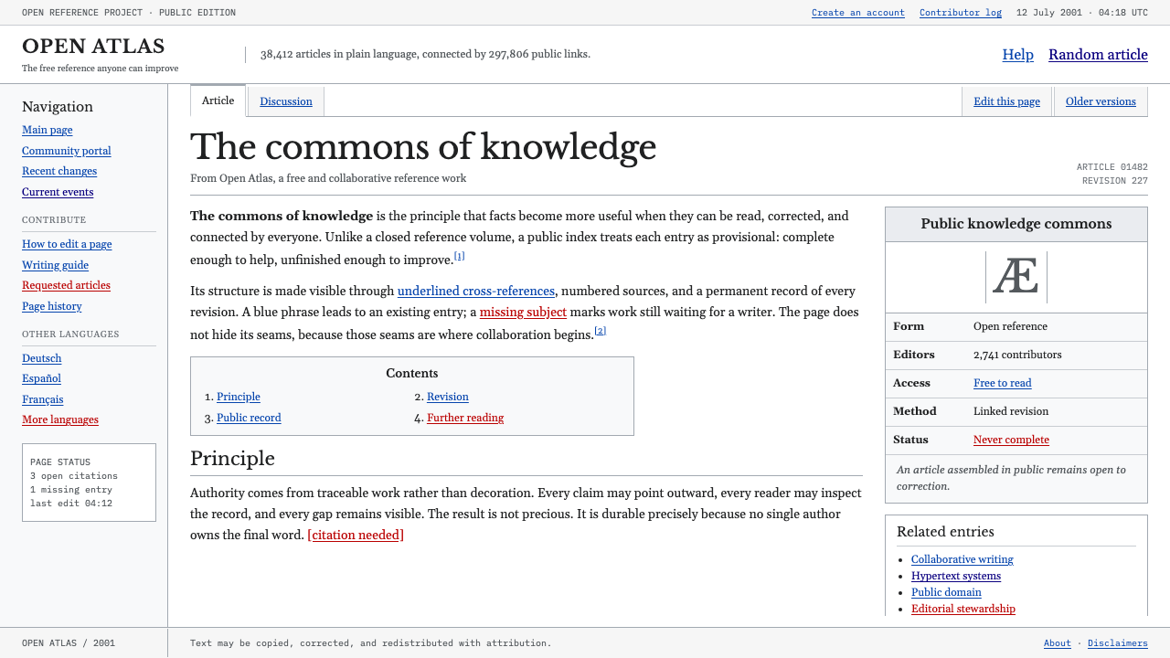 Wikipedia (2001)Content needs no ornament. Black serif text, gray hairlines, and blue links e…
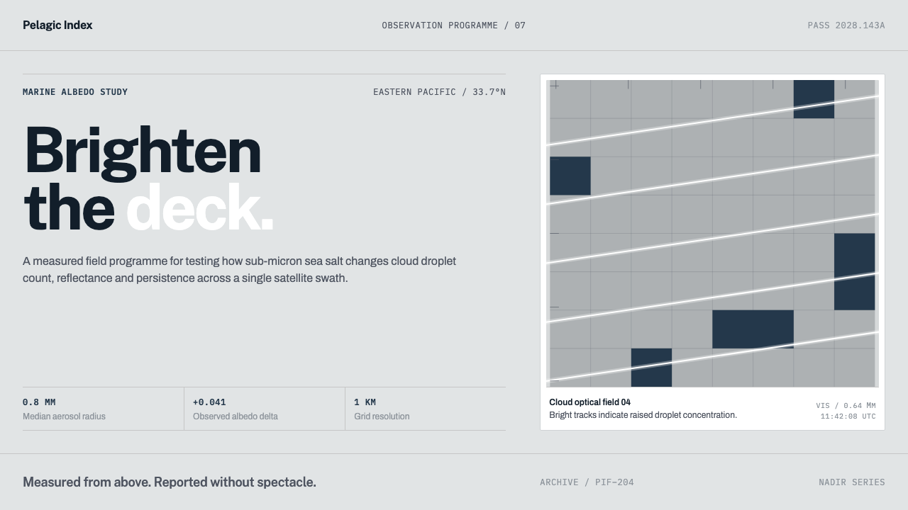 Cloud Brightening FleetBrightening becomes evidence. White ship-track lines score a cool-grey satell…
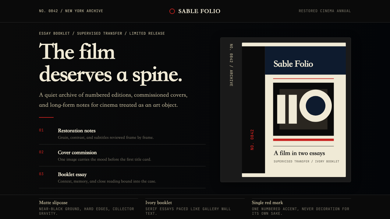 Criterion CollectionMuseum-grade cinema. Matte black, ivory serif, and one red numbered spine set…
 GitHub README Markdown (2014)Calm code authority. Blue links, gray code panels, and Inter/Mono stack on wh…
 Our World in DataCharts that cite themselves. Thin lines named at their ends on white, source…
 Palm webOSEvery app is a card you flick away. Charcoal gloss pills and blue labels on g…