What is Palm webOS?
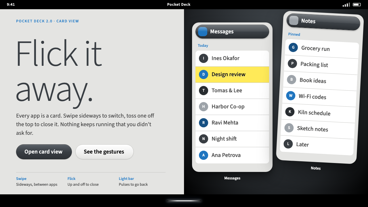
Palm webOS made every running app a card you could fan through sideways and flick away, wrapped in a quiet grey scene and glossy charcoal chrome.
Palm webOS in brief
Palm webOS is the interface language of a short-lived but influential mobile operating system. It arrived on the Palm Pre at CES in 2009 with one idea that outlived the company: every running application is a card. You fan through your open cards sideways, and you close one by flicking it off the top of the screen. The gesture is physical, immediate and easy to teach.
Inside each card sits a Mojo scene, the framework's default page. It is a quiet light grey surface with black and charcoal text, labels in Palm blue and a yellow highlight when something is selected. The type is Prelude, a humanist sans-serif by David Berlow for Font Bureau, chosen to disappear on screen rather than to announce itself.
Around the scene sits the system's black frame: a status bar at the top, a translucent notification strip at the bottom of the screen, and a white gesture light below the display. Glossy charcoal pills give buttons and list items a polished, slightly tactile finish. The system in this library keeps that light scene, the pills and the black chrome around them.

Where does Palm webOS come from?
The operating system was built at Palm, Inc. in Sunnyvale, California, and unveiled in 2009 with the Palm Pre and the smaller Pixi. Palm had defined the personal digital assistant a decade earlier, and by the late 2000s it needed a platform that could compete with the new generation of touchscreen phones. Jon Rubinstein, a veteran of hardware and product leadership, was one of the executives who steered the company toward that fresh start.
The design direction owes much to Matias Duarte, who led the webOS user experience work. The team's guiding insight was that people on phones juggle several activities at once and that the interface should make that juggling visible. Cards turned multitasking into a spatial arrangement rather than a hidden list, and the system treated notifications as something that arrives quietly at the bottom of the display instead of interrupting the screen.
webOS was also an early example of building a mobile system on web technologies. Applications were written with the Mojo framework, which used standard web markup and scripting, and the later Enyo framework carried the idea forward. That choice is why the scenes look like tidy web pages in a quiet palette: they were literally web content dressed in a consistent set of system styles.
The platform's life was short. It continued with the Pre 2 and webOS 2.0 in 2010 and reached the larger HP TouchPad in 2011, after which its commercial run effectively ended. Yet the card metaphor and the flick-to-close gesture were absorbed by later mobile systems, and designers still point to webOS when they discuss gesture-first interfaces. The movements in the source material, card-based multitasking, gesture-first mobile UI and web-technology app frameworks, describe a legacy larger than the product's sales.
What defines the Palm webOS look?
Cards as the Unit of Work
Each running application is one card, and the set of cards is the whole task switcher. Cards sit side by side in a horizontal row, can be reordered, and are dismissed with an upward flick. The design never asks the user to open a separate menu to manage apps. Visually this means every screen has a clear rectangular boundary and softly rounded corners, as if it were a physical object that could be lifted out.
Color
The scene is a calm light grey, text is black or charcoal, labels and links are Palm blue, and selection is marked with a yellow highlight. Colour is functional: blue means a label you can act on, yellow means current selection. The only heavy tone comes from the black system chrome around the scene, which frames the grey like a picture frame. There are no brand-colour backgrounds filling entire screens.
Typography
Prelude, a humanist sans-serif drawn by David Berlow for Font Bureau, is the single voice. Its open shapes and moderate contrast stay readable at small sizes on a phone display, and it reads as friendly without being decorative. Hierarchy comes from weight, colour and position rather than from changing typefaces. List rows use short labels in blue above or beside quieter grey detail text.
Glossy Charcoal Pills
Buttons, toggles and some list items take the form of rounded capsules with a soft gloss on the upper half, in charcoal against the grey scene. They look slightly raised and pressable, in line with the era's taste for tactile surfaces, yet restrained enough not to compete with content. The gloss is subtle and contained inside the pill; the surrounding page stays flat.
System Chrome and the Gesture Area
A black status bar sits at the top, a translucent notification strip rises from the bottom, and a thin white gesture light sits beneath the display. The system chrome is consistent across every app, so users learn it once. It also gives the lighter content a firm, high-contrast border, which makes the cards feel like windows set into a dark device.
Motion and Direction
Movement follows the logic of cards: they slide sideways to browse, shrink when you leave an app, and fly upward when dismissed. Transitions are quick and tied directly to the finger, so the interface feels like it is following your hand rather than playing an animation. Directions are never random; horizontal means browse, vertical means discard.

Who shaped Palm webOS?
Design lead for the webOS user experience. He shaped the card metaphor and the gesture-first approach to multitasking, ideas that later reappeared in other mobile operating systems.
A senior product and hardware executive at Palm who helped steer the company toward the Pre and webOS. His leadership explains why the software and the device's physical gesture area were conceived together.
A type and publication designer connected with Font Bureau, the foundry that released Prelude. His influence on screen-minded typography is part of why webOS pays unusual attention to text.
The type designer behind Prelude, the humanist sans-serif used throughout webOS. His design is intentionally quiet, which is exactly what a system font should be.
How do you use Palm webOS today?
The Palm webOS style is useful when you want a calm, utility-first interface with a distinct gesture-era personality. It suits products where users juggle several tasks and where content should dominate over branding. Its restrained palette makes it easy to combine with real data, lists and forms.
For presentation slides, a cover can use the black system frame as a border, with a single grey card holding the title in dark text and one blue label as the subtitle. Content slides work best as stacks of cards, each one carrying a single idea, arranged left to right to tell a sequence. Data pages should treat charts as cards too, with a pill-shaped control row above and quiet grey explanatory text below.
For web interfaces, the style fits task managers, inboxes, multi-document tools and mobile-first dashboards. Build the layout from rectangular cards with softly rounded corners, put actions in glossy charcoal pills, and use blue only for labels that can be clicked. Pricing pages can use three side-by-side cards, with the recommended plan marked by a yellow highlight rather than a loud badge.
For editorial and marketing work, the best use is nostalgia with substance: a retrospective on mobile design, a product history, or a launch page that wants an early-2010s feel without becoming a parody. Keep copy short, set it in a humanist sans-serif, and let the black frame and grey scene do the visual work. Photographs of devices can sit in cards with generous empty space around them.
A common mistake is to push the gloss too far, filling the whole page with shiny gradients until the quiet scene vanishes. The original keeps the shine inside the pills and leaves the page flat. Another mistake is to use blue for decoration; in this system blue always signals something you can act on, and yellow always signals selection.

Palm webOS — FAQ
What is the Palm webOS design style?
It is the interface language of Palm's webOS, introduced in 2009. Applications are cards you fan through sideways and flick off the top to close, shown in a light grey scene with charcoal glossy pills, blue labels, a yellow selection highlight and black system chrome.
Which device launched webOS?
The Palm Pre, unveiled at CES in 2009 together with the Pixi. The Pre 2 and webOS 2.0 followed in 2010, and the HP TouchPad arrived in 2011.
What font does it use?
Prelude, a humanist sans-serif designed by David Berlow for Font Bureau. It was picked for being unobtrusive and readable on small screens.
Why did webOS influence later mobile systems?
Its card-based multitasking and flick-to-close gesture made switching between running apps visible and physical. Those ideas were later echoed in other mobile operating systems even though webOS itself had a short commercial life.
What should I keep when borrowing the look?
Keep the card boundaries, the quiet grey scene with black frame, charcoal pills with their gloss contained, blue for actionable labels and yellow for selection. Without those, it becomes a generic grey interface.
Related design styles
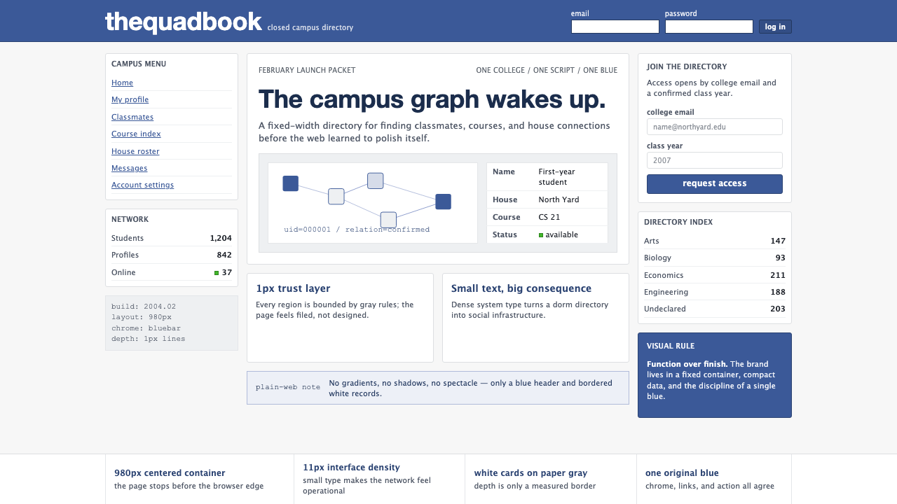 Facebook 2004Dorm-web austerity. Original blue, 980px grid, 1px borders, tiny Lucida Grand…
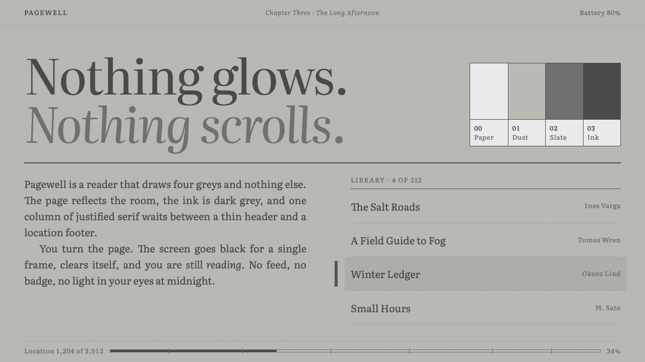 KindleNothing glows. Green-grey paper, grey Literata ink, one justified column, a b…
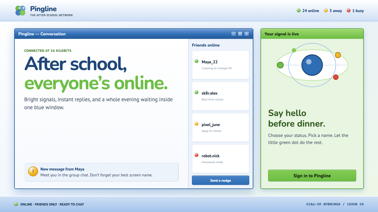 MSN Messenger (2001)Dial-up optimism, online. Luna-blue chrome and bright status dots keep every…
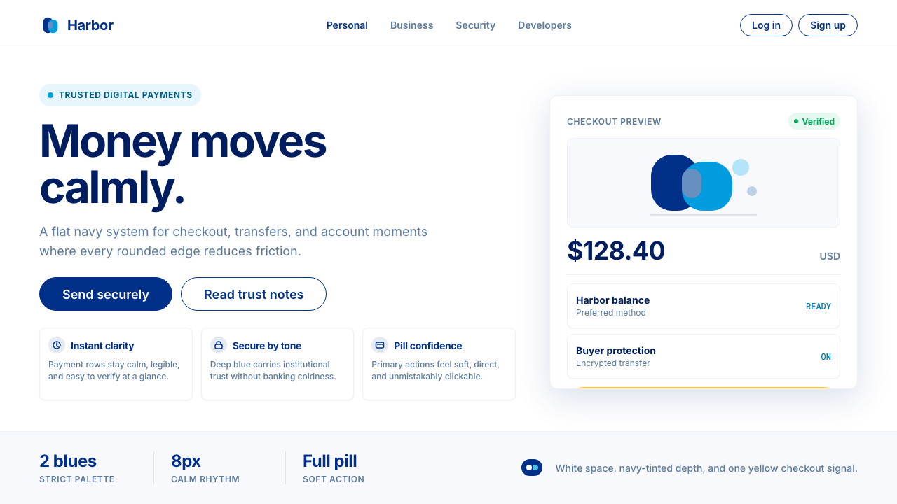 PayPalTrust without coldness. Deep navy, sky cyan, white cards, and pill checkout c…
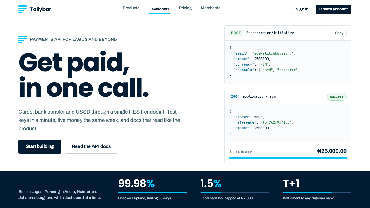 PaystackPlain-spoken payments infrastructure. White page, navy ink, four flat cyan ba…
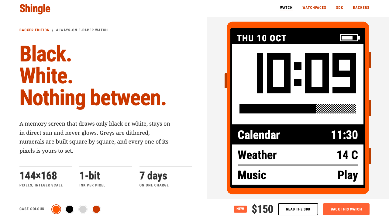 PebbleTwo colours, no greys. Burnt-orange headings on white frame a 144×168 one-bit…