What is Paystack?
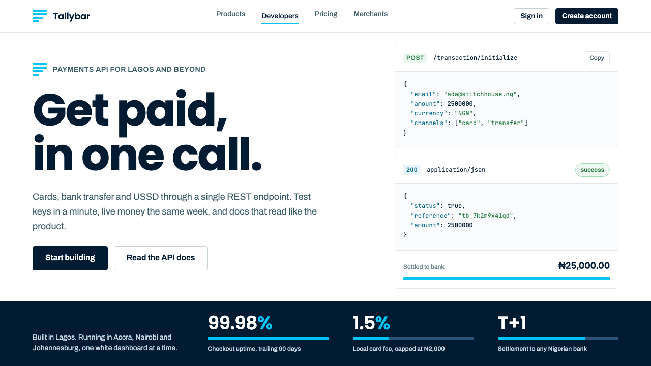
Paystack's look is plain-spoken payments infrastructure: a white page, navy ink, real merchants in their own shops, and four flat cyan bars as the only signature.
Paystack in brief
Paystack is a visual language for developer-first payments software, taken from the product and documentation site of a company that began in Lagos. The system is a white dashboard and documentation environment set in navy ink: tables, code wells and integration guides, interrupted at intervals by full-width navy bands and photographs of real merchants in their own shops.
The look is built on restraint. There are no gradients, no raised three-dimensional cards, and no African-pattern decoration borrowed as a cheap shortcut to identity. Warmth comes from the photographs, which show local traders at their counters, market stalls and hair salons. Everything else is quiet, tabular and exact, as befits software that moves money.
The only graphic motif is the four flat cyan bars from the logo. They are of different lengths and are reused as progress bars, tiny trend lines and section markers. A single repeated shape that does real work is more memorable than a decorative illustration system, and it keeps the brand legible in small sizes inside a dashboard.

Where does Paystack come from?
Paystack was started in Lagos, Nigeria, in 2015 by Shola Akinlade and Ezra Olubi. The job it set itself was narrow and practical: let a Nigerian business take a card payment online. At the time, accepting online payments in the country meant dealing with fragmented banking integrations and documentation that assumed a different market. A clean API and clear documentation addressed an obvious gap.
The company joined Y Combinator in 2016, an early sign that its approach, a developer-first payments product for a market underserved by existing tools, had reach beyond Nigeria. Over the following years it became one of the best-known payments APIs on the continent for developers. In 2020 it was acquired by Stripe, and the Paystack brand was kept intact rather than folded into its new parent.
The visual identity most associated with the system took shape around 2018 and has been refined through 2024. Three ideas from the source material describe its movements: African fintech, developer-first API design and documentation-as-marketing. The last matters most for the look. When documentation is the main sales material, the design of tables, code blocks and guides is the brand, and showy marketing graphics become less important than clear structure.
The decision to feature real merchants in photographs also has a design logic. A payments company needs to be trusted by two audiences at once: developers who judge it by precision, and business owners who judge it by whether it understands their shops. Navy ink and flat tables speak to the first group, and photographs of Lagos traders in their own spaces speak to the second, without tipping into stereotype.
What defines the Paystack look?
Color
A white page is the default, and text is set in a deep navy that reads as ink rather than black. Full-width navy bands break the page into chapters. Cyan is reserved for the four-bar signature and a few interactive states. There is no secondary rainbow of brand colours: success, warning and error colours exist for the product's needs but remain muted and functional.
Typography
A clean, modern sans-serif is used throughout, with a monospaced face for code. Headlines are direct and sentence-like, describing what the product does in plain words. Hierarchy relies on size and weight steps rather than colour. Numbers in tables are set so that columns align, because the audience reads figures for a living.
The Four Cyan Bars
Four flat horizontal bars of different lengths are the logo, and also the pattern that the system reuses. Stretched, they become a progress indicator; stacked at small scale, a sparkline; placed beside a heading, a chapter marker. Because the bars are always flat and always cyan, they act as a signature without ever needing a separate decorative layer.
Tables and Code Wells
Data tables have hairline row dividers, generous cell padding and sortable headers. Code appears in light wells or dark navy blocks with clear syntax colouring and a copy control. These are the core components of the system, and they get as much design attention as any hero section. Documentation pages feel like part of the product rather than an afterthought.
Merchant Photography
Photographs show real business owners in their own surroundings: behind counters, at market stalls, in hair salons. They are natural-light, unposed and given enough space to breathe, usually inside a full-width band or a plain rounded rectangle. The photographs carry the warmth and the local specificity so that the interface itself does not have to perform either.
Flat Surfaces
Components are flat: thin borders, solid fills, consistent corner treatment and no gradients or heavy shadows. Depth is conveyed by contrast between white and navy bands rather than by elevation effects. This keeps pages light to render and consistent across a very large documentation set, and it signals reliability.

Who shaped Paystack?
Co-founder of Paystack in Lagos in 2015. His developer background helps explain why the product leads with an API and documentation rather than with a sales deck.
Co-founder who shaped the engineering side of the company. His work is part of why integration guides and code samples are treated as first-class product surfaces.
The accelerator Paystack joined in 2016. The programme's emphasis on simple, usable products and direct language is visible in the brand's plain-spoken tone.
The payments company that acquired Paystack in 2020 while keeping the brand intact. Stripe is itself known for documentation-led design, and the two approaches reinforce each other.
How do you use Paystack today?
The Paystack style suits products where trust is built through clarity: payments, banking, invoicing, accounting, developer tools and any business-to-business software with a heavy documentation component. It also suits emerging-market products that want to look credible and modern without cultural clichés.
For presentation slides, a cover can be a white slide with a navy title and the four cyan bars along one edge. Content slides can alternate white pages with full-width navy bands for chapter breaks, and use a real photograph of a customer once per section. Data slides should lean on well-aligned tables and thin charts, with the cyan bars acting as a progress or comparison motif.
For web interfaces, it excels at dashboards, settings areas, transaction lists and documentation sites. Build with a white background, navy ink, hairline dividers and generous spacing. Code samples belong in distinct wells with a copy action. Pricing pages should be simple tables with plain-language rows, because the brand's credibility rests on being straightforward about fees.
For editorial and marketing work, the formula is plain headlines, a few strong photographs of real customers, and navy bands that frame a single message. Case studies read well in this system because each one can show a merchant, a short quote and two numbers. Avoid stock imagery of generic smiling people; the style depends on specific, named businesses.
A common mistake is to decorate: adding gradients, glossy cards or pattern fills to make the page feel more premium. The system's authority comes from absence of ornament. Another mistake is to use the cyan everywhere; it is a signature, not a fill colour, and works because it appears in small, flat, repeated bars.

Paystack — FAQ
What is the Paystack design style?
It is a plain-spoken payments and documentation look: a white page, navy ink, hairline tables, code wells, full-width navy bands, photographs of real merchants, and four flat cyan bars as the only graphic signature.
Where did Paystack come from?
It was founded in Lagos, Nigeria, in 2015 by Shola Akinlade and Ezra Olubi, joined Y Combinator in 2016, and was acquired by Stripe in 2020 with its brand kept intact.
Why does it avoid African patterns?
The system chooses real photographs of local merchants for warmth and specificity, and treats pattern decoration as a stereotype shortcut. The interface itself stays flat and functional.
What is documentation-as-marketing?
It means the product's documentation and developer guides serve as the main sales material. Design effort goes into tables, code blocks and clear structure, because that is where developers decide whether to trust a product.
How should the cyan bars be used?
As a small, flat, repeated motif: progress bars, mini trend lines and section markers. Do not use cyan as a general fill colour or add gradients to the bars.
Related design styles
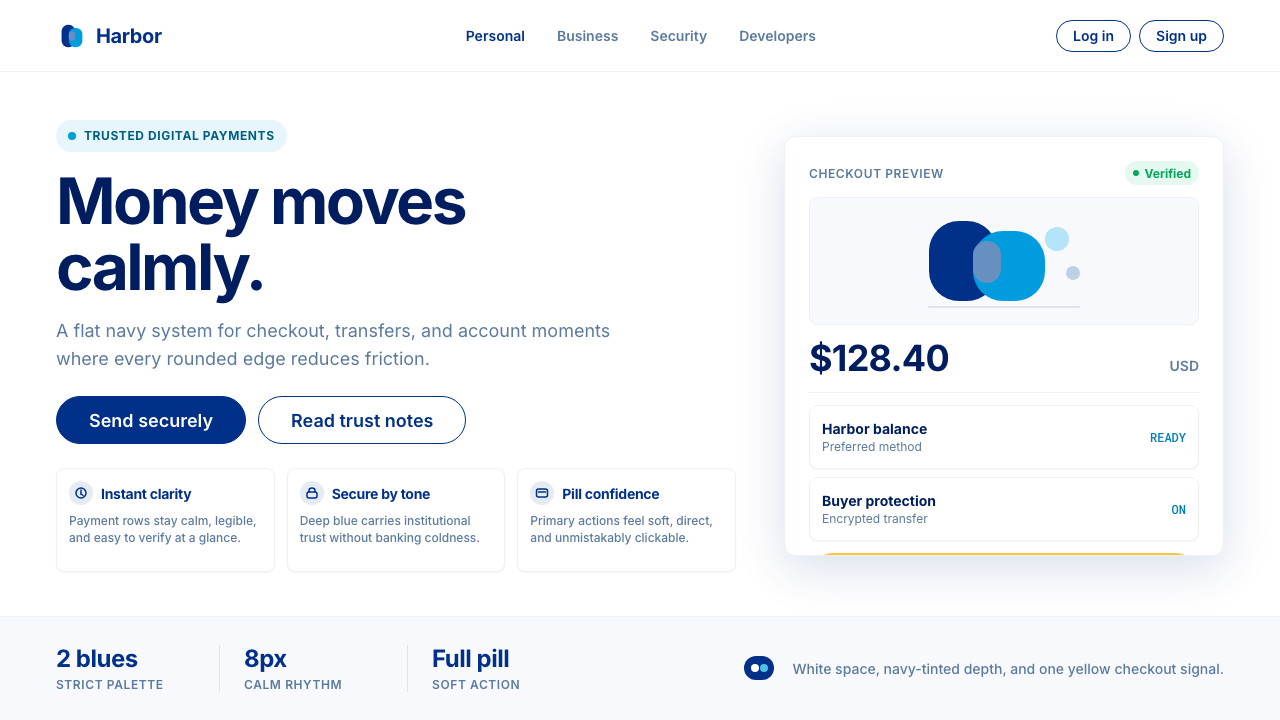 PayPalTrust without coldness. Deep navy, sky cyan, white cards, and pill checkout c…
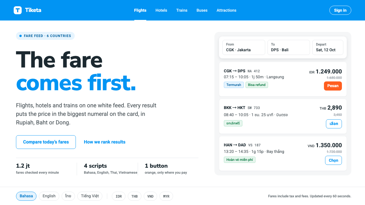 TravelokaThe fare comes first. Azure band, white cards, price as the biggest numeral,…
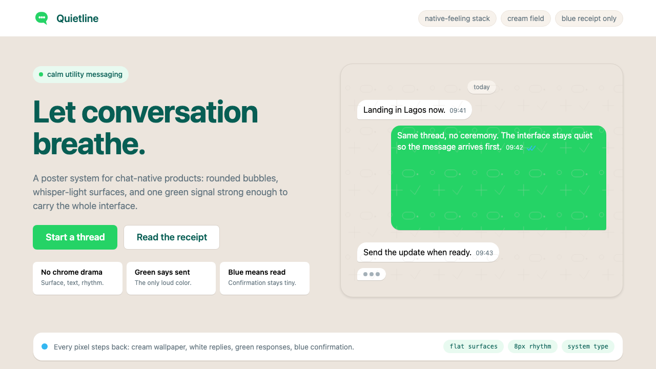 WhatsAppConversation is the interface. Cream wallpaper, green bubbles, and tiny blue…
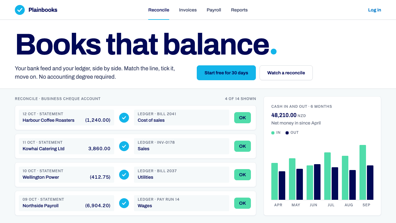 Xero AccountingCalm money, made scannable. White ledger cards, one sky-blue circle, navy onl…
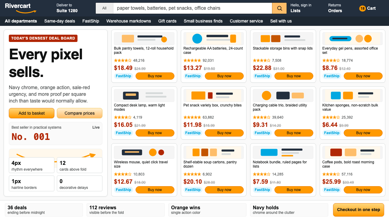 AmazonUgly sells efficiently. Navy chrome, orange buttons, red prices crowd a dense…
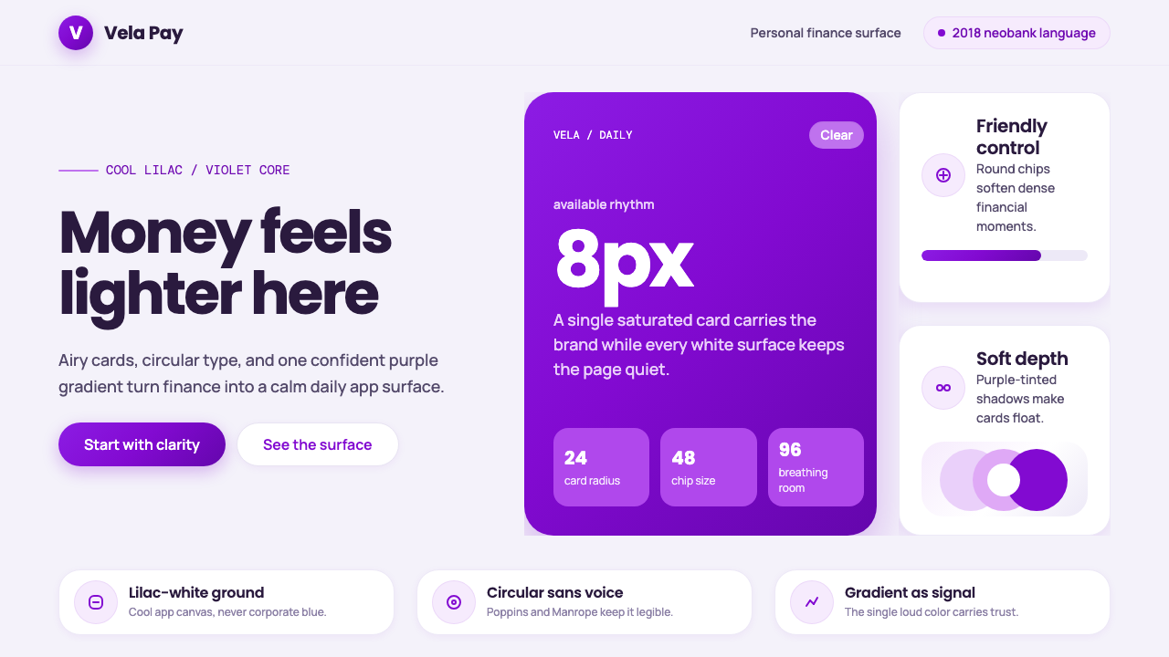 Circular FintechFinance feels light. Lilac-white space, rounded cards, and one vivid purple g…