What is Xero Accounting?
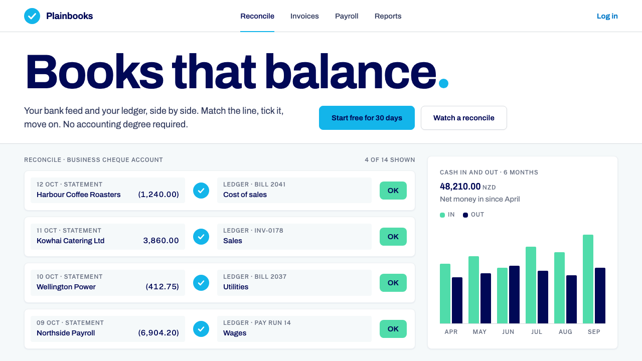
Xero turned bookkeeping into a calm white ledger — cards on a faintly blue canvas, one sky-blue circle, and navy used only as ink.
Xero Accounting in brief
The Xero style is the visual language of friendly cloud accounting. It comes from the web software company founded in Wellington, New Zealand, in 2006, and it is built around one conviction: money screens do not have to look like money screens. Instead of dense toolbars, small print and warning colours, it offers white ledger cards, generous breathing room and a palette so restrained that the numbers themselves become the main event.
Three ingredients define the look. First, a white card and invoice-row system that floats on a barely-blue canvas, so every block of figures reads as a separate sheet of paper. Second, a single sky-blue circle marking the top-left corner as the brand's anchor, with deep navy reserved strictly for text, never for large fills. Third, tabular figures aligned to the right, so a column of amounts can be scanned the way an accountant runs a finger down a page.
The overall feeling is quiet, clear and unthreatening. It is the opposite of the intimidating spreadsheet: the interface assumes the reader is a café owner, a tradesperson or a freelancer who never wanted to learn accounting, and it earns trust by giving every number plenty of white space rather than by piling on features.

Where does Xero Accounting come from?
Xero was founded in 2006 in Wellington by Rod Drury and Hamish Edwards. At the time, accounting software was desktop software: installed on one computer, maintained by specialists, and designed on the assumption that the user already understood debits, credits and the general ledger. The founders' bet was that accounting could move into the browser, and that a small-business owner should be able to reconcile a bank feed without ever needing that vocabulary.
That bet shaped the interface more than any design trend did. The company listed on the New Zealand exchange in 2007 and on the Australian exchange in 2012, growing from a Pacific-edge start-up into a global brand, and its screens had to work for a very wide audience: sole traders, bookkeepers, accountants and advisers all sharing the same data. A calm, high-legibility surface was a practical requirement, not a stylistic indulgence.
The movement it belongs to is best described as SaaS cloud accounting, and within that, bank-feed automation. The signature interaction is reconciliation: transactions flow in from the bank, and the user confirms or matches them one card at a time. The visual system grew around that rhythm. Each transaction is a clean white unit, the action is a single obvious choice, and the screen never shouts, because the work is repetitive and has to feel light.
The current brand system dates from the guidelines issued in November 2023, which refreshed the identity while keeping its core discipline. A third thread runs through the brand's story: a New Zealand type revival, with the typographer Kris Sowersby among the key figures associated with this strand. It signals a quiet national pride in craft, the idea that a software company from a small country can care about letterforms as much as about ledgers.
What defines the Xero Accounting look?
Color
The palette is deliberately small. A cool, almost imperceptibly blue background carries white cards, a single sky-blue accent appears in the circular mark, and deep navy is used as ink for text rather than as a surface. Status colours exist but stay secondary; the interface never relies on alarming red fields to get attention. The effect is a screen that feels clean and cold in the best sense, like fresh paper under daylight.
Typography
Type is a friendly, highly legible sans-serif set at modest sizes, with a clear contrast between labels, body text and headline figures. The decisive detail is numeric: amounts use tabular figures, so every digit occupies the same width and columns line up perfectly. Negative values are shown in brackets in the accounting tradition. Nothing is decorative; the typography exists to make money readable.
Cards and surfaces
The core unit is a white ledger card or invoice row. Cards float above the tinted canvas with the faintest separation, so they read as sheets of paper laid on a desk. Rows inside them are divided by light lines rather than boxes, which keeps long lists calm. There is no heavy chrome and no stacked panels competing for attention.
Spacing and density
White space is treated as a feature. Rows are given generous height and cards generous padding, even though financial data tempts designers to compress. The philosophy is that a user who sees fewer things at once feels more confident about each of them. Density is available when needed, but the default state is airy and unhurried.
Brand mark and shape
A sky-blue circle in the top-left corner is the single point of brand colour on most screens. Shapes elsewhere are soft and rounded without turning toy-like; buttons and tags have gentle corners that match the circle's friendliness. The result is an identity that can be recognised from a distance by one disc and a lot of white.
Tone of interaction
Actions are phrased and presented as plain choices: match, confirm, send. Feedback is gentle, with no sirens or flashing banners for ordinary events. This reflects the original premise that accounting should feel unthreatening, and it gives the interface a reassuring, almost conversational rhythm during repetitive tasks such as reconciliation.

Who shaped Xero Accounting?
Co-founder of Xero in Wellington in 2006. His central proposition, that accounting could live in the browser and be understood by people who had never studied it, is the idea from which the whole interface follows. The calm ledger look is the visual consequence of that product stance.
Co-founder alongside Rod Drury. Together they set out to replace desktop accounting with a service that small businesses could use without specialist training, and to connect directly to bank feeds. That automation-first ambition explains why the interface is organised around confirming transactions rather than entering them by hand.
A New Zealand typographer named among the key figures of the brand's type-revival thread. His presence in the story marks the idea that a financial product can take letterforms seriously, and that distinctive local typographic craft can sit comfortably inside a pragmatic, global software identity.
How do you use Xero Accounting today?
For slides, the Xero style suits finance reviews, small-business pitches and any deck where credibility depends on clarity. A cover works best with a large white field, the sky-blue circle used as a single anchor, and a short navy headline. Content slides should place one idea on one white card; resist the urge to tile several panels. For data slides, give each figure its own row, right-align the amounts, use tabular digits, and let the surrounding space do the work that borders and fills would do in a busier system.
For web interfaces, the natural homes are dashboards, invoicing flows, reconciliation lists and settings screens. A dashboard becomes a column of white summary cards over a pale tinted canvas; an invoice list becomes a stack of generously spaced rows with the totals aligned at the right edge. Pricing pages work in the same spirit: a few clean cards, one clear call to action each, and the sky-blue accent reserved for the choice you want people to make.
For editorial and marketing work, the style supports explainers, onboarding emails, help-centre articles and landing pages aimed at non-experts. Its strength is reassurance. Pair short, plain sentences with plenty of white and a single illustration or circle motif, and the page will feel as approachable as the product. Avoid dense infographics; the style wins by showing less, not more.
Carry the brand attitude into copy and structure as well. Name actions in the simplest verbs available, group related figures on a single card, and let totals sit where the eye lands last. The look works because it is consistent, so repeat the same card, the same row height and the same number alignment across every surface rather than inventing variations.
A common mistake is to read the restraint as emptiness and then fill the gaps. Teams add extra accent colours, gradient headers or heavy shadows, and the calm disappears. The other frequent error is to use navy as a large background; in this system it is ink, not paint. Keep the canvas pale, keep the cards white, keep the single blue accent rare, and the style will hold together.

Xero Accounting — FAQ
What is the Xero design style?
It is the calm, ledger-like look of Xero's cloud accounting software: white cards and invoice rows on a barely-blue canvas, a single sky-blue circular mark, navy used only for text, and right-aligned tabular numbers. Its purpose is to make financial information scannable and unintimidating for people who are not accountants.
When and where did it originate?
Xero was founded in Wellington, New Zealand, in 2006 by Rod Drury and Hamish Edwards. The company listed on the New Zealand exchange in 2007 and the Australian exchange in 2012, and the current brand system comes from guidelines issued in November 2023.
Why are the numbers right-aligned and tabular?
Because comparison is the core financial task. When every digit has the same width and amounts share a right edge, units, tens and hundreds line up vertically, so the eye can compare a whole column at a glance. Bracketed negatives follow accounting convention and keep the column readable without extra colour.
Can this style work for products that are not about money?
Yes. Anything built around lists of records, such as inventory tools, booking systems, admin consoles or project trackers, benefits from the same white cards, generous rows and quiet palette. The key is that the content is data-heavy and the audience is non-expert, which is exactly the situation the style was designed for.
How is it different from a typical dark trading or analytics dashboard?
Dark dashboards chase density and urgency, using heavy colour to signal movement. The Xero style does the opposite: it is light, spacious and low-saturation, treats navy as ink rather than background, and spends its single accent colour sparingly. It is designed for routine confidence, not for second-by-second alertness.
Related design styles
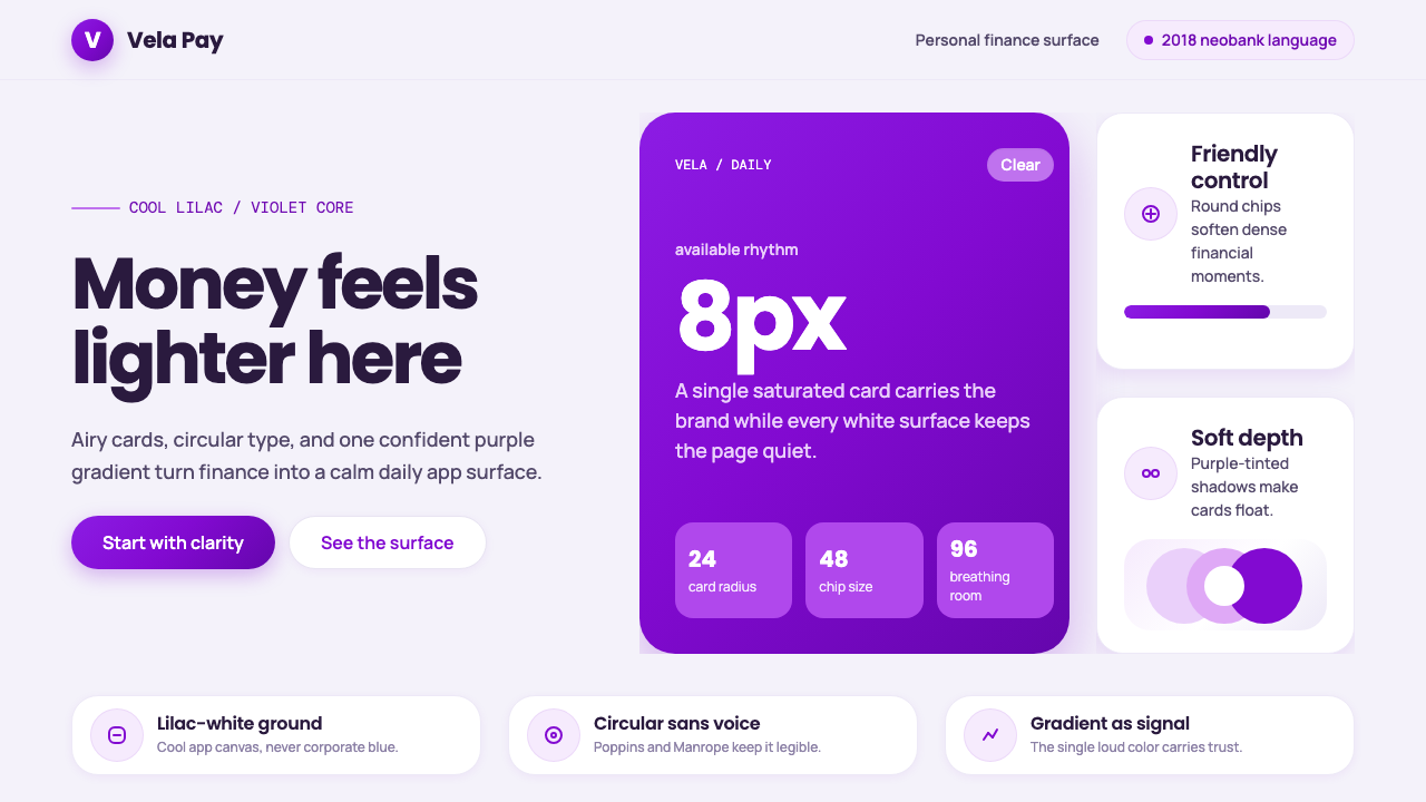 Circular FintechFinance feels light. Lilac-white space, rounded cards, and one vivid purple g…
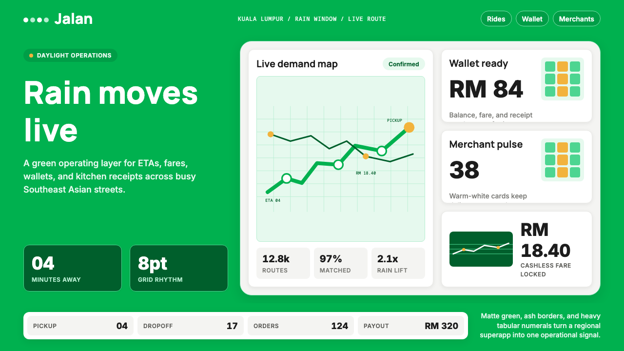 Grab SEA Superapp 2018Operational warmth. Saturated green, Inter numerals, and tight dashboard card…
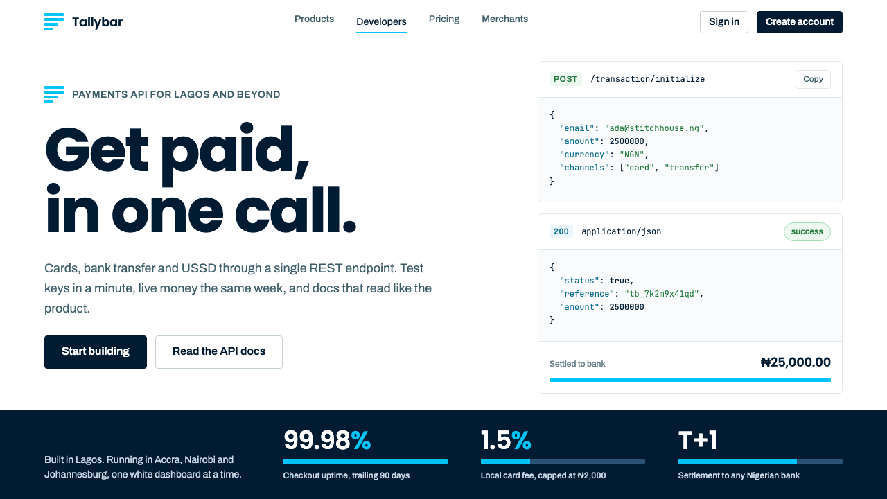 PaystackPlain-spoken payments infrastructure. White page, navy ink, four flat cyan ba…
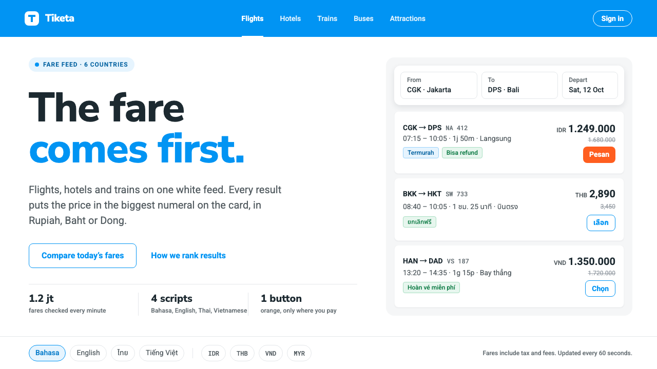 TravelokaThe fare comes first. Azure band, white cards, price as the biggest numeral,…
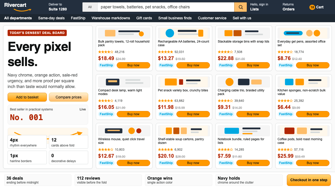 AmazonUgly sells efficiently. Navy chrome, orange buttons, red prices crowd a dense…
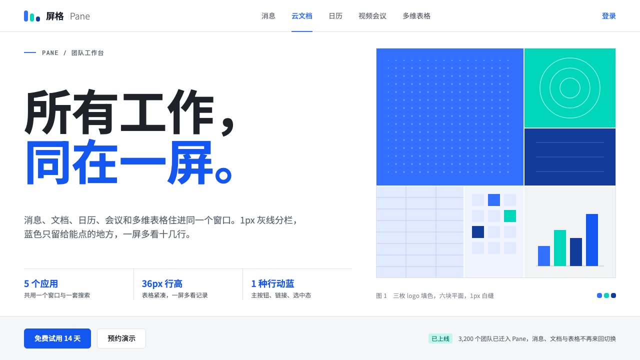 FeishuQuiet density, one blue. White panes split by 1px grey lines; blue marks only…