What is Traveloka?
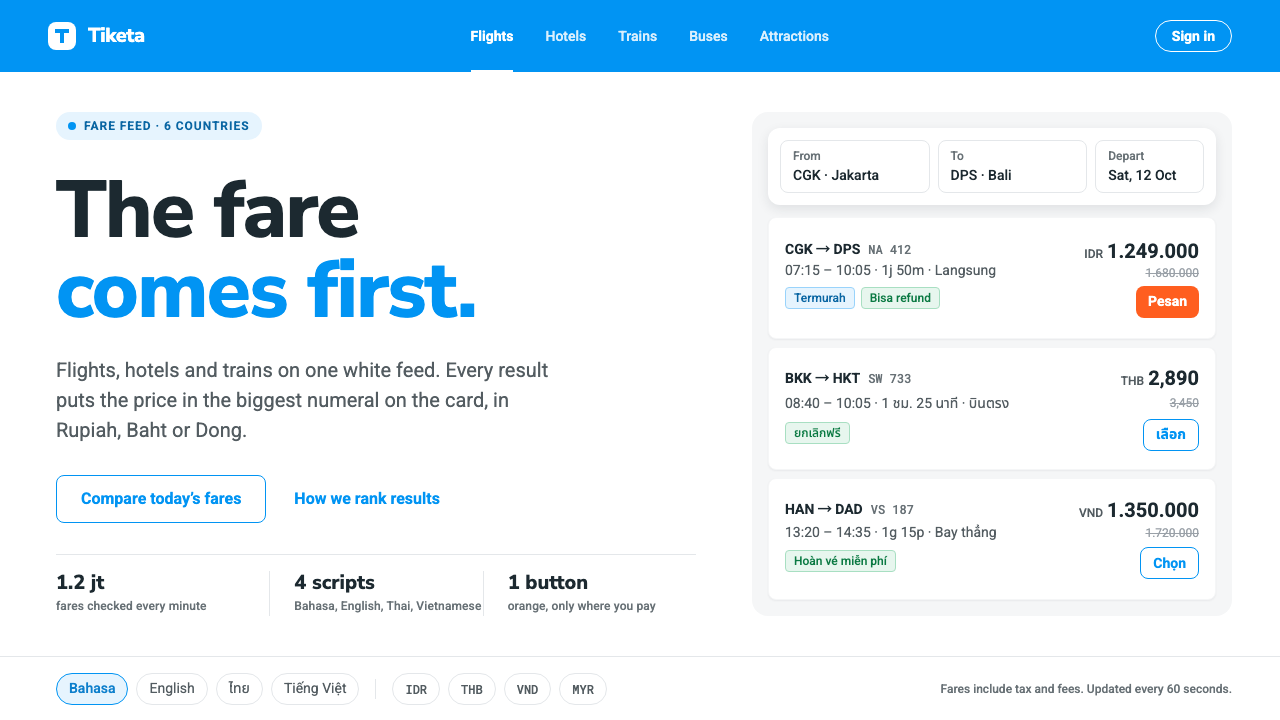
Traveloka turned the chaos of Southeast Asian travel booking into a single rule: the fare comes first, everything else gets out of its way.
Traveloka in brief
Traveloka is the visual language of a Southeast Asian travel super-app: flights, hotels, trains, buses and attraction tickets sold from one continuous feed of white cards, across Indonesia, Thailand, Vietnam, Malaysia, Singapore and the Philippines. It belongs to the family of online travel agency interfaces, but it is tuned for a specific audience: mobile-first, price-sensitive, impatient, and reading in several scripts at once.
The system rests on four decisions. A band of azure sky blue at the top holds the search and signals trust. Below it, white cards carry exactly one result each, so the eye never has to decide where one offer ends and the next begins. On each card the fare is the largest numeral on the screen, larger than the airline name, the duration or the hotel title. And a single orange button, used for almost nothing else, marks the step that cannot be undone: Book.
What makes the style recognizable is therefore not decoration but discipline. There are very few colors, very few type sizes, and almost no ornament. Ratings, badges and filters exist, but they are quiet and grey beside the price. The interface behaves like a well-run airport board: dense, scannable, and honest about what matters most to the person standing in front of it.

Where does Traveloka come from?
Traveloka began in Jakarta in 2012 as a flight metasearch site. Its founders, Ferry Unardi, Derianto Kusuma and Albert Zhang, started from a plain observation: buying a plane ticket in Indonesia meant visiting many airline sites, comparing by hand, and often paying through unfamiliar channels. A tool that put fares side by side and made the cheapest option obvious was already useful, long before it was beautiful. That origin explains the interface's permanent obsession with the number.
The product then widened in stages. Direct booking arrived in 2013 and hotels in 2014, and from there the company added trains, buses, attractions and a growing set of everyday services until it behaved like a super-app rather than a comparison page. Each new vertical had to fit into the same card feed, which is why the layout is so modular. A flight card, a hotel card and a bus card look like siblings: same white surface, same placement of price, same single call to action.
The visual language that people now associate with the product matured around 2019 to 2024, a period shaped by Material Design–era Android product design. That tradition gave Southeast Asian apps their shared grammar: elevated cards on a light ground, a strong primary brand color in the app bar, generous touch targets and a restrained accent for the main action. Traveloka took this grammar and bent it toward commerce. The azure band is the brand; the orange button is the sale.
Region shaped the design as much as era. Southeast Asia is multilingual in a way that stress-tests typography. Bahasa Indonesia, English, Thai and Vietnamese all appear in the same components, and Thai stacked vowel marks and Vietnamese tone diacritics sit above and below the line, demanding generous line height and fonts with full coverage. The system had to remain legible when a hotel name arrived in any of those scripts, which pushed it toward plain, open letterforms and away from tight, display-style typography. Many users also arrive on mid-range phones and variable connections, so heavy imagery is contained within cards and the interface itself stays light.
What defines the Traveloka look?
Color
The palette is nearly a one-brand, one-action system. Azure sky blue owns the top band and the identity; white owns every result surface; neutral greys handle secondary information; and a single warm orange is reserved for the decisive Book button. Because orange appears almost nowhere else, it works as a signal rather than a decoration: when the eye finds it, the task is one tap from done.
Price as hero numeral
On every card the fare is the largest and heaviest figure, set in a strong weight with the currency written smaller beside it. Airline, route and duration are subordinate. This hierarchy is the heart of the style: someone scrolling forty results at speed should be able to compare them by looking at one column of numbers alone.
One result, one card
Each offer lives on its own white card with soft separation from the grey page behind it. Cards are internally consistent: logo or thumbnail at one edge, route or title in the middle, price and action at the other. The repetition lets users build a scanning rhythm and means new verticals can be added without redesigning the feed.
Multilingual typography
Type is a clean, open sans-serif chosen for coverage and legibility rather than personality. It has to carry Latin, Thai and Vietnamese diacritics cleanly, so line spacing is generous and tight display tricks are avoided. Labels stay short because translation tends to lengthen strings, and containers are built to flex rather than clip.
Flat elevation
Depth is modest. Cards sit on the page with a faint, diffuse lift, the header band is a flat block of color, and nothing glows or gleams. The calm surface keeps attention on content and also renders reliably on lower-end screens, where heavy shadows and blur can look muddy.
Dense but ordered spacing
Information density is high, yet it is organized by a steady vertical rhythm: consistent padding inside cards, even gaps between them, and aligned left edges. Filters and sort controls collect in a compact strip. Density is treated as a service to the shopper, and order is what makes it bearable.
Quiet secondary signals
Ratings, amenities, baggage notes and cancellation tags use small grey type and thin icons. They are present for trust and detail but never compete with the fare. Urgency cues, when used, borrow the orange sparingly so that the main action keeps its meaning.

Who shaped Traveloka?
Co-founder who started Traveloka in Jakarta in 2012, and the person most associated with its price-first, customer-simplicity ethos.
Co-founder who helped build the early technical foundation of the flight search and, later, the booking platform behind the card feed.
Co-founder of the company, part of the original team that turned a metasearch idea into a multi-product travel super-app.
How do you use Traveloka today?
For slides, this style suits comparison and decision decks. A cover can use a full band of azure with a short white title and nothing else. Content slides work best as a row of white cards, one option per card, with the key figure set far larger than its label. Data slides should let a single number dominate each tile, with supporting values in small grey type; reserve the orange for the one recommendation or the one call to action the audience should remember.
For web and app interfaces, it is a natural fit for booking, ordering and price-comparison flows: search results, product listings, quote tables, subscription plans and checkout steps. Keep one result per card, put the price in the same position on every card, and keep the primary button the only orange element on the screen. Dashboards in this style should favor a single column of comparable rows over decorative charts, and pricing pages can borrow the pattern directly.
For editorial and marketing work, use the style when the message is practical and numeric: a fares newsletter, a deals landing page, a campaign that promises a lower price. The azure band can act as a masthead, and white cards can show offers as a tidy grid. It is less suitable for atmospheric storytelling about destinations, where it will feel more like a receipt than a postcard.
A common mistake is to treat the orange as a general accent and spread it across badges, links and icons. Once orange is everywhere it stops marking the irreversible step, and the whole hierarchy flattens. A second mistake is shrinking the price to make room for photography or promotional text. If the number is no longer the largest element on the card, the design has stopped being Traveloka and become a generic listing.

Traveloka — FAQ
What is the Traveloka design style?
It is the interface language of a Southeast Asian travel super-app: an azure header band, one result per white card, the fare as the largest numeral, and a single orange button for the final booking step. Its identity comes from restraint and price-first hierarchy rather than ornament.
When did Traveloka start and where?
It was founded in Jakarta, Indonesia in 2012 as a flight metasearch site. Direct booking followed in 2013 and hotels in 2014, after which it grew into a broader super-app covering trains, buses and attractions.
Why is there only one orange element on the screen?
Orange is a signal, not a decoration. By reserving it for the Book button, the interface tells the user exactly which step cannot be undone. Using it elsewhere would weaken that meaning and flatten the hierarchy.
How does the style handle several languages at once?
It uses an open, highly legible sans-serif with generous line spacing so Thai vowel marks and Vietnamese tone marks do not collide, keeps labels short, and builds containers that flex when translations run longer than the original text.
What kinds of projects fit this style best?
Booking flows, price comparison pages, marketplaces, quote tables, subscription plan pages and any dense mobile interface where users scan many similar offers and decide by one number.
Related design styles
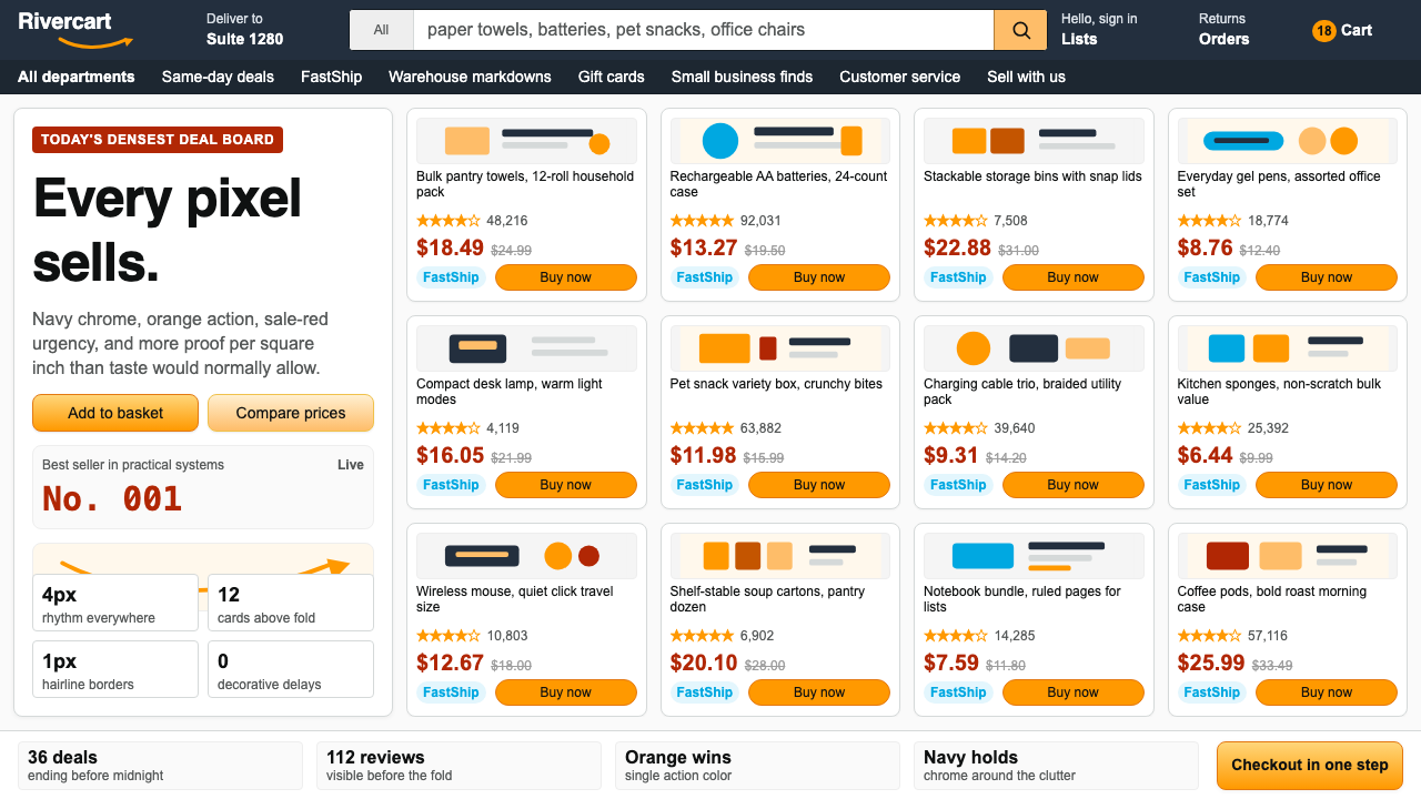 AmazonUgly sells efficiently. Navy chrome, orange buttons, red prices crowd a dense…
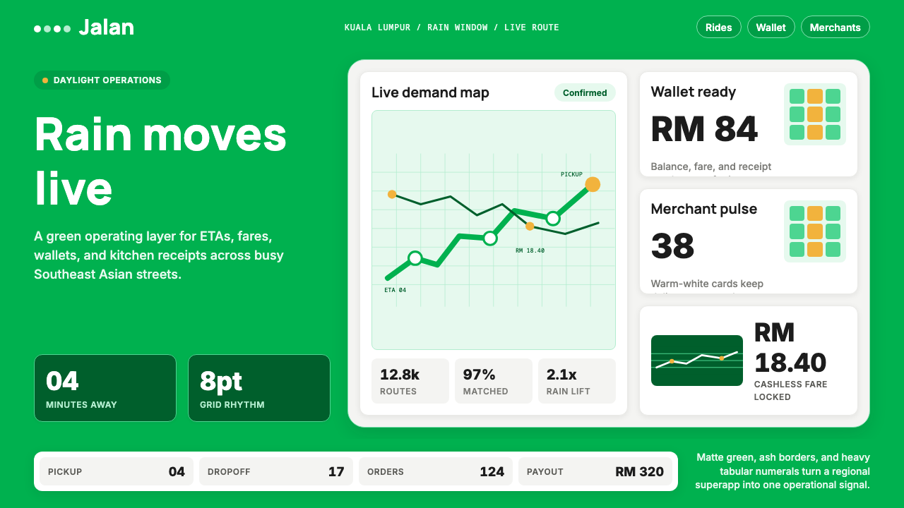 Grab SEA Superapp 2018Operational warmth. Saturated green, Inter numerals, and tight dashboard card…
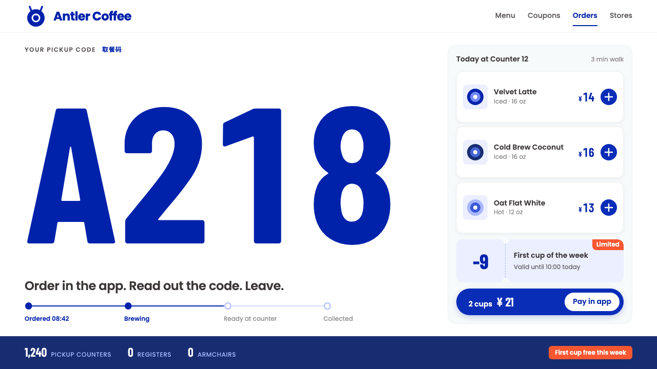 Luckin CoffeeWhite as a paper cup. Deer-blue roundel, tall condensed pickup codes, one ora…
 PaystackPlain-spoken payments infrastructure. White page, navy ink, four flat cyan ba…
 Xero AccountingCalm money, made scannable. White ledger cards, one sky-blue circle, navy onl…
 Circular FintechFinance feels light. Lilac-white space, rounded cards, and one vivid purple g…